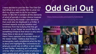
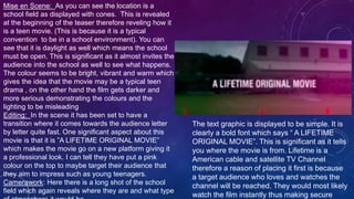
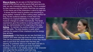
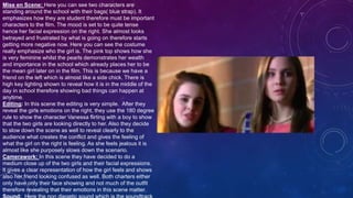
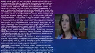
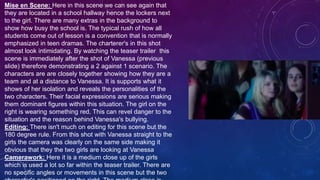
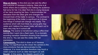
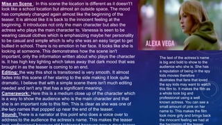
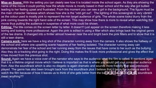
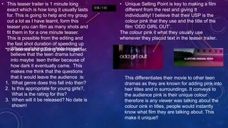
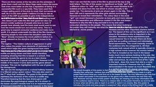
1. Odd Girl OutI have decided to pick the film The Odd Girl
Out which is a very similar film to what me
and my group want to do for our teaser
trailer. In this film it contains all the elements
of what is typically in a teen drama however
when studying the teaser I saw elements
that could also be displayed in a thriller. It
involved aspects such as isolation and
loneliness from the bullying that this girl
receives. In our teaser we would like to do
something similar to that which is why one of
these films is see as an inspiration.
Here I have captured nine screen shots of
the teaser trailer. I believe that these 9
screengrabs really emphasize what the film
is about and highlights the conventions on
what you would see on either a teen drama
or teen thriller. Analyzing all 9 will really
unwrap what everything could emphasize in
each scene which will be able to help me
https://www.youtube.com/watch?v=Yy0SnBejYgI
2. Mise en Scene: As you can see the location is a
school field as displayed with cones. This is revealed
at the beginning of the teaser therefore reveling how it
is a teen movie. (This is because it is a typical
convention to be in a school environment). You can
see that it is daylight as well which means the school
must be open. This is significant as it almost invites the
audience into the school as well to see what happens.
The colour seems to be bright, vibrant and warm which
gives the idea that the movie may be a typical teen
drama , on the other hand the film gets darker and
more serious demonstrating the colours and the
lighting to be misleading
Editing: In the scene it has been set to have a
transition where it comes towards the audience letter
by letter quite fast. One significant aspect about this
movie is that it is ”A LIFETIME ORIGINAL MOVIE”
which makes the movie go on a new platform giving it
a professional look. I can tell they have put a pink
colour on the top to maybe target their audience that
they aim to impress such as young teenagers.
Camerawork: Here there is a long shot of the school
field which again reveals where they are and what type
The text graphic is displayed to be simple. It is
clearly a bold font which says “ A LIFETIME
ORIGINAL MOVIE”. This is significant as it tells
you where the movie is from. Lifetime is a
American cable and satellite TV Channel
therefore a reason of placing it first is because
a target audience who loves and watches the
channel will be reached. They would most likely
watch the film instantly thus making secure
3. Mise en Scene: As we saw on the first frame the
outside of the school was the sports field and seconds
later we see characters playing sports. This is revealed
by their costume and the uniform that they are wearing
.In this frame one of the characters is about to high-five
. It shows that the mood is positive and everything is
going perfect, however in films nothing stays perfect for
long. As the audience watches it tricks them into
thinking it is a typical friendship in a high school
however changes to conflict dramatically. The facial
expressions give the audience a waring element of a
nice day demonstrated at the beginning of the play.
Editing: To maintain the positive attitude it is edited
with fast edits. The shot duration is quick which
matches the speed of their charterers and the energy
they all have.
Camerawork: In this frame we can see that there is a
medium shot when she high-fives the other character.
This can be purposely done because of how they would
want to just show the colored bibs that they are
wearing. It symbolize who is on what team and who is
the enemy. Later on another girl looks frustrated
wearing a red bib. It can display danger to her character
and a sign that the positivity wont last long.
4. Mise en Scene: Here you can see two characters are
standing around the school with their bags( blue strap). It
emphasizes how they are student therefore must be important
characters to the film. The mood is set to be quite tense
hence her facial expression on the right. She almost looks
betrayed and frustrated by what is going on therefore starts
getting more negative now. Here you can see the costume
really emphasize who the girl is. The pink top shows how she
is very feminine whilst the pearls demonstrates her wealth
and importance in the school which already places her to be
the mean girl later on in the film. This is because we have a
friend on the left which is almost like a side chick. There is
high key lighting shown to reveal how it is in the middle of the
day in school therefore showing bad things can happen at
anytime.
Editing: In this scene the editing is very simple. After they
reveal the girls emotions on the right, they use the 180 degree
rule to show the character Vanessa flirting with a boy to show
that the two girls are looking directly to her. Also they decide
to slow down the scene as well to reveal clearly to the
audience what creates the conflict and gives the feeling of
what the girl on the right is feeling. As she feels jealous it is
almost like she purposely slows down the scenario.
Camerawork: In this scene they have decided to do a
medium close up of the two girls and their facial expressions.
It gives a clear representation of how the girl feels and shows
also her friend looking confused as well. Both charters either
only have only their face showing and not much of the outfit
therefore revealing that their emotions in this scene matter.
5. Mise en Scene: As you can see, the character Vanessa is in the inside of the
school because of the coloured sheets in the background. It reveals that this is a
typical school scenario of her being lonely and maybe bullied. If she was in a
different location I believe that the analysis would be completely different thus
making her surrounding key to her situation and story line. She seems to be
upset by looking at her facial expressions, almost isolated. It gives tension to the
audience that she feels vulnerable also making the audience to sympathies with
her. It is clear who she is as a character by her costume. She is wearing a bright
blue bag with a pink top however the outfit looks casual compared to the other
girl that was wearing a peal necklace. It revels her status to be quite low in
school hence feeling isolated from the rest. The colours seem to look natural and
by observing the scene , the bright papers behind her could be representation of
her bright past and the happiness she had before getting in an argument with her
friends. Now that the bright past is gone this is why she is maybe standing in
front of the colourful papers next to a plain brick wall. The wall right next to her is
significant as it could again be a sign of isolation and alienation.
Editing: The shot duration of this screengrab is only 1 second long . This could
maybe reveal how obvious her emotions are thus not needing to show it for long.
It could also demonstrate how everything in her head is going fast pace as she
wants the day to be over so she can go home.
I can tell that when they edited they also speeded up the scene to significantly
show how the girl is feeling thus shocking the audience and almost scaring them.
By speeding it up it could be a tactic for the audience to also get excited as they
cant see much of the trailer. This would eventually lead to more people watching
the movie therefore more profit for jaffe/braunstein films.
Camerawork: In this shot it is a close up of Vanessa frustrated and annoyed
about the situation within the school. I believe that if used a longer shot such as
a medium or long shot her emotions wouldn't’t be as effective and sympathizing
.The audience would feel more tension and the unfriendly environment this way
6. Mise en Scene: Here in this scene we can see again that
they are located in a school hallway hence the lockers next
to the girl. There are many extras in the background to
show how busy the school is. The typical rush of how all
students come out of lesson is a convention that is normally
emphasized in teen dramas. The charterer's in this shot
almost look intimidating. By watching the teaser trailer this
scene is immediately after the shot of Vanessa (previous
slide) therefore demonstrating a 2 against 1 scenario. The
characters are are closely together showing how they are a
team and at a distance to Vanessa. It is supports what it
shows of her isolation and reveals the personalities of the
two characters. Their facial expressions are serious making
them dominant figures within this situation. The girl on the
right is wearing something red. This can revel danger to the
situation and the reason behind Vanessa's bullying.
Editing: There isn't much on editing for this scene but the
180 degree rule. From this shot with Vanessa straight to the
girls the camera was clearly on the same side making it
obvious that they the two girls are looking at Vanessa
Camerawork: Here it is a medium close up of the girls
which is used a lot so far within the teaser trailer. There are
no specific angles or movements in this scene but the two
7. Mise en Scene: In this shot you can see the effect
and outcome of Vanessa’s bullying. Here she is at
home where she is sobbing a lot making the audience
feel sorry for her. It is clear that she is crying because
of her hand covering her face. It demonstrates her
alienation from the other girls and changes the
innocent look of the trailer to serious. The contrast to
the beginning of the trailer is significant as it shows
how things in school can change very easily. The
audience which will most likely be young girls may
relate and I believe the teaser trailer will reach out to
them who may be in school still.
Editing: The scene is transitioned using a effect that
sounds like it went into a flash back. It’s a dramatic
sounding transition therefore showing how dramatic
this shot is. You can see this visibly with her
expression.
Camerawork: This shot is close up of Vanessa
crying. It is significant as the closer the camera is the
more emotions that are demonstrated to the
audience. It is more sensitive therefore may touch a
wider audience such as older teenagers as well.
Sound: In this scene, the diegetic sound of her
8. Mise en Scene: In this shot it changes the whole teaser trailer in my opinion. The mood set at this point is very dark
and almost look like a horror. It seems to give an essence of maturity which maybe excellent to putting in the teaser.
This is because it can attract a wide range of audience than one set age. The setting is in the bathroom where she
stares at herself in the mirror. This maybe reveals her hatred on herself and the outcome of getting bullied. It shows the
main character of her being stressed out and frustrated thus showing how her school life is no longer easy. This is also
shown in her facial expression to making it look very dark and almost phyco like. Does this change the genre of the
teaser trailer? Is it still a teen dram or now a thriller?(This is what me and my group wanted to do) . A teen thriller is what
may be represented now at this point of the trailer. It has a green effect on it to. The colour green is known to normally
be unpleasing and unattractive. This isn't normally shown in teen drama’s thus going against a convention. It could
represent her feeling unattractive and frustrated by her appearance hence the anger on her face. It gives elements of
horror to which I believe matures the teaser a lot.
Editing: The shot duration of this scene is very fast. It changed from different angles and shots to give the effect of her
going insane. Again the shot duration gives elements of horror which completely changes and contrasts to the tine at
the beginning of the teaser. The reason why the shot duration may be fast is because of how they speed up the shots. I
believe this increases tension and brings concerns to the audience to the character and the way she is feeling at this
point. The teaser doesn't reveal that much therefore we don't know what will happen next to Vanessa. Will she do
something serious?
Camerawork: Here we have a close up of Vanessa’s emotions which we would see more clearly in a shot like this than
for example a long shot. We are really introduced to another side of Vanessa which my be there to frighten the
audience.
Sounds: The diegetic sound from the the dialogue has been echoed thus making it sound like it is repeating voices in
her head. It shows that her character is really changing for the worse.
9. Mise en Scene : In this scene the location is different as it doesn't’t
look like a school location but almost an outside space. The mood
has completely changed again almost like the beginning of the
teaser. It is almost like it is back to the innocent feeling at the
beginning. It introduces not only the main character but also the
actress who plays the main character to. Vanessa is seen to be
wearing casual clothes which is emphasizing maybe her personality
to be casual and simple which Is why she was an easy target to get
bullied in school. There is no emotion in her face. It looks like she is
looking at someone. This demonstrates how the scene isn't
important, only the information written about who plays the character
is. It has high key lighting which takes away that dark mood that was
brought in as the teaser is coming to an end.
Editing: the way this shot is transitioned is very smooth. It almost
fades into this scene of her staring to the side making it look quite
dramatic. I believe that with a simple scene there isn't much editing
needed and isn't any that has a significant meaning.
Camerawork: Here this is a medium close up of the character which
is a way to show the audience who is the main character and that
she is an important role to this film. This is clear as she was one of
the two names that popped up near the end of the teaser.
Sound: There is a narrator at this point who does a voice over to
address to the audience the actress’s name. This makes the teaser
The text of the actress’s name
is big and bold to show to the
audience who she is. She has
a reputation of being in the spy
kids movies therefore
illustrates that fans that loved
the spy kids may want to watch
this film to. It makes the film as
a whole look big and
professional using a well
known actress. You can see a
small amount of pink on her
name to. This makes the film
look more girly and brings back
the innocent feeling we had at
10. Mise en Scene: With the setting you can clearly see how it is located inside the school again. As they are showing the
name of the movie it could portray how the whole movie is mostly based in their school and the way she got bullied
leading to her feeling upset and frustrated. From this moment you can see a girl in the background. The figure must be
the main character Vanessa which shows how she is the “odd girl out”. The lighting of this screengrab is very vibrant
as the colour used is mostly pink to represent the min target audience of girls. The whole scene looks blurry from the
pink coming towards the right hand side of the screen. This may show how there is more to reveal when watching this
movie thus putting the audience in suspense of what more could be shown.
Editing: The title comes on the screen letter by letter. It doesn't’t just appear on the screen therefore making it less
boring and looking more professional. Again the pink is edited in using a filter which also brings back the original genre
of the tee drama. It changed into a thriller almost however near the end bright back the pink filters and to show that it is
still a teen drama.
Camera work: here we have a ling shot of the character running away from the camera. It also shows the hallway of
the school and where one upsetting scene happens of her feeling isolated. The character running away can
demonstrate her fear of the school and her running away from the issues that have come to her such as the bullying.
Also they do a tracking shot going to the right. Doing this makes the fil look more professional and gives the effect that
it has moved from the previous shot.
Sound: Again we have a voice over of the narrator who says to the audience what the film is called. It mentions again
that it is a lifetime original movie which I believe is important as that is where you would get your consumer audience
from. Also the soundtrack which is also no diegetic is again dramatic and sounds more friendly that was previously
played. The genre has also been brought back from the soundtrack plus I believe that it helps the audience want to
watch the film because of how it leaves us to think of she gets better from the bullying or worse. Does the soundtrack
mean anything??
11. • This teaser trailer is 1 minute long
exact which is how long it usually lasts
for. This is going to help and my group
out a lot as I have learnt, form this
teaser you can film as many shots and
fit them in for a one minute teaser.
This is possible from the editing and
the fast shot duration of speeding up
the scenes and placing them together.• When watching the whole teaser I
believe that the teen drama turned
into maybe teen thriller because of
how dark it eventually came. This
makes me think that the questions
that it would leave the audience is:
1. What genre does this fall into then?
2. Is this appropriate for young girls?,
What is the rating for this?
3. When will it be released? No date is
shown!
• Unique Selling Point is key to making a film
different from the rest and giving it
individuality! I believe that their USP is the
colour pink that they use and the title of the
film ‘ODD GIRL OUT’.
The colour pink it what they usually use
whenever they placed text in the teaser trailer.
This differentiates their movie to other teen
dramas as they are known for adding pink into
heir titles and in surroundings. It conveys to
the audience pink is their unique colour
therefore is any viewer was talking about the
colour oink in titles, people would instantly
know what film they are talking about. This
make it unique!!
13. Here I can see that the name of the film is placed at the top in big
bold letters. The title of this poster is significant as firstly “girl” is in
a different colour to ”odd” and “out”. This can reveal Vanessa to be
isolated and alone from the rest which is shown visually in the
poster too. The elements of pink are shown again in the title. This is
their USP and it represents the other girls almost surrounding
Vanessa to reveal their intimidation. The colour blue in the word
“girl” can reveal Vanessa’s character as less girly and more relaxed
hence the separation and difference created in the film and teaser.
Reasons to why the title is big and bold is to try and catch
consumer attention to the people. This means that when looking at
the poster they will instantly see what the name is which is the key
element to movie poster.
Here we see the main character of the film
Vanessa and the other important charters behind
her. The layout of this can be significant as it can
show to the audience who is important in the
storyline. Vanessa’s facial expressions look
casual however the in the back there are three
girls that are pulling confused and intimidating
facial expressions. This could instantly reveal to
the audience who the antagonist is. All their
costumes look casual which is typically shown in
a high school movie however the women behind
her that is revealed as her mum in the teaser
looks much more serious looking to the side. Her
outfit is white therefore showing how she is much
older and serious. As she is in front of the 3 girls
in the back , does this mean that she is a more
important charterer? However this isn't really
demonstrated in the teaser as much therefore this
is a perfect example of a teaser and poster
revealing different things.
The characters are demonstrated using a mid shot. Their
outfits are being shown and their books therefore
revealing showing that this is based in a school. This
instantly reveals the genre to me as a teen drama
because of how it is a typical convention. However in the
middle of the teaser it turns dark and the genre almost
changes. This can be highlighted with the use of green in
the background.
We can see the background is a school hallway however
it is filtered using a green colour. This was also used in
the 7th shot that I analyzed. The green in the poster could
represent the darkness of the movie is a subtle way.
Therefore meaning that the teen drama genre still
dominates the psychological aspect. As it is shown in
the teaser as well it reveals how it is an important aspect
of Vanessa's downfall in the movie however in the teaser
There are three names at the top who are the actresses. It
gives them credit and the Alexa Vega name makes the movie
look even more better as she has a reputation of being in a
successful film such a s spy kids. They have used their
unique selling point of the pink to cover their surnames as
well. As it is the main poster I believe it is key to use as
much of the USP as possible to give it the independence
and difference to other teen dramas out there.As this is based on a a ‘ New York Times best selling book’
, this doesn't just make the film look good but also can
attract a wider audience of people who love to read. If
people have already read the book most would want to see
how the movie would turn out and vice versa. This is a
great way to expand consumer audience and make more
profit. It is placed underneath the title of the film therefore
allowing people to nice where the storyline came from.
“Best” already increases the movie platform before it is
being released as the storyline is already knows to be
good.
The tagline: “The hidden culture of aggression in girls”
also makes the poster have elements of darkness in it
swell which helps the green background have more
emphasis on the other genre that could be incorporated.
My overall thoughts of this poster is that it reveals some key information about the movie more
visually than using text. I believe that what the marketing team was trying to create is a girly
poster that shows what you could find out in the teaser as well. The only difference you may find
in the teaser and poster is the emphasis on the genre only a little however the rest links very
well. However one key issue of this poster is that they are missing a lot of key information that
us the audience need to know. There is no release date on the poster therefore we wont be able
to know when we will be able to reach it on DVD or watch it on cinema. Was this poster to
introduce the movie and keep people in suspense? Also where is the billing block? All credits
14. Finally to sum up how this will be useful to me and my group, I loved how they based
their film as a teen drama but incorporated a thriller element to their film. This I would
love to do with me and my group however instead change the psychological aspect
into a crime. Our genre will eventually turn out to be a teen thriller!
Secondly I loved the bullying storyline in this teaser. I believe it creates a dramatic
story for the audience to sympathize with. Me and my group may use this however
base the bullying at a party whilst showing the stereotypical reputation of teenagers
drinking and taking drugs.
Thirdly their unique selling point of the pink lettering is a good idea. Therefore me
and my group may use another colour such as red to portray blood or those typical
party cups that you would have. This is because we may base our teaser at a party.
By watching this teaser trailer and analysing the poster I have learnt that when using
specific colours or props it can really have a meaning to display the storyline,
therefore when me and my group shoot on the day and edit we have to be specific
and think why we have decided to for example place a filter on or add sound effects
to a specific scene.
The overlapping of the voice overs really make the teaser trailer look dramatic and
serious which is what I believe will bring more of an older audience to watch the
teaser.
The facial expressions on the poster have a significant effect to reveal what the