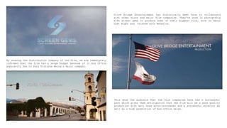
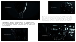
By showing the distribution company of the film, we are immediately
informed that the film had a large budget because of it box office
popularity due to Sony Pictures being a major company.
Olive Bridge Entertainment has historically been know to collaborate
with other minor and major film companies. They’ve work in partnership
with screen gems to produce some of their biggest hits, such as About
Last Night and Friends with Benefits.
This show the audience That the film companies have had a successful
past which gives them anticipation that the film will be a good quality
production with well know actor/actresses and a successful director as
well as a high prediction of box office sales.
‘A Will Gluck Film’ is shown immediately after the producers
and distributers. However it does not tell us that he is the
director until the end of the sequence although we assume this,
as it’s a common feature in title sequences.
As Will Gluck has directed various well know films previously,
this may suggest the type of the film it is going to be and
several techniques which may be used, for example camera angles
and mise en scene.
The title of the film is shown next. The title is only show
briefly, for a few seconds, however it tells the audience a lot
about the type of the film, making us assume that it’s a
teenage, coming of age film. We assume this from that title
because we associate ‘A’ with a school grade. This link is
exhilarated by the handwritten typeface in red marking ink.
As the camera moves past text and it slowly
moves off shot the text blurs moderately.
The text is in white in order to catch the audiences attention as it’s the brightest aspect on the screen.
The titles have also been made to look 3D on the ground by using shadowing and camera angles, which also
grabs the viewers attention as it is a new and original technique.
Characters
casually
move in
front of
and behind
the titles
in order
to make
them seem
realistic.
The style of the text used
is sans-sheriff which
excludes tails, swashes
and terminals purely using
only the stroke, stress
and stem for each
character. All the text is
kept in uppercase letters
and the kerning is kept
reasonably small.
The text does not the
audience a clear indication
of what the genre of the film
is, however it does show that
the film is quite light-
hearted and not too serious
from the casual typeface and
the bright colouring.
The movement of people changes the credit from to another as
it will follow the characters move, for example the boy on the
skateboard took the cameras shot from the schools field to the
building. This is a unique and interesting way of moving shots
and showing new credits which keeps the audience interested
and engaged as their target audience is young adults and
teenagers who are engrossed by new and inventive techniques.
The font has been made a simple standard
typeface so that the audience can read it
clearly and quickly because the scene is
being set and main characters are
introduced simultaneously. This allows the
audience to gather both pieces of vital
information before the shot is moved.
To accompany
the title
sequence, the
main character
is giving a
voiceover
explaining
about her
background,
hinting about
the narrative
of the film.
The
camera’s
shot is
continuous
and slowly
moves
between
credits as
other
characters
walk around
them.
The actors/actresses are shown after distribution and producers. These are
ordered, showing the most successful and well known actors first to interest
the audience as they made have seen their previous hits and will be intrigued
to see their role in this film. However they left the most famous actress
until last as her credit is shown at the same time as her character.
During the
end of the
title
sequence the
credits are
shown on the
side walls,
in this
instance on
the lockers.
To keep them
within the
viewers
attention the
letters are
kept bright
with the
shadow to
make them
stand out.
Low key lighting is also often used in the area of
the text so that the credits are even more clear.
In this
instance the
character is
introduced
as the same
time as
their title
in order to
show the
audience
each
character
identity
clearly.
During the introduction of characters, credits are shown for slightly longer as the audience is being many new things at
the same time and therefore will need a longer time to process all of it.
In these shots the text is not applied to seem as a part of the
scenery, instead it is put at the front of the screen during
various shots. This is a more well know and traditional way of
showing titles and credits.
The text still has the shadow effect on it to make it stand out
however it’s been changed to a light grey colour instead of
bright white, as the information being displayed is not as
important as the previous titles shown.
White text is used again to capture the
audiences attention as they are further in the
background and they are showing vital credits.
During the end of the opening sequence the credits
show writers, directors and producers. These are
shown last because they are some of the most
important credits, all of which were vital for the
film to be made.
THE GIRL WITH THE
DRAGON TATTOO
Firstly the production company is shown, to show key information.
For example from knowing Columbia Pictures is one of the most
successful distributer companies, we immediately know that the film
has a large budget and predicted high sales.
Showing the audience the production companies and director
also intrigues the secondary audience as they may have seen
their previous work and therefore would be interested in
their work on this film.
The part of David Fincher is not specified during the beginning of
the sequence, and only revealed at the ending which captures the
audience’s attention as they would want to find further information,
resulting in them paying additional attention to the credits.
The two most well-known actors are shown immediately after
as another technique to get the interest of both primary
and secondary audiences. Because of the actors’ successful
careers, it is likely that viewers have seen their
previous work which could intrigue them into this film.
Only these two credits are shown before the title is
revealed , because they are the two most important
characters in the film and showing their names separately
to others allows the audience to see the separation of
characters from the opening sequence.
The film title is only
briefly shown before it
is covered in the black
ink. The rapid movements
get the audiences
attention and makes them
focus on the text as
it’s shown so swiftly.
The typeface is unique,
representing the genre
of the film. The sharp
and staggered edges show
danger which gives us
the impression the film
is a horror.
After the title, the
credits return to show
the rest of actors and
actresses, still in order
of success and fame.
Each credit is shown
hastily, for
approximately two seconds
each which makes the
audience focus on the
credit shown rather than
concentrating of the
background movements.
White text is used to contrast with the dark background. The
dark colour implicates danger and the black ink gives us the
impression that it represents something ruthless, oppositely
white is associated purity and innocence. The overall cryptic
visuals engage the audience because of the strong contrast.
The element of danger is incorporated into the typeface through
the tails and terminals, as they are sharp at the ends. This gives
us the impression of something treacherous, with the capability of
hurting someone.
Each credit is
shown in white over
the dark greyscale
background, this
makes it stand out
and draws the
audience’s
attention towards
the writing. Red is
occasionally shown
through the credits
to keep the
audience paying
attention as the
bright red
contrasts with the
dark background.
When the fire
effects are shown
it gravitates the
audiences attention
towards the on
screen movements.
Therefore to
prevent them
missing any
information each
credit shown at the
same time as a
bright image is
also shown
simultaneously as
the dark background
so that it is seen
by the viewers.
The text slowly
moves in it’s
duration on
screen. The
strokes, tails
and terminals
gradually grow
and the text
often moves
closer together
or slightly
shrinks.
This captures
the audiences
attention
further as it
moves
therefore
viewers are
absentmindedly
drawn towards
the bright
movements.
Other essential
credits are shown
afterwards, as the
credits are shown in
order of importance
in the film.
They are shown as the
music builds and tension
increases which makes
the viewers become even
more engulfed in the
title sequence.
The credits are
shown in white
over the black
background
because it makes
a large contrast,
allowing the text
to stand out and
draw interest to
the text. This
also allows it to
be read quickly
and clearly.
The last three
credits are
shown at the
ending of the
opening
sequence
because they
are some of the
most important.
Due to this
they are also
shown longer
then the other
credits.

Title Research

  • 2.
    By showing thedistribution company of the film, we are immediately informed that the film had a large budget because of it box office popularity due to Sony Pictures being a major company. Olive Bridge Entertainment has historically been know to collaborate with other minor and major film companies. They’ve work in partnership with screen gems to produce some of their biggest hits, such as About Last Night and Friends with Benefits. This show the audience That the film companies have had a successful past which gives them anticipation that the film will be a good quality production with well know actor/actresses and a successful director as well as a high prediction of box office sales.
  • 3.
    ‘A Will GluckFilm’ is shown immediately after the producers and distributers. However it does not tell us that he is the director until the end of the sequence although we assume this, as it’s a common feature in title sequences. As Will Gluck has directed various well know films previously, this may suggest the type of the film it is going to be and several techniques which may be used, for example camera angles and mise en scene. The title of the film is shown next. The title is only show briefly, for a few seconds, however it tells the audience a lot about the type of the film, making us assume that it’s a teenage, coming of age film. We assume this from that title because we associate ‘A’ with a school grade. This link is exhilarated by the handwritten typeface in red marking ink.
  • 4.
    As the cameramoves past text and it slowly moves off shot the text blurs moderately. The text is in white in order to catch the audiences attention as it’s the brightest aspect on the screen. The titles have also been made to look 3D on the ground by using shadowing and camera angles, which also grabs the viewers attention as it is a new and original technique. Characters casually move in front of and behind the titles in order to make them seem realistic. The style of the text used is sans-sheriff which excludes tails, swashes and terminals purely using only the stroke, stress and stem for each character. All the text is kept in uppercase letters and the kerning is kept reasonably small. The text does not the audience a clear indication of what the genre of the film is, however it does show that the film is quite light- hearted and not too serious from the casual typeface and the bright colouring.
  • 5.
    The movement ofpeople changes the credit from to another as it will follow the characters move, for example the boy on the skateboard took the cameras shot from the schools field to the building. This is a unique and interesting way of moving shots and showing new credits which keeps the audience interested and engaged as their target audience is young adults and teenagers who are engrossed by new and inventive techniques. The font has been made a simple standard typeface so that the audience can read it clearly and quickly because the scene is being set and main characters are introduced simultaneously. This allows the audience to gather both pieces of vital information before the shot is moved. To accompany the title sequence, the main character is giving a voiceover explaining about her background, hinting about the narrative of the film. The camera’s shot is continuous and slowly moves between credits as other characters walk around them. The actors/actresses are shown after distribution and producers. These are ordered, showing the most successful and well known actors first to interest the audience as they made have seen their previous hits and will be intrigued to see their role in this film. However they left the most famous actress until last as her credit is shown at the same time as her character.
  • 6.
    During the end ofthe title sequence the credits are shown on the side walls, in this instance on the lockers. To keep them within the viewers attention the letters are kept bright with the shadow to make them stand out. Low key lighting is also often used in the area of the text so that the credits are even more clear. In this instance the character is introduced as the same time as their title in order to show the audience each character identity clearly. During the introduction of characters, credits are shown for slightly longer as the audience is being many new things at the same time and therefore will need a longer time to process all of it.
  • 7.
    In these shotsthe text is not applied to seem as a part of the scenery, instead it is put at the front of the screen during various shots. This is a more well know and traditional way of showing titles and credits. The text still has the shadow effect on it to make it stand out however it’s been changed to a light grey colour instead of bright white, as the information being displayed is not as important as the previous titles shown.
  • 8.
    White text isused again to capture the audiences attention as they are further in the background and they are showing vital credits. During the end of the opening sequence the credits show writers, directors and producers. These are shown last because they are some of the most important credits, all of which were vital for the film to be made.
  • 9.
    THE GIRL WITHTHE DRAGON TATTOO
  • 10.
    Firstly the productioncompany is shown, to show key information. For example from knowing Columbia Pictures is one of the most successful distributer companies, we immediately know that the film has a large budget and predicted high sales. Showing the audience the production companies and director also intrigues the secondary audience as they may have seen their previous work and therefore would be interested in their work on this film. The part of David Fincher is not specified during the beginning of the sequence, and only revealed at the ending which captures the audience’s attention as they would want to find further information, resulting in them paying additional attention to the credits.
  • 11.
    The two mostwell-known actors are shown immediately after as another technique to get the interest of both primary and secondary audiences. Because of the actors’ successful careers, it is likely that viewers have seen their previous work which could intrigue them into this film. Only these two credits are shown before the title is revealed , because they are the two most important characters in the film and showing their names separately to others allows the audience to see the separation of characters from the opening sequence.
  • 12.
    The film titleis only briefly shown before it is covered in the black ink. The rapid movements get the audiences attention and makes them focus on the text as it’s shown so swiftly. The typeface is unique, representing the genre of the film. The sharp and staggered edges show danger which gives us the impression the film is a horror. After the title, the credits return to show the rest of actors and actresses, still in order of success and fame. Each credit is shown hastily, for approximately two seconds each which makes the audience focus on the credit shown rather than concentrating of the background movements.
  • 13.
    White text isused to contrast with the dark background. The dark colour implicates danger and the black ink gives us the impression that it represents something ruthless, oppositely white is associated purity and innocence. The overall cryptic visuals engage the audience because of the strong contrast. The element of danger is incorporated into the typeface through the tails and terminals, as they are sharp at the ends. This gives us the impression of something treacherous, with the capability of hurting someone.
  • 14.
    Each credit is shownin white over the dark greyscale background, this makes it stand out and draws the audience’s attention towards the writing. Red is occasionally shown through the credits to keep the audience paying attention as the bright red contrasts with the dark background. When the fire effects are shown it gravitates the audiences attention towards the on screen movements. Therefore to prevent them missing any information each credit shown at the same time as a bright image is also shown simultaneously as the dark background so that it is seen by the viewers.
  • 15.
    The text slowly movesin it’s duration on screen. The strokes, tails and terminals gradually grow and the text often moves closer together or slightly shrinks. This captures the audiences attention further as it moves therefore viewers are absentmindedly drawn towards the bright movements.
  • 16.
    Other essential credits areshown afterwards, as the credits are shown in order of importance in the film. They are shown as the music builds and tension increases which makes the viewers become even more engulfed in the title sequence.
  • 17.
    The credits are shownin white over the black background because it makes a large contrast, allowing the text to stand out and draw interest to the text. This also allows it to be read quickly and clearly. The last three credits are shown at the ending of the opening sequence because they are some of the most important. Due to this they are also shown longer then the other credits.