SlideShare a Scribd company logo
Theme and style in Flutter
Topics
● How Flutter theme works
● What can be customized in theme
● Text style
● Interaction with System UI elements and settings (Android and iOS)
How Flutter theme works
“Everything is a widget” in Flutter and
theme too: it is just another widget at the
root of MaterialApp widget.
With the help of InheritedWidget current
theme properties are accessible everywhere
in the app down the widgets tree.
There are 4 variants of themes we can pass to
MaterialApp:
● theme – main light theme;
● darkTheme;
● highContrastTheme;
● highContrastDarkTheme.
High contrast themes are needed for
accessibility feature of OS for people with
who have problems with their vision.
How Flutter decides which theme to use.
MaterialApp themeMode allows to control which theme will be used by the app:
● system – use either the light or dark theme based on what the user has selected in the system settings;
● light – always use light theme;
● dark – always use dark theme if available.
System mode by default changes app theme automatically when system theme changed (if dark theme is
available).
To allow user manually change theme mode, themeMode should be updated when a new value is selected
and whole MaterialApp must be rebuilt (BLoC or Provider can be used for this, or other solutions).
Theme overriding for
local widgets
Even if global app theme was configured
properly some particular widgets may
require different theme/style settings to
match design.
For this a lot of Flutter widget comes with
style property (Text, buttons and etc.) or
parameters that control look of the widget.
If widget doesn’t come with style property
but needs custom theme anyway, it’s
possible to wrap this widget into Theme or
CupertinoTheme widget and pass
modified theme there.
Example of local theme override for
TextFormField input decoration
Sometimes it is not obvious which color or
style from theme is used by some widget
element.
In these cases inspecting widget source
code will help to find needed value fast and
decide if it can be overridden for whole app
theme or it should be overridden locally.
How TextField selects color of its label/hint
What can be customized
in theme
Flutter has two main themes setups
● ThemeData – theme settings for material widgets in app, used in MaterialApp root widget.
● CupertinoThemeData – theme data used for cupertino widgets appearance, used in CupertinoApp
root widget and inside ThemeData.
Ways to create ThemeData
● Default constructor ThemeData();
● ThemeData.light() – creates a light blue theme;
● ThemeData.dark() – creates dark theme with a teal secondary ColorScheme color;
● ThemeData.from() – which creates a ThemeData from a ColorScheme and textTheme if provided.
Theme data from ColorScheme:
Creates theme from brightness and 12
provided colors which are specified in
Material design color system.
There is tool for generating scheme colors
from selected primary and secondary
colors, but it generates 8 colors which are
different from Flutter ColorScheme.
Example of generated color scheme
ThemeData parameters
● brightness – overall theme brightness, app texts colors depends on this value;
● visualDensity – density value for specifying the compactness of various UI components;
● primaryColor, primaryColorBrightness – background color for major parts of the app (toolbars, tab
bars, etc);
● primaryColorLight – lighter version of the primaryColor;
● primaryColorDark – darker version of the primaryColor;
● canvasColor – default color of MaterialType.canvas;
● shadowColor – color that the Material widget uses to draw elevation shadows;
ThemeData parameters
● accentColor, accentColorBrightness – foreground color for widgets (toggles, checkboxes, overscroll
edge effect, etc);
● scaffoldBackgroundColor – color of the Material that underlies the Scaffold;
● bottomAppBarColor, bottomAppBarTheme – BottomAppBar widget customization;
● cardColor, cardTheme – Card widget customization;
● dividerColor, dividerTheme – Divider widget customization;
● focusColor – focus color used indicate that a component has the input focus;
● hoverColor – hover color used to indicate when a pointer is hovering over a component;
ThemeData parameters
● highlightColor – highlight color used during ink splash animations or to indicate an item in a menu is
selected;
● splashColor – color of ink splashes of InkWell widget;
● splashFactory – appearance of ink splashes produces by InkWell and InkResponse;
● selectedRowColor – color used to highlight selected rows in tables;
● unselectedWidgetColor – color used for widgets in their inactive (but enabled) state. For example,
an unchecked checkbox;
● disabledColor – color used for widgets that are inoperative, regardless of their state. For example, a
disabled checkbox;
ThemeData parameters
● buttonTheme – button theme for old Flutter buttons: RaisedButton and FlatButton;
● toggleButtonsTheme – default configuration of ToggleButtons widget;
● buttonColor – default fill color of the Material used in RaisedButton;
● secondaryHeaderColor – color of the header of a PaginatedDataTable when there are selected rows;
● backgroundColor – color that contrasts with the primaryColor, e.g. used as the remaining part of a
progress bar;
● dialogBackgroundColor, dialogTheme – dialogs customization;
ThemeData parameters
● indicatorColor – color of the selected tab indicator in a tab bar;
● hintColor – color to use for hint text or placeholder text, e.g. in TextField fields;
● errorColor – color to use for input validation errors;
● toggleableActiveColor – color used to highlight the active states of toggleable widgets like Switch,
Radio, and Checkbox;
● textTheme, primaryTextTheme, accentTextTheme – text with a color that contrasts with the card
and canvas colors, primary and accent colors;
● inputDecorationTheme – input decoration theme for text input fields;
ThemeData parameters
● iconTheme, primaryIconTheme, accentIconTheme – icon theme that contrasts with the card and
canvas colors, primary and accent colors;
● sliderTheme – colors and shapes used to render Slider;
● tabBarTheme – theme for customizing the size, shape, and color of the tab bar indicator;
● tooltipTheme – theme for customizing the visual properties of Tooltip;
● chipTheme – colors and styles used to render Chip;
○ platform – platform the material widgets should adapt to target (Android, iOS, macOS etc.) to
determine the current platform for the purpose of emulating the platform behavior (e.g.
scrolling or haptic effects);
ThemeData parameters
● materialTapTargetSize – the hit test size of certain Material widgets;
● applyElevationOverlayColor – apply a semi-transparent overlay color on Material surfaces to indicate
elevation for dark themes;
● pageTransitionsTheme – default MaterialPageRoute transitions per TargetPlatform;
● appBarTheme – theme for customizing the color, elevation, brightness, iconTheme and textTheme of
AppBar;
● scrollbarTheme – theme for customizing the colors, thickness, and shape of Scrollbar;
ThemeData parameters
● colorScheme – set of twelve colors that can be used to configure the color properties of most
components;
● snackBarTheme – theme for customizing colors, shape, elevation, and behavior of a SnackBar;
● floatingActionButtonTheme – theme for customizing the shape, elevation, and color of a
FloatingActionButton;
● navigationRailTheme – a theme for customizing the background color, elevation, text style, and icon
themes of a NavigationRail;
ThemeData parameters
● typography – the color and geometry TextTheme values used to configure textTheme,
primaryTextTheme, and accentTextTheme;
● cupertinoOverrideTheme – components of the CupertinoThemeData to override from the Material
ThemeData adaptation;
● bottomSheetTheme – theme for customizing the color, elevation, and shape of a bottom sheet;
● popupMenuTheme – theme for customizing the color, shape, elevation, and text style of popup menus;
ThemeData parameters
● bannerTheme – theme for customizing the color and text style of a MaterialBanner shown under AppBar;
● buttonBarTheme – theme for customizing the appearance and layout of ButtonBar widget;
● bottomNavigationBarTheme – theme for customizing the appearance and layout of
BottomNavigationBar widget;
● timePickerTheme – theme for customizing the appearance and layout of time picker widget;
● textButtonTheme, elevatedButtonTheme, outlinedButtonTheme – themes for new Flutter buttons:
TextButton, ElevatedButton, OutlinedButton;
ThemeData parameters
● textSelectionTheme – theme for customizing the appearance and layout of TextField widgets;
● dataTableTheme – theme for customizing the appearance and layout of DataTable widgets;
● checkboxTheme – theme for customizing the appearance and layout of Checkbox widgets;
● radioTheme – theme for customizing the appearance and layout of Radio widgets;
● switchTheme – theme for customizing the appearance and layout of Switch widgets.
Text style
A set of TextStyle-s that follows Material.io
specification.
Get needed style from context:
Theme.of(context).textTheme.headline1;
TextTheme
ThemeStyle parameters
● inherit – whether null values are replaced with their value in an ancestor text style (e.g., in a TextSpan tree).
If this is false, properties that don't have explicit values will revert to the defaults: white in color, a font size
of 10 pixels, in a sans-serif font face;
● color – the color to use when painting the text. If foreground is specified, this value must be null;
● backgroundColor – color to use as the background for the text;
● fontFamily – name of the font to use when painting the text (e.g., Roboto);
● fontFamilyFallback – ordered list of font families to fall back on when a glyph cannot be found in a higher
priority font family;
ThemeStyle parameters
● fontSize – size of glyphs (in logical pixels) to use when painting the text;
● fontWeight – typeface thickness to use when painting the text (e.g., bold);
● fontStyle – typeface variant to use when drawing the letters (e.g., italics);
● letterSpacing – amount of space (in logical pixels) to add between each letter;
● wordSpacing – The amount of space (in logical pixels) between each word;
● textBaseline – common baseline that should be aligned between this text span and its parent text span,
or, for the root text spans, with the line box;
○ alphabetic – The text baseline is the normal alphabetic baseline;
○ ideographic – text baseline is the ideographic baseline; this is the bottom of the body of the
characters, if the main body of characters protrudes beneath the alphabetic baseline. (Used by
Chinese, Japanese, and Korean scripts.);
ThemeStyle parameters
● height – height is non-null, the line height of the span of text will be a multiple of fontSize and be exactly
`fontSize * height` logical pixels tall;
● locale – locale used to select region-specific glyphs;
● foreground – paint drawn as a foreground for the text;
● background – paint drawn as a background for the text;
● decoration – decorations to paint near the text (e.g., an underline);
● decorationColor – color in which to paint the text decorations;
● decorationStyle – style in which to paint the text decorations (e.g., dashed);
○ decorationThickness – thickness of the decoration stroke as a multiplier of the thickness defined by
the font;
ThemeStyle parameters
● shadows – list of Shadow-s that will be painted underneath the text;
● fontFeatures – list of FontFeature-s that affect how the font selects glyphs.
If using package google_fonts custom text
theme can be applied globally:
Interaction with System UI
elements and settings
(Android and iOS)
SystemChrome class
Allows to control some system UI elements and their behavior.
SystemChrome.setEnabledSystemUIOverlays()
method.
Allows to control visibility of System UI: status
bar and navigation bar.
System events can trigger overlays again (e.g.
keyboard opening triggers navigation bar on
Android) and we need manually to hide them
again. Can be achieved with
restoreSystemUIOverlays() method.
SystemChrome.setSystemUIOverlayStyle().
Allows to set status bar and nav bar colors
on Android.
For iOS only statusbarIconBrightness and
statusBarBrightness parameters work.
Another way to control the look of System
elements – AnnotatedRegion widget.
It allows to set SystemUIOvelrayStyle
property for some region (widget) in layer
tree.
However, the AppBar and
CupertinoNavigationBar widgets
automatically set the system overlay style
based on its brightness or background
color.
Useful resources
● New Buttons and Button Themes official migration guide;
● google_fonts package;
● Panache theme viewer, WEB version;
● Material.io.
Ivan Myzherytskyi
Flutter Developer
Thanks!

More Related Content

What's hot

Kotlin on android
Kotlin on androidKotlin on android
Kotlin on android
Kurt Renzo Acosta
 
Angular routing
Angular routingAngular routing
Angular routing
Sultan Ahmed
 
React js
React jsReact js
Introduction to css & its attributes with syntax
Introduction to css & its attributes with syntaxIntroduction to css & its attributes with syntax
Introduction to css & its attributes with syntax
priyadharshini murugan
 
Building iOS App Project & Architecture
Building iOS App Project & ArchitectureBuilding iOS App Project & Architecture
Building iOS App Project & Architecture
Massimo Oliviero
 
Understanding react hooks
Understanding react hooksUnderstanding react hooks
Understanding react hooks
Maulik Shah
 
Pharo foreign function interface (FFI) by example by Esteban Lorenzano
Pharo foreign function interface (FFI) by example by Esteban LorenzanoPharo foreign function interface (FFI) by example by Esteban Lorenzano
Pharo foreign function interface (FFI) by example by Esteban Lorenzano
FAST
 
Introduction to kotlin and OOP in Kotlin
Introduction to kotlin and OOP in KotlinIntroduction to kotlin and OOP in Kotlin
Introduction to kotlin and OOP in Kotlin
vriddhigupta
 
React event
React eventReact event
React event
Ducat
 
PHP - Introduction to PHP Fundamentals
PHP -  Introduction to PHP FundamentalsPHP -  Introduction to PHP Fundamentals
PHP - Introduction to PHP Fundamentals
Vibrant Technologies & Computers
 
使用 TypeScript 駕馭 Web 世界的脫韁野馬:以 Angular 2 開發框架為例
使用 TypeScript 駕馭 Web 世界的脫韁野馬:以 Angular 2 開發框架為例使用 TypeScript 駕馭 Web 世界的脫韁野馬:以 Angular 2 開發框架為例
使用 TypeScript 駕馭 Web 世界的脫韁野馬:以 Angular 2 開發框架為例
Will Huang
 
Unit 2 introduction to c programming
Unit 2   introduction to c programmingUnit 2   introduction to c programming
Unit 2 introduction to c programming
Mithun DSouza
 
Css types internal, external and inline (1)
Css types internal, external and inline (1)Css types internal, external and inline (1)
Css types internal, external and inline (1)
Webtech Learning
 
Angular App Presentation
Angular App PresentationAngular App Presentation
Angular App Presentation
Elizabeth Long
 
Constructor and Destructor
Constructor and DestructorConstructor and Destructor
Constructor and Destructor
Sunipa Bera
 
Angular - Chapter 7 - HTTP Services
Angular - Chapter 7 - HTTP ServicesAngular - Chapter 7 - HTTP Services
Angular - Chapter 7 - HTTP Services
WebStackAcademy
 
C# Tutorial
C# Tutorial C# Tutorial
C# Tutorial
Jm Ramos
 
Java Swing
Java SwingJava Swing
Java Swing
Arkadeep Dey
 
Java swing
Java swingJava swing
Java swing
Apurbo Datta
 

What's hot (20)

Kotlin on android
Kotlin on androidKotlin on android
Kotlin on android
 
Angular routing
Angular routingAngular routing
Angular routing
 
React js
React jsReact js
React js
 
Introduction to css & its attributes with syntax
Introduction to css & its attributes with syntaxIntroduction to css & its attributes with syntax
Introduction to css & its attributes with syntax
 
Building iOS App Project & Architecture
Building iOS App Project & ArchitectureBuilding iOS App Project & Architecture
Building iOS App Project & Architecture
 
Django by rj
Django by rjDjango by rj
Django by rj
 
Understanding react hooks
Understanding react hooksUnderstanding react hooks
Understanding react hooks
 
Pharo foreign function interface (FFI) by example by Esteban Lorenzano
Pharo foreign function interface (FFI) by example by Esteban LorenzanoPharo foreign function interface (FFI) by example by Esteban Lorenzano
Pharo foreign function interface (FFI) by example by Esteban Lorenzano
 
Introduction to kotlin and OOP in Kotlin
Introduction to kotlin and OOP in KotlinIntroduction to kotlin and OOP in Kotlin
Introduction to kotlin and OOP in Kotlin
 
React event
React eventReact event
React event
 
PHP - Introduction to PHP Fundamentals
PHP -  Introduction to PHP FundamentalsPHP -  Introduction to PHP Fundamentals
PHP - Introduction to PHP Fundamentals
 
使用 TypeScript 駕馭 Web 世界的脫韁野馬:以 Angular 2 開發框架為例
使用 TypeScript 駕馭 Web 世界的脫韁野馬:以 Angular 2 開發框架為例使用 TypeScript 駕馭 Web 世界的脫韁野馬:以 Angular 2 開發框架為例
使用 TypeScript 駕馭 Web 世界的脫韁野馬:以 Angular 2 開發框架為例
 
Unit 2 introduction to c programming
Unit 2   introduction to c programmingUnit 2   introduction to c programming
Unit 2 introduction to c programming
 
Css types internal, external and inline (1)
Css types internal, external and inline (1)Css types internal, external and inline (1)
Css types internal, external and inline (1)
 
Angular App Presentation
Angular App PresentationAngular App Presentation
Angular App Presentation
 
Constructor and Destructor
Constructor and DestructorConstructor and Destructor
Constructor and Destructor
 
Angular - Chapter 7 - HTTP Services
Angular - Chapter 7 - HTTP ServicesAngular - Chapter 7 - HTTP Services
Angular - Chapter 7 - HTTP Services
 
C# Tutorial
C# Tutorial C# Tutorial
C# Tutorial
 
Java Swing
Java SwingJava Swing
Java Swing
 
Java swing
Java swingJava swing
Java swing
 

Similar to Theme and style in Flutter

Android Jetpack Compose - Turkey 2021
Android Jetpack Compose - Turkey 2021Android Jetpack Compose - Turkey 2021
Android Jetpack Compose - Turkey 2021
Nelson Glauber Leal
 
Localization and Shared Preferences in android
Localization and Shared Preferences in androidLocalization and Shared Preferences in android
Localization and Shared Preferences in android
Aly Arman
 
Angular Material Design.pdf
Angular Material Design.pdfAngular Material Design.pdf
Angular Material Design.pdf
Knoldus Inc.
 
Pg.41 to pg.54 bianca gutiérrez vargas
Pg.41 to pg.54 bianca gutiérrez vargasPg.41 to pg.54 bianca gutiérrez vargas
Pg.41 to pg.54 bianca gutiérrez vargasbiancagtz
 
CTools Style Plugins: Demo & Code Walk-Thru
CTools Style Plugins: Demo & Code Walk-ThruCTools Style Plugins: Demo & Code Walk-Thru
CTools Style Plugins: Demo & Code Walk-ThruAmber Matz
 
Material Design Theme & Flutter by Eunsil Jo
Material Design Theme & Flutter by Eunsil JoMaterial Design Theme & Flutter by Eunsil Jo
Material Design Theme & Flutter by Eunsil Jo
Eunsil Jo
 
What’s new for Android Developers in 2015 - Material Design, Android Studio, ...
What’s new for Android Developers in 2015 - Material Design, Android Studio, ...What’s new for Android Developers in 2015 - Material Design, Android Studio, ...
What’s new for Android Developers in 2015 - Material Design, Android Studio, ...
Deepu S Nath
 
HTML Lesson 2
HTML Lesson 2HTML Lesson 2
HTML Lesson 2TonyC445
 
RPE - Template formating, style and stylesheet usage
RPE - Template formating, style and stylesheet usageRPE - Template formating, style and stylesheet usage
RPE - Template formating, style and stylesheet usageGEBS Reporting
 
Power point design themes and slide layouts
Power point design themes and slide layoutsPower point design themes and slide layouts
Power point design themes and slide layouts
vivektalkin
 
Advanced MVVM Windows UWP apps with Template 10
Advanced MVVM Windows UWP apps with Template 10Advanced MVVM Windows UWP apps with Template 10
Advanced MVVM Windows UWP apps with Template 10
Jiri Danihelka
 
Note Anytime 2.0 update features
Note Anytime 2.0 update featuresNote Anytime 2.0 update features
Note Anytime 2.0 update features
kytsuda
 
Drupalcamp Atlanta 2010 Design-to-Theme
Drupalcamp Atlanta 2010 Design-to-ThemeDrupalcamp Atlanta 2010 Design-to-Theme
Drupalcamp Atlanta 2010 Design-to-ThemeMediacurrent
 
SmartArt-Graphics-Complete-Collection-4_3.pptx
SmartArt-Graphics-Complete-Collection-4_3.pptxSmartArt-Graphics-Complete-Collection-4_3.pptx
SmartArt-Graphics-Complete-Collection-4_3.pptx
Raghu804372
 
Designing Optimized Symbols for InduSoft Web Studio Projects
Designing Optimized Symbols for InduSoft Web Studio ProjectsDesigning Optimized Symbols for InduSoft Web Studio Projects
Designing Optimized Symbols for InduSoft Web Studio Projects
AVEVA
 
Triad 2010 power_point_chapter_3
Triad 2010 power_point_chapter_3Triad 2010 power_point_chapter_3
Triad 2010 power_point_chapter_3Dalia Saeed
 
PYTHON - TKINTER - GUI - PART 1.ppt
PYTHON - TKINTER - GUI - PART 1.pptPYTHON - TKINTER - GUI - PART 1.ppt
PYTHON - TKINTER - GUI - PART 1.ppt
PriyaSoundararajan1
 
Sitecore Knowledge Transfer 2018 (Template) day-2
Sitecore  Knowledge Transfer 2018 (Template) day-2Sitecore  Knowledge Transfer 2018 (Template) day-2
Sitecore Knowledge Transfer 2018 (Template) day-2
Manish Puri
 
Vp lecture1 ararat
Vp lecture1 araratVp lecture1 ararat
Vp lecture1 ararat
Saman M. Almufti
 
Smart Art Graphics Ready to Use Template
Smart Art Graphics Ready to Use TemplateSmart Art Graphics Ready to Use Template
Smart Art Graphics Ready to Use Template
Body of Knowledge
 

Similar to Theme and style in Flutter (20)

Android Jetpack Compose - Turkey 2021
Android Jetpack Compose - Turkey 2021Android Jetpack Compose - Turkey 2021
Android Jetpack Compose - Turkey 2021
 
Localization and Shared Preferences in android
Localization and Shared Preferences in androidLocalization and Shared Preferences in android
Localization and Shared Preferences in android
 
Angular Material Design.pdf
Angular Material Design.pdfAngular Material Design.pdf
Angular Material Design.pdf
 
Pg.41 to pg.54 bianca gutiérrez vargas
Pg.41 to pg.54 bianca gutiérrez vargasPg.41 to pg.54 bianca gutiérrez vargas
Pg.41 to pg.54 bianca gutiérrez vargas
 
CTools Style Plugins: Demo & Code Walk-Thru
CTools Style Plugins: Demo & Code Walk-ThruCTools Style Plugins: Demo & Code Walk-Thru
CTools Style Plugins: Demo & Code Walk-Thru
 
Material Design Theme & Flutter by Eunsil Jo
Material Design Theme & Flutter by Eunsil JoMaterial Design Theme & Flutter by Eunsil Jo
Material Design Theme & Flutter by Eunsil Jo
 
What’s new for Android Developers in 2015 - Material Design, Android Studio, ...
What’s new for Android Developers in 2015 - Material Design, Android Studio, ...What’s new for Android Developers in 2015 - Material Design, Android Studio, ...
What’s new for Android Developers in 2015 - Material Design, Android Studio, ...
 
HTML Lesson 2
HTML Lesson 2HTML Lesson 2
HTML Lesson 2
 
RPE - Template formating, style and stylesheet usage
RPE - Template formating, style and stylesheet usageRPE - Template formating, style and stylesheet usage
RPE - Template formating, style and stylesheet usage
 
Power point design themes and slide layouts
Power point design themes and slide layoutsPower point design themes and slide layouts
Power point design themes and slide layouts
 
Advanced MVVM Windows UWP apps with Template 10
Advanced MVVM Windows UWP apps with Template 10Advanced MVVM Windows UWP apps with Template 10
Advanced MVVM Windows UWP apps with Template 10
 
Note Anytime 2.0 update features
Note Anytime 2.0 update featuresNote Anytime 2.0 update features
Note Anytime 2.0 update features
 
Drupalcamp Atlanta 2010 Design-to-Theme
Drupalcamp Atlanta 2010 Design-to-ThemeDrupalcamp Atlanta 2010 Design-to-Theme
Drupalcamp Atlanta 2010 Design-to-Theme
 
SmartArt-Graphics-Complete-Collection-4_3.pptx
SmartArt-Graphics-Complete-Collection-4_3.pptxSmartArt-Graphics-Complete-Collection-4_3.pptx
SmartArt-Graphics-Complete-Collection-4_3.pptx
 
Designing Optimized Symbols for InduSoft Web Studio Projects
Designing Optimized Symbols for InduSoft Web Studio ProjectsDesigning Optimized Symbols for InduSoft Web Studio Projects
Designing Optimized Symbols for InduSoft Web Studio Projects
 
Triad 2010 power_point_chapter_3
Triad 2010 power_point_chapter_3Triad 2010 power_point_chapter_3
Triad 2010 power_point_chapter_3
 
PYTHON - TKINTER - GUI - PART 1.ppt
PYTHON - TKINTER - GUI - PART 1.pptPYTHON - TKINTER - GUI - PART 1.ppt
PYTHON - TKINTER - GUI - PART 1.ppt
 
Sitecore Knowledge Transfer 2018 (Template) day-2
Sitecore  Knowledge Transfer 2018 (Template) day-2Sitecore  Knowledge Transfer 2018 (Template) day-2
Sitecore Knowledge Transfer 2018 (Template) day-2
 
Vp lecture1 ararat
Vp lecture1 araratVp lecture1 ararat
Vp lecture1 ararat
 
Smart Art Graphics Ready to Use Template
Smart Art Graphics Ready to Use TemplateSmart Art Graphics Ready to Use Template
Smart Art Graphics Ready to Use Template
 

More from Cleveroad

Tokenized projects. Should I work with them or give them up right away?
Tokenized projects. Should I work with them or give them up right away?Tokenized projects. Should I work with them or give them up right away?
Tokenized projects. Should I work with them or give them up right away?
Cleveroad
 
Pulse of FinTech. 5 tips and tricks for BA on Finance project
Pulse of FinTech. 5 tips and tricks for BA on Finance projectPulse of FinTech. 5 tips and tricks for BA on Finance project
Pulse of FinTech. 5 tips and tricks for BA on Finance project
Cleveroad
 
System logistics based on cross-docking
System logistics based on cross-dockingSystem logistics based on cross-docking
System logistics based on cross-docking
Cleveroad
 
MWWM
MWWMMWWM
MWWM
Cleveroad
 
Payments in Mobile Apps
Payments in Mobile AppsPayments in Mobile Apps
Payments in Mobile Apps
Cleveroad
 
Communication plan
Communication planCommunication plan
Communication plan
Cleveroad
 
Combine Framework
Combine FrameworkCombine Framework
Combine Framework
Cleveroad
 
What’s new in Swift 5.2-5.3
What’s new in Swift 5.2-5.3What’s new in Swift 5.2-5.3
What’s new in Swift 5.2-5.3
Cleveroad
 
Streaming tools comparison
Streaming tools comparisonStreaming tools comparison
Streaming tools comparison
Cleveroad
 
Frontend Designer Interactions.
Frontend Designer Interactions.Frontend Designer Interactions.
Frontend Designer Interactions.
Cleveroad
 
ARcore vs ML-Kit
ARcore vs ML-KitARcore vs ML-Kit
ARcore vs ML-Kit
Cleveroad
 
Risk management
Risk managementRisk management
Risk management
Cleveroad
 
Flutter Design Features
Flutter Design FeaturesFlutter Design Features
Flutter Design Features
Cleveroad
 
UX Methods and Practices
UX Methods and PracticesUX Methods and Practices
UX Methods and Practices
Cleveroad
 
Ui perfomance
Ui perfomanceUi perfomance
Ui perfomance
Cleveroad
 
Rest vs GraphQL
Rest vs GraphQLRest vs GraphQL
Rest vs GraphQL
Cleveroad
 
SWOT-Analysis, 360 Degree Evaluation, Giving Feedbacks
SWOT-Analysis, 360 Degree Evaluation, Giving FeedbacksSWOT-Analysis, 360 Degree Evaluation, Giving Feedbacks
SWOT-Analysis, 360 Degree Evaluation, Giving Feedbacks
Cleveroad
 
Socket.io v.0.8.3
Socket.io v.0.8.3Socket.io v.0.8.3
Socket.io v.0.8.3
Cleveroad
 

More from Cleveroad (18)

Tokenized projects. Should I work with them or give them up right away?
Tokenized projects. Should I work with them or give them up right away?Tokenized projects. Should I work with them or give them up right away?
Tokenized projects. Should I work with them or give them up right away?
 
Pulse of FinTech. 5 tips and tricks for BA on Finance project
Pulse of FinTech. 5 tips and tricks for BA on Finance projectPulse of FinTech. 5 tips and tricks for BA on Finance project
Pulse of FinTech. 5 tips and tricks for BA on Finance project
 
System logistics based on cross-docking
System logistics based on cross-dockingSystem logistics based on cross-docking
System logistics based on cross-docking
 
MWWM
MWWMMWWM
MWWM
 
Payments in Mobile Apps
Payments in Mobile AppsPayments in Mobile Apps
Payments in Mobile Apps
 
Communication plan
Communication planCommunication plan
Communication plan
 
Combine Framework
Combine FrameworkCombine Framework
Combine Framework
 
What’s new in Swift 5.2-5.3
What’s new in Swift 5.2-5.3What’s new in Swift 5.2-5.3
What’s new in Swift 5.2-5.3
 
Streaming tools comparison
Streaming tools comparisonStreaming tools comparison
Streaming tools comparison
 
Frontend Designer Interactions.
Frontend Designer Interactions.Frontend Designer Interactions.
Frontend Designer Interactions.
 
ARcore vs ML-Kit
ARcore vs ML-KitARcore vs ML-Kit
ARcore vs ML-Kit
 
Risk management
Risk managementRisk management
Risk management
 
Flutter Design Features
Flutter Design FeaturesFlutter Design Features
Flutter Design Features
 
UX Methods and Practices
UX Methods and PracticesUX Methods and Practices
UX Methods and Practices
 
Ui perfomance
Ui perfomanceUi perfomance
Ui perfomance
 
Rest vs GraphQL
Rest vs GraphQLRest vs GraphQL
Rest vs GraphQL
 
SWOT-Analysis, 360 Degree Evaluation, Giving Feedbacks
SWOT-Analysis, 360 Degree Evaluation, Giving FeedbacksSWOT-Analysis, 360 Degree Evaluation, Giving Feedbacks
SWOT-Analysis, 360 Degree Evaluation, Giving Feedbacks
 
Socket.io v.0.8.3
Socket.io v.0.8.3Socket.io v.0.8.3
Socket.io v.0.8.3
 

Recently uploaded

Artificial Intelligence for XMLDevelopment
Artificial Intelligence for XMLDevelopmentArtificial Intelligence for XMLDevelopment
Artificial Intelligence for XMLDevelopment
Octavian Nadolu
 
Encryption in Microsoft 365 - ExpertsLive Netherlands 2024
Encryption in Microsoft 365 - ExpertsLive Netherlands 2024Encryption in Microsoft 365 - ExpertsLive Netherlands 2024
Encryption in Microsoft 365 - ExpertsLive Netherlands 2024
Albert Hoitingh
 
By Design, not by Accident - Agile Venture Bolzano 2024
By Design, not by Accident - Agile Venture Bolzano 2024By Design, not by Accident - Agile Venture Bolzano 2024
By Design, not by Accident - Agile Venture Bolzano 2024
Pierluigi Pugliese
 
A tale of scale & speed: How the US Navy is enabling software delivery from l...
A tale of scale & speed: How the US Navy is enabling software delivery from l...A tale of scale & speed: How the US Navy is enabling software delivery from l...
A tale of scale & speed: How the US Navy is enabling software delivery from l...
sonjaschweigert1
 
Enchancing adoption of Open Source Libraries. A case study on Albumentations.AI
Enchancing adoption of Open Source Libraries. A case study on Albumentations.AIEnchancing adoption of Open Source Libraries. A case study on Albumentations.AI
Enchancing adoption of Open Source Libraries. A case study on Albumentations.AI
Vladimir Iglovikov, Ph.D.
 
FIDO Alliance Osaka Seminar: The WebAuthn API and Discoverable Credentials.pdf
FIDO Alliance Osaka Seminar: The WebAuthn API and Discoverable Credentials.pdfFIDO Alliance Osaka Seminar: The WebAuthn API and Discoverable Credentials.pdf
FIDO Alliance Osaka Seminar: The WebAuthn API and Discoverable Credentials.pdf
FIDO Alliance
 
RESUME BUILDER APPLICATION Project for students
RESUME BUILDER APPLICATION Project for studentsRESUME BUILDER APPLICATION Project for students
RESUME BUILDER APPLICATION Project for students
KAMESHS29
 
National Security Agency - NSA mobile device best practices
National Security Agency - NSA mobile device best practicesNational Security Agency - NSA mobile device best practices
National Security Agency - NSA mobile device best practices
Quotidiano Piemontese
 
Removing Uninteresting Bytes in Software Fuzzing
Removing Uninteresting Bytes in Software FuzzingRemoving Uninteresting Bytes in Software Fuzzing
Removing Uninteresting Bytes in Software Fuzzing
Aftab Hussain
 
GDG Cloud Southlake #33: Boule & Rebala: Effective AppSec in SDLC using Deplo...
GDG Cloud Southlake #33: Boule & Rebala: Effective AppSec in SDLC using Deplo...GDG Cloud Southlake #33: Boule & Rebala: Effective AppSec in SDLC using Deplo...
GDG Cloud Southlake #33: Boule & Rebala: Effective AppSec in SDLC using Deplo...
James Anderson
 
DevOps and Testing slides at DASA Connect
DevOps and Testing slides at DASA ConnectDevOps and Testing slides at DASA Connect
DevOps and Testing slides at DASA Connect
Kari Kakkonen
 
Introduction to CHERI technology - Cybersecurity
Introduction to CHERI technology - CybersecurityIntroduction to CHERI technology - Cybersecurity
Introduction to CHERI technology - Cybersecurity
mikeeftimakis1
 
Generative AI Deep Dive: Advancing from Proof of Concept to Production
Generative AI Deep Dive: Advancing from Proof of Concept to ProductionGenerative AI Deep Dive: Advancing from Proof of Concept to Production
Generative AI Deep Dive: Advancing from Proof of Concept to Production
Aggregage
 
Alt. GDG Cloud Southlake #33: Boule & Rebala: Effective AppSec in SDLC using ...
Alt. GDG Cloud Southlake #33: Boule & Rebala: Effective AppSec in SDLC using ...Alt. GDG Cloud Southlake #33: Boule & Rebala: Effective AppSec in SDLC using ...
Alt. GDG Cloud Southlake #33: Boule & Rebala: Effective AppSec in SDLC using ...
James Anderson
 
20240607 QFM018 Elixir Reading List May 2024
20240607 QFM018 Elixir Reading List May 202420240607 QFM018 Elixir Reading List May 2024
20240607 QFM018 Elixir Reading List May 2024
Matthew Sinclair
 
UiPath Test Automation using UiPath Test Suite series, part 6
UiPath Test Automation using UiPath Test Suite series, part 6UiPath Test Automation using UiPath Test Suite series, part 6
UiPath Test Automation using UiPath Test Suite series, part 6
DianaGray10
 
Free Complete Python - A step towards Data Science
Free Complete Python - A step towards Data ScienceFree Complete Python - A step towards Data Science
Free Complete Python - A step towards Data Science
RinaMondal9
 
Elizabeth Buie - Older adults: Are we really designing for our future selves?
Elizabeth Buie - Older adults: Are we really designing for our future selves?Elizabeth Buie - Older adults: Are we really designing for our future selves?
Elizabeth Buie - Older adults: Are we really designing for our future selves?
Nexer Digital
 
GraphSummit Singapore | The Future of Agility: Supercharging Digital Transfor...
GraphSummit Singapore | The Future of Agility: Supercharging Digital Transfor...GraphSummit Singapore | The Future of Agility: Supercharging Digital Transfor...
GraphSummit Singapore | The Future of Agility: Supercharging Digital Transfor...
Neo4j
 
GridMate - End to end testing is a critical piece to ensure quality and avoid...
GridMate - End to end testing is a critical piece to ensure quality and avoid...GridMate - End to end testing is a critical piece to ensure quality and avoid...
GridMate - End to end testing is a critical piece to ensure quality and avoid...
ThomasParaiso2
 

Recently uploaded (20)

Artificial Intelligence for XMLDevelopment
Artificial Intelligence for XMLDevelopmentArtificial Intelligence for XMLDevelopment
Artificial Intelligence for XMLDevelopment
 
Encryption in Microsoft 365 - ExpertsLive Netherlands 2024
Encryption in Microsoft 365 - ExpertsLive Netherlands 2024Encryption in Microsoft 365 - ExpertsLive Netherlands 2024
Encryption in Microsoft 365 - ExpertsLive Netherlands 2024
 
By Design, not by Accident - Agile Venture Bolzano 2024
By Design, not by Accident - Agile Venture Bolzano 2024By Design, not by Accident - Agile Venture Bolzano 2024
By Design, not by Accident - Agile Venture Bolzano 2024
 
A tale of scale & speed: How the US Navy is enabling software delivery from l...
A tale of scale & speed: How the US Navy is enabling software delivery from l...A tale of scale & speed: How the US Navy is enabling software delivery from l...
A tale of scale & speed: How the US Navy is enabling software delivery from l...
 
Enchancing adoption of Open Source Libraries. A case study on Albumentations.AI
Enchancing adoption of Open Source Libraries. A case study on Albumentations.AIEnchancing adoption of Open Source Libraries. A case study on Albumentations.AI
Enchancing adoption of Open Source Libraries. A case study on Albumentations.AI
 
FIDO Alliance Osaka Seminar: The WebAuthn API and Discoverable Credentials.pdf
FIDO Alliance Osaka Seminar: The WebAuthn API and Discoverable Credentials.pdfFIDO Alliance Osaka Seminar: The WebAuthn API and Discoverable Credentials.pdf
FIDO Alliance Osaka Seminar: The WebAuthn API and Discoverable Credentials.pdf
 
RESUME BUILDER APPLICATION Project for students
RESUME BUILDER APPLICATION Project for studentsRESUME BUILDER APPLICATION Project for students
RESUME BUILDER APPLICATION Project for students
 
National Security Agency - NSA mobile device best practices
National Security Agency - NSA mobile device best practicesNational Security Agency - NSA mobile device best practices
National Security Agency - NSA mobile device best practices
 
Removing Uninteresting Bytes in Software Fuzzing
Removing Uninteresting Bytes in Software FuzzingRemoving Uninteresting Bytes in Software Fuzzing
Removing Uninteresting Bytes in Software Fuzzing
 
GDG Cloud Southlake #33: Boule & Rebala: Effective AppSec in SDLC using Deplo...
GDG Cloud Southlake #33: Boule & Rebala: Effective AppSec in SDLC using Deplo...GDG Cloud Southlake #33: Boule & Rebala: Effective AppSec in SDLC using Deplo...
GDG Cloud Southlake #33: Boule & Rebala: Effective AppSec in SDLC using Deplo...
 
DevOps and Testing slides at DASA Connect
DevOps and Testing slides at DASA ConnectDevOps and Testing slides at DASA Connect
DevOps and Testing slides at DASA Connect
 
Introduction to CHERI technology - Cybersecurity
Introduction to CHERI technology - CybersecurityIntroduction to CHERI technology - Cybersecurity
Introduction to CHERI technology - Cybersecurity
 
Generative AI Deep Dive: Advancing from Proof of Concept to Production
Generative AI Deep Dive: Advancing from Proof of Concept to ProductionGenerative AI Deep Dive: Advancing from Proof of Concept to Production
Generative AI Deep Dive: Advancing from Proof of Concept to Production
 
Alt. GDG Cloud Southlake #33: Boule & Rebala: Effective AppSec in SDLC using ...
Alt. GDG Cloud Southlake #33: Boule & Rebala: Effective AppSec in SDLC using ...Alt. GDG Cloud Southlake #33: Boule & Rebala: Effective AppSec in SDLC using ...
Alt. GDG Cloud Southlake #33: Boule & Rebala: Effective AppSec in SDLC using ...
 
20240607 QFM018 Elixir Reading List May 2024
20240607 QFM018 Elixir Reading List May 202420240607 QFM018 Elixir Reading List May 2024
20240607 QFM018 Elixir Reading List May 2024
 
UiPath Test Automation using UiPath Test Suite series, part 6
UiPath Test Automation using UiPath Test Suite series, part 6UiPath Test Automation using UiPath Test Suite series, part 6
UiPath Test Automation using UiPath Test Suite series, part 6
 
Free Complete Python - A step towards Data Science
Free Complete Python - A step towards Data ScienceFree Complete Python - A step towards Data Science
Free Complete Python - A step towards Data Science
 
Elizabeth Buie - Older adults: Are we really designing for our future selves?
Elizabeth Buie - Older adults: Are we really designing for our future selves?Elizabeth Buie - Older adults: Are we really designing for our future selves?
Elizabeth Buie - Older adults: Are we really designing for our future selves?
 
GraphSummit Singapore | The Future of Agility: Supercharging Digital Transfor...
GraphSummit Singapore | The Future of Agility: Supercharging Digital Transfor...GraphSummit Singapore | The Future of Agility: Supercharging Digital Transfor...
GraphSummit Singapore | The Future of Agility: Supercharging Digital Transfor...
 
GridMate - End to end testing is a critical piece to ensure quality and avoid...
GridMate - End to end testing is a critical piece to ensure quality and avoid...GridMate - End to end testing is a critical piece to ensure quality and avoid...
GridMate - End to end testing is a critical piece to ensure quality and avoid...
 

Theme and style in Flutter

  • 1. Theme and style in Flutter
  • 2. Topics ● How Flutter theme works ● What can be customized in theme ● Text style ● Interaction with System UI elements and settings (Android and iOS)
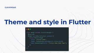
  • 4. “Everything is a widget” in Flutter and theme too: it is just another widget at the root of MaterialApp widget.
  • 5. With the help of InheritedWidget current theme properties are accessible everywhere in the app down the widgets tree.
  • 6. There are 4 variants of themes we can pass to MaterialApp: ● theme – main light theme; ● darkTheme; ● highContrastTheme; ● highContrastDarkTheme. High contrast themes are needed for accessibility feature of OS for people with who have problems with their vision.
  • 7. How Flutter decides which theme to use.
  • 8. MaterialApp themeMode allows to control which theme will be used by the app: ● system – use either the light or dark theme based on what the user has selected in the system settings; ● light – always use light theme; ● dark – always use dark theme if available. System mode by default changes app theme automatically when system theme changed (if dark theme is available). To allow user manually change theme mode, themeMode should be updated when a new value is selected and whole MaterialApp must be rebuilt (BLoC or Provider can be used for this, or other solutions).
  • 9. Theme overriding for local widgets Even if global app theme was configured properly some particular widgets may require different theme/style settings to match design. For this a lot of Flutter widget comes with style property (Text, buttons and etc.) or parameters that control look of the widget.
  • 10. If widget doesn’t come with style property but needs custom theme anyway, it’s possible to wrap this widget into Theme or CupertinoTheme widget and pass modified theme there. Example of local theme override for TextFormField input decoration
  • 11. Sometimes it is not obvious which color or style from theme is used by some widget element. In these cases inspecting widget source code will help to find needed value fast and decide if it can be overridden for whole app theme or it should be overridden locally. How TextField selects color of its label/hint
  • 12. What can be customized in theme
  • 13. Flutter has two main themes setups ● ThemeData – theme settings for material widgets in app, used in MaterialApp root widget. ● CupertinoThemeData – theme data used for cupertino widgets appearance, used in CupertinoApp root widget and inside ThemeData.
  • 14. Ways to create ThemeData ● Default constructor ThemeData(); ● ThemeData.light() – creates a light blue theme; ● ThemeData.dark() – creates dark theme with a teal secondary ColorScheme color; ● ThemeData.from() – which creates a ThemeData from a ColorScheme and textTheme if provided.
  • 15. Theme data from ColorScheme: Creates theme from brightness and 12 provided colors which are specified in Material design color system. There is tool for generating scheme colors from selected primary and secondary colors, but it generates 8 colors which are different from Flutter ColorScheme.
  • 16. Example of generated color scheme
  • 17. ThemeData parameters ● brightness – overall theme brightness, app texts colors depends on this value; ● visualDensity – density value for specifying the compactness of various UI components; ● primaryColor, primaryColorBrightness – background color for major parts of the app (toolbars, tab bars, etc); ● primaryColorLight – lighter version of the primaryColor; ● primaryColorDark – darker version of the primaryColor; ● canvasColor – default color of MaterialType.canvas; ● shadowColor – color that the Material widget uses to draw elevation shadows;
  • 18. ThemeData parameters ● accentColor, accentColorBrightness – foreground color for widgets (toggles, checkboxes, overscroll edge effect, etc); ● scaffoldBackgroundColor – color of the Material that underlies the Scaffold; ● bottomAppBarColor, bottomAppBarTheme – BottomAppBar widget customization; ● cardColor, cardTheme – Card widget customization; ● dividerColor, dividerTheme – Divider widget customization; ● focusColor – focus color used indicate that a component has the input focus; ● hoverColor – hover color used to indicate when a pointer is hovering over a component;
  • 19. ThemeData parameters ● highlightColor – highlight color used during ink splash animations or to indicate an item in a menu is selected; ● splashColor – color of ink splashes of InkWell widget; ● splashFactory – appearance of ink splashes produces by InkWell and InkResponse; ● selectedRowColor – color used to highlight selected rows in tables; ● unselectedWidgetColor – color used for widgets in their inactive (but enabled) state. For example, an unchecked checkbox; ● disabledColor – color used for widgets that are inoperative, regardless of their state. For example, a disabled checkbox;
  • 20. ThemeData parameters ● buttonTheme – button theme for old Flutter buttons: RaisedButton and FlatButton; ● toggleButtonsTheme – default configuration of ToggleButtons widget; ● buttonColor – default fill color of the Material used in RaisedButton; ● secondaryHeaderColor – color of the header of a PaginatedDataTable when there are selected rows; ● backgroundColor – color that contrasts with the primaryColor, e.g. used as the remaining part of a progress bar; ● dialogBackgroundColor, dialogTheme – dialogs customization;
  • 21. ThemeData parameters ● indicatorColor – color of the selected tab indicator in a tab bar; ● hintColor – color to use for hint text or placeholder text, e.g. in TextField fields; ● errorColor – color to use for input validation errors; ● toggleableActiveColor – color used to highlight the active states of toggleable widgets like Switch, Radio, and Checkbox; ● textTheme, primaryTextTheme, accentTextTheme – text with a color that contrasts with the card and canvas colors, primary and accent colors; ● inputDecorationTheme – input decoration theme for text input fields;
  • 22. ThemeData parameters ● iconTheme, primaryIconTheme, accentIconTheme – icon theme that contrasts with the card and canvas colors, primary and accent colors; ● sliderTheme – colors and shapes used to render Slider; ● tabBarTheme – theme for customizing the size, shape, and color of the tab bar indicator; ● tooltipTheme – theme for customizing the visual properties of Tooltip; ● chipTheme – colors and styles used to render Chip; ○ platform – platform the material widgets should adapt to target (Android, iOS, macOS etc.) to determine the current platform for the purpose of emulating the platform behavior (e.g. scrolling or haptic effects);
  • 23. ThemeData parameters ● materialTapTargetSize – the hit test size of certain Material widgets; ● applyElevationOverlayColor – apply a semi-transparent overlay color on Material surfaces to indicate elevation for dark themes; ● pageTransitionsTheme – default MaterialPageRoute transitions per TargetPlatform; ● appBarTheme – theme for customizing the color, elevation, brightness, iconTheme and textTheme of AppBar; ● scrollbarTheme – theme for customizing the colors, thickness, and shape of Scrollbar;
  • 24. ThemeData parameters ● colorScheme – set of twelve colors that can be used to configure the color properties of most components; ● snackBarTheme – theme for customizing colors, shape, elevation, and behavior of a SnackBar; ● floatingActionButtonTheme – theme for customizing the shape, elevation, and color of a FloatingActionButton; ● navigationRailTheme – a theme for customizing the background color, elevation, text style, and icon themes of a NavigationRail;
  • 25. ThemeData parameters ● typography – the color and geometry TextTheme values used to configure textTheme, primaryTextTheme, and accentTextTheme; ● cupertinoOverrideTheme – components of the CupertinoThemeData to override from the Material ThemeData adaptation; ● bottomSheetTheme – theme for customizing the color, elevation, and shape of a bottom sheet; ● popupMenuTheme – theme for customizing the color, shape, elevation, and text style of popup menus;
  • 26. ThemeData parameters ● bannerTheme – theme for customizing the color and text style of a MaterialBanner shown under AppBar; ● buttonBarTheme – theme for customizing the appearance and layout of ButtonBar widget; ● bottomNavigationBarTheme – theme for customizing the appearance and layout of BottomNavigationBar widget; ● timePickerTheme – theme for customizing the appearance and layout of time picker widget; ● textButtonTheme, elevatedButtonTheme, outlinedButtonTheme – themes for new Flutter buttons: TextButton, ElevatedButton, OutlinedButton;
  • 27. ThemeData parameters ● textSelectionTheme – theme for customizing the appearance and layout of TextField widgets; ● dataTableTheme – theme for customizing the appearance and layout of DataTable widgets; ● checkboxTheme – theme for customizing the appearance and layout of Checkbox widgets; ● radioTheme – theme for customizing the appearance and layout of Radio widgets; ● switchTheme – theme for customizing the appearance and layout of Switch widgets.
  • 29. A set of TextStyle-s that follows Material.io specification. Get needed style from context: Theme.of(context).textTheme.headline1; TextTheme
  • 30. ThemeStyle parameters ● inherit – whether null values are replaced with their value in an ancestor text style (e.g., in a TextSpan tree). If this is false, properties that don't have explicit values will revert to the defaults: white in color, a font size of 10 pixels, in a sans-serif font face; ● color – the color to use when painting the text. If foreground is specified, this value must be null; ● backgroundColor – color to use as the background for the text; ● fontFamily – name of the font to use when painting the text (e.g., Roboto); ● fontFamilyFallback – ordered list of font families to fall back on when a glyph cannot be found in a higher priority font family;
  • 31. ThemeStyle parameters ● fontSize – size of glyphs (in logical pixels) to use when painting the text; ● fontWeight – typeface thickness to use when painting the text (e.g., bold); ● fontStyle – typeface variant to use when drawing the letters (e.g., italics); ● letterSpacing – amount of space (in logical pixels) to add between each letter; ● wordSpacing – The amount of space (in logical pixels) between each word; ● textBaseline – common baseline that should be aligned between this text span and its parent text span, or, for the root text spans, with the line box; ○ alphabetic – The text baseline is the normal alphabetic baseline; ○ ideographic – text baseline is the ideographic baseline; this is the bottom of the body of the characters, if the main body of characters protrudes beneath the alphabetic baseline. (Used by Chinese, Japanese, and Korean scripts.);
  • 32. ThemeStyle parameters ● height – height is non-null, the line height of the span of text will be a multiple of fontSize and be exactly `fontSize * height` logical pixels tall; ● locale – locale used to select region-specific glyphs; ● foreground – paint drawn as a foreground for the text; ● background – paint drawn as a background for the text; ● decoration – decorations to paint near the text (e.g., an underline); ● decorationColor – color in which to paint the text decorations; ● decorationStyle – style in which to paint the text decorations (e.g., dashed); ○ decorationThickness – thickness of the decoration stroke as a multiplier of the thickness defined by the font;
  • 33. ThemeStyle parameters ● shadows – list of Shadow-s that will be painted underneath the text; ● fontFeatures – list of FontFeature-s that affect how the font selects glyphs.
  • 34. If using package google_fonts custom text theme can be applied globally:
  • 35. Interaction with System UI elements and settings (Android and iOS)
  • 36. SystemChrome class Allows to control some system UI elements and their behavior.
  • 37. SystemChrome.setEnabledSystemUIOverlays() method. Allows to control visibility of System UI: status bar and navigation bar. System events can trigger overlays again (e.g. keyboard opening triggers navigation bar on Android) and we need manually to hide them again. Can be achieved with restoreSystemUIOverlays() method.
  • 38. SystemChrome.setSystemUIOverlayStyle(). Allows to set status bar and nav bar colors on Android. For iOS only statusbarIconBrightness and statusBarBrightness parameters work.
  • 39. Another way to control the look of System elements – AnnotatedRegion widget. It allows to set SystemUIOvelrayStyle property for some region (widget) in layer tree. However, the AppBar and CupertinoNavigationBar widgets automatically set the system overlay style based on its brightness or background color.
  • 40. Useful resources ● New Buttons and Button Themes official migration guide; ● google_fonts package; ● Panache theme viewer, WEB version; ● Material.io.