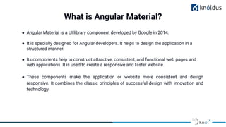
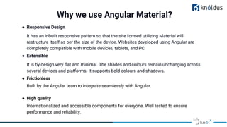
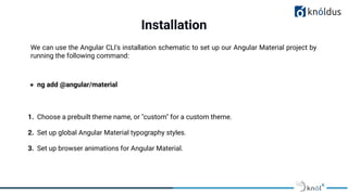
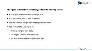
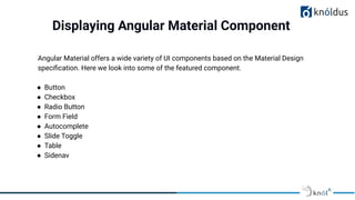
Presented By:
Kiran Jeet Kaur & Paras Jain
Angular Material Design
and Dynamic Theming
Lack of etiquette and manners is a huge turn off.
KnolX Etiquettes
Punctuality
Respect Knolx session timings, you
are requested not to join sessions
after a 5 minutes threshold post
the session start time.
Feedback
Make sure to submit a constructive
feedback for all sessions as it is
very helpful for the presenter.
Silent Mode
Keep your mobile devices in silent
mode, feel free to move out of
session in case you need to attend
an urgent call.
Avoid Disturbance
Avoid unwanted chit chat during
the session.
Our Agenda
01 Angular Material & its features
02 Installation
03 Components
04 Dynamic Theming
05 Demo
Significance of Theming
● Angular Material is a UI library component developed by Google in 2014.
● It is specially designed for Angular developers. It helps to design the application in a
structured manner.
● Its components help to construct attractive, consistent, and functional web pages and
web applications. It is used to create a responsive and faster website.
● These components make the application or website more consistent and design
responsive. It combines the classic principles of successful design with innovation and
technology.
What is Angular Material?
● Responsive Design
It has an inbuilt responsive pattern so that the site formed utilizing Material will
restructure itself as per the size of the device. Websites developed using Angular are
completely compatible with mobile devices, tablets, and PC.
● Extensible
It is by design very flat and minimal. The shades and colours remain unchanging across
several devices and platforms. It supports bold colours and shadows.
● Frictionless
Built by the Angular team to integrate seamlessly with Angular.
● High quality
Internationalized and accessible components for everyone. Well tested to ensure
performance and reliability.
Why we use Angular Material?
We can use the Angular CLI's installation schematic to set up our Angular Material project by
running the following command:
● ng add @angular/material
1. Choose a prebuilt theme name, or "custom" for a custom theme.
2. Set up global Angular Material typography styles.
3. Set up browser animations for Angular Material.
Installation
The ng add command will additionally perform the following actions:
● Add project dependencies to package.json
● Add the Roboto font to your index.html
● Add the Material Design icon font to your index.html
● Add a few global CSS styles to:
○ Remove margins from body
○ Set height: 100% on html and body
○ Set Roboto as the default application font
Displaying Angular Material Component
Angular Material offers a wide variety of UI components based on the Material Design
specification. Here we look into some of the featured component.
● Button
● Checkbox
● Radio Button
● Form Field
● Autocomplete
● Slide Toggle
● Table
● Sidenav
Buttons
Dynamic Theming
● Designing and theming is one of the most important parts of the Web Development process.
● In theory, a web application is always created to solve a specific set of problems for the
end-users, and as long as the application fulfills its primary goal, it will always attract the
users which require that solution.
● A good thing to remember is that a beautiful and appealing website with a great user
experience will always attract even more customers since the application will be easier to
use.
● Along with all the UX improvements, this is also where the brand’s specific visual identity
comes into play.
Angular Material Themes
● In Angular Material, a theme is a collection of color and typography options. Each theme
includes three palettes that determine component colors: primary, accent and warn.
● Angular Material's theming system comes with a predefined set of rules for color and
typography styles.You can also customize color and typography styles for components
in your application.
● A theme file is a SASS file that uses Angular Material SASS mixins to produce color and
typography CSS styles.
Palettes
● A palette is a collection of colors representing a
portion of color space. Each value in this collection is
called a hue.
● In Material Design, each hues in a palette has an
identifier number. These identifier numbers include
50, and then each 100 value between 100 and 900.
● The numbers order hues within a palette from lightest
to darkest.
● Angular Material represents a palette as a Sass map.
Using a pre built theme
● Angular Material represents a theme as a SASS map that contains your color and typography
choices. Colors are defined through a palette.
● Each theme includes three palettes that determine component colors:
○ A primary palette for the color that appears most frequently throughout your application
○ An accent, or secondary, palette used to selectively highlight key parts of your UI
○ A warn, or error, palette used for warnings and error states
● The define-palette SASS function accepts a color palette, as well as four optional hue numbers.
These four hues represent, in order: the "default" hue, a "lighter" hue, a "darker" hue, and a "text"
hue.
Defining a theme
….Theme file
….Theme file
You can construct a theme by calling either define-light-theme or define-dark-theme with
the result from define-palette. The choice of a light versus a dark theme determines the
background and foreground colors used throughout the components.
DEMO
References
● https://material.angular.io/guide/getting-started
● https://indepth.dev/tutorials/angular/angular-material-theming-system-complet
e-guide
● https://www.positronx.io/create-angular-material-8-custom-theme/
● https://www.javatpoint.com/angular-material
● https://material.angular.io/guide/theming
Thank You !
Get in touch with us:
Lorem Studio, Lord Building
D4456, LA, USA

Angular Material Design.pdf

  • 1.
    Presented By: Kiran JeetKaur & Paras Jain Angular Material Design and Dynamic Theming
  • 2.
    Lack of etiquetteand manners is a huge turn off. KnolX Etiquettes Punctuality Respect Knolx session timings, you are requested not to join sessions after a 5 minutes threshold post the session start time. Feedback Make sure to submit a constructive feedback for all sessions as it is very helpful for the presenter. Silent Mode Keep your mobile devices in silent mode, feel free to move out of session in case you need to attend an urgent call. Avoid Disturbance Avoid unwanted chit chat during the session.
  • 3.
    Our Agenda 01 AngularMaterial & its features 02 Installation 03 Components 04 Dynamic Theming 05 Demo
  • 4.
  • 5.
    ● Angular Materialis a UI library component developed by Google in 2014. ● It is specially designed for Angular developers. It helps to design the application in a structured manner. ● Its components help to construct attractive, consistent, and functional web pages and web applications. It is used to create a responsive and faster website. ● These components make the application or website more consistent and design responsive. It combines the classic principles of successful design with innovation and technology. What is Angular Material?
  • 6.
    ● Responsive Design Ithas an inbuilt responsive pattern so that the site formed utilizing Material will restructure itself as per the size of the device. Websites developed using Angular are completely compatible with mobile devices, tablets, and PC. ● Extensible It is by design very flat and minimal. The shades and colours remain unchanging across several devices and platforms. It supports bold colours and shadows. ● Frictionless Built by the Angular team to integrate seamlessly with Angular. ● High quality Internationalized and accessible components for everyone. Well tested to ensure performance and reliability. Why we use Angular Material?
  • 7.
    We can usethe Angular CLI's installation schematic to set up our Angular Material project by running the following command: ● ng add @angular/material 1. Choose a prebuilt theme name, or "custom" for a custom theme. 2. Set up global Angular Material typography styles. 3. Set up browser animations for Angular Material. Installation
  • 8.
    The ng addcommand will additionally perform the following actions: ● Add project dependencies to package.json ● Add the Roboto font to your index.html ● Add the Material Design icon font to your index.html ● Add a few global CSS styles to: ○ Remove margins from body ○ Set height: 100% on html and body ○ Set Roboto as the default application font
  • 9.
    Displaying Angular MaterialComponent Angular Material offers a wide variety of UI components based on the Material Design specification. Here we look into some of the featured component. ● Button ● Checkbox ● Radio Button ● Form Field ● Autocomplete ● Slide Toggle ● Table ● Sidenav
  • 10.
  • 11.
    Dynamic Theming ● Designingand theming is one of the most important parts of the Web Development process. ● In theory, a web application is always created to solve a specific set of problems for the end-users, and as long as the application fulfills its primary goal, it will always attract the users which require that solution. ● A good thing to remember is that a beautiful and appealing website with a great user experience will always attract even more customers since the application will be easier to use. ● Along with all the UX improvements, this is also where the brand’s specific visual identity comes into play.
  • 12.
    Angular Material Themes ●In Angular Material, a theme is a collection of color and typography options. Each theme includes three palettes that determine component colors: primary, accent and warn. ● Angular Material's theming system comes with a predefined set of rules for color and typography styles.You can also customize color and typography styles for components in your application. ● A theme file is a SASS file that uses Angular Material SASS mixins to produce color and typography CSS styles.
  • 13.
    Palettes ● A paletteis a collection of colors representing a portion of color space. Each value in this collection is called a hue. ● In Material Design, each hues in a palette has an identifier number. These identifier numbers include 50, and then each 100 value between 100 and 900. ● The numbers order hues within a palette from lightest to darkest. ● Angular Material represents a palette as a Sass map.
  • 14.
    Using a prebuilt theme
  • 15.
    ● Angular Materialrepresents a theme as a SASS map that contains your color and typography choices. Colors are defined through a palette. ● Each theme includes three palettes that determine component colors: ○ A primary palette for the color that appears most frequently throughout your application ○ An accent, or secondary, palette used to selectively highlight key parts of your UI ○ A warn, or error, palette used for warnings and error states ● The define-palette SASS function accepts a color palette, as well as four optional hue numbers. These four hues represent, in order: the "default" hue, a "lighter" hue, a "darker" hue, and a "text" hue. Defining a theme
  • 16.
  • 17.
    ….Theme file You canconstruct a theme by calling either define-light-theme or define-dark-theme with the result from define-palette. The choice of a light versus a dark theme determines the background and foreground colors used throughout the components.
  • 18.
  • 19.
    References ● https://material.angular.io/guide/getting-started ● https://indepth.dev/tutorials/angular/angular-material-theming-system-complet e-guide ●https://www.positronx.io/create-angular-material-8-custom-theme/ ● https://www.javatpoint.com/angular-material ● https://material.angular.io/guide/theming
  • 20.
    Thank You ! Getin touch with us: Lorem Studio, Lord Building D4456, LA, USA