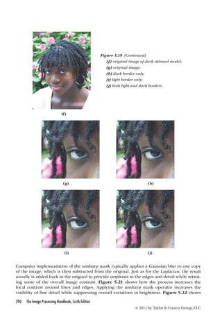
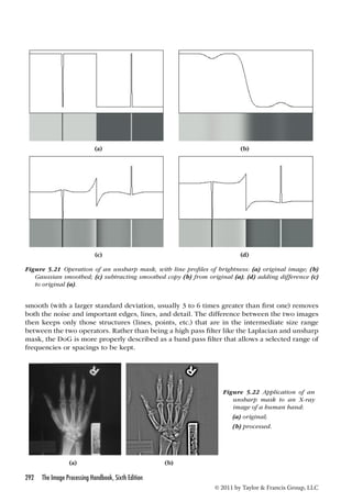
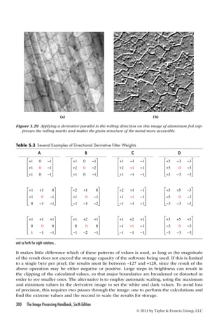
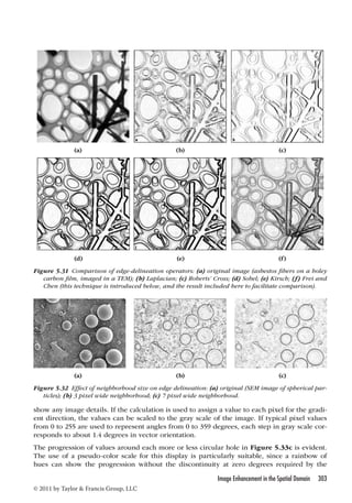
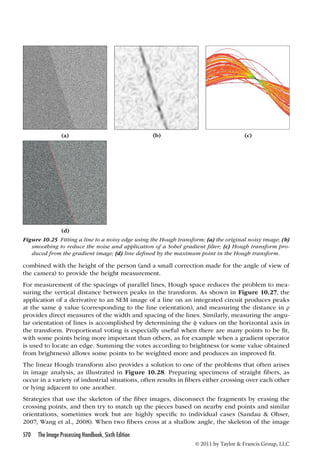
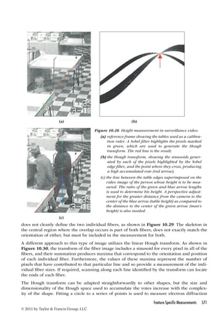
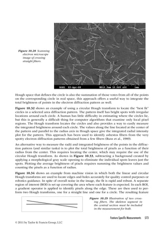
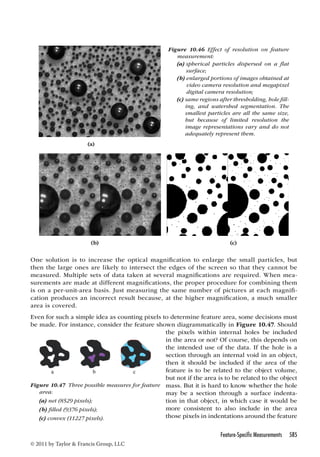
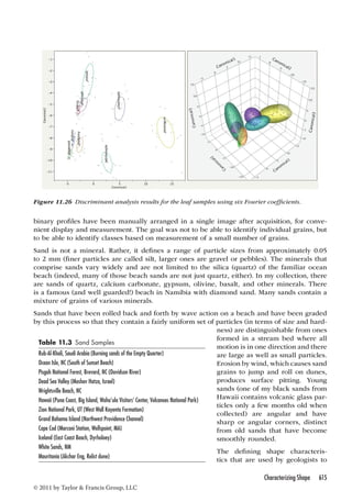
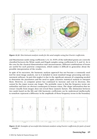
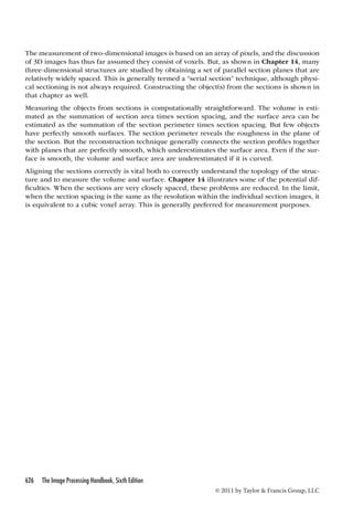
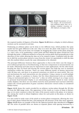
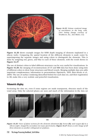
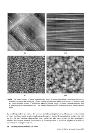
Downloaded 725 times


![many terms as the width of the original image, but each term has a real and imaginary part,
the total number of numeric values produced by the Fourier transform is the same as the
number of pixels in the original image width, or the number of samples of a time-varying
function, so there is no compression. Since the original pixel values are usually small integers
(e.g., one byte for an 8 bit gray scale image), while the values produced by the Fourier trans-form
are floating point numbers (and double precision ones in the best implementations), this
represents an expansion in the storage requirements for the data.
In both the continuous and the discrete cases, a direct extension from one-dimensional func-tions
to two- (or three-) dimensional ones can be made by substituting f(x,y) or f(x,y,z) for
f(x) and F(u,v) or F(u,v,w) for F(u), and performing the summation or integration over two (or
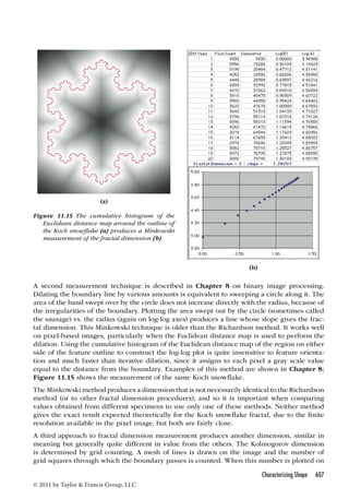
three) variables instead of one. Since the dimensions x,y,z are orthogonal, so are the u,v,w
dimensions. This means that the transformation can be performed separately in each direc-tion.
For a two-dimensional image, for example, it is possible to perform a one-dimensional
transform on each horizontal line of the image, producing an intermediate result with complex
values for each pixel. Then a second series of one-dimensional transforms can be performed
on each vertical column, finally producing the desired two-dimensional transform.
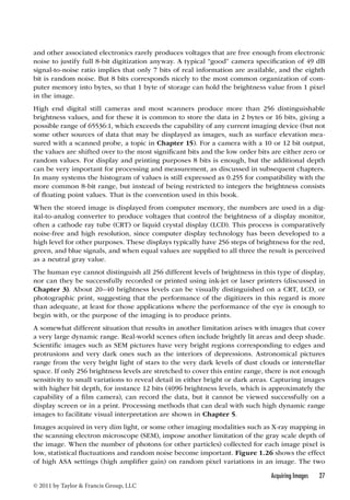
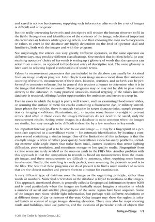
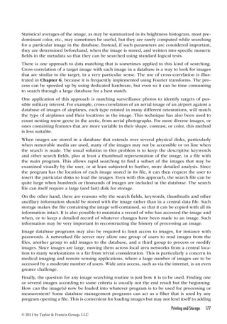
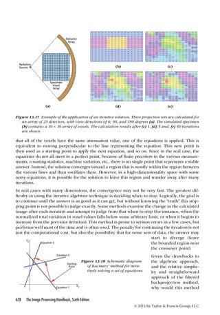
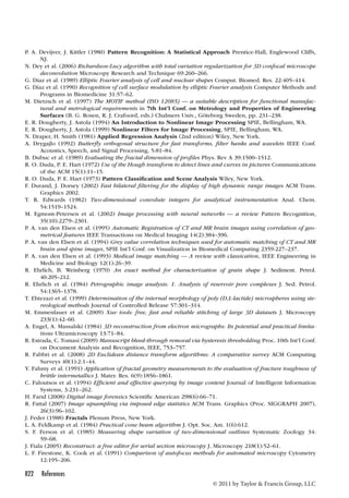
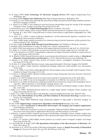
The program fragment listed below shows how to compute the FFT of a function. It is writ-ten
in C, but can be translated into any other language. On input to the subroutine, the array
data holds values to be transformed, arranged as pairs of real and imaginary components
(usually the imaginary part of these complex numbers is initially 0) and size is a power of 2.
The transform is returned in the same array. The first loop reorders the input data, while the
second performs the successive doubling that is the heart of the FFT method. For the inverse
transform, the sign of the angle theta must be changed, and the final values must be rescaled
by the number of points.
//even positions in data[] are real, odd are imaginary.
//input size must be a power-of-two
void FFT_Cooley_Tukey(float* data, unsigned long size) {
340 The Image Processing Handbook, Sixth Edition
© 2011 by Taylor Francis Group, LLC
unsigned long mmax, n = size 1;
unsigned long i, j = 1;
for (i = 1; i n; i += 2) { //Decimation-In-Time
unsigned long m;
if (j i) { //complex swap
swap(data[j-1], data[i-1]);
swap(data[j], data[i]);
}
m = size;
while ((m = 2) (j m)) {
j -= m;
m = 1;
}
j += m;
}
mmax=2; //Danielson-Lanczos, divide-and-conquer
while (mmax n) {
unsigned long istep = mmax 1;
float theta = -(2*3.141592653589793 / mmax);
float wtemp = sin(0.5 * theta);
//complex: W = exp(-2*pi*m / levelp)
float wpr = -2.0 * wtemp * wtemp;](https://image.slidesharecdn.com/crc-141015032457-conversion-gate01/85/the-image-processing-handbook-6th-edition-apr-2011-359-320.jpg)
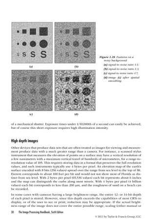
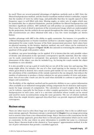
![unsigned long k = i + mmax; //second index
float tempr = wr * data[k-1] - wi * data[k];
float tempi = wr * data[k] + wi * data[k-1];
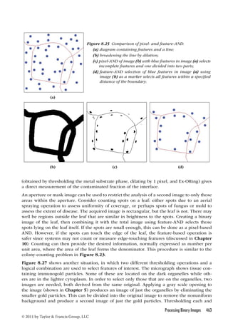
Applying this one-dimensional transform to each row and then each column of a two-dimen-sional
image is not the fastest way to perform the calculation, but it is by far the simplest to
understand and is used in many programs. A somewhat faster approach, known as a butterfly
because it uses various sets of pairs of pixel values throughout the two-dimensional image,
produces identical results. Storing an array of W values as predetermined constants can also
provide a slight increase in speed. Many software math libraries include highly optimized FFT
routines. Some of these allow for array sizes that are not an exact power of 2.
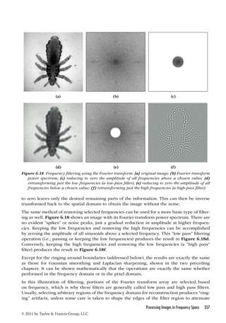
The resulting transform of the original image into frequency space has complex values at each
pixel. This is difficult to display in any readily interpretable way. In most cases, the display
shows the amplitude of the value, ignoring the phase. If the square of the amplitude is used,
this is referred to as the image’s power spectrum, since different frequencies are represented
at different distances from the origin, different directions represent different orientations in
the original image, and the power at each location shows how much of that frequency and ori-entation
are present in the image. This display is particularly useful for detecting and isolating
periodic structures or noise, which is illustrated below. However, the power spectrum by itself
cannot be used to restore the original image. The phase information is also needed, although
it is rarely displayed and is usually difficult to interpret visually. Because the amplitude or
power values usually cover a very large numeric range, many systems display the logarithm
of the value instead, and that is the convention used here.
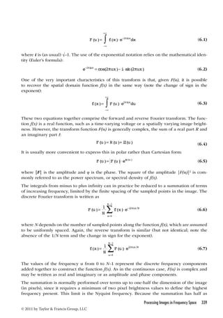
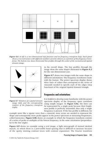
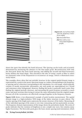
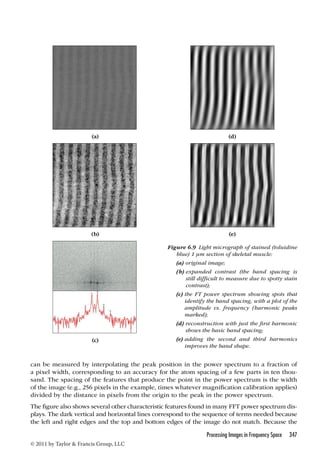
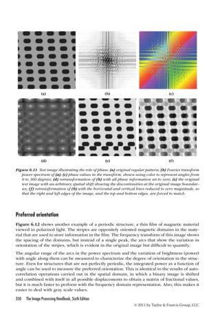
Fourier transforms of simple functions
A common illustration in math textbooks on the Fourier transform (which usually deal with
the one-dimensional case) is the quality of the fit to an arbitrary function by the sum of a
finite series of terms in the Fourier expansion. The parameters for the sinusoids combined
in the series are the amplitude, frequency, and phase, as shown in Figure 6.1. Figure 6.2
shows the case of a step function, illustrating the ability to add up a series of sine waves to
Processing Images in Frequency Space 341
//real component of W
float wpi = sin(theta);
float wr = 1.0;
float wi = 0.0;
for (m = 1; m mmax; m += 2) {
for (i = m; i = n; i += istep) {
data[k-1] = data[i-1] - tempr;
data[k] = data[i] - tempi;
data[i-1] += tempr;
data[i] += tempi;
}
wtemp = wr;
wr += wr * wpr - wi * wpi;
wi += wi * wpr + wtemp * wpi;
}
mmax = istep; //step to the next level
} //while mmax continues to increase
}//FFT
© 2011 by Taylor Francis Group, LLC](https://image.slidesharecdn.com/crc-141015032457-conversion-gate01/85/the-image-processing-handbook-6th-edition-apr-2011-360-320.jpg)


This document provides an overview of the 6th edition of The Image Processing Handbook by John C. Russ. It contains 15 chapters covering a wide range of topics related to acquiring, processing, analyzing and visualizing digital images. The book explains image processing techniques through examples and illustrations to help readers understand how to apply the methods. It presents tools that can be used for both improving visual appearance of images and preparing images for measurement and analysis. The techniques covered are generally ordered according to a typical image analysis workflow. The book emphasizes understanding over mathematical details and uses examples from various microscopy, macroscopy and astronomical images to demonstrate comparisons between different algorithms.