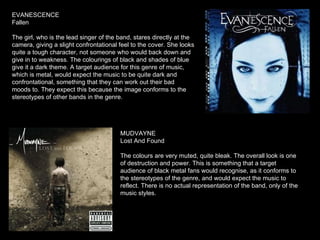
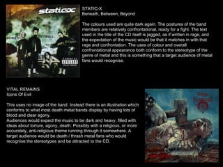
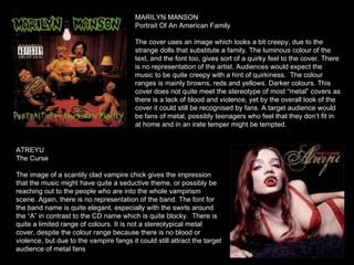
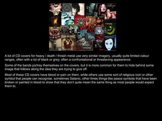
CD COVERS
EVANESCENCE  Fallen The girl, who is the lead singer of the band, stares directly at the camera, giving a slight confrontational feel to the cover. She looks quite a tough character, not someone who would back down and give in to weakness. The colourings of black and shades of blue give it a dark theme. A target audience for this genre of music, which is metal, would expect the music to be quite dark and confrontational, something that they can work out their bad moods to. They expect this because the image conforms to the stereotypes of other bands in the genre. MUDVAYNE Lost And Found The colours are very muted, quite bleak. The overall look is one of destruction and power. This is something that a target audience of black metal fans would recognise, as it conforms to the stereotypes of the genre, and would expect the music to reflect. There is no actual representation of the band, only of the music styles.
STATIC-X Beneath, Between, Beyond The colours used are quite dark again. The postures of the band members are relatively confrontational, ready for a fight. The text used in the title of the CD itself is jagged, as if written in rage, and the expectation of the music would be that it matches in with that rage and confrontation. The uses of colour and overall confrontational appearance both conform to the stereotype of the genre of metal and this is something that a target audience of metal fans would recognise. VITAL REMAINS Icons Of Evil This uses no image of the band. Instead there is an illustration which conforms to what most death metal bands display by having lots of blood and clear agony. Audiences would expect the music to be dark and heavy, filled with ideas about torture, agony, death. Possibly with a religious, or more accurately, anti-religious theme running through it somewhere. A target audience would be death / thrash metal fans who would recognise the stereotypes and be attracted to the CD.
MARILYN MANSON Portrait Of An American Family The cover uses an image which looks a bit creepy, due to the strange dolls that substitute a family. The luminous colour of the text, and the font too, gives sort of a quirky feel to the cover. There is no representation of the artist. Audiences would expect the music to be quite creepy with a hint of quirkiness.  The colour ranges is mainly browns, reds and yellows. Darker colours. This cover does not quite meet the stereotype of most “metal” covers as there is a lack of blood and violence, yet by the overall look of the cover it could still be recognised by fans. A target audience would be fans of metal, possibly teenagers who feel that they don’t fit in at home and in an irate temper might be tempted.  ATREYU The Curse The image of a scantily clad vampire chick gives the impression that the music might have quite a seductive theme, or possibly be reaching out to the people who are into the whole vampirism scene. Again, there is no representation of the band. The font for the band name is quite elegant, especially with the swirls around the “A” in contrast to the CD name which is quite blocky.  There is quite a limited range of colours. It is not a stereotypical metal cover, despite the colour range because there is no blood or violence, but due to the vampire fangs it could still attract the target audience of metal fans
CRADLE OF FILTH Cruelty And The Beast Again the colours are quite limited, mainly black, brown, yellows and red. The image is of a woman sitting in a bath of blood, looking quite malevolent. Listeners would expect the music to have a theme that would run along with the idea of sitting in bloody water. Possibly a vampiric theme. The darkness of the colours also helps to give the impression that the music will be very dark. Once again, there is no sign of the band itself. It conforms to the stereotypes of most death / thrash metal bands by use of blood once again.
A lot of CD covers for heavy / death / thrash metal use very similar imagery, usually quite limited colour ranges, often with a lot of black or grey; often a confrontational or threatening appearance.  Some of the bands portray themselves on the covers, but it is more common for them to hide behind some image that follows along the idea they are trying to give off. Most of these CD covers have blood or pain on them, while others use some sort of religious icon or other symbol that people can recognise, sometimes Satanic, other times things like peace symbols that have been broken or painted in blood to show that they don’t quite mean the same thing as most people would expect them to.

CD covers and their stereotypes

  • 1.
  • 2.
    EVANESCENCE FallenThe girl, who is the lead singer of the band, stares directly at the camera, giving a slight confrontational feel to the cover. She looks quite a tough character, not someone who would back down and give in to weakness. The colourings of black and shades of blue give it a dark theme. A target audience for this genre of music, which is metal, would expect the music to be quite dark and confrontational, something that they can work out their bad moods to. They expect this because the image conforms to the stereotypes of other bands in the genre. MUDVAYNE Lost And Found The colours are very muted, quite bleak. The overall look is one of destruction and power. This is something that a target audience of black metal fans would recognise, as it conforms to the stereotypes of the genre, and would expect the music to reflect. There is no actual representation of the band, only of the music styles.
  • 3.
    STATIC-X Beneath, Between,Beyond The colours used are quite dark again. The postures of the band members are relatively confrontational, ready for a fight. The text used in the title of the CD itself is jagged, as if written in rage, and the expectation of the music would be that it matches in with that rage and confrontation. The uses of colour and overall confrontational appearance both conform to the stereotype of the genre of metal and this is something that a target audience of metal fans would recognise. VITAL REMAINS Icons Of Evil This uses no image of the band. Instead there is an illustration which conforms to what most death metal bands display by having lots of blood and clear agony. Audiences would expect the music to be dark and heavy, filled with ideas about torture, agony, death. Possibly with a religious, or more accurately, anti-religious theme running through it somewhere. A target audience would be death / thrash metal fans who would recognise the stereotypes and be attracted to the CD.
  • 4.
    MARILYN MANSON PortraitOf An American Family The cover uses an image which looks a bit creepy, due to the strange dolls that substitute a family. The luminous colour of the text, and the font too, gives sort of a quirky feel to the cover. There is no representation of the artist. Audiences would expect the music to be quite creepy with a hint of quirkiness. The colour ranges is mainly browns, reds and yellows. Darker colours. This cover does not quite meet the stereotype of most “metal” covers as there is a lack of blood and violence, yet by the overall look of the cover it could still be recognised by fans. A target audience would be fans of metal, possibly teenagers who feel that they don’t fit in at home and in an irate temper might be tempted. ATREYU The Curse The image of a scantily clad vampire chick gives the impression that the music might have quite a seductive theme, or possibly be reaching out to the people who are into the whole vampirism scene. Again, there is no representation of the band. The font for the band name is quite elegant, especially with the swirls around the “A” in contrast to the CD name which is quite blocky. There is quite a limited range of colours. It is not a stereotypical metal cover, despite the colour range because there is no blood or violence, but due to the vampire fangs it could still attract the target audience of metal fans
  • 5.
    CRADLE OF FILTHCruelty And The Beast Again the colours are quite limited, mainly black, brown, yellows and red. The image is of a woman sitting in a bath of blood, looking quite malevolent. Listeners would expect the music to have a theme that would run along with the idea of sitting in bloody water. Possibly a vampiric theme. The darkness of the colours also helps to give the impression that the music will be very dark. Once again, there is no sign of the band itself. It conforms to the stereotypes of most death / thrash metal bands by use of blood once again.
  • 6.
    A lot ofCD covers for heavy / death / thrash metal use very similar imagery, usually quite limited colour ranges, often with a lot of black or grey; often a confrontational or threatening appearance. Some of the bands portray themselves on the covers, but it is more common for them to hide behind some image that follows along the idea they are trying to give off. Most of these CD covers have blood or pain on them, while others use some sort of religious icon or other symbol that people can recognise, sometimes Satanic, other times things like peace symbols that have been broken or painted in blood to show that they don’t quite mean the same thing as most people would expect them to.