Download to read offline


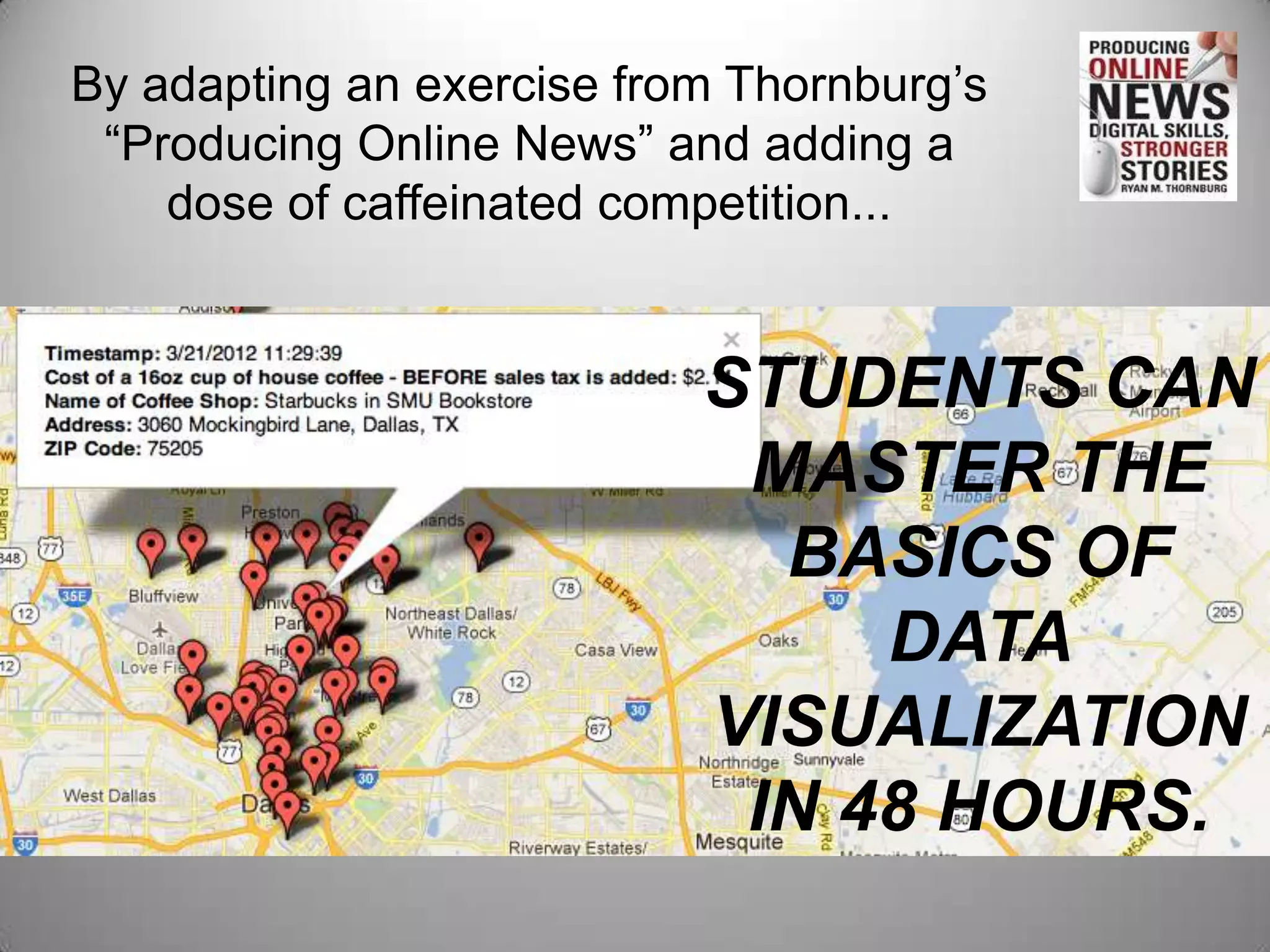
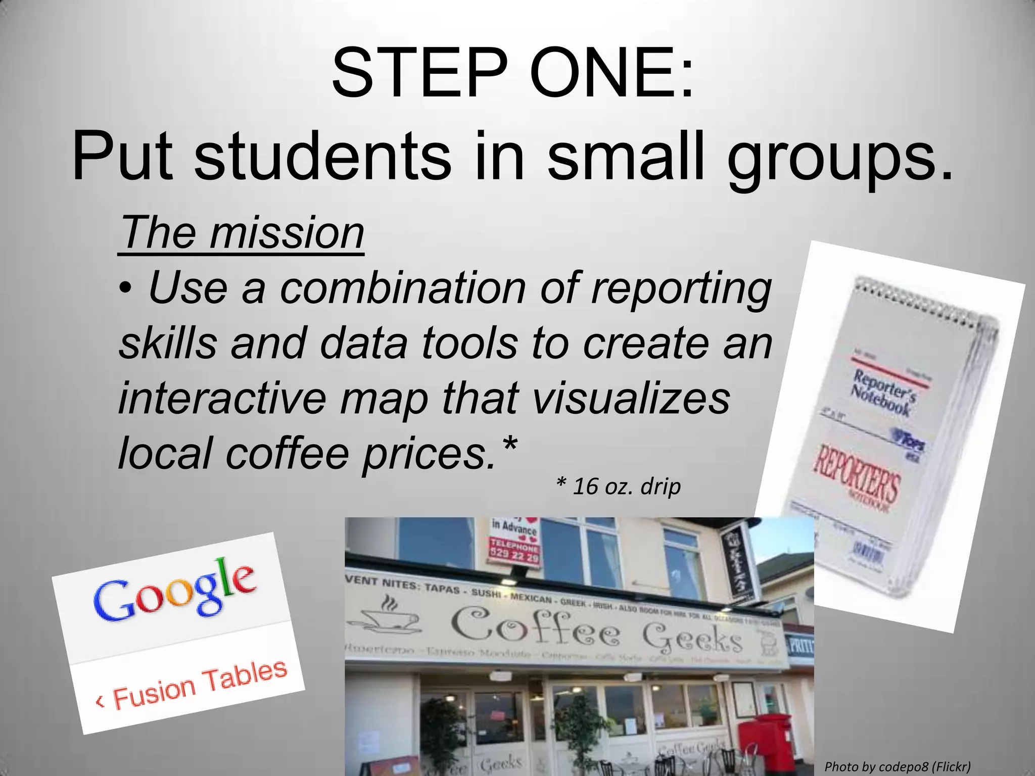
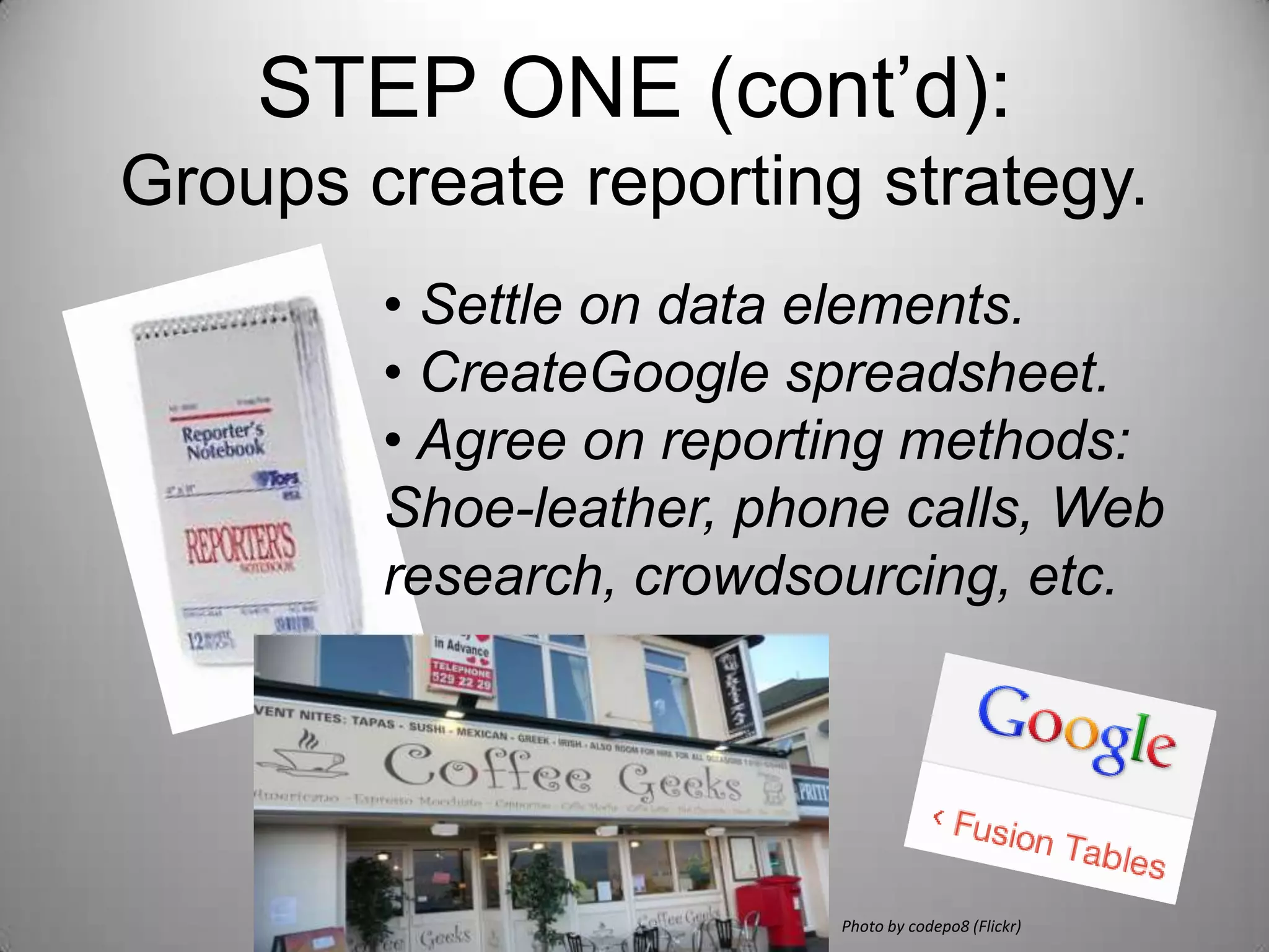

This document outlines a 4-step exercise to teach students data visualization basics through collecting and mapping local coffee shop prices. [1] Students are split into groups to collect price data and create a Google spreadsheet. [2] They then gather price data from various sources like calls, websites and crowdsourcing. [3] In class, groups use Google Fusion to turn their spreadsheets into interactive maps visualizing coffee prices. [4] The exercise culminates in prizes for the best maps.


