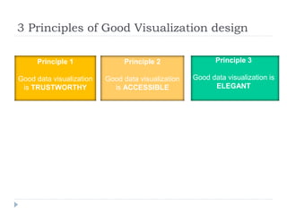
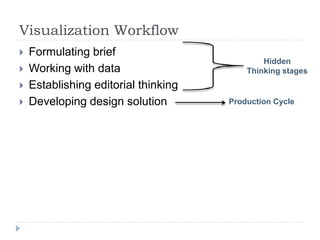
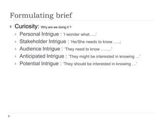
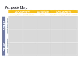
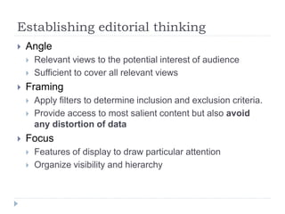
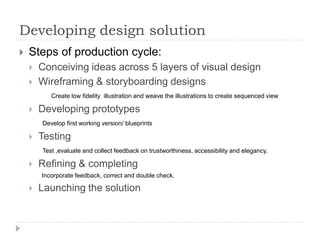
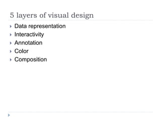
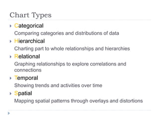
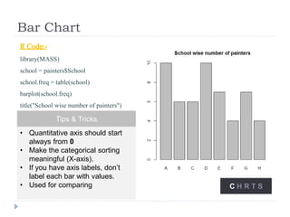
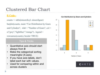
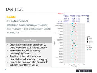
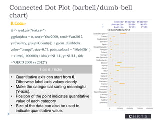
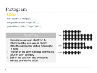
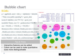
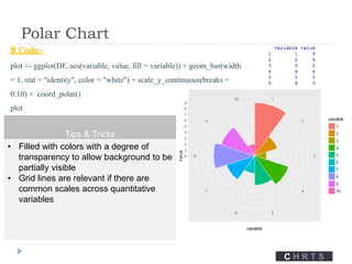
Data Visualization is widely used in industries in info-graphics design, business analytics, data analytics, advanced analytics, business intelligence dashboards, content marketing. It is the 1st part of 3 part series on data visualization. These techniques will enable you to create a good design UI/UX. It contains r codes useful for programmers to create good visual charts and depict a story to clients, customer, senior management, etc ...
Statistics For Data Science | Statistics Using R Programming Language | Hypot...Edureka!
( ** Data Science Certification Using R: https://www.edureka.co/data-science ** )
This Edureka tutorial on "Statistics for Data Science" talks about the basic concepts of Statistics, which is primarily an applied branch of mathematics, that attempts to make sense of observations in the real world. Statistics is generally regarded as one of the most crucial aspects of data science.
Introduction to statistics
Basic Terminology
Categories in Statistics
Descriptive Statistics
Reasons for moving to R
Descriptive Statistics in R Studio
Inferential Statistics
Inferential Statistics using R Studio
Check out our Data Science Tutorial blog series: http://bit.ly/data-science-blogs
Check out our complete Youtube playlist here: http://bit.ly/data-science-playlist
Slide explaining the distinction between bagging and boosting while understanding the bias variance trade-off. Followed by some lesser known scope of supervised learning. understanding the effect of tree split metric in deciding feature importance. Then understanding the effect of threshold on classification accuracy. Additionally, how to adjust model threshold for classification in supervised learning.
Note: Limitation of Accuracy metric (baseline accuracy), alternative metrics, their use case and their advantage and limitations were briefly discussed.
Exploratory data analysis data visualization:
Exploratory Data Analysis (EDA) is an approach/philosophy for data analysis that employs a variety of techniques (mostly graphical) to
Maximize insight into a data set.
Uncover underlying structure.
Extract important variables.
Detect outliers and anomalies.
Test underlying assumptions.
Develop parsimonious models.
Determine optimal factor settings
This is a presentation I gave on Data Visualization at a General Assembly event in Singapore, on January 22, 2016. The presso provides a brief history of dataviz as well as examples of common chart and visualization formatting mistakes that you should never make.
Missing data handling is typically done in an ad-hoc way. Without understanding the repurcussions of a missing data handling technique, approaches that only let you get to the "next step" in your analytics pipeline leads to terrible outputs, conclusions that aren't robust and biased estimates. Handling missing data in data sets requires a structured approach. In this workshop, we will cover the key tenets of handling missing data in a structured way
Introduction to linear regression and the maths behind it like line of best fit, regression matrics. Other concepts include cost function, gradient descent, overfitting and underfitting, r squared.
Introduction to Data Science and AnalyticsSrinath Perera
This webinar serves as an introduction to WSO2 Summer School. It will discuss how to build a pipeline for your organization and for each use case, and the technology and tooling choices that need to be made for the same.
This session will explore analytics under four themes:
Hindsight (what happened)
Oversight (what is happening)
Insight (why is it happening)
Foresight (what will happen)
Recording http://t.co/WcMFEAJHok
How to validate a model?
What is a best model ?
Types of data
Types of errors
The problem of over fitting
The problem of under fitting
Bias Variance Tradeoff
Cross validation
K-Fold Cross validation
Boot strap Cross validation
This Logistic Regression Presentation will help you understand how a Logistic Regression algorithm works in Machine Learning. In this tutorial video, you will learn what is Supervised Learning, what is Classification problem and some associated algorithms, what is Logistic Regression, how it works with simple examples, the maths behind Logistic Regression, how it is different from Linear Regression and Logistic Regression applications. At the end, you will also see an interesting demo in Python on how to predict the number present in an image using Logistic Regression.
Below topics are covered in this Machine Learning Algorithms Presentation:
1. What is supervised learning?
2. What is classification? what are some of its solutions?
3. What is logistic regression?
4. Comparing linear and logistic regression
5. Logistic regression applications
6. Use case - Predicting the number in an image
What is Machine Learning: Machine Learning is an application of Artificial Intelligence (AI) that provides systems the ability to automatically learn and improve from experience without being explicitly programmed.
- - - - - - - -
About Simplilearn Machine Learning course:
A form of artificial intelligence, Machine Learning is revolutionizing the world of computing as well as all people’s digital interactions. Machine Learning powers such innovative automated technologies as recommendation engines, facial recognition, fraud protection and even self-driving cars.This Machine Learning course prepares engineers, data scientists and other professionals with knowledge and hands-on skills required for certification and job competency in Machine Learning.
- - - - - - -
Why learn Machine Learning?
Machine Learning is taking over the world- and with that, there is a growing need among companies for professionals to know the ins and outs of Machine Learning
The Machine Learning market size is expected to grow from USD 1.03 Billion in 2016 to USD 8.81 Billion by 2022, at a Compound Annual Growth Rate (CAGR) of 44.1% during the forecast period.
- - - - - -
What skills will you learn from this Machine Learning course?
By the end of this Machine Learning course, you will be able to:
1. Master the concepts of supervised, unsupervised and reinforcement learning concepts and modeling.
2. Gain practical mastery over principles, algorithms, and applications of Machine Learning through a hands-on approach which includes working on 28 projects and one capstone project.
3. Acquire thorough knowledge of the mathematical and heuristic aspects of Machine Learning.
4. Understand the concepts and operation of support vector machines, kernel SVM, naive bayes, decision tree classifier, random forest classifier, logistic regression, K-nearest neighbors, K-means clustering and more.
5. Be able to model a wide variety of robust Machine Learning algorithms including deep learning, clustering, and recommendation systems
- - - - - - -
Data Science - Part VII - Cluster AnalysisDerek Kane
This lecture provides an overview of clustering techniques, including K-Means, Hierarchical Clustering, and Gaussian Mixed Models. We will go through some methods of calibration and diagnostics and then apply the technique on a recognizable dataset.
North Raleigh Rotarian Katie Turnbull gave a great presentation at our Friday morning extension meeting about data visualization. Katie is a consultant at research and advisory firm, Gartner, Inc.
A quick reference on designing data visualizations that delight and leverage best practices from the design world to ensure your data is presented in meaningful, usable, fun ways.
Designing Data Visualizations to Strengthen Health SystemsAmanda Makulec
Slide deck from our hands-on workshop hosted at the 4th Global Symposium on Health Systems Research, focused on basic design tips, tricks, and best practices to improve your charts and graphs.
Data Visualization Design Best Practices WorkshopAmanda Makulec
Presentation shared at the #MA4Health Data Visualization workshop cofacilitated with my colleague Tahmid Chowdhury. Our aim was to empower participants with simple principles they can apply to any graph or chart to improve its effectiveness in communicating information, and to share resources on viz design relevant to global health practitioners.
Data Visualization Design Best Practices WorkshopJSI
This introduction was presented as part of a workshop at the Measurement and Accountability for Results in Health Summit at the World Bank (June 2015). The workshop focused on simple ways anyone working with data can improve their presentations, and included visualization redesign activity to put these principles in practice.
Data visualization in data science: exploratory EDA, explanatory. Anscobe's quartet, design principles, visual encoding, design engineering and journalism, choosing the right graph, narrative structures, technology and tools.
Design and Data Processes Unified - 3rd Corner ViewJulian Jordan
In this presentation (given in early 2020) I explain that to build digital products, data analysts/scientists and designers need to leverage each other’s processes and work as a unit.
I introduce the problem solving approach of data analysts/scientists and designers as well as how to combine these approaches. Additionally, I explain how mental models and algorithms, while associated with design and data science, respectively, are similar ways to represent phenomena and questions about them.
Data Con LA 2022 - Real world consumer segmentationData Con LA
Jaysen Gillespie, Head of Analytics and Data Science at RTB House
1. Shopkick has over 30M downloads, but the userbase is very heterogeneous. Anecdotal evidence indicated a wide variety of users for whom the app holds long-term appeal.
2. Marketing and other teams challenged Analytics to get beyond basic summary statistics and develop a holistic segmentation of the userbase.
3. Shopkick's data science team used SQL and python to gather data, clean data, and then perform a data-driven segmentation using a k-means algorithm.
4. Interpreting the results is more work -- and more fun -- than running the algo itself. We'll discuss how we transform from ""segment 1"", ""segment 2"", etc. to something that non-analytics users (Marketing, Operations, etc.) could actually benefit from.
5. So what? How did team across Shopkick change their approach given what Analytics had discovered.
Effective Business Presentations with Storyboarding and Data VisualizationCarmen Proctor
Create Effective Presentations by learning a few basic steps and best practices. Deliver concise, to the point, and visually appealing presentations to both internal and external clients. Use storyboarding and correct data visualization are the key to getting your message across.
This will help you:
- Shorten extremely long presentations
- Deliver content in a very clear and easy to understand manner
- Simplify very data heavy presentations
- Keep focus on the project objectives, not filling the white space
Introduction to machine learning and model building using linear regressionGirish Gore
An basic introduction of Machine learning and a kick start to model building process using Linear Regression. Covers fundamentals of Data Science field called Machine Learning covering the fundamental topic of supervised learning method called linear regression. Importantly it covers this using R language and throws light on how to interpret linear regression results of a model. Interpretation of results , tuning and accuracy metrics like RMSE Root Mean Squared Error are covered here.
Join the data conversation and see how analytics drives decision making across industries. Learn to understand, analyze, and interpret data as you walk through the fundamentals of data analysis, learn introductory analytic functionality in Google Sheet to distill actionable insights from data sets, see how data analysts translate their findings into compelling business narratives, perform an exploratory analysis using real-world data.
The question of what defines a Data Scientist in organisations still troubles many today – here is a list of CV tips by Parallel Consulting that set you up for Data Science success in 2017.
Data visualization is an interdisciplinary field that deals with the graphic representation of data. It is a particularly efficient way of communicating when the data is numerous as for example a time series.
Time series analysis is conducted on daily views of Wikipedia article. The data set contains individual Pages and daily views of the pages.
The total number of pages in the data set is 145k. The training data set 1 contains daily views from July 1st 2015 to Dec 31st 2016 with a total number of 550 days.
Testing of forecast model is based on data from January, 1st, 2017 up until March 1st, 2017, which is 60 days including 1st march 2017.
Application of different tools such as CAGE framework and market entry strategies id different developing & developed economies and evaluating the success of Zara in India
RBL Bank is one of the fast growing private banks in India. A detailed general environment analysis(PESTEL), Industry analysis(Porter's 5 forces), VRIO analysis carried to look at the strategy analysis and formulated strategy for different business verticals, as part of the Project in MBA
P&G Strategic Restructuring of Global Business Service. Evaluation of strengths & weakness of outsourcing vs insourcing. Different difficulties in the decision. Effective communication strategy for employees
Opendatabay - Open Data Marketplace.pptxOpendatabay
Opendatabay.com unlocks the power of data for everyone. Open Data Marketplace fosters a collaborative hub for data enthusiasts to explore, share, and contribute to a vast collection of datasets.
First ever open hub for data enthusiasts to collaborate and innovate. A platform to explore, share, and contribute to a vast collection of datasets. Through robust quality control and innovative technologies like blockchain verification, opendatabay ensures the authenticity and reliability of datasets, empowering users to make data-driven decisions with confidence. Leverage cutting-edge AI technologies to enhance the data exploration, analysis, and discovery experience.
From intelligent search and recommendations to automated data productisation and quotation, Opendatabay AI-driven features streamline the data workflow. Finding the data you need shouldn't be a complex. Opendatabay simplifies the data acquisition process with an intuitive interface and robust search tools. Effortlessly explore, discover, and access the data you need, allowing you to focus on extracting valuable insights. Opendatabay breaks new ground with a dedicated, AI-generated, synthetic datasets.
Leverage these privacy-preserving datasets for training and testing AI models without compromising sensitive information. Opendatabay prioritizes transparency by providing detailed metadata, provenance information, and usage guidelines for each dataset, ensuring users have a comprehensive understanding of the data they're working with. By leveraging a powerful combination of distributed ledger technology and rigorous third-party audits Opendatabay ensures the authenticity and reliability of every dataset. Security is at the core of Opendatabay. Marketplace implements stringent security measures, including encryption, access controls, and regular vulnerability assessments, to safeguard your data and protect your privacy.
Levelwise PageRank with Loop-Based Dead End Handling Strategy : SHORT REPORT ...Subhajit Sahu
Abstract — Levelwise PageRank is an alternative method of PageRank computation which decomposes the input graph into a directed acyclic block-graph of strongly connected components, and processes them in topological order, one level at a time. This enables calculation for ranks in a distributed fashion without per-iteration communication, unlike the standard method where all vertices are processed in each iteration. It however comes with a precondition of the absence of dead ends in the input graph. Here, the native non-distributed performance of Levelwise PageRank was compared against Monolithic PageRank on a CPU as well as a GPU. To ensure a fair comparison, Monolithic PageRank was also performed on a graph where vertices were split by components. Results indicate that Levelwise PageRank is about as fast as Monolithic PageRank on the CPU, but quite a bit slower on the GPU. Slowdown on the GPU is likely caused by a large submission of small workloads, and expected to be non-issue when the computation is performed on massive graphs.
Techniques to optimize the pagerank algorithm usually fall in two categories. One is to try reducing the work per iteration, and the other is to try reducing the number of iterations. These goals are often at odds with one another. Skipping computation on vertices which have already converged has the potential to save iteration time. Skipping in-identical vertices, with the same in-links, helps reduce duplicate computations and thus could help reduce iteration time. Road networks often have chains which can be short-circuited before pagerank computation to improve performance. Final ranks of chain nodes can be easily calculated. This could reduce both the iteration time, and the number of iterations. If a graph has no dangling nodes, pagerank of each strongly connected component can be computed in topological order. This could help reduce the iteration time, no. of iterations, and also enable multi-iteration concurrency in pagerank computation. The combination of all of the above methods is the STICD algorithm. [sticd] For dynamic graphs, unchanged components whose ranks are unaffected can be skipped altogether.
Explore our comprehensive data analysis project presentation on predicting product ad campaign performance. Learn how data-driven insights can optimize your marketing strategies and enhance campaign effectiveness. Perfect for professionals and students looking to understand the power of data analysis in advertising. for more details visit: https://bostoninstituteofanalytics.org/data-science-and-artificial-intelligence/
3. 3 Stages of Understanding
Perceiving Interpreting Comprehending
What does it show ?
Where is big, medium, small ?
How do things compare?
What relationships exist?
What does it mean?
What is good and bad?
Is it meaningful or insignificant?
Unusual or expected?
What does it mean to me?
What are the main messages?
What have I learnt?
Any actions to take?
4. 3 Principles of Good Visualization design
Principle 1
Good data visualization
is TRUSTWORTHY
Principle 2
Good data visualization
is ACCESSIBLE
Principle 3
Good data visualization is
ELEGANT
5. Visualization Workflow
Formulating brief
Working with data
Establishing editorial thinking
Developing design solution
Hidden
Thinking stages
Production Cycle
6. Formulating brief
Curiosity: Why are we doing it ?
Personal Intrigue : ‘I wonder what…..’
Stakeholder Intrigue : ‘He/She needs to know …..;
Audience Intrigue : ‘They need to know ……..’
Anticipated Intrigue : ‘They might be interested in knowing …’
Potential Intrigue : ‘They should be interested in knowing …’
8. Working with data
Types of data
Textual(Qualitative)
Nominal (Qualitative)
Ordinal (Qualitative)
Interval (quantitative)
Ratio (quantitative)
10. Exploratory data analysis
Addressing of unknowns and substantiating knowns.
The things we are
aware of knowing
Beware complacency
The things we are
aware of not knowing
Deductive reasoning
The things we are
unaware of knowing
Acquire and review
The things we are
unaware of not
knowing
Inductive reasoning
KNOWN UNKNOWN
KNOWNUNKNOWN ACQUIRED
AWARENESS
11. Reasoning
Deductive reasoning
Hypothesis framed by subject knowledge, interrogate the
data to find evidence of relevance or interest in concluding
the finding. (Sherlock Holmes)
Inductive reasoning
Play around with data, based on sense or instinct and wait
and see what emerges.
12. Establishing editorial thinking
Angle
Relevant views to the potential interest of audience
Sufficient to cover all relevant views
Framing
Apply filters to determine inclusion and exclusion criteria.
Provide access to most salient content but also avoid
any distortion of data
Focus
Features of display to draw particular attention
Organize visibility and hierarchy
13. Developing design solution
Steps of production cycle:
Conceiving ideas across 5 layers of visual design
Wireframing & storyboarding designs
Create low fidelity illustration and weave the illustrations to create sequenced view
Developing prototypes
Develop first working version/ blueprints
Testing
Test ,evaluate and collect feedback on trustworthiness, accessibility and elegancy.
Refining & completing
Incorporate feedback, correct and double check.
Launching the solution
14. 5 layers of visual design
Data representation
Interactivity
Annotation
Color
Composition
15. Chart Types
Categorical
Comparing categories and distributions of data
Hierarchical
Charting part to whole relationships and hierarchies
Relational
Graphing relationships to explore correlations and
connections
Temporal
Showing trends and activities over time
Spatial
Mapping spatial patterns through overlays and distortions
16. Bar Chart
R Code:-
library(MASS)
school = painters$School
school.freq = table(school)
barplot(school.freq)
title("School wise number of painters")
Tips & Tricks
• Quantitative axis should start
always from 0
• Make the categorical sorting
meaningful (X-axis).
• If you have axis labels, don’t
label each bar with values.
• Used for comparing C H R T S
17. Clustered Bar Chart
R Code:-
counts <- table(mtcars$cyl, mtcars$gear)
barplot(counts, main="Car Distribution by Gears
and Cylinders", xlab = "Number of Gears", col =
c("grey","lightblue","orange") , legend =
rownames(counts), beside=TRUE)
C H R T S
Tips & Tricks
• Quantitative axis should start
always from 0
• Make the categorical sorting
meaningful (X-axis).
• If you have axis labels, don’t
label each bar with values.
• Used for comparing within and
across clusters
18. Dot Plot
R Code:-
tt <- read.csv("test.csv")
ggplot(data = tt, aes(x=Percentage, y=Country,
color = Gender)) + geom_point(aes(size = Count))
+ xlim(0,100)
Tips & Tricks
• Quantitative axis can start from 0.
Otherwise label axis values clearly
• Make the categorical sorting
meaningful (Y-axis).
• Position of the point indicates
quantitative value of each category
• Size of the data can also be used to
indicate quantitative value.
C H R T S
19. Connected Dot Plot (barbell/dumb-bell
chart)
C H R T S
R Code:-
tt <- read.csv("test.csv")
ggplot(data = tt, aes(x=Year2000, xend=Year2012,
y=Country, group=Country)) + geom_dumbbell(
color="orange", size=0.75, point.colour.l = "#0e668b“ )
+ xlim(0,1000000) +labs(x=NULL, y=NULL, title
="OECD 2000 vs 2012")
Tips & Tricks
• Quantitative axis can start from 0.
Otherwise label axis values clearly
• Make the categorical sorting meaningful
(Y-axis).
• Position of the point indicates quantitative
value of each category
• Size of the data can also be used to
indicate quantitative value.
21. Bubble chart
C H R T S
R Code:-
g <- ggplot(dt, aes(x= xlab, y = alphabet)) + labs(title
="State wise public spending") + geom_jitter
(aes(col=alphabet, size=FY.11)) + geom_text
(aes(label=State), size=3) + guides(colour=FALSE,
size = FALSE, x = FALSE, y = FALSE) +
theme(axis.title.x=element_blank(),axis.text.x=element
_blank(),axis.ticks.x=element_blank(),axis.title.y=elem
ent_blank(),axis.text.y=element_blank(),axis.ticks.y=el
ement_blank()) + scale_size_continuous(range = c(0,
50)) Tips & Tricks
• Interactive features can be added
• Colors can be used to make quantitative
sizes more distinguishable
22. Polar Chart
R Code:-
plot <- ggplot(DF, aes(variable, value, fill = variable)) + geom_bar(width
= 1, stat = "identity", color = "white") + scale_y_continuous(breaks =
0:10) + coord_polar()
plot
Tips & Tricks
• Filled with colors with a degree of
transparency to allow background to be
partially visible
• Grid lines are relevant if there are
common scales across quantitative
variables
C H R T S