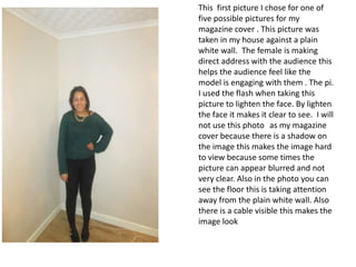
1. This first picture I chose for one of
five possible pictures for my
magazine cover . This picture was
taken in my house against a plain
white wall. The female is making
direct address with the audience this
helps the audience feel like the
model is engaging with them . The pi.
I used the flash when taking this
picture to lighten the face. By lighten
the face it makes it clear to see. I will
not use this photo as my magazine
cover because there is a shadow on
the image this makes the image hard
to view because some times the
picture can appear blurred and not
very clear. Also in the photo you can
see the floor this is taking attention
away from the plain white wall. Also
there is a cable visible this makes the
image look
2. I like this poise because it highlights
costume against the wall. The white
wall allows the green top to appear
brighter. The bright colour makes the
whole image look and feel brighter.
Also the leaning against the wall gives
the image a different feeling to it. Also
the model is making direct address
with the audience this helps to make
the picture look more personal
because he is making personal eye
contact with the audience. The reason
I have not chosen this picture is
because the model is too far away
from the camera. When the model is
far away from the camera it can make
the image look blurry. Its important
the camera is on focus on the model
because this can make the image
appear more personal.
3. The model is making eye contact with the
audience. This is a good technique because it
will make the audience feel like the model is
making a personal connection with them as a
audience . The lighting in this picture is
natural this good because its able to brighten
up the whole of the image , this means the
audience can clearly see the models face.
The image has a narrow depth feel the image
has a narrow depth of feel to it , this is positive
in this case because all of the models face is in
view and this the audience to have all there
attention on the model. Another reason I will
not use the image is because the model is
poising this means the auience wont be able to
understand the subject within the image or
what the image is about.
4. In this photo I like how the models
customer is highlighted by the white
background. The model is making a
strong eye connection with the
audience this makes the audience feel
like image is a direct address to them.
reason I am not able to use the
photograph because when I was
taken the picture I was to far away
from the model this makes the model
harder to focus on for the audience.
Another reason I can not use this
image is because you can see a plug in
the corner this makes the photo look
like it wasn’t taken properly.
5. I have decided to use this photo for
my magazine cover. The lighting in
this picture is good because you can
clearly see the models face. Also
there is no shadow within this
image this makes. Also I have
chosen this image is better than the
rest because , when I was taken the
photo I was able to use a close up
angle . The lighting in this picture is
good because you can clearly see
the models face. Using the white
background allows the audience to
clearly see the colours used in this
picture. The green jumper allows
the golden necklace to be
highlighted , this gives the image a
extra boost of colour.