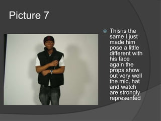
Pictures taken for front cover Rejected with analysisTeddy Boateng
Picture 1I felt that this picture was really good but as I looked at it closely It was a bit blurry. Which was the main problem thought my pictures. I didn’t like the lighting as well as the picture seems a littler lighter than I wanted.
Picture 2This picture was good but it was fairly blurry also and I felt the picture was to far away. As stretching pictures on Photoshop seem to make them fairly blurry
Picture 3This picture was one of my favourite as my model is sitting down which was something I was considering  I wanted to see hoe effective this position would be. I wanted a central picture so that my layout can appear around it as I wanted to use. Due to the hat being low I was really happy as it had the effect of anger and screw facing the camera. Which is something associated with hip hop artist. My props came out very well as the chains are very clear. But the microphone was cut out
Picture 4I made my model relax a little in this picture and jus to pose normally again I was really pleased with this one as it had potential to become on my front cover.
Picture 5This picture was good but I felt that it was to small and I wanted to make my main image to stand out so that it is capturing to the eye and the chains could stood out more.
Picture 6With this picture my model wasn’t ready. But I found the pose to be very interesting. As the watch is represented on my model very well for the first time. This prop also stands out well.
Picture 7This is the same I just made him pose a little different with his face again the props show out very well the mic, hat and watch are strongly represented
Picture 8Due to me knowing that stretched pictures do not look good on Photoshop. I tried to go for a close up shot but is was not satisfied with this image to be on my front cover. I felt that my model is to close. For an image this close I would have like sunglasses. I did want a close shot but this image wasn’t appealing for me. The pose was not good enough.
Picture 9With this photo  my model was not even looking at the camera. An image of my model not being ready would not be suitable for my front cover. I liked the fact that I made him hold the belt as holding the belt buckle is very common amongst hip hop artist.
Picture 10I told my model to cross his arms to see what effect this would have but looking at this image I can clearly see his head is tilted which wasn’t my aim for this picture even though
Picture 11My final picture was really good as the effect of the eyes not be very clear made the artist seem mischievous. I liked this photo quite a lot but I would have liked the chains to have been more clear as I wanted props to be significant for my main image.
ConclusionI use a male model as this is what is expected of hip hop models. Also all genders will be attracted to a male as a sign of masculinity or attractive. My model is black as this is a stereotype. I used props such as a baseball hat, chains, microphone and watch. I felt these props make the artist seem more realistic. As these things are normally seen on hip hop artist. With my images a lot of them were blurry up close. I couldn’t get a good close image which is one of my ideas for main image or waist above. These pictures aren't to bad but I didn’t feel they were good enough for my front cover though I may change my mind. I felt I chose good props and a model but I didn’t get the picture I was locking for. I also decided to make my image black and white as it clearly refers to the artist making the audience question the colours.

Model Planning 2

  • 1.
    Pictures taken forfront cover Rejected with analysisTeddy Boateng
  • 2.
    Picture 1I feltthat this picture was really good but as I looked at it closely It was a bit blurry. Which was the main problem thought my pictures. I didn’t like the lighting as well as the picture seems a littler lighter than I wanted.
  • 3.
    Picture 2This picturewas good but it was fairly blurry also and I felt the picture was to far away. As stretching pictures on Photoshop seem to make them fairly blurry
  • 4.
    Picture 3This picturewas one of my favourite as my model is sitting down which was something I was considering I wanted to see hoe effective this position would be. I wanted a central picture so that my layout can appear around it as I wanted to use. Due to the hat being low I was really happy as it had the effect of anger and screw facing the camera. Which is something associated with hip hop artist. My props came out very well as the chains are very clear. But the microphone was cut out
  • 5.
    Picture 4I mademy model relax a little in this picture and jus to pose normally again I was really pleased with this one as it had potential to become on my front cover.
  • 6.
    Picture 5This picturewas good but I felt that it was to small and I wanted to make my main image to stand out so that it is capturing to the eye and the chains could stood out more.
  • 7.
    Picture 6With thispicture my model wasn’t ready. But I found the pose to be very interesting. As the watch is represented on my model very well for the first time. This prop also stands out well.
  • 8.
    Picture 7This isthe same I just made him pose a little different with his face again the props show out very well the mic, hat and watch are strongly represented
  • 9.
    Picture 8Due tome knowing that stretched pictures do not look good on Photoshop. I tried to go for a close up shot but is was not satisfied with this image to be on my front cover. I felt that my model is to close. For an image this close I would have like sunglasses. I did want a close shot but this image wasn’t appealing for me. The pose was not good enough.
  • 10.
    Picture 9With thisphoto my model was not even looking at the camera. An image of my model not being ready would not be suitable for my front cover. I liked the fact that I made him hold the belt as holding the belt buckle is very common amongst hip hop artist.
  • 11.
    Picture 10I toldmy model to cross his arms to see what effect this would have but looking at this image I can clearly see his head is tilted which wasn’t my aim for this picture even though
  • 12.
    Picture 11My finalpicture was really good as the effect of the eyes not be very clear made the artist seem mischievous. I liked this photo quite a lot but I would have liked the chains to have been more clear as I wanted props to be significant for my main image.
  • 13.
    ConclusionI use amale model as this is what is expected of hip hop models. Also all genders will be attracted to a male as a sign of masculinity or attractive. My model is black as this is a stereotype. I used props such as a baseball hat, chains, microphone and watch. I felt these props make the artist seem more realistic. As these things are normally seen on hip hop artist. With my images a lot of them were blurry up close. I couldn’t get a good close image which is one of my ideas for main image or waist above. These pictures aren't to bad but I didn’t feel they were good enough for my front cover though I may change my mind. I felt I chose good props and a model but I didn’t get the picture I was locking for. I also decided to make my image black and white as it clearly refers to the artist making the audience question the colours.