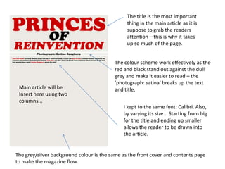
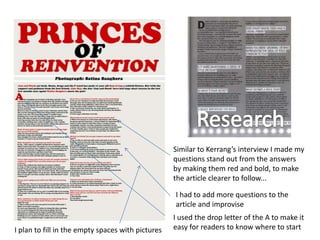
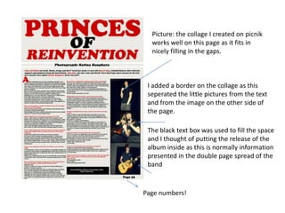
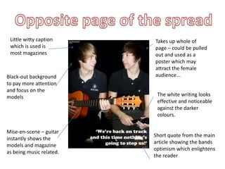
I had to get a front cover, contents page and a double page spread and pick out the conventions I intend to use in my magazine. Write why I liked it and that I would include it in my magazine.
The document analyzes the typography, layout, color, image, language, and conventions used in a magazine contents page. It notes that the headline and subheadings are larger fonts to stand out, and the rest of the text is smaller and sans-serif. The layout follows the natural flow of the eye, with the masthead first and a central image. Dark red and black colors are used for contrast. The image is a close-up of a woman to show makeup details. Formal language is used to appeal to older readers. Standard conventions include larger header fonts and column-based layout.
The document summarizes the key design elements of a magazine contents page. It discusses how the title, colors, and layout create visual interest and consistency across pages. Images and captions are anchored together to preview stories and genres. Page numbers, subheadings, and borders help guide readers to find articles of interest. The masthead, date, and drop caps also reinforce the publication's style.
The document analyzes and compares the layouts of two magazine contents pages. The first page uses a three-column layout that clearly separates sections. It includes branding elements, page numbers, and an advertisement placed strategically. The second page from Vibe magazine features a large celebrity image and separates article types with less text-based details over multiple pages. Overall, the first page has a cleaner, more informative structure while the second relies more on images than information.
This contents page uses a minimalist design with contrasting images, text, fonts, and colors to separate different sections. A central natural photo of a woman with blood on her head is intended to intrigue readers, while humorously contrasting images of men in bear onesies also draw attention. Key information like page numbers and titles are displayed in bold red text boxes to stand out from the black text organized under headings. The design emphasizes the most important visual elements to guide readers through the magazine in an accessible yet eye-catching layout.
The document describes the process of designing a magazine cover in Photoshop. The designer experiments with colors, layouts, and effects to improve the visibility and professional appearance of the title, date, articles, and images. Mistakes with barcodes and sizing are corrected. Photos are adjusted to stand out more clearly. Positions of elements are tweaked for balance and to follow design conventions. The final cover is cropped from Photoshop for submission.
The document analyzes contents pages from VIBE magazine. It notes that the contents pages have a consistent simple yet sophisticated style across issues with full bleed images, plain backgrounds, and section headings. The full bleed images of artists are used to attract readers to feature articles. The fonts and lack of colors suggest the magazine is aimed at older, sophisticated readers.
The document describes the process of designing a magazine cover in Photoshop. The designer experiments with colors, layouts, and effects to make the title stand out while following design conventions. Mistakes with barcodes and sizing are corrected. Photos are adjusted for brightness and placement. Colors, spacing, and text effects are tweaked until the designer is satisfied with the final magazine cover design.
The document analyzes the layout and design of several magazine double-page spreads. It notes that the first spread uses a black and white color scheme with gold accents to create an edgy look that matches the article's topic. The main text is situated in a single column for a neat, professional appearance. Images and text are also well-balanced across the two pages. The second spread effectively separates text into columns and uses different fonts and sizes to guide the reader. However, the third spread is less effective with a wide image, small hard-to-read text in multiple columns, and a lack of energy. Based on this analysis, the conclusion is that the first two spreads are better designed with readable text sizes, column
The document provides details on the flat plan evaluation for a music magazine called "Volume". Key points include:
1) Front cover features the magazine title "Volume" in an urban font, the main image is a mid-shot of an actor in sunglasses to draw readers in, and cover lines with arrows guide readers between the text and image.
2) Contents page positions the title overlapping the main image and uses arrows consistently, with large bold text for easy navigation.
3) A sample article double-page spread outlines the masthead, quote, column-structured text, and full-body main image to provide context for the piece. Page numbers are placed discreetly in the corner.
The document discusses plans for a new magazine aimed at the underground music scene. Initially, the target audience was class C1-D, but the creator realized a broader B-E audience would allow for more diverse content and design. They want a simple, sophisticated layout with minimal text on the clean, striking front cover featuring a close-up photo. Several magazine covers are shown as influences, with messier designs deemed less sophisticated. The title font will be condensed to fit longer names yet remain impactful.
The document discusses plans for a new magazine aimed at an underground music audience. Initially, the target income bracket was C1-D, but it was expanded to B-E to broaden content options and allow a simpler, more sophisticated design. The front cover will keep writing to a minimum and feature a close-up photo. Sample magazine covers demonstrating simple, sleek styles that portray sophistication are provided for inspiration. The chosen font will be sans serif, bold, and condensed to make long titles impactful while taking up little space.
The magazine cover features a mid-shot image of Lady Gaga to attract readers as she is a well-known artist. Her posture and minimal clothing give insight into her personality and sex appeal to attract a wide audience. The title of the magazine is centered at the top in a traditional font to create brand recognition. A preview of a "special report" on Fox News is placed prominently to draw readers in and encourage purchases. Key information is placed on the right side of the cover to attract readers to the articles inside.
The document discusses the layout and design elements used on a magazine page. The central picture boosts are used as the focal point. The text on the right and bottom is arranged in columns for readability. Images are placed around the center and include features relating to the red color scheme. Drop shadows are only used on layered images to separate them and add depth. Subheadings are underlined in red to match the scheme and help readers find the appropriate page numbers. Large colored page numbers and underlined subheadings stand out to help readers easily locate pages. The overall red color scheme is eye-catching and helps elements stand out.
The magazine cover features a mid-shot image of Lady Gaga to attract readers as she is a well-known artist. Her posture and minimal clothing give insights into her personality and sex appeal to attract a wide audience. The title of the magazine is centered at the top in a traditional font to create brand recognition. A preview of a "special report" on Fox News is placed prominently to draw readers in and encourage purchases. Key information like the title and previews are placed on the right side and in large, capitalized text to catch readers' attention.
1. The document describes the process of designing a contents page for a magazine, adding various design elements like colored boxes, lines, images, and logos to make it look more professional and finished.
2. Revisions were made such as changing colors to be lighter and more readable, removing Facebook/Twitter logos and replacing with simpler logos, and adjusting images and text sizes to fit additional content.
3. The final version has additional articles, photos, contact information, issue numbering, and other elements to create a polished, fully-designed contents page.
The document outlines draft sketches of magazine pages, including:
1) A front cover with a masthead, price, bleed image, and sell lines to illustrate key conventions.
2) A contents page with columns listing sections, page numbers, and a variety of artist images.
3) A double-page article spread with an image-accompanied piece and a sidebar with artist tour dates and social media links.
The document describes revisions made to a magazine cover design. The original design had clashes between different pink tones and not enough space for the masthead. To address this, the revised design spreads the masthead across two lines for more space. It also changes the background to blue to make the pink stand out. Additional elements like more articles and an "exclusive interview" were added to make the cover busier and catch readers' eyes. The revisions helped the design come together in a more cohesive and engaging way.
This document summarizes revisions made to a magazine cover design. The original design included one main image but feedback suggested adding overlapping photos to promote included posters. The revised design includes three overlapping photos on the bottom and rearranges other elements like cover lines and taglines to make the cover appear more "full" while avoiding overfilling the page. Color choices and font selections were made to appear elegant while complementing photos and appealing to both female and male audiences.
The document describes the process of designing the cover of a magazine in detail. It begins with choosing an A4 size canvas and selecting a main photo featuring a character with varying blue tones in the background. The character is separated from the sky to allow text to be placed behind its head. Layers are used to place the character over the masthead for depth. A pull quote is added above the masthead for visual balance. Additional articles and design elements like colored boxes and images are incorporated while keeping the main character the focal point. Barcode, date, and contact information are finally added in the bottom right corner to complete the cover design.
The magazine cover summarized has an eye-catching masthead and large, recognizable picture that fits the genre. The black text is simple to read and works well with the rest of the cover. The stories on the front are bright, clear, and easy for the reader to read. The white background provides good contrast for the text, masthead, and subheadings, giving the cover a professional feel. The masthead is almost completely covered by the foreground image, showing the magazine's popularity and familiarity.
The document discusses the process of designing a contents page for a magazine. [1] The creator used a black background to make additional colors stand out, taking inspiration from music magazines DJ Mag and Mixmag. [2] Conventions like placing the masthead in the top third and using smaller typography were followed to appear professional. [3] Images, subtitles, and articles were laid out in symmetrical columns separated by lines to clearly guide readers through the page. Care was taken to incorporate genre and magazine conventions throughout.
The document discusses the process of creating a double page spread (DPS) in PowerPoint. The author decided to use PowerPoint instead of Paint.net because it was better for formatting text in columns. They inserted an image and added a thin white divider line down the middle. Pull quotes and text boxes were added to the left and right pages respectively. Formatting of fonts, colors, and other design elements were applied. Overall the author was happy with the final DPS despite some challenges with formatting in PowerPoint.
The magazine cover uses a variety of design elements to attract its target audience. It has a formal newspaper-like layout with different fonts that gives it a sophisticated feel for a mature audience. Images are prominently featured throughout and relate to stories in the magazine to pique reader interest. While heavy on visuals, the balanced layout guides readers through the content in an informal but easy to understand manner.
The document discusses the design choices made for various elements of a dance music magazine, including the cover, masthead, contents page, and double page spread. For the cover, a photo was edited to remove the background and smooth edges. The masthead uses a mirrored font design and two-color gradient. The contents page uses graphic elements and photos related to dance music. Design conventions like columns and drop caps are followed in the double page spread layout.
The document provides details on how the student designed their music magazine to follow conventions of existing music magazines. They analyzed magazines like Q and NME to replicate elements like the masthead placement, color schemes, use of images, and layout of the cover, contents page, and double-page spread. The student aimed to create a magazine that looked mature and professional by copying proven designs from popular music publications. They made some small adjustments, like reducing the number of cover lines, to make the design unique while still drawing inspiration from industry standards.
The document summarizes the contents pages of 4 music magazines: Kerrang!, NME, Classic Rock, and Q. It describes elements like the mastheads, images, page numbers, color schemes, and text for each magazine's contents page. The mastheads stand out in color to draw the eye, and images are featured prominently in the center or along the side. Page numbers match the text color scheme. Together the elements follow a consistent style to clearly guide readers through what each issue contains.
The document summarizes the contents pages of 4 music magazines: Kerrang!, NME, Classic Rock, and Q. It describes elements like the mastheads, images, color schemes, page numbers, and text used on each contents page. The mastheads stand out in color to draw the eye, and images are featured prominently in the center or along the side. Page numbers match the color of surrounding text. Together the design elements follow each magazine's distinctive color brand and make key articles easy to identify.
Analysing contents pages prep for blog pptasmediag12
The contents page of NME magazine in September 2009 uses consistent colors, fonts and layout to maintain the magazine's style. Key features include a gray banner displaying "NME CONTENTS" to identify the purpose of the page. Bands are listed in red with page numbers in black. The date reminds readers the content is current. Subheadings are blocked in subsections to look organized while emphasizing important sections. The page effectively directs readers through the magazine using visual cues in its design.
NME uses a newspaper-style layout with columns, few images, and boxes around headings and subheadings. The layout is organized and makes the information seem factual rather than opinionated. Color is used consistently throughout the magazine to connect different elements and highlight key parts of the page.
The target audience for the magazine is teenagers and young adults aged 16-25. This age group is most likely to purchase music magazines. The artists featured in the magazine relate to younger generations. The magazine price of £2.50 is affordable for students and young people. The magazine aims to appeal to both genders and ethnicities. Representative images of the target audience include groups of teenagers and young adults at a music festival, showing they enjoy live music.
Analysing contents pages prep for blog pptPotterM2
The document analyzes the contents page layout of the NME magazine from September 2009. It notes several key design elements, including the masthead matching the front cover for brand consistency, a large inviting cover image, section headings in bold black text for visibility, artist names in red for prominence, and a call-out to subscribe for future issues. Overall, the analysis finds the layout uses visual cues like color, size, and positioning of text and images to clearly guide readers to content and encourage ongoing subscription.
The document summarizes the layout and design elements of magazine covers and pages. Key points include:
- Magazine covers feature recognizable mastheads, prominent cover images of popular celebrities or bands, and attention-grabbing cover lines.
- Inside pages use a consistent layout with section headings, article teasers, and photos to break up dense textual content.
- Design elements like different fonts, colors, and placement are used to draw the eye to important information and advertisements.
- Consistent branding through visual style and logos helps establish the magazine's identity and attract returning readers.
The document provides details on the layout and design of magazine covers and pages. Key points include:
- Magazine covers feature recognizable mastheads, cover lines that stand out, and photos of popular celebrities/artists to draw in readers.
- Inside pages use mastheads, bold headings, and color blocking to identify sections and make content easy to navigate.
- Articles are broken up with photos and captions while maintaining a clean, readable layout.
- Interviews are formatted with questions in one color and answers in another to clearly separate elements.
The document provides an analysis of magazine covers, contents pages, and double page spreads from various music and fashion magazines. Key points summarized:
1. Magazine covers are analyzed for color palette, font, image composition and how they represent the musical genre. Simplistic color schemes with 3-4 colors are most suitable for music magazines.
2. Contents pages organize information through section headers and discreet text listings. Images can attract readers if they take up 1/3 of the page.
3. Double page spreads examined layout, color palette, title/quote placement, and how photos represent the musical artist. Larger center images with minimal surrounding text look most like music magazine style.
The document provides details on the layout and design conventions used across the front covers, contents pages, and double page spreads of four music magazines: Q, NME, Vibe, and Kerrang. Some key conventions highlighted include:
1) Using a simple three color color scheme (typically some combination of red, black, and white).
2) Featuring large, capitalized headlines and easy to read fonts.
3) Including the magazine's master head or logo prominently and consistently throughout the issue.
4) Employing columns and variations in font size/color to structure articles and draw attention to important parts of pages.
5) Placing pictures, pull quotes and
The magazine cover features an extreme close-up of Lana Del Rey's face with blood, standing out from typical covers. The simplicity and red color scheme engage readers. The main story about Lana Del Rey relates to the blood on her face.
The contents page continues the red theme and features bold page numbers and large images of the main stories to highlight importance. Feature stories are in a clear left column for easy reading.
The double page article spread features a striking full-page image of Lana Del Rey and a large "S" added for impact without much additional text or color. The close-up shot of Lana Del Rey on the cover is also used.
The magazine cover uses various design techniques to draw attention to key information. The central image of Katy Perry dominates the cover. Her gaze directly addresses the audience. Additional techniques like bold fonts, different colors, and pull quotes are used to highlight the artist's name and other important details. The layout, colors, images, and text work together to effectively promote the stories and grab readers' interest.
This document analyzes the contents pages and front covers of a college magazine. It discusses design elements like fonts, colors, images and layouts used and how they appeal to the target audience of college students. Specific aspects summarized include the bold masthead logo, use of different font sizes and colors to highlight important content, inclusion of the publication date, natural front cover images that draw the reader in, and a neat table of contents layout that appeals to the demographic.
Mark Tucker evaluated his music magazine project. He targeted younger individuals aged 16-40 interested in unique fashion. Photographs represented this audience with hip, stylish clothing. Text used informal language and dramatic slogans. Design elements like red, white and silver colors and a simple layout also appealed to this group. Through constructing the magazine, he learned skills with software like Photoshop and InDesign, and how manipulation and careful planning are important for representing a target audience.
This document analyzes the design elements of a college magazine, including:
- The masthead uses bold, easy-to-read logo and font colors/sizes that draw attention to key content.
- Cover images feature people looking directly at the camera in an appealing but neutral pose against colored backgrounds for a cool, calm feel.
- Interior pages clearly link photos and articles through tags and page numbers while using varied but coordinated colors across elements.
- The table of contents presents information in a neat, formal, and upmarket style that would appeal to the target demographic of college-aged readers.
This contents page follows the color scheme and layout of the front cover. The masthead, date, and issue number are at the top in the same colors but opposite of the front cover. Article titles and page numbers are listed on the left in red with white text for contrast. A single striking greyscale image in the middle relates to the target audience. The cover stories are included to allow readers to easily find articles that interested them. Overall, the contents page provides a concise yet visually appealing listing of the magazine's contents.
This document analyzes the front covers of three magazines - NME, Rolling Stone, and Billboard. For each magazine cover, it describes elements like the masthead, headline, color scheme, use of photography, and positioning of text. It notes conventions like using red and white text that stands out from photos. It also comments on design choices that could inform the front cover of the student's own magazine, such as fitting text around a central photo subject or using direct gaze from the photo subject to create impact. Overall, the document examines magazine cover design techniques across different publications.
This magazine cover uses a variety of techniques to attract readers' attention and showcase its content. The central image of Katy Perry dominates the cover and draws the eye. Bold masthead text and buzzwords in different colors further emphasize key people and stories. Additional images and details around the edges provide a taste of the diverse articles inside.
The magazine contents pages are analyzed and summarized as follows:
1. The NME contents page layout is consistent with the cover, uses bold masthead and headings, and centers a music-related image. Band names are in red with page numbers in black.
2. The Vibe contents page features a large central image of women to attract readers. It uses a small masthead and breaks "contents" into smaller letters. Subheadings are in bold sections with brief summaries and page numbers.
3. Both magazines include dates to identify issues and contact information to increase subscriptions. NME provides more text descriptions while Vibe focuses on visual appeal through images and minimal text.
Similar to Double page spread: Working Progress (20)
Digital Marketing Trends in 2024 | Guide for Staying AheadWask
https://www.wask.co/ebooks/digital-marketing-trends-in-2024
Feeling lost in the digital marketing whirlwind of 2024? Technology is changing, consumer habits are evolving, and staying ahead of the curve feels like a never-ending pursuit. This e-book is your compass. Dive into actionable insights to handle the complexities of modern marketing. From hyper-personalization to the power of user-generated content, learn how to build long-term relationships with your audience and unlock the secrets to success in the ever-shifting digital landscape.
Your One-Stop Shop for Python Success: Top 10 US Python Development Providersakankshawande
Simplify your search for a reliable Python development partner! This list presents the top 10 trusted US providers offering comprehensive Python development services, ensuring your project's success from conception to completion.
TrustArc Webinar - 2024 Global Privacy SurveyTrustArc
How does your privacy program stack up against your peers? What challenges are privacy teams tackling and prioritizing in 2024?
In the fifth annual Global Privacy Benchmarks Survey, we asked over 1,800 global privacy professionals and business executives to share their perspectives on the current state of privacy inside and outside of their organizations. This year’s report focused on emerging areas of importance for privacy and compliance professionals, including considerations and implications of Artificial Intelligence (AI) technologies, building brand trust, and different approaches for achieving higher privacy competence scores.
See how organizational priorities and strategic approaches to data security and privacy are evolving around the globe.
This webinar will review:
- The top 10 privacy insights from the fifth annual Global Privacy Benchmarks Survey
- The top challenges for privacy leaders, practitioners, and organizations in 2024
- Key themes to consider in developing and maintaining your privacy program
Fueling AI with Great Data with Airbyte WebinarZilliz
This talk will focus on how to collect data from a variety of sources, leveraging this data for RAG and other GenAI use cases, and finally charting your course to productionalization.
Dandelion Hashtable: beyond billion requests per second on a commodity serverAntonios Katsarakis
This slide deck presents DLHT, a concurrent in-memory hashtable. Despite efforts to optimize hashtables, that go as far as sacrificing core functionality, state-of-the-art designs still incur multiple memory accesses per request and block request processing in three cases. First, most hashtables block while waiting for data to be retrieved from memory. Second, open-addressing designs, which represent the current state-of-the-art, either cannot free index slots on deletes or must block all requests to do so. Third, index resizes block every request until all objects are copied to the new index. Defying folklore wisdom, DLHT forgoes open-addressing and adopts a fully-featured and memory-aware closed-addressing design based on bounded cache-line-chaining. This design offers lock-free index operations and deletes that free slots instantly, (2) completes most requests with a single memory access, (3) utilizes software prefetching to hide memory latencies, and (4) employs a novel non-blocking and parallel resizing. In a commodity server and a memory-resident workload, DLHT surpasses 1.6B requests per second and provides 3.5x (12x) the throughput of the state-of-the-art closed-addressing (open-addressing) resizable hashtable on Gets (Deletes).
Introduction of Cybersecurity with OSS at Code Europe 2024Hiroshi SHIBATA
I develop the Ruby programming language, RubyGems, and Bundler, which are package managers for Ruby. Today, I will introduce how to enhance the security of your application using open-source software (OSS) examples from Ruby and RubyGems.
The first topic is CVE (Common Vulnerabilities and Exposures). I have published CVEs many times. But what exactly is a CVE? I'll provide a basic understanding of CVEs and explain how to detect and handle vulnerabilities in OSS.
Next, let's discuss package managers. Package managers play a critical role in the OSS ecosystem. I'll explain how to manage library dependencies in your application.
I'll share insights into how the Ruby and RubyGems core team works to keep our ecosystem safe. By the end of this talk, you'll have a better understanding of how to safeguard your code.
Salesforce Integration for Bonterra Impact Management (fka Social Solutions A...Jeffrey Haguewood
Sidekick Solutions uses Bonterra Impact Management (fka Social Solutions Apricot) and automation solutions to integrate data for business workflows.
We believe integration and automation are essential to user experience and the promise of efficient work through technology. Automation is the critical ingredient to realizing that full vision. We develop integration products and services for Bonterra Case Management software to support the deployment of automations for a variety of use cases.
This video focuses on integration of Salesforce with Bonterra Impact Management.
Interested in deploying an integration with Salesforce for Bonterra Impact Management? Contact us at sales@sidekicksolutionsllc.com to discuss next steps.
Best 20 SEO Techniques To Improve Website Visibility In SERPPixlogix Infotech
Boost your website's visibility with proven SEO techniques! Our latest blog dives into essential strategies to enhance your online presence, increase traffic, and rank higher on search engines. From keyword optimization to quality content creation, learn how to make your site stand out in the crowded digital landscape. Discover actionable tips and expert insights to elevate your SEO game.
leewayhertz.com-AI in predictive maintenance Use cases technologies benefits ...alexjohnson7307
Predictive maintenance is a proactive approach that anticipates equipment failures before they happen. At the forefront of this innovative strategy is Artificial Intelligence (AI), which brings unprecedented precision and efficiency. AI in predictive maintenance is transforming industries by reducing downtime, minimizing costs, and enhancing productivity.
Digital Banking in the Cloud: How Citizens Bank Unlocked Their MainframePrecisely
Inconsistent user experience and siloed data, high costs, and changing customer expectations – Citizens Bank was experiencing these challenges while it was attempting to deliver a superior digital banking experience for its clients. Its core banking applications run on the mainframe and Citizens was using legacy utilities to get the critical mainframe data to feed customer-facing channels, like call centers, web, and mobile. Ultimately, this led to higher operating costs (MIPS), delayed response times, and longer time to market.
Ever-changing customer expectations demand more modern digital experiences, and the bank needed to find a solution that could provide real-time data to its customer channels with low latency and operating costs. Join this session to learn how Citizens is leveraging Precisely to replicate mainframe data to its customer channels and deliver on their “modern digital bank” experiences.
Have you ever been confused by the myriad of choices offered by AWS for hosting a website or an API?
Lambda, Elastic Beanstalk, Lightsail, Amplify, S3 (and more!) can each host websites + APIs. But which one should we choose?
Which one is cheapest? Which one is fastest? Which one will scale to meet our needs?
Join me in this session as we dive into each AWS hosting service to determine which one is best for your scenario and explain why!
FREE A4 Cyber Security Awareness Posters-Social Engineering part 3Data Hops
Free A4 downloadable and printable Cyber Security, Social Engineering Safety and security Training Posters . Promote security awareness in the home or workplace. Lock them Out From training providers datahops.com
HCL Notes and Domino License Cost Reduction in the World of DLAUpanagenda
Webinar Recording: https://www.panagenda.com/webinars/hcl-notes-and-domino-license-cost-reduction-in-the-world-of-dlau/
The introduction of DLAU and the CCB & CCX licensing model caused quite a stir in the HCL community. As a Notes and Domino customer, you may have faced challenges with unexpected user counts and license costs. You probably have questions on how this new licensing approach works and how to benefit from it. Most importantly, you likely have budget constraints and want to save money where possible. Don’t worry, we can help with all of this!
We’ll show you how to fix common misconfigurations that cause higher-than-expected user counts, and how to identify accounts which you can deactivate to save money. There are also frequent patterns that can cause unnecessary cost, like using a person document instead of a mail-in for shared mailboxes. We’ll provide examples and solutions for those as well. And naturally we’ll explain the new licensing model.
Join HCL Ambassador Marc Thomas in this webinar with a special guest appearance from Franz Walder. It will give you the tools and know-how to stay on top of what is going on with Domino licensing. You will be able lower your cost through an optimized configuration and keep it low going forward.
These topics will be covered
- Reducing license cost by finding and fixing misconfigurations and superfluous accounts
- How do CCB and CCX licenses really work?
- Understanding the DLAU tool and how to best utilize it
- Tips for common problem areas, like team mailboxes, functional/test users, etc
- Practical examples and best practices to implement right away
Skybuffer SAM4U tool for SAP license adoptionTatiana Kojar
Manage and optimize your license adoption and consumption with SAM4U, an SAP free customer software asset management tool.
SAM4U, an SAP complimentary software asset management tool for customers, delivers a detailed and well-structured overview of license inventory and usage with a user-friendly interface. We offer a hosted, cost-effective, and performance-optimized SAM4U setup in the Skybuffer Cloud environment. You retain ownership of the system and data, while we manage the ABAP 7.58 infrastructure, ensuring fixed Total Cost of Ownership (TCO) and exceptional services through the SAP Fiori interface.
2. The title is the most important
thing in the main article as it is
suppose to grab the readers
attention – this is why it takes
up so much of the page.
The colour scheme work effectively as the
red and black stand out against the dull
grey and make it easier to read – the
‘photograph: satina’ breaks up the text
Main article will be and title.
Insert here using two
columns...
I kept to the same font: Calibri. Also,
by varying its size... Starting from big
for the title and ending up smaller
allows the reader to be drawn into
the article.
The grey/silver background colour is the same as the front cover and contents page
to make the magazine flow.
3. Similar to Kerrang’s interview I made my
questions stand out from the answers
by making them red and bold, to make
the article clearer to follow...
I had to add more questions to the
article and improvise
I used the drop letter of the A to make it
I plan to fill in the empty spaces with pictures easy for readers to know where to start
4. Picture: the collage I created on picnik
works well on this page as it fits in
nicely filling in the gaps.
I added a border on the collage as this
seperated the little pictures from the text
and from the image on the other side of
the page.
The black text box was used to fill the space
and I thought of putting the release of the
album inside as this is normally information
presented in the double page spread of the
band
Page 35
Page numbers!
5. Little witty caption Takes up whole of
which is used is page – could be pulled
most magazines out and used as a
poster which may
attract the female
Black-out background audience...
to pay more attention
and focus on the
models The white writing looks
effective and noticeable
against the darker
colours.
Mise-en-scene – guitar
Short quote from the main
instantly shows the
article showing the bands
models and magazine
optimism which enlightens
as being music related.
the reader