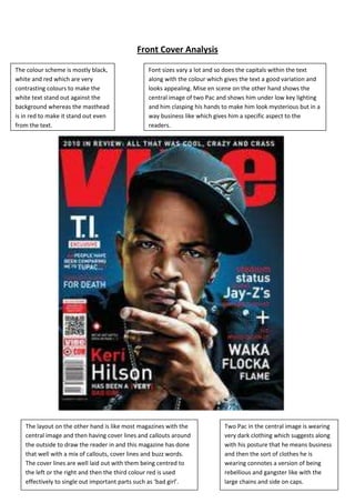
Front Cover Analysis

The colour scheme is mostly black,              Font sizes vary a lot and so does the capitals within the text
white and red which are very                    along with the colour which gives the text a good variation and
contrasting colours to make the                 looks appealing. Mise en scene on the other hand shows the
white text stand out against the                central image of two Pac and shows him under low key lighting
background whereas the masthead                 and him clasping his hands to make him look mysterious but in a
is in red to make it stand out even             way business like which gives him a specific aspect to the
from the text.                                  readers.


   The layout on the other hand is like most magazines with the            Two Pac in the central image is wearing
   central image and then having cover lines and callouts around           very dark clothing which suggests along
   the outside to draw the reader in and this magazine has done            with his posture that he means business
   that well with a mix of callouts, cover lines and buzz words.           and then the sort of clothes he is
   The cover lines are well laid out with them being centred to            wearing connotes a version of being
   the left or the right and then the third colour red is used             rebellious and gangster like with the
   effectively to single out important parts such as ‘bad girl’.           large chains and side on caps.
Front Cover Analysis
                      The page layout seems to be typical ‘VIBE’ layout due to it having the
                      central image actually cover up most of the masthead but still leaving
                      enough so readers know what it is but this is only possible by having
                      a large reputation already. Not many cover lines are used but they
                      use a main cover line and use the colour red to make it stand out as
                      well as a large font size. Varying fonts are used for each cover line.


The colour scheme seems to
be grey white and red but
does have parts that are
black but are mainly used in
small places to make the text
contrasting to its background.
The red is rarely used but for
that exact reason it is made
very effective by being used
on the main cover line along
with a buzz word of
‘exclusive’.


                                 The central image has a sinister facial expression but also looking a bit
                                 mysterious along with it again to draw in the reader’s attention. His
                                 clothing is contrasting colours to help him stand out at the same time
                                 blend with the background and the chain around his neck gives him a
                                 gangster look on him. He is also wearing a grey hat which helps to blend
                                 him into the background and keep him to the colour scheme for
                                 unification of the front cover.
Front Cover Analysis
  The colour scheme is yet again dark colours except this time the background has a glow behind
  the central image which makes him stand out even more in the centre of the cover. This front
  cover seems to actually use four colours of white black red and yellow but in specific places: red is
  used as the titles of the cover lines and backgrounds to the flash and adverts on the front cover
  and yellow is used to make specific parts of text stand out against the rest such as ‘Special’.


The central image is again
under low key lighting to
give him a more sinister
serious look to him and his
gesture is as if he is reading
someone’s mind which I
am unsure of the
implications but I imagine
it is to make him look
mysterious but also have
some relationship with the
main cover line. His
clothing on the other hand
is just a plain red shirt
which works with the
colour scheme and helps to
create that merging effect
and make the whole front
cover work well together.


  The layout of this page again is like most magazines          The text is well presents again with varying use of
  with the central image surrounded by cover lines and          colours but fonts seems to be more important in
  more but this time there is a central cover lines             this by them using it to single out more important
  referring to the central image which uses powerful            parts of text such as ‘wants you’ and they have also
  rhetorical questions to draw in the reader and shows          used it all in capitals to give it a powerful effect but
  that it is the main story of the magazine. This front         mainly the main cover line is in a different font,
  cover though also contains a by line above the mast           colour and position entirely to make it stand out as
  head and has used many more buzz words than the               much as possible.
  first I have analysed.
Front Cover Analysis
               This magazine front cover has an interesting colour scheme because it is black
               and white which is odd firstly because it makes ‘XXL’ stand out much more than
               most magazines would approve of but also because the background is as if he is
               stood under lamp light on a street which along with his gesture makes him look
               very sinister and almost dangerous. Like all the magazines they use white and
               black for contrasting colours.


The central images gesture is very sinister       This magazine front cover also has very few cover lines along
looking and his clothing is clearly something     it and has its main one as a callout which shows that they
black but is blurred to make it blend into the    focus on the image mostly grabbing the attention of its
background but also to give the background        readers and by making it a large part of the front cover but
a variety. They blurred this again to get all     also having a callout for the main image is in a way like
the attention onto his facial expression and      anchorage for the image. The fonts involved are not in
on the close up camera shot they used.            capitals but are sharp fonts to grab attention.
Front Cover Analysis
    The central image is the                 The colour scheme is very dark with like
    length of the front cover                most of their magazine, black white and
    which instantly takes control            red. These colours are used well to give
    but is almost seen as an                 variety to the front cover but also the
    anchorage to the main cover              excessive use of black connotes
    line below it due to it                  seriousness to the magazine issue and
    blending with the                        darkness to it.
    background so well. His
    gesture is quite relaxed and
    laid back with his hands
    suggesting he is a musician
    but also he is a rapper. His
    clothing is black and white
    which works with the colour
    scheme and is also wearing a
    lot of rings and a watch
    which suggests a gangster
    sort of look but also a rich
    look.


Text plays a big part in this
magazine front cover because
like a few of them they have a
main cover line which in this one
is the thing that grabs the
attention of the reader the most
in my opinion with the font of it
being as if it is worn away which
connotes again a gangster sort of
look to it. The cover lines around
the image moves with him like
the ones that are aligned around
his shoulder which gives him
central stage more to the cover
lines and in a sense gives it more
importance. The fonts vary like
most magazine front covers and
are used in this one solely for the
purpose of giving them
importance.
Contents Page Analysis
The layout of the page is                    The colour scheme of the whole
again very well done with no                 contents page is well made with the
use of a bleed which gives it a              use of only black and white to make
flowing effect and they have                 them as contrasting as possible and
made the header a good size                  then inject a bit of colour using the
which black lines to separate                one image which takes up half the
it from the body of text. The                page.
proximity of the image and
body of text is done well by
giving them both almost an
equal amount of the page but
the image being slightly
bigger meaning it gains
importance which is very well
made.


Mise en scene is important on
this page because it gives the
page a lot of colour through
what he is wearing and his
clothes are also very gangster
looking and has a cool looking
effect with the use of the
sunglasses. His gesture is also
important because him being
crouched down facing towards
the body of text is as if he is
related to it so they make them                   Fonts don’t vary very much only with
link using the image instead of                   the header and it being abbreviated
numbers or page layout. This                      gives it a more relaxed feel to the
effect is important to get right                  page but apart from that it is
but is difficult to make the                      relatively the same throughout due
image really link with the body                   to the body of text only being the
of text.                                          real text on the page.
Contents Page Analysis

The colour scheme of this magazine
contents page is as if the central image
was in a spotlight with the black fading
into a light grey and the text is black and
white which are contrasting colours
which suggests is potentially more male
but is not exactly clear with black and
white.


The layout is unusual but definitely
signifies it is a male target audience due
to the female central image almost being
wrapped around the texts and using her
as a border as well as the main attention
of the contents page so this strongly
suggests it’s of a male target audience


The central image of a female instantly
connotes it’s a male audience with the
way she is dressed in clothing that shows
off a lot of skin as well as the position she
has put herself in and even her facial
expression all suggest she is aimed at the
audience in a sexual sense to make them
find her attractive so this is clearly a male
audience without a doubt.


The fonts generally are difficult to make
to apply to a specific audience but with
this contents page they use fancy writing
for the sub headers but for the made
header of the contents page they use
very bold but smooth writing to grab the
attention without implying anything
further
Contents Page Analysis


The page layout seems to be a
typical ‘doin’ lines’ layout with the
image and the text sharing the
canter of the page which will
hardly suggests to the target
audience because it is a simple
way of integration of the text and
the central image.


The colour scheme I believe is
aimed very much at a male target
audience due to the black and
white which can be seen as both
genders but then with the mixes
of red against the black gives it
that male look and aspect about it
which you simply wouldn’t get if it
was just white and black.


The text on this contents page
clearly shows its of a male target
audience through its use of
abbreviations in the title of doing
and this is typically male due to
the connotations of those sorts of
language are of gangsters who do
tend to be typically male but apart
front that, the font size or the font
do not connote either side of the
target audience. The slang use of
the word doing also suggests its           The central image of this contents page also strongly suggests
target audience is of a younger            a male target audience of the younger generation due to the
origin and is aimed at young               way he is dressed suggests a gang culture or rap culture which
adults or teenagers.                       nowadays is appealing to those age groups and his gesture is of
                                           a ‘hard’ nature which suggests again that he is of a dangerous
                                           sort of background
Contents Page Analysis

The colour scheme does not
really imply anything to do with
the target audience that I can
find apart from that they are
quite happy people as the
colour scheme is mostly white
so it isn’t a dark looking
contents page. The fact the
central image is wearing a
white shirt which blends into
the background almost
completely shows a good
integration of the central
image and the background and
the fact he is black makes him
stand out so it still keeps the
image there on the page and
grabs attention but leaves out
his actually body.


The layout of the page does
not really imply an audience
either due to it being very open
with very little text actually on
the page and a lot of the page
being white so I am unsure
how the layout would actually
connote to a specific Audience
due to the very simple layout
and very open layout.


    The text and fonts do not really imply much about the
    target audience either but it’s the main image along
    with the colour scheme that mostly implies the target
    audience is of a younger generation of males due to
    the large chains being worn and the sunglasses to
    make him look ‘cool’ and therefore appealing to a
    younger male audience.
Contents Page Analysis


The layout of this contents page
seems to be typical of the VIBE
magazine due to the header
‘contents’ being split into 3 lines.
The layout does not tell us much
about their target audience and
is therefore difficult to analyse.
On the other hand the central
image shows us that it is of a
male target audience due to the
jewellery he is wearing and his
gesture towards the audience
shows it is of a younger
generation.


The colour scheme is an unusual
one to find on contents pages
and is red and white which seem
to be quite masculine colours in
the sense that it is used with the
text being white and the
background being a dark maroon
sort of red.


The text is an interesting way of
appealing to a specific target
audience because it suggests
strongly that this is focused at a
male target audience because of
the text tattooed on the central
images body although all the text
around the outside
Double Page Spread Analysis


       The central image of the female looks rather sexual and is in a sexual position on the flag
       which means that they are targeting an audience of males due to the sexual attraction of
       the female and suggests its adults or younger not old men.


Although the central image is suggesting            The colour scheme of this page is bright colours which
the magazines target audience is of                 suggest it has an uplifting mood to it. The colour scheme of
males, the text is very elegant and                 black and white work well due to them being contrasting
therefore suggests that they are actually           colours but then the central image is of the American flag
aiming at a more feminine audience so it            with the red which really helps to make this image stand
remains as conflicting.                             out from the double page spread.
Double Page Spread Analysis

 The layout of this page                 The colour scheme is unusual on this page because it is white and
 instantly suggests it’s meant           black but then the image strip on the top of the page is in grey and
 for a feminine target                   then the main image is in normal colour which is to make the
 audience due to the image               central image stand out as the most important one and to gather
 strip around the top of the             the most attention from the audience. This odd colour scheme
 page as if it was many                  again suggests that it is aimed at a female target audience because
 photos from a catwalk.                  it uses bright colours but also uses a feminine looking blue.


Text and font does not really tell us much about               The central image suggests it is a female target
the target audience apart from that the way it is              audience because unlike the other ones with a
written and the language used such as ‘forget                  male target audience it does not have her in a
her sister’ and is written in a very different way             sexual position but hasher more in a more
to which text is written towards males so in a                 fashionable position as if she’s showing off her
sense it is aimed again at females but is difficult            clothing instead of her sexuality so it seems
to gain evidence.                                              more aimed at females.
Double Page Spread Analysis
The colour scheme in this double page spread is            The central image shows us that the target
very good because it uses the colour of the hat as         audience is males because he has a malicious look
the main header which is a good way of linking             about him and is dressed up as if he were a
them but this also shows again like most of them           gangster and he is wearing masculine clothes and
that their target audience is of the younger               so it gives off an impression that its targeted to
generation of males due to the use of the colours          males other than females who would have him in a
of black and white and a dark orange colour.               sexual pose if it was aimed to females.


   The page layout does not tell us much
                                                     Text on the other hand actually does tell us quite a
   about the target audience because it is
                                                     bit about the target audience because of the actual
   not integrated through the means of
                                                     font used. They use a font which is usually used in
   the page layout but instead through
                                                     basketball matches which suggest that their target
   colour so they simply have one side of
                                                     audience is males because it’s stereotypically males
   the double page spread as the image
                                                     who play basketball but also shows us that it’s aimed
   and then the other side as the body of
                                                     at an active audience.
   text.
Double Page Spread Analysis
The page layout like a lot of the time                 The text tells us a lot about the target audience because of
does not tell us much about the target                 the slang they use and the fact they use stars to block out
audience apart from that it is quite                   words which would be rude and unauthorised in magazines
informative to them because only one                   which suggests that it is a young target audience and for
half of the double page spread is the                  people who are not light hearted but also that again its
central image.                                         aimed at partially more males than females because
                                                       stereotypically its mainly males who swear.


The central image is very clear that it’s a young                  The colour scheme does not tell us much
male audience because of the way they are stood                    about the target audience which is unusual
suggests they are stereotypical rappers but also                   because it is more or less just black and
because they are not in a sexual pose shows that                   white apart from the image which is black
it is aimed more towards males. Their clothing                     and grey which are rather dull colours and
also tells us it’s male because they are wearing a                 so it does not give away much about the
lot of jewellery and a hat which is stereotypical of               audience due to black and white being
young male singers.                                                potentially both genders.
Double Page Spread Analysis
Page layout of the double page spread         The central image tells us that unlike the other
does not seem to tell us much about the       ones it is a bit less aimed towards rebellious
target audience but again like the last one   teenagers/adults due to it being in black and
I analysed that it’s quite informative and    white and his clothing and gesture being rather
that they like to keep the image and text     calm and generic with no real intent to imply
spate on the page to make the text easier     something from the way the image is. They do
to read.                                      make the image stretch across the header a bit to
                                              suggest its connection to the story.


  The colour scheme again does not tell us       The text in this double page spread is the thing
  much about the target audience apart           that mainly shows us the target audience
  from that its aimed at males a bit more        which is male due to the header being ‘trilla’
  than females because of the red being          suggests it is male because it is slang and is the
  used in the header to make it stand out        singers stage name which suggests a male
  from the page whereas the rest of the          connection but apart from that the text and
  page is in black and white.                    font is relatively normal and hard to distinguish
                                                 what the target audience is from it.

15 analysis'

  • 1.
    Front Cover Analysis Thecolour scheme is mostly black, Font sizes vary a lot and so does the capitals within the text white and red which are very along with the colour which gives the text a good variation and contrasting colours to make the looks appealing. Mise en scene on the other hand shows the white text stand out against the central image of two Pac and shows him under low key lighting background whereas the masthead and him clasping his hands to make him look mysterious but in a is in red to make it stand out even way business like which gives him a specific aspect to the from the text. readers. The layout on the other hand is like most magazines with the Two Pac in the central image is wearing central image and then having cover lines and callouts around very dark clothing which suggests along the outside to draw the reader in and this magazine has done with his posture that he means business that well with a mix of callouts, cover lines and buzz words. and then the sort of clothes he is The cover lines are well laid out with them being centred to wearing connotes a version of being the left or the right and then the third colour red is used rebellious and gangster like with the effectively to single out important parts such as ‘bad girl’. large chains and side on caps.
  • 2.
    Front Cover Analysis The page layout seems to be typical ‘VIBE’ layout due to it having the central image actually cover up most of the masthead but still leaving enough so readers know what it is but this is only possible by having a large reputation already. Not many cover lines are used but they use a main cover line and use the colour red to make it stand out as well as a large font size. Varying fonts are used for each cover line. The colour scheme seems to be grey white and red but does have parts that are black but are mainly used in small places to make the text contrasting to its background. The red is rarely used but for that exact reason it is made very effective by being used on the main cover line along with a buzz word of ‘exclusive’. The central image has a sinister facial expression but also looking a bit mysterious along with it again to draw in the reader’s attention. His clothing is contrasting colours to help him stand out at the same time blend with the background and the chain around his neck gives him a gangster look on him. He is also wearing a grey hat which helps to blend him into the background and keep him to the colour scheme for unification of the front cover.
  • 3.
    Front Cover Analysis The colour scheme is yet again dark colours except this time the background has a glow behind the central image which makes him stand out even more in the centre of the cover. This front cover seems to actually use four colours of white black red and yellow but in specific places: red is used as the titles of the cover lines and backgrounds to the flash and adverts on the front cover and yellow is used to make specific parts of text stand out against the rest such as ‘Special’. The central image is again under low key lighting to give him a more sinister serious look to him and his gesture is as if he is reading someone’s mind which I am unsure of the implications but I imagine it is to make him look mysterious but also have some relationship with the main cover line. His clothing on the other hand is just a plain red shirt which works with the colour scheme and helps to create that merging effect and make the whole front cover work well together. The layout of this page again is like most magazines The text is well presents again with varying use of with the central image surrounded by cover lines and colours but fonts seems to be more important in more but this time there is a central cover lines this by them using it to single out more important referring to the central image which uses powerful parts of text such as ‘wants you’ and they have also rhetorical questions to draw in the reader and shows used it all in capitals to give it a powerful effect but that it is the main story of the magazine. This front mainly the main cover line is in a different font, cover though also contains a by line above the mast colour and position entirely to make it stand out as head and has used many more buzz words than the much as possible. first I have analysed.
  • 4.
    Front Cover Analysis This magazine front cover has an interesting colour scheme because it is black and white which is odd firstly because it makes ‘XXL’ stand out much more than most magazines would approve of but also because the background is as if he is stood under lamp light on a street which along with his gesture makes him look very sinister and almost dangerous. Like all the magazines they use white and black for contrasting colours. The central images gesture is very sinister This magazine front cover also has very few cover lines along looking and his clothing is clearly something it and has its main one as a callout which shows that they black but is blurred to make it blend into the focus on the image mostly grabbing the attention of its background but also to give the background readers and by making it a large part of the front cover but a variety. They blurred this again to get all also having a callout for the main image is in a way like the attention onto his facial expression and anchorage for the image. The fonts involved are not in on the close up camera shot they used. capitals but are sharp fonts to grab attention.
  • 5.
    Front Cover Analysis The central image is the The colour scheme is very dark with like length of the front cover most of their magazine, black white and which instantly takes control red. These colours are used well to give but is almost seen as an variety to the front cover but also the anchorage to the main cover excessive use of black connotes line below it due to it seriousness to the magazine issue and blending with the darkness to it. background so well. His gesture is quite relaxed and laid back with his hands suggesting he is a musician but also he is a rapper. His clothing is black and white which works with the colour scheme and is also wearing a lot of rings and a watch which suggests a gangster sort of look but also a rich look. Text plays a big part in this magazine front cover because like a few of them they have a main cover line which in this one is the thing that grabs the attention of the reader the most in my opinion with the font of it being as if it is worn away which connotes again a gangster sort of look to it. The cover lines around the image moves with him like the ones that are aligned around his shoulder which gives him central stage more to the cover lines and in a sense gives it more importance. The fonts vary like most magazine front covers and are used in this one solely for the purpose of giving them importance.
  • 6.
    Contents Page Analysis Thelayout of the page is The colour scheme of the whole again very well done with no contents page is well made with the use of a bleed which gives it a use of only black and white to make flowing effect and they have them as contrasting as possible and made the header a good size then inject a bit of colour using the which black lines to separate one image which takes up half the it from the body of text. The page. proximity of the image and body of text is done well by giving them both almost an equal amount of the page but the image being slightly bigger meaning it gains importance which is very well made. Mise en scene is important on this page because it gives the page a lot of colour through what he is wearing and his clothes are also very gangster looking and has a cool looking effect with the use of the sunglasses. His gesture is also important because him being crouched down facing towards the body of text is as if he is related to it so they make them Fonts don’t vary very much only with link using the image instead of the header and it being abbreviated numbers or page layout. This gives it a more relaxed feel to the effect is important to get right page but apart from that it is but is difficult to make the relatively the same throughout due image really link with the body to the body of text only being the of text. real text on the page.
  • 7.
    Contents Page Analysis Thecolour scheme of this magazine contents page is as if the central image was in a spotlight with the black fading into a light grey and the text is black and white which are contrasting colours which suggests is potentially more male but is not exactly clear with black and white. The layout is unusual but definitely signifies it is a male target audience due to the female central image almost being wrapped around the texts and using her as a border as well as the main attention of the contents page so this strongly suggests it’s of a male target audience The central image of a female instantly connotes it’s a male audience with the way she is dressed in clothing that shows off a lot of skin as well as the position she has put herself in and even her facial expression all suggest she is aimed at the audience in a sexual sense to make them find her attractive so this is clearly a male audience without a doubt. The fonts generally are difficult to make to apply to a specific audience but with this contents page they use fancy writing for the sub headers but for the made header of the contents page they use very bold but smooth writing to grab the attention without implying anything further
  • 8.
    Contents Page Analysis Thepage layout seems to be a typical ‘doin’ lines’ layout with the image and the text sharing the canter of the page which will hardly suggests to the target audience because it is a simple way of integration of the text and the central image. The colour scheme I believe is aimed very much at a male target audience due to the black and white which can be seen as both genders but then with the mixes of red against the black gives it that male look and aspect about it which you simply wouldn’t get if it was just white and black. The text on this contents page clearly shows its of a male target audience through its use of abbreviations in the title of doing and this is typically male due to the connotations of those sorts of language are of gangsters who do tend to be typically male but apart front that, the font size or the font do not connote either side of the target audience. The slang use of the word doing also suggests its The central image of this contents page also strongly suggests target audience is of a younger a male target audience of the younger generation due to the origin and is aimed at young way he is dressed suggests a gang culture or rap culture which adults or teenagers. nowadays is appealing to those age groups and his gesture is of a ‘hard’ nature which suggests again that he is of a dangerous sort of background
  • 9.
    Contents Page Analysis Thecolour scheme does not really imply anything to do with the target audience that I can find apart from that they are quite happy people as the colour scheme is mostly white so it isn’t a dark looking contents page. The fact the central image is wearing a white shirt which blends into the background almost completely shows a good integration of the central image and the background and the fact he is black makes him stand out so it still keeps the image there on the page and grabs attention but leaves out his actually body. The layout of the page does not really imply an audience either due to it being very open with very little text actually on the page and a lot of the page being white so I am unsure how the layout would actually connote to a specific Audience due to the very simple layout and very open layout. The text and fonts do not really imply much about the target audience either but it’s the main image along with the colour scheme that mostly implies the target audience is of a younger generation of males due to the large chains being worn and the sunglasses to make him look ‘cool’ and therefore appealing to a younger male audience.
  • 10.
    Contents Page Analysis Thelayout of this contents page seems to be typical of the VIBE magazine due to the header ‘contents’ being split into 3 lines. The layout does not tell us much about their target audience and is therefore difficult to analyse. On the other hand the central image shows us that it is of a male target audience due to the jewellery he is wearing and his gesture towards the audience shows it is of a younger generation. The colour scheme is an unusual one to find on contents pages and is red and white which seem to be quite masculine colours in the sense that it is used with the text being white and the background being a dark maroon sort of red. The text is an interesting way of appealing to a specific target audience because it suggests strongly that this is focused at a male target audience because of the text tattooed on the central images body although all the text around the outside
  • 11.
    Double Page SpreadAnalysis The central image of the female looks rather sexual and is in a sexual position on the flag which means that they are targeting an audience of males due to the sexual attraction of the female and suggests its adults or younger not old men. Although the central image is suggesting The colour scheme of this page is bright colours which the magazines target audience is of suggest it has an uplifting mood to it. The colour scheme of males, the text is very elegant and black and white work well due to them being contrasting therefore suggests that they are actually colours but then the central image is of the American flag aiming at a more feminine audience so it with the red which really helps to make this image stand remains as conflicting. out from the double page spread.
  • 12.
    Double Page SpreadAnalysis The layout of this page The colour scheme is unusual on this page because it is white and instantly suggests it’s meant black but then the image strip on the top of the page is in grey and for a feminine target then the main image is in normal colour which is to make the audience due to the image central image stand out as the most important one and to gather strip around the top of the the most attention from the audience. This odd colour scheme page as if it was many again suggests that it is aimed at a female target audience because photos from a catwalk. it uses bright colours but also uses a feminine looking blue. Text and font does not really tell us much about The central image suggests it is a female target the target audience apart from that the way it is audience because unlike the other ones with a written and the language used such as ‘forget male target audience it does not have her in a her sister’ and is written in a very different way sexual position but hasher more in a more to which text is written towards males so in a fashionable position as if she’s showing off her sense it is aimed again at females but is difficult clothing instead of her sexuality so it seems to gain evidence. more aimed at females.
  • 13.
    Double Page SpreadAnalysis The colour scheme in this double page spread is The central image shows us that the target very good because it uses the colour of the hat as audience is males because he has a malicious look the main header which is a good way of linking about him and is dressed up as if he were a them but this also shows again like most of them gangster and he is wearing masculine clothes and that their target audience is of the younger so it gives off an impression that its targeted to generation of males due to the use of the colours males other than females who would have him in a of black and white and a dark orange colour. sexual pose if it was aimed to females. The page layout does not tell us much Text on the other hand actually does tell us quite a about the target audience because it is bit about the target audience because of the actual not integrated through the means of font used. They use a font which is usually used in the page layout but instead through basketball matches which suggest that their target colour so they simply have one side of audience is males because it’s stereotypically males the double page spread as the image who play basketball but also shows us that it’s aimed and then the other side as the body of at an active audience. text.
  • 14.
    Double Page SpreadAnalysis The page layout like a lot of the time The text tells us a lot about the target audience because of does not tell us much about the target the slang they use and the fact they use stars to block out audience apart from that it is quite words which would be rude and unauthorised in magazines informative to them because only one which suggests that it is a young target audience and for half of the double page spread is the people who are not light hearted but also that again its central image. aimed at partially more males than females because stereotypically its mainly males who swear. The central image is very clear that it’s a young The colour scheme does not tell us much male audience because of the way they are stood about the target audience which is unusual suggests they are stereotypical rappers but also because it is more or less just black and because they are not in a sexual pose shows that white apart from the image which is black it is aimed more towards males. Their clothing and grey which are rather dull colours and also tells us it’s male because they are wearing a so it does not give away much about the lot of jewellery and a hat which is stereotypical of audience due to black and white being young male singers. potentially both genders.
  • 15.
    Double Page SpreadAnalysis Page layout of the double page spread The central image tells us that unlike the other does not seem to tell us much about the ones it is a bit less aimed towards rebellious target audience but again like the last one teenagers/adults due to it being in black and I analysed that it’s quite informative and white and his clothing and gesture being rather that they like to keep the image and text calm and generic with no real intent to imply spate on the page to make the text easier something from the way the image is. They do to read. make the image stretch across the header a bit to suggest its connection to the story. The colour scheme again does not tell us The text in this double page spread is the thing much about the target audience apart that mainly shows us the target audience from that its aimed at males a bit more which is male due to the header being ‘trilla’ than females because of the red being suggests it is male because it is slang and is the used in the header to make it stand out singers stage name which suggests a male from the page whereas the rest of the connection but apart from that the text and page is in black and white. font is relatively normal and hard to distinguish what the target audience is from it.