Download as PDF, PPTX


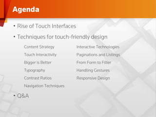
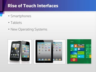
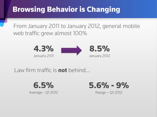
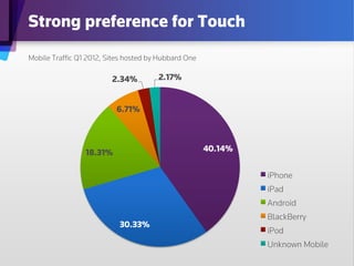


The document discusses the rise of touch interfaces and provides design techniques for creating touch-friendly experiences on smartphones and tablets. Key topics include content strategy, the importance of larger touch targets, responsive design, and effective navigation methods that enhance user experience. The document emphasizes tailored approaches for both handheld and tablet users while highlighting the evolving browsing behaviors due to increased mobile traffic.


