Download to read offline
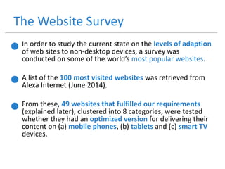
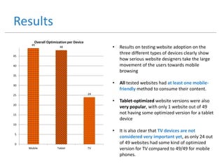
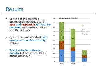
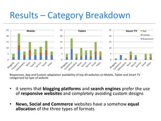
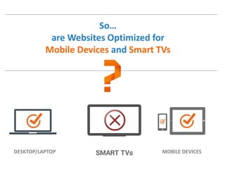

The document examines the optimization of websites for mobile devices and smart TVs, highlighting the need for tailored experiences for different device types due to varying user interactions and states. It reveals that while almost all tested websites had mobile-friendly versions, very few were optimized for smart TVs, leading to poor user experiences on these devices. The findings suggest a pressing need for improved web content designed specifically for smart TVs to satisfy user expectations and enhance accessibility.


![[Did you know] 모바일 전략과 웹앱 20130703](https://cdn.slidesharecdn.com/ss_thumbnails/didyouknow-20130703-131204010325-phpapp02-thumbnail.jpg?width=640&height=640&fit=bounds)


