


![Quirks & Unknowns
table[class=callout] {
width: 50% !important;
max-width: 50% !important;
height: auto !important;
padding: 0 0 3% 3%;
}
display: none;
#spopwebinar](https://image.slidesharecdn.com/multiscreen-webinar-final-130305114157-phpapp02/75/Multiscreen-Email-Design-Lessons-from-the-Pros-63-2048.jpg)
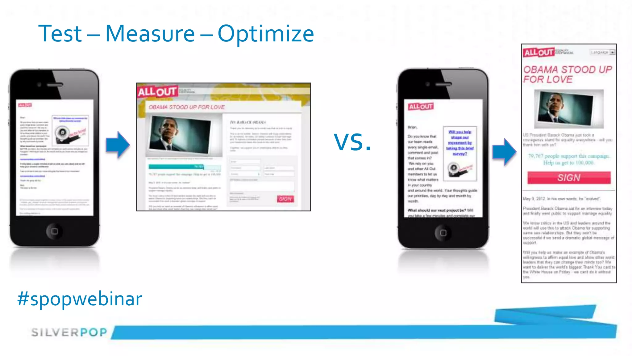


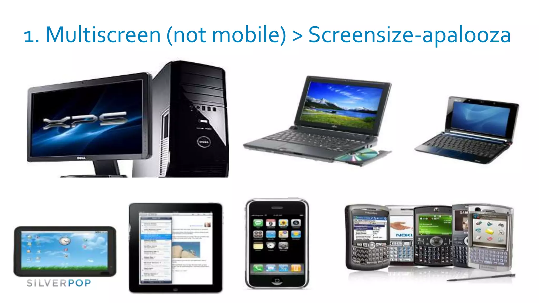
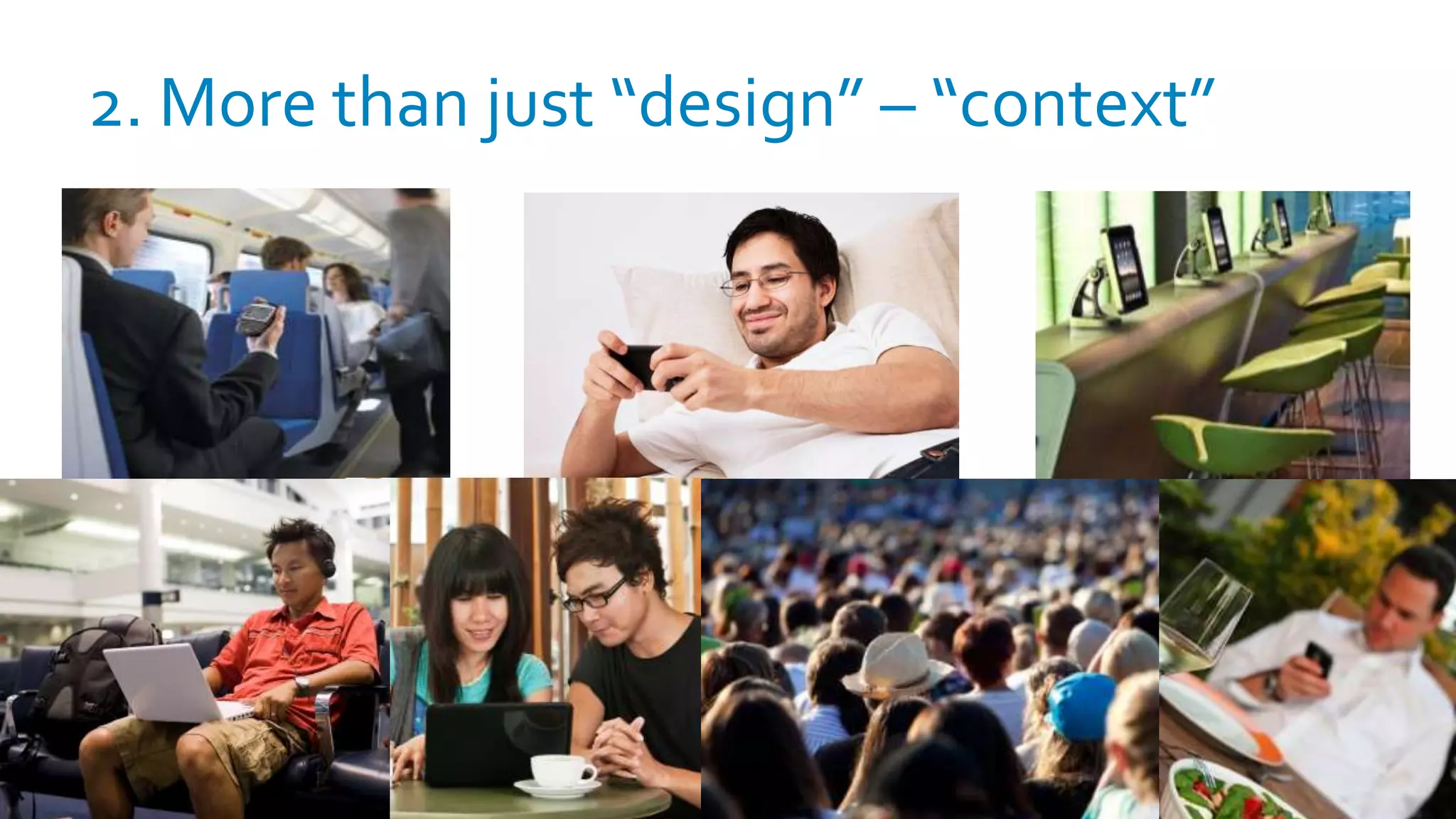
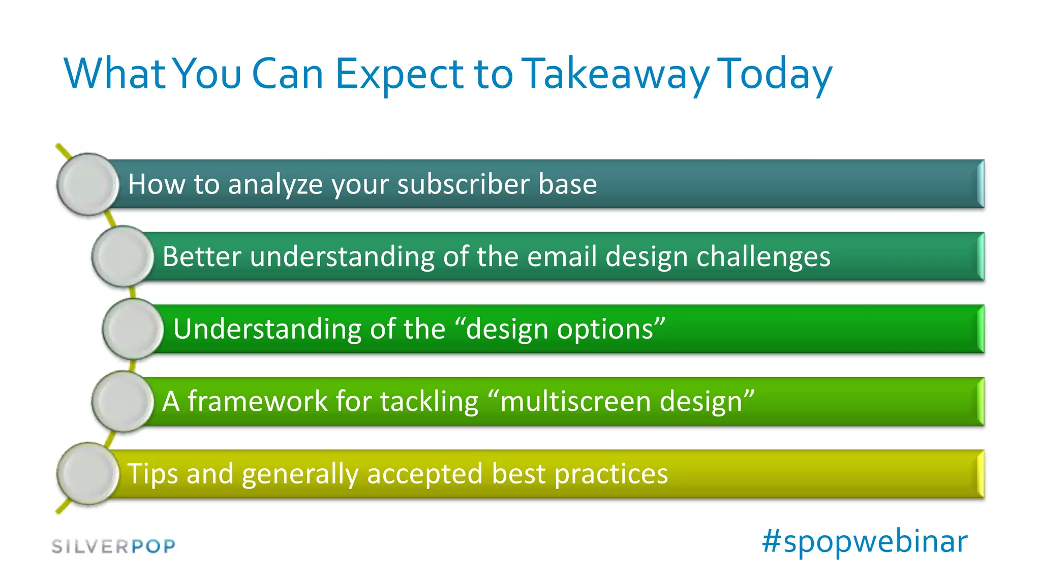
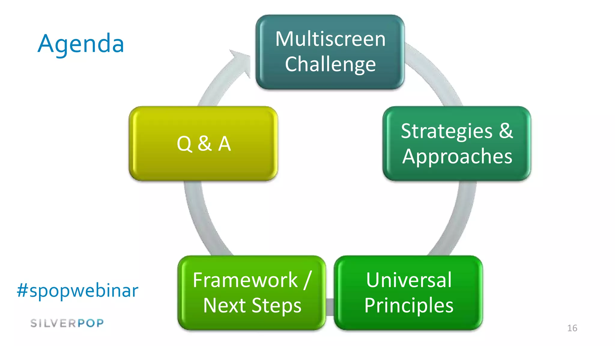
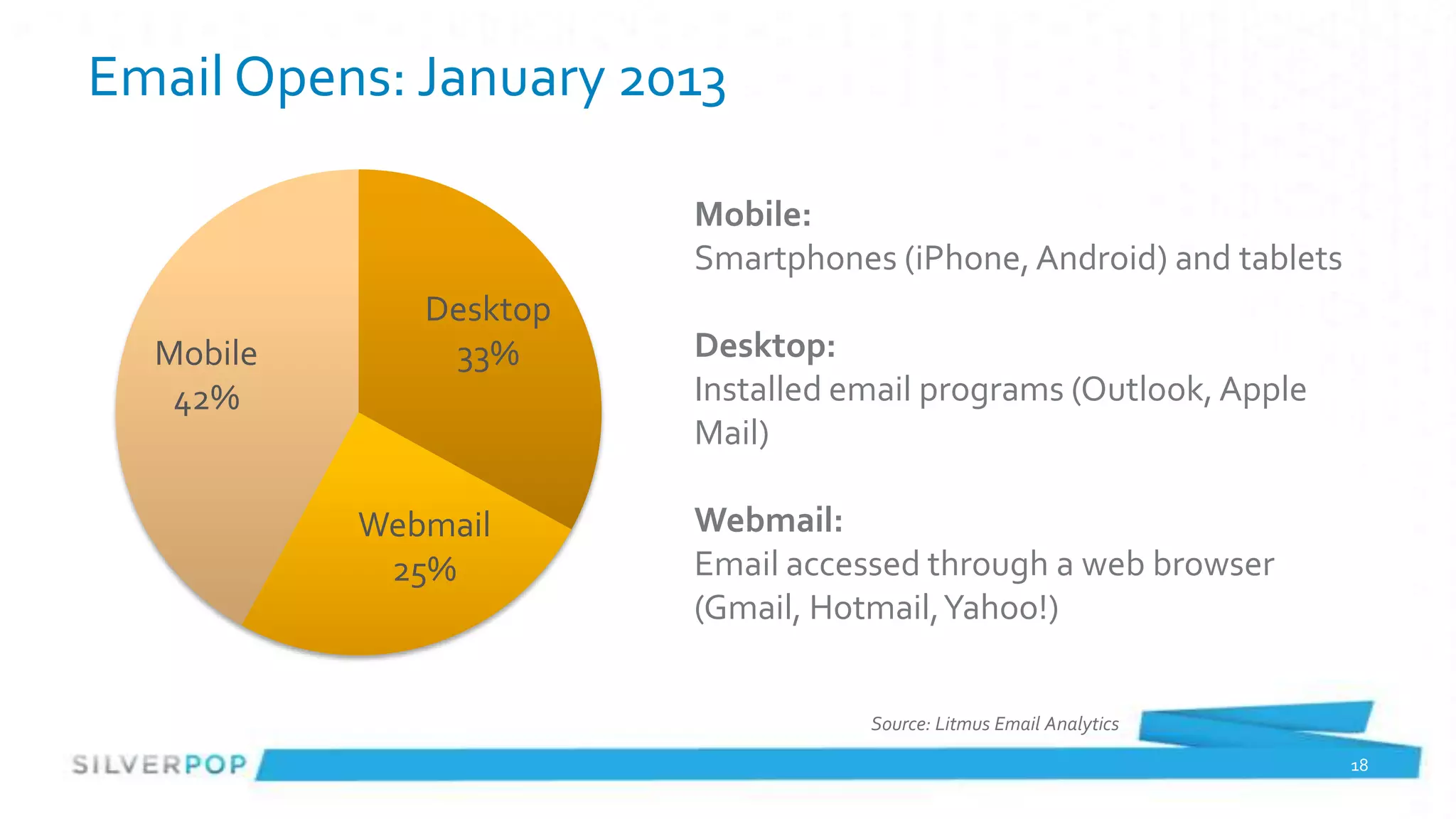
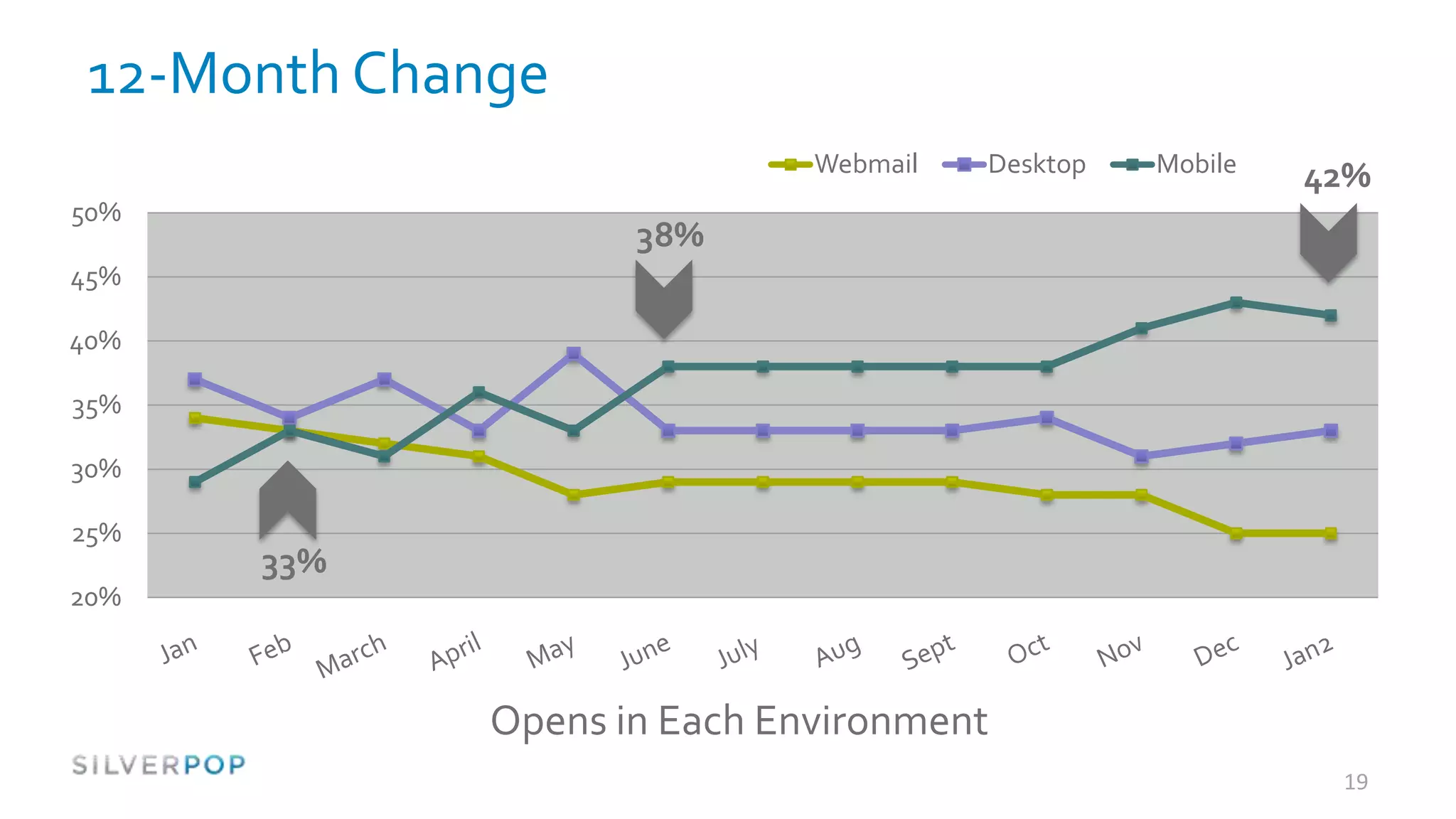
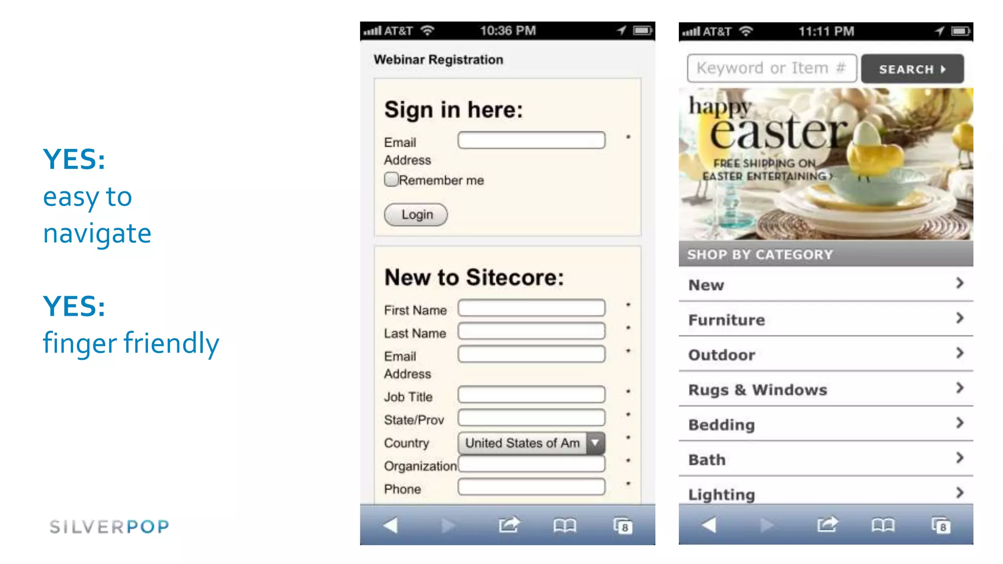
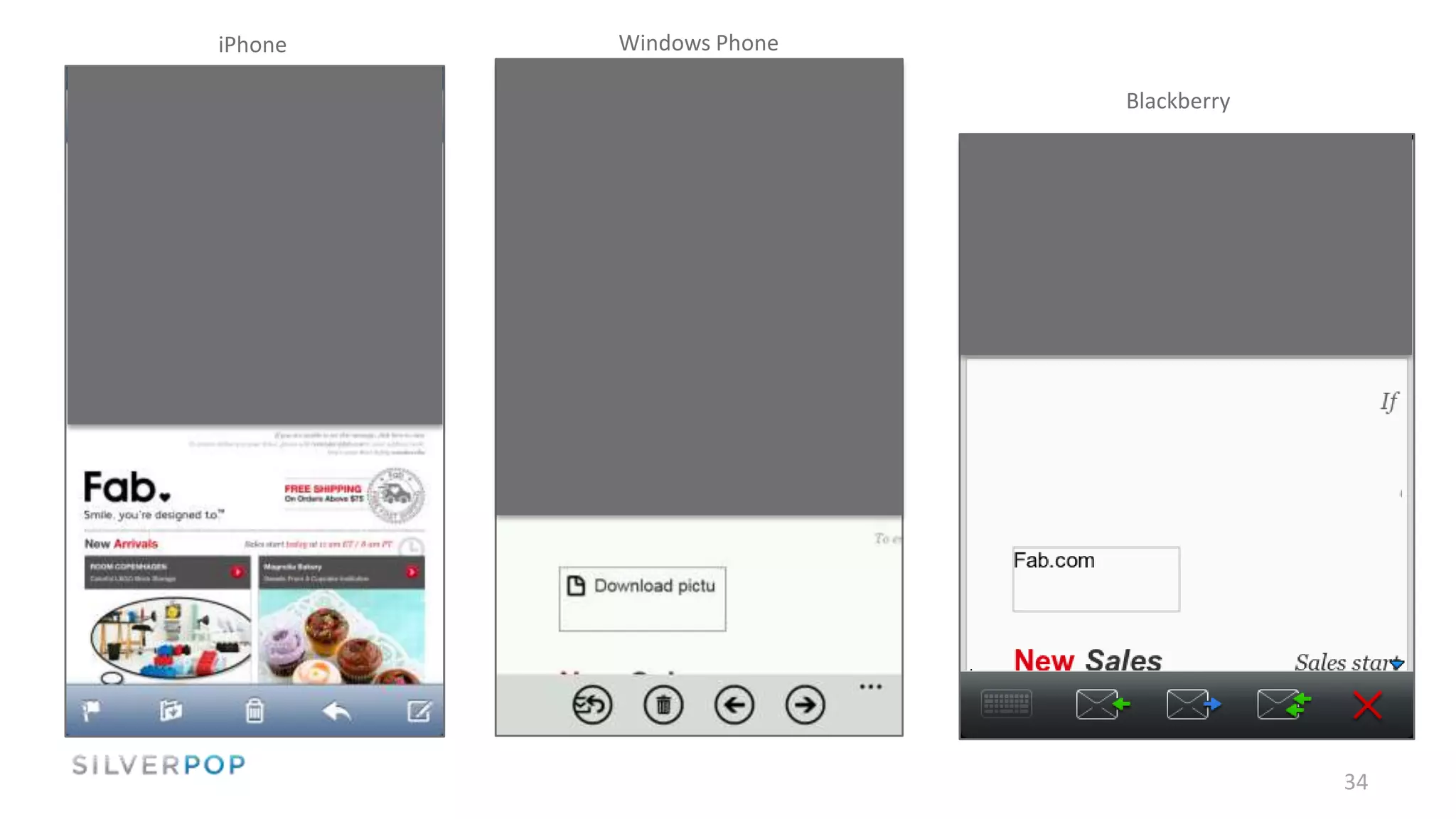
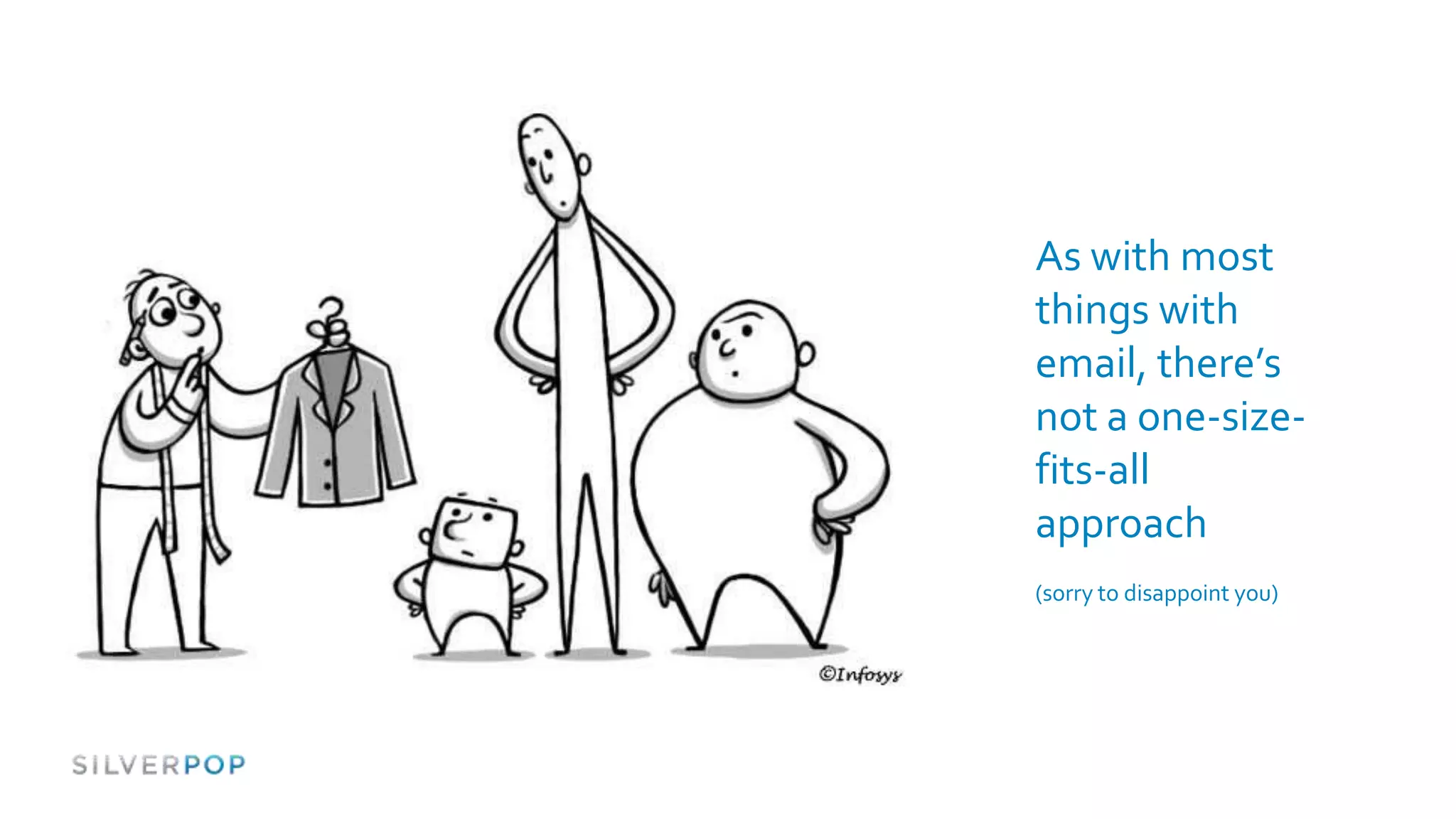
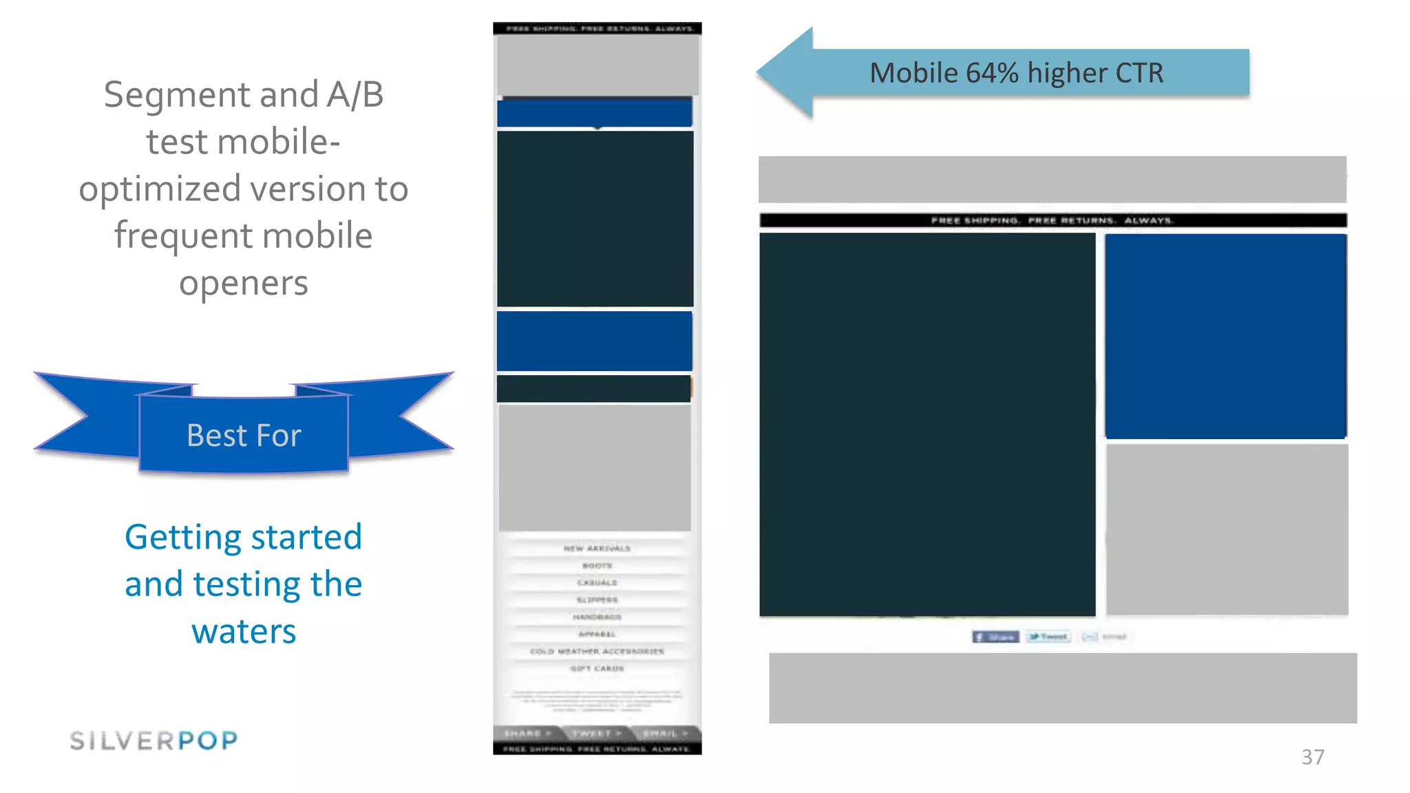
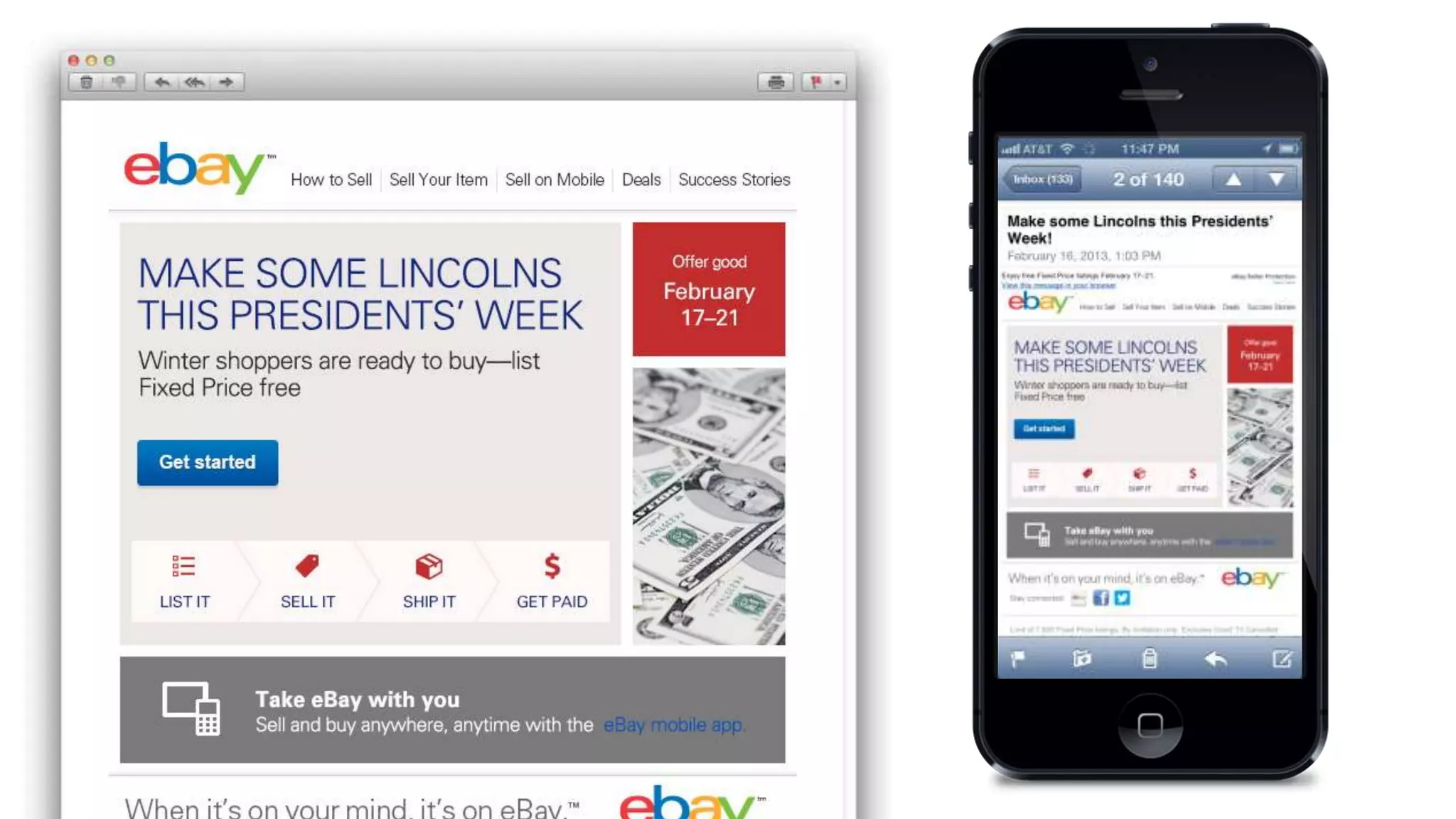
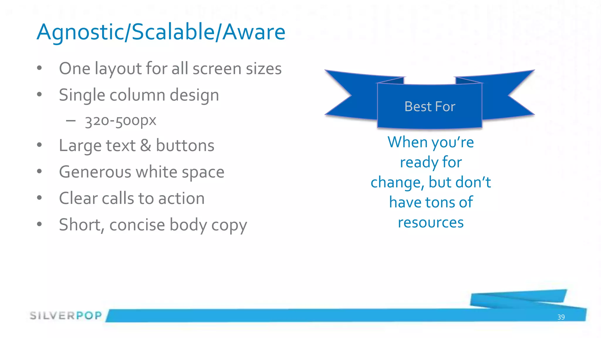
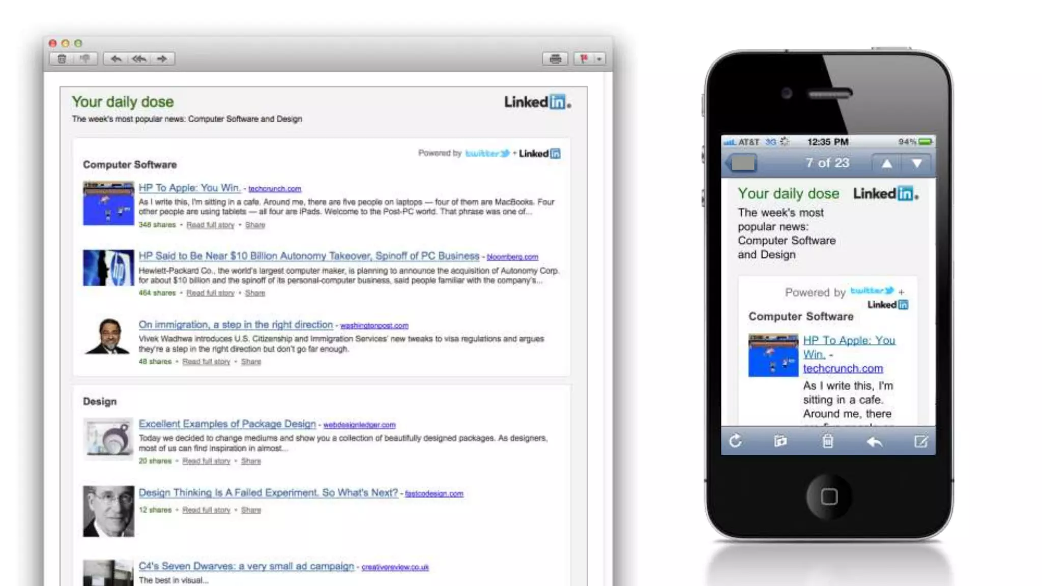
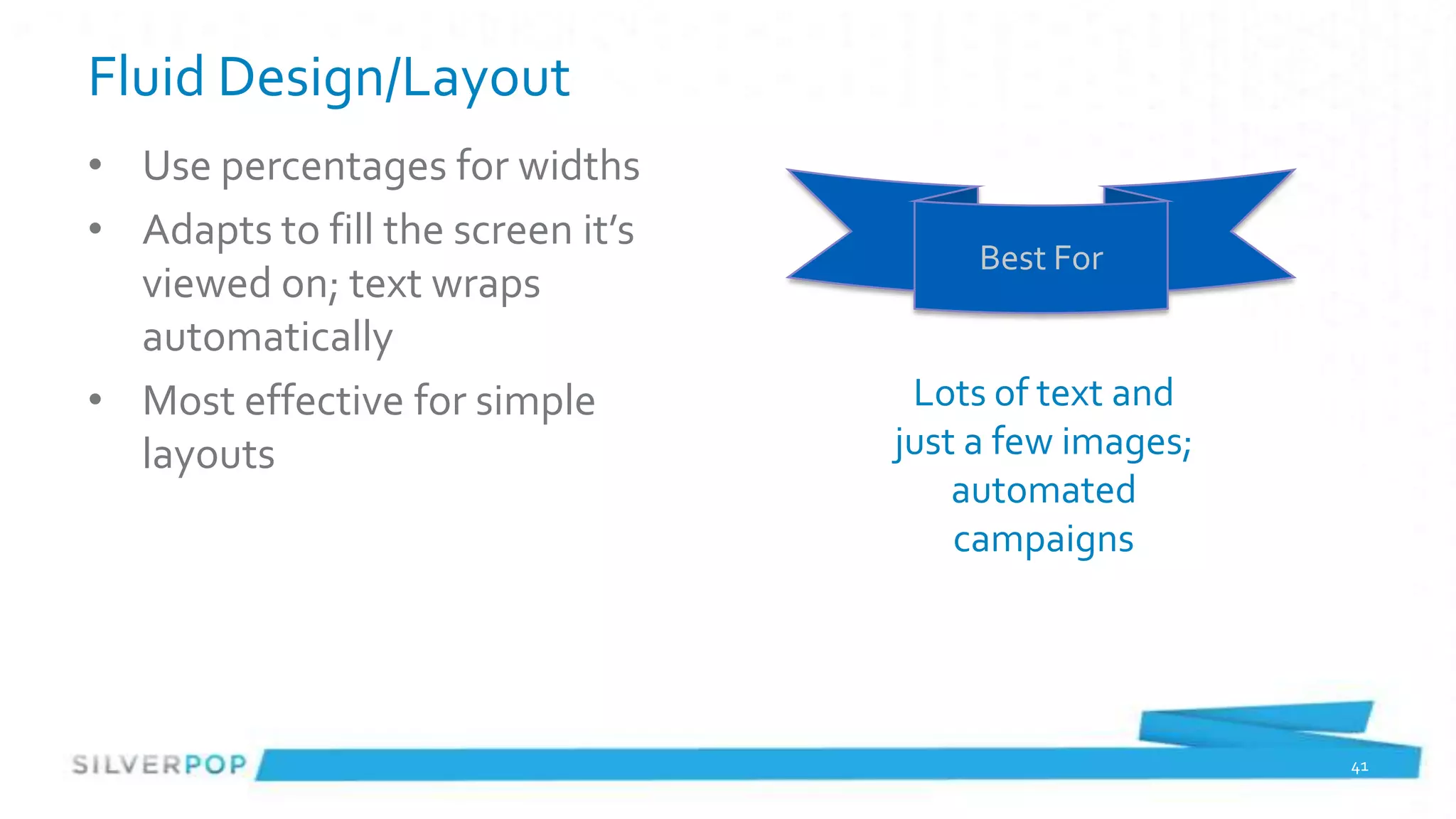
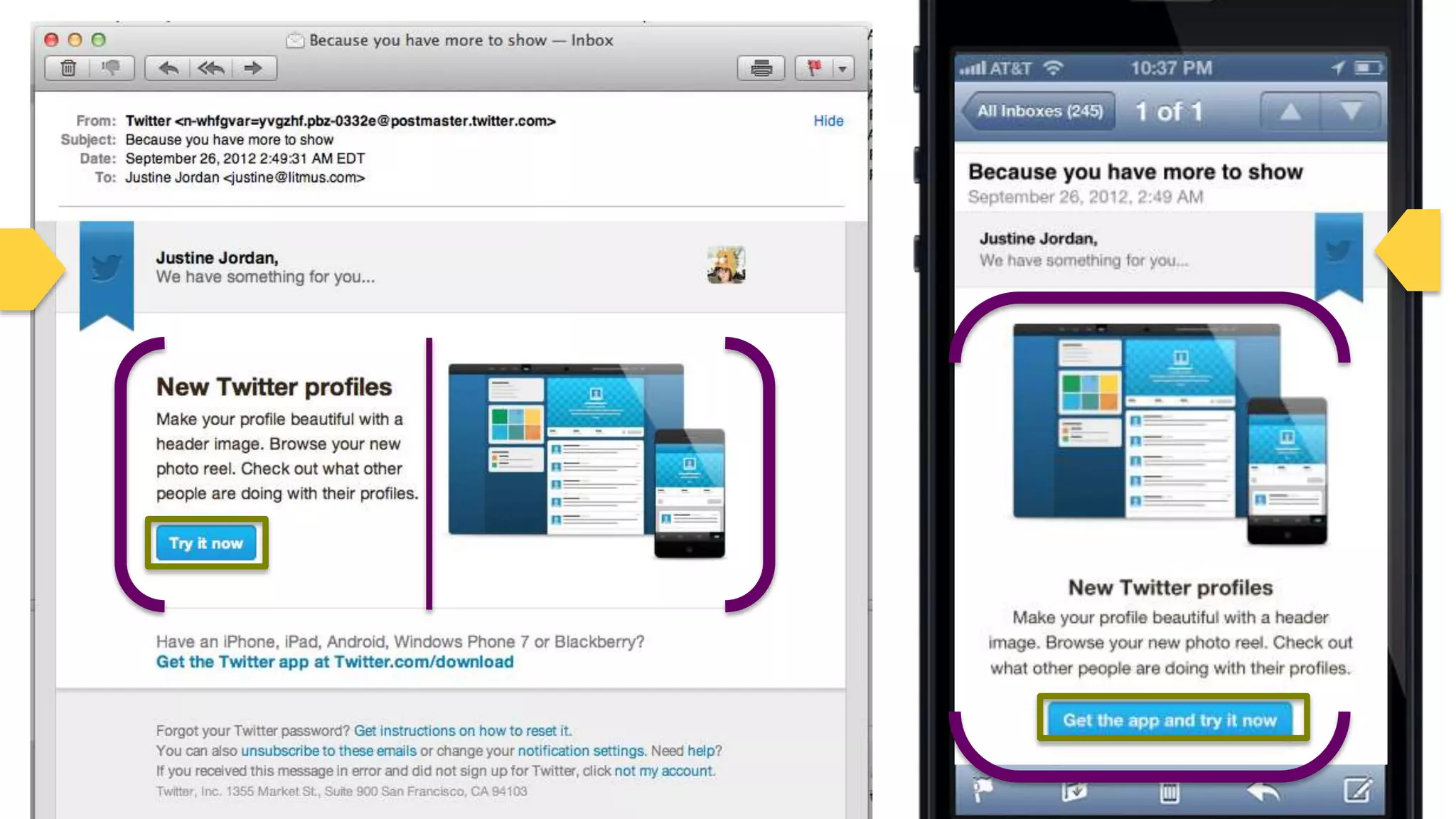
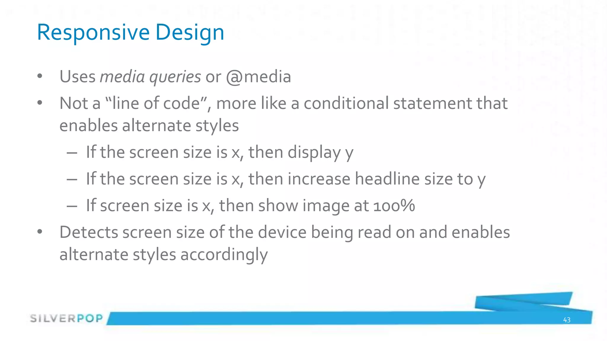
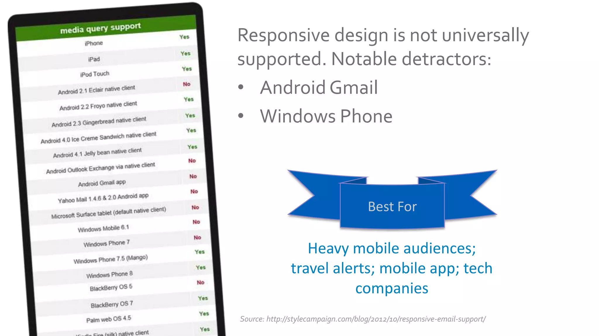
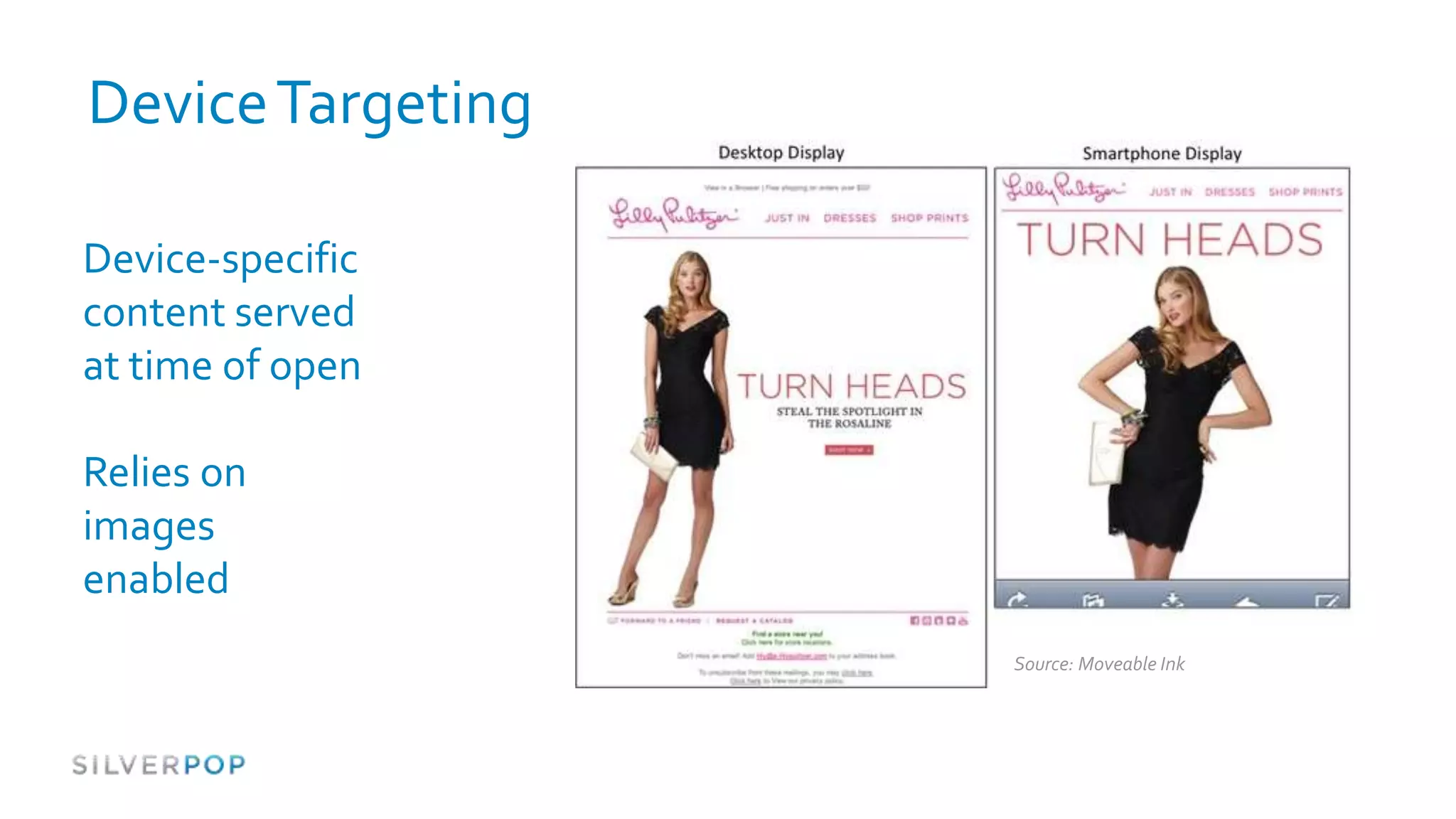
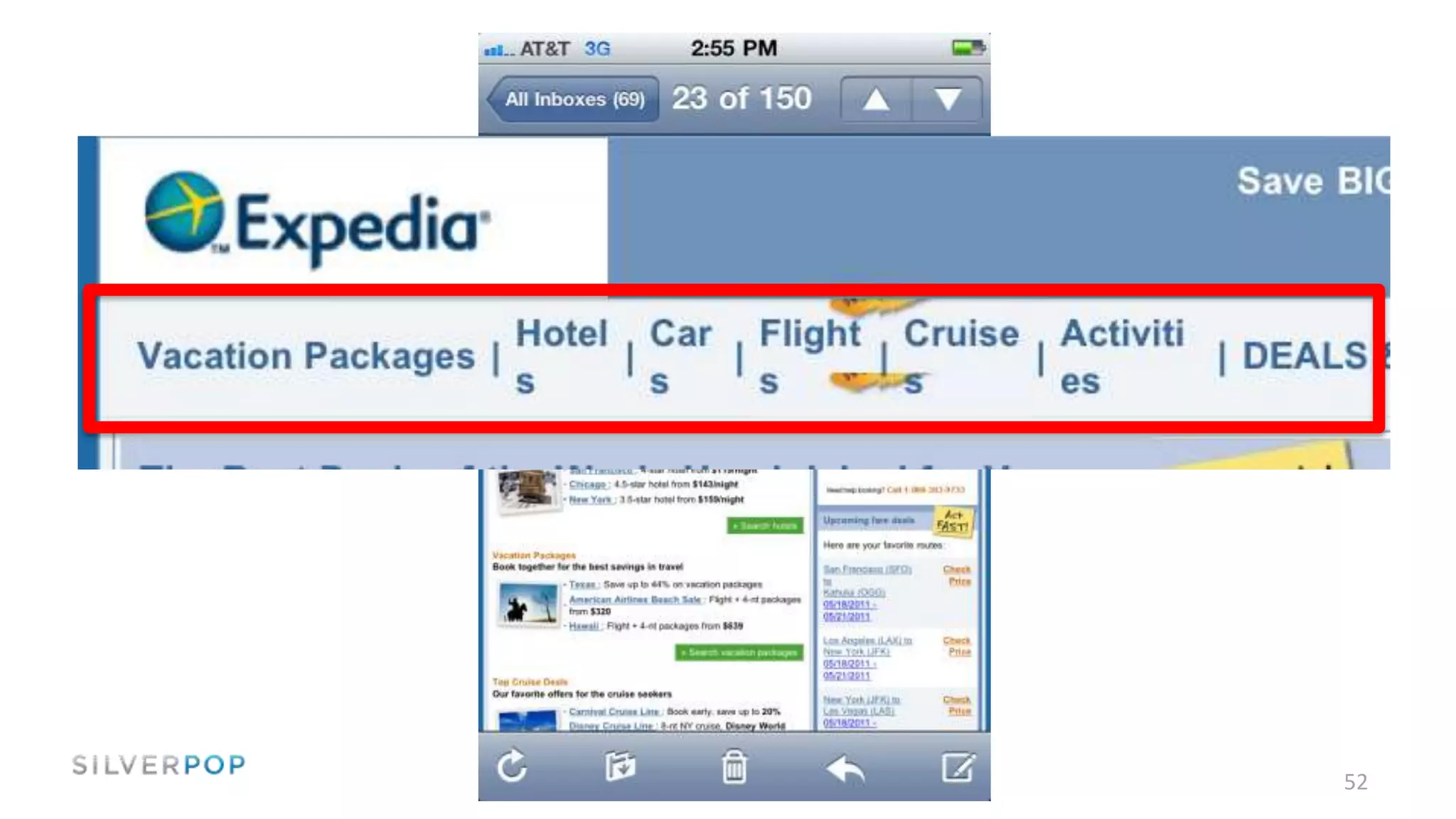
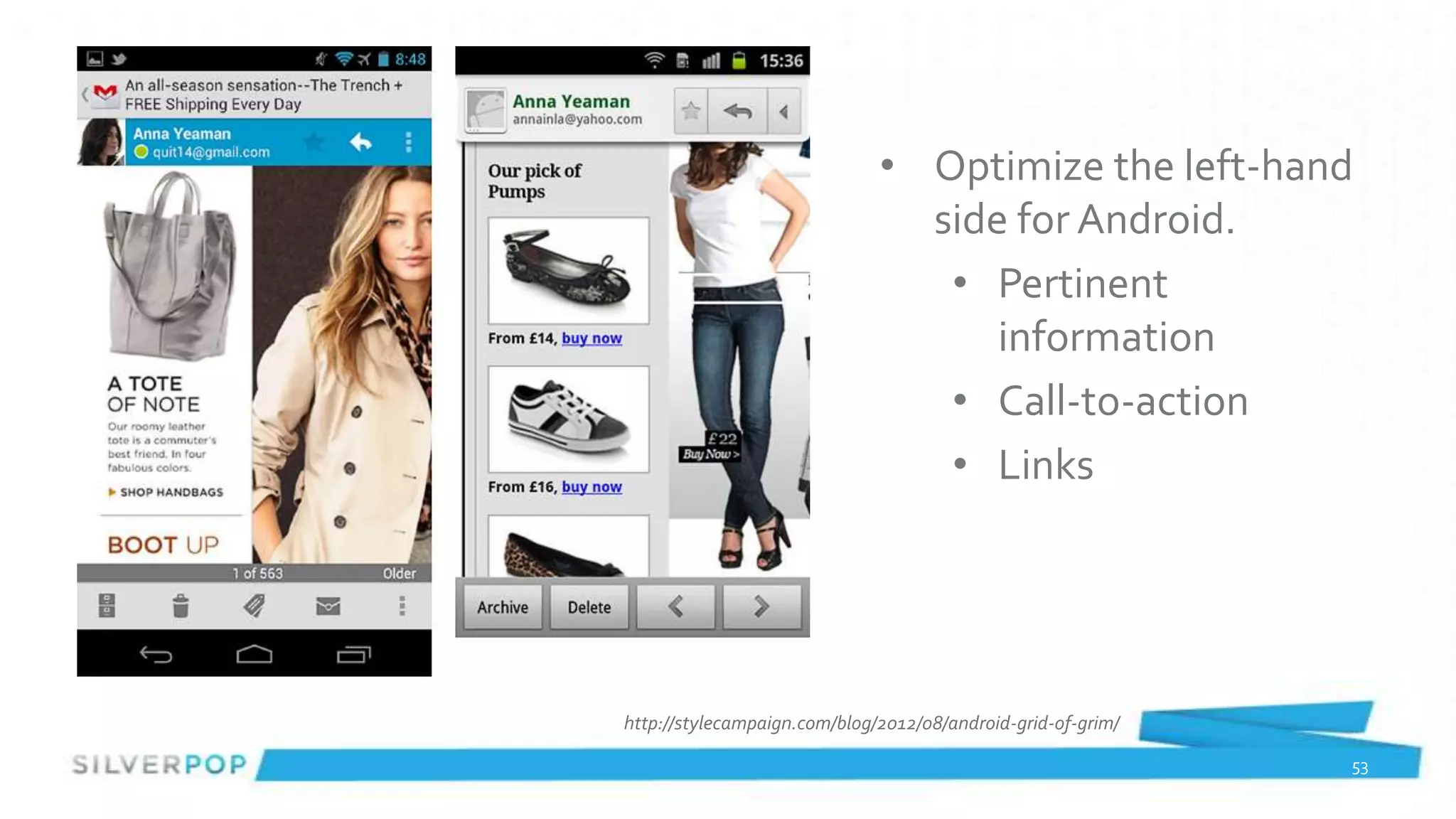
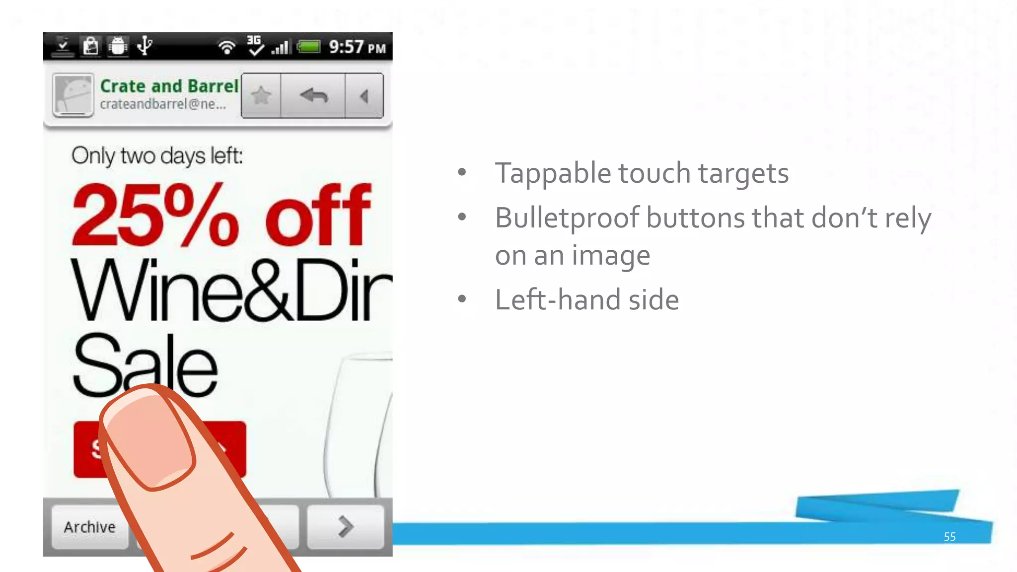
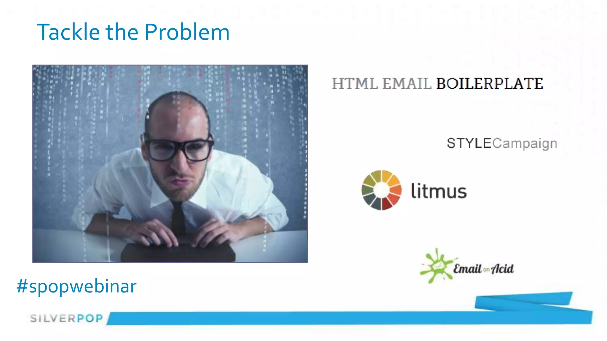
The webinar discusses the importance of multiscreen email design, particularly in light of significant mobile adoption by users. Topics include analyzing subscriber bases, understanding email design challenges, and various design options, along with best practices for optimizing emails for different screen sizes. Presenters emphasize that there is no one-size-fits-all approach and recommend scalable, responsive designs to enhance user engagement.


![Mobile-Friendly Email: Trends and Best Practices [Webinar with ActOn Software]](https://cdn.slidesharecdn.com/ss_thumbnails/mobilefriendlyemail-trendsandbestpractices-130304135339-phpapp02-thumbnail.jpg?width=640&height=640&fit=bounds)


