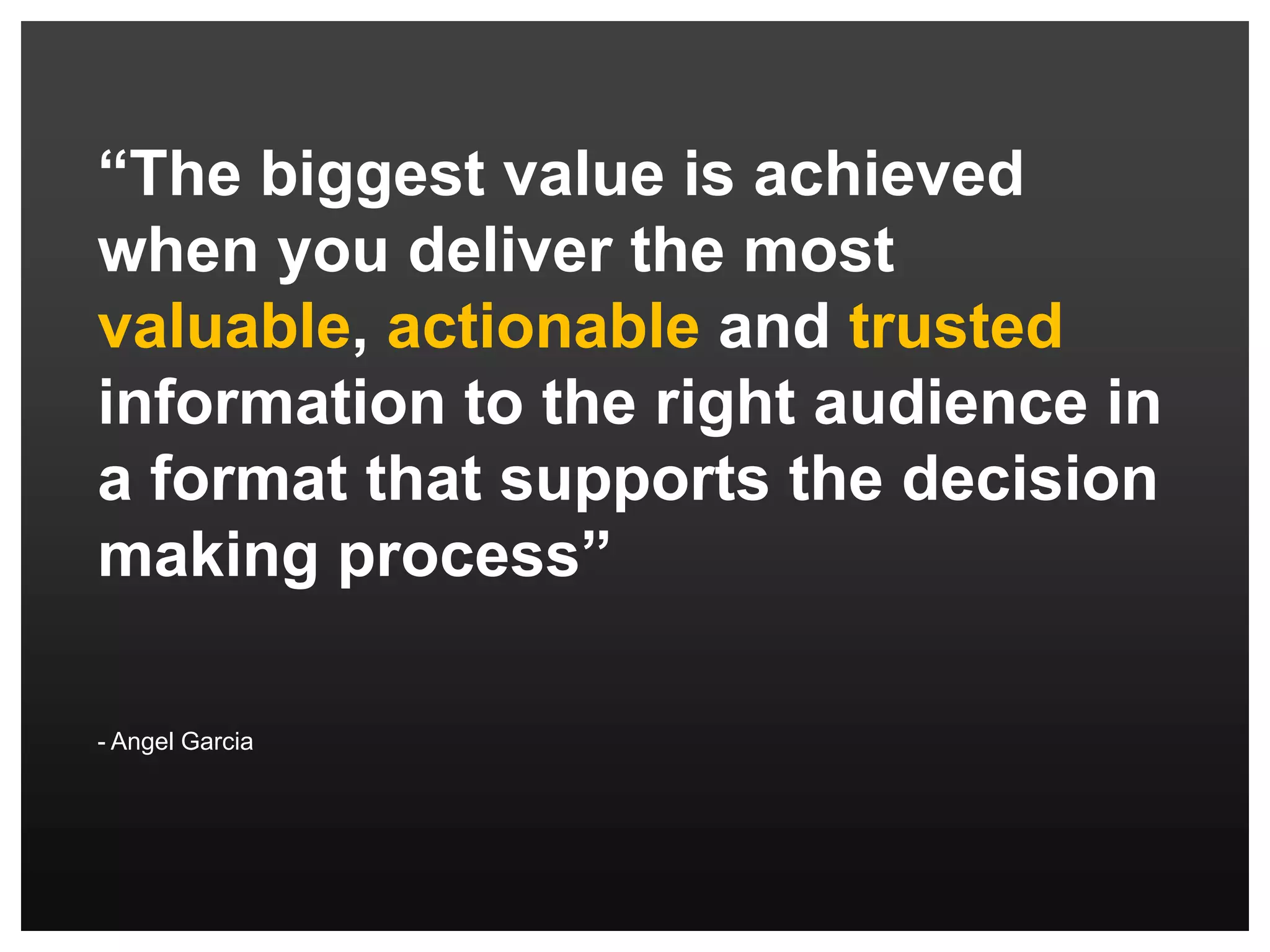
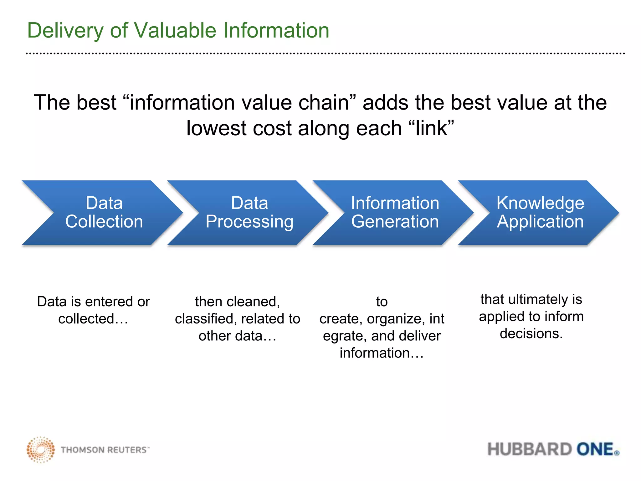
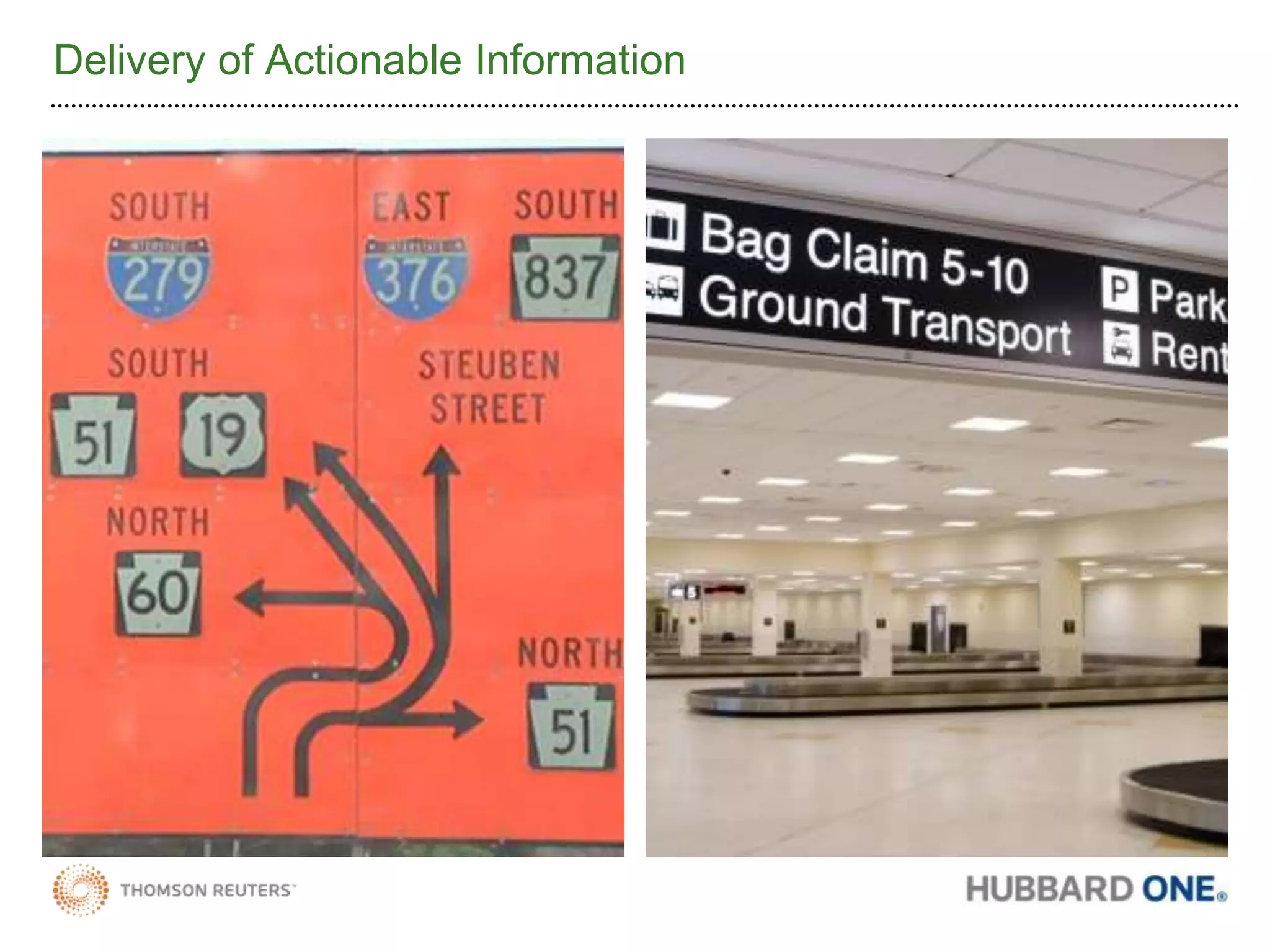
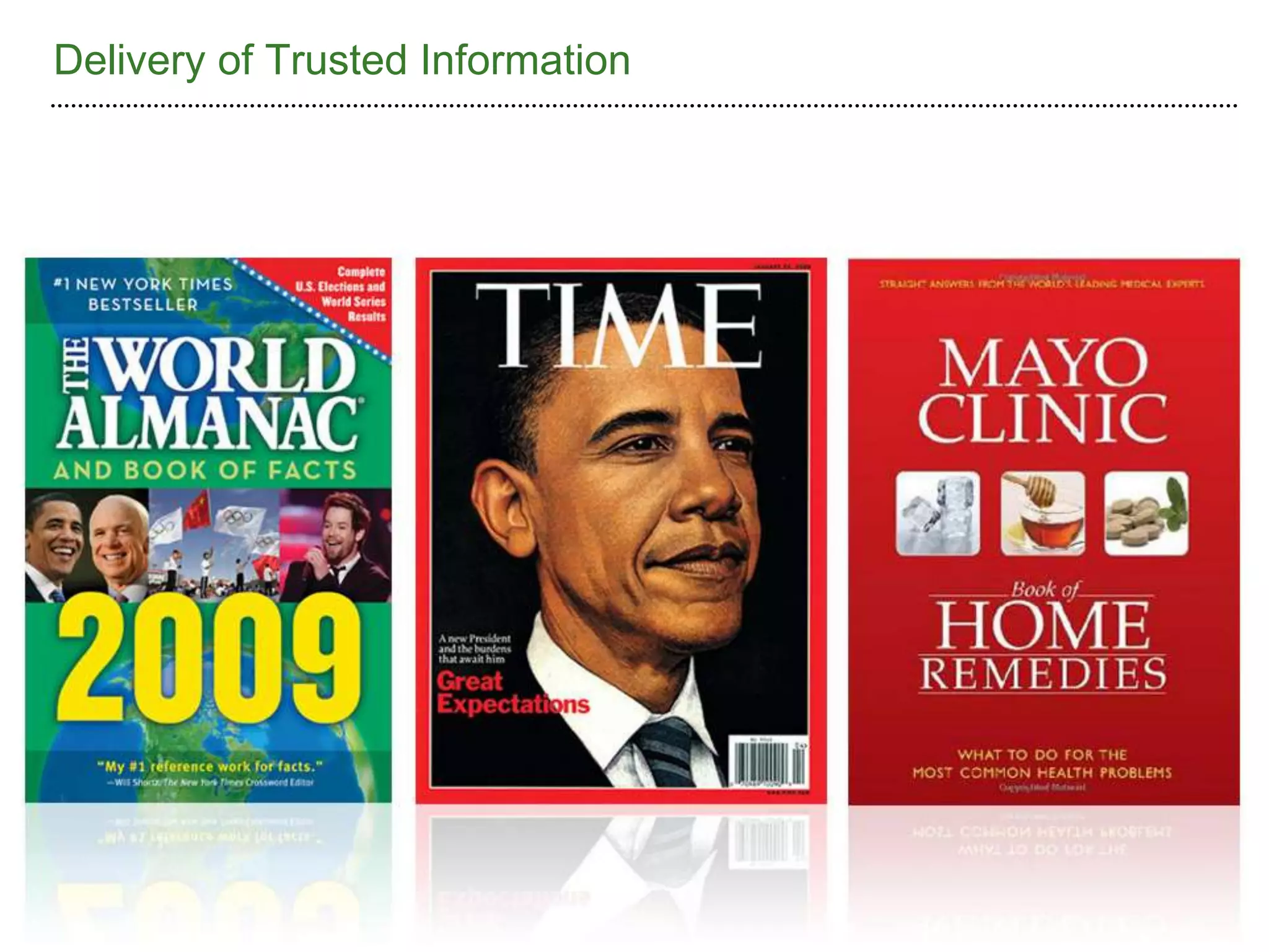
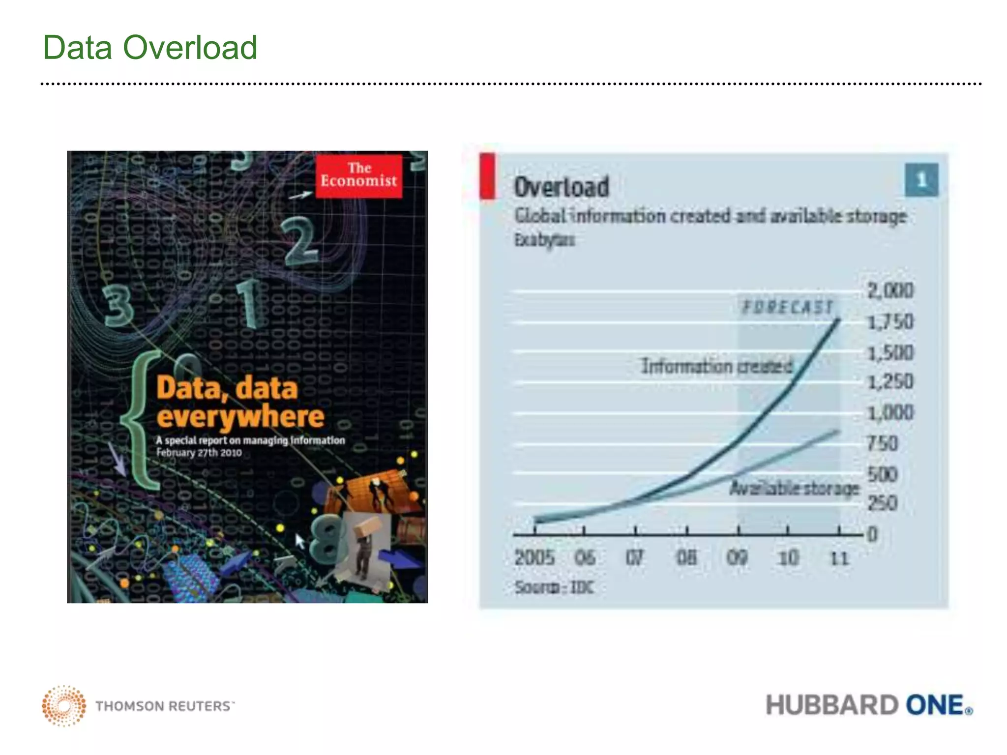
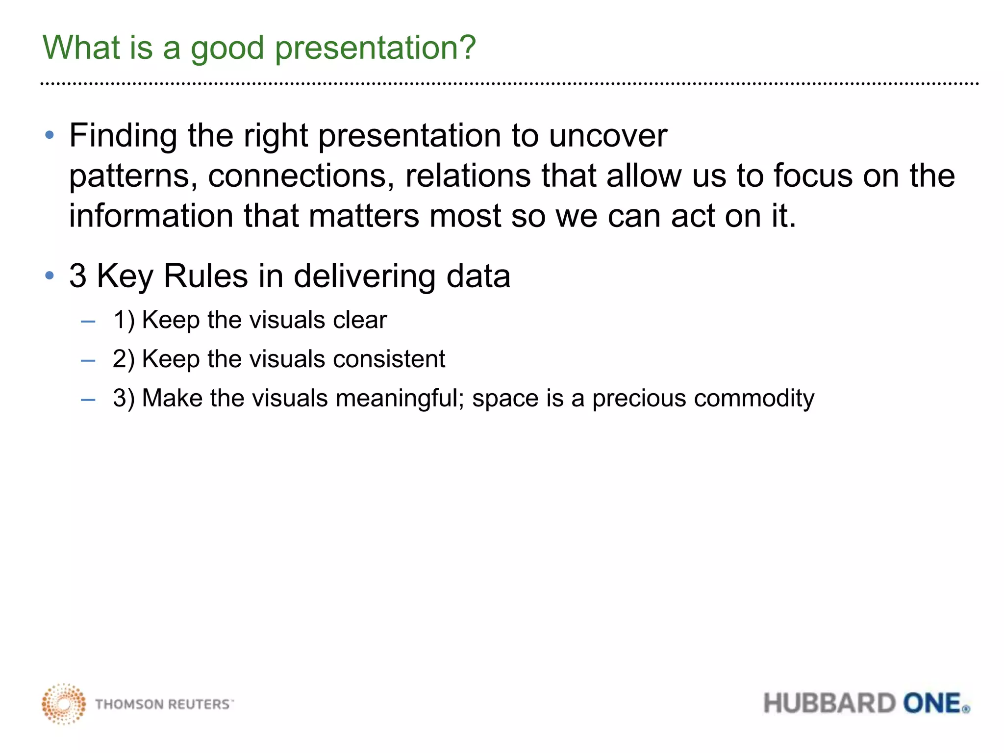
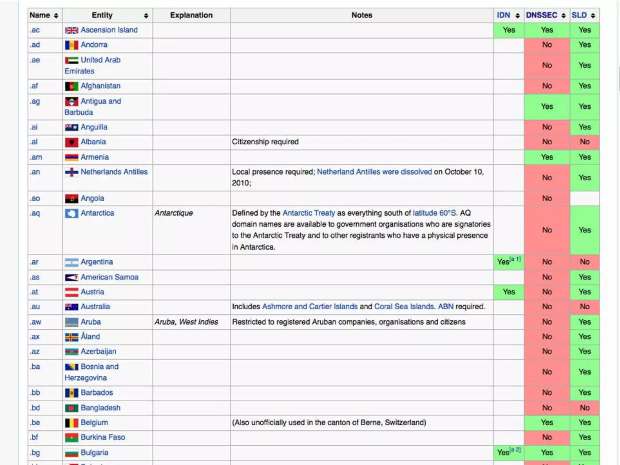
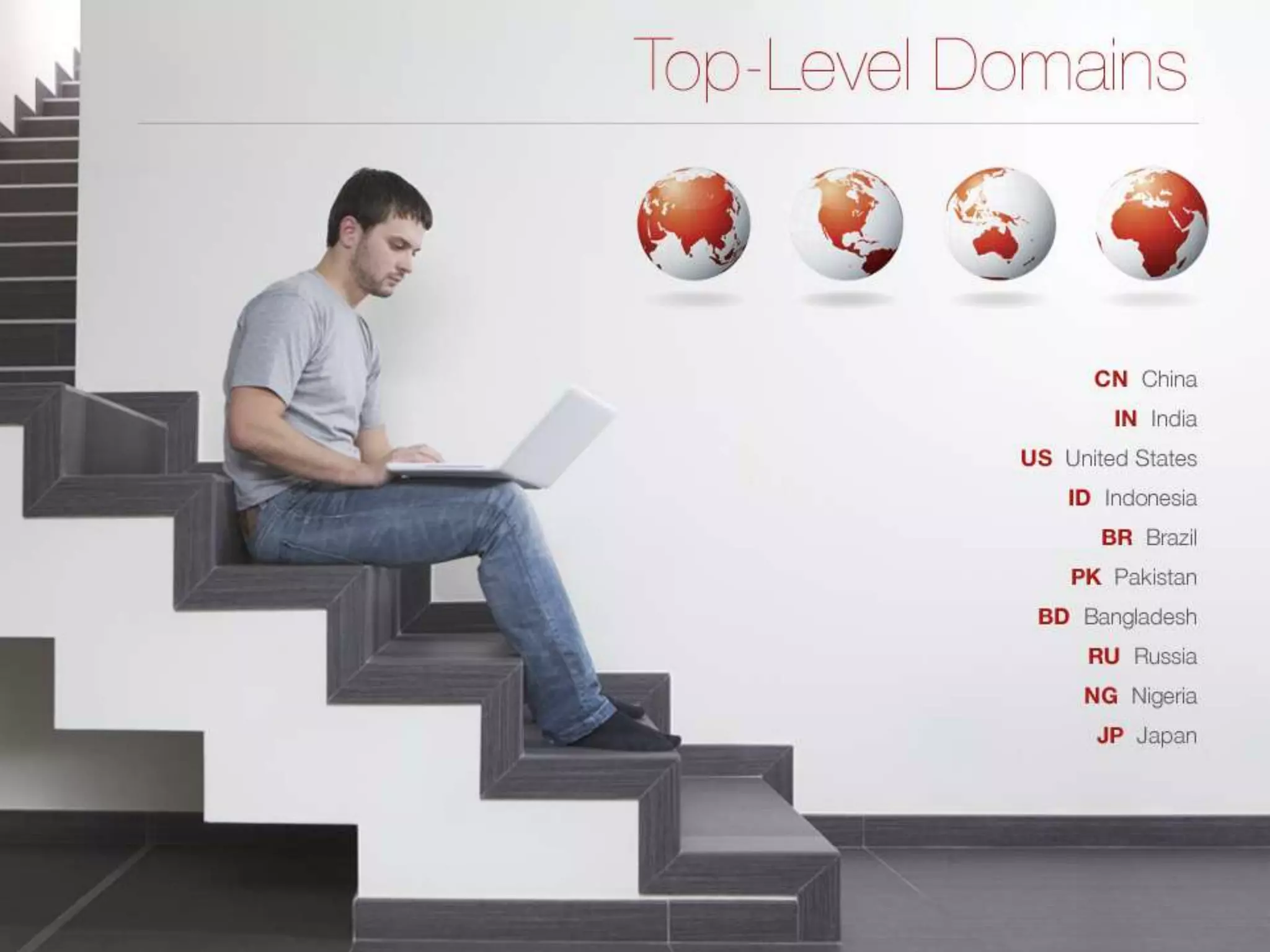
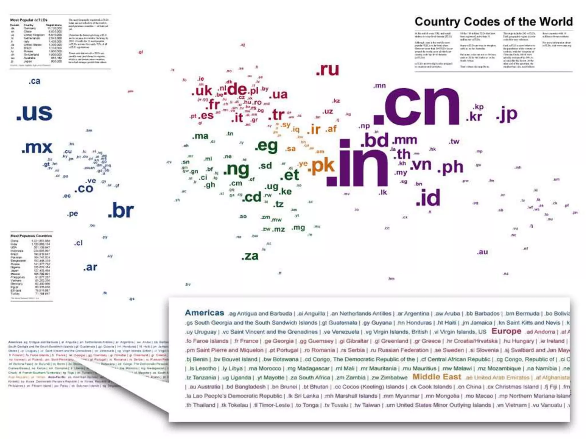
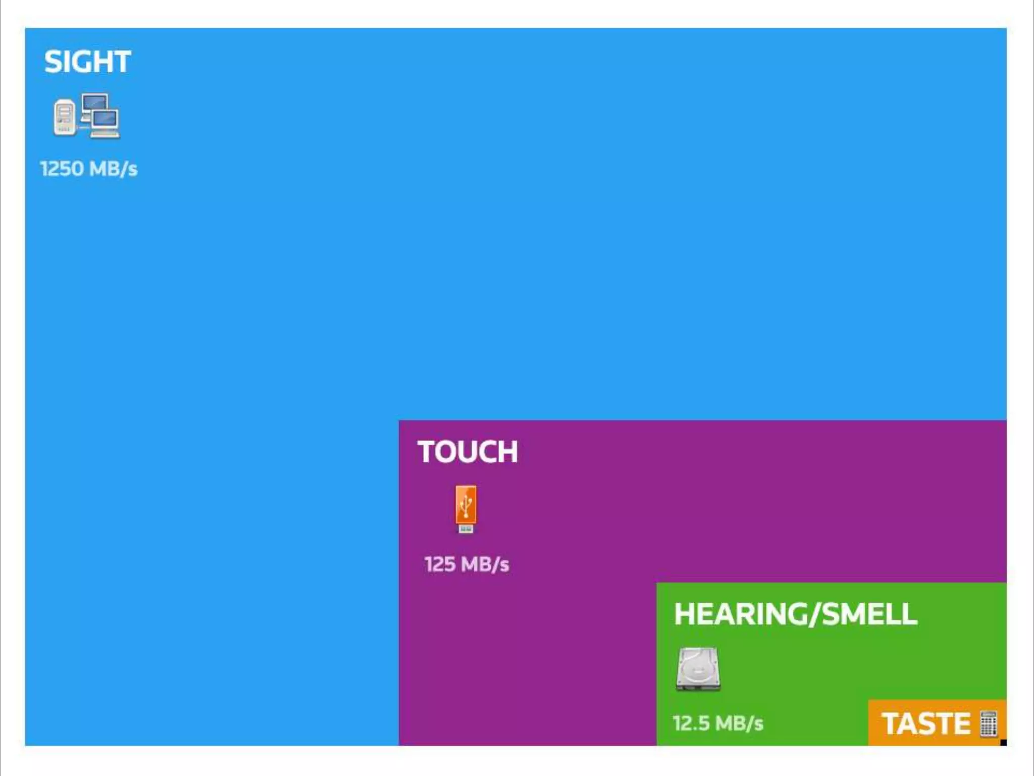
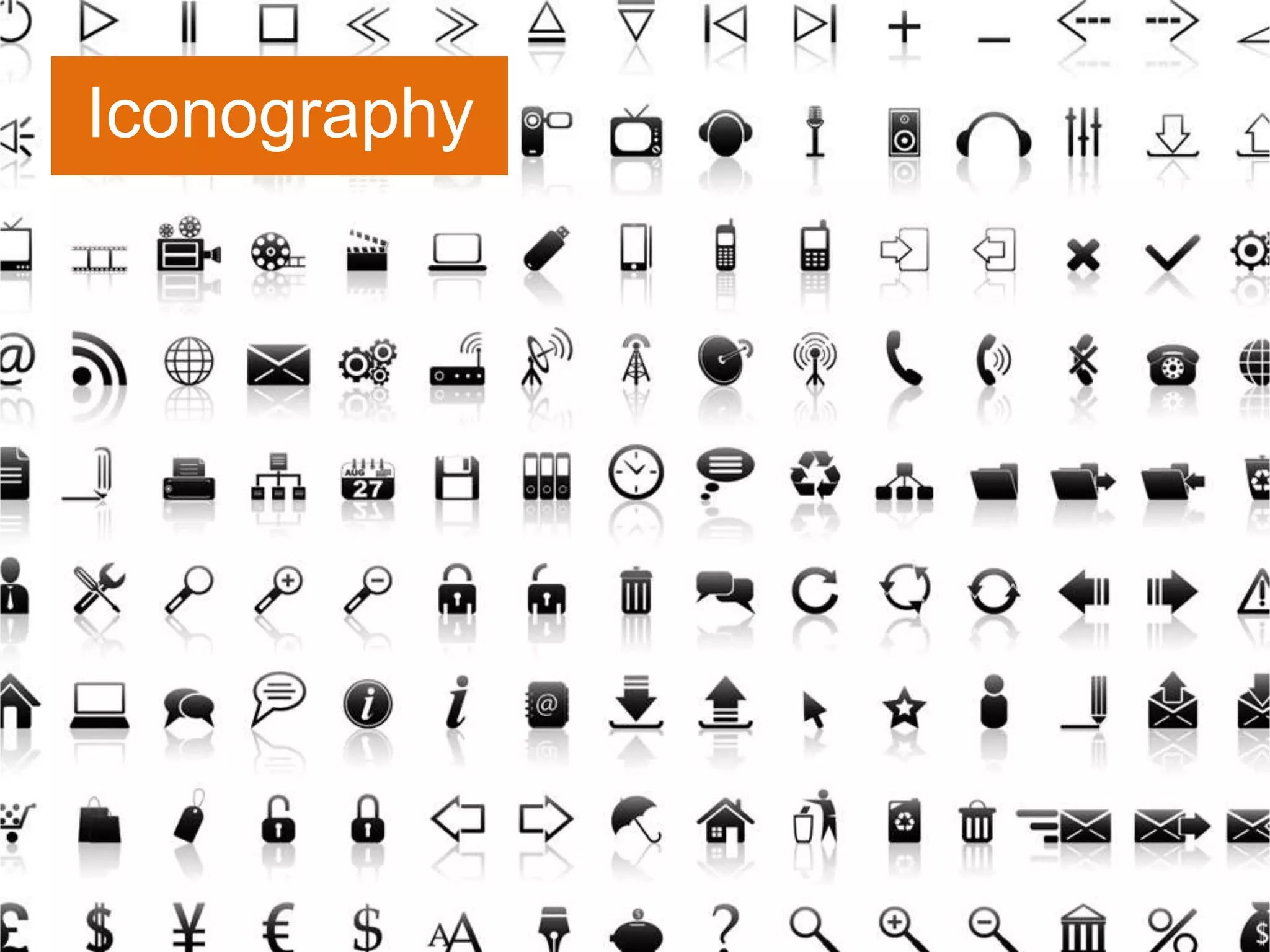
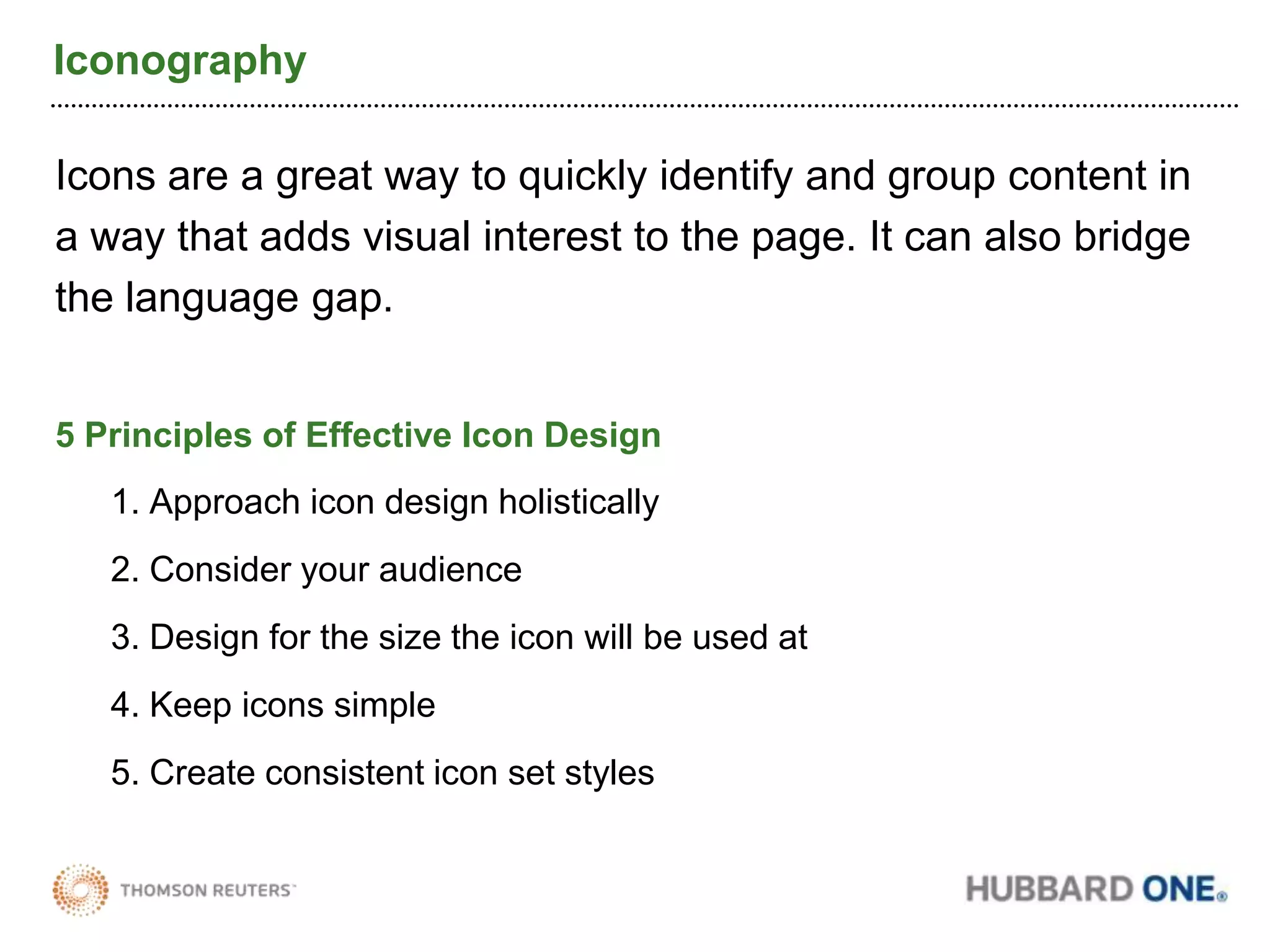
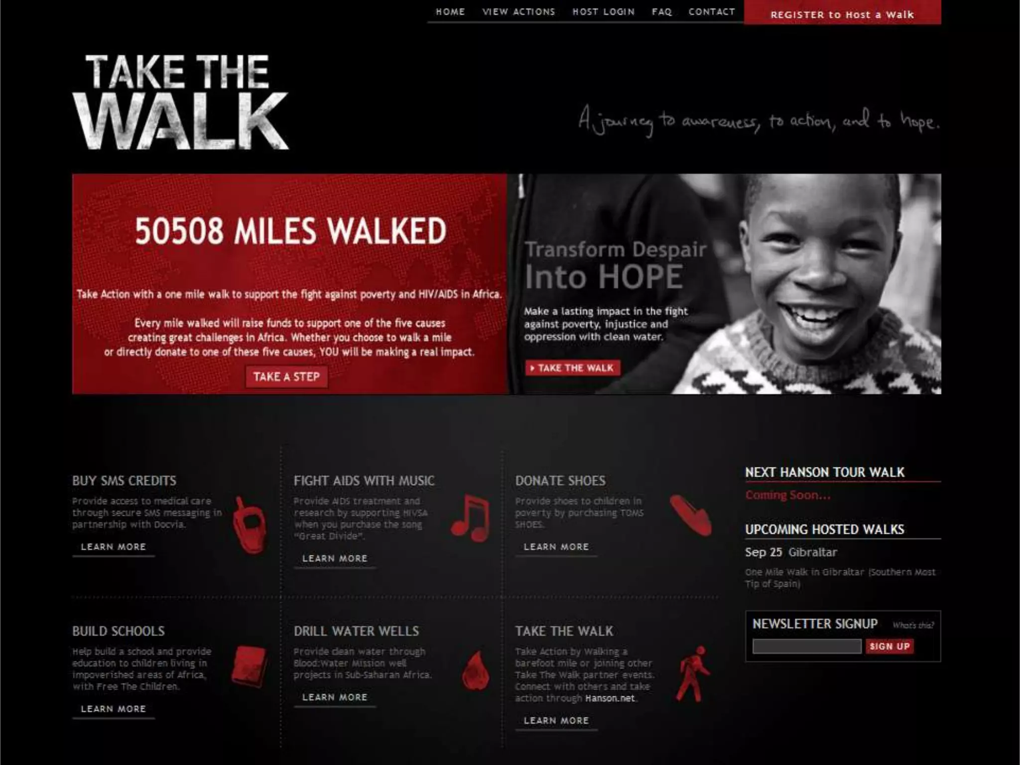
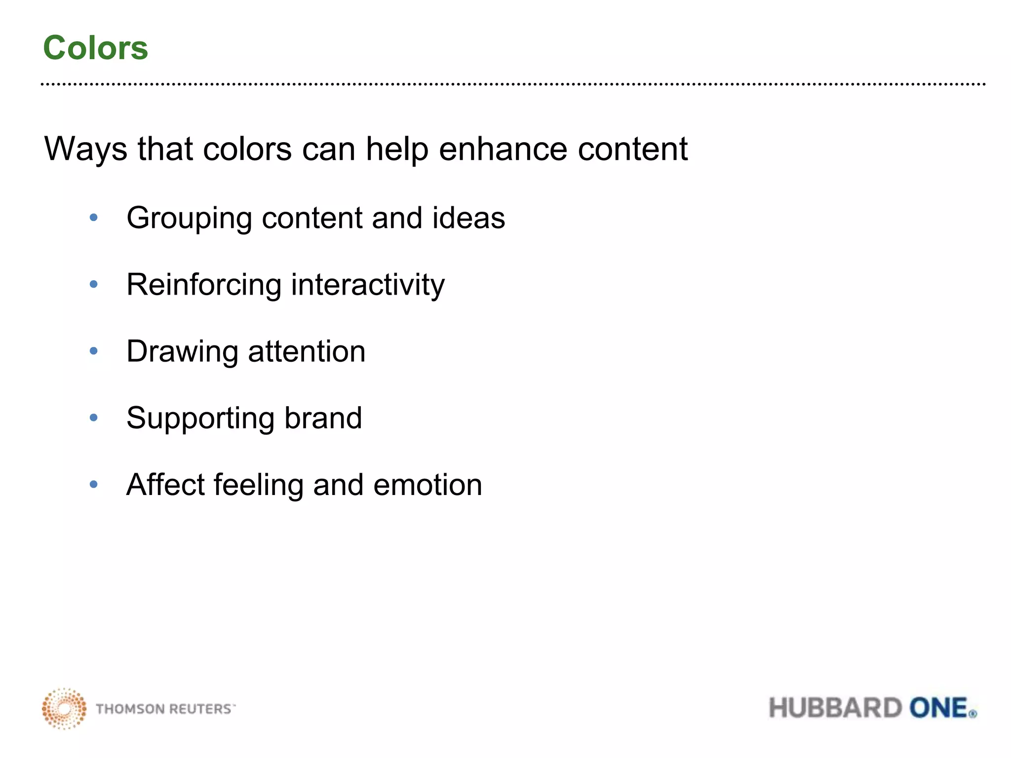
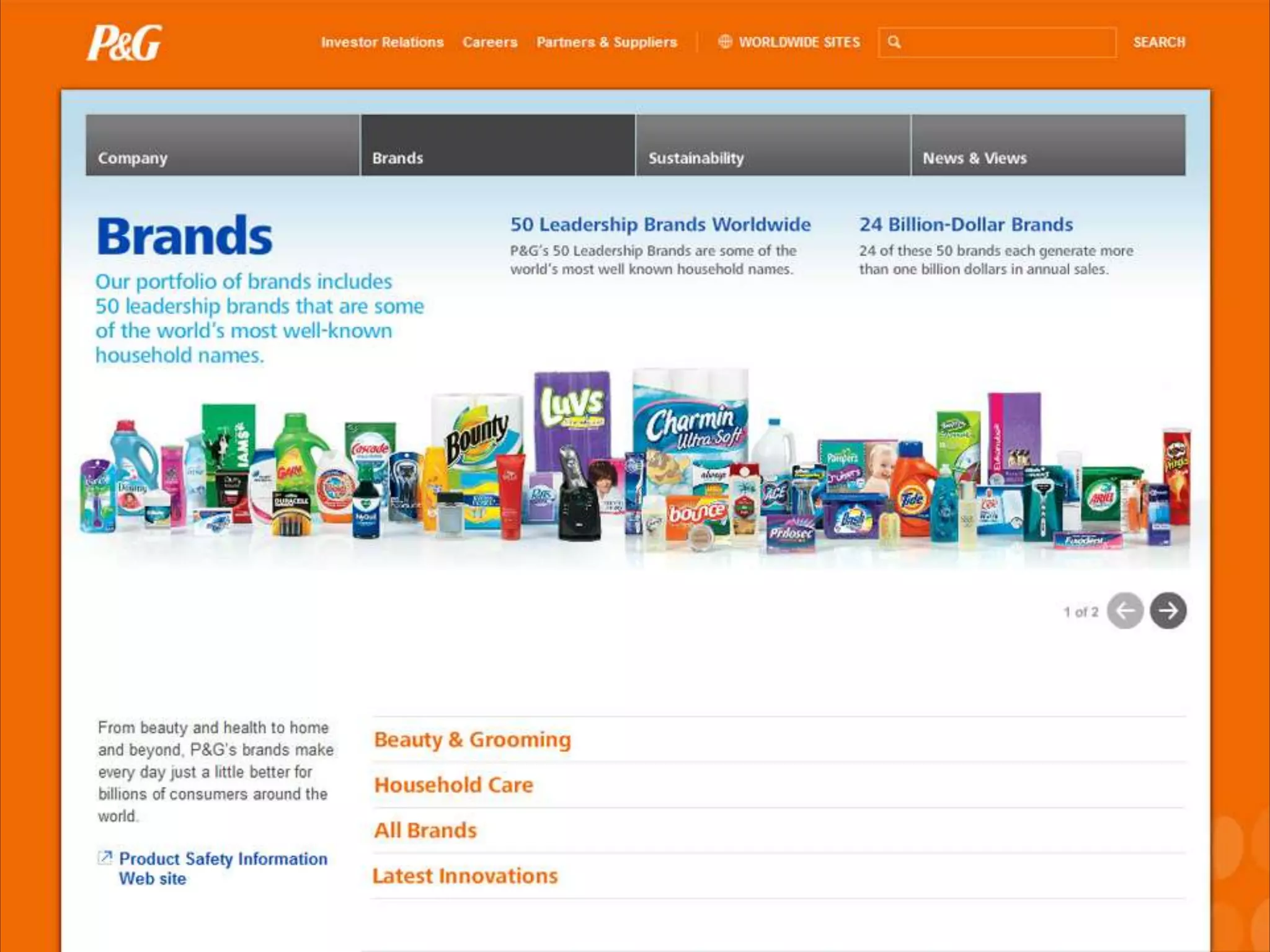
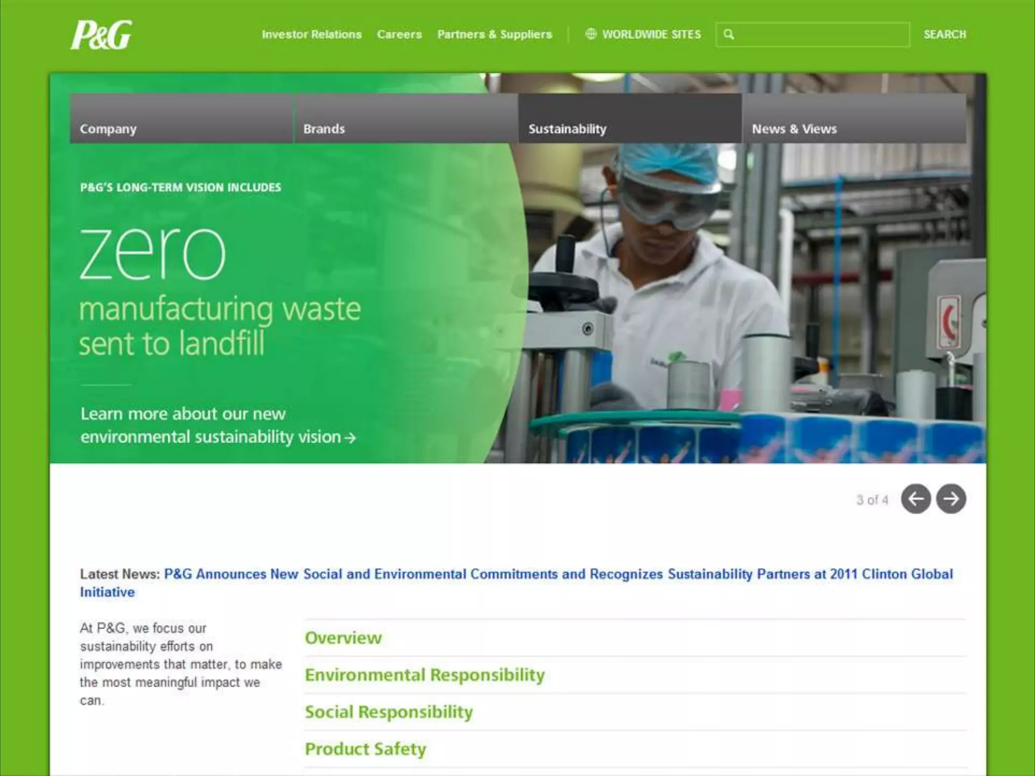
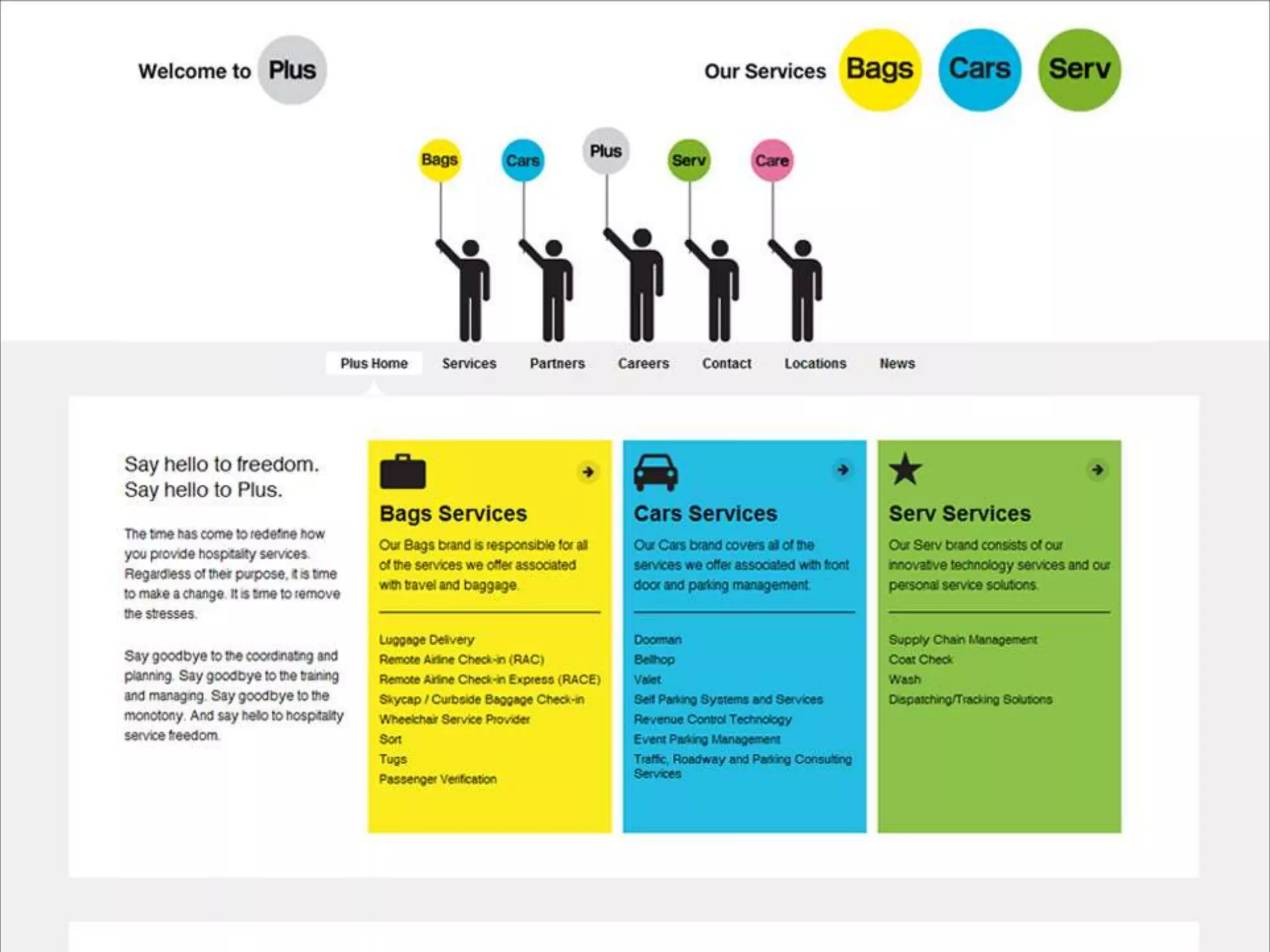
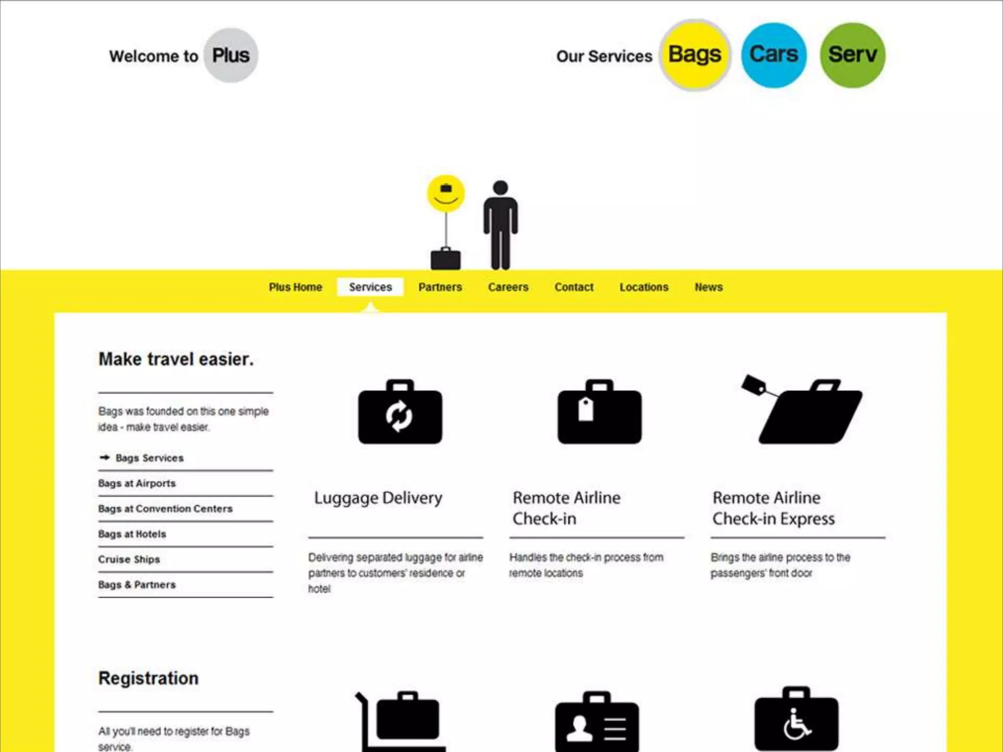
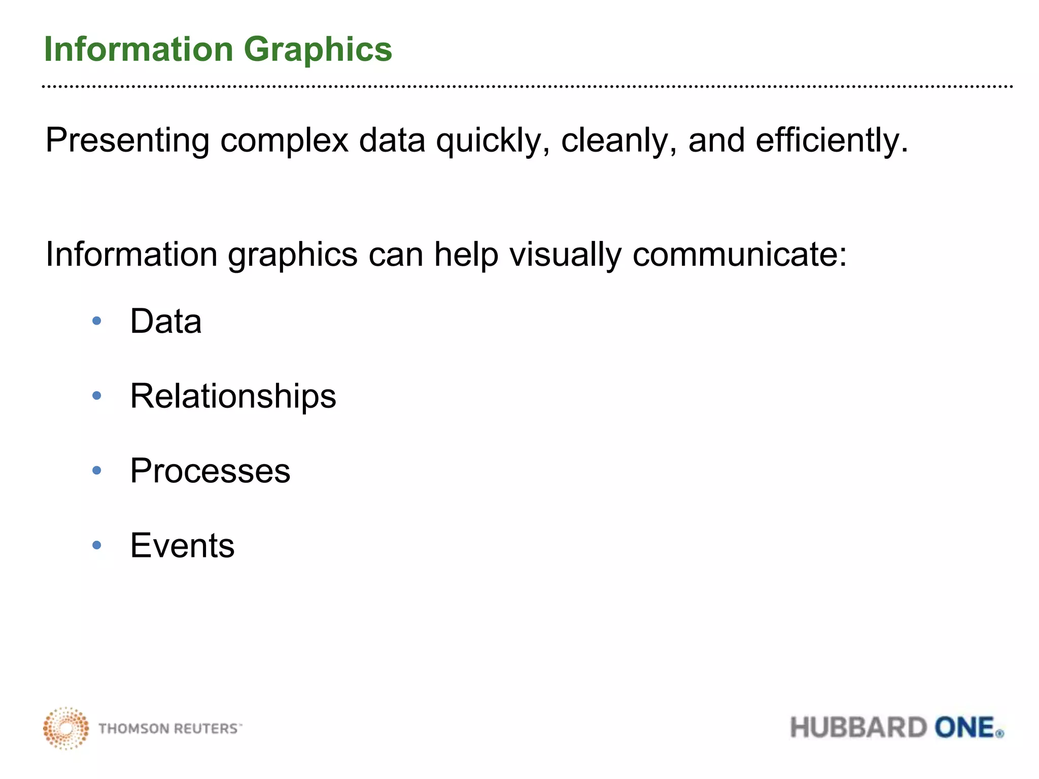
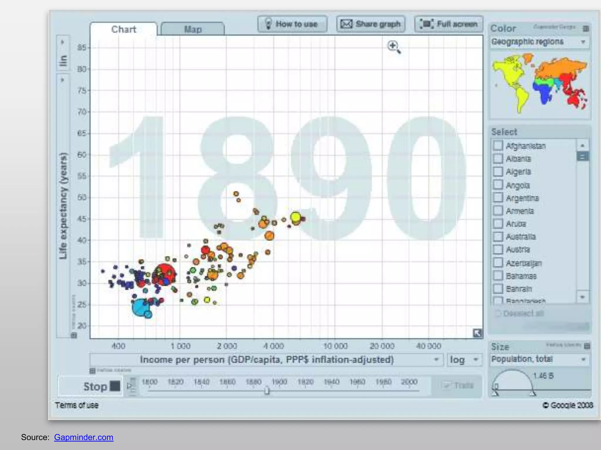
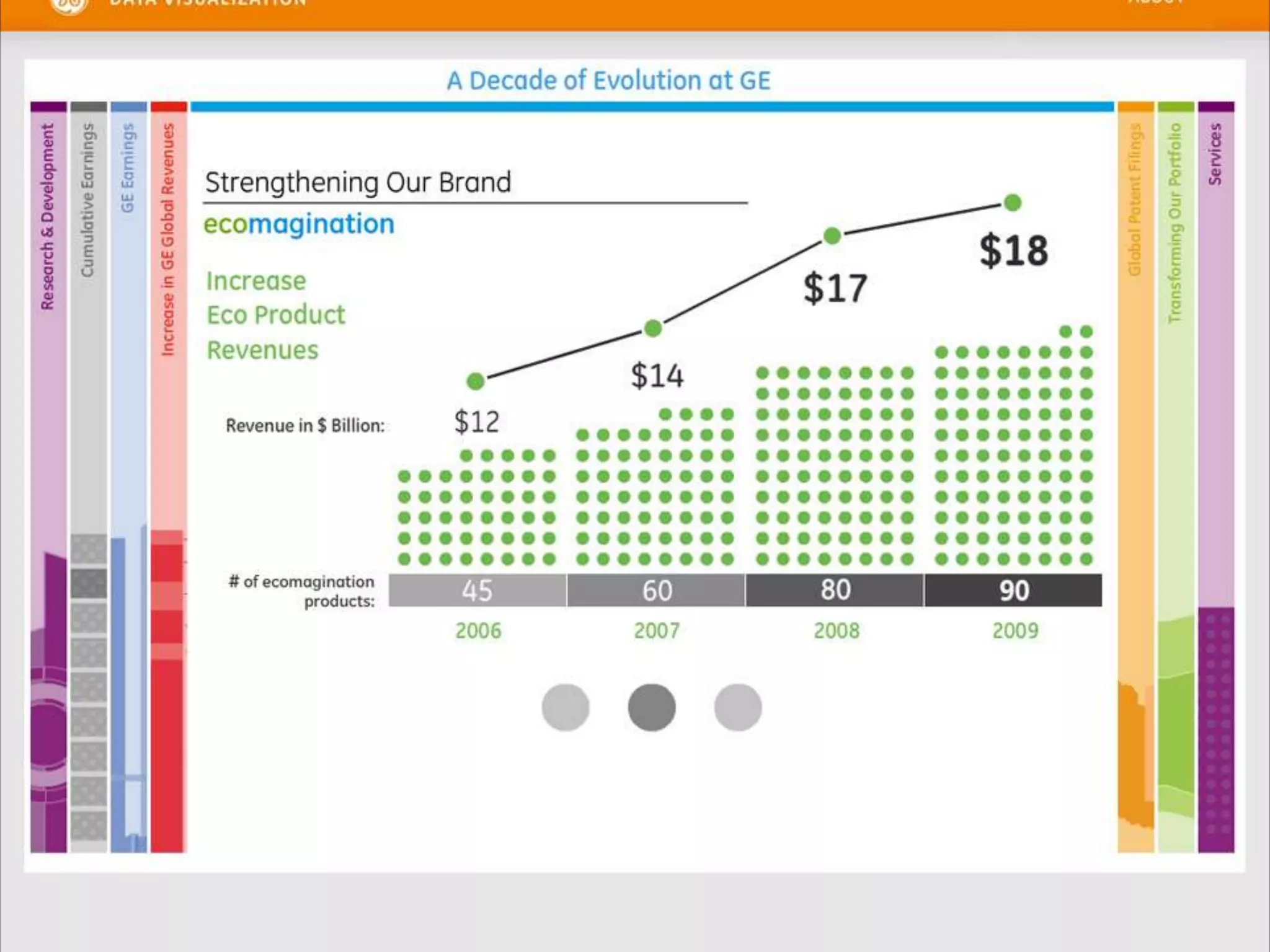
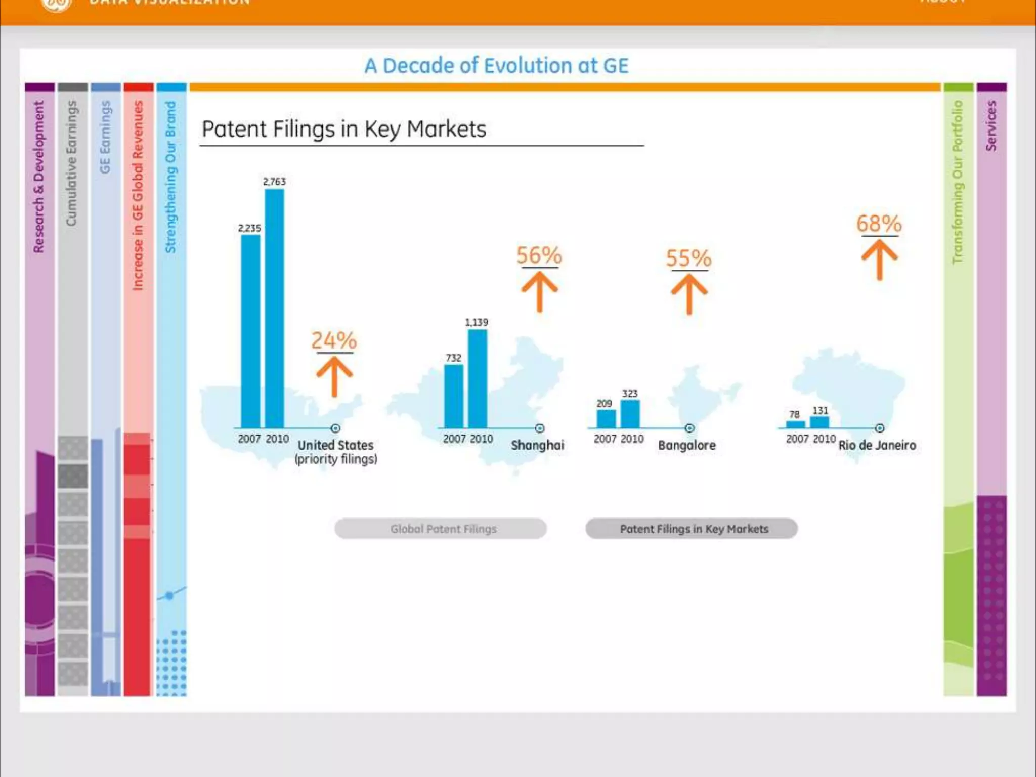
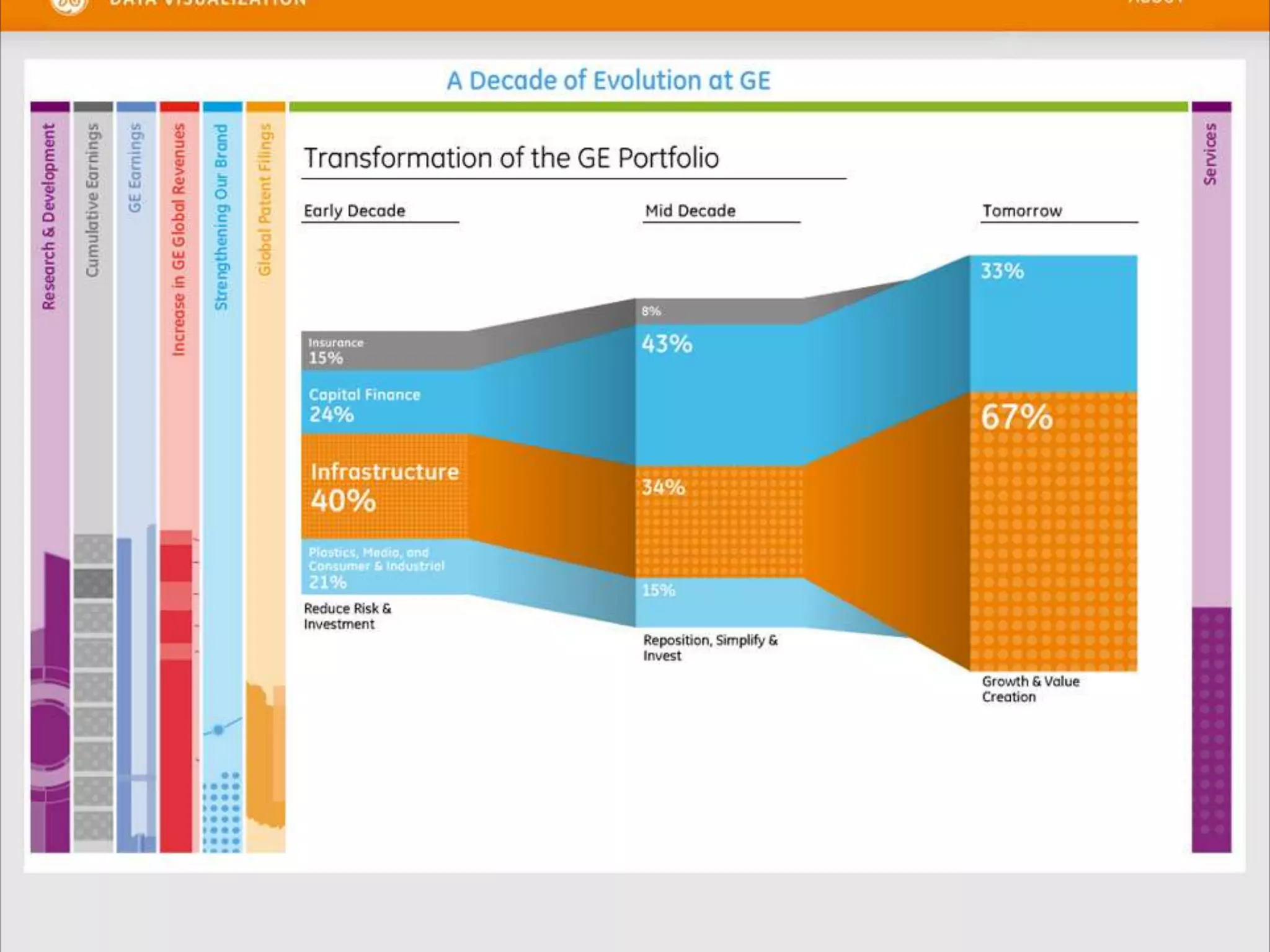
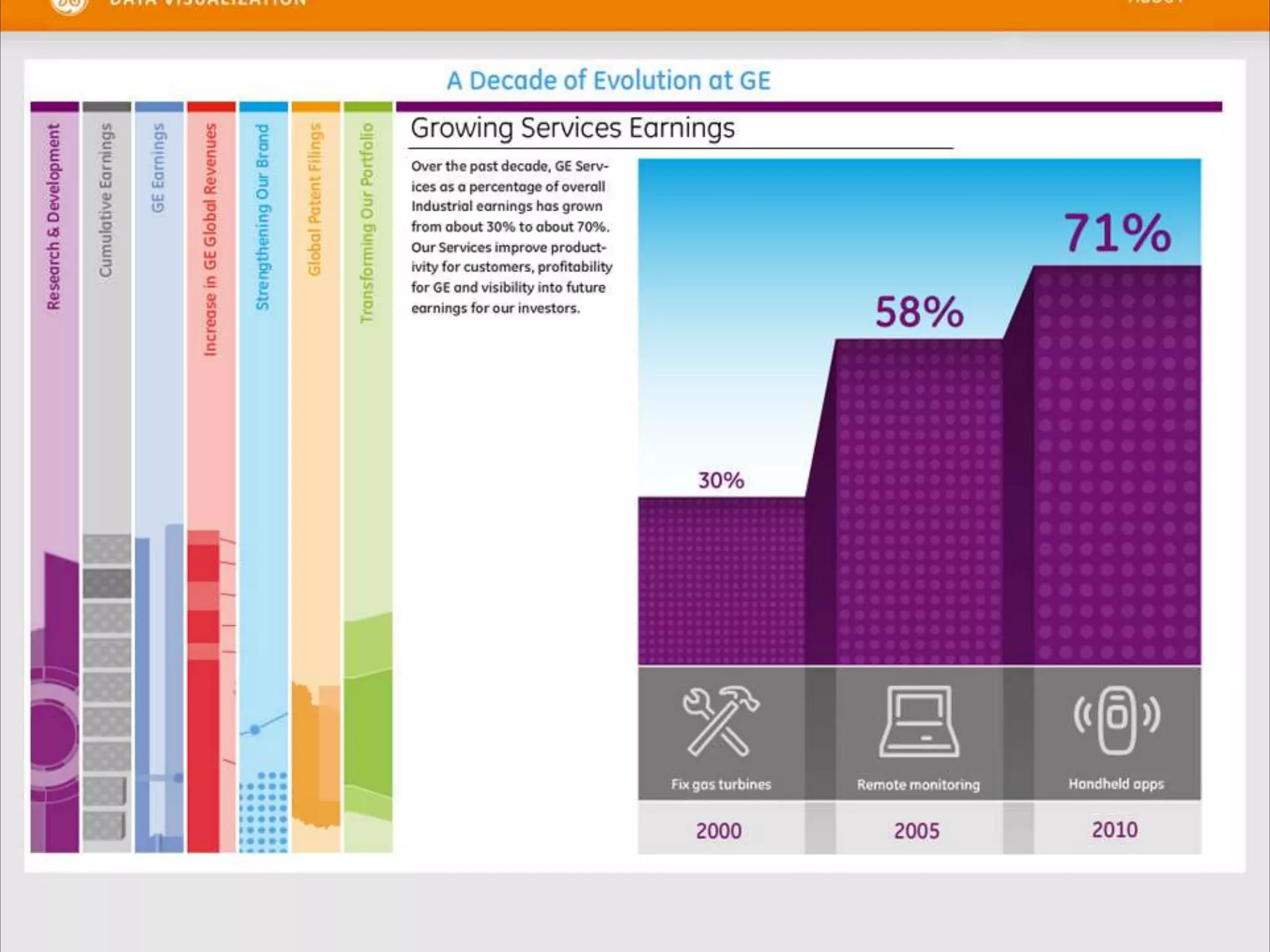
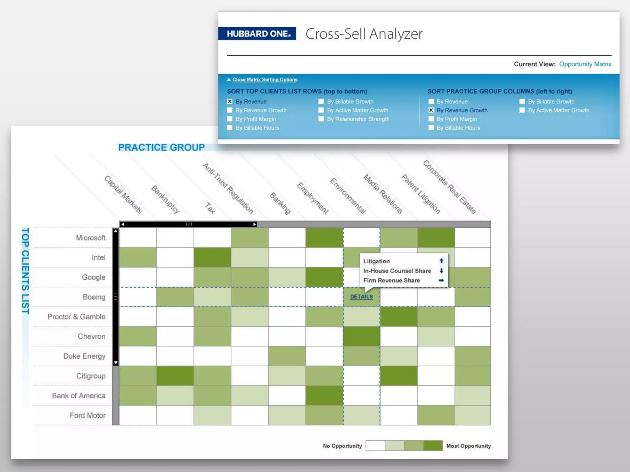
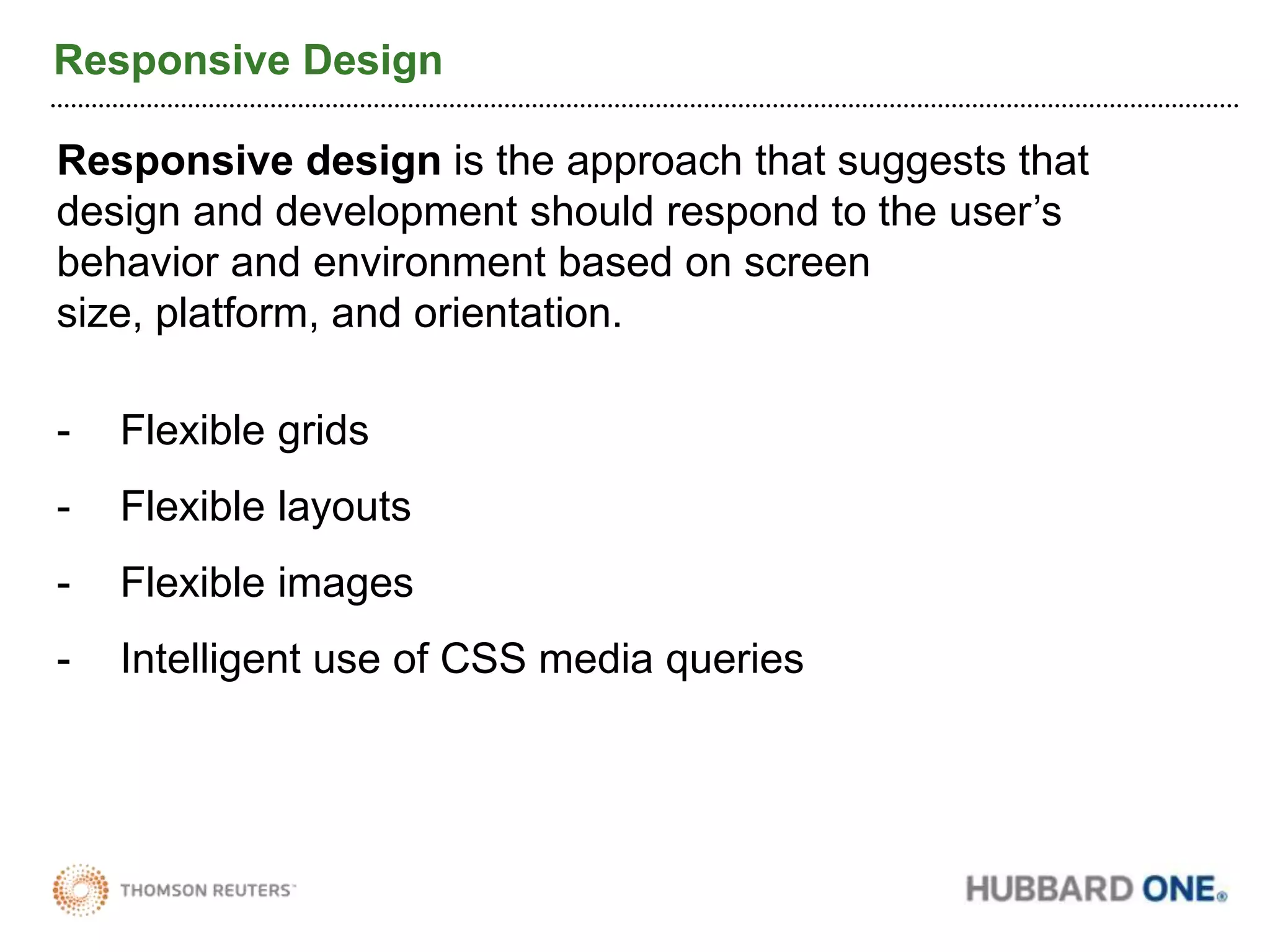
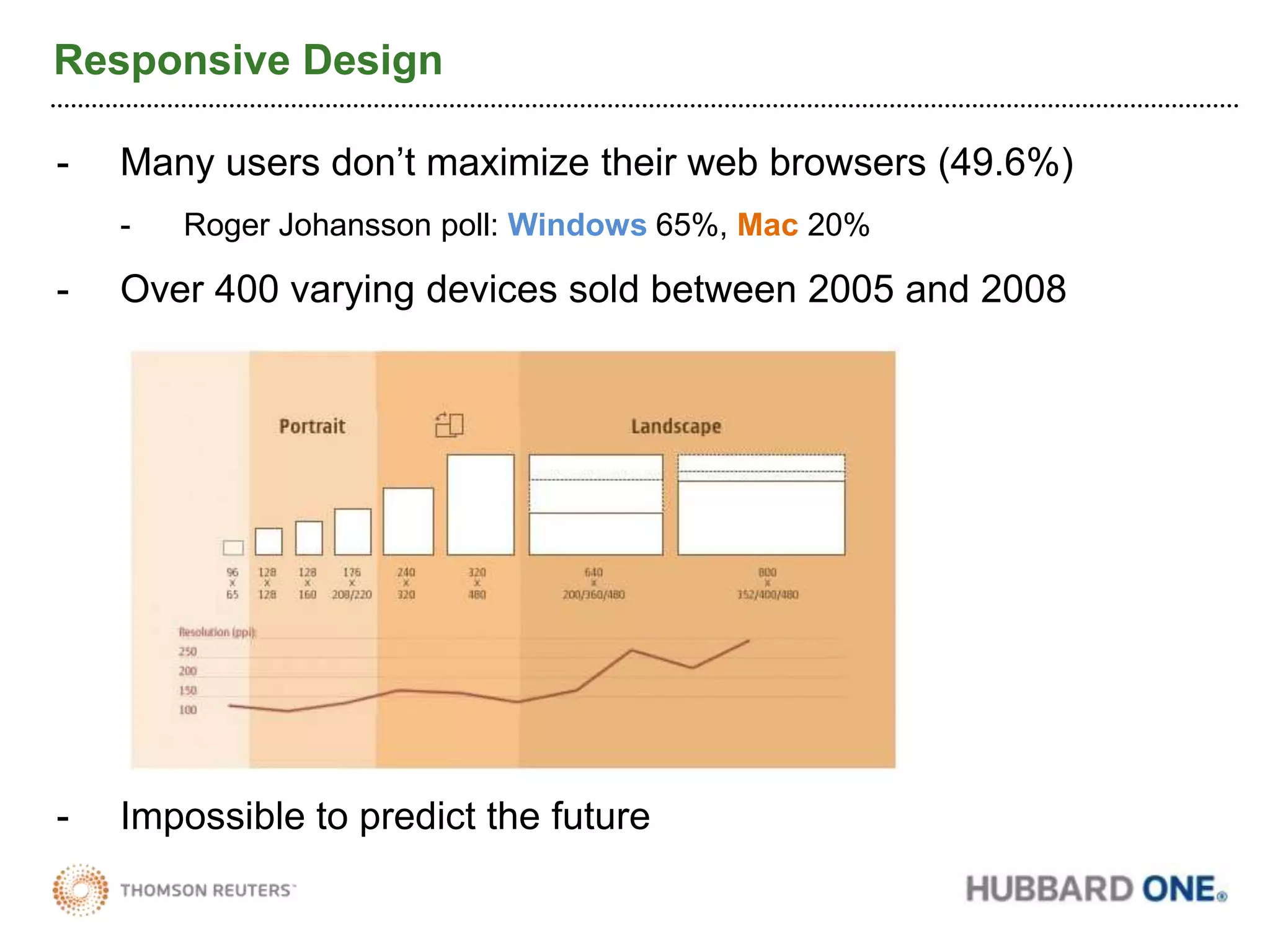
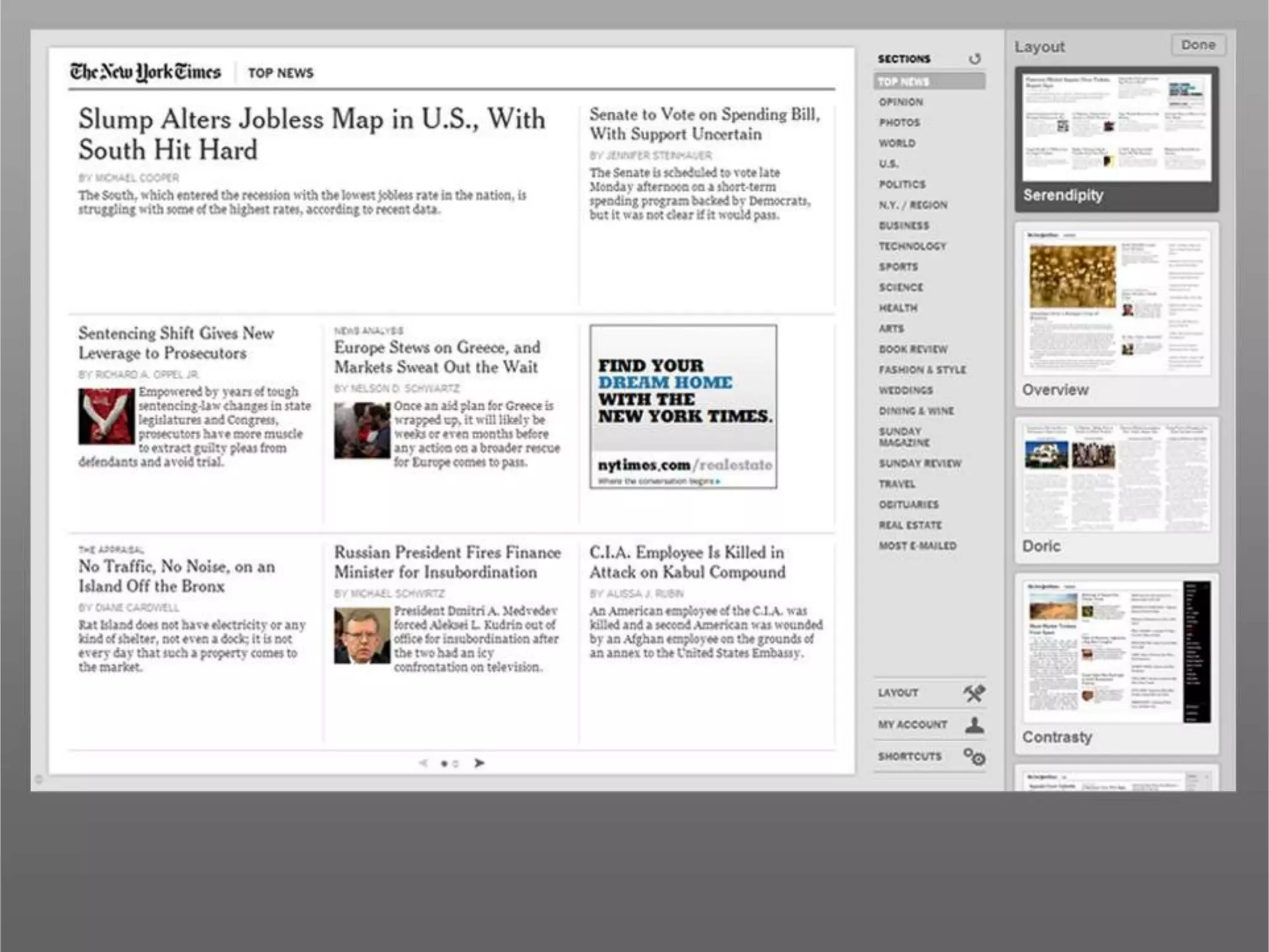
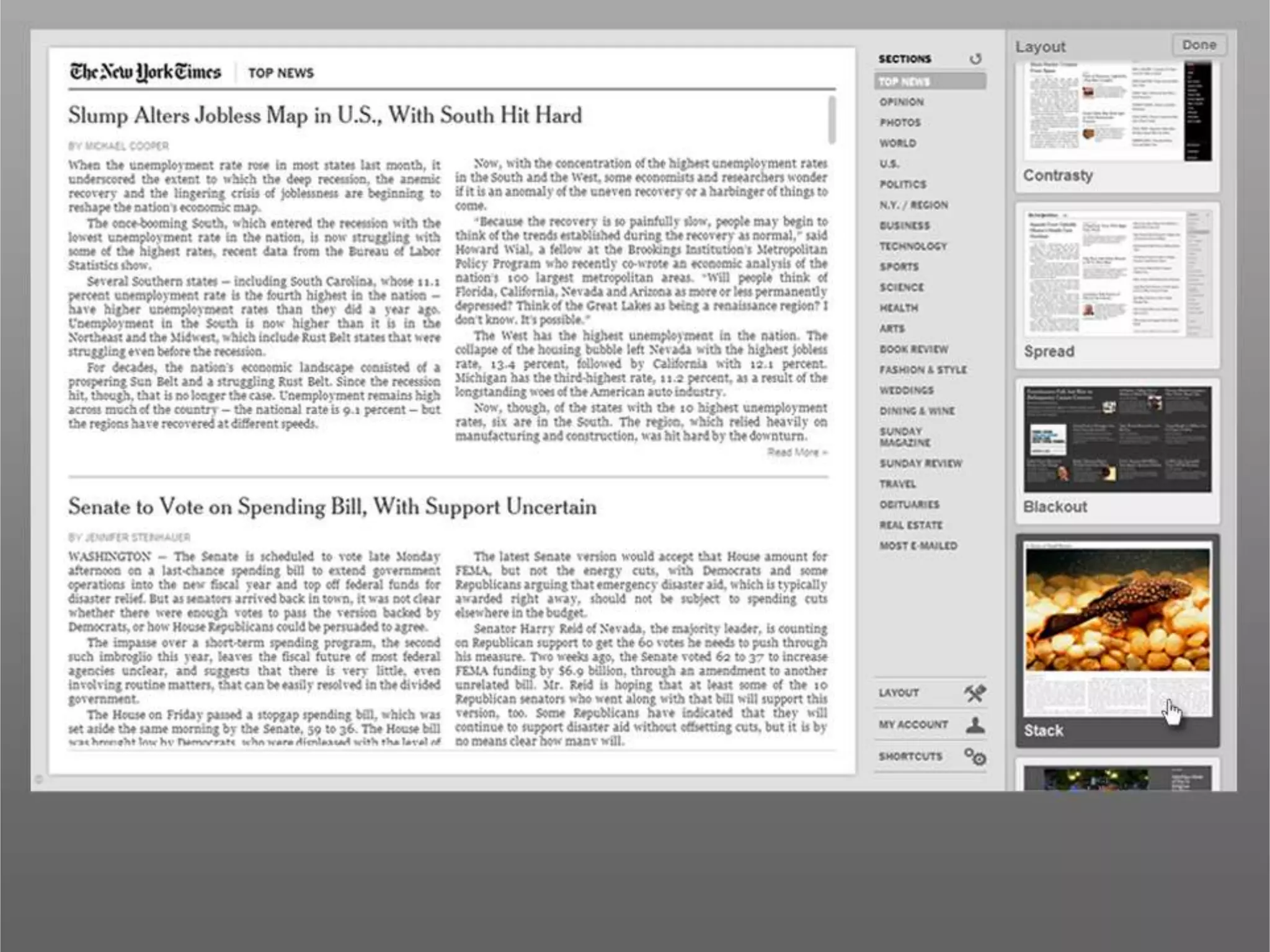
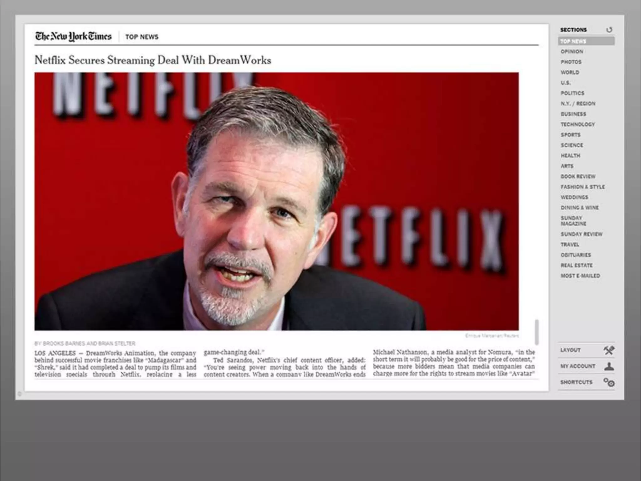
Making Information Usable: The Art & Science of Information DesignNathan Denton & Jeff Hirner
Innovation  as a Convergence Point OpportunityInnovation opportunityaroundservices marketing, business develop & practice management
“Visualizing information is a form of knowledge compression. It's a way of squeezing an enormous amount of information into a small space.”- David McCandless“The biggest value is achieved when you deliver the most valuable, actionable and trusted information to the right audience in a format that supports the decision making process”- Angel Garcia
Delivery of Valuable InformationThe best “information value chain” adds the best value at the lowest cost along each “link”that ultimately is applied to inform decisions.Data is entered or collected…then cleaned, classified, related to other data…to create, organize, integrate, and deliver information…
Delivery of Actionable Information
Delivery of Trusted Information
Data Overload
“Art, in itself, is an attempt to bring order out of chaos.”- Stephen Sondheim
What is a good presentation?Finding the right presentation to uncover patterns, connections, relations that allow us to focus on the information that matters most so we can act on it.3 Key Rules in delivering data1) Keep the visuals clear2) Keep the visuals consistent3) Make the visuals meaningful; space is a precious commodity
The Design Trends
Iconography
IconographyIcons are a great way to quickly identify and group content in a way that adds visual interest to the page. It can also bridge the language gap.5 Principles of Effective Icon Design1. Approach icon design holistically2. Consider your audience3. Design for the size the icon will be used at4. Keep icons simple5. Create consistent icon set styles
Color
ColorsWays that colors can help enhance contentGrouping content and ideas
Reinforcing interactivity
Drawing attention
Supporting brand
Affect feeling and emotion
Info Graphics
Information GraphicsPresenting complex data quickly, cleanly, and efficiently.Information graphics can help visually communicate:Data
Relationships
Processes
Events“Don’t just show the notes, play the music!”- Hans Rosling
Source:  Gapminder.com
“The commonality between science and art is in trying to see profoundly - to develop strategies of seeing and showing.”- Edward Tufte
“Visualizing information is a form of knowledge compression. It's a way of squeezing an enormous amount of information into a small space.”- David McCandless
StreamliningContent
Streamlining ContentShow what is most importantReinforce importance with visual hierarchyReinforce interactivity intuitivelyConsider the audience
ResponsiveDesign
Responsive DesignResponsive design is the approach that suggests that design and development should respond to the user’s behavior and environment based on screen size, platform, and orientation.Flexible grids
Flexible layouts
Flexible images
Intelligent use of CSS media queriesResponsive DesignMany users don’t maximize their web browsers (49.6%)
Roger Johansson poll: Windows65%, Mac20%
Over 400 varying devices sold between 2005 and 2008
Impossible to predict the future
Making Information Usable: The Art & Science of Information Design

Making Information Usable: The Art & Science of Information Design

Editor's Notes

  • #5 The biggest value is achieved when you deliver the most valuable, actionable and trusted informationto the right audience in a format that supports the decision making processValuable information: (Related to information value chain)Data is an object and information is a relationship between data, and knowledge is the application of information.:“Data” - Data is essentially an object. Standalone it's useless. Take the name of the hotel for example - “Half Moon Bay” is data which doesn’t tell you much.“Information” – however, when you associate “Half Moon Bay” with “Innovation Forum” or link it to your LinkedIn profile, it turns into information. You create relationships between different types of data “Knowledge” – apply the information to a scenario. Greatest value is in how uniquely you can apply it to create competitive advantage
  • #6 The biggest value is achieved when you deliver the most valuable, actionable and trusted informationto the right audience in a format that supports the decision making processActionable information: (Related to presentation)The information needs to be relevant to the audience as to facilitate and enable decision makingThe sign on the left will probably make you stop in the highway or keep going without knowing where you need to go.Signs on most airports on the other hand are set up in a way that allows passengers to make decisions about the direction they want to take without having to stop
  • #7 The biggest value is achieved when you deliver the most valuable, actionable and trustedinformationto the right audience in a format that supports the decision making processTrusted Information has the properties of:Authority:  it is up-to-date and recognized as the reference copy of the relevant information.Authenticity:  it is what it says it is and can be linked back to its source.Reliability:  it can be trusted as a full and accurate representation of the relevant facts, transaction or business process.Integrity:  it is complete, unaltered and preserves context and chain of custody.
  • #8 So what happens when there is data overload?Cleaning/harmonizing data is a large effort at firms today. Currently firms are overcoming by applying manual efforts:Firms are currently tackling the issue of data acquisition, manipulation and concordance in a very manual way. That has to change… We’re seeing a new trend toward automating the data concordance.
  • #38 Link to actual site that allows for dynamic explanation: www.bit.ly/cVMWJ4This visualization tool presents vast amount of information including population, life expentancy, Income, continent, trends over time, etc. for most of the worlds countries in a simple and intuitive way.As you run the time movie, you can observe the effect of things like World War II on European countries (orange), the fast increase in income of China in the 90s, the decline of life expectancy of African countries on the 90s, The sharp decline in life expectancy during the Russian revolution 1917 - 1920, etc.All this without having to analyze the vast amount of data that supports this visualization
  • #51 Link to actual site that allows for dynamic explanation: www.bit.ly/cVMWJ4This visualization tool presents vast amount of information including population, life expentancy, Income, continent, trends over time, etc. for most of the worlds countries in a simple and intuitive way.As you run the time movie, you can observe the effect of things like World War II on European countries (orange), the fast increase in income of China in the 90s, the decline of life expectancy of African countries on the 90s, The sharp decline in life expectancy during the Russian revolution 1917 - 1920, etc.All this without having to analyze the vast amount of data that supports this visualization
  • #54 - Consider the audience – a lot of people are gathering their information on the go
  • #67 - Recently emerging discipline of responsive architecture
  • #68 - Total polled 1385