Downloaded 118 times
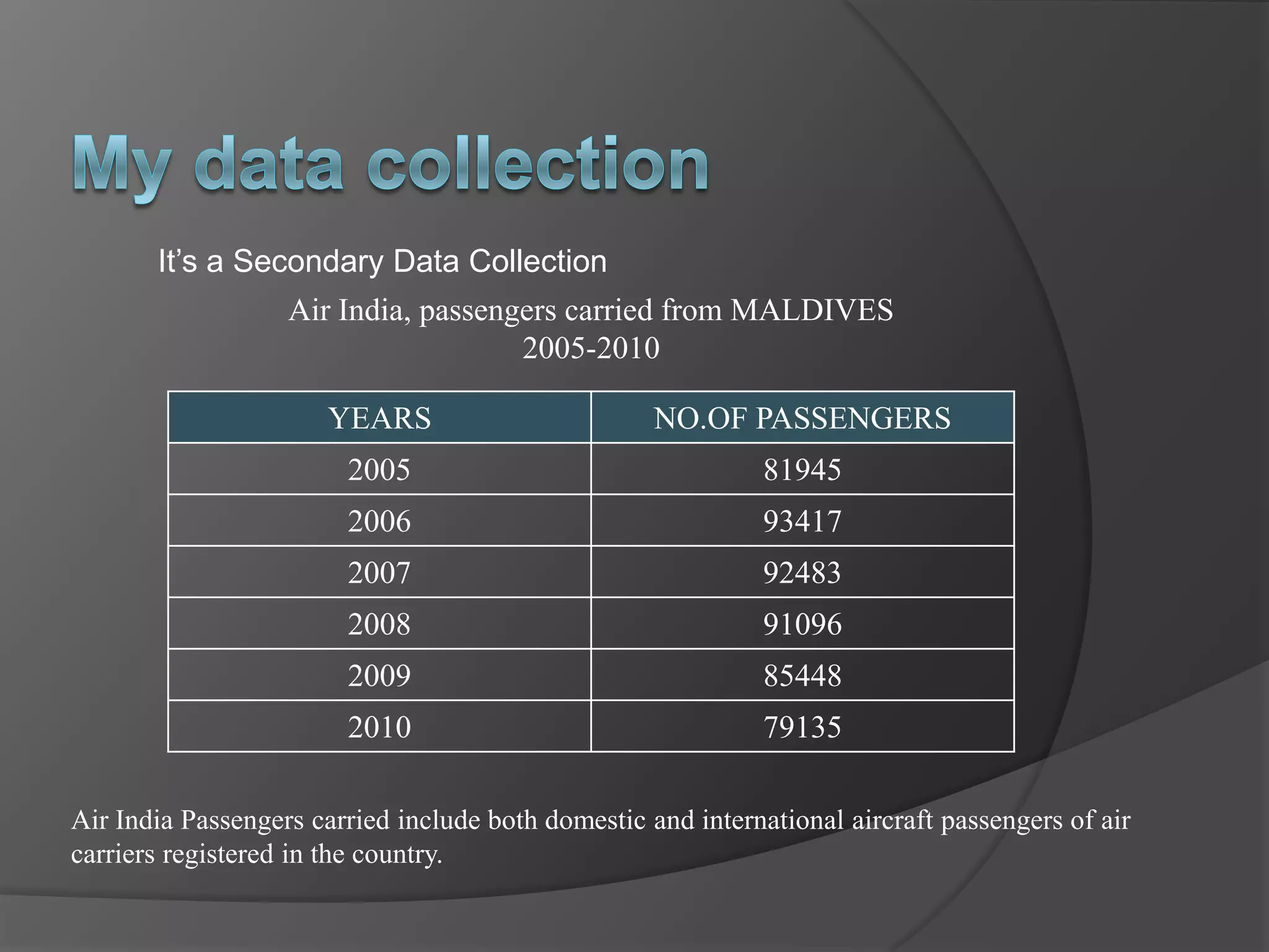
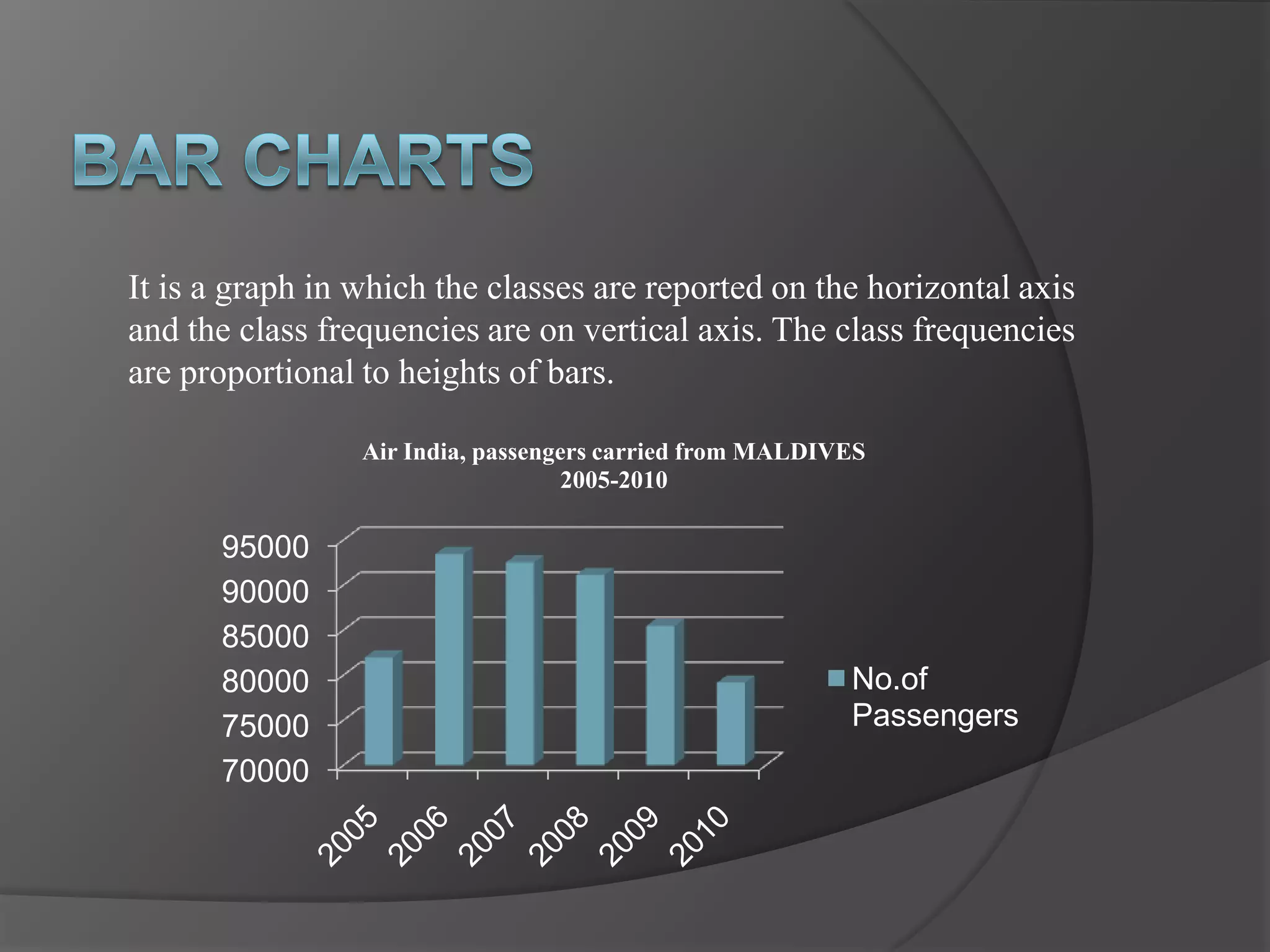
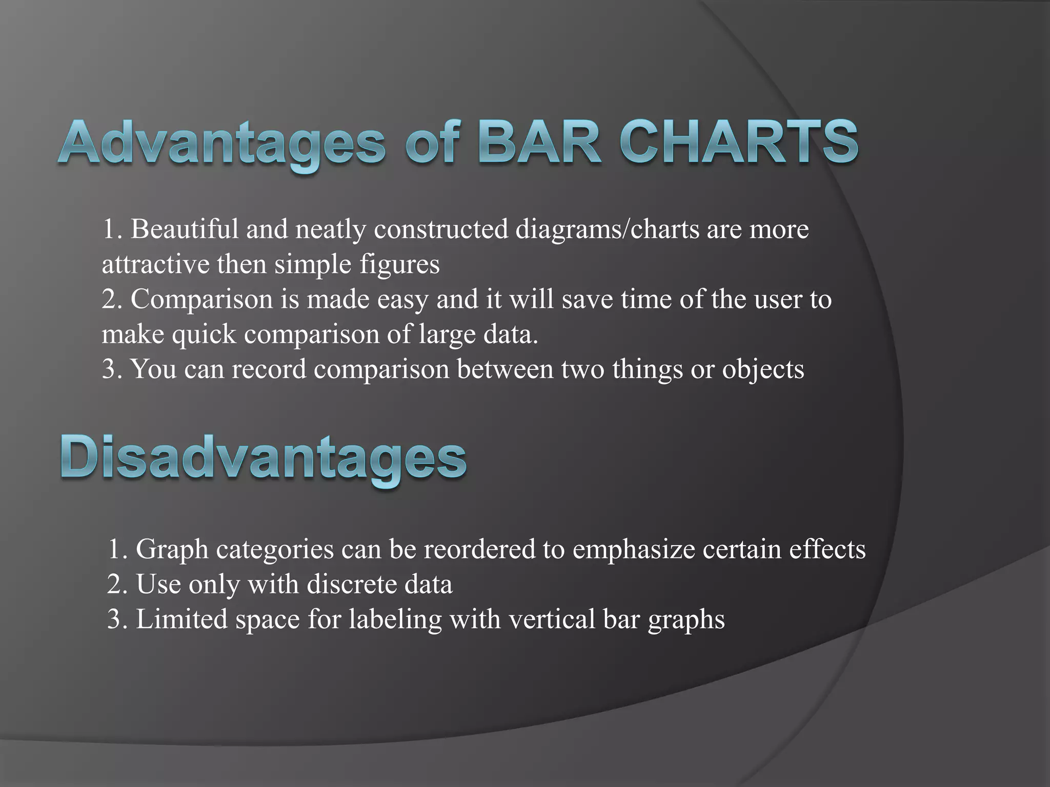
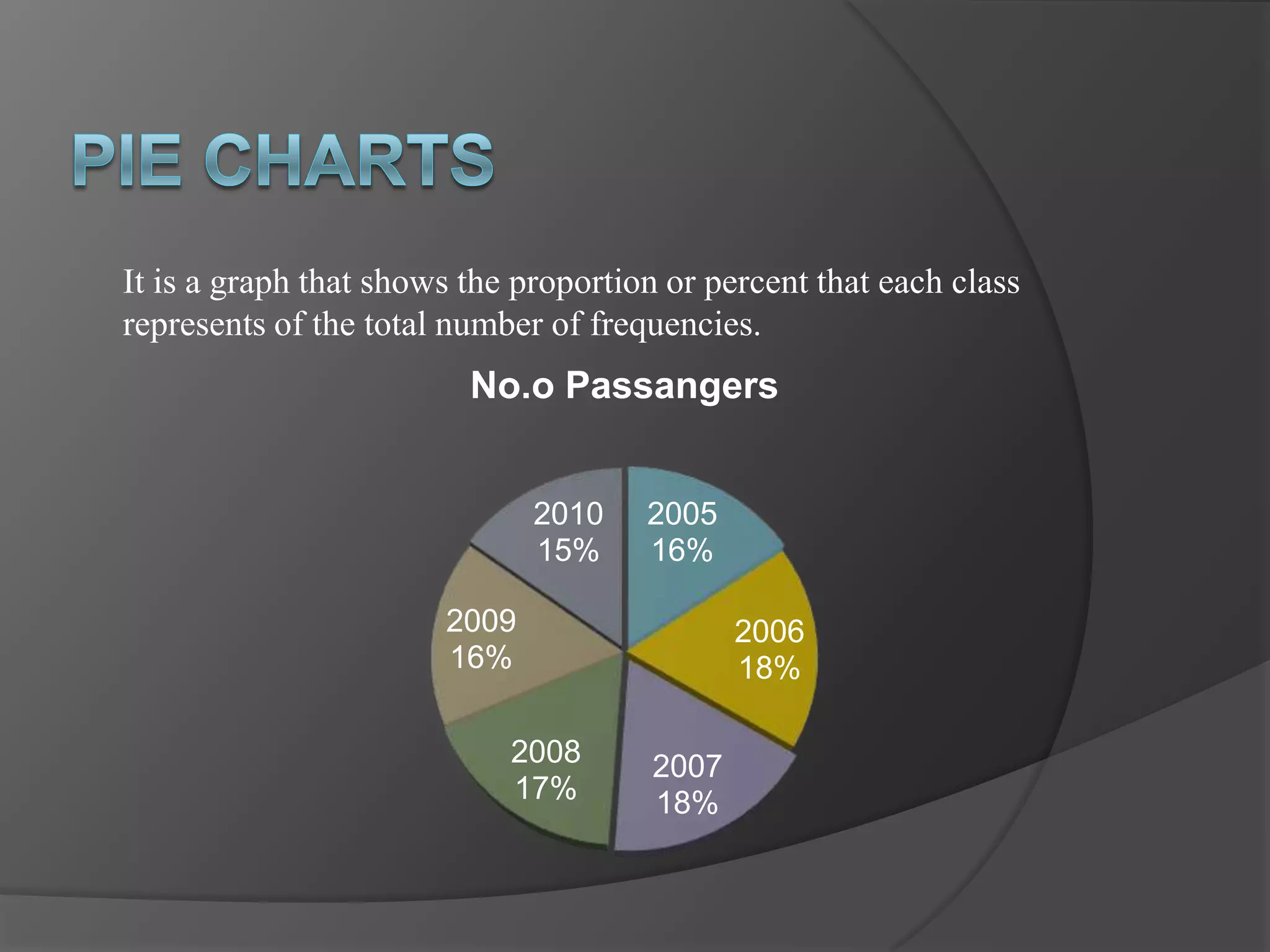
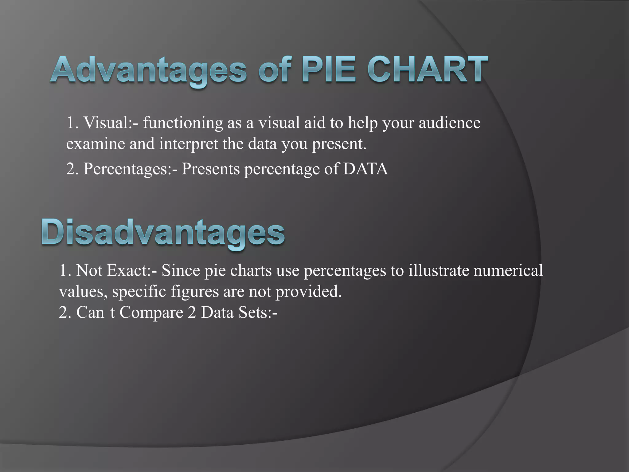
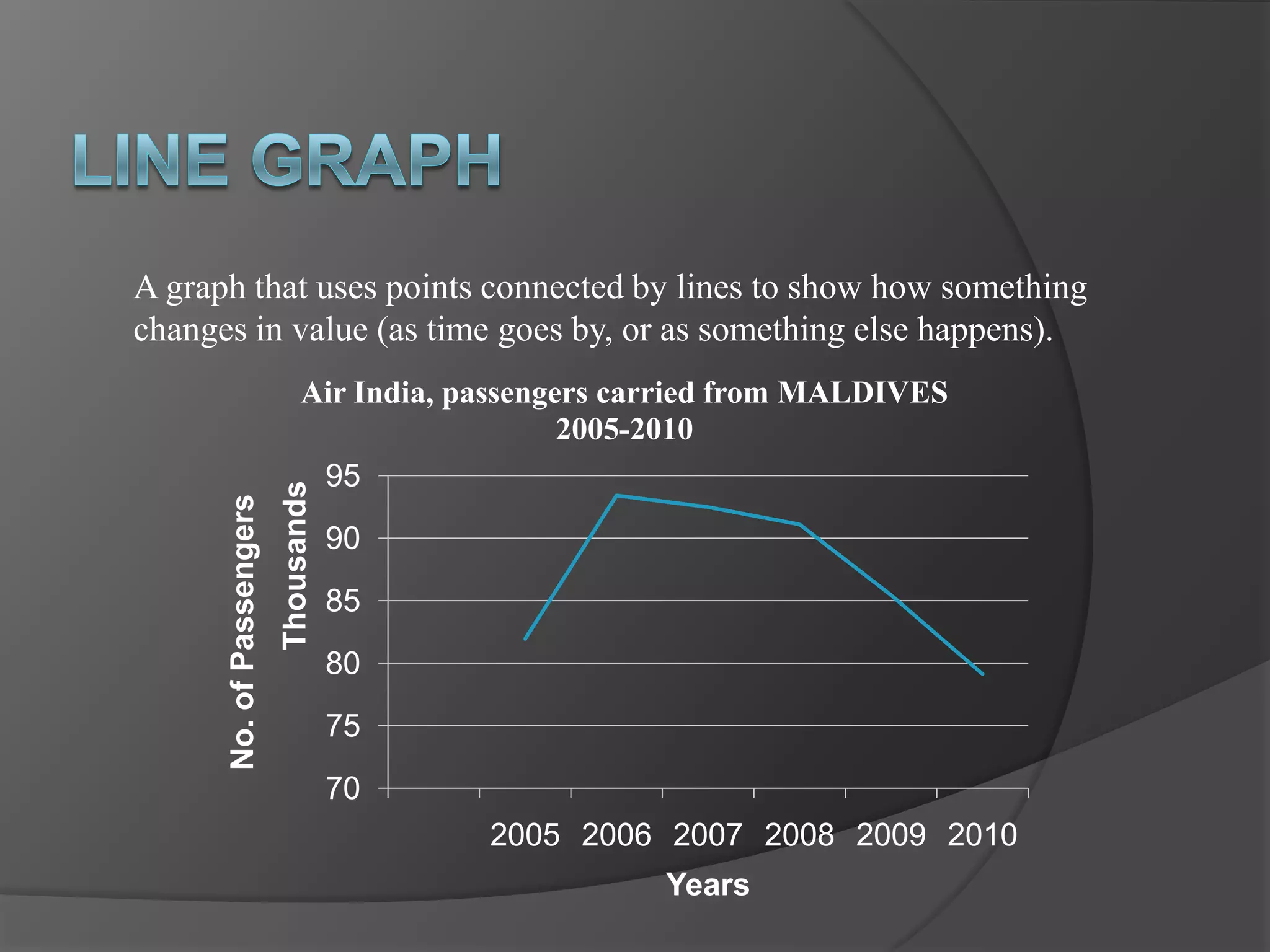
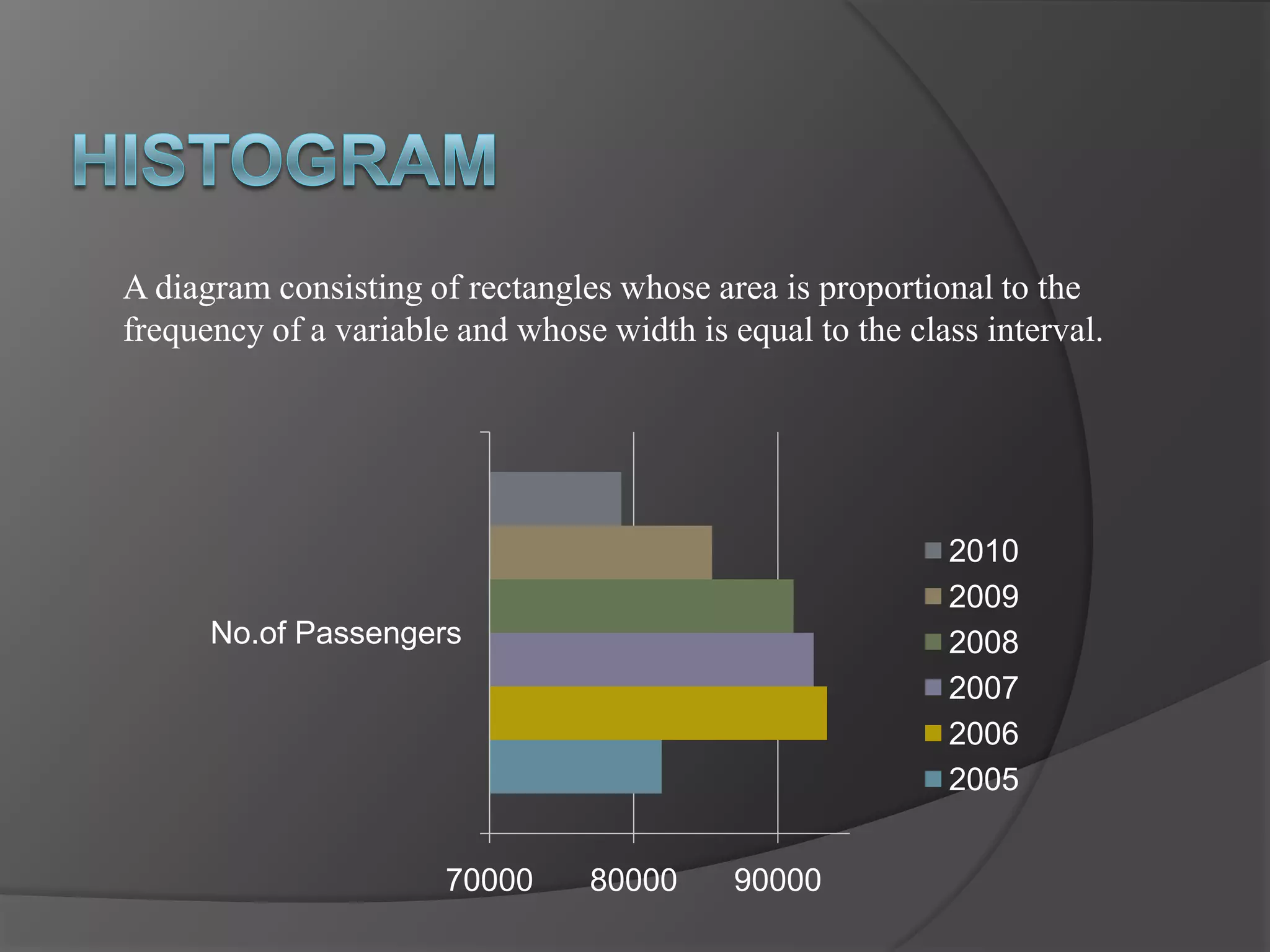


The document provides information about different types of statistical graphs used to represent numerical data, including: - A line graph showing the number of passengers carried by Air India from the Maldives from 2005 to 2010, with a steady decline over those years. - Bar graphs, pie charts, and histograms that can be used to represent the passenger data from the Maldives in different visual ways, each with their own advantages and disadvantages. - Definitions of key graph types like line graphs, bar graphs, pie charts, and histograms, along with notes on when each is best used and potential limitations.