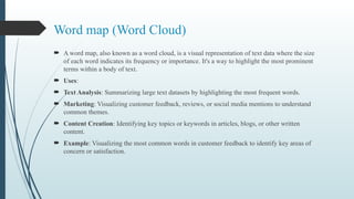
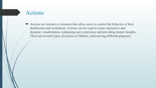
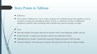
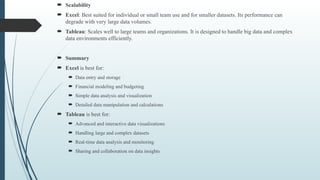
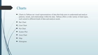
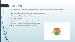
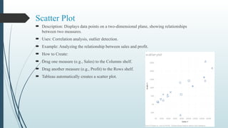
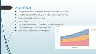
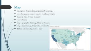
Tableau is a robust data visualization tool that simplifies the creation of interactive dashboards and visualizations, catering to users with varying technical skills. It excels in handling large datasets, offers real-time data connectivity, and provides advanced analytics capabilities while allowing for easy sharing and collaboration. Tableau's features make it distinct from Excel, which is primarily a spreadsheet application better suited for basic data manipulation and analysis.


![Cloumn formatting
Cloumn Name [Changing to new name or resetting it back)
Splitting columns using delimiter.
Sorting columns. [headers]
Sorting column. [values]
Delete the column](https://image.slidesharecdn.com/tableaufullppt-241112110152-cbcda0fe/85/Tableau_Course_Full_-Power_Point_presentation-pptx-16-320.jpg)
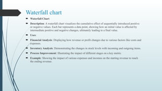
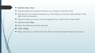
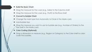
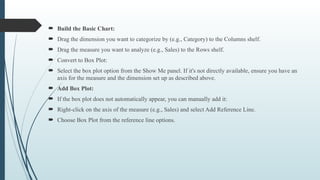
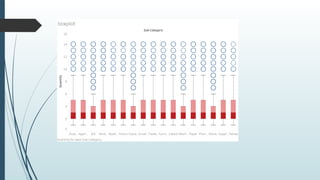
![ How to Create:
Create a Calculated Field for Running Total -> Go to the Data pane, right-click, and select Create
Calculated Field.
Name it something like Running Total.Use the following formula:
RUNNING_SUM(SUM([Value]))
Build the Basic Chart:
Drag your Category dimension to the Columns shelf. -> Drag your Value measure to the Rows shelf.
Convert to Gantt Bar Chart: ->Change the mark type from Automatic to Gantt Bar in the Marks card.
Add Running Total to Size:->Drag the Running Total calculated field to the Size shelf in the Marks
card.
Adjust the Size: ->You might need to adjust the size of the bars to make them more visible. You can do
this by clicking on the Size shelf and adjusting the slider.
Color Coding:->To differentiate between positive and negative changes, drag the Value field to the Color
shelf. Tableau will color the bars differently based on whether the values are positive or negative.
Formatting:->Adjust the colors, labels, and tooltips to improve readability.
Add labels by dragging the Value field to the Label shelf in the Marks card.
Refinement:->You can add reference lines or annotations to provide more context.
Ensure your axis and chart titles are descriptive.](https://image.slidesharecdn.com/tableaufullppt-241112110152-cbcda0fe/85/Tableau_Course_Full_-Power_Point_presentation-pptx-42-320.jpg)