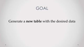
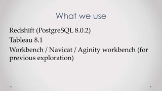
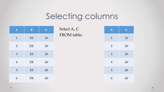
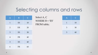
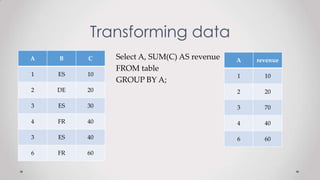
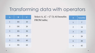
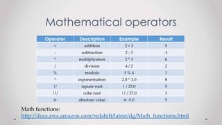
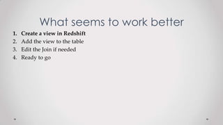
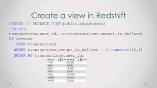
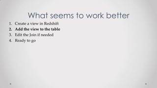
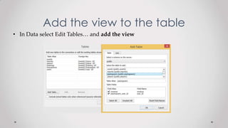
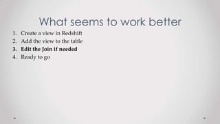
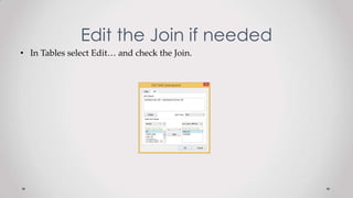
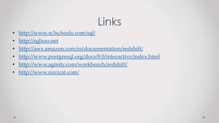
This document provides an overview of dashboards in Salesforce. It defines dashboards as visual representations of key business information made up of components like charts, tables, metrics and gauges that display data from custom reports. It describes how to create a dashboard, add different types of charts, refresh dashboards, and add an existing dashboard to the home page. The document also includes knowledge check questions to test understanding.
The document describes various ways to modify and enhance visualizations in SAP Lumira, including:
1) Sorting, filtering, ranking, and calculating measures and attributes in an existing column chart visualization.
2) Creating a "trellis effect" by dragging an attribute to the trellis section to show each value in a separate chart.
3) Changing global chart formatting preferences like color palette, template, and font size.
This document discusses how to enrich data in SAP Lumira by managing measures, creating time and geographic hierarchies, and other options like calculated fields. Specifically, it covers automatically converting numeric columns to measures, promoting attributes to measures, modifying aggregation methods, creating a time hierarchy to visualize sales revenue by year and quarter, creating a geographic hierarchy to map locations to country and city levels for pie charts of sales by country and city, and defining calculated measures or attributes.
SAP Lumira allows users to acquire data from various sources like SAP HANA, Excel, universes, and SQL queries. It enables combining datasets by appending records with the same structure or merging on a shared column. The tool also allows managing connections to view, edit, and modify connections between documents and data sources.
This document provides instructions for using the AutoSum function in OpenOffice Calc to calculate sums of rows and columns of data. It includes example data on bicycle sales and fundraising activities with multiple rows and columns and instructs the user to use AutoSum to calculate the total sales for each year and the grand total for all years, as well as the amount raised by each group and the total raised for each fundraising activity.
The document provides instructions for performing various GIS tasks in ArcMap including joining tables, creating relates between tables, appending data, performing erase operations, setting the map scale, defining and projecting feature coordinate systems.
In linear projects activities are associated with certain locations. They are usually construction projects, such as building and roads where each activities have location attributes in addition to duration, start and finish times, cost, resources and other attributes of traditional project schedules.
Time location charts are a way of visualizing project schedules with linear locations on the horizontal axis, and dates on the vertical axis. Schedule activities are then plotted onto the chart according to the locations over which they occur and the dates that the project schedule determines.
Time location charts could be presented for original project schedule and risks-adjusted project schedule.
Risk adjusted project schedule is a result of project risk analysis
This document provides instructions for converting contour data from GIS format to CAD format for use in 3D modeling. It involves checking that ArcGIS ArcInfo software is being used, verifying there is a field named "elevation" in the GIS data, and ensuring the data is in a supported projection before using the ArcToolbox Conversion Tool to export the data to DWG or DXF format.
The document provides instructions for multiple activities involving interactive analysis and formatting of tables and charts in an e-fashion data universe. The activities include:
1) Creating tables and charts to analyze quantity sold by year and quarter, and formatting the header.
2) Formatting various chart types like column, surface line, and 3D pie charts using different styles and removing axes titles.
3) Formatting reports by adding sections, sums, breaks and page layout.
4) Defining the scope of analysis using a product lines hierarchy and adding rules to flag low and average performing product lines.
The document outlines specifications for 6 reports. Report 1 displays divisions, counties, and clients in a relational source with groups on division and country. Report 2 shows labor costs by county as a pie chart using a specified cube and measure. Report 3 displays overhead costs by category for Q3 and Q4 2005 from a cube with any increases in red. Report 4 is similar but allows selecting an overhead category and quarter. Report 5 shows overhead by category and quarter from a cube, allowing sorting. Report 6 displays labor costs for an employee's jobs within a date range from a cube, grouping by name and date.
The document provides instructions for creating a waterfall chart in Excel to show rising and falling values over time. It describes adding columns to the data to calculate chart values, formatting the different series, and customizing the chart appearance. The completed chart uses colored bars and formatting to visually depict starting, ending, and monthly changing values in the data series.
This document discusses different types of graphs that can be used in Actuate reports, including pie, bar, line, scatter, high-low-close, and candlestick graphs. It provides examples of when each graph type would be appropriate and how to insert and configure graphs in an Actuate report. Graphs are configured using properties to select the type and format the data stream.
This is an SOP for the inside field technician to create the report of the overall amount of tickets per day, how long it takes to fix a problem and if there any other problems told not in the ticket system.
This document provides instructions for completing the BIS 155 Final Exam in Microsoft Excel. It outlines 10 sections to complete, including formatting charts and tables, using formulas and functions, sorting data, creating pivot tables and charts, financial analysis, consolidating data from multiple worksheets, and conducting an analysis to provide a recommendation. The exam is open book and allows referencing notes, textbooks, and online resources, but no outside help. It must be completed individually within 4 hours. Sections are worth between 30-40 points each and cover a range of Excel skills and business concepts.
In this presentation, we will see How to make Gantt chart in excel. Gantt chart is a wonderful way of planning and tracking activities in Project Management.
For Video Tutorial: https://youtu.be/haXPykHchaY
For Tutorial:
http://www.edtechnology.in/software-engineering/what-is-gantt-chart-how-to-make-gantt-chart-in-excel/
This chapter discusses Excel charts and their components. It covers various chart types like column, bar, pie and line charts. It describes how to create and modify charts by changing their type, location, or data source. It also discusses formatting chart elements, titles, labels and legends. The chapter aims to teach readers how to work with charts in Excel.
This document summarizes new features in Calc and Chart in OpenOffice.org 3.3. For Calc, it highlights support for up to 1 million rows, automatic number of decimals displayed, adapting filter selections to used columns, and custom names for DataPilot fields. For Chart, it discusses hierarchical axis labels, adding shapes within charts, controlling chart position and size, and updated 2D and 3D chart defaults. Performance improvements were needed to support millions of rows in Calc.
Excel 2016 | Module 3: SAM Project 1a Pick Up MotorsAlexHunetr
This document provides instructions for a project in Excel involving analyzing sales data for a car dealership. The instructions include 20 steps to format and analyze the sales data, add charts and sparklines, calculate commissions using formulas, and generate a goal value using Goal Seek. The completed workbook should include formatted sales data, charts showing monthly sales and commissions, sparklines, and a system date.
This is part of Media4Math's new collection of Tutorials for the new TI-Nspire iPad App. See the complete collection on http://www.media4mathplus.com. Sign up for a 30-day free preview.
Excel 2013 Chapter 8: SAM Project 1a Precision Guitars WORKING WITH PIVOTTABL...AlexHunetr
This document provides instructions for a project analyzing sales data for Precision Guitars. The goals are to create pivot tables and pivot charts to analyze sales by region, guitar type, and other factors. Specific steps include formatting pivot charts, adding and formatting pivot tables, adding slicers, and creating a line chart with a trendline to analyze sales trends over time. The project involves analyzing actual sales data and creating visualizations to help the sales manager evaluate performance.
The document discusses creating dynamic search functionality for a website about tours. It provides instructions for modifying three pages - tours.php, tours_details.php, and index.php - to add search forms and recordsets to allow filtering tours by region. It describes adding code to tours_details.php to dynamically change the recordset displayed based on the user's search criteria. The objective is to group data in a select statement, create a search page from a form, and implement search results using conditional logic in the SQL statement.
This document provides step-by-step instructions for modeling an arch with a radius of 29 ft, height of 8 ft, and span of 40 ft in the structural analysis software SAP2000. The modeling process uses a barrel vault shell template to initially place points defining the arch geometry, then deletes the shell elements to leave just the arch frame. Key steps include calculating arch parameters from dimensions, using the template to input values, rotating and positioning the arch frame, adding supports and loads, and analyzing the model.
GIS Analysts frequently produce reports based on a combination of analysis techniques, with data sourced from a variety of spatial and non-spatial databases. Joining data from large, disparate enterprise databases can be challenging and time consuming. This presentation will explore options to streamline these processes by configuring User Parameters and utilizing Excel templates to eliminate time spent formatting generic data outputs. The end result will be consistent looking, professional quality spreadsheets with charts and tables, which can also be utilized by FME Server for self-serving and/or automated reporting.
Spring 2020 excel project #1 instructionsAnetteNsah
This document provides instructions for a multi-worksheet Excel project analyzing rental car revenue data from two locations over multiple years and quarters. Students are directed to import provided data into a 'Data' worksheet, then create 'Sorted' and 'Airport' worksheets to further analyze and chart the airport location data. Formulas are used to calculate average revenues, which are then conditionally formatted. Two charts are created visualizing average revenues for hybrid and premium vehicles over time. Students must answer two analysis questions in the worksheet commenting on trends in the data and the best chart type to compare all vehicle classes.
Using a stacked bar chart in Excel, you can create a Gantt chart to plan and track projects over time. The steps are: 1) Enter task data including descriptions, start dates, and durations in columns; 2) Create a stacked bar chart from the data and manually set the category and data series labels; 3) Format the chart axes to display tasks in order from top to bottom spanning the earliest to latest dates. Hide the start date data series to resemble a Gantt chart. Adjusting the project schedule will automatically update the chart.
This document provides instructions for completing a project in Exploring E Cap Grader C2 involving updating a workbook to display bank transactions in a PivotTable and PivotChart, performing various financial calculations and analyses, importing and manipulating text and XML data, and modifying document properties. The project consists of 24 steps worth a total of 100 points, such as sorting and filtering data, creating data tables and scenarios, using functions like INDEX and CUMPRINC, applying themes and styles, and ensuring the correct worksheets are present in the submitted workbook.
Next generation analytics isn’t on its way… it’s already arrived. Most businesses are in the process of developing their new data platforms on the cloud, or moving their existing analytics infrastructure to the cloud. Attend this webinar to learn model architectures and best practices for analytics on AWS. You’ll also learn how you can leverage cloud to spread insight throughout your organization.
Join us to learn:
• What cloud data infrastructure should look like
• How to optimize your analytics deployment on the cloud
• Using Tableau to find and share new insights with everyone in your organization
From weeks to hours big data analytics with tableau and amazon web services ...Amazon Web Services
Amazon Web Services and Tableau Software have shifted how organizations store and access their data. The fast, scalable, and cost efficient services that Amazon Web Services provides for housing data combined with Tableau's visual analytics solution means that within hours an organization can securely put the power of their massive data assets into the hands of their domain experts removing expensive overhead and lengthy setup-up time. Go from a petabyte scale data warehouse setup to leveraging visual analytics in just a couple of hours. Learn how leaders in managing big data are taking advantage of disruptive technology.
In this presentation you'll learn how to:
Empower visual data discovery against big data via a live demo of AWS and Tableau working together
Revolutionize corporate reporting and dashboards, including examples of customer case studies.
Promote data driven decision making at every level
Speaker: Jason Oakes, Sales Consultant, Tableau
Analyzing Billions of Data Rows with Alteryx, Amazon Redshift, and TableauDATAVERSITY
This document discusses amaysim's implementation of Amazon Redshift, Alteryx, and Tableau for data analytics. It provides an overview of each tool and how amaysim uses them together in their business intelligence stack. Key points include:
- Amaysim uses Redshift for data warehousing, Alteryx to prepare and blend data, and Tableau for visualization and self-service analytics. This allows for analysis within hours rather than weeks.
- With a small analytics team, the tools empower line of business users to solve their own problems quickly. This increases workforce productivity.
- Lessons learned include democratizing analytics, making tools relevant to different stakeholders, and celebrating successes to drive cultural
Tableau Software - Business Analytics and Data Visualizationlesterathayde
Tableau boasts drag-and-drop features that allow users to visualize information from any structured format. Tableau is the only provider of data visualization and business intelligence software that can be installed and used by anyone while also adhering to IT standards making it the fastest growing tool on the planet for Business Intelligence. Gartner has recently named us in the magic Quadrant among the Top 27 vendors for BI tool. We are no 1 in ease of use, no 1 in reporting and dashboard creation, interactive visualization, etc.
. Feel free to download the product, see the sample reports & dashboards for other industries from
http://www.tableausoftware.com
Please use the below link to download a 15 Day trial version of Tableau Desktop and Server Versions.
http://www.tableausoftware.com/products/trial
You can also do a self-training by going through the Videos in the below link.
http://www.tableausoftware.com/learn/training.
Step-1 Tableau Introduction
Step-2 Connecting to Data
Step-3 Building basic views
Step-4 Data manipulations and Calculated fields
Step-5 Tableau Dashboards
Step-6 Advanced Data Options
Step-7 Advanced graph Options
Tableau is business intelligence software that was created in 1992 as VizQL and allows users to visualize data through drag-and-drop interfaces to create dashboards, charts, and maps. It has three main products - Tableau Desktop for personal use, Tableau Server for organizations, and Tableau Online for cloud-based offerings. Tableau can connect to different data sources and perform functions like mapping, filtering, and unlimited undo. It is an alternative to using Excel for data analysis and visualization, with pros like ease of use but potential cons around cost and capabilities. The business intelligence software market that Tableau operates in continues to grow.
TekSlate is the leader in Tableau tutorials and other business intelligence tutorials emphasis on delivering complete knowledge through self-paced learning. Tableau Free Tutorials tech to create highly interactive dashboards using actions.
To Learn More Click On Below Link:
http://bit.ly/1zKKnPm
The document discusses data manipulation language (DML) statements in SQL. It describes how to insert rows into a table using INSERT, update rows using UPDATE, and delete rows from a table using DELETE. It also covers transaction control using COMMIT to save changes permanently and ROLLBACK to undo pending changes back to a savepoint.
An introductory presentation about table partitioning in PostgreSQL and how to integrate it in your Rails application. Given at the Cambridge Ruby User Group meetup Mar 27th 2014.
The document provides an agenda and overview for a data warehousing training on SQL Server Reporting Services (SSRS). It discusses the architecture of SSRS, using the report designer and wizard, publishing reports, and building OLAP reports. It also assigns participants to create a data warehouse using SQL Server Integration Services from an AdventureWorks database and build BI reports in SSRS.
V.6 CSPro Tabulation Application_Creating Tables with PostCalc Application.pptxEmmanuelAzuela3
This document provides instructions on how to create a CSPro tabulation application to generate a table showing average per capita monthly food consumption expenditure by barangay for a municipality. It describes how to:
1. Create a new tabulation application and input dictionary
2. Add variables to store household and indicator information
3. Specify the universe, value tallied, tabulation logic, and post-calculation for the table
4. Select the area to disaggregate the data by barangay
5. Save, run the application, and view the output table
The goal is to generate a table with monthly average food expenditure per capita by barangay using CSPro post-calculation logic.
This document discusses managing schema objects in an Oracle database. It defines schema objects as tables, constraints, indexes, views, sequences and temporary tables. It provides instructions on how to create and modify tables, define constraints on tables, view table columns and data, create indexes, views, sequences, and temporary tables. It explains the purpose and use of each schema object type.
This document outlines a 20-day Tableau training course covering Tableau basics, advanced functions, administration, and Tableau Public. The training includes connecting to various data sources, building visualizations, dashboarding, calculations, sets, filters, advanced charts, maps, and performance optimization. Administration topics include server configuration, permissions, subscriptions, and data refresh. Tableau Public is also introduced for end user sharing of reports.
Session 8 connect your universal application with database .. builders & deve...Moatasim Magdy
This document provides an overview of using SQLite database with C# and Universal Windows Platform (UWP) applications. It discusses why to use a database, the basic SQL queries like CREATE, SELECT, INSERT, UPDATE, DELETE. It then demonstrates how to connect a UWP app to a SQLite database, create and open the database, define and add records to tables, query and update records. The steps include adding SQLite references, installing SQLite packages, checking for database existence, creating and opening connections, executing queries to select, insert, update and delete records from tables.
The document summarizes the development of business intelligence reports for a project. It involved creating dashboards using Performance Point Server (PPS) and publishing them to SharePoint. SQL Server Reporting Services (SSRS) reports were also created and published. Excel reports were integrated into PPS dashboards. Data connections, filters, and scheduling were established to provide automated daily generation and viewing of reports.
This document discusses data manipulation in Oracle databases. It describes how to insert, update, and delete rows from tables using DML statements like INSERT, UPDATE, and DELETE. It also covers transaction management using COMMIT, ROLLBACK, and SAVEPOINT statements to control when changes are committed to the database or rolled back. Key aspects covered include inserting new rows, updating and deleting specific rows or all rows, and handling integrity constraints and transactions.
This document discusses data manipulation language (DML) statements used to insert, update, and delete rows in database tables. It describes the INSERT statement syntax for adding new rows, the UPDATE statement for modifying existing rows, and the DELETE statement for removing rows. It also covers transactions, using the COMMIT statement to make changes permanent and the ROLLBACK statement to undo pending changes. Key points covered include controlling consistency with transactions, implicit and explicit transaction processing, and read consistency.
This document contains an agenda and presentation materials for a SQL Saturday event on DAX in Ancona, Italy. The presentation introduces PowerPivot and DAX, the data analysis expression language used in PowerPivot. Key topics covered include calculated columns vs measures, evaluation context, aggregation functions, logical and date functions, and techniques like ABC analysis. The presentation aims to explain core DAX concepts and functionality to help users build effective data models and calculations.
This document discusses data manipulation language (DML) statements used to insert, update, and delete rows in database tables. It describes the INSERT statement syntax for adding new rows, the UPDATE statement for modifying existing rows, and the DELETE statement for removing rows. It also covers transactions, which group related DML statements, and the COMMIT and ROLLBACK statements used to make changes permanent or discard them.
The document discusses how to create and manage database tables. Key topics covered include using CREATE TABLE to define table structure, ALTER TABLE to modify tables, DROP TABLE to remove tables, and TRUNCATE TABLE to delete all rows. Datatypes, naming conventions, adding comments, and joining tables with subqueries are also summarized.
This document contains a step by step guide to create a BI Solution with SQL Server 2008 R2, it was downloaded from
http://channel9.msdn.com/Learn/Courses/Office2010/BIApplicationsUnit/BIApplicationsLab
This document is part of the Developing BI Applications Course that is available at Channel9 from Microsoft
Regards,
Eduardo Castro
Microsoft SQL Server MVP
http://ecastrom.blogspot.com
Part 3 of the SQL Tuning workshop examines the different aspects of an execution plan, from cardinality estimates to parallel execution and explains what information you should be gleaming from the plan and how it affects the execution. It offers insight into what caused the Optimizer to make the decision it did as well as a set of corrective measures that can be used to improve each aspect of the plan.
This document provides an overview of Power BI and discusses various features and considerations for building effective data models and reports. It begins with an introduction to Power BI Desktop and its capabilities compared to other Power BI options. The document then covers topics like building a data warehouse, learning SQL and DAX, creating measures and relationships, and best practices for mapping and self-service BI. It concludes with instructions for a Power BI demo. In 3 sentences or less: This document provides guidance on getting started with Power BI, discusses key skills needed like data warehousing and DAX, and includes a demo for exploring Power BI functionality through a sample model and report.
The document discusses various ways that web developers can leverage database techniques to simplify and optimize data-intensive web applications. It describes database views, virtual columns, packages with stored procedures and functions, subquery factoring, pipelined functions, triggers, LDAP integration, and TCP/IP connections - all of which can be used at the database level to add value to applications and handle complex business logic and data processing close to the data for better performance.
SQL Database Performance Tuning for DevelopersBRIJESH KUMAR
1. The document provides SQL performance tuning techniques for developers, including proper use of indexes, avoiding coding loops, and temporary tables.
2. It also discusses how developers and database administrators (DBAs) can work together effectively through improved communication, understanding different roles, and establishing processes for testing and changes.
3. Tips for both parties include being patient, providing database status updates, helping with testing, and planning for future migrations.
Online Statistics Gathering for Bulk Loads - the official name of the feature - was introduced in Oracle 12.1. The idea is to gather optimizer statistics "on the fly" for direct path loads. Sounds good for ETL? In certain scenarios it makes sense but even then there are many points to consider so that it becomes a reliable part of your ETL processes. When exactly will it be working and when not? Do you prevent it yourself? Documented, undocumented cases, known bugs. Which statistics are gathered and which are not? What has to be considered with partitioned tables? Interval partitioning - special case?
Similar to Tableau + Redshift views for dummies (20)
Global Situational Awareness of A.I. and where its headedvikram sood
You can see the future first in San Francisco.
Over the past year, the talk of the town has shifted from $10 billion compute clusters to $100 billion clusters to trillion-dollar clusters. Every six months another zero is added to the boardroom plans. Behind the scenes, there’s a fierce scramble to secure every power contract still available for the rest of the decade, every voltage transformer that can possibly be procured. American big business is gearing up to pour trillions of dollars into a long-unseen mobilization of American industrial might. By the end of the decade, American electricity production will have grown tens of percent; from the shale fields of Pennsylvania to the solar farms of Nevada, hundreds of millions of GPUs will hum.
The AGI race has begun. We are building machines that can think and reason. By 2025/26, these machines will outpace college graduates. By the end of the decade, they will be smarter than you or I; we will have superintelligence, in the true sense of the word. Along the way, national security forces not seen in half a century will be un-leashed, and before long, The Project will be on. If we’re lucky, we’ll be in an all-out race with the CCP; if we’re unlucky, an all-out war.
Everyone is now talking about AI, but few have the faintest glimmer of what is about to hit them. Nvidia analysts still think 2024 might be close to the peak. Mainstream pundits are stuck on the wilful blindness of “it’s just predicting the next word”. They see only hype and business-as-usual; at most they entertain another internet-scale technological change.
Before long, the world will wake up. But right now, there are perhaps a few hundred people, most of them in San Francisco and the AI labs, that have situational awareness. Through whatever peculiar forces of fate, I have found myself amongst them. A few years ago, these people were derided as crazy—but they trusted the trendlines, which allowed them to correctly predict the AI advances of the past few years. Whether these people are also right about the next few years remains to be seen. But these are very smart people—the smartest people I have ever met—and they are the ones building this technology. Perhaps they will be an odd footnote in history, or perhaps they will go down in history like Szilard and Oppenheimer and Teller. If they are seeing the future even close to correctly, we are in for a wild ride.
Let me tell you what we see.
Beyond the Basics of A/B Tests: Highly Innovative Experimentation Tactics You...Aggregage
This webinar will explore cutting-edge, less familiar but powerful experimentation methodologies which address well-known limitations of standard A/B Testing. Designed for data and product leaders, this session aims to inspire the embrace of innovative approaches and provide insights into the frontiers of experimentation!
The Building Blocks of QuestDB, a Time Series Databasejavier ramirez
Talk Delivered at Valencia Codes Meetup 2024-06.
Traditionally, databases have treated timestamps just as another data type. However, when performing real-time analytics, timestamps should be first class citizens and we need rich time semantics to get the most out of our data. We also need to deal with ever growing datasets while keeping performant, which is as fun as it sounds.
It is no wonder time-series databases are now more popular than ever before. Join me in this session to learn about the internal architecture and building blocks of QuestDB, an open source time-series database designed for speed. We will also review a history of some of the changes we have gone over the past two years to deal with late and unordered data, non-blocking writes, read-replicas, or faster batch ingestion.
Natural Language Processing (NLP), RAG and its applications .pptxfkyes25
1. In the realm of Natural Language Processing (NLP), knowledge-intensive tasks such as question answering, fact verification, and open-domain dialogue generation require the integration of vast and up-to-date information. Traditional neural models, though powerful, struggle with encoding all necessary knowledge within their parameters, leading to limitations in generalization and scalability. The paper "Retrieval-Augmented Generation for Knowledge-Intensive NLP Tasks" introduces RAG (Retrieval-Augmented Generation), a novel framework that synergizes retrieval mechanisms with generative models, enhancing performance by dynamically incorporating external knowledge during inference.
06-04-2024 - NYC Tech Week - Discussion on Vector Databases, Unstructured Data and AI
Round table discussion of vector databases, unstructured data, ai, big data, real-time, robots and Milvus.
A lively discussion with NJ Gen AI Meetup Lead, Prasad and Procure.FYI's Co-Found
ViewShift: Hassle-free Dynamic Policy Enforcement for Every Data LakeWalaa Eldin Moustafa
Dynamic policy enforcement is becoming an increasingly important topic in today’s world where data privacy and compliance is a top priority for companies, individuals, and regulators alike. In these slides, we discuss how LinkedIn implements a powerful dynamic policy enforcement engine, called ViewShift, and integrates it within its data lake. We show the query engine architecture and how catalog implementations can automatically route table resolutions to compliance-enforcing SQL views. Such views have a set of very interesting properties: (1) They are auto-generated from declarative data annotations. (2) They respect user-level consent and preferences (3) They are context-aware, encoding a different set of transformations for different use cases (4) They are portable; while the SQL logic is only implemented in one SQL dialect, it is accessible in all engines.
#SQL #Views #Privacy #Compliance #DataLake
Enhanced Enterprise Intelligence with your personal AI Data Copilot.pdfGetInData
Recently we have observed the rise of open-source Large Language Models (LLMs) that are community-driven or developed by the AI market leaders, such as Meta (Llama3), Databricks (DBRX) and Snowflake (Arctic). On the other hand, there is a growth in interest in specialized, carefully fine-tuned yet relatively small models that can efficiently assist programmers in day-to-day tasks. Finally, Retrieval-Augmented Generation (RAG) architectures have gained a lot of traction as the preferred approach for LLMs context and prompt augmentation for building conversational SQL data copilots, code copilots and chatbots.
In this presentation, we will show how we built upon these three concepts a robust Data Copilot that can help to democratize access to company data assets and boost performance of everyone working with data platforms.
Why do we need yet another (open-source ) Copilot?
How can we build one?
Architecture and evaluation
State of Artificial intelligence Report 2023kuntobimo2016
Artificial intelligence (AI) is a multidisciplinary field of science and engineering whose goal is to create intelligent machines.
We believe that AI will be a force multiplier on technological progress in our increasingly digital, data-driven world. This is because everything around us today, ranging from culture to consumer products, is a product of intelligence.
The State of AI Report is now in its sixth year. Consider this report as a compilation of the most interesting things we’ve seen with a goal of triggering an informed conversation about the state of AI and its implication for the future.
We consider the following key dimensions in our report:
Research: Technology breakthroughs and their capabilities.
Industry: Areas of commercial application for AI and its business impact.
Politics: Regulation of AI, its economic implications and the evolving geopolitics of AI.
Safety: Identifying and mitigating catastrophic risks that highly-capable future AI systems could pose to us.
Predictions: What we believe will happen in the next 12 months and a 2022 performance review to keep us honest.
Predictably Improve Your B2B Tech Company's Performance by Leveraging DataKiwi Creative
Harness the power of AI-backed reports, benchmarking and data analysis to predict trends and detect anomalies in your marketing efforts.
Peter Caputa, CEO at Databox, reveals how you can discover the strategies and tools to increase your growth rate (and margins!).
From metrics to track to data habits to pick up, enhance your reporting for powerful insights to improve your B2B tech company's marketing.
- - -
This is the webinar recording from the June 2024 HubSpot User Group (HUG) for B2B Technology USA.
Watch the video recording at https://youtu.be/5vjwGfPN9lw
Sign up for future HUG events at https://events.hubspot.com/b2b-technology-usa/
3. No, no, no, no
We are not going to:
• Delete
• Insert
• Update
(for the moment…)
4. What we use
Redshift (PostgreSQL 8.0.2)
Tableau 8.1
Workbench / Navicat / Aginity workbench (for
previous exploration)
5. Selecting columns
Select A, C
FROM table;
A B C
1 ES 10
2 DE 20
3 ES 30
4 FR 40
3 ES 40
6 FR 60
A C
1 10
2 20
3 30
4 40
3 40
6 60
6. Selecting columns and rows
A B C
1 ES 10
2 DE 20
3 ES 30
4 FR 40
3 ES 40
6 FR 60
A C
1 10
3 30
3 40
Select A, C
WHERE B = ‘ES’
FROM table;
7. Transforming data
A B C
1 ES 10
2 DE 20
3 ES 30
4 FR 40
3 ES 40
6 FR 60
Select A, SUM(C) AS revenue
FROM table
GROUP BY A;
A revenue
1 10
2 20
3 70
4 40
6 60
8. Transforming data with operators
A B C
1 ES 10
2 DE 20
3 ES 30
4 FR 40
3 ES 40
6 FR 60
Select A, (C – C*.3) AS benefits
FROM table;
A benefits
1 7
2 14
3 21
4 28
6 28
6 42
10. What seems to work better
1. Create a view in Redshift
2. Add the view to the table
3. Edit the Join if needed
4. Ready to go
11. Create a view in Redshift
CREATE OR REPLACE VIEW public.payingusers
SELECT
transactions.user_id, sum(transactions.amount_in_dollars)
AS revenue
FROM transactions
WHERE transactions.amount_in_dollars > 0::numeric(12,4)
GROUP BY transactions.user_id;
12. What seems to work better
1. Create a view in Redshift
2. Add the view to the table
3. Edit the Join if needed
4. Ready to go
13. Add the view to the table
• In Data select Edit Tables… and add the view
14. What seems to work better
1. Create a view in Redshift
2. Add the view to the table
3. Edit the Join if needed
4. Ready to go
15. Edit the Join if needed
• In Tables select Edit… and check the Join.