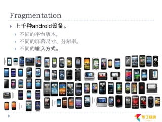
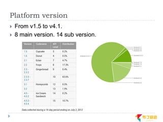
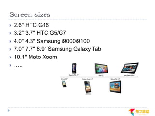
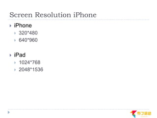
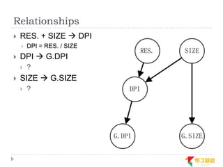
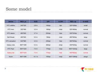
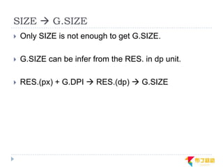
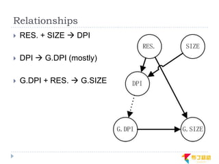
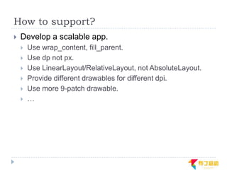
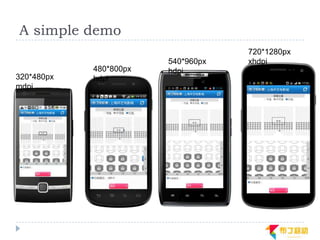
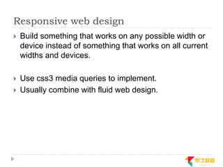
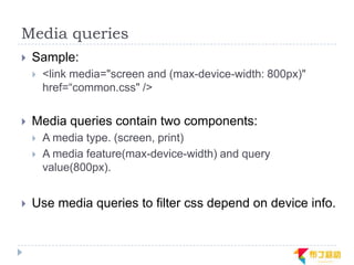
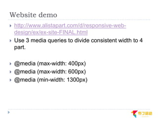
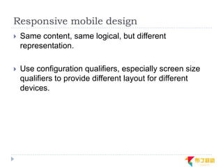
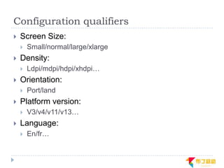
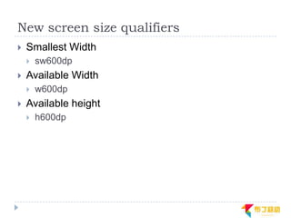
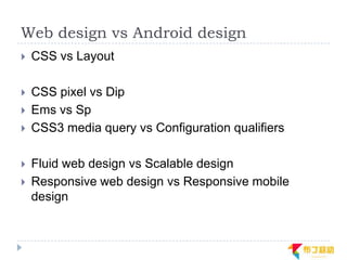
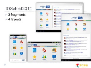
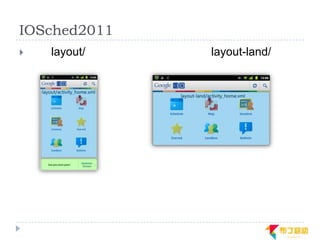
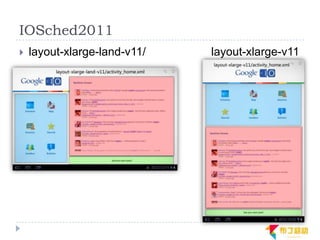
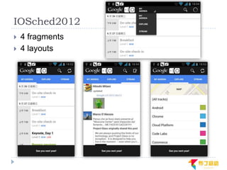
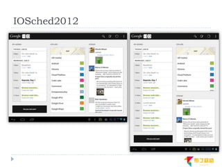
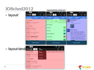
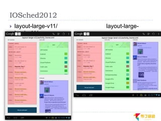
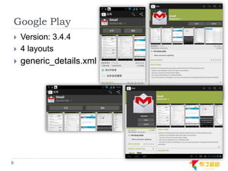
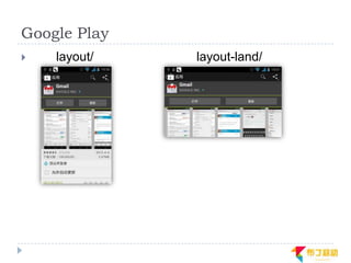
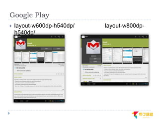
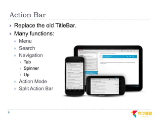
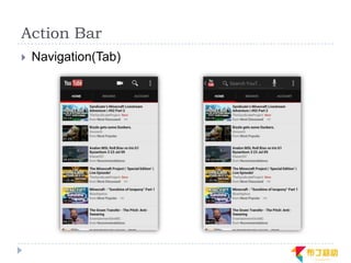
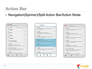
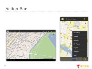
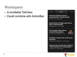
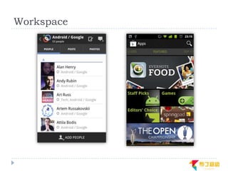
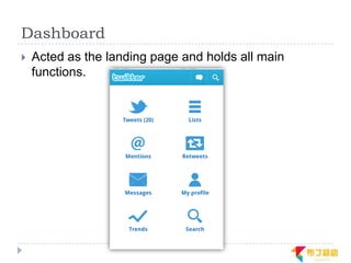
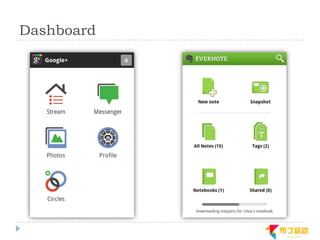
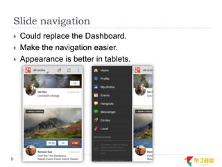
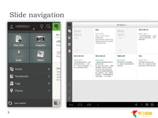
Supporting Multiple Screens in
                      Android
                 Android多屏幕适配
Preface
   Author:
       Ren Fei. Android developer
       Buding Mobile /       Innovation Works


   Announcement:
       本slide大量出现英文,都是我直接从原文copy/paste过来
        的,英文水平有限也不知道该怎么翻,还望读者见谅。
       本slide内容全部来自互联网,以及我自己的一点臆想,如
        有错误,欢迎随便指出。
Origin of the problem

              问题的由来
Fragmentation
   上千种android设备。
       不同的平台版本。
       不同的屏幕尺寸、分辨率。
       不同的输入方式。
Platform version
   From v1.5 to v4.1.
   8 main version. 14 sub version.
Screen sizes
   2.6" HTC G16
   3.2" 3.7" HTC G5/G7
   4.0" 4.3" Samsung i9000/9100
   7.0" 7.7" 8.9" Samsung Galaxy Tab
   10.1" Moto Xoom
   …..
Screen Resolution iPhone
   iPhone
       320*480
       640*960

   iPad
       1024*768
       2048*1536
Screen Resolution Android
   QVGA    240*320
   WQVGA   240*400
   HVGA    320*480
   WVGA    480*800
   FWVGA   480*854
   SVGA    600*800
   DVGA    960*640
   WSVGA   1024*600
   WXGA    1280*768
   qHD     540*960
   HD      1280*720
   ……
Screen RES. iPhone vs. Android
Android System Support

             Android系统支持
What does android do ?
Some definition
   Screen resolution
       480*800
   Screen size
       3.7"
   Screen density
       252dpi


   DPI(dots per inch), xdpi, ydpi
       DPI= RES. / SIZE
   DIP (Density-independent pixel)
       px = dp * (dpi / 160)
Generalized SIZE/DPI
   Hdpi/mdpi/ldpi/xhdpi
   Small/normal/large/xlarge
Generalized DPI definition
   ldpi (Low density)          120 dpi   0.75
   mdpi (Medium density)            160 dpi   1
   hdpi (High density)         240 dpi   1.5
   xhdpi(Extra-high density)        320 dpi   2
Generalized SIZE definition
   xlarge screens are at least 960dp x 720dp.
   large screens are at least 640dp x 480dp.
   normal screens are at least 470dp x 320dp.
   small screens are at least 426dp x 320dp. (Android
    does not currently support screens smaller than this.)
Relationships
   RES. + SIZE  DPI
       DPI = RES. / SIZE
   DPI  G.DPI
       ?
   SIZE  G.SIZE
       ?
Some model

   device       RES. px    SIZE       DPI     G.DPI    RES. dp     G.SIZE

 HTC wildfire   240*320    2.8 in    140dpi    ldpi   320*428dp     small

  HTC hero      320*480    3.2 in    180dpi   mdpi    320*480dp    normal

 HTC desire     480*800    3.7 in    252dpi   hdpi    320*533dp    normal

 Dell Streak    480*800    5.0 in    186dp    mdpi    480*800dp     large

HTC sensation   540*960    4.3 in    256dpi   hdpi    360*640dp    normal

 Galaxy note    800*1280   5.3 in    284dpi   xhdpi   400*640dp    normal

  HTC Flyer     600*1024   7.0 in    170dpi   mdpi    600*1024dp    large

 Galaxy tab     600*1024   7.0 in    170dpi   hdpi    400*682dp    normal

    Xoom        800*1280   10.1 in   150dpi   mdpi    800*1280dp   xlarge
DPI  G.DPI
   G.DPI mostly can be inferred from DPI

   But some G.DPI may be very different with the real
    dpi.
       Samsung galaxy tab has HDPI, but its real dpi is 170.


   G.DPI, xdpi, ydpi are set by manufacturers.

   Manufacturer will choose a G.DPI to make its UI
    looks the best.
SIZE  G.SIZE
   Only SIZE is not enough to get G.SIZE.

   G.SIZE can be infer from the RES. in dp unit.

   RES.(px) + G.DPI  RES.(dp)  G.SIZE
Relationships
   RES. + SIZE  DPI

   DPI  G.DPI (mostly)

   G.DPI + RES.  G.SIZE
Effect of G.DPI
   Developers do not need to care about real density.

   Different RES.(px). are aggregated to RES.(dp),
    which has a much smaller range.
       For example, some small/normal size device.
             device       RES. px    G.DPI   RES. dp     G.SIZE

           HTC wildfire   240*320     ldpi   320*428dp    small

            HTC hero      320*480    mdpi    320*480dp   normal

           HTC desire     480*800    hdpi    320*533dp   normal

          HTC sensation   540*960    hdpi    360*640dp   normal

           Galaxy note    800*1280   xhdpi   400*640dp   normal
Density independence
   The Android system scales dp units and drawable
    res to appropriate size based on the G.DPI.

   For example, a Button(100*100dp) and a icon image
    will looks nearly the same in different devices.
Support general handset

            如何支持普通手机?
Handset features
   Small and Normal devices take over 90%.
   These devices are nearly all handset.
Handset qualifier
   G.SIZE: small/normal
   Default Orientation: portrait
   RES.(dp): 426dp x 320dp - 640dp x 480dp.
How to support?
   Develop a scalable app.
       Use wrap_content, fill_parent.
       Use dp not px.
       Use LinearLayout/RelativeLayout, not AbsoluteLayout.
       Provide different drawables for different dpi.
       Use more 9-patch drawable.
       …
A simple demo
                                    720*1280px
                        540*960px   xhdpi
            480*800px   hdpi
320*480px   hdpi
mdpi
Support more devices
   (handset & tablet)
        如何支持更多的设备?
The first guideline
   Develop one app for all devices.
       There is no dividing line between handsets and tablets.
        Maintaining multi apps for different devices is not working
        well.
Official Guidelines
   Build your activity designs based on fragments
   Use the action bar
   Implement flexible layouts
Implement flexible layouts
   How to implement flexible layouts in one app?
       Official answer: Think like a web designer.
Responsive web design
   Build something that works on any possible width or
    device instead of something that works on all current
    widths and devices.

   Use css3 media queries to implement.
   Usually combine with fluid web design.
Media queries
   Sample:
       <link media="screen and (max-device-width: 800px)"
        href=“common.css" />

   Media queries contain two components:
       A media type. (screen, print)
       A media feature(max-device-width) and query
        value(800px).


   Use media queries to filter css depend on device info.
Website demo
   http://www.alistapart.com/d/responsive-web-
    design/ex/ex-site-FINAL.html
   Use 3 media queries to divide consistent width to 4
    part.

   @media (max-width: 400px)
   @media (max-width: 600px)
   @media (min-width: 1300px)
Responsive mobile design
   Same content, same logical, but different
    representation.

   Use configuration qualifiers, especially screen size
    qualifiers to provide different layout for different
    devices.
Configuration qualifiers
   Screen Size:
       Small/normal/large/xlarge
   Density:
       Ldpi/mdpi/hdpi/xhdpi…
   Orientation:
       Port/land
   Platform version:
       V3/v4/v11/v13…
   Language:
       En/fr…
New screen size qualifiers
   Smallest Width
       sw600dp
   Available Width
       w600dp
   Available height
       h600dp
Web design vs Android design
   CSS vs Layout

   CSS pixel vs Dip
   Ems vs Sp
   CSS3 media query vs Configuration qualifiers

   Fluid web design vs Scalable design
   Responsive web design vs Responsive mobile
    design
App demos
   IOSched2011
   IOSched2012
   Google Play
IOSched2011
   3 fragments
   4 layouts
IOSched2011
   layout/   layout-land/
IOSched2011
   layout-xlarge-land-v11/   layout-xlarge-v11
IOSched2012
   4 fragments
   4 layouts
IOSched2012
IOSched2012
   layout/


   layout-land/
IOSched2012
   layout-large-v11/   layout-large-
    land-v11/
Google Play
   Version: 3.4.4
   4 layouts
   generic_details.xml
Google Play
   layout/   layout-land/
Google Play
   layout-w600dp-h540dp/   layout-w800dp-
    h540dp/
UI Design Patterns

           UI设计模式
Android UI design patterns
   A UI design pattern describes a general solution to a
    recurring question.

   Mature UI patterns have flexible layouts towards
    different devices. They are self-adaptive to multi-
    screen.

   Here we introduce some useful patterns.
       Action Bar
       Workspace
       Dashboard
       Slide navigation
Action Bar
   Replace the old TitleBar.
   Many functions:
       Menu
       Search
       Navigation
           Tab
           Spinner
           Up
       Action Mode
       Split Action Bar
Action Bar
   Navigation(Tab)
Action Bar
   Navigation(Spinner)/Split Action Bar/Action Mode
Action Bar
Workspace
   A scrollable TabView.
   Could combine with ActionBar.
Workspace
Dashboard
   Acted as the landing page and holds all main
    functions.
Dashboard
Slide navigation
   Could replace the Dashboard.
   Make the navigation easier.
   Appearance is better in tablets.
Slide navigation
Conclusion
   Density independence in android could handles most
    of work to adapt apps to each devices.

   What you should do is supporting flexible, dynamic
    layouts.(think like a web designer)

   Remember developing one app for all devices.

   Follow platform guideline and use more UI design
    patterns.
The End

Thanks for watching
Contact
 欢迎各种交流与切磋
 @Renfei
 Email:renfei@buding.cn

 期待你的加入,与布丁一起创造、成长!
 Welcome to Buding Mobile(布丁移动)
 Contact:hr@buding.cn
Reference
   http://android-developers.blogspot.com/
   https://developer.android.com/
   http://www.pushing-pixels.org/
   http://www.androiduipatterns.com/
   http://androidniceties.tumblr.com/
   http://en.wikipedia.org/
   http://www.alistapart.com/articles/responsive-web-
    design/
   http://opensignalmaps.com/reports/fragmentation.ph
    p
Q&A
   Email: renfei@buding.cn
Web demo gallery
Web demo gallery
Web demo gallery
Web demo gallery
Web demo gallery
Web demo gallery

Supporting multi screen in android

  • 1.
    Supporting Multiple Screensin Android Android多屏幕适配
  • 2.
    Preface  Author:  Ren Fei. Android developer  Buding Mobile / Innovation Works  Announcement:  本slide大量出现英文,都是我直接从原文copy/paste过来 的,英文水平有限也不知道该怎么翻,还望读者见谅。  本slide内容全部来自互联网,以及我自己的一点臆想,如 有错误,欢迎随便指出。
  • 3.
    Origin of theproblem 问题的由来
  • 4.
    Fragmentation  上千种android设备。  不同的平台版本。  不同的屏幕尺寸、分辨率。  不同的输入方式。
  • 5.
    Platform version  From v1.5 to v4.1.  8 main version. 14 sub version.
  • 6.
    Screen sizes  2.6" HTC G16  3.2" 3.7" HTC G5/G7  4.0" 4.3" Samsung i9000/9100  7.0" 7.7" 8.9" Samsung Galaxy Tab  10.1" Moto Xoom  …..
  • 7.
    Screen Resolution iPhone  iPhone  320*480  640*960  iPad  1024*768  2048*1536
  • 8.
    Screen Resolution Android  QVGA 240*320  WQVGA 240*400  HVGA 320*480  WVGA 480*800  FWVGA 480*854  SVGA 600*800  DVGA 960*640  WSVGA 1024*600  WXGA 1280*768  qHD 540*960  HD 1280*720  ……
  • 9.
    Screen RES. iPhonevs. Android
  • 10.
    Android System Support Android系统支持
  • 11.
  • 12.
    Some definition  Screen resolution  480*800  Screen size  3.7"  Screen density  252dpi  DPI(dots per inch), xdpi, ydpi  DPI= RES. / SIZE  DIP (Density-independent pixel)  px = dp * (dpi / 160)
  • 13.
    Generalized SIZE/DPI  Hdpi/mdpi/ldpi/xhdpi  Small/normal/large/xlarge
  • 14.
    Generalized DPI definition  ldpi (Low density) 120 dpi 0.75  mdpi (Medium density) 160 dpi 1  hdpi (High density) 240 dpi 1.5  xhdpi(Extra-high density) 320 dpi 2
  • 15.
    Generalized SIZE definition  xlarge screens are at least 960dp x 720dp.  large screens are at least 640dp x 480dp.  normal screens are at least 470dp x 320dp.  small screens are at least 426dp x 320dp. (Android does not currently support screens smaller than this.)
  • 16.
    Relationships  RES. + SIZE  DPI  DPI = RES. / SIZE  DPI  G.DPI  ?  SIZE  G.SIZE  ?
  • 17.
    Some model device RES. px SIZE DPI G.DPI RES. dp G.SIZE HTC wildfire 240*320 2.8 in 140dpi ldpi 320*428dp small HTC hero 320*480 3.2 in 180dpi mdpi 320*480dp normal HTC desire 480*800 3.7 in 252dpi hdpi 320*533dp normal Dell Streak 480*800 5.0 in 186dp mdpi 480*800dp large HTC sensation 540*960 4.3 in 256dpi hdpi 360*640dp normal Galaxy note 800*1280 5.3 in 284dpi xhdpi 400*640dp normal HTC Flyer 600*1024 7.0 in 170dpi mdpi 600*1024dp large Galaxy tab 600*1024 7.0 in 170dpi hdpi 400*682dp normal Xoom 800*1280 10.1 in 150dpi mdpi 800*1280dp xlarge
  • 18.
    DPI  G.DPI  G.DPI mostly can be inferred from DPI  But some G.DPI may be very different with the real dpi.  Samsung galaxy tab has HDPI, but its real dpi is 170.  G.DPI, xdpi, ydpi are set by manufacturers.  Manufacturer will choose a G.DPI to make its UI looks the best.
  • 19.
    SIZE  G.SIZE  Only SIZE is not enough to get G.SIZE.  G.SIZE can be infer from the RES. in dp unit.  RES.(px) + G.DPI  RES.(dp)  G.SIZE
  • 20.
    Relationships  RES. + SIZE  DPI  DPI  G.DPI (mostly)  G.DPI + RES.  G.SIZE
  • 21.
    Effect of G.DPI  Developers do not need to care about real density.  Different RES.(px). are aggregated to RES.(dp), which has a much smaller range.  For example, some small/normal size device. device RES. px G.DPI RES. dp G.SIZE HTC wildfire 240*320 ldpi 320*428dp small HTC hero 320*480 mdpi 320*480dp normal HTC desire 480*800 hdpi 320*533dp normal HTC sensation 540*960 hdpi 360*640dp normal Galaxy note 800*1280 xhdpi 400*640dp normal
  • 22.
    Density independence  The Android system scales dp units and drawable res to appropriate size based on the G.DPI.  For example, a Button(100*100dp) and a icon image will looks nearly the same in different devices.
  • 23.
    Support general handset 如何支持普通手机?
  • 24.
    Handset features  Small and Normal devices take over 90%.  These devices are nearly all handset.
  • 25.
    Handset qualifier  G.SIZE: small/normal  Default Orientation: portrait  RES.(dp): 426dp x 320dp - 640dp x 480dp.
  • 26.
    How to support?  Develop a scalable app.  Use wrap_content, fill_parent.  Use dp not px.  Use LinearLayout/RelativeLayout, not AbsoluteLayout.  Provide different drawables for different dpi.  Use more 9-patch drawable.  …
  • 27.
    A simple demo 720*1280px 540*960px xhdpi 480*800px hdpi 320*480px hdpi mdpi
  • 28.
    Support more devices (handset & tablet) 如何支持更多的设备?
  • 29.
    The first guideline  Develop one app for all devices.  There is no dividing line between handsets and tablets. Maintaining multi apps for different devices is not working well.
  • 30.
    Official Guidelines  Build your activity designs based on fragments  Use the action bar  Implement flexible layouts
  • 31.
    Implement flexible layouts  How to implement flexible layouts in one app?  Official answer: Think like a web designer.
  • 32.
    Responsive web design  Build something that works on any possible width or device instead of something that works on all current widths and devices.  Use css3 media queries to implement.  Usually combine with fluid web design.
  • 33.
    Media queries  Sample:  <link media="screen and (max-device-width: 800px)" href=“common.css" />  Media queries contain two components:  A media type. (screen, print)  A media feature(max-device-width) and query value(800px).  Use media queries to filter css depend on device info.
  • 34.
    Website demo  http://www.alistapart.com/d/responsive-web- design/ex/ex-site-FINAL.html  Use 3 media queries to divide consistent width to 4 part.  @media (max-width: 400px)  @media (max-width: 600px)  @media (min-width: 1300px)
  • 35.
    Responsive mobile design  Same content, same logical, but different representation.  Use configuration qualifiers, especially screen size qualifiers to provide different layout for different devices.
  • 36.
    Configuration qualifiers  Screen Size:  Small/normal/large/xlarge  Density:  Ldpi/mdpi/hdpi/xhdpi…  Orientation:  Port/land  Platform version:  V3/v4/v11/v13…  Language:  En/fr…
  • 37.
    New screen sizequalifiers  Smallest Width  sw600dp  Available Width  w600dp  Available height  h600dp
  • 38.
    Web design vsAndroid design  CSS vs Layout  CSS pixel vs Dip  Ems vs Sp  CSS3 media query vs Configuration qualifiers  Fluid web design vs Scalable design  Responsive web design vs Responsive mobile design
  • 39.
    App demos  IOSched2011  IOSched2012  Google Play
  • 40.
    IOSched2011  3 fragments  4 layouts
  • 41.
    IOSched2011  layout/ layout-land/
  • 42.
    IOSched2011  layout-xlarge-land-v11/ layout-xlarge-v11
  • 43.
    IOSched2012  4 fragments  4 layouts
  • 44.
  • 45.
    IOSched2012  layout/  layout-land/
  • 46.
    IOSched2012  layout-large-v11/ layout-large- land-v11/
  • 47.
    Google Play  Version: 3.4.4  4 layouts  generic_details.xml
  • 48.
    Google Play  layout/ layout-land/
  • 49.
    Google Play  layout-w600dp-h540dp/ layout-w800dp- h540dp/
  • 50.
    UI Design Patterns UI设计模式
  • 51.
    Android UI designpatterns  A UI design pattern describes a general solution to a recurring question.  Mature UI patterns have flexible layouts towards different devices. They are self-adaptive to multi- screen.  Here we introduce some useful patterns.  Action Bar  Workspace  Dashboard  Slide navigation
  • 52.
    Action Bar  Replace the old TitleBar.  Many functions:  Menu  Search  Navigation  Tab  Spinner  Up  Action Mode  Split Action Bar
  • 53.
    Action Bar  Navigation(Tab)
  • 54.
    Action Bar  Navigation(Spinner)/Split Action Bar/Action Mode
  • 55.
  • 56.
    Workspace  A scrollable TabView.  Could combine with ActionBar.
  • 57.
  • 58.
    Dashboard  Acted as the landing page and holds all main functions.
  • 59.
  • 60.
    Slide navigation  Could replace the Dashboard.  Make the navigation easier.  Appearance is better in tablets.
  • 61.
  • 62.
    Conclusion  Density independence in android could handles most of work to adapt apps to each devices.  What you should do is supporting flexible, dynamic layouts.(think like a web designer)  Remember developing one app for all devices.  Follow platform guideline and use more UI design patterns.
  • 63.
  • 64.
    Contact 欢迎各种交流与切磋 @Renfei Email:renfei@buding.cn 期待你的加入,与布丁一起创造、成长! Welcome to Buding Mobile(布丁移动) Contact:hr@buding.cn
  • 65.
    Reference  http://android-developers.blogspot.com/  https://developer.android.com/  http://www.pushing-pixels.org/  http://www.androiduipatterns.com/  http://androidniceties.tumblr.com/  http://en.wikipedia.org/  http://www.alistapart.com/articles/responsive-web- design/  http://opensignalmaps.com/reports/fragmentation.ph p
  • 66.
    Q&A  Email: renfei@buding.cn
  • 67.
  • 68.
  • 69.
  • 70.
  • 71.
  • 72.