Download as PDF, PPTX


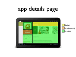
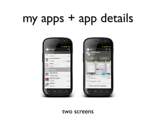
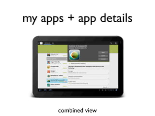
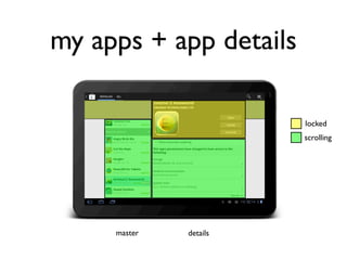

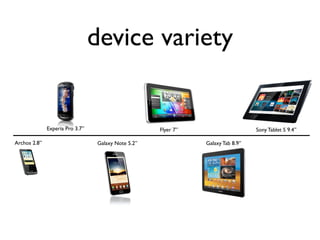
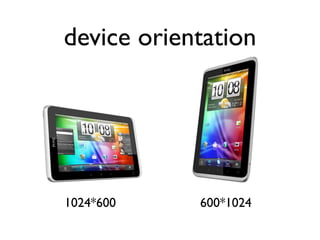
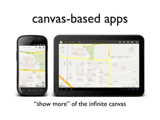
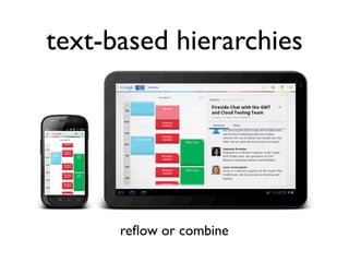


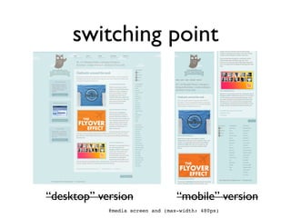
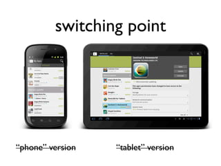
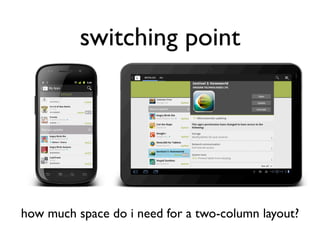
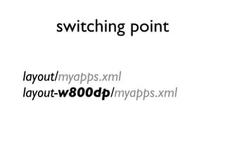
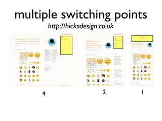
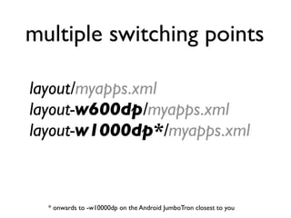
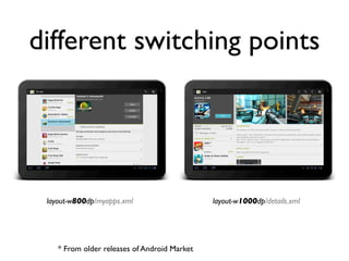
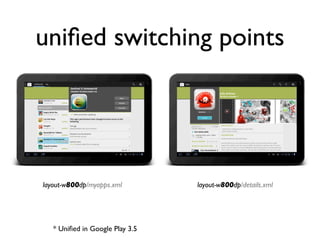
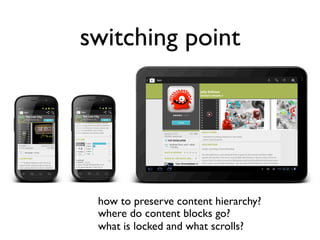
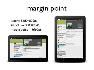

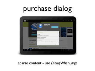
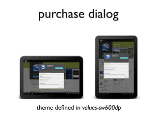
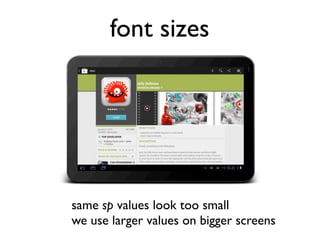
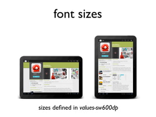
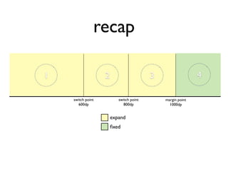
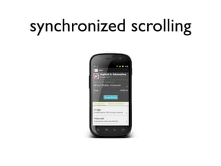
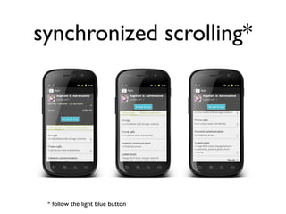
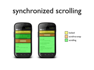
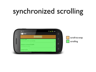

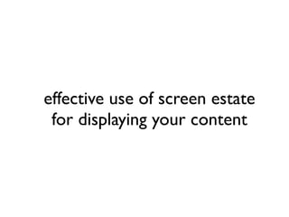


This talk discusses responsive mobile design for Android applications. It emphasizes starting with the same content and hierarchy across different screen sizes and adapting the layout through switching points and margin points. The key is allowing the same content and functionality while making optimal use of screen space through techniques like synchronized scrolling, scroll-to-snap, and dynamically adjusting font sizes and dialogs. Responsive design ensures a quality experience across the wide variety of Android devices.


![[Droidcon]Developing Apps for Android on 2.x/3.x/4.x](https://cdn.slidesharecdn.com/ss_thumbnails/droidconandroiddevelopingapptipskambarakenichirevised-121101233658-phpapp02-thumbnail.jpg?width=640&height=640&fit=bounds)


