Download as PDF, PPTX


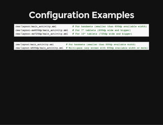


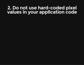


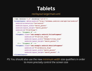

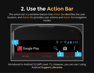


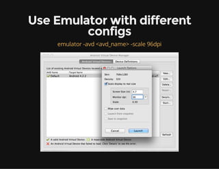


The document discusses the challenges of device fragmentation in the Android ecosystem, referencing over 11,868 distinct Android devices in 2013 across various categories like phones, tablets, and smart TVs. It offers best practices for supporting multiple screen sizes and densities, emphasizing the use of density-independent pixels and alternative resources for different devices. Additionally, it provides guidelines for UI design, including the use of fragments and action bars to enhance user experience on various screen formats.


![Apache Spark 101 [in 50 min]](https://cdn.slidesharecdn.com/ss_thumbnails/apachespark101-in50min1-150227110033-conversion-gate01-thumbnail.jpg?width=640&height=640&fit=bounds)


