SlideShare a Scribd company logo
1 of 11
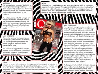
MASTHEAD                                                          SKYLINE
The masthead is one consonant ‘Q’ which is an                     The skyline is on a black background with white capital writing which are contrasting
impacting name for a magazine because it is so                    colours and suits the colours of the magazine without being overpowering. Lady Gaga’s
short. The sound ‘Q’ could also be a shortening                   hair is messy and therefore covers some of the skyline so there is a gap between the
for the word ‘queue’ as it sounds the same and                    sentence. I think this is really effective as it brings the image to the front and appear
could connote people queuing for the                              more 3D as well as reflecting Lady Gaga’s different style.
magazine.

The red background and white writing is very
powerful because it is almost like a warning
sign catching the audience’s attention. The
colour red is often thought as a sexy colour to
wear and therefore could reflect the image                                                             MAIN COVER IMAGE
Lady Gaga and the magazine are trying to                                                               This is quite a revealing image compared to the
create.                                                                                                NME magazine this is probably because the target
                                                                                                       audience is for slightly older more sophisticated
                                                                                                       people therefore they would appreciate this for its
                                                                                                       artiness rather than young boys who would just be
MAIN COVER LINE                                                                                        interested because Lady Gaga isn't wearing much.
This is in the centre of the magazine almost
screaming out to the audience for attention.                                                           The red tones in her cheeks enhance her face and
The main image is wrapped between the                                                                  make her look more attractive and feminine with
‘GAGA’ making her seem more 3D and                                                                     cheek bones. The red colour is very strong in her
highlighting her body.                                                                                 cheeks and therefore ties in well with the red in the
                                                                                                       other features of the magazine. She is almost
The ‘GAGA’ is in a bigger font size to ‘Lady’                                                          dressed as a crow with the long fingered gloves
probably because most people can recognise                                                             acting like claws and the spikes on her trousers
her name by this part of it therefore you                                                              acting like feathers. This reflects her outrageous
almost don’t need the ‘lady’.                                                                          style and therefore helps people recognise who she
                                                                                                       is. Her messy hair is quite seductive and could
                                                                                                       reflect a crow that’s just got out of its nest or a
                                                                                                       female that has just got out of bed which has an
                                                                                                       appeal to the male target audience.
FLASH
This is at the bottom right hand side of the magazine which is a rare place to find it but it
                                                                                                       The background colour is fairly simple and it shows
could be placed here because the ‘Q’ is a similar circle shape and therefore may look too
                                                                                                       that it has been taken in the proper rooms with
much all at the top half of the page. I think the flash placed here helps to even out the
                                                                                                       lighting rather than in a special setting, this is
magazine of what is one each side and reflects the curves in the letter ‘Q’ and in Lady
                                                                                                       similar with most other Q magazine front covers.
Gaga’s body shape.
MASTHEAD                                                                                                             ANCHORAGE
This masthead is placed in the top left                                                                              The main image has text that ties in
hand corner on top of the main image                                                                                 with it and acts as an anchor to give
which is a feature I feel doesn’t look as                                                                            the right message across to the
affective. The masthead is a pink/purple                                                                             audience. This text is the most
colour tying in with Rihanna’s eye and                                                                               dominating to the front cover
lip makeup. This creates a theme                                                                                     because it is the biggest and right in
throughout the magazine as well as                                                                                   the middle which I have noticed is a
drawing the audience’s attention to                                                                                  common feature in magazines
Rihanna’s face.                                                                                                      where the main text is found in the
                                                                                                                     middle of the front cover of the
The pink/purple colour connotes females                                                                              middle of the main image. This
and therefore reveals Rihanna’s girly                                                                                helps the audience link the text
temperaments and implies to the                                                                                      with the main image. The message
audience that the target audience for                                                                                given from this anchorage text ‘you
this special edition is females.                                                                                     need people who aren’t afraid to
                                                                                                                     tell you when you’re f*****g up
                                                                                                                     this gives the message that Rihanna
TAGLINE                                                                                                              has been through tough times and
The tagline beneath the masthead                                                                                     is giving advice to her fans.
reminds the reader what the acronym
‘NME’ stands for (New Musical Express)
and informs those who are new to NME
magazine that the music discussed in this
magazine is new.


COVER IMAGE
The audience will more than likely know who Rihanna is and what she looks like even if they don't like her music which is good for attracting a wider
audiences attention as more people will be able to relate to her, this is a key feature of the magazine it attracts all different stereotypes of people
because it has lots of different stereotypes of music within it.

The shot type is a mid shot revealing Rihanna’s style which is quite unique in society today helping to portray her personality. The positioning of
Rihanna is a typical pose showing her attitude. The bird on her right shoulder is almost like a demon on her shoulder protecting her.
MASTHEAD                                 TEASERS                                             COVER IMAGE
The masthead is large and in capital     ‘Free’, ‘hot’, ‘new’ are words that entice the      This is placed in front of the title
letters this stands out to the           reader in as they want to get as much as they can   which is an effect that i think makes it
audience and helps grab their            for their money and be in the know.                 clear to the audience this is a well
attention. The bubble like font                                                              known and therefore good magazine
reflects the title itself ‘blender’ as                                                       because its as though you don't even
blenders chop things up and                                                                  need to know what the masthead
therefore the title looks like the                                                           says because you already know the
edges have been chopped off and                                                              name of the magazine.
rounded. The black colour also helps
dominate the audiences attention                                                             The black hair tones in with the title
because black on white are                                                                   and therefore doesn't overpower the
contrasting colours which is eye                                                             masthead. Katy Perry’s outfit helps to
catching.                                                                                    structure a colour scheme on the
                                                                                             front cover with pinks and black
                                                                                             tones for the writing which are colour
CALLOUT                                                                                      picked out from her outfit so
A callout is used which helps draw                                                           everything ties in.
the reader in and make them read
more because they are intrigued by
                                                                                             PUN
what is further in the magazine.
                                                                                             ‘Keeping it wheel’ when it is
                                                                                             supposed to say ‘Keeping it real’ this
SKYLINE                                                                                      draws the reader in because it is
This skyline isn't placed in a box                                                           humorous and the audience want to
which is a different way of                                                                  read more to then find out how to
representing skylines as they can also                                                       keep ‘real’ and up to date as this pun
be put in a box to make them stand                                                           suggests this magazine can tell the
out more, but as this magazines                                                              audience how to keep ‘real’.
background is simple it stands out on
its own.
SKYLINE                                            PLUGS                                                    COVER IMAGE
This helps to sell the magazine as it is telling   The plugs are only at the far left hand side of the      The cover image is a mid shot of Eminem
the reader what is inside the magazine. It is      magazine probably because the cover image is the         most likely because the main article in the
at the top of the page which after the             right more and the producer didn’t want to over          magazine is about Eminem and most
masthead and main image the audience may           power the cover image. The plugs have hanging            people would know who he is. His outfit
look there next as it is more chronological to     indents making it easier for the audience to read        reflects his personality and perhaps the
look at the top of the page first.                 because it is almost split into sections to read with    dress code of some of the target audience’s
                                                   the different colours.                                   dress sense, helping the audience to relate
The words used in the skyline such as ‘FREE’,                                                               to him. His facial expressions represents
‘NEW’, ‘HOTTEST’ and ‘BEST’ are puffs                                                                       him singing and could also connote the
working with the skyline to try and                                                                         audience’s face when he ‘stunned the
encourage the audience to buy the magazine                                                                  world’. Often magazines choose their cover
because it is suggesting this magazine has the                                                              image to have the person looking into the
‘best’ of everything.                                                                                       camera so the audience feel more involved
                                                                                                            with the person however Eminem is not
                                                                                                            looking at the camera, this could be
MAIN COVER LINE
                                                                                                            because they are trying to make the
The main cover line on the front cover gives
                                                                                                            audience feel as though they were at his
information to the reader about the main
                                                                                                            concert, especially as it is a low angle shot
article in the magazine. This main cover line
                                                                                                            implying him to be on a stage and the
is placed in the middle of Eminem’s body
                                                                                                            audience watching him.
which is quite a powerful place to put it
because it helps the audience relate the text
                                                                                                            The background is black to help the artist
to his face and also is a more informal place
                                                                                                            stand out however the black is not a block
to put a main cover line because generally
                                                                                                            colour which suggests it could be his
you only see cover lines at the sides of pages,
                                                                                                            background on the stage. I think this is
although this layout is more popular in a lot
                                                                                                            more effective than a block colour as this
of magazines.
                                                                                                            can look boring. I think this affect looks
                                                                                                            more arty reflecting the singers and their
Eminem’s name is in a red text box
                                                                                                            different styles.
highlighting his dominance and making the
cover line even more obviously that it is a key
article in the magazine.
                                                                                                           DATELINE AND BARCODE
                                                                                                           This is placed at the bottom left hand side of
                                                                                                           the magazine which is not overpowering of
                                                                                                           the other features of the magazine as this is
                                                                                                           not particularly important to the reader.
TEASERS                                              COVER IMAGE
‘I feel so alone’ This is a quote from an article    I like this image as it is a close up so the
inside the magazine used to encourage the            audience feels more involved with the
reader to read more it is a quote that               magazine and the artist, it shows they are not
involves emotions ‘feel, ‘alone’ suggesting          hiding anything and therefore connoting that
that this magazine is targeted at women              the magazine reveals all truth. Although this
because they feel more open about their              is a close up the image has been carefully
emotions and find it interesting hearing other       used so that the text doesn’t get in the way
peoples problems.                                    of her face or hair. The use of her hands
                                                     makes the image seem more personal and
ANCHORAGE                                            with more emotion because hand gestures
This text relates to the main image so the           can symbolise emotion.
audience can relate the image to the text and
the real life article. The text is obvious that it   HANGING INDENT
is anchorage text because it includes the            Quite uniquely this front cover has hanging
artists name and is bold and in capitals.            indents but they are the same colour as the
                                                     rest of the text. Usually they are different
                                                     colour so they stand out more. However the
FLASH                                                hanging indents are in a larger font size
This is placed towards the bottom section of         which draws their attention well. I think that
the magazine which seems to be a common              with this magazine front cover there is no
layout for ‘Q’ magazine helping to keep the          need for different coloured hanging indents
magazine individual reflecting and making            because it would look to much and over
the magazine more attractive and noticeable          power the cover image, sometimes less is
to its target audience. The blue colour used         more and this is the case with this.
to surround the flash makes it stand out
more as blue isn't a common colour used              I will bare in mind when coming to make my
throughout the magazine. However the                 magazine cover that all the text on the page
colour isn't completely out of the blue              is capital letters which makes the writing
(excuse the pun) because it ties in with her         more have more attention and seem
eye colour and some of the much smaller              important and clear to read.
features in the magazine. The use of this
colour draws the attention to Florence's eyes
and therefore making the audience feel more
of a connection with her and therefore
encourage them to buy it through the
persuasive technique of emotion.
MAIN IMAGE
MASTHEAD
                                             The background of the image is a faded black
The mast of this page has a very unique
                                             colour which could suggest there is a light shining
layout. The word is separated over
                                             on the model which draws the attention to her.
three different lines which is a good
                                             There is a very subtle ‘V’ shape behind the model
technique to guide the readers eyes
                                             which symbolises the name of the magazine
down the page and to go on to read
                                             ‘Vibe’. This is not too over powering but doesn’t
the txt and look at the image next. The
                                             let the reader forget what magazine they are
use of bold, capital and clear writing
                                             reading as they can identify where the ‘V’ is from.
makes it easy for the reader to read. It
                                             The models legs are then incorporated in with the
also shows what contents page they
                                             V shape and making her legs look longer as the V
are on ‘1/3’ which helps guide them to
                                             follows the line of her legs.
know what's coming next in the
magazine.
                                             The pose the model is doing is very revealing and
                                             is probably chosen as a model for other female
HANGING INDENTS                              readers to follow her ways. She is looking into the
These help the audience identify what        camera again making the audience feel a
they are going to be reading further on,     connection and making them read further to find
they are made bold and a different font      out more about her. The colours used are sepia
to catch the audiences attention first       tones and this helps create the modern style of
before they read on and get confused         the magazine. However the shoes do add a purple
with what they are reading.                  colour to the magazine and catch the audiences
                                             eye, the shoes are close to the writing which is
I have noticed that the writing in this      probably a direction for the audience to read it.
contents page is mainly all lowercase        Also the slightly brighter colour shoes would also
compared to the front cover. This is         imply that this is more a magazine targeted at
probably because the magazine feels          women as they are well known for loving shoes
more like they have the audiences            and therefore they have chosen for the shoes to
attention now and no longer need to be       stand out.
as dominating with capital letters. But it
also informs the reader that this m=part
of the magazine may not be as                The name, page number and date is placed at the
important and you could just read on to      bottom of the page so the audience can keep
find out what is going on rather than        track of what issue they have last read or if they
reading the contents page.                   are collectors they can put the magazines in
                                             chronological order. It also means readers can
                                             stop reading and go back to the page number
                                             they were on if they remember the number. The
                                             title is a constant reminder to the audience of
                                             what they are reading and helps the audience
                                             gain popularity as the audience can remember
                                             what it is called and tell there friends about it.
This is a typical layout of a contents     MASTHEAD
page however it reminds me of the          The masthead is very simple and to the
layout for gossip/celebrity magazines I    point with the clear black on white
feel it is slightly less classy than the   writing and bold capital letters making
contents pages with less on them           it easy for the audience to know what
however sometimes they can look            they are looking at. It covers the page
bare.                                      from left to right which is less common
                                           recently as now they are more
                                           commonly placed in more strange
                                           places to stand out from the crowd.

MAIN IMAGE                                 COLOURS
This is of girls aloud which were          The colours are used are
probably more popular at the time this     complimenting to the pictures which
magazine was published. They are           also tie in with the blue tones. To
probably chosen to use as a role model     brighten the page they have used a
fort he readers. They are all wearing      contrasting colour (orange) in some of
the same coloured clothing but             the texts and boxes that text is in.
different styles which helps remind the
audience they are singers as this is a
common way of representing singers         The text is all contrasting colours
on stage to show they are part of one      depending on the background colour of
group and follow one style.                the text. The page numbers are
                                           different colours to the text making it
This takes over the page and makes the     seem easier to read for the reader.
writing seem not so over powering as if    The use of hanging indents helps the
there was lots to read. The page           audience to identify the most
number is included in every image so       important parts of the articles and then
that the reader can easily access the      if they are interested they will read
things they are interested in reading      onto the smaller writing.
about.

All the images are different in size and
shot type making it more interesting
for the audience to look at.
MASTHEAD                                     PULL QUOTE
The masthead is in a bold bubble like        The pull quote is used to attract the
font which reflects the blown up             audiences attention and intrigue them
bubble like mushroom. The black              to make them want to read more.
contrasting on a very light pink
background makes the mast easy to
read. The mas is again at the top of the
page across the hole page which I think
works for this magazine because an
editing skill has been used to make it
different with the mushroom in front of
the mast.


DATELINE
The dateline is just placed below the
masthead and reminds the reader what
issue they are reading. The fact that it
just has the month and not the day
number suggests to the audience that
this is a monthly magazine and
therefore they may look out for the
next issue in a months time. Next to
the dateline is the features. Everything
is grouped into one and helps keep the
main focus on the main image.
‘Features’ is written in a contrasting
colour to the red in the main image
which helps the text stand out a little
bit so the audience don’t ignore it
totally but the main focus is still on the
main image.
REFLECTION AND PERSONAL LEARNING ON RESEARCH INTO
SIMILAR PRODUCTS AND AUDIENCE RESEARCH – Front Covers

From researching different magazine front covers I have learnt that there are lots of different
techniques and strategies to draw an audiences attention to a magazine, there tends to be a few
common things that do this whilst other magazines choose to use less common techniques because it
suits the style of their magazine and target audience better. The main feature of a magazine is its
background image which is often a mid shot with the famous person looking into the camera to create a
connection with the audience. The person on the front cover should be famous because then more
people are familiar with the singer/artist/band for example Rihanna because she has had many number
ones therefore more people can talk about her. The picture has to reflect the persons personality and
music genre well. Most magazines use a buzzword like ‘new’ because it attracts the audiences attention
and makes them think this magazine is better than another and therefore they go on to rad the rest of
the magazine. The masthead is often covered up by the main persons head I think this effect shows a
more artistic skill and represents the different unique genres of music it also gives the impression to
first time buyers that this must be a good magazine because people can recognise the magazine without
the full title, these mastheads can be recognised on music channels, websites, blogs, banners etc. A rare
feature that I discovered that weren't generally found on music magazines were skylines this could be
because they don’t want to hassle the reader of advertisements inside the magazine or it could be
because they want to leave their audience in suspense of what is inside the magazine. I noticed that
strong contrasts of colours were used on front pages to make an extreme impact on the front cover so
that it is noticed by an audience. All these features work together to make a magazine more popular
and stand out on the shelf.
REFLECTION AND PERSONAL LEARNING ON RESEARCH INTO
  SIMILAR PRODUCTS AND AUDIENCE RESEARCH – Contents
                        Pages
After researching different music magazine contents pages I have realised they play a key
role in keeping the audiences attention on the magazine because it is the second page after
the front cover. It needs to give the audience a feel for what is inside the magazine and
encourage them to read further otherwise the magazine will struggle with bored customers
who will go to another magazine. I feel that contents pages look better when they are
simple but the features and images can connote lots of different messages to the reader
because this way it leaves them in suspense and doesn’t give too much away. When
coming to do my magazine I need to make sure that the images I use are of a brilliant
quality otherwise this sets a very bad standard and impression for the rest of the magazine.
The font used on a contents page has to be clear and easy to read as well as bold so that
the audience want to read it. I feel that often the contents pages that have the best positive
impacts are those who have little writing and one main image that takes over the whole of
the A4 page because this way the audience can look at the main image and make their own
opinions on the image yet the text isn't too over powering and doesn’t give too much away.
A style must be maintained through the magazine for example the front cover should follow
a simple colour scheme and font style as the contents page otherwise the magazine looks
messy and inconsistent. I feel that the contents page plays a strong role in holding the
magazine together and providing the audience with enough information too keep them
interested but not too much that they’ve found everything out that they want to.
REFLECTION AND PERSONAL LEARNING ON RESEARCH INTO
     SIMILAR PRODUCTS AND AUDIENCE RESEARCH – DPS

When researching into DPS’s I realised that they are vital in that they have to be targeted at
your predominant target audience otherwise they are not going to be interested. You can
keep them interested by keeping up to date with the latest news on current artists and by
following a style throughout your magazine that generally speaking suits their stereotype
for example you would be less inclined to put a baby pink colour in a rock magazine
because this just doesn’t suit the audiences personality. A double page spread can look
quite daunting if there is lots of writing or no title to inform he reading what this article is
about therefore I think techniques like drop caps is important to not scare the audience
away and to help the page look good. There need to be something to catch the audiences
eye for example a main image which I think looks effective when it takes over the whole A4
page because the size is more lifelike therefore the audience can feel more of a connection
with the person in the main image. I think it is important that this image is edited well and
the colour scheme suits the text or the text suits the colour scheme of the picture
otherwise it can look like too much is on the DPS and the reader wont know where to look
at first. It is important to have a leading text whether it is a pull quote or highlighted name
but this attracts the audience in further so that they get dragged in by the storyline of the
text even more until finally they read the big block text. By keeping this style, targeting your
main target audience and using special advertising techniques this helps keep the flow of
the magazine strong.

More Related Content

What's hot

Magazine Front Cover Analysis
Magazine Front Cover AnalysisMagazine Front Cover Analysis
Magazine Front Cover AnalysisLouis1995
 
Media -magazine_coursework updated
Media  -magazine_coursework updatedMedia  -magazine_coursework updated
Media -magazine_coursework updatedgabyrock005
 
Media magazine analysis
Media magazine analysisMedia magazine analysis
Media magazine analysisniamhreilly23
 
Front cover analysis
Front cover analysisFront cover analysis
Front cover analysismariatou
 
Contents pages
Contents pagesContents pages
Contents pagesCraig Hunt
 
Front Cover Research
Front Cover ResearchFront Cover Research
Front Cover Researchjessheap
 
Deconstructing magazines
Deconstructing magazinesDeconstructing magazines
Deconstructing magazinesLauracharlotte
 
Magazine Cover Analysis
Magazine Cover AnalysisMagazine Cover Analysis
Magazine Cover Analysisemilygrimshaw
 
Magazine cover anylysis billboard
Magazine cover anylysis   billboardMagazine cover anylysis   billboard
Magazine cover anylysis billboardamybrackenridge
 
Magazine analyasis[1]
Magazine analyasis[1]Magazine analyasis[1]
Magazine analyasis[1]Cl0e
 
Evaluation of my media productfin
Evaluation of my media productfinEvaluation of my media productfin
Evaluation of my media productfinOS1793
 
Analysis of front covers
Analysis of front coversAnalysis of front covers
Analysis of front coversLUCYcrowther
 

What's hot (18)

Number 2
Number 2Number 2
Number 2
 
Magazine Front Cover Analysis
Magazine Front Cover AnalysisMagazine Front Cover Analysis
Magazine Front Cover Analysis
 
Media -magazine_coursework updated
Media  -magazine_coursework updatedMedia  -magazine_coursework updated
Media -magazine_coursework updated
 
Media as fdhdfhdf
Media as fdhdfhdfMedia as fdhdfhdf
Media as fdhdfhdf
 
Number 4
Number 4Number 4
Number 4
 
Media magazine analysis
Media magazine analysisMedia magazine analysis
Media magazine analysis
 
Front cover analysis
Front cover analysisFront cover analysis
Front cover analysis
 
Contents pages
Contents pagesContents pages
Contents pages
 
Number 3
Number 3Number 3
Number 3
 
Front Cover Research
Front Cover ResearchFront Cover Research
Front Cover Research
 
Front cover analysis
Front cover analysisFront cover analysis
Front cover analysis
 
Deconstructing magazines
Deconstructing magazinesDeconstructing magazines
Deconstructing magazines
 
Magazine Cover Analysis
Magazine Cover AnalysisMagazine Cover Analysis
Magazine Cover Analysis
 
15 analysis'
15 analysis'15 analysis'
15 analysis'
 
Magazine cover anylysis billboard
Magazine cover anylysis   billboardMagazine cover anylysis   billboard
Magazine cover anylysis billboard
 
Magazine analyasis[1]
Magazine analyasis[1]Magazine analyasis[1]
Magazine analyasis[1]
 
Evaluation of my media productfin
Evaluation of my media productfinEvaluation of my media productfin
Evaluation of my media productfin
 
Analysis of front covers
Analysis of front coversAnalysis of front covers
Analysis of front covers
 

Viewers also liked

Flat plan
Flat planFlat plan
Flat plan954451
 
Evaluation Q4
Evaluation Q4Evaluation Q4
Evaluation Q4954451
 
Evaluation q4
Evaluation q4Evaluation q4
Evaluation q4954451
 
Audience research
Audience researchAudience research
Audience research954451
 
W4 ucl@md day2011
W4 ucl@md day2011W4 ucl@md day2011
W4 ucl@md day2011MDDAY11
 

Viewers also liked (8)

Q5
Q5Q5
Q5
 
Flat plan
Flat planFlat plan
Flat plan
 
Evaluation Q4
Evaluation Q4Evaluation Q4
Evaluation Q4
 
Evaluation q4
Evaluation q4Evaluation q4
Evaluation q4
 
Audience research
Audience researchAudience research
Audience research
 
Q6
Q6Q6
Q6
 
W4 ucl@md day2011
W4 ucl@md day2011W4 ucl@md day2011
W4 ucl@md day2011
 
Neets&parcours improbables gdl_tacklingearlyschoolleaving_20150709
Neets&parcours improbables gdl_tacklingearlyschoolleaving_20150709Neets&parcours improbables gdl_tacklingearlyschoolleaving_20150709
Neets&parcours improbables gdl_tacklingearlyschoolleaving_20150709
 

Similar to Front cover analysis [autosaved]

Front cover analysis
Front cover analysisFront cover analysis
Front cover analysismariatou
 
Magazine cover analysis
Magazine cover analysis Magazine cover analysis
Magazine cover analysis emilylivesey
 
Analysis of nme
Analysis of nmeAnalysis of nme
Analysis of nmeasmediaf12
 
Analysis of nme
Analysis of nmeAnalysis of nme
Analysis of nmeasmediaf12
 
Analysis of nme
Analysis of nmeAnalysis of nme
Analysis of nmeasmediaf12
 
Magazine cover analysis_adele
Magazine cover analysis_adeleMagazine cover analysis_adele
Magazine cover analysis_adeleRyanDenner
 
Magazine construction
Magazine constructionMagazine construction
Magazine constructionaimeexjade
 
Lady gaga fornt cover evaluation
Lady gaga fornt cover evaluationLady gaga fornt cover evaluation
Lady gaga fornt cover evaluationCharlotte Hughes
 
Front page analysis 1
Front page analysis 1Front page analysis 1
Front page analysis 1nadiaewins
 
Front Page Analysis 1
Front Page Analysis 1Front Page Analysis 1
Front Page Analysis 1nadiaewins
 
Billboard magazine
Billboard magazineBillboard magazine
Billboard magazinechloeanne94
 
Analysis of college magazines
Analysis of college magazinesAnalysis of college magazines
Analysis of college magazinesmarwasaroya
 
double page spreads
double page spreadsdouble page spreads
double page spreadsfayweldon
 

Similar to Front cover analysis [autosaved] (20)

Magazine Analysis
Magazine AnalysisMagazine Analysis
Magazine Analysis
 
Task 2
Task 2Task 2
Task 2
 
Magazine analysis
Magazine analysisMagazine analysis
Magazine analysis
 
Double page spread analysis
Double page spread analysisDouble page spread analysis
Double page spread analysis
 
Front cover analysis
Front cover analysisFront cover analysis
Front cover analysis
 
Magazine cover analysis
Magazine cover analysis Magazine cover analysis
Magazine cover analysis
 
Analysis of nme
Analysis of nmeAnalysis of nme
Analysis of nme
 
Analysis of nme
Analysis of nmeAnalysis of nme
Analysis of nme
 
Analysis of nme
Analysis of nmeAnalysis of nme
Analysis of nme
 
Magazine cover analysis_adele
Magazine cover analysis_adeleMagazine cover analysis_adele
Magazine cover analysis_adele
 
NME
NMENME
NME
 
Contents research 2
Contents research 2Contents research 2
Contents research 2
 
Magazine construction
Magazine constructionMagazine construction
Magazine construction
 
Front covers
Front coversFront covers
Front covers
 
Lady gaga fornt cover evaluation
Lady gaga fornt cover evaluationLady gaga fornt cover evaluation
Lady gaga fornt cover evaluation
 
Front page analysis 1
Front page analysis 1Front page analysis 1
Front page analysis 1
 
Front Page Analysis 1
Front Page Analysis 1Front Page Analysis 1
Front Page Analysis 1
 
Billboard magazine
Billboard magazineBillboard magazine
Billboard magazine
 
Analysis of college magazines
Analysis of college magazinesAnalysis of college magazines
Analysis of college magazines
 
double page spreads
double page spreadsdouble page spreads
double page spreads
 

More from 954451

Drafting for masthead
Drafting for mastheadDrafting for masthead
Drafting for masthead954451
 
Presentation1
Presentation1Presentation1
Presentation1954451
 
Readership profile 2
Readership profile 2Readership profile 2
Readership profile 2954451
 
Target audience
Target audienceTarget audience
Target audience954451
 
Evaluation q4
Evaluation q4Evaluation q4
Evaluation q4954451
 
Analysing magazine front covers
Analysing magazine front coversAnalysing magazine front covers
Analysing magazine front covers954451
 

More from 954451 (6)

Drafting for masthead
Drafting for mastheadDrafting for masthead
Drafting for masthead
 
Presentation1
Presentation1Presentation1
Presentation1
 
Readership profile 2
Readership profile 2Readership profile 2
Readership profile 2
 
Target audience
Target audienceTarget audience
Target audience
 
Evaluation q4
Evaluation q4Evaluation q4
Evaluation q4
 
Analysing magazine front covers
Analysing magazine front coversAnalysing magazine front covers
Analysing magazine front covers
 

Recently uploaded

Nurturing Families, Empowering Lives: TDP's Vision for Family Welfare in Andh...
Nurturing Families, Empowering Lives: TDP's Vision for Family Welfare in Andh...Nurturing Families, Empowering Lives: TDP's Vision for Family Welfare in Andh...
Nurturing Families, Empowering Lives: TDP's Vision for Family Welfare in Andh...narsireddynannuri1
 
₹5.5k {Cash Payment} Independent Greater Noida Call Girls In [Delhi INAYA] 🔝|...
₹5.5k {Cash Payment} Independent Greater Noida Call Girls In [Delhi INAYA] 🔝|...₹5.5k {Cash Payment} Independent Greater Noida Call Girls In [Delhi INAYA] 🔝|...
₹5.5k {Cash Payment} Independent Greater Noida Call Girls In [Delhi INAYA] 🔝|...Diya Sharma
 
KAHULUGAN AT KAHALAGAHAN NG GAWAING PANSIBIKO.pptx
KAHULUGAN AT KAHALAGAHAN NG GAWAING PANSIBIKO.pptxKAHULUGAN AT KAHALAGAHAN NG GAWAING PANSIBIKO.pptx
KAHULUGAN AT KAHALAGAHAN NG GAWAING PANSIBIKO.pptxjohnandrewcarlos
 
Pakistan PMLN Election Manifesto 2024.pdf
Pakistan PMLN Election Manifesto 2024.pdfPakistan PMLN Election Manifesto 2024.pdf
Pakistan PMLN Election Manifesto 2024.pdfFahimUddin61
 
AI as Research Assistant: Upscaling Content Analysis to Identify Patterns of ...
AI as Research Assistant: Upscaling Content Analysis to Identify Patterns of ...AI as Research Assistant: Upscaling Content Analysis to Identify Patterns of ...
AI as Research Assistant: Upscaling Content Analysis to Identify Patterns of ...Axel Bruns
 
29042024_First India Newspaper Jaipur.pdf
29042024_First India Newspaper Jaipur.pdf29042024_First India Newspaper Jaipur.pdf
29042024_First India Newspaper Jaipur.pdfFIRST INDIA
 
26042024_First India Newspaper Jaipur.pdf
26042024_First India Newspaper Jaipur.pdf26042024_First India Newspaper Jaipur.pdf
26042024_First India Newspaper Jaipur.pdfFIRST INDIA
 
2024 03 13 AZ GOP LD4 Gen Meeting Minutes_FINAL.docx
2024 03 13 AZ GOP LD4 Gen Meeting Minutes_FINAL.docx2024 03 13 AZ GOP LD4 Gen Meeting Minutes_FINAL.docx
2024 03 13 AZ GOP LD4 Gen Meeting Minutes_FINAL.docxkfjstone13
 
Enjoy Night⚡Call Girls Rajokri Delhi >༒8448380779 Escort Service
Enjoy Night⚡Call Girls Rajokri Delhi >༒8448380779 Escort ServiceEnjoy Night⚡Call Girls Rajokri Delhi >༒8448380779 Escort Service
Enjoy Night⚡Call Girls Rajokri Delhi >༒8448380779 Escort ServiceDelhi Call girls
 
Israel Palestine Conflict, The issue and historical context!
Israel Palestine Conflict, The issue and historical context!Israel Palestine Conflict, The issue and historical context!
Israel Palestine Conflict, The issue and historical context!Krish109503
 
30042024_First India Newspaper Jaipur.pdf
30042024_First India Newspaper Jaipur.pdf30042024_First India Newspaper Jaipur.pdf
30042024_First India Newspaper Jaipur.pdfFIRST INDIA
 
Vashi Escorts, {Pooja 09892124323}, Vashi Call Girls
Vashi Escorts, {Pooja 09892124323}, Vashi Call GirlsVashi Escorts, {Pooja 09892124323}, Vashi Call Girls
Vashi Escorts, {Pooja 09892124323}, Vashi Call GirlsPooja Nehwal
 
TDP As the Party of Hope For AP Youth Under N Chandrababu Naidu’s Leadership
TDP As the Party of Hope For AP Youth Under N Chandrababu Naidu’s LeadershipTDP As the Party of Hope For AP Youth Under N Chandrababu Naidu’s Leadership
TDP As the Party of Hope For AP Youth Under N Chandrababu Naidu’s Leadershipanjanibaddipudi1
 
BDSM⚡Call Girls in Sector 135 Noida Escorts >༒8448380779 Escort Service
BDSM⚡Call Girls in Sector 135 Noida Escorts >༒8448380779 Escort ServiceBDSM⚡Call Girls in Sector 135 Noida Escorts >༒8448380779 Escort Service
BDSM⚡Call Girls in Sector 135 Noida Escorts >༒8448380779 Escort ServiceDelhi Call girls
 
N. Chandrababu Naidu Receives Global Agriculture Policy Leadership Award
N. Chandrababu Naidu Receives Global Agriculture Policy Leadership AwardN. Chandrababu Naidu Receives Global Agriculture Policy Leadership Award
N. Chandrababu Naidu Receives Global Agriculture Policy Leadership Awardsrinuseo15
 
2024 04 03 AZ GOP LD4 Gen Meeting Minutes FINAL.docx
2024 04 03 AZ GOP LD4 Gen Meeting Minutes FINAL.docx2024 04 03 AZ GOP LD4 Gen Meeting Minutes FINAL.docx
2024 04 03 AZ GOP LD4 Gen Meeting Minutes FINAL.docxkfjstone13
 
BDSM⚡Call Girls in Sector 143 Noida Escorts >༒8448380779 Escort Service
BDSM⚡Call Girls in Sector 143 Noida Escorts >༒8448380779 Escort ServiceBDSM⚡Call Girls in Sector 143 Noida Escorts >༒8448380779 Escort Service
BDSM⚡Call Girls in Sector 143 Noida Escorts >༒8448380779 Escort ServiceDelhi Call girls
 
How Europe Underdeveloped Africa_walter.pdf
How Europe Underdeveloped Africa_walter.pdfHow Europe Underdeveloped Africa_walter.pdf
How Europe Underdeveloped Africa_walter.pdfLorenzo Lemes
 
HARNESSING AI FOR ENHANCED MEDIA ANALYSIS A CASE STUDY ON CHATGPT AT DRONE EM...
HARNESSING AI FOR ENHANCED MEDIA ANALYSIS A CASE STUDY ON CHATGPT AT DRONE EM...HARNESSING AI FOR ENHANCED MEDIA ANALYSIS A CASE STUDY ON CHATGPT AT DRONE EM...
HARNESSING AI FOR ENHANCED MEDIA ANALYSIS A CASE STUDY ON CHATGPT AT DRONE EM...Ismail Fahmi
 
如何办理(BU学位证书)美国贝翰文大学毕业证学位证书
如何办理(BU学位证书)美国贝翰文大学毕业证学位证书如何办理(BU学位证书)美国贝翰文大学毕业证学位证书
如何办理(BU学位证书)美国贝翰文大学毕业证学位证书Fi L
 

Recently uploaded (20)

Nurturing Families, Empowering Lives: TDP's Vision for Family Welfare in Andh...
Nurturing Families, Empowering Lives: TDP's Vision for Family Welfare in Andh...Nurturing Families, Empowering Lives: TDP's Vision for Family Welfare in Andh...
Nurturing Families, Empowering Lives: TDP's Vision for Family Welfare in Andh...
 
₹5.5k {Cash Payment} Independent Greater Noida Call Girls In [Delhi INAYA] 🔝|...
₹5.5k {Cash Payment} Independent Greater Noida Call Girls In [Delhi INAYA] 🔝|...₹5.5k {Cash Payment} Independent Greater Noida Call Girls In [Delhi INAYA] 🔝|...
₹5.5k {Cash Payment} Independent Greater Noida Call Girls In [Delhi INAYA] 🔝|...
 
KAHULUGAN AT KAHALAGAHAN NG GAWAING PANSIBIKO.pptx
KAHULUGAN AT KAHALAGAHAN NG GAWAING PANSIBIKO.pptxKAHULUGAN AT KAHALAGAHAN NG GAWAING PANSIBIKO.pptx
KAHULUGAN AT KAHALAGAHAN NG GAWAING PANSIBIKO.pptx
 
Pakistan PMLN Election Manifesto 2024.pdf
Pakistan PMLN Election Manifesto 2024.pdfPakistan PMLN Election Manifesto 2024.pdf
Pakistan PMLN Election Manifesto 2024.pdf
 
AI as Research Assistant: Upscaling Content Analysis to Identify Patterns of ...
AI as Research Assistant: Upscaling Content Analysis to Identify Patterns of ...AI as Research Assistant: Upscaling Content Analysis to Identify Patterns of ...
AI as Research Assistant: Upscaling Content Analysis to Identify Patterns of ...
 
29042024_First India Newspaper Jaipur.pdf
29042024_First India Newspaper Jaipur.pdf29042024_First India Newspaper Jaipur.pdf
29042024_First India Newspaper Jaipur.pdf
 
26042024_First India Newspaper Jaipur.pdf
26042024_First India Newspaper Jaipur.pdf26042024_First India Newspaper Jaipur.pdf
26042024_First India Newspaper Jaipur.pdf
 
2024 03 13 AZ GOP LD4 Gen Meeting Minutes_FINAL.docx
2024 03 13 AZ GOP LD4 Gen Meeting Minutes_FINAL.docx2024 03 13 AZ GOP LD4 Gen Meeting Minutes_FINAL.docx
2024 03 13 AZ GOP LD4 Gen Meeting Minutes_FINAL.docx
 
Enjoy Night⚡Call Girls Rajokri Delhi >༒8448380779 Escort Service
Enjoy Night⚡Call Girls Rajokri Delhi >༒8448380779 Escort ServiceEnjoy Night⚡Call Girls Rajokri Delhi >༒8448380779 Escort Service
Enjoy Night⚡Call Girls Rajokri Delhi >༒8448380779 Escort Service
 
Israel Palestine Conflict, The issue and historical context!
Israel Palestine Conflict, The issue and historical context!Israel Palestine Conflict, The issue and historical context!
Israel Palestine Conflict, The issue and historical context!
 
30042024_First India Newspaper Jaipur.pdf
30042024_First India Newspaper Jaipur.pdf30042024_First India Newspaper Jaipur.pdf
30042024_First India Newspaper Jaipur.pdf
 
Vashi Escorts, {Pooja 09892124323}, Vashi Call Girls
Vashi Escorts, {Pooja 09892124323}, Vashi Call GirlsVashi Escorts, {Pooja 09892124323}, Vashi Call Girls
Vashi Escorts, {Pooja 09892124323}, Vashi Call Girls
 
TDP As the Party of Hope For AP Youth Under N Chandrababu Naidu’s Leadership
TDP As the Party of Hope For AP Youth Under N Chandrababu Naidu’s LeadershipTDP As the Party of Hope For AP Youth Under N Chandrababu Naidu’s Leadership
TDP As the Party of Hope For AP Youth Under N Chandrababu Naidu’s Leadership
 
BDSM⚡Call Girls in Sector 135 Noida Escorts >༒8448380779 Escort Service
BDSM⚡Call Girls in Sector 135 Noida Escorts >༒8448380779 Escort ServiceBDSM⚡Call Girls in Sector 135 Noida Escorts >༒8448380779 Escort Service
BDSM⚡Call Girls in Sector 135 Noida Escorts >༒8448380779 Escort Service
 
N. Chandrababu Naidu Receives Global Agriculture Policy Leadership Award
N. Chandrababu Naidu Receives Global Agriculture Policy Leadership AwardN. Chandrababu Naidu Receives Global Agriculture Policy Leadership Award
N. Chandrababu Naidu Receives Global Agriculture Policy Leadership Award
 
2024 04 03 AZ GOP LD4 Gen Meeting Minutes FINAL.docx
2024 04 03 AZ GOP LD4 Gen Meeting Minutes FINAL.docx2024 04 03 AZ GOP LD4 Gen Meeting Minutes FINAL.docx
2024 04 03 AZ GOP LD4 Gen Meeting Minutes FINAL.docx
 
BDSM⚡Call Girls in Sector 143 Noida Escorts >༒8448380779 Escort Service
BDSM⚡Call Girls in Sector 143 Noida Escorts >༒8448380779 Escort ServiceBDSM⚡Call Girls in Sector 143 Noida Escorts >༒8448380779 Escort Service
BDSM⚡Call Girls in Sector 143 Noida Escorts >༒8448380779 Escort Service
 
How Europe Underdeveloped Africa_walter.pdf
How Europe Underdeveloped Africa_walter.pdfHow Europe Underdeveloped Africa_walter.pdf
How Europe Underdeveloped Africa_walter.pdf
 
HARNESSING AI FOR ENHANCED MEDIA ANALYSIS A CASE STUDY ON CHATGPT AT DRONE EM...
HARNESSING AI FOR ENHANCED MEDIA ANALYSIS A CASE STUDY ON CHATGPT AT DRONE EM...HARNESSING AI FOR ENHANCED MEDIA ANALYSIS A CASE STUDY ON CHATGPT AT DRONE EM...
HARNESSING AI FOR ENHANCED MEDIA ANALYSIS A CASE STUDY ON CHATGPT AT DRONE EM...
 
如何办理(BU学位证书)美国贝翰文大学毕业证学位证书
如何办理(BU学位证书)美国贝翰文大学毕业证学位证书如何办理(BU学位证书)美国贝翰文大学毕业证学位证书
如何办理(BU学位证书)美国贝翰文大学毕业证学位证书
 

Front cover analysis [autosaved]

  • 1. MASTHEAD SKYLINE The masthead is one consonant ‘Q’ which is an The skyline is on a black background with white capital writing which are contrasting impacting name for a magazine because it is so colours and suits the colours of the magazine without being overpowering. Lady Gaga’s short. The sound ‘Q’ could also be a shortening hair is messy and therefore covers some of the skyline so there is a gap between the for the word ‘queue’ as it sounds the same and sentence. I think this is really effective as it brings the image to the front and appear could connote people queuing for the more 3D as well as reflecting Lady Gaga’s different style. magazine. The red background and white writing is very powerful because it is almost like a warning sign catching the audience’s attention. The colour red is often thought as a sexy colour to wear and therefore could reflect the image MAIN COVER IMAGE Lady Gaga and the magazine are trying to This is quite a revealing image compared to the create. NME magazine this is probably because the target audience is for slightly older more sophisticated people therefore they would appreciate this for its artiness rather than young boys who would just be MAIN COVER LINE interested because Lady Gaga isn't wearing much. This is in the centre of the magazine almost screaming out to the audience for attention. The red tones in her cheeks enhance her face and The main image is wrapped between the make her look more attractive and feminine with ‘GAGA’ making her seem more 3D and cheek bones. The red colour is very strong in her highlighting her body. cheeks and therefore ties in well with the red in the other features of the magazine. She is almost The ‘GAGA’ is in a bigger font size to ‘Lady’ dressed as a crow with the long fingered gloves probably because most people can recognise acting like claws and the spikes on her trousers her name by this part of it therefore you acting like feathers. This reflects her outrageous almost don’t need the ‘lady’. style and therefore helps people recognise who she is. Her messy hair is quite seductive and could reflect a crow that’s just got out of its nest or a female that has just got out of bed which has an appeal to the male target audience. FLASH This is at the bottom right hand side of the magazine which is a rare place to find it but it The background colour is fairly simple and it shows could be placed here because the ‘Q’ is a similar circle shape and therefore may look too that it has been taken in the proper rooms with much all at the top half of the page. I think the flash placed here helps to even out the lighting rather than in a special setting, this is magazine of what is one each side and reflects the curves in the letter ‘Q’ and in Lady similar with most other Q magazine front covers. Gaga’s body shape.
  • 2. MASTHEAD ANCHORAGE This masthead is placed in the top left The main image has text that ties in hand corner on top of the main image with it and acts as an anchor to give which is a feature I feel doesn’t look as the right message across to the affective. The masthead is a pink/purple audience. This text is the most colour tying in with Rihanna’s eye and dominating to the front cover lip makeup. This creates a theme because it is the biggest and right in throughout the magazine as well as the middle which I have noticed is a drawing the audience’s attention to common feature in magazines Rihanna’s face. where the main text is found in the middle of the front cover of the The pink/purple colour connotes females middle of the main image. This and therefore reveals Rihanna’s girly helps the audience link the text temperaments and implies to the with the main image. The message audience that the target audience for given from this anchorage text ‘you this special edition is females. need people who aren’t afraid to tell you when you’re f*****g up this gives the message that Rihanna TAGLINE has been through tough times and The tagline beneath the masthead is giving advice to her fans. reminds the reader what the acronym ‘NME’ stands for (New Musical Express) and informs those who are new to NME magazine that the music discussed in this magazine is new. COVER IMAGE The audience will more than likely know who Rihanna is and what she looks like even if they don't like her music which is good for attracting a wider audiences attention as more people will be able to relate to her, this is a key feature of the magazine it attracts all different stereotypes of people because it has lots of different stereotypes of music within it. The shot type is a mid shot revealing Rihanna’s style which is quite unique in society today helping to portray her personality. The positioning of Rihanna is a typical pose showing her attitude. The bird on her right shoulder is almost like a demon on her shoulder protecting her.
  • 3. MASTHEAD TEASERS COVER IMAGE The masthead is large and in capital ‘Free’, ‘hot’, ‘new’ are words that entice the This is placed in front of the title letters this stands out to the reader in as they want to get as much as they can which is an effect that i think makes it audience and helps grab their for their money and be in the know. clear to the audience this is a well attention. The bubble like font known and therefore good magazine reflects the title itself ‘blender’ as because its as though you don't even blenders chop things up and need to know what the masthead therefore the title looks like the says because you already know the edges have been chopped off and name of the magazine. rounded. The black colour also helps dominate the audiences attention The black hair tones in with the title because black on white are and therefore doesn't overpower the contrasting colours which is eye masthead. Katy Perry’s outfit helps to catching. structure a colour scheme on the front cover with pinks and black tones for the writing which are colour CALLOUT picked out from her outfit so A callout is used which helps draw everything ties in. the reader in and make them read more because they are intrigued by PUN what is further in the magazine. ‘Keeping it wheel’ when it is supposed to say ‘Keeping it real’ this SKYLINE draws the reader in because it is This skyline isn't placed in a box humorous and the audience want to which is a different way of read more to then find out how to representing skylines as they can also keep ‘real’ and up to date as this pun be put in a box to make them stand suggests this magazine can tell the out more, but as this magazines audience how to keep ‘real’. background is simple it stands out on its own.
  • 4. SKYLINE PLUGS COVER IMAGE This helps to sell the magazine as it is telling The plugs are only at the far left hand side of the The cover image is a mid shot of Eminem the reader what is inside the magazine. It is magazine probably because the cover image is the most likely because the main article in the at the top of the page which after the right more and the producer didn’t want to over magazine is about Eminem and most masthead and main image the audience may power the cover image. The plugs have hanging people would know who he is. His outfit look there next as it is more chronological to indents making it easier for the audience to read reflects his personality and perhaps the look at the top of the page first. because it is almost split into sections to read with dress code of some of the target audience’s the different colours. dress sense, helping the audience to relate The words used in the skyline such as ‘FREE’, to him. His facial expressions represents ‘NEW’, ‘HOTTEST’ and ‘BEST’ are puffs him singing and could also connote the working with the skyline to try and audience’s face when he ‘stunned the encourage the audience to buy the magazine world’. Often magazines choose their cover because it is suggesting this magazine has the image to have the person looking into the ‘best’ of everything. camera so the audience feel more involved with the person however Eminem is not looking at the camera, this could be MAIN COVER LINE because they are trying to make the The main cover line on the front cover gives audience feel as though they were at his information to the reader about the main concert, especially as it is a low angle shot article in the magazine. This main cover line implying him to be on a stage and the is placed in the middle of Eminem’s body audience watching him. which is quite a powerful place to put it because it helps the audience relate the text The background is black to help the artist to his face and also is a more informal place stand out however the black is not a block to put a main cover line because generally colour which suggests it could be his you only see cover lines at the sides of pages, background on the stage. I think this is although this layout is more popular in a lot more effective than a block colour as this of magazines. can look boring. I think this affect looks more arty reflecting the singers and their Eminem’s name is in a red text box different styles. highlighting his dominance and making the cover line even more obviously that it is a key article in the magazine. DATELINE AND BARCODE This is placed at the bottom left hand side of the magazine which is not overpowering of the other features of the magazine as this is not particularly important to the reader.
  • 5. TEASERS COVER IMAGE ‘I feel so alone’ This is a quote from an article I like this image as it is a close up so the inside the magazine used to encourage the audience feels more involved with the reader to read more it is a quote that magazine and the artist, it shows they are not involves emotions ‘feel, ‘alone’ suggesting hiding anything and therefore connoting that that this magazine is targeted at women the magazine reveals all truth. Although this because they feel more open about their is a close up the image has been carefully emotions and find it interesting hearing other used so that the text doesn’t get in the way peoples problems. of her face or hair. The use of her hands makes the image seem more personal and ANCHORAGE with more emotion because hand gestures This text relates to the main image so the can symbolise emotion. audience can relate the image to the text and the real life article. The text is obvious that it HANGING INDENT is anchorage text because it includes the Quite uniquely this front cover has hanging artists name and is bold and in capitals. indents but they are the same colour as the rest of the text. Usually they are different colour so they stand out more. However the FLASH hanging indents are in a larger font size This is placed towards the bottom section of which draws their attention well. I think that the magazine which seems to be a common with this magazine front cover there is no layout for ‘Q’ magazine helping to keep the need for different coloured hanging indents magazine individual reflecting and making because it would look to much and over the magazine more attractive and noticeable power the cover image, sometimes less is to its target audience. The blue colour used more and this is the case with this. to surround the flash makes it stand out more as blue isn't a common colour used I will bare in mind when coming to make my throughout the magazine. However the magazine cover that all the text on the page colour isn't completely out of the blue is capital letters which makes the writing (excuse the pun) because it ties in with her more have more attention and seem eye colour and some of the much smaller important and clear to read. features in the magazine. The use of this colour draws the attention to Florence's eyes and therefore making the audience feel more of a connection with her and therefore encourage them to buy it through the persuasive technique of emotion.
  • 6. MAIN IMAGE MASTHEAD The background of the image is a faded black The mast of this page has a very unique colour which could suggest there is a light shining layout. The word is separated over on the model which draws the attention to her. three different lines which is a good There is a very subtle ‘V’ shape behind the model technique to guide the readers eyes which symbolises the name of the magazine down the page and to go on to read ‘Vibe’. This is not too over powering but doesn’t the txt and look at the image next. The let the reader forget what magazine they are use of bold, capital and clear writing reading as they can identify where the ‘V’ is from. makes it easy for the reader to read. It The models legs are then incorporated in with the also shows what contents page they V shape and making her legs look longer as the V are on ‘1/3’ which helps guide them to follows the line of her legs. know what's coming next in the magazine. The pose the model is doing is very revealing and is probably chosen as a model for other female HANGING INDENTS readers to follow her ways. She is looking into the These help the audience identify what camera again making the audience feel a they are going to be reading further on, connection and making them read further to find they are made bold and a different font out more about her. The colours used are sepia to catch the audiences attention first tones and this helps create the modern style of before they read on and get confused the magazine. However the shoes do add a purple with what they are reading. colour to the magazine and catch the audiences eye, the shoes are close to the writing which is I have noticed that the writing in this probably a direction for the audience to read it. contents page is mainly all lowercase Also the slightly brighter colour shoes would also compared to the front cover. This is imply that this is more a magazine targeted at probably because the magazine feels women as they are well known for loving shoes more like they have the audiences and therefore they have chosen for the shoes to attention now and no longer need to be stand out. as dominating with capital letters. But it also informs the reader that this m=part of the magazine may not be as The name, page number and date is placed at the important and you could just read on to bottom of the page so the audience can keep find out what is going on rather than track of what issue they have last read or if they reading the contents page. are collectors they can put the magazines in chronological order. It also means readers can stop reading and go back to the page number they were on if they remember the number. The title is a constant reminder to the audience of what they are reading and helps the audience gain popularity as the audience can remember what it is called and tell there friends about it.
  • 7. This is a typical layout of a contents MASTHEAD page however it reminds me of the The masthead is very simple and to the layout for gossip/celebrity magazines I point with the clear black on white feel it is slightly less classy than the writing and bold capital letters making contents pages with less on them it easy for the audience to know what however sometimes they can look they are looking at. It covers the page bare. from left to right which is less common recently as now they are more commonly placed in more strange places to stand out from the crowd. MAIN IMAGE COLOURS This is of girls aloud which were The colours are used are probably more popular at the time this complimenting to the pictures which magazine was published. They are also tie in with the blue tones. To probably chosen to use as a role model brighten the page they have used a fort he readers. They are all wearing contrasting colour (orange) in some of the same coloured clothing but the texts and boxes that text is in. different styles which helps remind the audience they are singers as this is a common way of representing singers The text is all contrasting colours on stage to show they are part of one depending on the background colour of group and follow one style. the text. The page numbers are different colours to the text making it This takes over the page and makes the seem easier to read for the reader. writing seem not so over powering as if The use of hanging indents helps the there was lots to read. The page audience to identify the most number is included in every image so important parts of the articles and then that the reader can easily access the if they are interested they will read things they are interested in reading onto the smaller writing. about. All the images are different in size and shot type making it more interesting for the audience to look at.
  • 8. MASTHEAD PULL QUOTE The masthead is in a bold bubble like The pull quote is used to attract the font which reflects the blown up audiences attention and intrigue them bubble like mushroom. The black to make them want to read more. contrasting on a very light pink background makes the mast easy to read. The mas is again at the top of the page across the hole page which I think works for this magazine because an editing skill has been used to make it different with the mushroom in front of the mast. DATELINE The dateline is just placed below the masthead and reminds the reader what issue they are reading. The fact that it just has the month and not the day number suggests to the audience that this is a monthly magazine and therefore they may look out for the next issue in a months time. Next to the dateline is the features. Everything is grouped into one and helps keep the main focus on the main image. ‘Features’ is written in a contrasting colour to the red in the main image which helps the text stand out a little bit so the audience don’t ignore it totally but the main focus is still on the main image.
  • 9. REFLECTION AND PERSONAL LEARNING ON RESEARCH INTO SIMILAR PRODUCTS AND AUDIENCE RESEARCH – Front Covers From researching different magazine front covers I have learnt that there are lots of different techniques and strategies to draw an audiences attention to a magazine, there tends to be a few common things that do this whilst other magazines choose to use less common techniques because it suits the style of their magazine and target audience better. The main feature of a magazine is its background image which is often a mid shot with the famous person looking into the camera to create a connection with the audience. The person on the front cover should be famous because then more people are familiar with the singer/artist/band for example Rihanna because she has had many number ones therefore more people can talk about her. The picture has to reflect the persons personality and music genre well. Most magazines use a buzzword like ‘new’ because it attracts the audiences attention and makes them think this magazine is better than another and therefore they go on to rad the rest of the magazine. The masthead is often covered up by the main persons head I think this effect shows a more artistic skill and represents the different unique genres of music it also gives the impression to first time buyers that this must be a good magazine because people can recognise the magazine without the full title, these mastheads can be recognised on music channels, websites, blogs, banners etc. A rare feature that I discovered that weren't generally found on music magazines were skylines this could be because they don’t want to hassle the reader of advertisements inside the magazine or it could be because they want to leave their audience in suspense of what is inside the magazine. I noticed that strong contrasts of colours were used on front pages to make an extreme impact on the front cover so that it is noticed by an audience. All these features work together to make a magazine more popular and stand out on the shelf.
  • 10. REFLECTION AND PERSONAL LEARNING ON RESEARCH INTO SIMILAR PRODUCTS AND AUDIENCE RESEARCH – Contents Pages After researching different music magazine contents pages I have realised they play a key role in keeping the audiences attention on the magazine because it is the second page after the front cover. It needs to give the audience a feel for what is inside the magazine and encourage them to read further otherwise the magazine will struggle with bored customers who will go to another magazine. I feel that contents pages look better when they are simple but the features and images can connote lots of different messages to the reader because this way it leaves them in suspense and doesn’t give too much away. When coming to do my magazine I need to make sure that the images I use are of a brilliant quality otherwise this sets a very bad standard and impression for the rest of the magazine. The font used on a contents page has to be clear and easy to read as well as bold so that the audience want to read it. I feel that often the contents pages that have the best positive impacts are those who have little writing and one main image that takes over the whole of the A4 page because this way the audience can look at the main image and make their own opinions on the image yet the text isn't too over powering and doesn’t give too much away. A style must be maintained through the magazine for example the front cover should follow a simple colour scheme and font style as the contents page otherwise the magazine looks messy and inconsistent. I feel that the contents page plays a strong role in holding the magazine together and providing the audience with enough information too keep them interested but not too much that they’ve found everything out that they want to.
  • 11. REFLECTION AND PERSONAL LEARNING ON RESEARCH INTO SIMILAR PRODUCTS AND AUDIENCE RESEARCH – DPS When researching into DPS’s I realised that they are vital in that they have to be targeted at your predominant target audience otherwise they are not going to be interested. You can keep them interested by keeping up to date with the latest news on current artists and by following a style throughout your magazine that generally speaking suits their stereotype for example you would be less inclined to put a baby pink colour in a rock magazine because this just doesn’t suit the audiences personality. A double page spread can look quite daunting if there is lots of writing or no title to inform he reading what this article is about therefore I think techniques like drop caps is important to not scare the audience away and to help the page look good. There need to be something to catch the audiences eye for example a main image which I think looks effective when it takes over the whole A4 page because the size is more lifelike therefore the audience can feel more of a connection with the person in the main image. I think it is important that this image is edited well and the colour scheme suits the text or the text suits the colour scheme of the picture otherwise it can look like too much is on the DPS and the reader wont know where to look at first. It is important to have a leading text whether it is a pull quote or highlighted name but this attracts the audience in further so that they get dragged in by the storyline of the text even more until finally they read the big block text. By keeping this style, targeting your main target audience and using special advertising techniques this helps keep the flow of the magazine strong.