Style File
•Download as PPTX, PDF•
0 likes•78 views
Digipak album covers that are most appealing use minimal color palettes and imagery to avoid distracting from the music. Makeup on the cover should match the background's color scheme. Logos are usually a single color or feature an image in the background. Album text is clearly presented and contrasts the background, often in red or white. The front and back covers typically share the same color scheme. Song listings on the back may overlay a photo or follow the design of the front cover. Fonts for the title and artist are usually the same and bold with high contrast against the background.
Report
Share
Report
Share

Recommended
Digipak research
The document summarizes and compares the design elements of four different album digipaks:
1. Lana Del Rey's "Born To Die" uses bold contrasting colors and fonts on the front and back covers, with her mid-shot photograph taking up most of the front cover. Song titles are in bold font in the booklet.
2. Ellie Goulding's "Lights" also contains a CD and booklet, but with darker colors providing high contrast for her close-up face shot on the left of the front cover in light colors.
3. Lo-Fang's "Blue Film" uses a simple bold white font throughout, with a darker background making the artist's
Digipak Research..
This document summarizes and analyzes the album covers of four different bands: Echosmith, The Neighbourhood, Bastille, and Haim. For each band, it describes visual elements of the album covers like colors, images, text, and layout. It also analyzes how these visual choices relate to the bands' images and intended emotions or messages for the albums. Key details like symbols, characters, and backgrounds are discussed in order to understand the overall themes or feelings conveyed by each album cover design.
McFly: Memory Lane digipak analysis
The document provides an analysis of the digipak for McFly's album "Memory Lane". The front cover has a simple watercolor drawing of the band brought together closely, representing the band and fans reuniting after years apart. Inside, the booklet contains never-before-seen pictures of the band throughout their career overlaid with lyrics. It also includes information about each song on the album and a thank you letter from the band to their fans, giving the digipak a personal touch.
Analysing digipaks
The digipak for the Arctic Monkeys album features a single black and white mid-shot photograph of the entire band posing similarly away from the camera. They are dressed uniformly in white shirts and black ties, reflecting the simple black and white color scheme throughout. While sparse in colors and details, the black and white image and sound wave graphic used on the front cover and CD effectively represent the band's focus on the music over extra visual elements.
The Lana Del Rey album digipak has a consistent red and white color theme. The front cover depicts the artist in a garden, establishing an outdoor theme reflected in the three roses printed on the CD. This central image of Lana promotes brand recognition while listening to the
Digipak Research
This document discusses and summarizes the album covers of four different albums:
1) Echosmith's "Talking Dreams" album cover features the lead singer standing out in white against the black-clad band members.
2) The Neighbourhood's "I Love You" album cover features an upside down house symbolizing the band, with an eye and heart representing the album title. A cloud pattern represents the wide range of emotions in the album.
3) Bastille's "Bad Blood" album cover has a sepia-toned aesthetic and features a car chasing a man, alluding to the album's themes.
4) Haim's "Days Are Gone" has
Alesso Poster Analysis
The poster for Alesso's song "Heroes (We could be)" featuring Tove Lo splits the content into two sections promoting both the artist and song. The font, colors, and design mimic the single's CD cover, maintaining consistency across formats. By not including his face but rather a symbolic image from the music video, the poster directs viewers to watch the video to see Alesso's starring role. His neutral expression on the black and white photo aims to portray him as taking his music seriously while remaining approachable.
Digipak Research
This document discusses Digipaks, which are a type of CD/DVD packaging. It then provides examples of Digipak album covers for two indie pop artists - Florence and the Machine and Ellie Goulding. For both artists, the covers feature close-up portraits of the artists looking away from the camera, with illustrative backgrounds that fit the themes of their albums and signature consistent color schemes and logos.
Research into digipaks
Research into digipaks. I looked into Rihanna's album 'Loud', Cheryl Cole's album '3 Words' and Carly Rae Jepson's album 'Kiss'
Digipack powerpoint
The document analyzes and summarizes the design elements of several artists' digipaks, or album packaging, including Katy Perry, Lily Allen, Kesha, and Miley Cyrus. Key elements discussed include prominent display of the artist name over the album title, use of distinctive fonts and colors as a consistent style, inclusion of track listings and other information on the back, and emphasis on simple yet eye-catching cover designs that represent the artist's brand.
Digipak analysis
This is a research document on all the different kind of digipaks. I did this to give me a rough idea on what to do for my digipak when I was in the planning stage of making one. These different albums helped me out especially as they are under the same genre as the one I am producing so it was good for me to go off digipaks that are in the same genre.
Analysis of student digipak
The Digipak uses a consistent color scheme of purple, pink, black and white across three pages to promote a single called "Talking Dreams" by a band. Each page features a nighttime landscape background image representing the theme of dreams. Page one displays the song and band name prominently in purple. Page two depicts band members in a studio setting continuing the color scheme. Page three shows the band members in the landscape from page one, with song details listed below in purple. Consistency in images, colors and layout across the three pages creates an effective overall design for the Digipak that matches the theme of the song and genre of music.
Existing digipaks
This document describes several music digipaks for various artists including Adele, Taylor Swift, Rihanna, and Jessie J. It provides details on the front and back cover designs, images used, song listings, and color coordination across the different elements. Common elements described include close-up or full-length images of the artist, differentiation in font styles for the artist and album names, inclusion of record label logos, and consistency in color schemes between the cover, disc, and internal packaging.
Analysing CD Packs
This document analyzes and compares the packaging of CDs from The Blossoms, Liam Gallagher, and Noel Gallagher's High Flying Birds. It discusses the album art, booklet design, photos, and possible meanings and intentions behind the stylistic choices. Key points include: The Blossoms CD has a basic cardboard cover and bright colors, while Liam Gallagher's is plain black and white to draw attention to the music. Noel Gallagher went with a cardboard case instead of plastic. The booklets vary in their inclusion of lyrics, photos of the artists, and abstract or symbolic images possibly related to the song meanings.
digipack desconstuction
The document summarizes and analyzes the album covers, layouts, colors, genres, and branding of four different albums:
1. The Black Keys - El Camino uses an orange-tinted photo of a car to represent the album's Spanish name and origins. It features the car centered in the frame with equal space above and below. The cover subverts genre conventions to brand the artist as unconventional.
2. Gorillaz - Gorillaz features a camouflaged car on a white background to catch attention. It is positioned as driving toward the viewer. The cover follows alternative hip hop conventions while subverting bright electronica styles. This brands the artists as curious and unseen.
EDM CD Cover Analysis
1) Electronic dance music (EDM) CD covers commonly use bright, bold colors like purple, blue, and green with an enhanced light glow to evoke a nightclub setting. Artist photos are sometimes featured but DJ covers often omit faces to maintain mystery.
2) Designs also include abstract shapes, landscapes, and artistic alterations of photos to make them stylized. Fonts are typically artistic deco styles. Song titles are larger than artist names.
3) EDM CD covers can be categorized into groups based on design elements but designs ultimately depend on the artist and music, with established artists focusing more on music over themselves.
Digipack analysis
This digipak features an eye-catching central image of a spotlight on a square, which is a trademark symbol for the band. While it does not include photos of the band members, the font used for the band name is unique and iconic. Additional information on the back includes social media links, the record label, and a list of the songs on the CD.
Digipak advert kings of leon
This document analyzes the cover art for Kings of Leon's 2008 album "Only by the Night". It notes the low saturation of colors used, resembling older computer fonts to connote older elements in their music. It also points out how incorporating their most popular song titles could attract new audiences. The title is subtly emphasized through an owl's eyes in the center. The document praises how all band members are incorporated through facial features, with the lead singer's top half shown as the most recognizable. Nostalgia is added through tiny camera elements, emphasizing the tone and theme of the album.
Existing Digipacks
The document discusses existing digipacks and album covers from various artists such as Coldplay, Britney Spears, Lady Gaga, Black Eyed Peas, Beyonce, Linkin Park, Lily Allen, and Kings of Leon. It analyzes how consistent elements like fonts, colors, images, and logos are used across different album covers and marketing materials to create recognizable styles and represent the artists' brands. Abstract and unconventional designs from artists like Coldplay and Kings of Leon that do not clearly convey meaning are also said to intrigue audiences and represent their less conventional music styles.
Digipak analysis led zeppelin
The document summarizes the digipak design for the Led Zeppelin album "Celebration Day". The front cover features the band's trademark blimp logo along with bright colors, which is a departure from their usual designs. It uses the image of Big Ben to represent that many of the songs are from concerts in London. The back cover continues the theme with an image of London and spacing for the song titles, emphasizing the music was recorded in the O2 Arena. Both covers effectively use small details and bold colors to make the images of London stand out and be memorable.
Album cover analysis
The album cover for Pendulum - in Silico features a small title to focus attention on the circular maze-like artwork, which relates to the sci-fi style music. The Linkin Park - Minutes to Midnight cover uses minimal greyscale images and silhouettes to convey a dark feeling. Pendulum - Immersion depicts band members reaching towards figures amid neon-lit ocean life, relating to their electronic style.
Digipak inspiration
The document discusses three album covers that provide inspiration for designing a digipak album cover. The Oasis album cover provides an example of an urban street scene. The Arctic Monkeys album uses a simple black and white monochrome design. Finally, the Lumineers album cover shows how the band and album name can be styled together on a digipak using a particular font. Elements from each cover, such as the urban street photos, monochrome color scheme, and name styling, will be considered when designing the author's own digipak cover.
Presentation 4
This document analyzes the websites of bands Lmfao, Kesha, and Gym Class Heroes. It examines how each band has set up their website, noting similarities and differences. For Gym Class Heroes, the logo is prominently displayed in the center of the page and navigation links are below. Colors used represent the electro-pop genre. The website also has news, tour information, music, and videos. Social media links and a download link are included. Kesha's site focuses on her image and has social media links and a newsletter sign-up. LMFAO's site similarly focuses on the band image and navigation. It includes social media links and a fan blog.
Digipak analysis for five video's
This digipak features an eye-catching central image of a spotlight on a square, which is a trademark symbol for the band. While it does not include photos of the band members, the unique font used for the band name makes it clear who the artist is. Information on the back includes social media links, the record label, and a list of the songs on the CD.
Album Cover Analysis
The album cover for The Clash's "London Calling" shows bassist Paul Simonon in mid-smash of his bass guitar on stage, capturing the passion and anger of punk rock. The black and white photo emphasizes Simonon and references the album cover of Elvis Presley's debut. Michael Jackson's "Dangerous" cover features only his eyes and strange scenes that represent the madness of fame. Lupe Fiasco's "Food & Liquor" depicts him floating with urban props, signifying his dominance in the rap/R&B genre. Kanye West's "The College Dropout" cover subverts rap album conventions by depicting West as a teddy bear mascot, reflecting his decision to drop out
Digipak
The front cover of the Ellie Goulding album features a relaxed image of the artist with water colors and bold text highlighting her name as the main branding. Song titles on the back cover and inside uses the same font and colors. Photos on the inside depict emotions related to songs about violence and death with toned down colors not distracting from the artistic imagery and lyrics. Track listings and website are included for more information.
Album cover
The document provides details about two album covers. For the first album "Brothers" by The Black Keys, it notes the simple front cover design with text describing the band and album. It analyzes the color scheme and font used. For the second album "More Than Just a Dream" by Fitz and the Tantrums, it describes the front cover image of a heart-shaped neon light in the woods and relates this visual to the album title. It also examines the relationship between the image and text on both album covers.
Digipak analysis
This document analyzes and compares the digipak designs of albums by Coldplay, Rihanna, Ed Sheeran, and Little Mix. Some key points made in the analysis include:
- Coldplay's design uses bright colors and graffiti images to appeal to younger audiences. Rihanna's design focuses more on her image and words like "victory" and "fearless" to appeal to women.
- Ed Sheeran's design stands out for its simplicity, using just black and neon green colors along with a large "X" symbol.
- Little Mix's design prominently features the group's image on the front cover and uses the color red throughout in a "gir
Skirmantas Stukas CV
Skirmantas Stukas has over 10 years of experience in various carpentry, construction, and logistics roles. He has expertise in areas such as finish carpentry, roofing, using hand and power tools, and safety practices. Stukas also has experience in administrative roles, such as scheduling and processing accounts. Most recently, he has worked as a chef cook, where he prepares food orders and provides excellent customer service.
Skirmantas Stukas CV
Skirmantas Stukas has over 10 years of experience in various carpentry, construction, and logistics roles. He has expertise in areas such as finish carpentry, roofing, using hand and power tools, and safety practices. Stukas also has experience planning projects, interpreting blueprints, and maintaining productive working relationships with crew members. He is bilingual and focused on completing construction projects on time or ahead of schedule.
More Related Content
What's hot
Digipack powerpoint
The document analyzes and summarizes the design elements of several artists' digipaks, or album packaging, including Katy Perry, Lily Allen, Kesha, and Miley Cyrus. Key elements discussed include prominent display of the artist name over the album title, use of distinctive fonts and colors as a consistent style, inclusion of track listings and other information on the back, and emphasis on simple yet eye-catching cover designs that represent the artist's brand.
Digipak analysis
This is a research document on all the different kind of digipaks. I did this to give me a rough idea on what to do for my digipak when I was in the planning stage of making one. These different albums helped me out especially as they are under the same genre as the one I am producing so it was good for me to go off digipaks that are in the same genre.
Analysis of student digipak
The Digipak uses a consistent color scheme of purple, pink, black and white across three pages to promote a single called "Talking Dreams" by a band. Each page features a nighttime landscape background image representing the theme of dreams. Page one displays the song and band name prominently in purple. Page two depicts band members in a studio setting continuing the color scheme. Page three shows the band members in the landscape from page one, with song details listed below in purple. Consistency in images, colors and layout across the three pages creates an effective overall design for the Digipak that matches the theme of the song and genre of music.
Existing digipaks
This document describes several music digipaks for various artists including Adele, Taylor Swift, Rihanna, and Jessie J. It provides details on the front and back cover designs, images used, song listings, and color coordination across the different elements. Common elements described include close-up or full-length images of the artist, differentiation in font styles for the artist and album names, inclusion of record label logos, and consistency in color schemes between the cover, disc, and internal packaging.
Analysing CD Packs
This document analyzes and compares the packaging of CDs from The Blossoms, Liam Gallagher, and Noel Gallagher's High Flying Birds. It discusses the album art, booklet design, photos, and possible meanings and intentions behind the stylistic choices. Key points include: The Blossoms CD has a basic cardboard cover and bright colors, while Liam Gallagher's is plain black and white to draw attention to the music. Noel Gallagher went with a cardboard case instead of plastic. The booklets vary in their inclusion of lyrics, photos of the artists, and abstract or symbolic images possibly related to the song meanings.
digipack desconstuction
The document summarizes and analyzes the album covers, layouts, colors, genres, and branding of four different albums:
1. The Black Keys - El Camino uses an orange-tinted photo of a car to represent the album's Spanish name and origins. It features the car centered in the frame with equal space above and below. The cover subverts genre conventions to brand the artist as unconventional.
2. Gorillaz - Gorillaz features a camouflaged car on a white background to catch attention. It is positioned as driving toward the viewer. The cover follows alternative hip hop conventions while subverting bright electronica styles. This brands the artists as curious and unseen.
EDM CD Cover Analysis
1) Electronic dance music (EDM) CD covers commonly use bright, bold colors like purple, blue, and green with an enhanced light glow to evoke a nightclub setting. Artist photos are sometimes featured but DJ covers often omit faces to maintain mystery.
2) Designs also include abstract shapes, landscapes, and artistic alterations of photos to make them stylized. Fonts are typically artistic deco styles. Song titles are larger than artist names.
3) EDM CD covers can be categorized into groups based on design elements but designs ultimately depend on the artist and music, with established artists focusing more on music over themselves.
Digipack analysis
This digipak features an eye-catching central image of a spotlight on a square, which is a trademark symbol for the band. While it does not include photos of the band members, the font used for the band name is unique and iconic. Additional information on the back includes social media links, the record label, and a list of the songs on the CD.
Digipak advert kings of leon
This document analyzes the cover art for Kings of Leon's 2008 album "Only by the Night". It notes the low saturation of colors used, resembling older computer fonts to connote older elements in their music. It also points out how incorporating their most popular song titles could attract new audiences. The title is subtly emphasized through an owl's eyes in the center. The document praises how all band members are incorporated through facial features, with the lead singer's top half shown as the most recognizable. Nostalgia is added through tiny camera elements, emphasizing the tone and theme of the album.
Existing Digipacks
The document discusses existing digipacks and album covers from various artists such as Coldplay, Britney Spears, Lady Gaga, Black Eyed Peas, Beyonce, Linkin Park, Lily Allen, and Kings of Leon. It analyzes how consistent elements like fonts, colors, images, and logos are used across different album covers and marketing materials to create recognizable styles and represent the artists' brands. Abstract and unconventional designs from artists like Coldplay and Kings of Leon that do not clearly convey meaning are also said to intrigue audiences and represent their less conventional music styles.
Digipak analysis led zeppelin
The document summarizes the digipak design for the Led Zeppelin album "Celebration Day". The front cover features the band's trademark blimp logo along with bright colors, which is a departure from their usual designs. It uses the image of Big Ben to represent that many of the songs are from concerts in London. The back cover continues the theme with an image of London and spacing for the song titles, emphasizing the music was recorded in the O2 Arena. Both covers effectively use small details and bold colors to make the images of London stand out and be memorable.
Album cover analysis
The album cover for Pendulum - in Silico features a small title to focus attention on the circular maze-like artwork, which relates to the sci-fi style music. The Linkin Park - Minutes to Midnight cover uses minimal greyscale images and silhouettes to convey a dark feeling. Pendulum - Immersion depicts band members reaching towards figures amid neon-lit ocean life, relating to their electronic style.
Digipak inspiration
The document discusses three album covers that provide inspiration for designing a digipak album cover. The Oasis album cover provides an example of an urban street scene. The Arctic Monkeys album uses a simple black and white monochrome design. Finally, the Lumineers album cover shows how the band and album name can be styled together on a digipak using a particular font. Elements from each cover, such as the urban street photos, monochrome color scheme, and name styling, will be considered when designing the author's own digipak cover.
Presentation 4
This document analyzes the websites of bands Lmfao, Kesha, and Gym Class Heroes. It examines how each band has set up their website, noting similarities and differences. For Gym Class Heroes, the logo is prominently displayed in the center of the page and navigation links are below. Colors used represent the electro-pop genre. The website also has news, tour information, music, and videos. Social media links and a download link are included. Kesha's site focuses on her image and has social media links and a newsletter sign-up. LMFAO's site similarly focuses on the band image and navigation. It includes social media links and a fan blog.
Digipak analysis for five video's
This digipak features an eye-catching central image of a spotlight on a square, which is a trademark symbol for the band. While it does not include photos of the band members, the unique font used for the band name makes it clear who the artist is. Information on the back includes social media links, the record label, and a list of the songs on the CD.
Album Cover Analysis
The album cover for The Clash's "London Calling" shows bassist Paul Simonon in mid-smash of his bass guitar on stage, capturing the passion and anger of punk rock. The black and white photo emphasizes Simonon and references the album cover of Elvis Presley's debut. Michael Jackson's "Dangerous" cover features only his eyes and strange scenes that represent the madness of fame. Lupe Fiasco's "Food & Liquor" depicts him floating with urban props, signifying his dominance in the rap/R&B genre. Kanye West's "The College Dropout" cover subverts rap album conventions by depicting West as a teddy bear mascot, reflecting his decision to drop out
Digipak
The front cover of the Ellie Goulding album features a relaxed image of the artist with water colors and bold text highlighting her name as the main branding. Song titles on the back cover and inside uses the same font and colors. Photos on the inside depict emotions related to songs about violence and death with toned down colors not distracting from the artistic imagery and lyrics. Track listings and website are included for more information.
Album cover
The document provides details about two album covers. For the first album "Brothers" by The Black Keys, it notes the simple front cover design with text describing the band and album. It analyzes the color scheme and font used. For the second album "More Than Just a Dream" by Fitz and the Tantrums, it describes the front cover image of a heart-shaped neon light in the woods and relates this visual to the album title. It also examines the relationship between the image and text on both album covers.
Digipak analysis
This document analyzes and compares the digipak designs of albums by Coldplay, Rihanna, Ed Sheeran, and Little Mix. Some key points made in the analysis include:
- Coldplay's design uses bright colors and graffiti images to appeal to younger audiences. Rihanna's design focuses more on her image and words like "victory" and "fearless" to appeal to women.
- Ed Sheeran's design stands out for its simplicity, using just black and neon green colors along with a large "X" symbol.
- Little Mix's design prominently features the group's image on the front cover and uses the color red throughout in a "gir
What's hot (19)
Viewers also liked
Skirmantas Stukas CV
Skirmantas Stukas has over 10 years of experience in various carpentry, construction, and logistics roles. He has expertise in areas such as finish carpentry, roofing, using hand and power tools, and safety practices. Stukas also has experience in administrative roles, such as scheduling and processing accounts. Most recently, he has worked as a chef cook, where he prepares food orders and provides excellent customer service.
Skirmantas Stukas CV
Skirmantas Stukas has over 10 years of experience in various carpentry, construction, and logistics roles. He has expertise in areas such as finish carpentry, roofing, using hand and power tools, and safety practices. Stukas also has experience planning projects, interpreting blueprints, and maintaining productive working relationships with crew members. He is bilingual and focused on completing construction projects on time or ahead of schedule.
Career education in school
Careers guidance should be at the heart of school education, not an afterthought. Career management is not just something that those in danger of slipping into unemployment need to be good at - all young people are presented with a host of difficult decisions. What subjects to choose? College, industrial training or work? Which university will be best? Stay at home or live away? All of these choices have huge implications and young people are likely to need help to navigate them.
Help a Reporter:
Use Visual Content in Your
Media Pitches and Press Releases
Meagan Phelan, Executive Director of the Science Press Package, gave this presentation at a PR News event at the National Press Club on 8 December, 2016.
Skirmantas Stukas CV
Skirmantas Stukas has over 10 years of experience in various carpentry, construction, and logistics roles. He has expertise in areas such as finish carpentry, roofing, using hand and power tools, and safety practices. Stukas also has experience planning projects, interpreting blueprints, and maintaining productive working relationships with colleagues. He is bilingual and focused on completing construction projects on time or ahead of schedule.
AMIT (1)
This document is a resume for Amit Sankhe summarizing his experience in instrumentation and control engineering. He has over 4 years of experience in areas like DCS engineering, instrumentation installation, commissioning, and operations and maintenance. Some of the key projects he has worked on include power plants in Saudi Arabia and Tanzania. He is seeking a challenging role in automation/instrumentation and control preferably in the oil and gas, petroleum, or power industries.
Poseidon power point
Poseidón era el dios griego del mar y los terremotos. El documento resume la genealogía de Poseidón, sus roles como protector de ciudades y su representación en mitos famosos como el diluvio y el de Atenas. También menciona cómo Poseidón sigue siendo referenciado en películas y arte.
Viewers also liked (11)
Help a Reporter:
Use Visual Content in Your
Media Pitches and Press Releases
Help a Reporter:
Use Visual Content in Your
Media Pitches and Press Releases
Similar to Style File
Digipak mate
This document discusses and compares the album covers, backs, CDs, and inside covers of several albums. It notes that some covers have graphic elements while incorporating photos, and that they vary in their inclusion of band names, album titles, and other typical information. Some covers are simplistic with minimal text while others contain more details. The inside covers also differ regarding additional images, lyrics, and materials used for the CD case. Overall, the document examines the visual design choices across formats for presenting album information.
Appendix 9: Digipak Analysis
The document provides analysis of the packaging, known as digipaks, for several music albums. It summarizes the key elements and stylistic choices for each digipak and what they aim to convey about the artist and their music. Common elements discussed include color schemes, images used, font styles, and layouts. The analyses suggest the digipaks are designed to represent the artists' personalities, target audiences, and themes in their music through visual symbols and aesthetics.
Digipak and magazine advert
The document provides analyses of album covers, digipaks, and advertisements for albums by Lana Del Rey, Florence and the Machine, and Marina and the Diamonds.
For Lana Del Rey's album, the digipak and cover art have a minimalist design with a clear image of the artist against a blue sky. Florence and the Machine's cover stands out with a vintage filter over an image of the artist among flowers and leaves, representing the album title. Marina and the Diamond's design gives the artist a cartoon-like appearance against a green floral background in the style of old vinyl records.
The advertisements analyzed effectively promote the albums by featuring the same artwork and key details like release dates, singles,
8 research into digipaks
This summarizes 5 different album digipaks:
1. Katy Perry's "Teenage Dream" digipak uses a pink color scheme and images of Perry surrounded by candy to portray her as girly, flirtatious, and sweet to appeal to its target female demographic.
2. David Guetta's "One Love" digipak keeps its design simple with a black, white, and pink color scheme to let the electronic music speak for itself.
3. Arctic Monkeys' "Whatever People Say I Am..." uses a black and white scheme and an image of a man smoking to portray an indie rock genre and grungy atmosphere.
4. Beyonce
8 research into digipaks
This summarizes 5 different album digipaks:
1) Katy Perry's "Teenage Dream" uses pink colors and candy imagery to appeal to young female fans and embody Katy's flirtatious personality.
2) David Guetta's "One Love" uses simplicity and a splash of pink to intrigue audiences about its electronic music contents.
3) Arctic Monkeys' "Whatever People Say I Am" uses black and white with an image of a man smoking to represent its indie rock genre and everyday image.
4) Beyonce's "Dangerously in Love" uses revealing images of Beyonce and bright colors to sexually appeal to audiences through its pop genre.
CD cover analysis
The document analyzes the cover art of the album "Highway to Hell" by the band AC/DC. It discusses various elements of the cover art including the band name in red gothic font, the lightning bolt logo, the devilish horns and tail imagery linking to the album title and song, the lead singer's rebellious expression fitting the rock genre, and the background depicting fire and hell. It also analyzes other band members' iconographic styles and threatening facial expressions, as well as the positioning and fonts of the album title and track listing.
Digipack presentation
The document discusses the conventions and design elements of digipacks. It provides examples of digipacks for the albums Nevermind by Nirvana, Smash by Offspring, and The Battle of LA by Rage Against the Machine. Some key points:
- Digipacks typically include the artist/album name, tracklist, label logo, and barcode
- Front panels usually feature the artist image and name in a recognizable font
- Back panels contain the tracklist, barcode, and label logos
- Color schemes aim to represent the genre and atmosphere of the music
Digipak analysis
The document discusses the album packaging and design for several albums. It describes the color schemes, imagery, and layouts used on the covers, inserts, and promotional materials. Elements like logos, fonts, and photos are described as being consistent across materials to clearly represent the artists and brand the albums. Imagery is also analyzed in the context of themes like gender and the artists' messages.
Analysis of album covers and magazine adverts
The magazine advert uses a collage of images of each band member acting as the central focal point. The images are framed similarly but placed asymmetrically. The font matches the album cover. Information at the bottom includes a quote and song names. Dark colors and minimalism are used besides red and blue from the background image. The collage approach makes the band members seem like they fit together despite individual images.
Digipak media
The document analyzes the album cover design for British rapper Tinie Tempah's album "Discovery". It notes that while the three-color rule is not followed, the front and back covers use consistent space-themed colors. The artist's signature font is used throughout, and his image on the front cover presents him in control of his hometown London with flashy accessories, establishing his persona. The overall design fits a galaxy theme through its purple color scheme and spiritual protection symbolism.
Digipak Analysis
The document analyzes the cover art of an album by artist Tinie Tempah. It notes that while the three-color rule is not followed, the front and back covers use consistent space-themed colors. The artist's signature font is used throughout and he is depicted on the front cover in a serious pose, linking his arms around London. The color scheme and fonts on the disk and digipak packaging fit with the album's theme of discovery and spiritual protection.
Digipak analysis
The document summarizes and analyzes the design elements of three different album digipaks:
1) The Wombats album uses a bright pink circle and unusual font on the cover with a quirky orange back.
2) The Kooks album has a simplistic monochrome design with a band photo and blurred back photo.
3) The Red Hot Chili Peppers digipak has the band name wrapping around the cover without the album title, and an inconsistent back with a hard to read tracklist.
Digipak Analysis
The document analyzes and summarizes the digipak designs of three albums: Bastille's "Bad Blood", Fall Out Boy's "Save Rock and Roll", and Foxes' "Glorious". For Bastille's album, the front cover features the lead singer running away from a car, implying a storyline. The design has a cinematic feel reflecting indie conventions. Fall Out Boy's cover shows a "punk and monk" holding hands, representing tradition and change clashing. The design appeals to alternative fans through its rough styling. Foxes' debut album focuses on her image on the front with a simple yet feminine design, implying vulnerability and relatability to target a female audience.
Digi pak research
The document provides information about Digipaks and analyzes several album covers. A Digipak is a multi-panel paperboard CD package that includes additional content like lyrics, photos, etc. The summary analyzes Beyoncé's "4" album cover, noting the bold font, empowering photo pose, and representation of a strong, independent woman. It also summarizes Lana Del Rey's "Born to Die" cover, highlighting the vintage style photo and simple font and colors conveying a simple musical style. Finally, it analyzes common elements of Cassie's earlier album covers, including close-up photos of her facing the camera and use of simple colors.
Digipak
digipak analysis lorde, lana del rey, charli xcx, team music covers i am only doing this for the dicoverability score. this is getting super annoying man, public team speaking do this at the same time, pull the exmas now this is not working god i will break. my laptop is AMAZING. ahh the struggle
Digipack decon 2
The document summarizes the design elements of the album cover and packaging for Razorlight's "Digipack" album. The front cover features a collage of images in a scrapbook style reflecting a free spirit theme. The inside cover and disk feature a simple dotted pattern with minimal text. The back cover brings together both the dotted pattern and collage scrapbook themes to tie the overall album packaging design together in an understated color scheme.
Digipak analysis
The digipak uses bold fonts and bright colors to attract consumer attention. The front cover does not include images of artists, instead showing music instruments to intrigue consumers without revealing who is included. Inside, the color scheme carries over in a coordinated way across the disk holders and surfaces. The back cover more prominently displays song titles to encourage consumers to learn more. Details like the color scheme and images aim to convey messages about the possible happy, romantic, or sad themes of the music.
Ancillary task research Regan
This document summarizes and analyzes the album packaging and promotional materials for several pop albums. It discusses design elements and how they relate to pop music conventions or subvert expectations. Key aspects like color schemes, use of the artist's image, layouts, and font choices are examined for how they portray the artist and sell the music. Comparisons are drawn between albums to highlight what makes some more typical or unique within the genre.
Digipack analysis
The front cover of the Nirvana album "Smells Like Teen Spirit" features a large dark blue logo against a light blue backdrop. It includes a blurred photo from the music video of the band performing, connecting the album visually to the title song. The CD has the same water background and blurred band photo. The back provides song information and credits, while the spine displays the barcode and label logo. Throughout, a consistent blue color scheme and visual references to the "Teen Spirit" video tie the packaging cohesively together.
Digipak analaysis
The document analyzes and summarizes the cover art, packaging, and visual style of several albums. It discusses elements like the front and back covers, CD art, booklet images, and posters. Key points made include how various albums convey a casual, urban style through imagery of smoking and trash or use simplistic, minimalist design to reinforce the band's image. Color schemes, fonts, and photographic styles are also described as reflecting the mood or themes of the albums.
Similar to Style File (20)
Recently uploaded
ISO/IEC 27001, ISO/IEC 42001, and GDPR: Best Practices for Implementation and...
Denis is a dynamic and results-driven Chief Information Officer (CIO) with a distinguished career spanning information systems analysis and technical project management. With a proven track record of spearheading the design and delivery of cutting-edge Information Management solutions, he has consistently elevated business operations, streamlined reporting functions, and maximized process efficiency.
Certified as an ISO/IEC 27001: Information Security Management Systems (ISMS) Lead Implementer, Data Protection Officer, and Cyber Risks Analyst, Denis brings a heightened focus on data security, privacy, and cyber resilience to every endeavor.
His expertise extends across a diverse spectrum of reporting, database, and web development applications, underpinned by an exceptional grasp of data storage and virtualization technologies. His proficiency in application testing, database administration, and data cleansing ensures seamless execution of complex projects.
What sets Denis apart is his comprehensive understanding of Business and Systems Analysis technologies, honed through involvement in all phases of the Software Development Lifecycle (SDLC). From meticulous requirements gathering to precise analysis, innovative design, rigorous development, thorough testing, and successful implementation, he has consistently delivered exceptional results.
Throughout his career, he has taken on multifaceted roles, from leading technical project management teams to owning solutions that drive operational excellence. His conscientious and proactive approach is unwavering, whether he is working independently or collaboratively within a team. His ability to connect with colleagues on a personal level underscores his commitment to fostering a harmonious and productive workplace environment.
Date: May 29, 2024
Tags: Information Security, ISO/IEC 27001, ISO/IEC 42001, Artificial Intelligence, GDPR
-------------------------------------------------------------------------------
Find out more about ISO training and certification services
Training: ISO/IEC 27001 Information Security Management System - EN | PECB
ISO/IEC 42001 Artificial Intelligence Management System - EN | PECB
General Data Protection Regulation (GDPR) - Training Courses - EN | PECB
Webinars: https://pecb.com/webinars
Article: https://pecb.com/article
-------------------------------------------------------------------------------
For more information about PECB:
Website: https://pecb.com/
LinkedIn: https://www.linkedin.com/company/pecb/
Facebook: https://www.facebook.com/PECBInternational/
Slideshare: http://www.slideshare.net/PECBCERTIFICATION
The simplified electron and muon model, Oscillating Spacetime: The Foundation...
Discover the Simplified Electron and Muon Model: A New Wave-Based Approach to Understanding Particles delves into a groundbreaking theory that presents electrons and muons as rotating soliton waves within oscillating spacetime. Geared towards students, researchers, and science buffs, this book breaks down complex ideas into simple explanations. It covers topics such as electron waves, temporal dynamics, and the implications of this model on particle physics. With clear illustrations and easy-to-follow explanations, readers will gain a new outlook on the universe's fundamental nature.
Types of Herbal Cosmetics its standardization.
Physiology and chemistry of skin and pigmentation, hairs, scalp, lips and nail, Cleansing cream, Lotions, Face powders, Face packs, Lipsticks, Bath products, soaps and baby product,
Preparation and standardization of the following : Tonic, Bleaches, Dentifrices and Mouth washes & Tooth Pastes, Cosmetics for Nails.
clinical examination of hip joint (1).pdf
described clinical examination all orthopeadic conditions .
PCOS corelations and management through Ayurveda.
This presentation includes basic of PCOS their pathology and treatment and also Ayurveda correlation of PCOS and Ayurvedic line of treatment mentioned in classics.
Executive Directors Chat Leveraging AI for Diversity, Equity, and Inclusion
Let’s explore the intersection of technology and equity in the final session of our DEI series. Discover how AI tools, like ChatGPT, can be used to support and enhance your nonprofit's DEI initiatives. Participants will gain insights into practical AI applications and get tips for leveraging technology to advance their DEI goals.
A Survey of Techniques for Maximizing LLM Performance.pptx
A Survey of Techniques for Maximizing LLM Performance
Introduction to AI for Nonprofits with Tapp Network
Dive into the world of AI! Experts Jon Hill and Tareq Monaur will guide you through AI's role in enhancing nonprofit websites and basic marketing strategies, making it easy to understand and apply.
How to Fix the Import Error in the Odoo 17
An import error occurs when a program fails to import a module or library, disrupting its execution. In languages like Python, this issue arises when the specified module cannot be found or accessed, hindering the program's functionality. Resolving import errors is crucial for maintaining smooth software operation and uninterrupted development processes.
RPMS TEMPLATE FOR SCHOOL YEAR 2023-2024 FOR TEACHER 1 TO TEACHER 3
RPMS Template 2023-2024 by: Irene S. Rueco
How to Manage Your Lost Opportunities in Odoo 17 CRM
Odoo 17 CRM allows us to track why we lose sales opportunities with "Lost Reasons." This helps analyze our sales process and identify areas for improvement. Here's how to configure lost reasons in Odoo 17 CRM
CACJapan - GROUP Presentation 1- Wk 4.pdf
Macroeconomics- Movie Location
This will be used as part of your Personal Professional Portfolio once graded.
Objective:
Prepare a presentation or a paper using research, basic comparative analysis, data organization and application of economic information. You will make an informed assessment of an economic climate outside of the United States to accomplish an entertainment industry objective.
A Strategic Approach: GenAI in Education
Artificial Intelligence (AI) technologies such as Generative AI, Image Generators and Large Language Models have had a dramatic impact on teaching, learning and assessment over the past 18 months. The most immediate threat AI posed was to Academic Integrity with Higher Education Institutes (HEIs) focusing their efforts on combating the use of GenAI in assessment. Guidelines were developed for staff and students, policies put in place too. Innovative educators have forged paths in the use of Generative AI for teaching, learning and assessments leading to pockets of transformation springing up across HEIs, often with little or no top-down guidance, support or direction.
This Gasta posits a strategic approach to integrating AI into HEIs to prepare staff, students and the curriculum for an evolving world and workplace. We will highlight the advantages of working with these technologies beyond the realm of teaching, learning and assessment by considering prompt engineering skills, industry impact, curriculum changes, and the need for staff upskilling. In contrast, not engaging strategically with Generative AI poses risks, including falling behind peers, missed opportunities and failing to ensure our graduates remain employable. The rapid evolution of AI technologies necessitates a proactive and strategic approach if we are to remain relevant.
The Diamonds of 2023-2024 in the IGRA collection
A review of the growth of the Israel Genealogy Research Association Database Collection for the last 12 months. Our collection is now passed the 3 million mark and still growing. See which archives have contributed the most. See the different types of records we have, and which years have had records added. You can also see what we have for the future.
BÀI TẬP BỔ TRỢ TIẾNG ANH 8 CẢ NĂM - GLOBAL SUCCESS - NĂM HỌC 2023-2024 (CÓ FI...
BÀI TẬP BỔ TRỢ TIẾNG ANH 8 CẢ NĂM - GLOBAL SUCCESS - NĂM HỌC 2023-2024 (CÓ FI...Nguyen Thanh Tu Collection
https://app.box.com/s/y977uz6bpd3af4qsebv7r9b7s21935vdRecently uploaded (20)
ISO/IEC 27001, ISO/IEC 42001, and GDPR: Best Practices for Implementation and...
ISO/IEC 27001, ISO/IEC 42001, and GDPR: Best Practices for Implementation and...
The simplified electron and muon model, Oscillating Spacetime: The Foundation...
The simplified electron and muon model, Oscillating Spacetime: The Foundation...
Executive Directors Chat Leveraging AI for Diversity, Equity, and Inclusion
Executive Directors Chat Leveraging AI for Diversity, Equity, and Inclusion
A Survey of Techniques for Maximizing LLM Performance.pptx
A Survey of Techniques for Maximizing LLM Performance.pptx
Introduction to AI for Nonprofits with Tapp Network
Introduction to AI for Nonprofits with Tapp Network
RPMS TEMPLATE FOR SCHOOL YEAR 2023-2024 FOR TEACHER 1 TO TEACHER 3
RPMS TEMPLATE FOR SCHOOL YEAR 2023-2024 FOR TEACHER 1 TO TEACHER 3
How to Manage Your Lost Opportunities in Odoo 17 CRM
How to Manage Your Lost Opportunities in Odoo 17 CRM
BÀI TẬP BỔ TRỢ TIẾNG ANH 8 CẢ NĂM - GLOBAL SUCCESS - NĂM HỌC 2023-2024 (CÓ FI...
BÀI TẬP BỔ TRỢ TIẾNG ANH 8 CẢ NĂM - GLOBAL SUCCESS - NĂM HỌC 2023-2024 (CÓ FI...
Style File
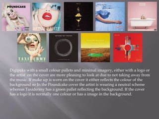
- 1. Digipaks with a small colour pallets and minimal imagery, either with a logo or the artist on the cover are more pleasing to look at due to not taking away from the music. If make up is worn on the cover it either reflects the colour of the background so In the Poundcake cover the artist is wearing a neutral scheme whereas Taxidermy has a green pallet reflecting the background. If the cover has a logo it is normally one colour or has a image in the background.
- 2. Albums with simplistic texts which are clearly presented on the page. Normally which contrasts or reflects the background. The text is quite often red or white which pops off the background.
- 3. The back of the digipak is normally either the same colour as the front such as Marina and the Diamonds, Froot album where the front has a portrait photo of her with purple and blue lighting in her hair on both sides of her head with a faded black background, the faded background follows round to the back and the colour of the album name is in stripes under each song name creating a small rainbow. But on her family jewels album the song names on the back are on top of a photo of her laying down, with the song titles following the wave of her hair. In the Bad Suns album, Language and Perspective there is a simple logo with an image in the background an the logo transfers to the background with the song names sitting in the back.
- 4. Fonts on albums are normally the same for the title and artist name , but the album name is normally smaller than the artist. The font is also very bold and in a colour which stands out against the backing photo.