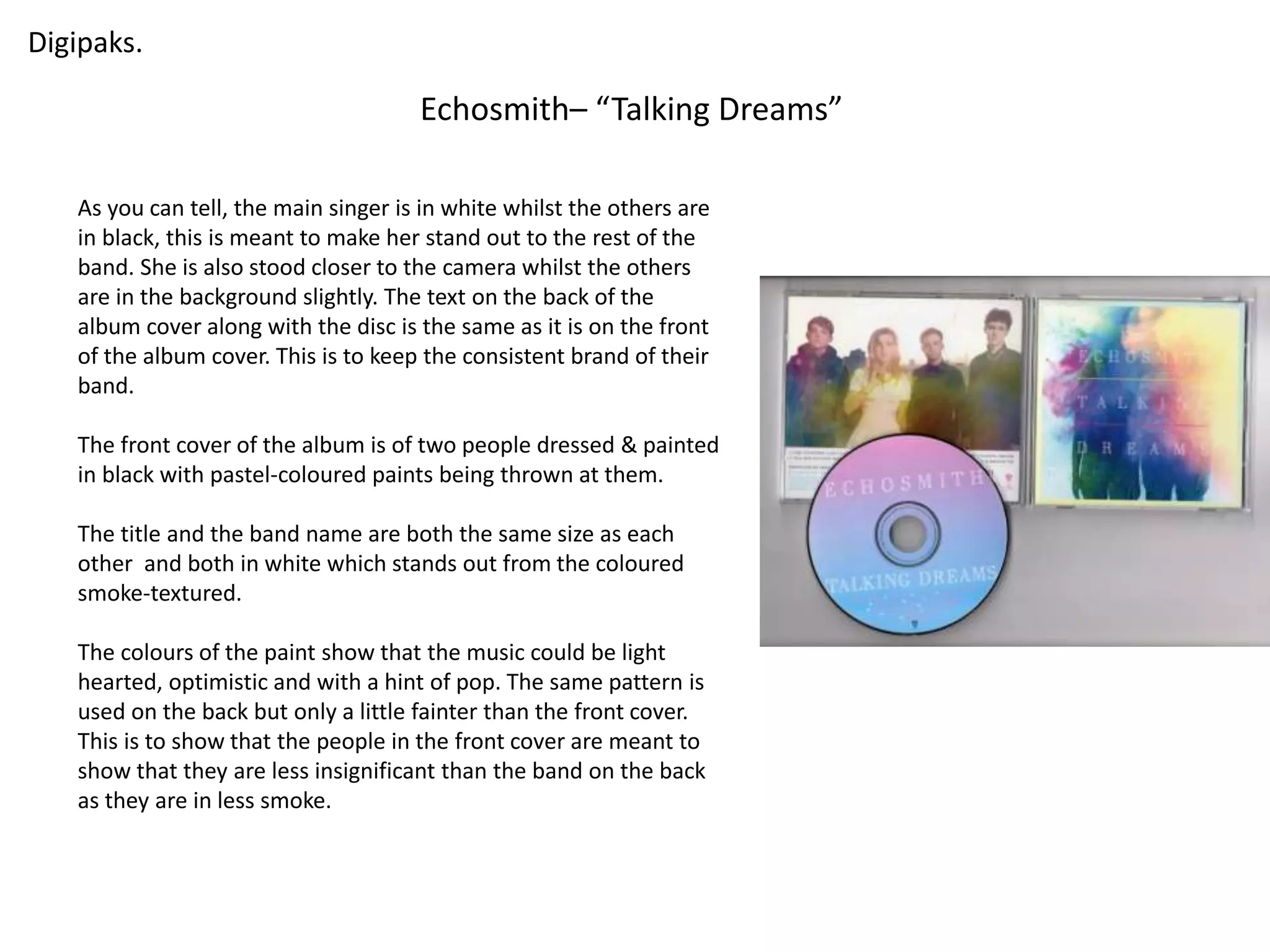
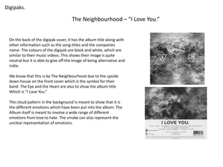
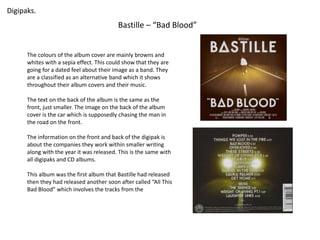
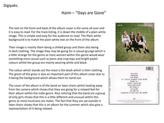
Digipaks. 
Echosmith– “Talking Dreams” 
As you can tell, the main singer is in white whilst the others are 
in black, this is meant to make her stand out to the rest of the 
band. She is also stood closer to the camera whilst the others 
are in the background slightly. The text on the back of the 
album cover along with the disc is the same as it is on the front 
of the album cover. This is to keep the consistent brand of their 
band. 
The front cover of the album is of two people dressed & painted 
in black with pastel-coloured paints being thrown at them. 
The title and the band name are both the same size as each 
other and both in white which stands out from the coloured 
smoke-textured. 
The colours of the paint show that the music could be light 
hearted, optimistic and with a hint of pop. The same pattern is 
used on the back but only a little fainter than the front cover. 
This is to show that the people in the front cover are meant to 
show that they are less insignificant than the band on the back 
as they are in less smoke.
Digipaks. 
The Neighbourhood – “I Love You.” 
On the back of the digipak cover, it has the album title along with 
other information such as the song titles and the companies 
name. The colours of the digipak are black and white, which are 
similar to their music videos. This shows their image is quite 
neutral but it is able to give off the image of being alternative and 
indie. 
We know that this is by The Neighbourhood due to the upside 
down house on the front cover which is the symbol for their 
band. The Eye and the Heart are also to show the album title 
Which is “I Love You.” 
The cloud pattern in the background is meant to show that it is 
the different emotions which have been put into the album. The 
Album itself is meant to involve a wide range of different 
emotions from love to hate. The smoke can also represent the 
unclear representation of emotions.
Digipaks. 
Bastille – “Bad Blood” 
The colours of the album cover are mainly browns and 
whites with a sepia effect. This could show that they are 
going for a dated feel about their image as a band. They 
are a classified as an alternative band which it shows 
throughout their album covers and their music. 
The text on the back of the album is the same as the 
front, just smaller. The image on the back of the album 
cover is the car which is supposedly chasing the man in 
the road on the front. 
The information on the front and back of the digipak is 
about the companies they work within smaller writing 
along with the year it was released. This is the same with 
all digipaks and CD albums. 
This album was the first album that Bastille had released 
then they had released another soon after called “All This 
Bad Blood” which involves the tracks from the
Digipaks. 
Haim – “Days are Gone” 
The text on the front and back of the album cover is the same all over and 
it is easy to read. For the track listing, it is down the middle of a plain white 
image. This is simple and easy for the audience to read. The Plain white 
background is to match the plain white text on the front of the album. 
Their image is mainly them being a chilled group and them also being 
In dark clothing. The image they may be going for is casual-grunge which is 
a little strange for the genre as most women within this genre would wear 
something more casual such as jeans and crop tops and bright pastel 
colours whilst the group are mainly wearing white and black. 
The colour which stands out the most is the black which is their clothing. 
The green of the grass is also an important part of this album cover due to 
it being the background which allows them to stand out. 
The cover of the album is of the band on lawn chairs whilst looking away 
from the camera which shows that they are going for a relaxed feel for 
their album within the indie genre. Also noticing that the band are a group 
of only girls shows that this is a little different and unusual within this 
genre as most musicians are males. The fact that they are sat outside in 
lawn chairs shows that this is an album for the summer which also give a 
representation of it being relaxed.

Digipak Research..

  • 1.
    Digipaks. Echosmith– “TalkingDreams” As you can tell, the main singer is in white whilst the others are in black, this is meant to make her stand out to the rest of the band. She is also stood closer to the camera whilst the others are in the background slightly. The text on the back of the album cover along with the disc is the same as it is on the front of the album cover. This is to keep the consistent brand of their band. The front cover of the album is of two people dressed & painted in black with pastel-coloured paints being thrown at them. The title and the band name are both the same size as each other and both in white which stands out from the coloured smoke-textured. The colours of the paint show that the music could be light hearted, optimistic and with a hint of pop. The same pattern is used on the back but only a little fainter than the front cover. This is to show that the people in the front cover are meant to show that they are less insignificant than the band on the back as they are in less smoke.
  • 2.
    Digipaks. The Neighbourhood– “I Love You.” On the back of the digipak cover, it has the album title along with other information such as the song titles and the companies name. The colours of the digipak are black and white, which are similar to their music videos. This shows their image is quite neutral but it is able to give off the image of being alternative and indie. We know that this is by The Neighbourhood due to the upside down house on the front cover which is the symbol for their band. The Eye and the Heart are also to show the album title Which is “I Love You.” The cloud pattern in the background is meant to show that it is the different emotions which have been put into the album. The Album itself is meant to involve a wide range of different emotions from love to hate. The smoke can also represent the unclear representation of emotions.
  • 3.
    Digipaks. Bastille –“Bad Blood” The colours of the album cover are mainly browns and whites with a sepia effect. This could show that they are going for a dated feel about their image as a band. They are a classified as an alternative band which it shows throughout their album covers and their music. The text on the back of the album is the same as the front, just smaller. The image on the back of the album cover is the car which is supposedly chasing the man in the road on the front. The information on the front and back of the digipak is about the companies they work within smaller writing along with the year it was released. This is the same with all digipaks and CD albums. This album was the first album that Bastille had released then they had released another soon after called “All This Bad Blood” which involves the tracks from the
  • 4.
    Digipaks. Haim –“Days are Gone” The text on the front and back of the album cover is the same all over and it is easy to read. For the track listing, it is down the middle of a plain white image. This is simple and easy for the audience to read. The Plain white background is to match the plain white text on the front of the album. Their image is mainly them being a chilled group and them also being In dark clothing. The image they may be going for is casual-grunge which is a little strange for the genre as most women within this genre would wear something more casual such as jeans and crop tops and bright pastel colours whilst the group are mainly wearing white and black. The colour which stands out the most is the black which is their clothing. The green of the grass is also an important part of this album cover due to it being the background which allows them to stand out. The cover of the album is of the band on lawn chairs whilst looking away from the camera which shows that they are going for a relaxed feel for their album within the indie genre. Also noticing that the band are a group of only girls shows that this is a little different and unusual within this genre as most musicians are males. The fact that they are sat outside in lawn chairs shows that this is an album for the summer which also give a representation of it being relaxed.