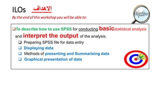
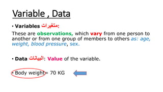
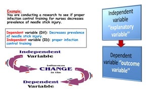
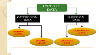
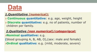
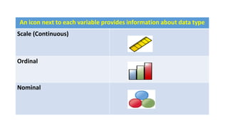
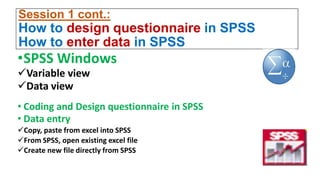
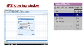
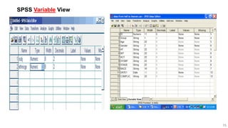
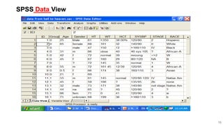
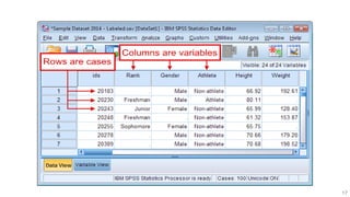
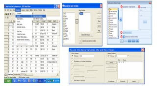
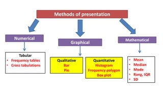
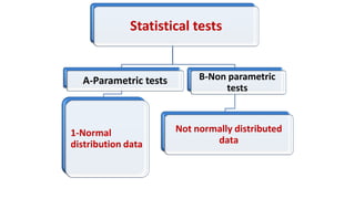
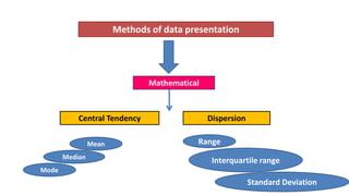
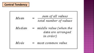
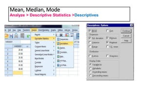
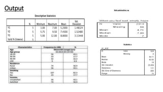
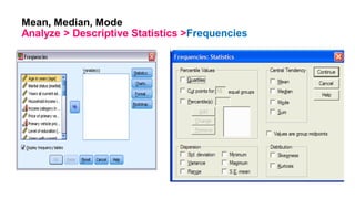
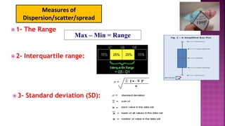
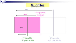
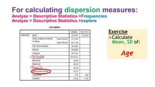
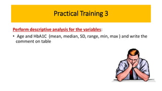
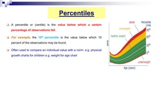
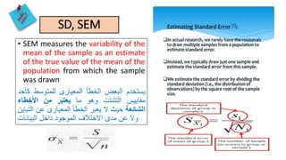
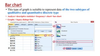
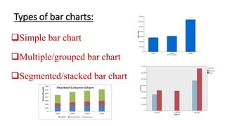
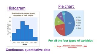
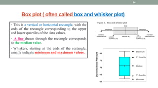
Expectations
ILOs
To describe how to use SPSS for conducting basicstatistical analysis
and interpret the output of the analysis.
 Preparing SPSS file for data entry
 Displaying data
 Methods of presenting and Summarizing data
 Graphical presentation of data
By the end of this workshop you will be able to:
‫االهداف‬
SPSS made easy
SPSS
•STANDS FOR STATISTICAL PACKAGE FOR SOCIAL
SCIENCE
‫اإلجتماعية‬ ‫العلوم‬ ‫في‬ ‫اإلحصائية‬ ‫الحزم‬
Variable , Data
• Variables ‫:متغيرات‬
These are observations, which vary from one person to
another or from one group of members to others as: age,
weight, blood pressure, sex.
• Data ‫البيانات‬: Value of the variable.
• Body weight= 70 KG
Example:
You are conducting a research to see if proper
infection control training for nurses decreases
prevalence of needle stick injury.
Dependent variable (DV): Decreases prevalence
of needle stick injury.
Independent variable (ID): proper infection
control training
Data
1.Quantitative (numerical):
 Continuous quantitative: e.g. age, weight, height
 Discrete quantitative: e.g. no of patients, number of
children per family.
2.Qualitative (non numerical)/categorigcal:
Nominal qualitative: e.g.
(blood grouping A, B, AB, O),(sex: male and female)
Ordinal qualitative: e.g. (mild, moderate, severe)
An icon next to each variable provides information about data type
Scale (Continuous)
Ordinal
Nominal
Session 1 cont.:
How to design questionnaire in SPSS
How to enter data in SPSS
•SPSS Windows
Variable view
Data view
• Coding and Design questionnaire in SPSS
• Data entry
Copy, paste from excel into SPSS
From SPSS, open existing excel file
Create new file directly from SPSS
SPSS opening window
15
SPSS Variable View
16
SPSS Data View
17
Practical training 1: (10 min.)
•Please each one design the questionnaire with
you on SPSS and enter data
N.B How to Code questions with more than one answer
What are risks, adverse effects do you know of oral Isotretinoin therapy? (You can
choose more than one answer):
1. Teratogenicity
2. Dryness
3. Constipation
4. Lipid profile disturbance
5. Hepatic side effects
6. Depression
7. Anemia
8. Others………………….
9. I don’t know
Each item in answer enter as a separate
variable with yes, no answer
How to Code open ended questions
• Read through responses
• Create a preliminary code based on
responses
• Put responses into category and code it
• Try not to have more than 10 categories,
with no individual category receiving less
than 5% of responses.
• Also, there is software that can be used to
help you code open-ended responses.
Session 2:
How to perform data cleaning/manipulation?
Use data set 1
• Data files are not always organized to meet specific user needs, user
may need to select specific group, split data file into separate group
for analysis
• Copy, paste: age, duration, HbA1C
From Data menu
1. Select case: first 20 cases, male only, Saudi, age <45ys
2. Split file: by sex, nationality
3. Sort cases: duration, HbA1C (ascending, descending)
From SPSS dialog box, go to:
Data
Select cases, Sort cases,
Split file
Practical training 2
Data transformation
Use data set 1
From transform menu
1. Recode into different variable:
Age: from number to groups (1- <25y, 2- ≥25y)
Duration 1- <5, 2- ≥5
HBA1C 1- <6.5, 2- ≥6.5
1. Recode into same variable
2. Compute variable: Mean, %, BMI ‫ضرورى‬ ‫االقواس‬
From SPSS dialog box, go to:
Transform
Recode
Into Same variables
Into different variables
Methods of presentation
Numerical
Graphical
Qualitative
Bar
Pie
Quantitative
Histogram
Frequency polygon
Box plot
Tabular
• Frequency tables
• Cross tabulations
Mathematical
• Mean
• Median
• Mode
• Rang, IQR
• SD
Session 3:
Descriptive statistics, Data presentation
• After data entry, it can be analyzed using descriptive statistics
Purpose:
• To find wrong entries, have basic knowledge on the sample,
summarize data
•Tabular presentation
 Frequency analysis (simple frequency table)
 Crosstabs (2 X 2 table and C x R)
1- Simple frequency table
From the menu choose:
Analyze > Descriptive Statistics > Frequencies...
e.g. (sex, nationality, compliance and comments)
Output
So you can do frequency to filter data, detect
missed one
Missed data
Missing Values for a Numeric Variable
• Type 999 in the Value field.
Missing Values for a String Variable
• Type NR (no response) in the Value field.
A value is missing may be important to your analysis. For example, you may
find it useful to distinguish between those respondents, and non respondents
Characteristics of good table:
1. Simple
2. Self explanatory
3- Explaining abbreviation
4- Columns and rows labeled clearly
5- Unites of measures should be written
6- Title: Every table should have a title, above the
table, which is clear and answers, as possible as you
can, four questions
(what, who, where and when).
2- Crosstabs
• Crosstabs are used to examine the relationship between two
variables Analyze > Descriptive Statistics >crosstabs
• e.g. 2x2 (sex & nationality)
Statistics iconCells icon
Output
Odds Ratio (OR)
• The odds ratio is the odds of outcome occurrence in
one group divided by the odds of outcome
occurrence in the comparison group
• Analysis of case-control studies
• If the OR = 1 there is no difference between the two
groups
• If the OR >1 this exposure is risk factor for
occurrence of disease
• If the OR <1 this exposure is protective factor for
occurrence of disease
Relative risk (RR)
 RR indicates how many times those
exposed are likely to develop the disease
relative to non-exposed.
• Analysis of cohort studies
RR= 1: the exposure is not associated with the
disease.
RR > 1: the exposure is a risk
RR < 1: the exposure is a protective
Practical training 3:
•Using data set 1 exercise
•Descriptive statistics: Simple frequency table for
sex, compliance
•Crosstabs: 2 X 2 table: relation between gender and
nationality.
•C x R: Association of compliance to treatment and
gender
Statistical tests
A-Parametric tests
1-Normal
distribution data
B-Non parametric
tests
Not normally distributed
data
Methods of data presentation
Central Tendency
Mathematical
Dispersion
Mean
Median
Mode
Range
Interquartile range
Standard Deviation
Central Tendency
Mean, Median, Mode
Analyze > Descriptive Statistics >Descriptives
Output
Mean, Median, Mode
Analyze > Descriptive Statistics >Frequencies
 1- The Range
 2- Interquartile range:
Max – Min = Range
 3- Standard deviation (SD):
Measures of
Dispersion/scatter/spread
Quartiles
2nd quartile
median
3rd quartile
75th percentile
75%
50%
1st quartile
25th percentile
25%
For calculating dispersion measures:
Analyze > Descriptive Statistics >Frequencies
Analyze > Descriptive Statistics >explore
Exercise
Calculate
Mean, SD of:
Age
Practical Training 3
Perform descriptive analysis for the variables:
• Age and HbA1C (mean, median, SD, range, min, max ) and write the
comment on table
Percentiles
 A percentile or (centile) is the value below which a certain
percentage of observations fall.
 For example, the 10th percentile is the value below which 10
percent of the observations may be found.
 Often used to compare an individual value with a norm. e.g. physical
growth charts for children e.g. weight for age chart
SD, SEM
• SEM measures the variability of the
mean of the sample as an estimate
of the true value of the mean of the
population from which the sample
was drawn
‫يستخدم‬‫البعض‬‫الخطأ‬‫المعيارى‬‫للمتوسط‬‫كأحد‬
‫مقاييس‬‫التشتت‬‫وهو‬‫ما‬‫يعتبر‬‫من‬‫األخطاء‬
‫الشائعة‬‫حيث‬‫ال‬‫يعبر‬‫الخطأ‬‫المعيارى‬‫عن‬‫التباين‬
‫وال‬‫عن‬‫مدى‬‫االختالف‬‫الموجود‬‫داخل‬‫البيانات‬
Practice: Try calculate SD,SEM for age
Graphical presentation of data
How to present data by
graph ?
Graphical
Qualitative
Bar
Pie
Quantitative
Histogram
Frequency polygon
Box plot
Bar chart
• This type of graph is suitable to represent data of the two subtypes of
qualitative and quantitative discrete type
• Analyze> descriptive statistics> frequency> chart> bar chart
• Graphs > legacy dialogs>bar
Types of bar charts:
Simple bar chart
Multiple/grouped bar chart
Segmented/stacked bar chart
Histogram
Continuous quantitative data
Pie chart
For all the four types of variables
 Angle =
𝐟𝐫𝐞𝐪𝐮𝐞𝐧𝐜𝐲 𝐨𝐟 𝐜𝐚𝐭𝐞𝐠𝐨𝐫𝐲 𝐨𝐫 𝐢𝐧𝐭𝐞𝐫𝐯𝐚𝐥
𝐭𝐨𝐭𝐚𝐥 𝐟𝐫𝐞𝐪𝐮𝐞𝐧𝐜𝐲
× 360
Box plot ( often called box and whisker plot)
• This is a vertical or horizontal rectangle, with the
ends of the rectangle corresponding to the upper
and lower quartiles of the data values.
• A line drawn through the rectangle corresponds
to the median value.
• Whiskers, starting at the ends of the rectangle,
usually indicate minimum and maximum values.
54
Box plot
Graphs > legacy dialogs> box plot
Scatter plot
 The dependent variable on the
vertical axis (the y-axis)
 The independent variable on the
horizontal axis (the x-axis).
The value of (r) ranges between ( -1) and ( +1)
Pareto chart (Analyze> quality control> pareto)
• Is a vertical bar graph in which values
are plotted in decreasing order of
relative frequency from left to right.
• Is one of the seven basic tools of quality
control. Useful for analyzing what
problems need attention first.
• Pareto principle (80/20 rule), is a theory
maintaining that 80 percent of the
output from a given situation or system
is determined by 20 percent of the
input.
• Pareto chart guiding how to solve 80%
of the problem.
Quiz: which cause could solve 80% of problem
Pareto chart ranking perceived problems of food service providers at
dietary department
Area chart
• A way to quickly and easily
visualize how well the students in
your class were doing over the
course of the year.
• A way to show the average exam
scores throughout the course on
an area chart.
• Show a trend over time
Practical 3:
• Using data set 2 exercise to make:
• Pie graph for sex , Bar chart for compliance
• Bar graph for compliance with sex
• Bar chart for compliance of females only
• Histogram of age, duration
• Histogram of female height/ male height
• Box plot for age
References
• SPSS for the Classroom: the Basics
https://www.ssc.wisc.edu/sscc/pubs/spss/classintro/spss_stud
ents1.htm
• California state university. IBM SPSS statistics 20. part 1
descriptive statistics.
• IBM SPSS Statistics 20 Brief Guide.
• www. spsstests.com.
‫صالحا‬ ‫كله‬ ‫عملنا‬ ‫اجعل‬ ‫اللهم‬
‫اللهم‬‫به‬ ‫ينتفع‬ ‫علما‬ ‫اجعله‬

Spss basic Dr Marwa Zalat

  • 3.
  • 4.
    ILOs To describe howto use SPSS for conducting basicstatistical analysis and interpret the output of the analysis.  Preparing SPSS file for data entry  Displaying data  Methods of presenting and Summarizing data  Graphical presentation of data By the end of this workshop you will be able to: ‫االهداف‬
  • 6.
  • 7.
    SPSS •STANDS FOR STATISTICALPACKAGE FOR SOCIAL SCIENCE ‫اإلجتماعية‬ ‫العلوم‬ ‫في‬ ‫اإلحصائية‬ ‫الحزم‬
  • 8.
    Variable , Data •Variables ‫:متغيرات‬ These are observations, which vary from one person to another or from one group of members to others as: age, weight, blood pressure, sex. • Data ‫البيانات‬: Value of the variable. • Body weight= 70 KG
  • 9.
    Example: You are conductinga research to see if proper infection control training for nurses decreases prevalence of needle stick injury. Dependent variable (DV): Decreases prevalence of needle stick injury. Independent variable (ID): proper infection control training
  • 11.
    Data 1.Quantitative (numerical):  Continuousquantitative: e.g. age, weight, height  Discrete quantitative: e.g. no of patients, number of children per family. 2.Qualitative (non numerical)/categorigcal: Nominal qualitative: e.g. (blood grouping A, B, AB, O),(sex: male and female) Ordinal qualitative: e.g. (mild, moderate, severe)
  • 12.
    An icon nextto each variable provides information about data type Scale (Continuous) Ordinal Nominal
  • 13.
    Session 1 cont.: Howto design questionnaire in SPSS How to enter data in SPSS •SPSS Windows Variable view Data view • Coding and Design questionnaire in SPSS • Data entry Copy, paste from excel into SPSS From SPSS, open existing excel file Create new file directly from SPSS
  • 14.
  • 15.
  • 16.
  • 17.
  • 18.
    Practical training 1:(10 min.) •Please each one design the questionnaire with you on SPSS and enter data
  • 19.
    N.B How toCode questions with more than one answer What are risks, adverse effects do you know of oral Isotretinoin therapy? (You can choose more than one answer): 1. Teratogenicity 2. Dryness 3. Constipation 4. Lipid profile disturbance 5. Hepatic side effects 6. Depression 7. Anemia 8. Others…………………. 9. I don’t know Each item in answer enter as a separate variable with yes, no answer
  • 20.
    How to Codeopen ended questions • Read through responses • Create a preliminary code based on responses • Put responses into category and code it • Try not to have more than 10 categories, with no individual category receiving less than 5% of responses. • Also, there is software that can be used to help you code open-ended responses.
  • 21.
    Session 2: How toperform data cleaning/manipulation? Use data set 1 • Data files are not always organized to meet specific user needs, user may need to select specific group, split data file into separate group for analysis • Copy, paste: age, duration, HbA1C From Data menu 1. Select case: first 20 cases, male only, Saudi, age <45ys 2. Split file: by sex, nationality 3. Sort cases: duration, HbA1C (ascending, descending) From SPSS dialog box, go to: Data Select cases, Sort cases, Split file
  • 22.
    Practical training 2 Datatransformation Use data set 1 From transform menu 1. Recode into different variable: Age: from number to groups (1- <25y, 2- ≥25y) Duration 1- <5, 2- ≥5 HBA1C 1- <6.5, 2- ≥6.5 1. Recode into same variable 2. Compute variable: Mean, %, BMI ‫ضرورى‬ ‫االقواس‬ From SPSS dialog box, go to: Transform Recode Into Same variables Into different variables
  • 24.
    Methods of presentation Numerical Graphical Qualitative Bar Pie Quantitative Histogram Frequencypolygon Box plot Tabular • Frequency tables • Cross tabulations Mathematical • Mean • Median • Mode • Rang, IQR • SD
  • 25.
    Session 3: Descriptive statistics,Data presentation • After data entry, it can be analyzed using descriptive statistics Purpose: • To find wrong entries, have basic knowledge on the sample, summarize data •Tabular presentation  Frequency analysis (simple frequency table)  Crosstabs (2 X 2 table and C x R)
  • 26.
    1- Simple frequencytable From the menu choose: Analyze > Descriptive Statistics > Frequencies... e.g. (sex, nationality, compliance and comments)
  • 27.
  • 28.
    So you cando frequency to filter data, detect missed one Missed data Missing Values for a Numeric Variable • Type 999 in the Value field. Missing Values for a String Variable • Type NR (no response) in the Value field. A value is missing may be important to your analysis. For example, you may find it useful to distinguish between those respondents, and non respondents
  • 29.
    Characteristics of goodtable: 1. Simple 2. Self explanatory 3- Explaining abbreviation 4- Columns and rows labeled clearly 5- Unites of measures should be written 6- Title: Every table should have a title, above the table, which is clear and answers, as possible as you can, four questions (what, who, where and when).
  • 30.
    2- Crosstabs • Crosstabsare used to examine the relationship between two variables Analyze > Descriptive Statistics >crosstabs • e.g. 2x2 (sex & nationality)
  • 31.
  • 32.
  • 33.
    Odds Ratio (OR) •The odds ratio is the odds of outcome occurrence in one group divided by the odds of outcome occurrence in the comparison group • Analysis of case-control studies • If the OR = 1 there is no difference between the two groups • If the OR >1 this exposure is risk factor for occurrence of disease • If the OR <1 this exposure is protective factor for occurrence of disease Relative risk (RR)  RR indicates how many times those exposed are likely to develop the disease relative to non-exposed. • Analysis of cohort studies RR= 1: the exposure is not associated with the disease. RR > 1: the exposure is a risk RR < 1: the exposure is a protective
  • 34.
    Practical training 3: •Usingdata set 1 exercise •Descriptive statistics: Simple frequency table for sex, compliance •Crosstabs: 2 X 2 table: relation between gender and nationality. •C x R: Association of compliance to treatment and gender
  • 35.
    Statistical tests A-Parametric tests 1-Normal distributiondata B-Non parametric tests Not normally distributed data
  • 36.
    Methods of datapresentation Central Tendency Mathematical Dispersion Mean Median Mode Range Interquartile range Standard Deviation
  • 37.
  • 38.
    Mean, Median, Mode Analyze> Descriptive Statistics >Descriptives
  • 39.
  • 40.
    Mean, Median, Mode Analyze> Descriptive Statistics >Frequencies
  • 41.
     1- TheRange  2- Interquartile range: Max – Min = Range  3- Standard deviation (SD): Measures of Dispersion/scatter/spread
  • 42.
    Quartiles 2nd quartile median 3rd quartile 75thpercentile 75% 50% 1st quartile 25th percentile 25%
  • 43.
    For calculating dispersionmeasures: Analyze > Descriptive Statistics >Frequencies Analyze > Descriptive Statistics >explore Exercise Calculate Mean, SD of: Age
  • 44.
    Practical Training 3 Performdescriptive analysis for the variables: • Age and HbA1C (mean, median, SD, range, min, max ) and write the comment on table
  • 45.
    Percentiles  A percentileor (centile) is the value below which a certain percentage of observations fall.  For example, the 10th percentile is the value below which 10 percent of the observations may be found.  Often used to compare an individual value with a norm. e.g. physical growth charts for children e.g. weight for age chart
  • 46.
    SD, SEM • SEMmeasures the variability of the mean of the sample as an estimate of the true value of the mean of the population from which the sample was drawn ‫يستخدم‬‫البعض‬‫الخطأ‬‫المعيارى‬‫للمتوسط‬‫كأحد‬ ‫مقاييس‬‫التشتت‬‫وهو‬‫ما‬‫يعتبر‬‫من‬‫األخطاء‬ ‫الشائعة‬‫حيث‬‫ال‬‫يعبر‬‫الخطأ‬‫المعيارى‬‫عن‬‫التباين‬ ‫وال‬‫عن‬‫مدى‬‫االختالف‬‫الموجود‬‫داخل‬‫البيانات‬
  • 47.
  • 48.
  • 50.
    How to presentdata by graph ? Graphical Qualitative Bar Pie Quantitative Histogram Frequency polygon Box plot
  • 51.
    Bar chart • Thistype of graph is suitable to represent data of the two subtypes of qualitative and quantitative discrete type • Analyze> descriptive statistics> frequency> chart> bar chart • Graphs > legacy dialogs>bar
  • 52.
    Types of barcharts: Simple bar chart Multiple/grouped bar chart Segmented/stacked bar chart
  • 53.
    Histogram Continuous quantitative data Piechart For all the four types of variables  Angle = 𝐟𝐫𝐞𝐪𝐮𝐞𝐧𝐜𝐲 𝐨𝐟 𝐜𝐚𝐭𝐞𝐠𝐨𝐫𝐲 𝐨𝐫 𝐢𝐧𝐭𝐞𝐫𝐯𝐚𝐥 𝐭𝐨𝐭𝐚𝐥 𝐟𝐫𝐞𝐪𝐮𝐞𝐧𝐜𝐲 × 360
  • 54.
    Box plot (often called box and whisker plot) • This is a vertical or horizontal rectangle, with the ends of the rectangle corresponding to the upper and lower quartiles of the data values. • A line drawn through the rectangle corresponds to the median value. • Whiskers, starting at the ends of the rectangle, usually indicate minimum and maximum values. 54
  • 55.
    Box plot Graphs >legacy dialogs> box plot
  • 56.
    Scatter plot  Thedependent variable on the vertical axis (the y-axis)  The independent variable on the horizontal axis (the x-axis).
  • 57.
    The value of(r) ranges between ( -1) and ( +1)
  • 58.
    Pareto chart (Analyze>quality control> pareto) • Is a vertical bar graph in which values are plotted in decreasing order of relative frequency from left to right. • Is one of the seven basic tools of quality control. Useful for analyzing what problems need attention first. • Pareto principle (80/20 rule), is a theory maintaining that 80 percent of the output from a given situation or system is determined by 20 percent of the input. • Pareto chart guiding how to solve 80% of the problem.
  • 59.
    Quiz: which causecould solve 80% of problem Pareto chart ranking perceived problems of food service providers at dietary department
  • 60.
    Area chart • Away to quickly and easily visualize how well the students in your class were doing over the course of the year. • A way to show the average exam scores throughout the course on an area chart. • Show a trend over time
  • 61.
    Practical 3: • Usingdata set 2 exercise to make: • Pie graph for sex , Bar chart for compliance • Bar graph for compliance with sex • Bar chart for compliance of females only • Histogram of age, duration • Histogram of female height/ male height • Box plot for age
  • 62.
    References • SPSS forthe Classroom: the Basics https://www.ssc.wisc.edu/sscc/pubs/spss/classintro/spss_stud ents1.htm • California state university. IBM SPSS statistics 20. part 1 descriptive statistics. • IBM SPSS Statistics 20 Brief Guide. • www. spsstests.com. ‫صالحا‬ ‫كله‬ ‫عملنا‬ ‫اجعل‬ ‫اللهم‬
  • 63.