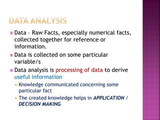
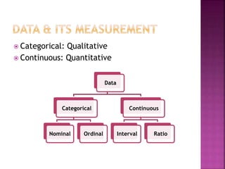
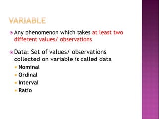
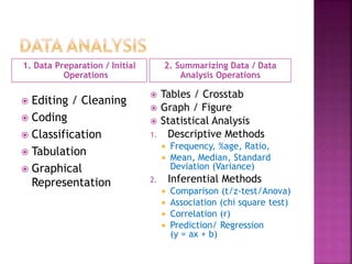
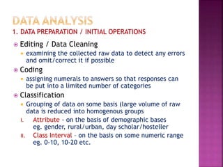
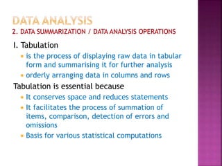
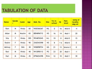
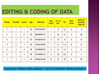
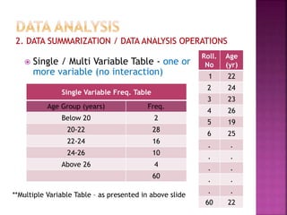
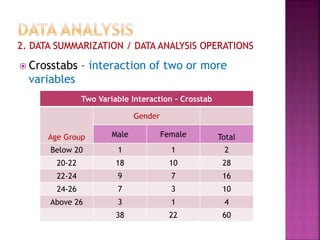
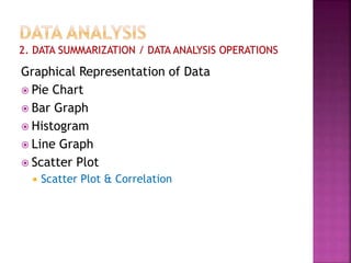
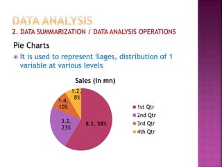
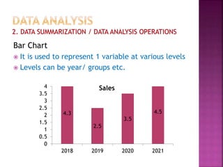
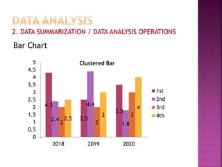
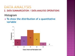
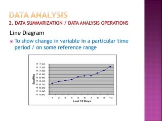
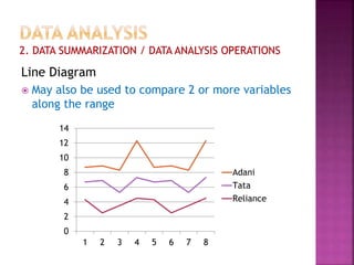
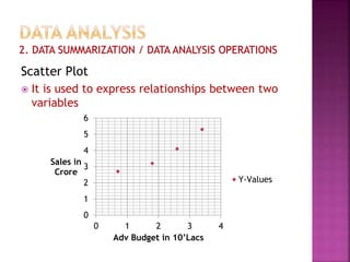
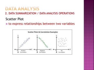
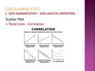
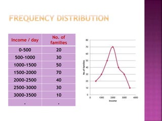
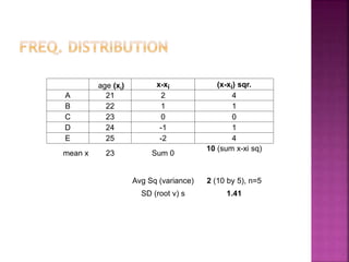
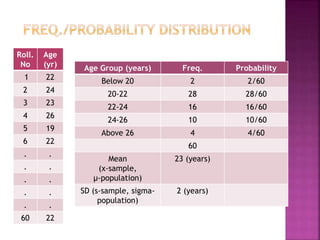
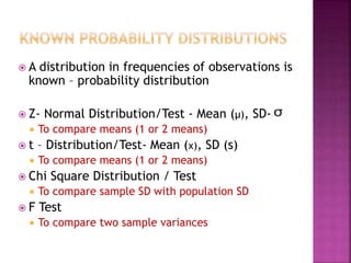
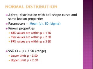
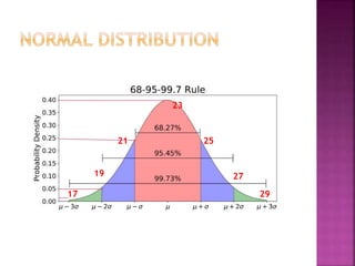
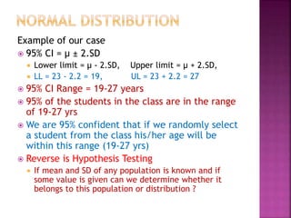
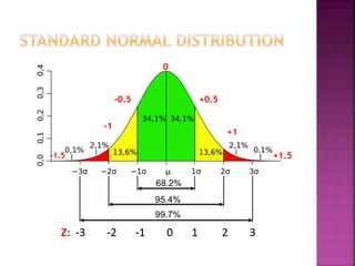
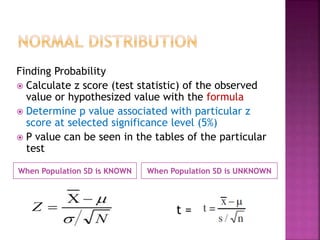
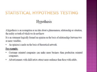
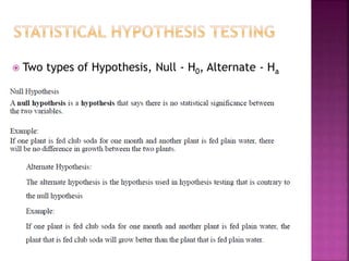
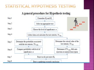
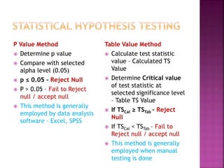
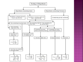
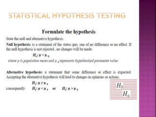
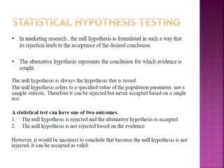
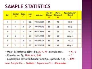
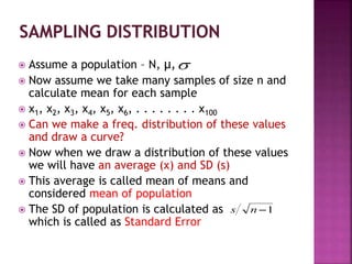
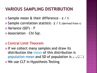
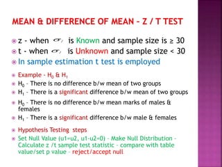
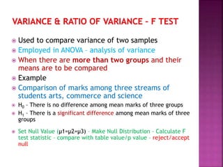
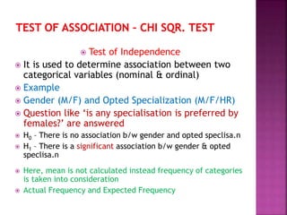
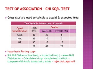
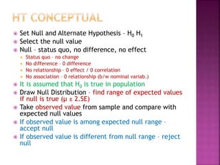
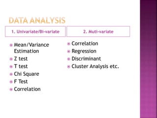
Dr. Urooj A Siddiqui
 Data – Raw Facts, especially numerical facts,
collected together for reference or
information.
 Data is collected on some particular
variable/s
 Data analysis is processing of data to derive
useful information
 Knowledge communicated concerning some
particular fact
 The created knowledge helps in APPLICATION /
DECISION MAKING
 Categorical: Qualitative
 Continuous: Quantitative
Data
Categorical
Nominal Ordinal
Continuous
Interval Ratio
 Any phenomenon which takes at least two
different values/ observations
 Data: Set of values/ observations
collected on variable is called data
 Nominal
 Ordinal
 Interval
 Ratio
1. Data Preparation / Initial
Operations
2. Summarizing Data / Data
Analysis Operations
 Editing / Cleaning
 Coding
 Classification
 Tabulation
 Graphical
Representation
 Tables / Crosstab
 Graph / Figure
 Statistical Analysis
1. Descriptive Methods
 Frequency, %age, Ratio,
 Mean, Median, Standard
Deviation (Variance)
2. Inferential Methods
 Comparison (t/z-test/Anova)
 Association (chi square test)
 Correlation (r)
 Prediction/ Regression
(y = ax + b)
 Editing / Data Cleaning
 examining the collected raw data to detect any errors
and omit/correct it if possible
 Coding
 assigning numerals to answers so that responses can
be put into a limited number of categories
 Classification
 Grouping of data on some basis (large volume of raw
data is reduced into homogenous groups
I. Attribute - on the basis of demographic bases
eg. gender, rural/urban, day scholar/hosteller
II. Class Interval – on the basis on some numeric range
eg. 0-10, 10-20 etc.
I. Tabulation
 is the process of displaying raw data in tabular
form and summarising it for further analysis
 orderly arranging data in columns and rows
Tabulation is essential because
 It conserves space and reduces statements
 It facilitates the process of summation of
items, comparison, detection of errors and
omissions
 Basis for various statistical computations
Name
Gende
r
Caste Age Mob. No. Edu
Yrs in
school
IQ
Pain
level
temp of
locality
deg cel
Ram M Hindu 60 9450366367 NIL 0 16 Mild-0 -4
Akbar M Muslim 65 8004896712 HS 16 14 Mod-1 20
Sita F Hindu 305 9934876545 Int. 19 0 Mild-0 15
Shalini F Hindu 90 2542543598 HS 8 1 6 Mild-0 0
Mehnaj F Sikh 38 9458098734 UG 21 13 Severe-2 0
Ravi M Hindu 48 9412890112 PG 23 20 Mod-1 -1
Hari M Hindu 45 8796654398 Prim 12 10 Mod-1 30
Name Gender Caste Age Mob.No.
Edu
level
Yrs in
sch.
IQ
Pain
level
temp of
locality
deg cel
7 1 1 60 9450366367 -1 0 16 0 -4
2 1 2 65 8004896712 1 16 14 2 20
5 2 1 35 9934876545 2 19 0 0 15
4 2 1 90 2542543598 1 8 1 6 0 0
3 2 3 38 9458098734 3 21 13 3 0
6 1 1 48 9412890112 4 23 20 2 -1
1 1 1 45 8796654398 0 12 10 2 30
Nominal & Ordinal called qualitative . Interval and Ratio called quantitative
Single Variable Freq. Table
Age Group (years) Freq.
Below 20 2
20-22 28
22-24 16
24-26 10
Above 26 4
60
Roll.
No
Age
(yr)
1 22
2 24
3 23
4 26
5 19
6 25
. .
. .
. .
. .
. .
60 22
 Single / Multi Variable Table - one or
more variable (no interaction)
**Multiple Variable Table – as presented in above slide
 Crosstabs – interaction of two or more
variables
Two Variable Interaction – Crosstab
Age Group
Gender
Male Female Total
Below 20 1 1 2
20-22 18 10 28
22-24 9 7 16
24-26 7 3 10
Above 26 3 1 4
38 22 60
Graphical Representation of Data
 Pie Chart
 Bar Graph
 Histogram
 Line Graph
 Scatter Plot
 Scatter Plot & Correlation
Pie Charts
 It is used to represent %ages, distribution of 1
variable at various levels
8.2, 58%
3.2,
23%
1.4,
10%
1.2,
8%
Sales (in mn)
1st Qtr
2nd Qtr
3rd Qtr
4th Qtr
Bar Chart
 It is used to represent 1 variable at various levels
 Levels can be year/ groups etc.
4.3
2.5
3.5
4.5
0
0.5
1
1.5
2
2.5
3
3.5
4
2018 2019 2020 2021
Sales
Bar Chart
4.3
2.5
3.5
2.4
4.4
1.8
2 2
3
2.5
3
4
0
0.5
1
1.5
2
2.5
3
3.5
4
4.5
5
2018 2019 2020
Clustered Bar
1st
2nd
3rd
4th
Histogram
 To show the distribution of a quantitative
variable
4
6
10
8
2 0
0
2
4
6
8
10
12
10 20 30 40 50
Frequency
Class Interval/Variable Unit
Line Diagram
 To show change in variable in a particular time
period / on some reference range
₹ 5.60
₹ 5.80
₹ 6.00
₹ 6.20
₹ 6.40
₹ 6.60
₹ 6.80
₹ 7.00
₹ 7.20
₹ 7.40
1 2 3 4 5 6 7 8 9 10
Stock
Price
Last 10 Days
Line Diagram
 May also be used to compare 2 or more variables
along the range
0
2
4
6
8
10
12
14
1 2 3 4 5 6 7 8
Adani
Tata
Reliance
Scatter Plot
 It is used to express relationships between two
variables
0
1
2
3
4
5
6
0 1 2 3 4
Sales in
Crore
Adv Budget in 10’Lacs
Y-Values
Scatter Plot
 to express relationships between two variables
Scatter Plot
 Trend Lines - Correlation
Income / day
No. of
families
0-500 20
500-1000 30
1000-1500 50
1500-2000 70
2000-2500 40
2500-3000 30
3000-3500 10
. .
0
10
20
30
40
50
60
70
80
0 1000 2000 3000 4000
No.of
families
Income
age (xi) x-xi (x-xi) sqr.
A 21 2 4
B 22 1 1
C 23 0 0
D 24 -1 1
E 25 -2 4
mean x 23 Sum 0
10 (sum x-xi sq)
Avg Sq (variance) 2 (10 by 5), n=5
SD (root v) s 1.41
Age Group (years) Freq. Probability
Below 20 2 2/60
20-22 28 28/60
22-24 16 16/60
24-26 10 10/60
Above 26 4 4/60
60
Mean
(x-sample,
µ-population)
23 (years)
SD (s-sample, sigma-
population)
2 (years)
Roll.
No
Age
(yr)
1 22
2 24
3 23
4 26
5 19
6 22
. .
. .
. .
. .
. .
60 22
 A distribution in frequencies of observations is
known – probability distribution
 Z- Normal Distribution/Test - Mean (µ), SD-
 To compare means (1 or 2 means)
 t – Distribution/Test- Mean (x), SD (s)
 To compare means (1 or 2 means)
 Chi Square Distribution / Test
 To compare sample SD with population SD
 F Test
 To compare two sample variances
 A freq. distribution with bell shape curve and
some known properties
 Parameters - Mean (µ), SD (sigma)
 Known properties
 68% values are within µ ± 1 SD
 95% values are within µ ± 2 SD
 99% values are within µ ± 3 SD
 95% CI = µ ± 2.SD (range)
 Lower limit µ - 2.SD
 Upper limit µ + 2.SD
23
25
27
29
21
19
17
Example of our case
 95% CI = µ ± 2.SD
 Lower limit = µ - 2.SD, Upper limit = µ + 2.SD,
 LL = 23 - 2.2 = 19, UL = 23 + 2.2 = 27
 95% CI Range = 19-27 years
 95% of the students in the class are in the range
of 19-27 yrs
 We are 95% confident that if we randomly select
a student from the class his/her age will be
within this range (19-27 yrs)
 Reverse is Hypothesis Testing
 If mean and SD of any population is known and if
some value is given can we determine whether it
belongs to this population or distribution ?
0
+0.5
+1
+1.5
-0.5
-1
-1.5
When Population SD is KNOWN When Population SD is UNKNOWN
Finding Probability
 Calculate z score (test statistic) of the observed
value or hypothesized value with the formula
 Determine p value associated with particular z
score at selected significance level (5%)
 P value can be seen in the tables of the particular
test
t =
 Two types of Hypothesis, Null - H0, Alternate - Ha
P Value Method
 Determine p value
 Compare with selected
alpha level (0.05)
 p ≤ 0.05 – Reject Null
 P > 0.05 – Fail to Reject
null / accept null
 This method is generally
employed by data analysis
software – Excel, SPSS
Table Value Method
 Calculate test statistic
value – Calculated TS
Value
 Determine Critical value
of test statistic at
selected significance level
– Table TS Value
 If TSCal ≥ TSTab – Reject
Null
 If TSCal < TSTab – Fail to
Reject null / accept null
 This method is generally
employed when manual
testing is done
RN
Gender
G
Caste
C
Age
A
Mob.No.
No. of
Classes
N
Marks
Obtained
M
Specialization
Opted
S
1 1 1 22 9450366367 87 72 HR-3
2 1 2 24 8004896712 65 68 HR-3
3 2 1 26 9934876545 48 56 Fin.-2
4 2 1 21 2542543598 95 83 Mktg.-1
5 2 3 22 9458098734 65 58 Fin.-2
6 1 1 23 9412890112 74 65 Mktg.-1
• Mean & Variance (SD) – Eg. A, N, M – sample stat. – x, s
• Correlation Eg. N-M, A-N, A-M – r
• Association between Gender and Sp. Opted (G n S) - chi
Note Sample Ch.c – Statistic , Population Ch.c - Parameter
 Assume a population – N, µ,
 Now assume we take many samples of size n and
calculate mean for each sample
 x1, x2, x3, x4, x5, x6, . . . . . . . . x100
 Can we make a freq. distribution of these values
and draw a curve?
 Now when we draw a distribution of these values
we will have an average (x) and SD (s)
 This average is called mean of means and
considered mean of population
 The SD of population is calculated as
which is called as Standard Error
 Sample mean & their difference - z / t
 Sample correlation statistic– z / t (derived from r)
 Variance (SD2) – F
 Association – Chi Sqr.
 Central Limit Theorem
 If we collect many samples and draw its
distribution the mean of this distribution is
population mean and SD of population is
 We use CLT in Hypothesis Testing
 z - when is Known and sample size is ≥ 30
 t - when is Unknown and sample size < 30
 In sample estimation t test is employed
 Example - H0 & H1
 H0 – There is no difference b/w mean of two groups
 H1 – There is a significant difference b/w mean of two groups
 H0 – There is no difference b/w mean marks of males &
females
 H1 – There is a significant difference b/w male & females
 Hypothesis Testing steps
 Set Null Value (u1=u2, u1-u2=0) – Make Null Distribution –
Calculate z /t sample test statistic – compare with table
value/set p value – reject/accept null
 Used to compare variance of two samples
 Employed in ANOVA – analysis of variance
 When there are more than two groups and their
means are to be compared
 Example
 Comparison of marks among three streams of
students arts, commerce and science
 H0 – There is no difference among mean marks of three groups
 H1 – There is a significant difference among mean marks of three
groups
 Set Null Value (µ1=µ2=µ3) – Make Null Distribution – Calculate F
test statistic – compare with table value/p value – reject/accept
null
 Test of Independence
 It is used to determine association between two
categorical variables (nominal & ordinal)
 Example
 Gender (M/F) and Opted Specialization (M/F/HR)
 Question like ‘is any specialisation is preferred by
females?’ are answered
 H0 – There is no association b/w gender and opted speclisa.n
 H1 – There is a significant association b/w gender & opted
speclisa.n
 Here, mean is not calculated instead frequency of categories
is taken into consideration
 Actual Frequency and Expected Frequency
 Cross tabs are used to calculate actual & expected freq
 Hypothesis Testing steps
 Set Null Value (actual freq. = expected freq.) – Make Null
Distribution – Calculate chi sqr. sample test statistic –
compare with table value/set p value – reject/accept null
Two Variable Interaction – Crosstab
Opted
Specialization
Total
(60)
Gender
Male (40) Female (20)
Mktg. 30 20 8
Fin. 15 10 2
HR 15 10 10
60 40 20
 Set Null and Alternate Hypothesis – H0 H1
 Select the null value
 Null – status quo, no difference, no effect
 Status quo – no change
 No difference – 0 difference
 No relationship – 0 effect / 0 correlation
 No association – 0 relationship (b/w nominal variab.)
 It is assumed that H0 is true in population
 Draw Null Distribution – find range of expected values
if null is true (µ ± 2.SE)
 Take observed value from sample and compare with
expected null values
 If observed value is among expected null range –
accept null
 If observed value is different from null range – reject
null
1. Univariate/Bi-variate 2. Muti-variate
 Mean/Variance
Estimation
 Z test
 T test
 Chi Square
 F Test
 Correlation
 Correlation
 Regression
 Discriminant
 Cluster Analysis etc.
 Regression analysis
 1 dependent variable/DV (continuous)
 many independent variables/IV (continuous)
 Y = a.x1 +b.x2 +c.x3…….+.x.n
 Discriminant analysis
 1 dependent variable (catgorical)
 many independent variables (continuous)
 Z (yes/no) = a.x1 +b.x2 +c.x3…….+.x.n
 Cluster analysis
 No DV/IV
 Used to group respondents/customers in
various cluster
 Employed in market segmentation
 Factor analysis
 No DV/IV
 Used to group variables in various cluster of
more condensed variables

BRM Unit 3 Data Analysis-1.pptx

  • 1.
    Dr. Urooj ASiddiqui
  • 2.
     Data –Raw Facts, especially numerical facts, collected together for reference or information.  Data is collected on some particular variable/s  Data analysis is processing of data to derive useful information  Knowledge communicated concerning some particular fact  The created knowledge helps in APPLICATION / DECISION MAKING
  • 3.
     Categorical: Qualitative Continuous: Quantitative Data Categorical Nominal Ordinal Continuous Interval Ratio
  • 4.
     Any phenomenonwhich takes at least two different values/ observations  Data: Set of values/ observations collected on variable is called data  Nominal  Ordinal  Interval  Ratio
  • 5.
    1. Data Preparation/ Initial Operations 2. Summarizing Data / Data Analysis Operations  Editing / Cleaning  Coding  Classification  Tabulation  Graphical Representation  Tables / Crosstab  Graph / Figure  Statistical Analysis 1. Descriptive Methods  Frequency, %age, Ratio,  Mean, Median, Standard Deviation (Variance) 2. Inferential Methods  Comparison (t/z-test/Anova)  Association (chi square test)  Correlation (r)  Prediction/ Regression (y = ax + b)
  • 6.
     Editing /Data Cleaning  examining the collected raw data to detect any errors and omit/correct it if possible  Coding  assigning numerals to answers so that responses can be put into a limited number of categories  Classification  Grouping of data on some basis (large volume of raw data is reduced into homogenous groups I. Attribute - on the basis of demographic bases eg. gender, rural/urban, day scholar/hosteller II. Class Interval – on the basis on some numeric range eg. 0-10, 10-20 etc.
  • 7.
    I. Tabulation  isthe process of displaying raw data in tabular form and summarising it for further analysis  orderly arranging data in columns and rows Tabulation is essential because  It conserves space and reduces statements  It facilitates the process of summation of items, comparison, detection of errors and omissions  Basis for various statistical computations
  • 8.
    Name Gende r Caste Age Mob.No. Edu Yrs in school IQ Pain level temp of locality deg cel Ram M Hindu 60 9450366367 NIL 0 16 Mild-0 -4 Akbar M Muslim 65 8004896712 HS 16 14 Mod-1 20 Sita F Hindu 305 9934876545 Int. 19 0 Mild-0 15 Shalini F Hindu 90 2542543598 HS 8 1 6 Mild-0 0 Mehnaj F Sikh 38 9458098734 UG 21 13 Severe-2 0 Ravi M Hindu 48 9412890112 PG 23 20 Mod-1 -1 Hari M Hindu 45 8796654398 Prim 12 10 Mod-1 30
  • 9.
    Name Gender CasteAge Mob.No. Edu level Yrs in sch. IQ Pain level temp of locality deg cel 7 1 1 60 9450366367 -1 0 16 0 -4 2 1 2 65 8004896712 1 16 14 2 20 5 2 1 35 9934876545 2 19 0 0 15 4 2 1 90 2542543598 1 8 1 6 0 0 3 2 3 38 9458098734 3 21 13 3 0 6 1 1 48 9412890112 4 23 20 2 -1 1 1 1 45 8796654398 0 12 10 2 30 Nominal & Ordinal called qualitative . Interval and Ratio called quantitative
  • 10.
    Single Variable Freq.Table Age Group (years) Freq. Below 20 2 20-22 28 22-24 16 24-26 10 Above 26 4 60 Roll. No Age (yr) 1 22 2 24 3 23 4 26 5 19 6 25 . . . . . . . . . . 60 22  Single / Multi Variable Table - one or more variable (no interaction) **Multiple Variable Table – as presented in above slide
  • 11.
     Crosstabs –interaction of two or more variables Two Variable Interaction – Crosstab Age Group Gender Male Female Total Below 20 1 1 2 20-22 18 10 28 22-24 9 7 16 24-26 7 3 10 Above 26 3 1 4 38 22 60
  • 12.
    Graphical Representation ofData  Pie Chart  Bar Graph  Histogram  Line Graph  Scatter Plot  Scatter Plot & Correlation
  • 13.
    Pie Charts  Itis used to represent %ages, distribution of 1 variable at various levels 8.2, 58% 3.2, 23% 1.4, 10% 1.2, 8% Sales (in mn) 1st Qtr 2nd Qtr 3rd Qtr 4th Qtr
  • 14.
    Bar Chart  Itis used to represent 1 variable at various levels  Levels can be year/ groups etc. 4.3 2.5 3.5 4.5 0 0.5 1 1.5 2 2.5 3 3.5 4 2018 2019 2020 2021 Sales
  • 15.
  • 16.
    Histogram  To showthe distribution of a quantitative variable 4 6 10 8 2 0 0 2 4 6 8 10 12 10 20 30 40 50 Frequency Class Interval/Variable Unit
  • 17.
    Line Diagram  Toshow change in variable in a particular time period / on some reference range ₹ 5.60 ₹ 5.80 ₹ 6.00 ₹ 6.20 ₹ 6.40 ₹ 6.60 ₹ 6.80 ₹ 7.00 ₹ 7.20 ₹ 7.40 1 2 3 4 5 6 7 8 9 10 Stock Price Last 10 Days
  • 18.
    Line Diagram  Mayalso be used to compare 2 or more variables along the range 0 2 4 6 8 10 12 14 1 2 3 4 5 6 7 8 Adani Tata Reliance
  • 19.
    Scatter Plot  Itis used to express relationships between two variables 0 1 2 3 4 5 6 0 1 2 3 4 Sales in Crore Adv Budget in 10’Lacs Y-Values
  • 20.
    Scatter Plot  toexpress relationships between two variables
  • 21.
    Scatter Plot  TrendLines - Correlation
  • 22.
    Income / day No.of families 0-500 20 500-1000 30 1000-1500 50 1500-2000 70 2000-2500 40 2500-3000 30 3000-3500 10 . . 0 10 20 30 40 50 60 70 80 0 1000 2000 3000 4000 No.of families Income
  • 23.
    age (xi) x-xi(x-xi) sqr. A 21 2 4 B 22 1 1 C 23 0 0 D 24 -1 1 E 25 -2 4 mean x 23 Sum 0 10 (sum x-xi sq) Avg Sq (variance) 2 (10 by 5), n=5 SD (root v) s 1.41
  • 24.
    Age Group (years)Freq. Probability Below 20 2 2/60 20-22 28 28/60 22-24 16 16/60 24-26 10 10/60 Above 26 4 4/60 60 Mean (x-sample, µ-population) 23 (years) SD (s-sample, sigma- population) 2 (years) Roll. No Age (yr) 1 22 2 24 3 23 4 26 5 19 6 22 . . . . . . . . . . 60 22
  • 25.
     A distributionin frequencies of observations is known – probability distribution  Z- Normal Distribution/Test - Mean (µ), SD-  To compare means (1 or 2 means)  t – Distribution/Test- Mean (x), SD (s)  To compare means (1 or 2 means)  Chi Square Distribution / Test  To compare sample SD with population SD  F Test  To compare two sample variances
  • 26.
     A freq.distribution with bell shape curve and some known properties  Parameters - Mean (µ), SD (sigma)  Known properties  68% values are within µ ± 1 SD  95% values are within µ ± 2 SD  99% values are within µ ± 3 SD  95% CI = µ ± 2.SD (range)  Lower limit µ - 2.SD  Upper limit µ + 2.SD
  • 27.
  • 28.
    Example of ourcase  95% CI = µ ± 2.SD  Lower limit = µ - 2.SD, Upper limit = µ + 2.SD,  LL = 23 - 2.2 = 19, UL = 23 + 2.2 = 27  95% CI Range = 19-27 years  95% of the students in the class are in the range of 19-27 yrs  We are 95% confident that if we randomly select a student from the class his/her age will be within this range (19-27 yrs)  Reverse is Hypothesis Testing  If mean and SD of any population is known and if some value is given can we determine whether it belongs to this population or distribution ?
  • 29.
  • 30.
    When Population SDis KNOWN When Population SD is UNKNOWN Finding Probability  Calculate z score (test statistic) of the observed value or hypothesized value with the formula  Determine p value associated with particular z score at selected significance level (5%)  P value can be seen in the tables of the particular test t =
  • 32.
     Two typesof Hypothesis, Null - H0, Alternate - Ha
  • 34.
    P Value Method Determine p value  Compare with selected alpha level (0.05)  p ≤ 0.05 – Reject Null  P > 0.05 – Fail to Reject null / accept null  This method is generally employed by data analysis software – Excel, SPSS Table Value Method  Calculate test statistic value – Calculated TS Value  Determine Critical value of test statistic at selected significance level – Table TS Value  If TSCal ≥ TSTab – Reject Null  If TSCal < TSTab – Fail to Reject null / accept null  This method is generally employed when manual testing is done
  • 38.
    RN Gender G Caste C Age A Mob.No. No. of Classes N Marks Obtained M Specialization Opted S 1 11 22 9450366367 87 72 HR-3 2 1 2 24 8004896712 65 68 HR-3 3 2 1 26 9934876545 48 56 Fin.-2 4 2 1 21 2542543598 95 83 Mktg.-1 5 2 3 22 9458098734 65 58 Fin.-2 6 1 1 23 9412890112 74 65 Mktg.-1 • Mean & Variance (SD) – Eg. A, N, M – sample stat. – x, s • Correlation Eg. N-M, A-N, A-M – r • Association between Gender and Sp. Opted (G n S) - chi Note Sample Ch.c – Statistic , Population Ch.c - Parameter
  • 39.
     Assume apopulation – N, µ,  Now assume we take many samples of size n and calculate mean for each sample  x1, x2, x3, x4, x5, x6, . . . . . . . . x100  Can we make a freq. distribution of these values and draw a curve?  Now when we draw a distribution of these values we will have an average (x) and SD (s)  This average is called mean of means and considered mean of population  The SD of population is calculated as which is called as Standard Error
  • 42.
     Sample mean& their difference - z / t  Sample correlation statistic– z / t (derived from r)  Variance (SD2) – F  Association – Chi Sqr.  Central Limit Theorem  If we collect many samples and draw its distribution the mean of this distribution is population mean and SD of population is  We use CLT in Hypothesis Testing
  • 43.
     z -when is Known and sample size is ≥ 30  t - when is Unknown and sample size < 30  In sample estimation t test is employed  Example - H0 & H1  H0 – There is no difference b/w mean of two groups  H1 – There is a significant difference b/w mean of two groups  H0 – There is no difference b/w mean marks of males & females  H1 – There is a significant difference b/w male & females  Hypothesis Testing steps  Set Null Value (u1=u2, u1-u2=0) – Make Null Distribution – Calculate z /t sample test statistic – compare with table value/set p value – reject/accept null
  • 44.
     Used tocompare variance of two samples  Employed in ANOVA – analysis of variance  When there are more than two groups and their means are to be compared  Example  Comparison of marks among three streams of students arts, commerce and science  H0 – There is no difference among mean marks of three groups  H1 – There is a significant difference among mean marks of three groups  Set Null Value (µ1=µ2=µ3) – Make Null Distribution – Calculate F test statistic – compare with table value/p value – reject/accept null
  • 45.
     Test ofIndependence  It is used to determine association between two categorical variables (nominal & ordinal)  Example  Gender (M/F) and Opted Specialization (M/F/HR)  Question like ‘is any specialisation is preferred by females?’ are answered  H0 – There is no association b/w gender and opted speclisa.n  H1 – There is a significant association b/w gender & opted speclisa.n  Here, mean is not calculated instead frequency of categories is taken into consideration  Actual Frequency and Expected Frequency
  • 46.
     Cross tabsare used to calculate actual & expected freq  Hypothesis Testing steps  Set Null Value (actual freq. = expected freq.) – Make Null Distribution – Calculate chi sqr. sample test statistic – compare with table value/set p value – reject/accept null Two Variable Interaction – Crosstab Opted Specialization Total (60) Gender Male (40) Female (20) Mktg. 30 20 8 Fin. 15 10 2 HR 15 10 10 60 40 20
  • 47.
     Set Nulland Alternate Hypothesis – H0 H1  Select the null value  Null – status quo, no difference, no effect  Status quo – no change  No difference – 0 difference  No relationship – 0 effect / 0 correlation  No association – 0 relationship (b/w nominal variab.)  It is assumed that H0 is true in population  Draw Null Distribution – find range of expected values if null is true (µ ± 2.SE)  Take observed value from sample and compare with expected null values  If observed value is among expected null range – accept null  If observed value is different from null range – reject null
  • 48.
    1. Univariate/Bi-variate 2.Muti-variate  Mean/Variance Estimation  Z test  T test  Chi Square  F Test  Correlation  Correlation  Regression  Discriminant  Cluster Analysis etc.
  • 49.
     Regression analysis 1 dependent variable/DV (continuous)  many independent variables/IV (continuous)  Y = a.x1 +b.x2 +c.x3…….+.x.n  Discriminant analysis  1 dependent variable (catgorical)  many independent variables (continuous)  Z (yes/no) = a.x1 +b.x2 +c.x3…….+.x.n
  • 50.
     Cluster analysis No DV/IV  Used to group respondents/customers in various cluster  Employed in market segmentation  Factor analysis  No DV/IV  Used to group variables in various cluster of more condensed variables