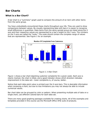
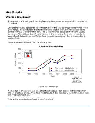
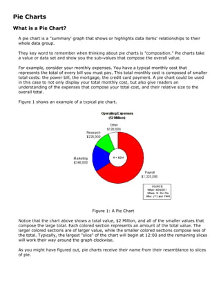
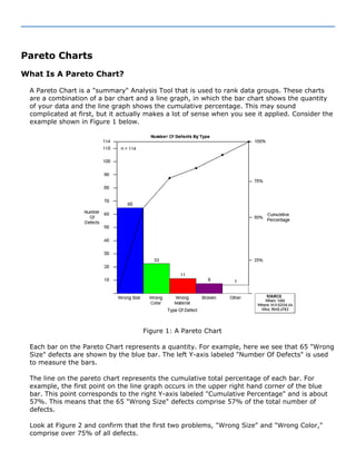
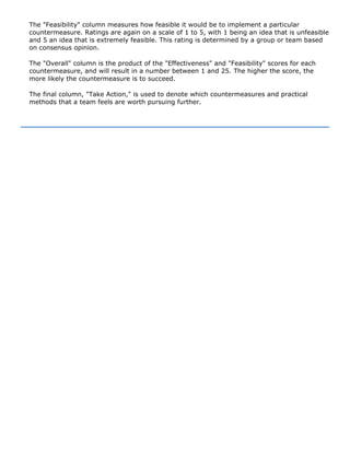
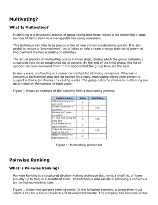
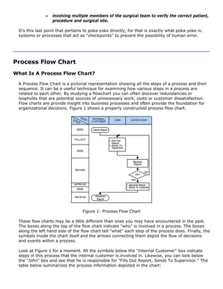
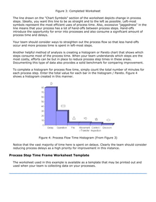
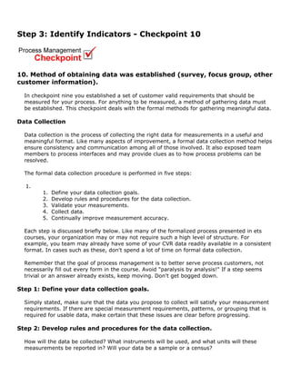
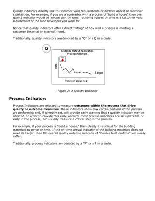
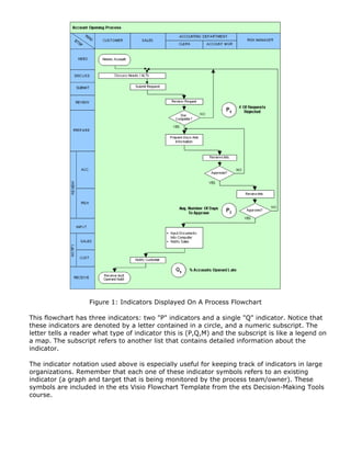
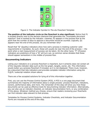
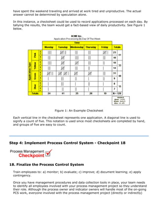
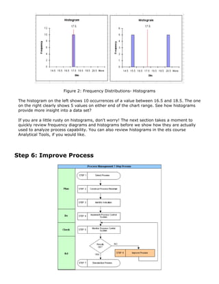
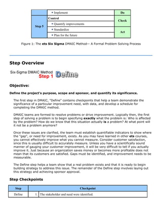
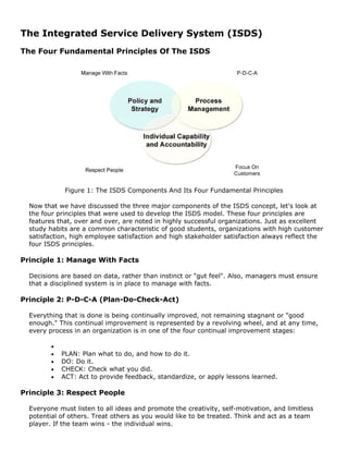
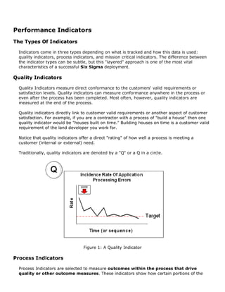
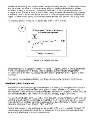
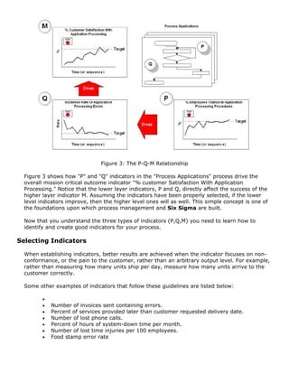
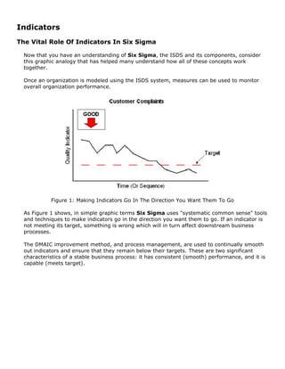
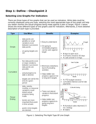
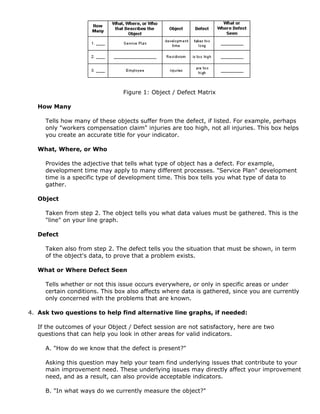
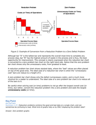
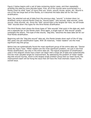
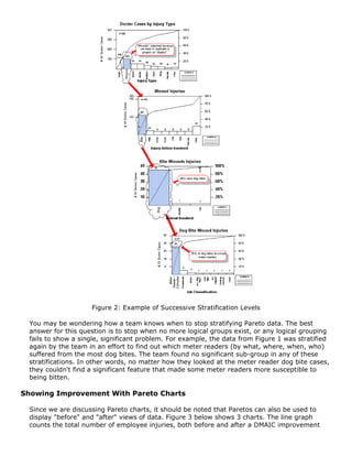
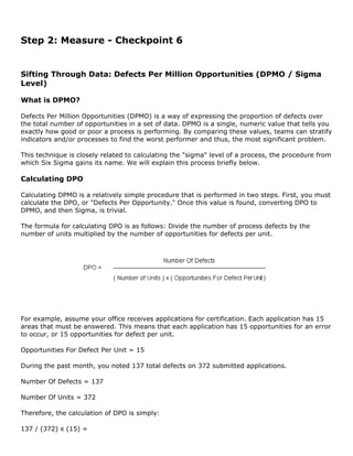
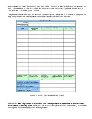
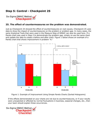
The document provides an overview of Six Sigma, explaining that it is a management system that uses data and systematic approaches to continually improve quality and performance. It discusses the five major areas of Six Sigma: analytical tools, decision-making tools, process management, the DMAIC problem solving process, and leadership/strategic planning. The course will provide a quick overview of key Six Sigma concepts and then focus on walking through the DMAIC problem solving process step-by-step using an example.
Data analysis involves cleaning, transforming and modeling data to extract useful information for making business decisions. It involves gathering past data or memories to analyze what happened previously or what could happen from different decisions in order to make informed choices. There are various tools that can help users process, manipulate and analyze relationships in data to identify patterns and trends. Major techniques of data analysis include text analysis, statistical analysis, diagnostic analysis, predictive analysis and prescriptive analysis. Statistical modeling applies statistical analysis to data to understand relationships between variables, make predictions and visualize data for stakeholders. Learning statistical modeling helps in choosing the right model, preparing data for analysis, and communicating findings to different audiences.
This project is about "Big Data Analytics," and it provides a comprehensive overview of topics related to Data and Analytics and a short note on Cognitive Analytics, Sentiment Analytics, Data Visualization, Artificial intelligence & Data-Driven Decision Making along with examples and diagrams.
The document provides an overview of business analytics (BA) including its history, types, examples, challenges, and relationship to data mining. BA involves exploring past business performance data to gain insights and guide planning. It can focus on specific business segments. Types of BA include descriptive analytics like reporting, affinity grouping, and clustering, as well as predictive analytics. Challenges to BA include acquiring high quality data and rapidly processing large volumes of data. Data mining is an important task within BA that helps handle large datasets and specific problems.
Data analytics involves analyzing data to extract useful information. It is used to identify risks, improve business processes, verify effectiveness, and influence decisions. There are five categories: data analytics of transactions and operations; web analytics of website traffic; social analytics of social media; mobile analytics of device data; and big data analytics. Companies obtain user data from GPS, sensors, and social media to perform analyses that benefit organizations.
This document discusses data mining and the SEMMA process. It defines data mining as discovering hidden patterns in large amounts of data in order to create predictive models that provide insights. These insights can help target customers and reduce costs and risks. The SEMMA process is a 5-stage approach developed by SAS for conducting data mining projects: sample data, explore data patterns, modify/transform variables, model relationships, and assess model usefulness. SEMMA offers an organized, structured process for developing and maintaining data mining projects to address business problems and goals.
Business analytics is a custom of transforming the data into business understandings enabling the end users for better decision-making. By using the modern tools and techniques, business analytics can help assess complex situations, consider all the available options, and predict outcomes and showcase critical risks for the decision makers.
Business Analytics can simply be described as a practice that includes the use of various techniques such as Data warehousing, Data mining, Programming in order to visualize and discover several patterns or trends in data. In simple, Analytics help convert the data into useful information, which can be used for decision-making. As a means of sorting through data to find useful information, the application of analytics has found new purpose
This document discusses the Excel add-in for data mining. It allows users to mine data with a few clicks using advanced algorithms without needing experience in data mining or SQL server configuration. The add-in contains sections for data preparation, modeling, accuracy validation, and connection. Data can be explored, cleaned, and prepared for modeling. Common modeling algorithms like decision trees, clustering, and association rules are available. Accuracy and validation tools allow testing models on real data. The add-in combines the power of SQL Server Analysis Services with the ease of use of Excel.
Riding The Technology Wave - Effective Dashboard Data VisualizationLisa McCorkle, Ph.D.
This document discusses effective dashboard design for data visualization. It begins by introducing the concept of data dashboards and their purpose in consolidating important data for decision making. It then describes three categories of dashboards: strategic, operational, and analytical. Strategic dashboards provide a high-level view of performance over months or years, operational dashboards require timely data to monitor daily measures, and analytical dashboards examine complex data relationships over various timeframes. The document concludes by discussing best practices for visualizing data on dashboards, such as using charts, graphs and key performance indicators (KPIs) that clearly and efficiently convey comparisons and status. Color coding and interactive elements can also help users quickly understand and act on the data.
This document discusses data analytics and related concepts. It defines data and information, explaining that data becomes information when it is organized and analyzed to be useful. It then discusses how data is everywhere and the value of data analysis skills. The rest of the document outlines the methodology of data analytics, including data collection, management, cleaning, exploratory analysis, modeling, mining, and visualization. It provides examples of how data analytics is used in healthcare and travel to optimize processes and customer experiences.
1. The document discusses various advanced data analytics techniques including data mining, online analytical processing (OLAP), pivot tables, power pivot, power view in Excel, and different types of data mining techniques like classification, clustering, regression, association rules, outlier detection, sequential patterns, and prediction.
2. It provides details on each technique including definitions, applications, and examples.
3. The key data analytics techniques covered are data mining, OLAP, pivot tables, power pivot and power view in Excel, and various classification methods for advanced data analysis.
Data analytics presentation- Management career institute PoojaPatidar11
1. The basic definition of Data, Analytics, and Data Analytics
2. Definition: Data: Data is a set of values of qualitative or quantitative variables. It is information in the raw or unorganized form. It may be a fact, figure, characters, symbols etc
Analytics: Analytics is the discovery, interpretation, and communication of meaningful patterns in data and applying those patterns towards effective decision making.
Data Analytics: Data analytics refers to qualitative and quantitative techniques and processes used to enhance productivity and business gain.
3.Types of analytics: Predictive Analytics (What could happen?)
Prescriptive Analytics (What should we do)
Descriptive Analytics (What has happened?)
4.Why Data analytics? Data Analytics is needed in Business to Consumer applications (B2C)
5.The process of Data analytics: Data requirements,
Data collection, Data processing, Data cleaning, Exploratory data analysis,
Modeling and algorithms, Data product, Communication
6.The scope of Data Analytics: Bright future of data analytics, many professionals and students are interested in a career in data analytics.
7.Importance of data analytics:1. Predict customer trends and behaviors
Analyze,
2 interpret and deliver data in meaningful ways
3.Increase business productivity
4.Drive effective decision-making
8.why become a data analyst? talented gaps of skill candidates, good salaries for freshers, great future growth path
9. What recruiters look for in applicants: Problem-Solving Skills, Analytical Mind, Maths and Statistic Skills, Communication (both oral and written), Teamwork Abilities
10. Skill is required for Data analytics?
1.) Analytical Skills
2.) Numeracy Skills
3.) Technical and Computer Skills
4.) Attention to Details
5.) Business Skills
6.) Communication Skills
11. Data analytics tools
1.SAS: SAS (Statistical Analysis System) is a software suite developed by SAS Institute. sas language can be defined as a programming language in the computing field. This language is generally used for the purpose of statistical analysis. The language has the ability to read data from databases and common spreadsheets.
2. R: R is a programming language and software environment for statistical analysis, graphics representation and reporting.R is freely available under the GNU General Public License, and pre-compiled binary versions are provided for various operating systems like Linux, Windows, and Mac.
3.PYTHON: Python is a popular programming language Python is a powerful, flexible, open-sources language that is easy to use,
and has a powerful library for data manipulation and analysis.
4.TABLEAU: Tableau Software is a software company that produces interactive data visualization products focused on business intelligence.
This presentation briefly discusses the following topics:
Classification of Data
What is Structured Data?
What is Unstructured Data?
What is Semistructured Data?
Structured vs Unstructured Data: 5 Key Differences
Medici Technologies common problems with data analysisRiesRobinson
Presentation on data analysis problems for small life science companies. Presentation explains the problems and how Medici Technologies fills this need. Medici accelerates client progress toward goals using a structured approach that incorporates project management, parallel algorithmic assessment, optimization, robustness testing, and validation.
The one question you must never ask!" (Information Requirements Gathering for...Alan D. Duncan
Presentation from 2014 International Data Quality Summit (www.idqsummit.org, Twitter hashtag #IDQS14). Techniques for business analysts and data scientists to facilitate better requirements gathering in data and analytic projects.
The document discusses several key challenges in adopting predictive analytics in healthcare:
1) Lack of quality data due to incomplete, inconsistent, or non-standardized data from different sources.
2) Difficulty incorporating analytics into clinical workflows and ensuring usability for clinicians.
3) Privacy concerns around sharing and integrating patient data from different organizations.
4) Need for interdisciplinary teams including data scientists, clinicians, and other stakeholders to design effective predictive solutions.
This document discusses business analytics. It defines business analytics as using data, statistical and quantitative analysis, explanatory and predictive models to gain insights and support decision-making. The document outlines the typical business analytics process, including understanding the business objectives, assessing the situation, collecting and preparing data, developing analytic models, evaluating and reporting results, and deploying the outcomes. It provides examples of how analytics can be used to drive personalized customer services, optimize people management decisions, and conduct real-time sentiment analysis of social media data for an FMCG company. The document concludes with lessons learned, emphasizing the importance of continuous learning, gaining experience through projects and mentoring, and having confidence in one's abilities.
Data Quality in Data Warehouse and Business Intelligence Environments - Disc...Alan D. Duncan
Time and again, we hear about the failure of data warehouses – while things may be improving, they’re moving only slowly. One explanation data quality being overlooked is that the I.T. department is often responsible for delivering and operating the DWH/BI
environment. What ensues ends up being an agenda based on “how do we build it”, not a “why are we doing this”. This needs to change. In this discussion paper, I explore the issues of data quality in data warehouse, business intelligence and analytic environments, and propose an approach based on "Data Quality by Design"
Business analytics can help organizations make better decisions by applying analytical techniques to business problems. While many organizations collect large amounts of data, few systematically analyze this data to improve decision making. Common approaches used by organizations to enhance decisions include analytics, testing hypotheses with data, and improving data quality. Business analytics frameworks provide tools to leverage more information for strategic and operational decisions.
The document discusses the process of data preparation for analysis. It involves checking data for accuracy, developing a database structure, entering data into the computer, and transforming data. Key steps include logging incoming data, screening for errors, generating a codebook to document the database structure and variables, entering data using double entry to ensure accuracy, and transforming data through handling missing values, reversing items, calculating scale totals, and collapsing variables into categories.
Using Business Intelligence: The Strategic Use of Analytics in GovernmentIBM Government
IBM Center for the Business of Government addresses the value of analytics for measurably improving each of four government sector: health care, logistics, revenue management, and intelligence. Using the business strategy of leveraging analytics to promote promote change, these sectors can run as efficiently as any successful business.
A presentation on Talent Analytics or HR Analytics. This presentation gives various tools and parameters involved in HR Analytics and their Application.
Paradigm4 Research Report: Leaving Data on the tableParadigm4
While Big Data enjoys widespread media coverage, not enough attention has been paid to what practitioners think — data scientists who manage and analyze massive volumes of data. We wanted to know, so Paradigm4 teamed up with Innovation Enterprise to ask over 100 data scientists for their help separating Big Data hype from reality. What we learned is that data scientists face multiple challenges achieving their company’s analytical aspirations. The upshot is that businesses are leaving data — and money — on the table.
This document outlines the phases of the data analytics lifecycle, with a focus on Phase 1: Discovery. The Discovery phase involves understanding the business problem, available resources, and formulating initial hypotheses to test. Key activities in Discovery include interviewing stakeholders, learning the domain, assessing available data and tools, and framing the business and analytics problems. The goal is to have enough information to draft an analytic plan and scope the project before moving to the next phase of data preparation.
Helping Hands International (h2i) Presentation presented by Samuel Iyinbo, Fo...Samuel Iyinbo
Helping Hands International is a humanitarian organization that offers various services to empower its members and non-members. Through business opportunities and training programs, they help people realize their dreams. Their vision is to touch lives by providing humanitarian aid, skills training, small business support, loans, and scholarships. Members can progress through six stages by recruiting others, with increasing incentives like electronics, vehicles, property support, and post-retirement income. Their goal is to serve humanity and make a difference through compassionate actions.
This document lists numerous industrial and infrastructure projects that Penta Engineering has worked on involving structural engineering and fabrication of steel and reinforced concrete structures. Some of the notable projects include the Shah Deniz Stage 2 project in Azerbaijan, the Gübretaş Yarımca Plant upgrading in Turkey, various projects for Petrobras in Brazil, and the Marmaray railway project in Istanbul involving stations and bridges. Penta Engineering's work involved preparation of workshop drawings, erection drawings, design of reinforced concrete structures, and structural engineering.
This 3 sentence summary provides the high level information from the document:
The document advertises property for sale in Dubai by a real estate company called Driven Properties. Driven Properties employs knowledgeable property consultants who are experienced in real estate principles like negotiation, market analysis, and property management as well as business ethics. Potential home buyers can find more information at the website given.
Virtual Student Conferences in BrightspaceD2L Barry
Virtual Student Conferences in Brightspace, Nancyruth Leibold and Laura Schwarz – Minnesota State University, Mankato. Presentation at the Brightspace Minnesota Connection at Normandale Community College on April 14, 2016.
This document describes the Online Travel Booking Management System (OTBMS) created by Maco Infotech Ltd. OTBMS is a comprehensive online booking portal that allows for booking of flights, hotels, transfers, and cars. It has separate modules for B2C (business to customer), B2B (business to business), and administration. Key features include availability searches, online payments, booking histories, notifications, and reporting. The system can manage inventories, suppliers, payments, and profits. Maco Infotech has experience integrating the system with other travel providers through XML.
Virtual Heritage: combining the past with modern technology - OpenArch Confer...EXARC
Sebastian Buks presented on using augmented reality and mobile technologies to enhance cultural heritage experiences. He discussed projects combining augmented reality with museums and archaeological sites to visualize historical artifacts and structures. Evaluations found the "wow factor" of augmented reality experiences but also usability issues. Buks suggested designing smartphone applications with points of interest connected to 3D models of historical structures to create immersive historical walking tours and games. He concluded augmented reality, when combined with storytelling and game-based learning, shows promise for cultural heritage but design of user-friendly interfaces remains a challenge.
This document summarizes the details of four membership package levels (Silver, Gold, Diamond, Platinum) offered by a multi-level marketing company. It outlines the costs to join each package, the passive income earned per month over a set period of time, and the total earnings. It also describes the active income opportunities from sponsoring others and binary team pairing bonuses. Finally, it provides details on the generation royalty payments and three digital wallet accounts available to members.
This document is a module on cost analysis from Mr. Anirban of Christ College Institute of Management in Bangalore. It covers various cost concepts including actual and opportunity costs, fixed and variable costs, as well as cost curves like total, average, and marginal costs. Examples are provided to illustrate break-even analysis and the calculation of costs at different output levels. The module aims to explain traditional cost theory and how costs are measured in managerial economics.
Intrapartum Care: Skills workshop Examination in labourSaide OER Africa
Intrapartum Care was developed for doctors and advanced midwives who care for women who deliver in district hospitals. It contains theory chapters and skills workshops adapted from the labour chapters of Maternal Care. monitoring the mother, fetus, and progress of labour, the second and third stages of labour, managing pain, the puerperium and family planning
Este documento anuncia la próxima Liga Fantástica con los siguientes equipos participantes: Riotorto, C.F. S.D. Guitiriz S.D. Guitiriz Juvenil, S.D. Momán, S.D. Muimenta, U.D. Pastoricense y U.D. Folgueiro. Más detalles sobre la liga estarán disponibles en ud-folgueiro.blogspot.com.
To effectively leverage the power of rich visualizations in making data-driven decisions, you must significantly reduce front-end data preparation time.
In order to create visualizations that lead to answers quickly, you need to prepare your data in the right way. Together, Alteryx and Tableau can help. This paper will show you how.
The Seven Management Tools - Total Quality ManagementSnehal Nemane
The document discusses several quality management tools used in DMAIC (Define, Measure, Analyze, Improve, Control) process including affinity diagram, tree diagram, matrix diagram, interrelationship diagram, prioritization matrix, process decision program chart, and activity network diagram. It provides descriptions of each tool, when they should be used, and examples of how to apply them to identify problems, analyze causes and effects, prioritize issues, plan tasks, and schedule projects.
Challenges Of A Junior Data Scientist_ Best Tips To Help You Along The Way.pdfvenkatakeerthi3
One of the most fascinating fields today that is enabling businesses to improve their operations is data science.
Databases, network servers and official social media pages.
7 QC Tools 7 Quality Tools Process Improvement Tools.pdfSRIKUMAR BIRADAR
The document discusses the 7 quality control tools, which are simple graphical and statistical tools used to analyze and solve work-related problems. The 7 tools - check sheet, fishbone diagram, histogram, Pareto chart, control chart, scatter diagram, and stratification diagram - are widely used across industries for product and process improvement. They help identify potential causes of issues, monitor processes, and drive continual process improvement to enhance quality, productivity, and customer satisfaction.
Data science and data analytics professionals enable organizations to utilize the potential of predictive analytics to make informed decisions & help in transforming analytics maturity model of the organization.
Running head CS688 – Data Analytics with R1CS688 – Data Analyt.docxtodd271
Running head: CS688 – Data Analytics with R1
CS688 – Data Analytics with R10
CS688 – Data Analytics with R
Surendra Parimi
CS688 – Introduction to CRISP-DM and the R platform IP 1
Colorado Technical University
07/10/2019
Table of Contents
Introduction to CRISP-DM and the R Platform Organizational Background3
Organizational Background:3
CRISP-DM(Cross-industry standard process for data mining):3
Data Maturity:4
Role of Data Analyst:6
How Do we Implement the R Platform:6
R Modeling With Regressions and Classifications (TBD)7
Model Performance Evaluation (TBD)8
Visualizations With R (TBD)9
Machine Learning (TBD)10
References11
Introduction to CRISP-DM and the R Platform Organizational BackgroundOrganizational Background:
The organization I currently work for and planning to implement the techniques of the data analytics course is T-Mobile USA, which offers wireless mobile phone services to 0ver 80 million customers in the United States. It’s a huge enterprise with large scale information technology systems that support the business that T-Mobile does. The company is seeing significant growth in terms of business and therefore the IT systems that are supporting the business. Myself as a DEVOPS engineer works on deploying the code to these mission critical systems, host them and operate to make sure the systems are working as expected. As the land scape of our IT systems grow, we want to be able to identify the issues in our systems in advance so that we can prevent them before causing any outage to the business. To achieve such a result, our IT systems logs needs to be analyzed in-depth to unleash the critical insights about the system performance and apply the feedback to improve our systems.
CRISP-DM(Cross-industry standard process for data mining):
The CRISP-DM helps us ensure our data analysis adheres certain standards and CRISP-DM is a proven strategy worldwide. Corporations like IBM have further enhanced and or customized the standard and came up with their own methodology knows as ‘Analytics
Solution
s Unified Method for Data Mining/Predictive Analytics(ASUS_DM)’
The CRISP-DM methodology involves 6 different steps
Business Understanding: Building the knowledge about business requirements and objectives from functional aspect and transforming this knowledge as a data mining objective with an implementation plan.
Data Understanding: Involves the process of data collection from diverse sources of data, review and understand the data to be able to identify the problems which compromise data quality and also give the initial understanding of what the data can deliver.
Data Preparation: The data preparation phase covers all activities to build the final dataset from the initial raw data collected.
Modeling: Modeling techniques are based on the objective of the problem being tried. So, based on the problem, model is decided and based on the model, data is collected.
Evaluation: The evaluation phase is taken up once.
Data analytics and visualization tools are increasingly being used in accounting and auditing to analyze large datasets, identify anomalies, and detect fraud. Descriptive, diagnostic, predictive, and prescriptive analytics help analyze financial and operational data. Techniques like regression analysis, decision trees, and clustering can be used to identify patterns and predict outcomes. AI is also being applied through automation, contract analysis, and machine learning algorithms to process data and transactions at large scale. Internal audits now leverage analytics to examine 100% of data rather than just samples, improving fraud detection.
Data analytics tools and techniques are increasingly being used in forensic accounting and internal auditing to uncover fraud and errors. Descriptive, diagnostic, predictive, and prescriptive analytics help auditors analyze large amounts of financial data. Techniques like Benford's Law, cluster analysis, and decision trees can help identify anomalies that traditional sampling may miss. AI and machine learning are also being applied to tasks like contract analysis, image recognition, and identifying outliers in big data sets.
This document provides an overview and instructions for using the 7 Quality Control tools: check sheets, stratification, Pareto charts, cause-and-effect (fishbone) diagrams, histograms, control charts, and scatter diagrams. It describes the objective, rules, background and importance of each tool. For each tool, it addresses the purpose, when to use it, procedure, and benefits. The overall goal is to present these tools to address problem solving and quality improvement through structured data collection and analysis.
Tutorial for Beginners WHAT IS TABLEAU.docxjuliennehar
Tutorial for
Beginners
WHAT IS TABLEAU?
Tableau is an easy to use business intelligence software. It makes data visualization, data analytics,
and reporting as easy as dragging and dropping. Anyone can learn to use Tableau without having
a prior programming experience. Tableau can combine data from various data sources such as
spreadsheets, databases, cloud data, and even big data- all into one program to perform dynamic
analysis.
WHY TABLEAU?
Whether it’s small or large, profitable or non-profit, every organization needs to analyze their
data for optimal decision making. Analyzing data has never been easier with traditional business
intelligence tools.
Here are some of the advantages of using Tableau over the traditional BI tools:
Traditional Method Tableau
Requires specific programming skills No programming skills required
Focused on only one type of database Combines different types of database
spreadsheets, databases, cloud data, and even
big data such as Hadoop
Time consuming Time saving
Decision makers have to ask the IT people to
retrieve any information from the database
Decision makers can directly use the
dashboard to retrieve any information from
the database
Largely depends on Query languages Query is done behind the scene
Combining different types of database is
difficult
Different types of databases can be
combined easily
Not every business intelligence tool offers
interactive dashboard
Interactive dashboard is easy to build and it
makes data visualization quick and efficient
Comparatively expensive Comparatively affordable
Mostly designed for large businesses Perfect BI solution for small, medium, and
large businesses, and even for non-profits
Tableau is the next generation’s business intelligence software that brings traditional complex
analytics to the end user in a desktop environment with dynamic and faster performance.
CONNECTING TO EXCEL FILE
There are many ways to connect to data as you can see on left side.
Navigate to the bottom and click on Sample-Superstore as shown here.
This is data that came with your installation of Tableau.
Now you are in the data connection window, It looks somewhat like the following-
Notice there are three sheets in this file-
Orders, People, and Returns. You can simply drag
the table you want. If you drag more than one
table, Tableau automatically creates the join
between the tables.
CREATING CHARTS
Creating charts based on the data we connected is easy. At the bottom of the page, Click on a
sheet (sheet 1) and we will see the following screen:
Tableau automatically
separates the data into
Dimensions and Measures.
Dimensions are the
categorical fields. These
fields will create labels in the
chart. Measures are the
quantitative fields. These are
the numbers we want to
analyze. They create axis in
the chart.
After adding Order Date, Category, and Sales, the chart looks li ...
Top 30 Data Analyst Interview Questions.pdfShaikSikindar1
Data Analytics has emerged has one of the central aspects of business operations. Consequently, the quest to grab professional positions within the Data Analytics domain has assumed unimaginable proportions. So if you too happen to be someone who is desirous of making through a Data Analyst .
Self-service analytics tools are empowering business users to perform complex data analysis without relying on traditional BI teams. This changes risks that must be addressed, including ensuring proper access controls and understanding where data is sourced from. Key considerations for implementing these tools include whether data contains sensitive personal information, who the audience and purpose of analyses are, and who is responsible for data quality.
what is ..how to process types and methods involved in data analysisData analysis ireland
Data analysis is the process of cleaning, transforming, and processing raw data in order to extract useful and actionable information that can assist businesses in making better decisions.
Documentation Workbook Series. Step 3 Presenting Information (Visual Document...Adrienne Bellehumeur
The document provides tips for improving documentation through the use of visuals such as diagrams, pictures, and simple drawings. It emphasizes replacing blocks of text with visual representations of key messages and processes to better engage readers. Exercises are presented for practicing visual documentation skills, such as cartooning meeting notes or modeling personal life processes.
IBD BI MC Business Analysis Tools And Tasksbusdeve
The document discusses the role of a business analyst and the tools and tasks they use. It defines a business analyst as a liaison between stakeholders who elicits, analyzes, communicates and validates requirements to provide recommendations on business processes, policies and information systems. It outlines the scope of work for a business analyst, including requirements planning, elicitation, analysis, documentation and communication. It also discusses different methods for dividing work among a team of business analysts, including reviewing activities and deciding on a work division strategy.
What are the best Six Sigma tools to optimize process cycle time_.pdfmzai2003
The document summarizes the key Six Sigma tools that can be used at each stage of a process improvement project to optimize cycle time:
1. Define the process - SIPOC, COPIS, project charter
2. Measure the current state - value stream mapping, process flowcharting, histograms, control charts
3. Analyze root causes - fishbone diagrams, Pareto charts, 5 Whys, regression analysis, design of experiments
4. Improve the process - brainstorming, affinity diagrams, FMEA, poka-yoke, standard work
5. Control the process - SPC, dashboards, audits, PDCA, DMAIC
The discussion provides perspectives
The document discusses using the DMAIC process for SEO projects. DMAIC is a structured problem-solving methodology originally developed by Motorola for process improvement. It stands for Define, Measure, Analyze, Improve, and Control. While originally used for manufacturing, DMAIC can also be applied to digital marketing projects by defining problems, measuring key metrics, analyzing data to determine root causes, improving processes, and controlling changes. The document provides details on carrying out each step of the DMAIC process for SEO projects.
By Idealware—Your senior staff and board of directors can benefit from the ability to view high level metrics for your organization, but it’s not obvious how to easily pull such a thing together. We'll outline what has worked for other organizations to define the metrics that should be tracked, strategies for compiling data from different systems, and then possibilities for putting it all together into a visual dashboard.
BA is used to gain insights that inform business decisions and can be used to automate and optimize business processes. Data-driven companies treat their data as a corporate asset and leverage it for a competitive advantage. Successful business analytics depends on data quality, skilled analysts who understand the technologies and the business, and an organizational commitment to data-driven decision-making.
Business analytics examples
Business analytics techniques break down into two main areas. The first is basic business intelligence. This involves examining historical data to get a sense of how a business department, team or staff member performed over a particular time. This is a mature practice that most enterprises are fairly accomplished at using.
Chapter wise All Notes of First year Basic Civil Engineering.pptxDenish Jangid
Chapter wise All Notes of First year Basic Civil Engineering
Syllabus
Chapter-1
Introduction to objective, scope and outcome the subject
Chapter 2
Introduction: Scope and Specialization of Civil Engineering, Role of civil Engineer in Society, Impact of infrastructural development on economy of country.
Chapter 3
Surveying: Object Principles & Types of Surveying; Site Plans, Plans & Maps; Scales & Unit of different Measurements.
Linear Measurements: Instruments used. Linear Measurement by Tape, Ranging out Survey Lines and overcoming Obstructions; Measurements on sloping ground; Tape corrections, conventional symbols. Angular Measurements: Instruments used; Introduction to Compass Surveying, Bearings and Longitude & Latitude of a Line, Introduction to total station.
Levelling: Instrument used Object of levelling, Methods of levelling in brief, and Contour maps.
Chapter 4
Buildings: Selection of site for Buildings, Layout of Building Plan, Types of buildings, Plinth area, carpet area, floor space index, Introduction to building byelaws, concept of sun light & ventilation. Components of Buildings & their functions, Basic concept of R.C.C., Introduction to types of foundation
Chapter 5
Transportation: Introduction to Transportation Engineering; Traffic and Road Safety: Types and Characteristics of Various Modes of Transportation; Various Road Traffic Signs, Causes of Accidents and Road Safety Measures.
Chapter 6
Environmental Engineering: Environmental Pollution, Environmental Acts and Regulations, Functional Concepts of Ecology, Basics of Species, Biodiversity, Ecosystem, Hydrological Cycle; Chemical Cycles: Carbon, Nitrogen & Phosphorus; Energy Flow in Ecosystems.
Water Pollution: Water Quality standards, Introduction to Treatment & Disposal of Waste Water. Reuse and Saving of Water, Rain Water Harvesting. Solid Waste Management: Classification of Solid Waste, Collection, Transportation and Disposal of Solid. Recycling of Solid Waste: Energy Recovery, Sanitary Landfill, On-Site Sanitation. Air & Noise Pollution: Primary and Secondary air pollutants, Harmful effects of Air Pollution, Control of Air Pollution. . Noise Pollution Harmful Effects of noise pollution, control of noise pollution, Global warming & Climate Change, Ozone depletion, Greenhouse effect
Text Books:
1. Palancharmy, Basic Civil Engineering, McGraw Hill publishers.
2. Satheesh Gopi, Basic Civil Engineering, Pearson Publishers.
3. Ketki Rangwala Dalal, Essentials of Civil Engineering, Charotar Publishing House.
4. BCP, Surveying volume 1
Strategies for Effective Upskilling is a presentation by Chinwendu Peace in a Your Skill Boost Masterclass organisation by the Excellence Foundation for South Sudan on 08th and 09th June 2024 from 1 PM to 3 PM on each day.
Beyond Degrees - Empowering the Workforce in the Context of Skills-First.pptxEduSkills OECD
Iván Bornacelly, Policy Analyst at the OECD Centre for Skills, OECD, presents at the webinar 'Tackling job market gaps with a skills-first approach' on 12 June 2024
This document provides an overview of wound healing, its functions, stages, mechanisms, factors affecting it, and complications.
A wound is a break in the integrity of the skin or tissues, which may be associated with disruption of the structure and function.
Healing is the body’s response to injury in an attempt to restore normal structure and functions.
Healing can occur in two ways: Regeneration and Repair
There are 4 phases of wound healing: hemostasis, inflammation, proliferation, and remodeling. This document also describes the mechanism of wound healing. Factors that affect healing include infection, uncontrolled diabetes, poor nutrition, age, anemia, the presence of foreign bodies, etc.
Complications of wound healing like infection, hyperpigmentation of scar, contractures, and keloid formation.
How to Make a Field Mandatory in Odoo 17Celine George
In Odoo, making a field required can be done through both Python code and XML views. When you set the required attribute to True in Python code, it makes the field required across all views where it's used. Conversely, when you set the required attribute in XML views, it makes the field required only in the context of that particular view.
Reimagining Your Library Space: How to Increase the Vibes in Your Library No ...Diana Rendina
Librarians are leading the way in creating future-ready citizens – now we need to update our spaces to match. In this session, attendees will get inspiration for transforming their library spaces. You’ll learn how to survey students and patrons, create a focus group, and use design thinking to brainstorm ideas for your space. We’ll discuss budget friendly ways to change your space as well as how to find funding. No matter where you’re at, you’ll find ideas for reimagining your space in this session.
A review of the growth of the Israel Genealogy Research Association Database Collection for the last 12 months. Our collection is now passed the 3 million mark and still growing. See which archives have contributed the most. See the different types of records we have, and which years have had records added. You can also see what we have for the future.
A workshop hosted by the South African Journal of Science aimed at postgraduate students and early career researchers with little or no experience in writing and publishing journal articles.
This slide is special for master students (MIBS & MIFB) in UUM. Also useful for readers who are interested in the topic of contemporary Islamic banking.
2. Six Sigma Explained
Six Sigma is the popular name of a management system that uses data and systematic
approaches to continually improve the quality of business processes and consistently achieve
performance excellence. Simply stated, Six Sigma is a way for you to do things better,
faster, and for less cost.
The term "Six Sigma" was originally coined by General Electric and literally refers to a
statistical condition is which a process achieves a failure rate of less than 6 standard
deviations (the symbol for standard deviation is the Greek litter sigma), or 3.4 parts per
million. In this regard, achieving Six Sigma performance ideally means reducing undesirable
issues to a rate of less than 3.4 per million transactions. In reality however, few business
processes require true six sigma error levels and the term "Six Sigma" has adopted a more
general definition of "continually working toward making business processes as efficient as
possible."
Although Six Sigma is a relatively modern term, it borrows heavily from earlier management
philosophies such as Business Process Management, Total Quality Management, and others. If
you have any experience with these techniques, you will probably find much of Six Sigma
familiar.
3. The Five Major Areas Of Six Sigma
When Six Sigma is taught, it is generally broken down into five groups of related topics.
Since we are moving quickly, rather than covering each of the five areas in depth we will
instead provide a brief overview of each area and spend one page highlighting their purpose
and components. Let's begin by introducing each topic area:
Analytical Tools
Analytical tools are a collection of charts and graphs that help people understand and
communicate data. Some of these charts will be familiar to you while others, such as a
control chart, will probably be new. These tools are used when data must be organized,
displayed, or communicated to others in the Six Sigma process.
Decision-Making Tools
Decision-making tools are a collection of tools and techniques that help people make logical,
fact-based decisions based on data. These tools are used to prioritize options and make the
mathematically "best" decision based on the data available to the team. By making the best
decisions, a team has the highest possible probability of success.
Process Management
Process management is a step-by-step procedure that helps organizations understand what
they do, find better ways to do it, and ensure that improvements remain effective.
This technique is frequently used organization-wide to get a handle on what needs to be
improved and to ensure that improvement efforts are, and remain, effective.
DMAIC Problem Solving Process
DMAIC is a formal problem solving methodology for correcting an undesirable process
outcome performance and ensuring that corrective measures maintain acceptable
performance. When an organization encounters a problem, or when a business process is not
meeting its performance targets, the DMAIC process can be utilized to systematically reduce
or eliminate the problem.
Leadership / Strategic Planning
General leadership and strategic planning topics are often discussed as part of traditional Six
Sigma training. These include areas such as team dynamics, managing improvement
teams, and establishing clear linkages between Six Sigma efforts and organizational
objectives.
4. How We Will Discuss Six Sigma In This Course
Now that you have a general idea of the topics provided in a Six Sigma course, we'll spend
the remainder of this course two ways. First, we must quickly cover some simple concepts
and terminology that are used in Six Sigma. You need to learn some of the basics or it will
be difficult to understand DMAIC. Once that is finished we will dive right into practical Six
Sigma by walking, step-by-step, through the DMAIC problem solving process.
DMAIC is a good tool for teaching Six Sigma. As you learn each step in the DMAIC process,
you will see how many of the analytical and decision tools are applied, and you will view an
example DMAIC "story" to see exactly what the outcome of the structured problem solving
process looks like. Once you have a basic familiarity of the tools, techniques, and a
"structured process," you will have the minimum skills you need to begin applying DMAIC,
Process Management, or any other Six Sigma concept. Working through this process will also
demystify Six Sigma and show you why it works so well.
Now, before we jump into DMAIC, let's take a look at each of five Six Sigma topic areas
along with an index of links to each of their specific tools, techniques, and concepts.
Key Point
ets FasTrack
Summary 1 of 1:- -
What is the name of the management system that uses data and systematic approaches to continually improve
the quality of business processes and consistently achieve performance excellence?-
Answer: Six Sigma
5. What Are The Analytical Tools?
Below you will find a very brief overview of the major concepts introduced in the full
Electronic Training Solution (ets) Analytical Tools course. We will encounter many of these
tools and techniques as they are applied throughout his course. You are encouraged to skim
the list below and see if any of these concepts are unfamiliar to you. If so, please take a
moment to click on the item and read a short description of it.
Analytical Tools Are A Common Language For Data (Excerpted from the ets Analytical Tools
course)
Analytical Tools are a common language of charts and graphs that are used to
communicate information throughout your organization. Each chart and graph conveys
different information, but the purpose of each is to help you and others better
understand data.
During the course, you were introduced to some general concepts. Click on any of these
topics to return to the appropriate page in the course:
• The Need For Source Blocks
• Populations and Samples
• Attribute Data vs. Variables Data
You also learned the purpose, application, and construction methods for the following
analytical tools. Click on any of these topics to return to the appropriate page in the course:
•
• Checksheets or Electronic Spreadsheets
A Checksheet is a tool used to collect data.
• Bar Charts
A Bar Chart is a "summary" graph used to compare the amount of an item with
other items.
• Line Graphs
A Line Graph is a "trend" graph that displays process outputs or outcomes
sequenced by time or by occurrence.
• Pie Charts
A Pie Chart is a "summary" graph that shows highlights data items' relationships to
their whole data set.
• Pareto Charts
A Pareto Chart is a "summary" analysis tool that is used to rank data groups.
6. • Cause and Effect Diagrams
A Cause and Effect Diagram is an analytical tool used to determine qualitative
relationships between a problem and the reasons or factors that are possibly
causing it.
• Scatter Diagrams
The Scatter Diagram is an analytical tool that determines whether or not
a relationship exists between two linked or paired data sets.
• Histograms
A Histogram is an analytical tool that displays how a group of data is distributed
from lowest to highest.
• Control Charts
A Control Chart is a data analysis tool that helps you to monitor the stability of
a process output.
7. What are Source Blocks?
Maintaining Accountability
Just as you sign your name to a report, you should let others know that you are the source of
any analytical tool you create. Source blocks are small packages of information that are
attached to analytical tools so that readers know when the data was generated, where the
source data was taken from, and who they can contact if they have questions about the tool.
Many times analytical tools, such as charts and graphs, are reused or included in
presentations, marketing packages etc. Providing a source block ensures that even if your tool
is taken out of context, a reader can clearly determine the timeliness of your data and contact
the author if questions arise.
By requiring clear documentation of authors and dates, source blocks help maintain
accountability for analysis tools and encourage you to produce accurate work. They also
prevent others from misinterpreting your data or using outdated information.
The Typical Source Block
Source block formatting is the same for all data analysis tools. You should know what
information goes into a source block and the standard way they are constructed.
Each source block looks like a small table and should contain, at a minimum, the following
information:
When: This is the date when the data was collected, not when the tool was created or
revised. This value may be an exact date, a quarter, or even an event. If you are unsure
about what to put here, ask yourself what information that a reader would require to find the
exact information you used in creating your chart.
Where: This is the physical source of the data. The "Where" entry should provide enough
guidance so that any employee could locate the exact data used for this particular tool. Make
sure to specify exact locations, such as file paths or document numbers, if they are available.
Who: The "Who" entry lists all employees that created the tool. It is provided as a
reference so that coworkers may identify the authors of the tool in case they have questions,
corrections, or additions.
Figures 1 and 2 show example source blocks. Note the level of detail provided in each section
of the source block and the variation of the two styles. Locating data in a small company is
dramatically different compared to a multinational conglomerate. Make sure you provide
enough information for your organization.
8. Data Source Information
When: First Quarter, 2003 YTD
Where: Doc #11354-1 Human Resource Funding, P
19-27
Who: K. Abrahams x3386, C. Fenwick x1914
Figure 1: A Typical Source Block from a Large Organization
Data Source Information
When: October 3, 2003
Where: Accountant Report (From J. Peterson)
Who: Karen in Human Resources
Figure 2: A Typical Source Block from a Small Organization
Source blocks should be attached to every data management tool you produce. In fact, it is a
good practice to attach the source block prior to completing the tool to ensure your chart will
be accurately represented if someone pulls your chart off the printer or your desk while you
are at lunch.
Source blocks may be placed in any convenient location on your tool, but generally they are
kept in the lower right hand corner for consistency.
9. Sample vs. Population
What is the difference between a Sample and a Population?
You can collect information from ALL of the relevant things (every employee) or you can
sample a smaller sub-group of relevant things and use their results to represent the entire
group (20% of the employees).
When you collect data from everything in your relevant data set, this is called a "population"
of data. Populations are denoted by a capital "N." For example, if you have 450 employees
and you asked each one of them which flavor of ice cream they prefer, you have conducted a
population analysis where N = 450. Gathering population data is also called performing a
"census" of your data.
When you collect data from a representative portion of your entire relevant data set, this is
called a "sample" of data. Samples are denoted by a lowercase "n." If you instead only asked
100 of your 450 employees which ice cream flavor they prefer, you would have conducted a
sample analysis where n = 100. Gathering population data is also called performing a
"sample" of your data.
What makes data "relevant?"
If you are performing a study of employee satisfaction in your organization, your population
would include every single employee. This makes sense, since every employee has a relevant
stake in the company's overall satisfaction.
Consider, however, an employee satisfaction study of only your Human Resources
department. In this case, only HR employees' data would be relevant. You may have 450 total
employees, but if only 30 of them work in HR, then your population size for the relevant data
set is only 30.
When determining whether or not you are performing population or sample analysis, you
must first decide who your relevant population is. In the first case, the entire organization is
relevant. In the second case, only the HR employees are relevant.
Why should I discriminate between "n" and "N?"
Because in the case of a population analysis, "N," you have 100% of the relevant data. This
means that, assuming no one made any mistakes in your data collection, you have almost
complete certainty that your data accurately reflects your relevant population.
When you perform a sample analysis, "n," the accuracy of your results is dependent on how
representative the sample ("n") relevant characteristics are to the population ("N"). In other
words, how well the sample resembles the population.
Logically, if you only ask 5 people out of 5,000 you will have much less accurate data than if
you ask 500 out of 5,000.
10. Types of Data
Attribute Data vs. Variables Data
Before we look at control charts in depth, it is important to establish an understanding of the
difference between the two types of data that control charts display. This is important
because the two major categories of control charts only work with their appropriate type of
data. Make sure you completely understand this section before proceeding.
Attribute Data
Attribute data is any form of data that can be counted as individual events or items.
Attribute data points will always be a whole number or count of some type of data that can
only exist in two states. A good way to remember this is to think of a light switch. A switch is
either on or off, it is never partially on or partially off. If you checked a light switch at noon
every day for a month, you could count how many times the switch was on. This would be a
set of attribute data.
Some examples of attribute data sets are shown below.
•
• Number of repeat offenders (Did they repeat? If so, then count them.)
• Quantity of defective units (Were the units acceptable? If not, then count them.)
• Project days on time (Is the project on time today? If not, then count it.)
• Sick children (Is the child sick? If so, count him/her.)
• Employee performance issues (Is there an issue? If so, record an issue event.)
Variables Data
Variables data is any form of data that is measured in more than two states. In other words,
anytime your data value can be represented in more than a "count it or don't count it"
fashion, you are dealing with variables data.
Consider the following examples of variables data. The examples provided are similar to the
attribute data examples above, but these have been modified to clearly illustrate the
difference in the two types of data.
•
• Severity of repeat offense: 1 to 10. (How bad was it?)
• Total cost of defective unit replacement. (What is the dollar amount?)
• How far behind is the project? (How many days is it behind?)
• How high is the child's temperature? (What is the thermometer measurement?)
• How urgent is the issue: 1 to 5. (How urgent is it?)
Other more typical variable data sets include:
•
• Time (days, months, weeks, hours, etc.)
• Cost (dollars, cents, etc.)
11. • Height, weight, length, etc.
• Pressure
• ... or any measurement value!
Key Point
ets FasTrack
Summary 1 of 8: A collection of charts and graphs that help people understand and communicate data are
called? –
Answer: Analytical Tools
12. Checksheets
What is a Checksheet?
A checksheet is a form used to collect data. A good checksheet is easy to understand and
helps by structuring collected data into groups. Although data can be counted in many ways,
checksheets specifically show all of the categories that you are counting in addition to how
many "checks" each category received.
For example, consider a team that is asked to increase daily application processing speed.
They decide to begin their task by analyzing how many applications are processed each day.
Some people would suggest Monday is the most productive day, since the staff is rested and
ready to come back to work. This seems logical, but on the other hand, some workers may
have spent the weekend traveling and arrived at work tired and unproductive. The actual
answer cannot be determined by speculation alone.
In this instance, a checksheet could be used to record applications processed on each day. By
tallying the results, the team would get a fact-based view of daily productivity. See Figure 1
below.
Figure 1: An Example Checksheet
Each vertical line in the checksheet represents one application. A diagonal line is used to
signify a count of five. This notation is used since most checksheets are completed by hand,
and groups of five are easy to count. In today's work, checksheets are often created using
electronic spreadsheets (i.e. Microsoft Excel®).
14. Bar Charts
What is a Bar Chart?
A bar chart is a "summary" graph used to compare the amount of an item with other items
from the same group.
You have undoubtedly encountered these charts throughout your life. They are used to show
comparisons between values. By visually representing data with bars it is easier to recognize
small differences in quantities. Data items from the same sample group are listed along the X
axis and their respective values are represented by a bar's height on the Y-axis. The numbers
on the Y-axis are called the “scale.” The scale should contain the complete range of values
that are represented. See Figure 1 for an example.
Figure 1: A Bar Chart
Figure 1 shows a bar chart depicting customer complaints for a given week. Each axis is
clearly marked, the chart is titled, and a good indicator shows which direction indicates
improvement in the data set-- lower complaints is, of course, better.
Notice that each data point value is printed over the X-axis bars. This is desirable information
when reviewing a chart, but due to size limitations you may not always be able to include
numerical values.
Bar chart data can be grouped by color or pattern. When presenting multiple sets of data on a
single chart, use different colored bars for each data set.
There are many good graphing packages available for creating charts. All of the examples and
templates provided in this course use the Microsoft Office XP® suite of products.
15. Line Graphs
What is a Line Graph?
A line graph is a "trend" graph that displays outputs or outcomes sequenced by time (or by
occurrence).
Line graphs visually represent data so that change in the data set may be determined over a
given range. The structure of this chart is similar to the bar chart, but here we use points
plotted on the X-axis rather than bars. The X-axis indicates a division of time and usually
places the oldest data on the left hand side. As in the bar chart, the Y-axis represents the
value of each data point on the X-axis. Once the points are plotted, they are connected by
straight lines.
Figure 1 shows an example of a typical line graph.
Figure 1: A Line Graph
A line graph is an excellent tool for highlighting trends and can be used to track more than
one set of data at a time. If you have multiple sets of data to display, use different color lines
and symbols for each set.
Note: A line graph is also referred to as a "run chart".
16. Pie Charts
What is a Pie Chart?
A pie chart is a "summary' graph that shows or highlights data items' relationships to their
whole data group.
They key word to remember when thinking about pie charts is "composition." Pie charts take
a value or data set and show you the sub-values that compose the overall value.
For example, consider your monthly expenses. You have a typical monthly cost that
represents the total of every bill you must pay. This total monthly cost is composed of smaller
total costs: the power bill, the mortgage, the credit card payment. A pie chart could be used
in this case to not only display your total monthly cost, but also give readers an
understanding of the expenses that compose your total cost, and their relative size to the
overall total.
Figure 1 shows an example of a typical pie chart.
Figure 1: A Pie Chart
Notice that the chart above shows a total value, $2 Million, and all of the smaller values that
compose the large total. Each colored section represents an amount of the total value. The
larger colored sections are of larger value, while the smaller colored sections compose less of
the total. Typically, the largest "slice" of the chart will begin at 12:00 and the remaining slices
will work their way around the graph clockwise.
As you might have figured out, pie charts receive their name from their resemblance to slices
of pie.
17. Pareto Charts
What Is A Pareto Chart?
A Pareto Chart is a "summary" Analysis Tool that is used to rank data groups. These charts
are a combination of a bar chart and a line graph, in which the bar chart shows the quantity
of your data and the line graph shows the cumulative percentage. This may sound
complicated at first, but it actually makes a lot of sense when you see it applied. Consider the
example shown in Figure 1 below.
Figure 1: A Pareto Chart
Each bar on the Pareto Chart represents a quantity. For example, here we see that 65 "Wrong
Size" defects are shown by the blue bar. The left Y-axis labeled "Number Of Defects" is used
to measure the bars.
The line on the pareto chart represents the cumulative total percentage of each bar. For
example, the first point on the line graph occurs in the upper right hand corner of the blue
bar. This point corresponds to the right Y-axis labeled "Cumulative Percentage" and is about
57%. This means that the 65 "Wrong Size" defects comprise 57% of the total number of
defects.
Look at Figure 2 and confirm that the first two problems, "Wrong Size" and "Wrong Color,"
comprise over 75% of all defects.
18. Figure 2: Determining Cumulative Percentage Of Bars
Notice that each bar has a corresponding point on the line graph located directly above it. To
be technically correct, this line graph point should be above the right-most edge of the bar,
however, many graphing programs place this point directly above the bar.
In practice, Pareto Charts should be ordered from largest bar to smallest, but they are not
required to be drawn this way. In some cases, the last bar is labeled "other" and is used as a
"catch-all" for data that occurs significantly less than in the other bars.
19. Cause And Effect Diagrams
What Is A Cause And Effect Diagram?
A Cause and Effect Diagram is an analytical tool used to determine qualitive relationships
between a problem and the reasons that are possibly causing it. These diagrams help to find
the most likely causes of problems or situations.
We will refer to all of these contributing issues as “causes” and the problem itself as the
“effect.” Look at the example cause and effect diagram in Figure 1 below.
Figure 1: A Cause And Effect Diagram
The large blue box on the right-hand side of the diagram is the "effect box." The effect box
lists the overall problem that is to be broken down into potential causes. In this case, the
problem is "Customer orders are arriving late."
The four smaller blue boxes located on the top and the bottom of the chart are "group boxes."
Group boxes represent logical groups of potential causes: people issues, method or process
issues, equipment materials issues and environmental issues. Whenever a potential cause is
added to the chart, the cause is attached to its appropriate group.
The lines with arrows and text that attach below the group boxes are "potential causes." Each
potential cause is repeatedly broken down into its another cause until they cannot be broken
down further. For example, look at the methods group box. Below it is a series of potential
causes. See Figure 2 below (which is a sub-set of figure one).
20. Figure 2: A Group Box And Potential Causes
Figure 2 is interpreted like this:
•
• Having the "Wrong Address" is a potential METHODS cause of the effect "Customer
orders are arriving late."
• The "Address Not Being Verified" is a potential cause of having the "Wrong
Address."
• "The Customer Is Not Asked For Their Address" is a potential cause of the "Address
Not Being Verified."
• The "Customer Is Not Asked For Their Address" is a potential "root cause" of the
effect "Customer orders are arriving late."
As you can see, the Cause and Effect Diagram links potential causes to an effect and then
attempts to determine the lowest level cause- the "root cause" of the effect.
Cause and Effect Diagrams will always have only one effect, but their number of group boxes,
potential causes, and even potential root causes may vary as needed.
The key concept to remember about Cause and Effect Diagrams is that they explain a logical
thought process in which a reader attempts to determine the lowest level root causes of an
effect. These charts serve as a history to this process and a structured aid to those
performing the cause and effect analysis.
21. Scatter Diagrams
What Is A Scatter Diagram?
The Scatter Diagram is an Analytical Tool that determines whether or not a relationship exists
between two (2) linked (or paired) data sets. If a relationship is found, scatter diagrams also
provide information about the type of relationship that these sets share. Figure 1 shows a
typical Scatter Diagram.
Figure 1: A Scatter Diagram
Scatter Diagrams contain two sets of data. The two sets shown in the example above are
"Speed Of Impact" and "Automobile Repair Cost." Notice that one set of data is listed along
the X-axis and the other is listed on the Y-axis.
The information that is plotted along the X-axis is called the independent variable. This
variable represents the "input" condition into the situation that we are testing for a
relationship.
The information that is plotted on the Y-axis is called the dependent variable. This variable is
the "output" that results from the dependent variable.
Each red dot represents an ordered pair of an X-value and a Y-value. These ordered pairs
come from an insurance report in which the speed of a vehicle and the repair cost were
recorded.
For example, if you look directly over the 22 mph "Speed Of Impact" tick mark, you will
notice a red dot near the "3" mark on the Y-axis. This means that for 22 mph speeds, at least
one Automobile Repair Cost was $3,000. Figure 2 shows how the dots establish a relationship
between the two sets of data.
22. Figure 2: Reading The Scatter Diagram
Remember that Scatter Diagrams are tests to determine and communicate relationships, if
they exist. In Figure 1 above, the creator of the diagram is testing a theory that a relationship
exists between the speed of a car's impact and the subsequent cost to repair that vehicle.
Does this seem logical to you?
23. Histograms
What Is A Histogram?
A Histogram is an Analytical Tool that displays how a group of data (e.g. 30 student test
scores) is distributed from lowest to highest.
The term frequency distribution is a technical term that means "how the values of this data
set are dispersed between a minimum and maximum value." In other words, histograms
provide readers with a unique view of a data set's values and how frequently each value
appears in the set.
Histograms provide lots of information about data, much more than any analytical tool
discussed so far. Histograms are also more complex than the previous tools, but once you
understand the need for histograms, their structure becomes logical and fairly easy to follow.
Take a moment to look at the Histogram shown in Figure 1. Try to familiarize yourself with
the format of the chart, but don't worry about actually understanding it yet-- the best way to
understand a histogram is to see an example of why they are important. You will see such an
example in the next section.
Figure 1: A Histogram
24. Histograms are actually a special type of bar chart. The X-axis breaks your data set into
categories called "bins." The Y-axis, much like other charts, shows the value of each bar's
height.
Unlike other charts you have seen, the X-axis labels here are boundaries. The first bin on the
left begins at .7 and ends at a value of 2.7.
The height of each bar tells the reader how many values in a data set are within a certain
range. For example, according to Figure 1, there are 19 values in the data set between a
value of 4.7 and a value of 6.7.
Finally, note that the bars in the Histogram form a sort of "pyramid" or "bell" curve shape.
Much like the scatter diagram, the shape of your plotted data also provides information for
these charts.
Now that you have a basic familiarity of what a histogram looks like, the next section will
explain why histograms are so valuable and how to read them.
25. Control Charts
What Is A Control Chart?
A Control Chart is a data Analysis Tool that helps you to monitor the stability of a process
output. Whenever you are tracking information that produces continuing data and you seek
stability for your process, a Control Chart provides you with an effective method of
determining where to investigate process outputs for special causes that can affect process
stability.
Much like a Histogram, a Control Chart provides a different view of data that can reveal
hidden aspects of the data set. In this case, a Control Chart is a specialized form of a line
graph that provides extensive information about how consistent the data is around an
average output.
The Control Chart is used only to monitor the "stability" of a process and should never
be used to determine whether or not process outputs are "good" or "bad".
Control Charts are used often in manufacturing where many sub-processes are needed to
produce a product such as a car, television set, lamp, etc. Control Charts are used by front-
line supervisors and staff to monitor the consistency of their outputs. Since their outputs are
critical inputs for the next sub-process, they need to know on-going (and real-time) whether
or not their process remains stable and in control. Consistent outputs (around an average
value) are critical to ensure the success of an individual process.
Control Charts simply tell you whether or not your process is "in control and, more
importantly, they tell you when to take action on a process output – a process output that
signals a new special cause has entered your process. By utilizing Control Charts you could
better monitor outputs of your process and be able to differentiate between outputs that are a
result of normal (built in) random variation in your process and the outputs that are a result
of an abnormal factor (or special cause) that you need to investigate. Consider this example:
26. Figure 1: A Control Chart For Home Temperature
Figure 1 shows a control chart that measures the output of a Service Planning process. The
13th and 22nd outputs were outside the Upper Control Limit (UCL) and each point should
cause the supervisor to investigate circumstances that caused that output. Those
circumstances most probably involved abnormal factors that need to be addressed. Those
abnormal factors (or special causes) were not designed into the process and need to be
identified and remembered, if appropriate.
Key Point
ets FasTrack
Summary 3 of 8: If you wanted to show summary data and compare one item with other items from the
same group, what graph would you use?
Answer:Bar Chart
Key Point
ets FasTrack
Summary 4 of 8: If you wanted to show trend data and display process outputs or outcomes sequenced
by time or by occurrence, what graph would you use?
Answer: Line Graph
Key Point
ets FasTrack
Summary 5 of 8:If you wanted to show summary data that shows data items' relationship to the whole data set,
what graph would you use?
Answer: Pie Chart
Key Point
ets FasTrack
Summary 6 of 8:If you wanted to summarize and rank data groups, what graph would you use?
Answer: Pareto Chart
Key Point
ets FasTrack
Summary 7 of 8:If you had to determine qualitative relationships between a problem and all the reasons
that are possibly causing it, what analytical tool would be the best to use?
Answer: Cause and Effect (Fish Bone) Diagram
27. Key Point
ets FasTrack
Summary 8 of 8:If you wanted to display how a group of data is distributed from lowest to highest, what
tool would you use?
Answer: Histogram
28. Decision Making Tools Overview
What Are The Decision-Making Tools?
Below you will find a very brief overview of the major concepts introduced in the full
ets Decision-Making Tools course. We will encounter many of these tools and
techniques as they are applied throughout this course. You are encouraged to skim
the list below and see if any of these concepts are unfamiliar to you. If so, please take
a moment to click on the item and read a short description of it.
Decision-Making Tools Produce Decisions Based On Consensus, Fact (Excerpted from
the ets Decision Making Tools course)
Decision-making tools are a series of techniques used to organize thoughts and
determine outcomes. The consensus and data-based approach to the decision
making tools shown in this course help teams stay focused on logical solutions
and back outcomes that are most likely to succeed.
Remember that these tools are all required skills in formal problem solving, DMAIC,
six sigma and process management methods. In those courses, you will learn how to
apply these tools in a logical sequence to achieve dramatic results.
The following list provides a quick reference listing of each topic that you covered in
the course, along with a reminder of their general application and role. Take a
moment to ensure that you remember the general purpose of each tool, paying
special attention to the bold-faced text.
29. The Problem Statement
What Is A Problem Statement?
A problem statement is the first step in many decision-making processes. A brief discussion
on the problem statement is included so that you will have an understanding of the
specialized connotation of "problem" often used in formalized decision making processes.
A problem statement is a concise, specific statement of a problem that is to be solved –
particularly in the context of formal decision-making, process management, or improvement
programs (six sigma).
A good problem statement specifies precisely the problem to be addressed. It has been said,
"a problem well stated, is a problem half solved." Clear definition of the problem help focus
the team and move them in the right direction from the beginning. Taking time to correctly
state the problem can also give a "second look" before moving on to the more time
consuming processes of data collection and analysis. It is easy, especially when working on a
project over many days, to drift from the original specific problem. Having a single clear
statement greatly reduces this effect.
30. Action Plans
What Is An Action Plan?
An action plan is a technique that contains the "Who, What, When and How" of a course of
action (countermeasure). In the context of management, action plans are often used for
improvement or project tracking. When well constructed, an action plan serves as the overall
blueprint of how your process resources are allocated, and how each member of your team will
be involved in the process.
Let's briefly look at how the Action Plan shows Who, What, When, and How, using Figure 1 for
an example.
Figure 1: An Action Plan
Figure 1 shows a typical Action Plan format. Since this course is designed to support
improvement, the action plan presented here is for a process improvement countermeasure. For
the sake of clarity, a "countermeasure" is an action taken to correct a problem in a process or
behavior.
31. The root cause, practical method, and countermeasure lines all refer to information from a
process improvement team. There is a logical relationship between these three fields. The root
cause is the problem that the countermeasure is attempting to resolve. The practical method is
the way in which the countermeasure will be implemented. Each practical method is usually
composed of a series of tasks that must be completed, or continued, to ensure that the method
succeeds. These tasks are the items highlighted on an action plan.
The "Owners" line lists the people who are responsible for this particular Countermeasure and
Method. These will typically be the people held accountable for this plan and its timely execution.
In some cases, an "Owners" column may appear on the chart, listing a specific owner's name for
each task.
Below all of the previous information is where the actual tasks are listed. Each task is
represented by a row with boxes used to denote the planned time (empty) and actual time
(filled) for each task. Like the x-Axis of a chart, the bars pass through vertical columns that
denote some segmentations of time: days, weeks, months, etc. Time progresses from left to
right, such that boxes on the left denote a time prior to boxes farther to the right.
For example look at the bar to the right of Task Two in Figure 1. The solid box represents
completed work toward the task; the empty box represents scheduled work. By using the right
and left edges of these boxes you can tell that Task Two, "Generate new questions," began in
early February, is about 1/4 completed, and is scheduled to finish in late March.
When an action plan is completed, it clearly shows all the information about an improvement
process: its owners, its purpose, and its status. These plans serve as a record of team efforts
and a standardized way to report progress and timeliness.
These types of charts, which use boxes or lines to denote tasks, are also referred to as Gantt
Charts.
32. Barriers and Aids Analysis
What is a Barriers and Aids Analysis?
Barriers and Aids Analysis is a technique that is used to identify elements that hinder
(barriers) or help (aids) a proposed course of action (countermeasure). Barriers and Aids
Analysis helps a team to decide whether or not a countermeasure would be an effective
solution to a problem or opportunity, and to identify any potential problems before going too
far with a project. In fact, this process is frequently done before starting an action plan to
verify the feasibility of proposed countermeasures.
In simple terms, Barriers and Aids Analysis is a structured method of determining the "Pros"
and "Cons" of doing something.
Figure 1 shows how Barriers and Aids Analysis breaks down the barriers and aids to your
countermeasure and rates them on a standardized scale of importance. Remember that
standardization and effective communication are important when providing information to
decision makers!
Figure 1: A Barrier and Aids Analysis
The general course of action is listed on the "countermeasure" line.
33. The specific course of action, or "Practical Method," line gives a description of how this
countermeasure is specifically proposed to be implemented. Note that for every
countermeasure, many practical methods may exist!
The "Forces Pushing Against - Barriers" column lists all of the barriers that could hinder the
implementation of the countermeasure. To the left of this column is the "Impact" column,
where each barrier is rated as a High, Medium, or Low barrier to success.
The "Forces Pushing For - Aids" column lists all of the aids that can be used to overcome, or
balance, the barriers listed. It is not necessary, however, to have an aid for every barrier. The
"Impact" column to the left of the "Aids" column rates the impact of each aid on the barrier it
affects.
When this analysis is completed, a team will have identified the most important barriers that
could prevent them from succeeding in implementation of a countermeasure. If a barrier
rated as High or Medium impact is not countered or balanced by an appropriate aid, a specific
action plan may be needed, or the planned countermeasure may need to be reconsidered.
34. Brainstorming
What is Brainstorming?
Brainstorming is a structured session in which a group rapidly generates ideas. This is a
technique that produces a large amount of ideas in a short amount of time. It is essentially a
process in which a group of people follow a systematic procedure of generating creative ideas
/ solutions to a given problem.
Although many people have used an unstructured form of this technique, there are guidelines
that should be followed to increase its effectiveness.
The Need For Simple Systematic Processes- "A Tale Of Two Buildings"
While reading about many of the techniques presented in decision making literature, you may
find yourself considering how seemingly "simple" some of these processes are. While many of
these may seem intuitive, it is important to remember that they are the building blocks of
more advanced procedures. Following a structured, standardized process in the "little things"
can have a profound effect on larger outcomes. Consider the following example:
Two groups of workers are asked to construct a small building using bricks.
The first group, realizing that stacking one brick on top of another is a simple task, begin to
build their wall. Each worker places the mortar between the brink and stacks another one
on top.
The second group recognizes the need for consistency, even in a simple task. They
measure their mortar, establish a standard method of placing the bricks, and then begin to
build.
When both groups had finished, they both had completely different results! Group one's
bricks were arranged differently on each wall, and one wall was three inches higher due to
excess mortar. Group two's walls were of uniform shape and height.
Remember this as you progress through your training: Complex processes are almost always
composed of many simple processes. Small errors in simple processes add up and produce big
problems. For this reason, make sure you master the language and procedure of even the
simplest processes.
35. Consensus
What is Consensus?
Consensus, in the context of this course, is a group decision-making process that takes each
member's ideas and opinions into account and results in a decision that everyone in the group
can support. It is an effective method for decision making because it involves each member's
participation and results in an outcome that every participant had a stake in determining.
Consensus improves decision quality, equalizes power, causes examination of alternatives,
increases commitment to implement the decision and promotes unity among the team
members.
The goals of consensus are to:
•
• Eliminate a "we-they" feeling.
• Focus on the problem, not on personalities, position, or points of view.
• Reach a "win-win" decision.
• Develop team ownership of the decision.
Achieving consensus should be the goal of your team in any decision-making
process.
When consensus has been achieved, the concerns of each individual in the team have been
addressed and every team member feels that he or she has participated in the decision-
making and that the decision that has been made is one that everyone can support, if
not 100% agree with.
36. Cost-Benefit Analysis
What is a Cost-Benefit Analysis?
Cost-benefit analysis is a numerical method of evaluating potential practical methods for
implementation. Consider the following situation:
An organization's cafeteria has a problem. Their donut sales have dropped for the third
consecutive month, and donuts are a high profit item used to cover the operating costs of
the small cafeteria.
After performing a cause and effect analysis and a countermeasures matrix, the cafeteria
staff determined that customers are dissatisfied with the freshness of the donuts (they are
made days in advance). The staff unanimously agreed that their first countermeasure
should be to create fresher donuts! After some brainstorming, the following practical
methods were suggested:
•
• Hire a full time baker to make donuts all day long.
• Modify the storage system to increase shelf life of the product.
• Modify the recipe to help prolong freshness.
Each of these suggestions would probably increase donut freshness, but which one should
they choose?
When identifying practical methods for implementation, organizations can use cost-benefit
analysis to find the one that provides the most benefit with the least cost. By selecting the
practical method with the highest cost / benefit ratio, a team is ensures the highest
probability of success.
Take a look at Figure 1 for an example of a cost-benefit analysis based on the previous
example:
37. Figure 1: A Cost-Benefit Analysis?
As you can see, the worksheet lists the practical method at the top and then provides
columns underneath. The left hand column contains "Costs," with their approximate values.
Likewise, the right hand column contains "Benefits" with values. These values are estimates
and do not require exact numbers in most cases.
The total cost and benefit is computed by adding up each individual value. A ratio of benefits
to cost is then calculated, with larger ratio value being more cost effective choices than
smaller ratio values.
38. Countermeasures Matrix
What is a Countermeasures Matrix?
A countermeasures matrix is a technique applied to select the most actionable solutions to a
problem, and provide a clear communication of the solution determination process. In more
simple terms, this technique is used to "weed out" less feasible solutions and help establish a
short list of best possible solutions. The countermeasures matrix also establishes the
relevance of a solution to the root cause of a problem and its practical solution methods.
The countermeasures matrix consists of a table that lists each countermeasure and provides
sections for ranking them according to a series of criteria. Figure 1 provides an example of a
typical countermeasures matrix format.
Figure 1: A Countermeasures Matrix
The purpose of each column in Figure 1 is described below:
The "Problem Statement" column lists the problem you are attempting to solve.
The "Root Causes" column lists the sources of the problem, which can be generated and
verified using a cause and effect diagram.
The "Countermeasures" column should lists potential solutions for each root cause. Each root
cause should have at least one countermeasure listed.
The "Practical Method" column specifies the exact method with which a countermeasure could
be implemented. Each practical method is usually composed of a series of tasks that must be
completed, or continued regularly to ensure that the method succeeds.
The "Effectiveness" column represents the effect of each countermeasure on the root cause it
is meant to solve. Each countermeasure must be rated from 1 to 5, with a rating of 1 showing
no effect on the root cause and a rating of 5 showing an extreme effect on the root cause.
This rating is determined by a group or team based on consensus opinion.
39. The "Feasibility" column measures how feasible it would be to implement a particular
countermeasure. Ratings are again on a scale of 1 to 5, with 1 being an idea that is unfeasible
and 5 an idea that is extremely feasible. This rating is determined by a group or team based
on consensus opinion.
The "Overall" column is the product of the "Effectiveness" and "Feasibility" scores for each
countermeasure, and will result in a number between 1 and 25. The higher the score, the
more likely the countermeasure is to succeed.
The final column, "Take Action," is used to denote which countermeasures and practical
methods that a team feels are worth pursuing further.
40. Multivoting?
What Is Multivoting?
Multivoting is a structured process of group voting that helps reduce a list containing a large
number of items down to a manageable few using consensus.
This technique can help large groups arrive at near consensus decisions quickly. It is also
useful to reduce a "brainstormed" list of ideas or help a team arrange their list of potential
improvement themes according to priorities.
The actual process of multivoting occurs in three steps, during which the group performs a
structured vote on an established list of options. By the end of the third phase, the list of
options has been narrowed down to the options that the group feels are the best.
In many ways, multivoting is a numerical method for obtaining consensus. Whereas in
consensus each person provides an opinion on a topic, multivoting allows each person to
support a choice (or choices) by casting a vote. The group outcome choices in multivoting are
determined by the number of total votes.
Figure 1 shows an example of the outcome from a multivoting process.
Figure 1: Multivoting Worksheet
Pairwise Ranking
What is Pairwise Ranking?
Pairwise Ranking is a structured decision making technique that ranks a small list of items
(usually up to five) in a prioritized order. This technique also assists in achieving a consensus
on the highest-ranking item.
Figure 1 shows how pairwise ranking works. In the following example, a corporation must
select a site for a future research and development facility. The company has locations across
41. the United States, and there are many factors to consider. To help make a decision, the team
in charge of site selection has created the following matrix:
Figure 1: Pairwise Ranking Matrix
In this matrix, each of the sites are compared to each of the other sites, one at a time. The
value written in the matrix is the option, out of the two intersecting choices, that the team
prefers. Note that this method forces a team to compare each pair of choices in a matrix, two
at a time.
In the first column of the matrix (below the blue box with a "1"), Site 1 "Headquarters" is
compared with Sites 2, 3, 4, 5, and 6. Whichever site the team believed to be the best was
then entered in the box. For instance, when comparing Site 2 with Site 5, the team decided
that Site 5 was the best of the pair. Figure 2, shows how you could determine this:
Figure 2: Site 2 vs. Site 5: Site 5 Is Selected
The yellow boxes show the intersection of Site 2 with Site 5. The green box, at the actual
intersection point, contains the value of the preferred option "5." Logically, the intersection
point of a pairwise ranking matrix will always contain either the value at the top of the column
(2 in this case) or the site at the head of the row (5 in this case).
When the matrix is completed, the team counts how many times each site appears in the
matrix and lists them in order. The site that appears the most is the "best choice."
42. Poka Yoke Mistake Proofing
What is Poka Yoke Mistake Proofing?
Poka Yoke is a specialized type of decision-making process associated with mistake proofing.
Although it is not a process to choose between a list of items, the poka yoke process is a
systematic method for determining methods of improvement. This method is used in some
formal problem solving processes and has been included in this course for completeness.
Poke yoke refers to a process of identifying and implementing simple, inexpensive solutions to
problems. Developed by a Japanese manufacturing engineer named Shigeo Shingo, this
concept revolutionized manufacturing, first in Japan and later throughout the world. Also
known as "fail safing," poka yoke (pronounced "poh-kah yoh-kay") is translated into English
as to avoid (yokeru) inadvertent errors (poka).
The Need For "Mistake Proofing"
One of the most horrific cases of wrong-site surgery in the U.S. occurred in 1995 in Tampa,
Florida, when diabetic patient Willie King had the wrong foot amputated by surgeons at
University Community Hospital. Since that time, over 130 other cases have been reported
to the Joint Commission on Accreditation of Health Care Organizations, the nation's top
accrediting agency for hospitals.
In 1998, and again in 2001, the Commission issued special alerts advising patients and
doctors to insist that surgical sites be marked with a permanent marker and initialed by the
attending physician. Despite these alerts, incidents continue to occur such as the
November 2002 removal of a bone from the wrong foot of high school basketball player
Keith Smith. Smith, 17, was in the University of Oklahoma Medical Center in order to have
a bone growth removed from his left heel, when the bone was mistakenly removed from
his right.
In 2001 a surgeon at the Adirondack Medical Center in Saranac City, New York, operated
on a patient's healthy knee. Unfortunately for the doctor, it had only been five years since
he had operated on the wrong hip of a patient. The New York surgery department had
started requiring that "YES" be printed on the limb or area to be operated on, but it is now
also requiring that a red sock be pulled over the healthy limb of a patient to prevent any
further errors.
It's hard for most of us to imagine how such a terrible mistake could be made, but two major
causes have been identified for wrong site surgery:
•
• Poor communications between the patient and the doctor, and poor
communications between the medical team itself.
• Lack of systems or processes that would include "check points" to prevent the
possibility of human error, such as:
• marking surgical sites;
• using checklists for verification and assessment; and
43. • involving multiple members of the surgical team to verify the correct patient,
procedure and surgical site.
It's this last point that pertains to poka yoke directly, for that is exactly what poka yoke is:
systems or processes that act as "checkpoints" to prevent the possibility of human error.
Process Flow Chart
What Is A Process Flow Chart?
A Process Flow Chart is a pictorial representation showing all the steps of a process and their
sequence. It can be a useful technique for examining how various steps in a process are
related to each other. By studying a flowchart you can often discover redundancies or
loopholes that are potential sources of unnecessary work, costs or customer dissatisfaction.
Flow charts are provide insight into business processes and often provide the foundation for
organizational decisions. Figure 1 shows a properly constructed process flow chart.
Figure 1: Process Flow Chart
These flow charts may be a little different than ones you may have encountered in the past.
The boxes along the top of the flow chart indicate "who" is involved in a process. The boxes
along the left hand side of the flow chart tell "what" each step of the process does. Finally, the
symbols inside the chart itself and the arrows connecting them depict the flow of decisions
and events within a process.
Look at Figure 1 for a moment. All the symbols below the "Internal Customer" box indicate
steps in this process that the internal customer is involved in. Likewise, you can look below
the "John" box and see that he is responsible for "Fills Out Report, Sends To Supervisor." The
table below summarizes the process information depicted in the chart:
44. 1.
1. An Internal Customer Needs a Report (initial activity indicated by an ellipse and
should be on top row)
2. John Fills Out Report and Sends To Supervisor (activities or steps indicated by a
box)
3. Supervisor Reviews Report (activities or steps indicated by a box)
4. Supervisor Approves or Disapproves (Yes or No decision indicated by a diamond)
5. If Supervisor Approves, Supervisor Sends Report To Customer (activities or steps
indicated by a box)
6. If Supervisor Disapproves, Report is Returned to John to be Filled Out again
(arrow from decision diamond leading back to previous step)
7. Customer Receives Report (final activity or step indicated by an ellipse and is
located on the last row)
When reading a flow chart, begin with the top "oval" and follow the arrows through the
process. Diamonds represent decisions that will direct you to one path or another, with the
most desirable path always being down, and the less desirable path being to the side.
As you will learn in the following sections, these specialized flow charts provide a tremendous
amount of information on accountability, indicators, rework and hand-offs.
Project Planning Worksheet
What is a Project Planning Worksheet?
The Project Planning Worksheet is a summary document that tracks problem solving or
decision-making efforts. This document provides teams and management an overview of the
entire decision-making process, based on the principles of Deming's Plan-Do-Check-Act Cycle.
The project planning sheet acts as a "road map" as you work to address the theme statement
your organization has selected.
Let's take a look at Figure 1 to see how a Project Planning Worksheet can assist you in long
and short range planning:
45. Figure 1: A Project Planning Worksheet
The project planning worksheet contains the following elements:
•
• The name of your team and members' names.
• Meeting attendance record.
• Project schedule organized by the Plan-Do-Check-Act Cycle (a Gant chart similar to
an action plan).
• Recognition of individuals who provide support to the team, but are not team
members, such as subject matter experts or the team sponsor.
• Reference to the Theme and Problem Statements your project is addressing.
46. Radar (Spider) Chart
What is a Radar (Spider) Chart?
Radar charts are a specialized Analytical Tool often used to gauge improvement or show
"difference" between two sets of data —typically before and after.
Radar charts provide a large amount of information in an easy to read format. Consider the
radar chart shown in Figure 1 below.
Figure 1: A Sample Radar Chart
Categories or sets are represented as radii on the circle, or "strands" of the "spider web."
Each one of these lines, going from the center of the circle to the edge, are like an axis. The
radii are divided with tick marks, with the tick marks beginning with their lowest value in the
center of the circle, and increasing in value as they move outward. For example, "A" in Figure
1 has the highest value.
Notice that each radius actually has two points plotted on it: the inner point, and the outer.
The area between the inner and outer points is the blue shaded area shown above. As
mentioned earlier, radar charts show comparison between two sets of data. The innermost
point on a radius is the "before" value, and the outermost is the "after." The width of the gap
between these two points denotes how much change occurred between the two values.
By quickly glancing at a radar chart, the width of the shaded region quickly helps a reader
identify areas of large change. Additionally, the shape of the shaded region denotes areas of
high and low values.
47. Survey/Interview
What is a Survey/Interview?
A survey, or interview, is a well-designed method for collecting data that is not readily
available in a numeric format.
Putting an exact value on "customer satisfaction" isn't always easy. You don't have a meter to
read or a print-out to analyze. Instead, organizations use surveys. These tools can take the
form of face-to-face interviews, written questionnaires, e-mail, online web sites? or a
combination of all of them. In the context of this course and many process improvement or
problem solving processes, surveys are typically use to gather information from customers.
Nonetheless, surveys can be used to gather many types of data required for decision making,
including:
•
• A sample of voters is polled by interviewers before an election to determine which
candidates or issues they perceive as most relevant.
• A sample of customers is asked to rate their experience when purchasing a product
through a company's website by answering an online questionnaire at the
conclusion of their purchase.
• A company conducts a telephone survey of potential customers in a geographic
area to determine a need for its services.
• Employees are asked to confidentially rate their satisfaction with their employer by
filling out a questionnaire and mailing it to an outside firm for tabulation.
• The U.S. Bureau of the Census conducts a survey each month to obtain information
on employment and unemployment in the nation.
Most organizations have already developed one or more customer satisfaction surveys. Often
these surveys ask a variety of "important" questions, but fail to ask the "right" questions? the
ones needed to actually improve customer satisfaction. Consequently, most survey
instruments are inadequate because very little can be done with the results.
48. Best Practices In Survey Design
Typical Surveys Good Surveys
1. Identify / validate customer needs 1. Identify / validate customer needs by
customer segment
2. Measure customer satisfaction overall. 2. Measure customer satisfaction overall:
… by customer segment
… by valid requirement
3. Assist in stratifying the customer
satisfaction data.
3. Assist in stratifying the customer
satisfaction data.
… by customer segment
… by pertinent what, where, when, who
categories
4. Provide some general customer
comments.
4. Provide comments that tie directly to each
question.
5. Assist in identifying root causes of
problems.
6. Are brief and to the point.
Figure 1: Differences Between Typical Surveys And Good Surveys
Figure 2 shows an example of a well-designed customer satisfaction survey instrument
(form). We will discuss the methods for ensuring that your surveys are well designed later in
this section. Take a moment to review the figure below, noting its structure and the type of
information it asks for.
49. Figure 2: A Good Survey Instrument
Theme Selection Matrix
What Is A Theme Selection Matrix?
A Theme Selection Matrix is a decision making process that helps a group to determine the
importance of one particular process, or "Theme," in an organization to demonstrate why it
should be selected for attention. The word theme, in the context of process management and
DMAIC/six-sigma, refers to the overall goal of a team. Example themes include topics such as
"increase sales to priority customers, reduce operating overhead in publishing, minimize
delays in form processing, etc."
Theme selection matrices help teams determine the most important themes to pursue.
As with many of the other decision-making tools highlighted in this course, theme selection
matrices are integral tools for use in process management and the DMAIC process.
Figure 1 shows a simplified theme selection matrix:
50. Figure 1: A Theme Selection Matrix
As you can see, each theme is evaluated based on how greatly it will affect an organization's
customers and on how high the perceived need to improve the theme is.
Potential themes are given a score for "Impact on Customer" and "Need To Improve," using a
scale from one to five. The two scores are then multiplied to determine an overall or score for
each potential theme statement. The theme with the highest total score is the theme that is
likely to have the greatest effect on customers the highest need to improve.
Key Points
Summary 1 of 4: A collection of tools and techniques that help people make logical, fact-based decisions
based on data are called?
Answer: Decision Making Tools
Summary 2 of 4: When a group rapidly generates ideas in a structured session it is called?
Answer: Brainstorming
Summary 3 of 4: The process resulting from a group reaching a decision that they can all support, and it
is based on taking into account each members ideas and opinions is called?
Answer: Consensus
51. Summary 4 of 4: What kind of chart should be used to illustrate how things work, potential rework and
accountability?
Answer: Process Flow Chart
52. Process Management Overview
What Is Process Management?
Below you will find a very brief overview of Process Management, one of the two major,
structured processes used in Six Sigma. Process management is a series of steps that are
followed in which the Analytical / Decision making tools are used to understand and
improve business processes throughout the organization. DMAIC is often used to
support process management efforts, and process management itself has many similar
features to the DMAIC process, although process management is more robust.
You are encouraged to skim the list below and see if any of these concepts are unfamiliar to
you. If so, please take a moment to click on the item and read a short description of it. A
basic familiarity with process management may help you better understand the purpose of
DMAIC projects, indicators, and linkages to organization objectives.
A Method For Understanding And Meeting Customer Needs
Process management is a step-by-step process that helps organizations understand what they
do, find better ways to do it, and ensures that improvements remain effective. It is a
management technique to systematically ensure that an organization monitors and improves
performance in all areas critical to organizational objectives and customer valid
requirements.
Process management, in a nutshell, states the following – everything that is done in an
organization is a process: calling a client, creating software, processing an application,
shipping an order, etc. These processes are all inter-related, and each to some degree should
help bring an organization closer to achieving its mission and objectives. When these
processes are understood, their links to customers and suppliers can be determined and then
managed, and acceptable targets can be established. When targets are met, organizational
goals will be met also.
Process management includes the following concepts:
•
• The Integrated Services Delivery System and Strategic Planning
The ISDS can be thought of as the all-encompassing methodology that drives
organizations to achieve performance excellence. Process management is an
integral part of the ISDS.
• The 7 Steps Of Process Management
Process management is performed in using 7 major steps, and 25 checkpoints.
• Step 1: Select Process
Determine which process should be managed, based on priority, stakeholder
impact, and improvement need.
53. • Step 2: Construct Process Flowchart
Map your process, review its efficiency, and assign accountability for on going
process management.
• Step 3: Identify Indicators
Establish measures of success for your process that reflect customer requirements.
Ensure that measures are documented and data is available. Assign indicator
accountability and develop contingency plans.
• Step 4: Implement Process Control Systems
Launch the process control system in the organization and assess early
effectiveness.
• Step 5: Monitor Process Control Systems
Review indicators for performance issues focusing on the stability of processes and
the capability of processes.
• Step 6: Improve Process
Fix processes when they are not meeting targets.
• Step 7: Standardize Process
Document your process management project and maximize its value through
replication and P-D-C-A.
The table below shows the seven steps of process management and corresponding checkpoints
and provides a quick link to each process management step and checkpoint.
Step Checkpoint
1. Key work processes were identified and prioritized according to stakeholder impact and
need for improvement.
Select
Process
2. Top priority process was selected.
3. Customers and participants were identified.
4. Current process flow was shown.
5. Process flow was reviewed for efficiency.
6. Process steps / time frames were identified.
Construct
Process
Flowchart
7. Process champion was identified.
8. Process objective was stated.Identify
Indicators
9. Customer needs and requirements were identified and prioritized.
54. 10. Method of obtaining data was established (survey, focus group, other customer
information).
11. Quality and process indicators were assigned, and considered (Quality, Cost, Delivery,
Timeliness, Safety, Security and Environment).
12. Process indicators were linked to quality indicators.
13. Standards, targets or limits were established.
14. Quality and process indicators were noted on flowchart.
15. Indicator owners were identified.
16. Contingency plans to ensure control were noted (if necessary).
17. Control system was reviewed with supervisor / manager.
Implement
Process
Control
System
18. Finalize the Process Control System.
• Develop a procedure for managing the process control system.
• Develop checksheets to facilitate data collection and analysis.
• Train employees to: a) monitor; b) evaluate; c) improve; d) document learning; e)
apply contingency.
• Commence data collection and monitor indicators.
• Review initial results and adjust data collection or process as needed.
19. Process was evaluated for stability (e.g., six interpretation approaches).Monitor
Process
Control
System
20. Process was evaluated for capability (e.g., histograms).
21. Systematic improvement techniques were used (six-sigma DMAIC method).Improve
Process
22. An action plan was established to get back into control or improve the process.
23. Method was established to ensure process standards continuously reflect customer
requirements.
24. Specific areas for replication were considered.
Standardize
Process
25. Applied P-D-C-A to lessons learned.
55. Step 1: Select Process
Overview
Step 1 of process management is where organizations identify key processes for management
and select the highest priority process. The process selected in this step will be the one used
for the remainder of this process management cycle.
Step Checkpoints
Step Checkpoint
1. Key work processes were identified and prioritized according to stakeholder impact and
need for improvement.
Select
Process
2. Top priority process was selected.
56. Step 1: Select Process - Checkpoint 1
How Do You Select A Process?
Process Management is a way of improving and controlling work so that it consistently meets
customer and business needs. It can ultimately be used for all work processes, but should be
applied initially to a key work process that is not performing at the desired level of
consistency. In addition, limited organization resources usually require a process selection
based on the greatest potential for customer impact and improvement.
In order to complete "Step 1: Select Process," processes must first be identified and
prioritized. After that, a priority process must be selected for use in the remaining six steps.
Identifying Processes
The first step in process management is to identify your processes so that a key process can
be selected that will provide a high return on improvement efforts. If you don't already have a
list of processes, you should make one.
Remember, processes are ongoing, repetitive, linked activities converting inputs into outputs.
Ask yourself or your team the following questions to help obtain a list of your work processes:
• What activities are involved in providing customer (internal and external) products and
services?
• What activities are described in your Job Descriptions?
• What activities are described in Procedures Manuals?
• What activities are involved in achieving organization Standards?
• What activities are described on department checklists?
• What activities are involved in processing organization forms?
• What activities do you typically do daily, weekly, or monthly?
Naming Processes
Each process name, or description, should include an action verb and the output or
product of the process. The following example is provided to help clarify the structure of
process names:
Example:
A Shipping Coordinator is asked to define her work processes.
From her job description, the shipping coordinator identified her key processes as follows.
The verb and output have been colored green and red respectively to emphasize proper
process name structure:
1.
57. a. Complete Accounting Reports
b. Generate Plant Production Schedule
c. Manage Plant Inventory
d. Fill Orders
e. Ship Product in Rail Cars
f. Ship Product in Trucks
g. Schedule Rail Car Movements
h. Supervise Clerical Staff
58. Step 1: Select Process - Checkpoint 2
2. Top priority process was selected.
How Do You Select A Priority Process?
Once a prioritization matrix has been completed, it is important to review the highest scoring
processes from a more complete perspective.
Prioritization matrices are designed to help you use available, known information and data in
a systematic method to help surface the top priority processes requiring attention. To
complete the selection process, however, consider a few remaining questions (or viewpoints)
before seeking consensus from the team.
Important questions to consider before final selection include:
1. What adverse consequences could result if we select this process?
2. Does the emerging priority process make sense to select from a customer, employee and
investor point of view?
3. How much control does the team have in affecting changes in this process?
59. Step 2: Construct Process Flowchart
Overview
After selecting a process in Step 1, it is necessary to describe the process work activities by
constructing a Process Flowchart. Step 2 of process management is where organizations
illustrate the participants and activities of a process using a process flowchart. Once in proper
flowchart form, the process can be optimized, time frames can be analyzed, and a champion
established.
Step Checkpoints
Step Checkpoint
3. Customers and participants were identified.
4. Current process flow was shown.
5. Process flow was reviewed for efficiency.
6. Process steps / time frames were identified.
Construct
Process
Flowchart
7. Process champion was identified.
60. Step 2: Construct Process Flowchart - Checkpoint 3
3. Customers and participants were identified.
Who Are Your Customers?
A customer is anyone who is affected by our process, or uses the products or services
resulting from our process. There are two (2) types of customers:
•
• External customers are people external to the organization that pay for, use and/or
are affected by the products or services associated with the core processes.
• Internal customers are individuals or departments within the organization that need
products or services in order to support the core processes or other support
processes.
In identifying internal customers often the expression "the next process is our customer" can
be helpful. This expression reminds your team that your process outcome provides an input
into another process. All processes and people that depend on your process are customers.
Figure 1: Customer Types
Keep a list of the customers of your process. You will need this list in the following steps,
while constructing a process flowchart.
61. Step 2: Construct Process Flowchart - Checkpoint 4
4. Current process flow was shown.
Process flow is shown by using a specialized type of flowchart. These flowcharts, and their
general construction procedures, are covered in the ets course Decision-Making Tools. A short
review is provided, but this course focuses on application rather than construction.
If you are uncomfortable with these flowcharts, you are encouraged to review the ets
Decision-Making Tools course.
What Is A Process Flowchart? (Review from Decision Making Tools)
A process flowchart is a pictorial representation showing all the steps of a process and their
sequence. It can be a useful technique for examining how various steps in a process are
related to each other. By studying a flowchart you can often discover redundancies or
loopholes that are potential sources of unnecessary work, costs or customer dissatisfaction.
Flowcharts provide insight into business processes and often provide the foundation for
organizational decisions. Figure 1 shows a properly constructed process flowchart.
Figure 1: Process Flowchart
These flowcharts may be a little different than ones you may have encountered in the past.
The boxes along the top of the flowchart indicate "who" is involved in a process. The boxes
62. along the left hand side of the flowchart tell "what" each step of the process does. Finally, the
symbols inside the chart itself and the arrows connecting them depict the flow of decisions
and events within a process.
Look at Figure 1 for a moment. All the symbols below the "Internal Customer" box indicate
steps in this process that the internal customer is involved in. Likewise, you can look below
the "John" box and see that he is responsible for "Fills Out Report, Sends To Supervisor." The
table below summarizes the process information depicted in the chart:
1.
1. An Internal Customer Needs a Report (initial activity indicated by an ellipse)
2. John Fills Out Report and Sends To Supervisor (activities or steps indicated by a
box)
3. Supervisor Reviews Report (activities or steps indicated by a box)
4. Supervisor Approves or Disapproves (Yes or No decision indicated by a diamond)
5. If Supervisor Approves, Supervisor Sends Report To Customer (activities or steps
indicated by a box)
6. If Supervisor Disapproves, Report is Returned to John to be Filled Out again
(arrow from decision diamond leading back to previous step)
7. Customer Receives Report (final activity or step indicated by an ellipse)
When reading a flowchart, begin with the top "oval" and follow the arrows through the
process. Diamonds represent decisions that will direct you to one path or another, with the
most desirable path always being down, and the less desirable path being to the side.
As you will learn in the following sections, these specialized flowcharts provide a tremendous
amount of information on accountability, indicators, rework and hand-offs.
63. Step 2: Construct Process Flowchart - Checkpoint 5
5. Process flow was reviewed for efficiency.
Qualitative Analysis
One important up-front analysis activity involves utilizing the process flowchart after creation
to identify potential process weaknesses and evaluate efficiency. Based on the special design
of process flowcharts, inefficient patterns can be spotted easily.
Figure 1: Qualitative Analysis Is Reviewing Flowcharts For Potential Process Weaknesses
There are several generic potential weaknesses one can look for when performing qualitative
analysis using a properly constructed flow chart. One should visually inspect the flow chart for
the following:
Potential Process Weaknesses
1.
1. Multiple reviews.
2. Rework loops. (See Figure 1 for a good example of rework loops.)
3. Idle time (wait time, dead time, etc.)
4. Too many hand-offs between process players.
64. 5. Too many players (or steps) involved.
6. Low value added steps (these might not be needed).
7. Duplicate steps.
You should consider other potential weaknesses based on your team's knowledge of where in
the process problems or delays can occur. Since properly constructed flowcharts promote a
"downward" flow, one should also look for variations from the vertical flow of the process
flowchart to identify additional weaknesses.
Once the process weaknesses have been identified, countermeasures can be sought to
mitigate or eliminate the process weaknesses.
Determining Low Value Added Steps
Reviewing each process step and determining the "value added" can help determine the kind
of improvement countermeasures that may be most effective in redesigning the process.
Methods for determining the "value added" vary. One approach is to interview process players
for value using a subjective high, medium, and low criteria. Another approach is to quantify
each process step's relative cost and benefits and add a corresponding point value (3, 2, 1)
for cost and a point value (1, 2, 3) for each benefit. Each step can then be plotted on a matrix
and a "value added score" can be calculated by multiplying the cost value by the benefit
value.
Figure 2: A Value Added Matrix
Once "value added" determinations have been made for each step, the above matrix can be
used to help prioritize steps for redesign or suggest an improvement activity to increase low
value steps.
Quantitative, as opposed to Qualitative, Analysis using flow charts can also be a powerful
stratification technique for solving process cycle time problems. Surprisingly, the use of flow
charts for stratifications is widely unknown among most process experts. The technique is
65. powerful in that it stratifies a problem two (2) ways (i.e., by process step and process player)
and at the same time.
Quantitative analysis will be discussed later in this course.
66. Step 2: Construct Process Flowchart - Checkpoint 6
6. Process steps / time frames were identified.
Each step in a process has a certain amount of time associated with it. Certain steps, such as
simple operations, are performed in a minimal amount of process time. Other steps, such as
movements and inspections, typically consume a larger amount of process flow time.
Documenting process step time frames is a useful technique for identifying the steps in your
process that consume the most resources, and therefore, should be focused on for
improvement.
Documenting Process Steps And Time Frames
By this point in process management, you should have already created a working flowchart
for the process your mapping. This provides you with a complete list of process steps that can
be transferred to the form shown in Figure 1 below. This form is used to identify process steps
that consume large amounts of time, and identify processes with lots of hand-offs between
operations, transfers, etc.
67. Figure 1: Process Step Time Frame Worksheet
To complete the form, begin by filling out the pertinent information at the top. If this is the
current method, check the "current method" box. If this is a revised process, check the
"Proposed Method" box.
Next, transfer each step your process flowchart into the Process Description / Steps boxes on
the worksheet. Start with the first ellipse on your flowchart and enter its text into the top
Process Description / Step box on this sheet. Work downward on both the flowchart and the
worksheet. Process steps that occur on the same horizontal flowchart level may be entered as
a single process, with a time value sum for both steps.
Enter the time, in minutes, for this step of the process and place a "dot" on the appropriate
symbol for what type of step it is. An explanation of each symbol and step type is provided in
Figure 2 below.
68. Figure 2: Process Step Types And Symbols
Beginning with the top "dot" draw a line that connects each dot to its adjacent "dots." When
your team has completed their worksheet, it should appear similar to the one shown in Figure
3 below.
69. Figure 3: Completed Worksheet
The line drawn on the "Chart Symbols" section of the worksheet depicts change in process
steps. Ideally, you want this line to be as straight and to the left as possible. Left-most
symbols represent the most efficient uses of process time. Also, excessive "jaggedness" in the
line means that your process has a lot of hand-offs between process steps. Hand-offs
introduce the opportunity for error into processes and also consume a significant amount of
process time and delays.
Your team should consider ways to straighten out the process flow so that less hand-offs
occur and more process time is spent in left-most steps.
Another helpful method of analysis is creating a histogram or Pareto chart that shows which
steps consume most of the process time. When your team understands which steps are the
most costly, efforts can be but in place to reduce process step times in these areas.
Documenting this type of data also provides a solid benchmark for comparing improvement.
To complete a histogram for process flow time, simply count the total number of minutes for
each process step. Enter the total value for each bar in the histogram / Pareto. Figure 4
shows a histogram created in this manner.
Figure 4: Process Flow Time Histogram (From Figure 3)
Notice that the vast majority of time here is spent on delays. Clearly the team should consider
reducing process delays as a high priority for improvement in this instance.
Process Step Time Frame Worksheet Template
The worksheet used in this example is available as a template that may be printed out and
used when your team is collecting data on your processes.
70. Step 2: Construct Process Flowchart - Checkpoint 7
7. Process champion was identified.
Process Champion/Owner Responsibility
Because processes are used by several people, it is important that one person be responsible
for the process, and maintaining the Process Control System. Process Control Systems are the
documents used to track and record all facets of a process and its status. These documents
will be discussed in detail later.
Process champions are responsible for ensuring:
o Charts are plotted for process related activities.
o Documentation is completed for process activities.
o Improvement action is taken and accountability is maintained.
o Training is completed, as needed.
Your team must establish a process owner, or "champion" as they are traditionally called.
In many cases, the process owner is a supervisor. However, as you move further towards the
goal of empowering your organization, ownership can be assigned or accepted by one of the
process users. The process owner is empowered to make continuous process improvements
to enhance the consistency and efficiency of their process. In order to ensure that each
Process Control System is maintained, a process owner needs to be identified for each
process.
Core Process Owner (Or Champion) Responsibilities
Since a core process in a large organization is performed similarly by many locations, often an
executive manager is designated as process owner (or champion) for each of the
organization's core processes.
Each core process owner is responsible for coordinating improvement efforts with the
organization's current Business Plan. The core process owner must play an active role in
setting improvement targets while allocating sufficient resources needed to help reach those
"stretch" goals.
In order for processes to be effective drivers of an organization's overall Business Plan and
objectives, a process owner (or champion) must be identified in top management levels for
each core process. Process management must be deployed and practiced through all levels of
an organization for full results to be achieved. ?
71. Step 3: Identify Indicators
Overview
Step 3 of process management is where process objectives are defined and effective
measures are put into place that allow accountable persons to monitor process performance
using effective indicators. Step 3 helps organizations determine how to properly judge the
performance of a process, and put systems in place that enable performance to be monitored.
Step Checkpoints
Step Checkpoint
8. Process objective was stated.
9. Customer needs and requirements were identified and prioritized.
10. Method of obtaining data was established (survey, focus group, other customer
information).
11. Quality and process indicators were assigned, and considered (Quality, Cost, Delivery,
Timeliness, Safety, Security and Environment).
12. Process indicators were linked to quality indicators.
13. Standards, targets or limits were established.
Identify Indicators
14. Quality and process indicators were noted on flowchart.
72. 15. Indicator owners were identified.
16. Contingency plans to ensure control were noted (if necessary).
17. Control system was reviewed with supervisor / manager.
73. Step 3: Identify Indicators - Checkpoint 8
8. Process objective was stated.
In "Step 3: Identify Indicators," process management focus shifts from mapping process
structure to evaluating process outcomes.
By this point in process management, a team has a clear view of the steps involved in a
process. Although it is often easy to find qualitative ways to improve processes flow, it is not
quite so easy to determine how much improvement is needed.
Realistically, organizations work with finite resources. Most improvement projects are under
funded, or added to an already heavy workload. Also, customers may place higher
significance on certain processes (payroll, delivery time) and respond negatively to even the
smallest performance shortcomings. For these reasons, and many more, understanding how
much improvement is needed becomes a high priority.
Your mission, should you choose to accept it...
Checkpoint 8 helps process management teams "shift gears" from process mapping back into
performance evaluation. Consider the process that was just mapped in Step 2. This process
had a name that described an input and an objective: "Deliver Goods To Customers, Screen
Employee Applications, Process Form 19s."
Using the process name as a starting point, determine what the overall mission, or "objective"
of your process is. In many cases, the objective of a process is a restatement of the process
name with adjectives and adverbs added.
For example, the object of the "Deliver Goods To Customers" process might be stated as
"Deliver The Correct Goods To All Customers On-Time, Every Time." Another example:
"Screen Employee Applications" may have an objective of "Screen Employee Applications In 3
Days Or Less, As Sorted By Priority."
Try to establish a definitive objective of your process that tells what it does and how it should
do it. Write the process objective down and keep it visible through the remainder of
this step.
74. Step 3: Identify Indicators - Checkpoint 9
9. Customer needs and requirements were identified and prioritized.
The first step is determining how well a process works is to determine the needs and
requirements that it fulfills for customers.
As you have already learned, processes are work activities that meet customer needs. The
purpose of this checkpoint is to help process management teams define the specific customer
needs and requirements for a process. Once these needs are defined, teams can analyze the
needs to determine how well they are, or aren't, meeting them.
Up till now we have spoken of customer needs in general terms. The remainder of this step
will help you understand specifically what your customer needs are.
Customer Valid Requirements (CVR)
The customer needs that a process must fulfill have a special name: customer valid
requirements.
These customer valid requirements are defined by process outcomes (e.g., products and
services) described in terms of five fundamental quality elements: accuracy, timeliness, cost,
safety, and the environment.
For example, a process objective such as "Process Applications On Time" clearly indicates that
a customer needs applications processed. The customer valid requirements for this process
are created by defining the "Process Applications On Time" need in terms of accuracy,
timeliness, cost, safety and the environment. Consider the following possible customer valid
requirements (CVR's):
CVR1: Process applications within 5 working days.
CVR2: Ensure 100% of all required fields are filled out on the application form.
CVR3: Keep shipping costs for application less than $1.25 for each completed form.
To summarize, customer valid requirements are customer needs that are specified in terms of
the five quality elements.
Using your process objective, consider the outcome or product of a process. For each
outcome, the following five quality elements have some degree that must be met for the
outcome to be considered acceptable by a customer.
Quality Elements
1.
75. 1. Accuracy (Quality or Fit)
• How accurate (or defect-free) should the process outcomes be?
2. Timeliness (or delivery)
• How quickly should the process outcomes be produced?
• What time and place should the process outcomes be delivered?
3. Cost
• What is the allowable cost for process outcomes in terms of dollars and/or
resources?
4. Safety
• How safe should the process outcome be to meet standards or ensure safe
usage?
• How safely should the outcome be produced and delivered?
5. Environment (corporate responsibility or ethics)
• How environmentally sound or ethical should be the process outcome?
• How environmentally sound or ethical should the outcome be produced and
delivered?
Even though all customer requirements can be derived from these five quality elements,
accuracy and timeliness often specify the most urgent customer requirements not consistently
being met by existing processes.
Now that you understand what customer valid requirements are, you will learn how to convert
general needs into these values. Securing customer input in the five quality element areas will
produce customer valid requirements expected of the process.
Discuss Customer Needs With The Customer
A key step in the search for customer valid (or agreed upon) requirements is to meet with
your customer.
This meeting can take place with a focus group of external customers or a direct meeting with
your internal (or external) customer(s). Through your meeting discussions, you should
identify needs, evaluate these needs in terms of the five quality elements, and agree to
consistently meet the important needs of your customers.
The following guide can assist you in your meeting to establish these valid requirements. Take
a moment to review Figure 1 and then read the explanation below the graphic.
76. Figure 1: Customer Needs Evaluation Worksheet
Using the worksheet, meet with the customers of the process. Under each of the five quality
elements, list any specific requirements that the customer has. For each item that is listed,
complete the columns to the right of the item by interviewing the customer. Refer to the
bottom of each column for instructions.
Note that you may be required to gather data or a general estimate for the "Actual" column.
Once you have completed the chart, select the appropriate CVR's to be measured based on
their overall score. The number of CVR's that you selected should be limited on available time
and resources.
77. Template
The guide in Figure 1 is available as a downloadable template that you may print and use as
needed.
78. Step 3: Identify Indicators - Checkpoint 10
10. Method of obtaining data was established (survey, focus group, other
customer information).
In checkpoint nine you established a set of customer valid requirements that should be
measured for your process. For anything to be measured, a method of gathering data must
be established. This checkpoint deals with the formal methods for gathering meaningful data.
Data Collection
Data collection is the process of collecting the right data for measurements in a useful and
meaningful format. Like many aspects of improvement, a formal data collection method helps
ensure consistency and communication among all of those involved. It also exposed team
members to process interfaces and may provide clues as to how process problems can be
resolved.
The formal data collection procedure is performed in five steps:
1.
1. Define your data collection goals.
2. Develop rules and procedures for the data collection.
3. Validate your measurements.
4. Collect data.
5. Continually improve measurement accuracy.
Each step is discussed briefly below. Like many of the formalized process presented in ets
courses, your organization may or may not require such a high level of structure. For
example, you team may already have some of your CVR data readily available in a consistent
format. In cases such as these, don't spend a lot of time on formal data collection.
Remember that the goal of process management is to better serve process customers, not
necessarily fill out every form in the course. Avoid "paralysis by analysis!" If a step seems
trivial or an answer already exists, keep moving. Don't get bogged down.
Step 1: Define your data collection goals.
Simply stated, make sure that the data you propose to collect will satisfy your measurement
requirements. If there are special measurement requirements, patterns, or grouping that is
required for usable data, make certain that these issues are clear before progressing.
Step 2: Develop rules and procedures for the data collection.
How will the data be collected? What instruments will be used, and what units will these
measurements be reported in? Will your data be a sample or a census?
79. All of these questions must be answered before progressing. You must ensure that the data
you collect will be done so in a regular fashion, and a consistent format.
Step 3: Validate your measurements.
Make sure that your measurements remain consistent, don't assume it. Although there are
many complex and mathematical methods for determining variation in measurements, most
measurement validation can be done by a simple "common sense" check.
For example, have two separate people measure your data and see if they get the same
values. Check previous values against current ones using a line graph. If you notice any
highly unusual trends or variation, you may need to perform further analytical analysis.
They key point to remember about this step is: "make sure your measurements are good."
Step 4: Collect data.
Begin the logistical process of collecting data. Ensure that people are accountable for data
collection and that they understand the frequency, format, and destination for any data they
collect.
Step 5: Continually improve measurement accuracy.
Try to make data collection as accurate and painless as possible. CVR measurements are on-
going. This means that you will continue to collect your data indefinitely! For this reason, it is
important that you keep the data collection process simple and efficient.
Try and find ways to continually improve the accuracy and reduce the effort required to
collect measurement data. Technology often provides innovative and cost effective solutions
for producing low-cost, high quality data.
Data Collection Plan Worksheet
A worksheet has been provided to help your team construct a well thought-out data collection
plan. Two versions of this worksheet are included in the template: a general format and a
"Voice of the Customer" (VOC) format.
The general format will work for all data collection plans, while the VOC format is designed to
help you gather data on customer opinion or satisfaction with your process.