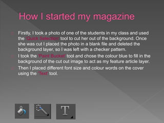
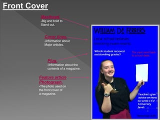
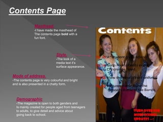
Firstly, I took a photo of one of the students in my class and used 
the ‘Quick Selection’ tool to cut her out of the background. Once 
she was cut I placed the photo in a blank file and deleted the 
background layer, so I was left with a checker pattern. 
I took the ‘Paint Bucket’ tool and chose the colour blue to fill in the 
background of the cut out image to act as my feature article layer. 
Then I placed different font size and colour words on the cover 
using the ‘Text’ tool.
Front Cover 
Masthead. 
-Big and bold to 
Stand out. 
Cover lines. 
-Information about 
Major articles. 
Plug. 
-Information about the 
contents of a magazine. 
Feature article 
Photograph. 
-The photo used on 
the front cover of 
a magazine.
Contents Page 
Masthead. 
-I have made the masthead of 
The contents page bold with a 
fun font. 
Style. 
-The look of a 
media text it’s 
surface appearance. 
Mode of address. 
-The contents page is very colourful and bright 
and is also presented in a chatty form. 
Demographic 
-The magazine is open to both genders and 
Is mainly created for people aged from teenagers 
to adults, to give detail and advice about 
going back to school.
I used a masthead on both the front cover and the contents page to show what the 
page is about. 
Cover lines and a plug are used on the cover page to explain what is being 
presented in the magazine. 
The front page and the contents each have one feature article photograph and many 
little photos on top of each other. 
The style of the magazine is shown to be fun, chatty and friendly, which is shown 
through the many colours in the magazine.
I could improve my magazine by using an actual background on the front 
cover, instead of just one solid colour. It is harder to match colours to an 
electric blue. 
The cover lines and plug on the front page could be more increased and 
placed in an order on the front page. 
The contents page could consist of more than one photograph and the 
wording to be spread out and put into sections.

School Magazine Evaluation

  • 2.
    Firstly, I tooka photo of one of the students in my class and used the ‘Quick Selection’ tool to cut her out of the background. Once she was cut I placed the photo in a blank file and deleted the background layer, so I was left with a checker pattern. I took the ‘Paint Bucket’ tool and chose the colour blue to fill in the background of the cut out image to act as my feature article layer. Then I placed different font size and colour words on the cover using the ‘Text’ tool.
  • 3.
    Front Cover Masthead. -Big and bold to Stand out. Cover lines. -Information about Major articles. Plug. -Information about the contents of a magazine. Feature article Photograph. -The photo used on the front cover of a magazine.
  • 4.
    Contents Page Masthead. -I have made the masthead of The contents page bold with a fun font. Style. -The look of a media text it’s surface appearance. Mode of address. -The contents page is very colourful and bright and is also presented in a chatty form. Demographic -The magazine is open to both genders and Is mainly created for people aged from teenagers to adults, to give detail and advice about going back to school.
  • 5.
    I used amasthead on both the front cover and the contents page to show what the page is about. Cover lines and a plug are used on the cover page to explain what is being presented in the magazine. The front page and the contents each have one feature article photograph and many little photos on top of each other. The style of the magazine is shown to be fun, chatty and friendly, which is shown through the many colours in the magazine.
  • 6.
    I could improvemy magazine by using an actual background on the front cover, instead of just one solid colour. It is harder to match colours to an electric blue. The cover lines and plug on the front page could be more increased and placed in an order on the front page. The contents page could consist of more than one photograph and the wording to be spread out and put into sections.