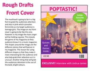
1. POPTASTIC!
Celebs
favourite
The masthead is going to be in a big styles
font to grab the audiences attention
and also in pink which connotes
femininity as my target audience is
teenage girls. The image on my front
cover is going to be like this one,
however in my image the main singer
will be holding a guitar. This reveals
the genre of my magazine so they
audience know it is a music magazine. Quizzes
The shapes around the image are the and
different stories that will feature in
Games
my magazine. The reason for using
different shapes is that they make it Inside
more interesting for the audience and
also help grab their attention as it is
£2.50
unusual. Another thing that will grab
the audiences attention is the use of
the bold, bright colours.
EXCLUSIVE! Interview with Joshua James
2. Picture
CONTENTS of front
cover
The title of the page is at the top to let the
audience know what the page is. It is Editors On the
bigger than the other text on the page message cover
because it is the main point to let the
audience know what they are reading. The
writing is in pink and in the same font as
the front cover which shows the continuity
of the brand “Poptastic!”. The image on Celeb
the left is big and is the main feature of the style
magazine as it is the main image on the
front cover too. On the right hand side is a
list of other features in the magazine. They
are colour coded as the stories on the Other
front cover are. There is a box as the top
features
for the editor to have their say on that
issue of the magazine. There will also be a
picture of the front cover in the top right
hand corner. Smaller images will be around Games
the boxes of other stories in the magazine and
to make it more interesting for audience to Quizzes
read.
3. MASTHEAD Pull quote
Pull quote
Interview Interview
with all band with all band
Member 1 Member 2 Member 3 Member 4
Q&A Q&A Q&A Q&A
4. The title of the article is at the top, again in the same font
and colour as the masthead and contents page to show
the continuity of the magazine. The main image to will
take up half the double page spread to grab the
audiences attention. Pull quotes will be surrounded by
the image to make the audience feel as if the band are
talking directly to them. At the bottom of the double
page spread, each band member will also have a box to
answer questions individually instead of just as a band
like in the interview on the right hand side. The main
image is going to have the band pulling funny faces to
connote their childhood and the fact that although they
are this big boy band, they still live a normal life and have
fun.