Call Girl Nashik Amaira 7001305949 Independent Escort Service Nashik
Front Cover Analysis
1. Front Cover Analysis
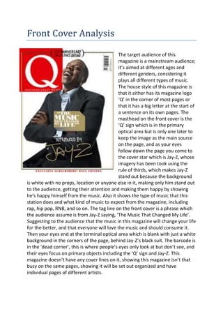
The target audience of this
magazine is a mainstream audience;
it’s aimed at different ages and
different genders, considering it
plays all different types of music.
The house style of this magazine is
that it either has its magazine logo
‘Q’ in the corner of most pages or
that it has a big letter at the start of
a sentence on its own pages. The
masthead on the front cover is the
‘Q’ sign which is in the primary
optical area but is only one later to
keep the image as the main source
on the page, and as your eyes
follow down the page you come to
the cover star which is Jay-Z, whose
imagery has been took using the
rule of thirds, which makes Jay-Z
stand out because the background
is white with no props, location or anyone else in it, making only him stand out
to the audience, getting their attention and making them happy by showing
he’s happy himself from the music. Also it shows the type of music that this
station does and what kind of music to expect from the magazine, including
rap, hip pop, RNB, and so on. The tag line on the front cover is a phrase which
the audience assume is from Jay-Z saying, ‘The Music That Changed My Life’.
Suggesting to the audience that the music in this magazine will change your life
for the better, and that everyone will love the music and should consume it.
Then your eyes end at the terminal optical area which is blank with just a white
background in the corners of the page, behind Jay-Z’s black suit. The barcode is
in the ‘dead corner’, this is where people’s eyes only look at but don’t see, and
their eyes focus on primary objects including the ‘Q’ sign and Jay-Z. This
magazine doesn’t have any cover lines on it, showing this magazine isn’t that
busy on the same pages, showing it will be set out organized and have
individual pages of different artists.
2. The target audience of this
magazine is a mainstream
audience; it’s aimed at different
ages and genders of people.
People that mainly like rock
music, and different rock bands
and artists that do punk music.
The house style of this magazine
is mainly the colours. The colours
are always black and yellow. Black
represents danger, darkness, and
isolation and the yellow shows
warning. Also the masthead
which is always the same, the
magazine logo which is always
against white to stand out and
has lines going through it as if its
glass being smashed, which is also
in the primary optical area. The
audience’s eyes then follow down
the page to the cover star which is an image of 5 different people from 5
different rock bands. Showing the audience this magazine is going to be busy
and have lots of information and photos of different rock bands and artists
which is associated with the music which is fast, busy and wild. The people in
the image are all wearing the same kind of clothes, black, dark, grey colours
associating with the genre of music, showing the audience that this magazine
is definitely going to have a lot of information about rock bands. The image
doesn’t really have the rule of thirds init but the two men under ‘KER’ and half
of the woman’s face is in the primary optical area making them three people
look important to the audience and that the two men in the dead corner aren’t
so important and are just there for show. The cover line on this front cover is
the names of each band that the people on the front cover are from, having
the first bands name at the top as the woman directly in the middle of the
page, showing she’s most likely the most important throughout the magazine.
The cover line has been done to give the audience more information about the
people in the image showing what band they come from and what music they
do. The tag line in this image is ‘pop punks not dead’ which we figure is a quote
from one of the bands, telling the audience themselves that their favourite
genre of music is still alive and these people on the front cover are going to
prove it with their music and that reading this magazine will be worth their
3. time. In the terminal optical area is the barcode and a little more information
of what to expect inside the magazine but showing it’s not that important.
Comparisons and contrasting of front
covers
Both these front covers have some similarities including using the people on
the front covers to gain its audience and using tag lines to show how great the
music is and how much it can tell you about it inside the magazine. They also
use their magazines logos as the masthead to gain audiences of certain people
that like them certain genres of music. In comparison it also mainly has the
same background as white, having the people on the front and some cover
lines and taglines stand out to people. In contrast Kerrang has a lot more
information on the front cover maybe being associated with the fact that it has
more people on the front cover and so needs more information for the
audience. also in contrast the barcode is at the bottom on the Kerrang front
cover whereas on the Q front cover its on the top, I think this has been done
because on the Kerrang front cover most of the information is all at the
bottom next to each other in the terminal optical area, and so the magazine is
showing the audience how busy it is and cramped with all these bands, but
then also keeping the people as the main source to look at. Furthermore in
contrast both magazine front covers show how different they are targeting at
certain audiences, by the colours and styles of quotes etc.