This document provides information about an exhibition of works by Irish artist Robert Ballagh held at The Gorry Gallery from September 20 to October 5, 2006. It includes an introduction, overview of Ballagh's career, catalogue of the works in the exhibition, and chronology of his paintings. The exhibition gave insights into Ballagh's artistic development and unique political perspective through a range of works from his studio spanning 1959 to 2006, including photographs, studies, and finished pieces in various media.

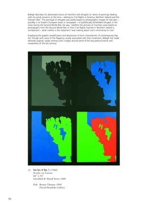
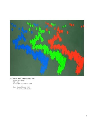
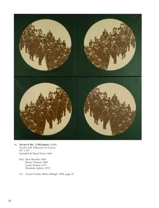
![all were part of the impetus behind these imposing works
whose forms movingly yet coolly abstract the newsprint-
photo forms of protesters and victims of war and civil strife.
‘A terrible beauty is born’ indeed out of these abstracted
snapshots of life in the media-snatched front line.
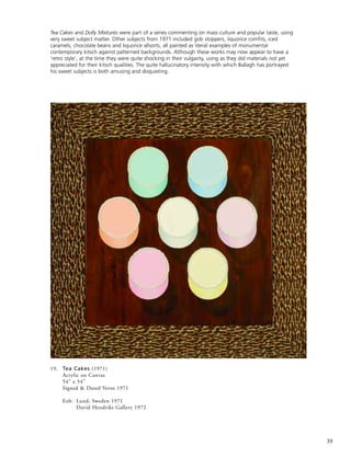
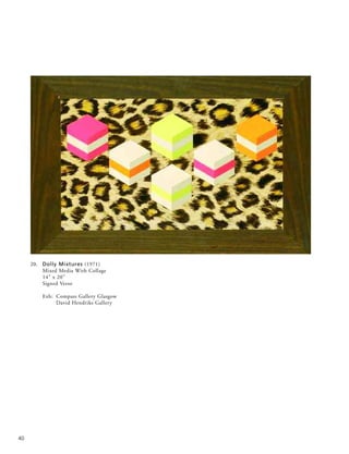
The garish, rather sickly sweetness of the modernising Irish
economy, with its burgeoning consumer culture, that had
emerged in the 1960s is the subject of a series of paintings
made in 1971. The trite empty-headedness of a society
aiming for purely materialistic ends is hinted at in portrayals
of iced cakes and dolly mixtures set with deliberate,
discomforting vapidness against collaged, kitsch materials
redolent, for example, of fake leopard skin.
‘It is impossible, thirty years later, to appreciate the impact
of this first major onslaught of international art on an
unsuspecting Irish public’, the critic Dorothy Walker wrote
in 1997. She was referring to the first two ground-breaking
ROSC exhibitions that took place in Dublin in 1967 and
1971. These showed the most famous living artists from
around the world - including Picasso, Bacon, Barnett
Newman, Rothko, Tapies and some of the younger
American Pop artists like Rauschenberg, Lichtenstein and
Jim Dine - though modern Irish art was excluded. Seeing
work by the American Pop artists in particular confirmed to
Ballagh that he was on the right track, having quite
independently come to many similar artistic conclusions.
In an article (published in The Dubliner, November 2004),
Ballagh recalls the 1967 ROSC exhibition, ‘washed up on
Irish shores… the fields of bright acrylic primary colours,
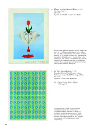
the razor sharp outlines and the hopelessly ironic comic
book content all overwhelmed me.’ He found ‘gaining access
to the modern art scene [in Ireland] was not difficult’, and
‘within a relatively short period I became Ireland’s best-
known Pop artist. To be frank, I was probably Ireland’s only
Pop artist.’ Yet even at such an early stage in his career,
Ballagh could not help contemplating the potential impasse
of much contemporary avant-garde art. ‘When I looked at
the work of, say, Roy Lichtenstein, an incredibly intelligent
artist, I couldn’t help speculating that his chosen technique
would inevitably restrict his full development, and sadly,
such has been the case. Lichtenstein remained trapped in a
prison of Ben Day dots for the rest of his life, and let’s face
it, he is not unique. Many other modern artists have
suffered the same stylistic incarceration.’
In the late 1960s, Ballagh’s attention was drawn in two
apparently disparate directions - researching and
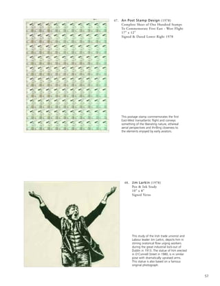
contemplating great classical artists, and watching the state
of national emergency unfolding in Northern Ireland as
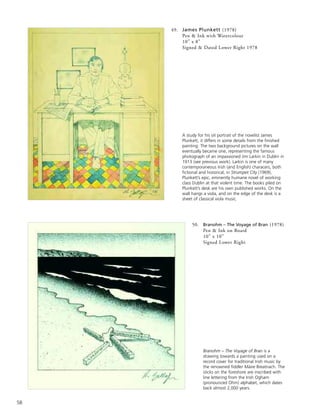
Civil Rights marchers were attacked by the B-Special police.
Actually, there was no divergence at all in these two aspects,
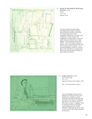
as Ballagh went on make a series of innovative paintings
based on Goya’s The Third of May, David’s The Rape of the
Sabines and Delacroix’s Liberty at the Barricades. Just as
these late 18th and 19th masterpieces convey thoughtful yet
viscerally charged responses to contemporaneous political
repression, so Ballagh’s Pop Art adaptations - with a stinging
succinctness of their own, as in his juxtaposition of a
simplified version of Delacroix’s painting with a glimpse of
a current Irish newspaper headline reporting events
‘(RIOTS) IN DERRY’ - reflect his own response to events
of his own time.
In his 1986 book, Robert Ballagh, Ciaran Carty has written:
‘Seamus Heaney made a similar connection in terms of
poetry. In August 1969 he saw the Goya painting The Third
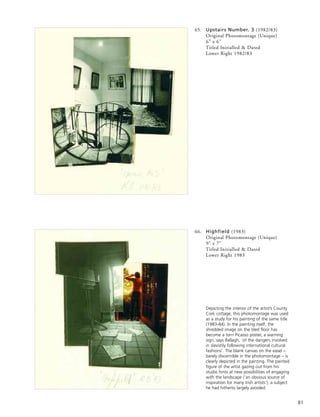
of May at the Prado in Madrid. That night he turned on the
TV in his hotel room to see the B-Specials rampaging up the
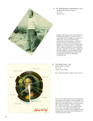
Catholic Falls Road. For a while he toyed with
counterpointing the two images of violence in a poem.
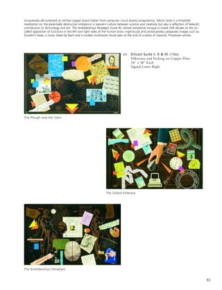
Some months later he came across Ballagh’s painting… He
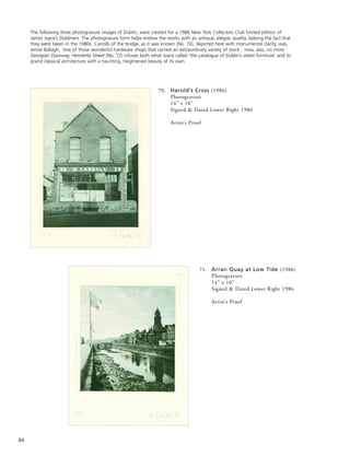
thought it intriguing that two Irish artists in two different
disciplines had thought of using the same Spanish image of
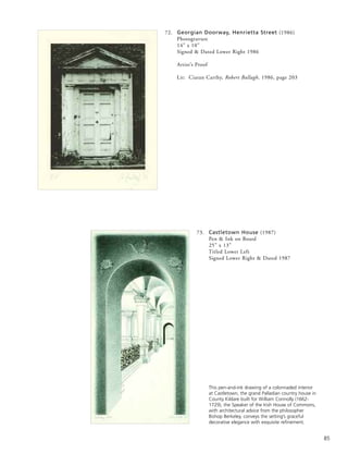
oppression in exactly the same association.’ Carty quotes
Ballagh’s comment: ‘Seamus understood very early on what
my painting was about - that it wasn’t just a classical
pastiche.’
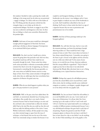
The question of how artists could respond to the
increasingly violent situation became an urgent one. Louis
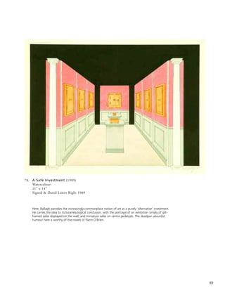
le Brocquy painted semi-occluded images where anguished
faces are helplessly shielded behind outstretched hands with
plaintive palms. Oisín Kelly made a cast aluminium
sculpture in 1969 of poignantly vulnerable rows of nearly
faceless Marchers. The artist Brian O’Doherty made a public
performance in which he changed his name by deed poll to
Patrick Ireland (all his subsequent artwork, though not his
11](https://image.slidesharecdn.com/robertballagh-140314062020-phpapp01/85/Robert-ballagh-12-320.jpg)
![art criticism, being made under that name) ‘until such time
as the British military presence is removed from Northern
Ireland and all citizens are granted their civil rights’. Micheal
Farrell has spoken of the changed direction of his work as a
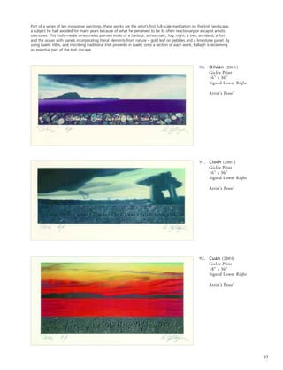
consequence of events in Northern Ireland: ‘In 1969, the
Bogside in Derry was ablaze. I made a speech at the opening
of the Living Art exhibition in Cork when I was accepting
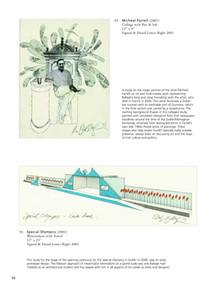
my prize-money, but those assembled did not think much of
it. I believed that we could not stand by and let the series of
events unfold. The only ones who supported me were Leo
Smith, my art dealer, and Robert Ballagh. I donated the
prize-money as part of the artists’ fund for refugees who
were streaming across the border.’
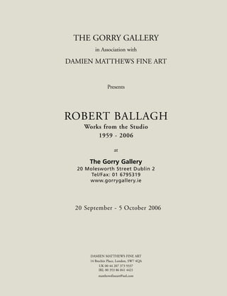
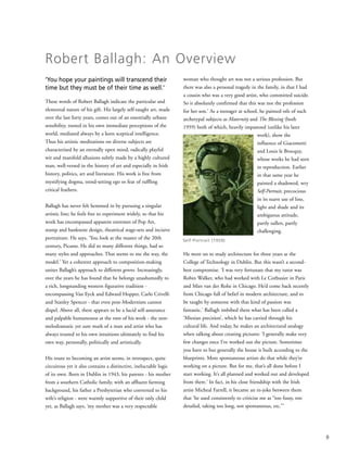
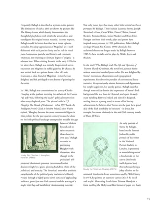
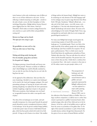
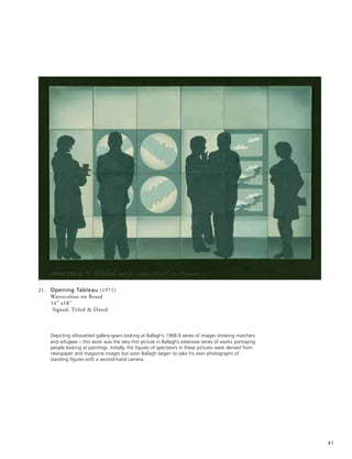
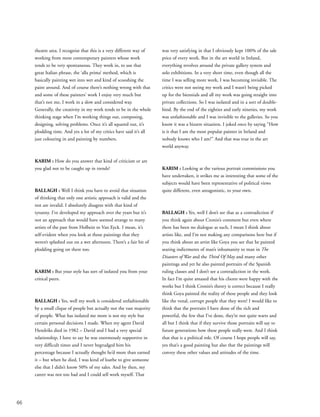
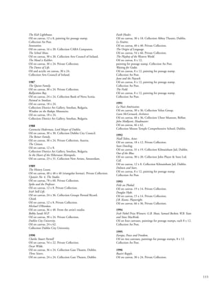
The traumatic events of January 30 1972, known as Bloody
Sunday, when British soldiers opened fire indiscriminately
on peaceful demonstrators in the Bogside, Derry, killing
thirteen and wounding others, were the spur for Ballagh’s
installation at the Irish Exhibition of Living Art in Dublin
later that year. He chalked out the rough outline of thirteen
figures on the gallery floor, pouring animal blood onto
them. This commemoration of victims of the Bloody
Sunday atrocities was made as a response to the ‘self-
protective apathy’ that, ‘after the initial shock and
indignation, many citizens of the Republic of Ireland [felt].’
Now preserved only in the form of a photomontage of nine
panels, this ephemeral artwork still has a raw power to
disquiet and move.
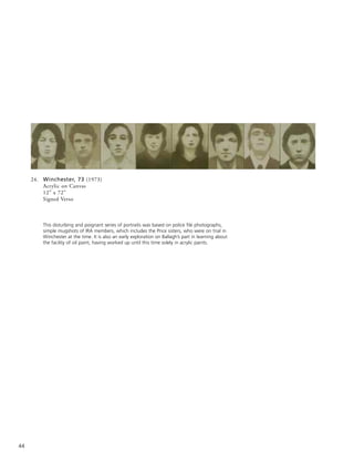
Ballagh’s 1973 painting of the so-called Winchester Eight -
IRA members on trial in England - is seen by the artist ‘on
one level as simply an early attempt to use oil paint’,
reproducing the sepia tones of police file photos of the
group. But on another level, the effect is sinister and
surreally mundane in the way its attenuated palette, pitifully
economical portrayals and mournful mugshot solemnity
help implicitly conjure up something of the sufferings and
violence of the period.
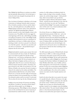
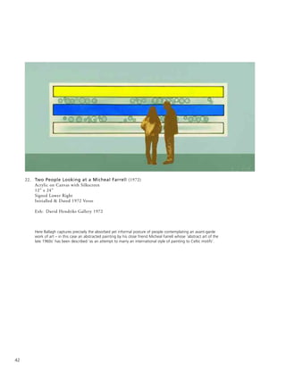
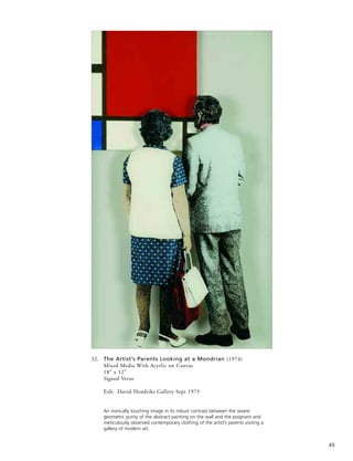
In 1972 Ballagh began an extensive series of pictures
depicting people observed looking at paintings by artists
such as Mondrian, Warhol, Stella, Jasper Johns, Barnett
Newman, Pollock, Motherwell, Soulages and, from Ireland,
Farrell and Cecil King. A vast polyptych canvas (1972) of
back views of simplified gallery-going figures - often based
on his own photos of standing and crouching spectators -
peering at modern masterpieces on the museum wall was
purchased for the Bank of Ireland Collection. His exhibition
of these paintings at the prestigious David Hendriks Gallery
in Dublin in 1972 was a sell-out. A series of successful
selling exhibitions followed abroad, based on similar themes.
(He showed with Hendriks for fifteen years, and later
recalled that ‘in the often fractious world of Irish art’
Hendriks offered him ‘generosity, support and
encouragement during the difficult beginnings of a career in
the arts.’) A 1977 painting, The Conversation, interposes the
sunglasses-wearing Ballagh into a Vermeer-like domestic
interior, where he appears to ruminate on advice from an
admonitory Old Master. This speculatively humourous
example of cultural time travel shows how increasingly
Ballagh was going beyond Modernist and contemporary
influences to contemplate examples of earlier, classical
western art - the antithesis perhaps of the instantaneous
modern approach. He says, ‘As my career developed, I found
myself wandering into the National Gallery rather than the
Tate Gallery.’
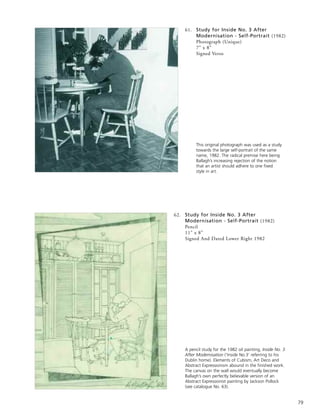
In 1973, he painted a picture Inside No. 3, set in his inner-
city Dublin family home. ‘The nude is such a predominant
theme for western painting, I just said I had to have a crack
at this. The only model I had was my wife.’ His wife is
seen nude, descending a spiral staircase - a reference to
Duchamps’ seminal image, and there is a Pop Art reprise of
Delacroix’s Liberty over the fireplace. Ballagh had in mind
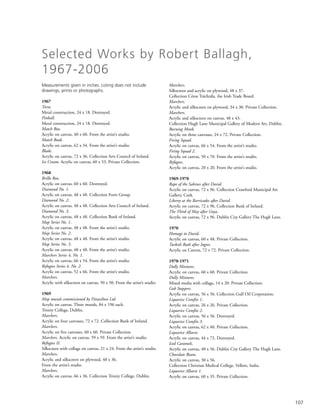
12
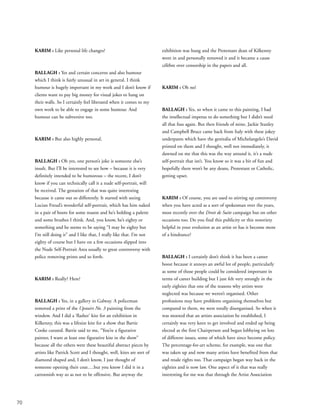
Derry January 30, 1972 (Part View)
Two People and a Michael Farrell, 1972](https://image.slidesharecdn.com/robertballagh-140314062020-phpapp01/85/Robert-ballagh-13-320.jpg)
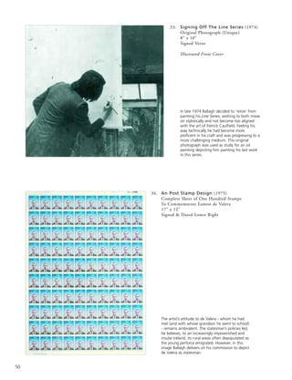
![politician Dr. Ian Paisley complained to Sir Alec Douglas-
Hume in the House of Commons about the absence of an
Irish border in the design. The British Foreign Secretary
reminded Paisley it was a weather map, not a political one.
The way that Ballagh’s artistic and political interests can
sympathetically interfuse to make a powerfully original
postal image is shown in his 1979 stamp commemorating
the anniversary of the birthdate of the revolutionary Patrick
Pearse (Pádraig Mac Piarais 1879-1916, as is written on the
stamp itself). The left-hand side shows Pearse in black-and-
white profile. To the right is the figure of Liberty in the
same format as in Ballagh’s earlier Pop Art painting based on
Delacroix’s Liberty at the Barricades. The Parisian barricades
have been surplanted here by the GPO building in Dublin,
headquarters of the 1916 uprising. The French tricolour
which Liberty brandishes has been replaced by the Irish flag
- a most telling transposition.
Early on in this overview, Ballagh was characterised as a
quintessentially urbane artist. That has remained true
throughout his career. However, as a young man, a bit of ‘a
young hell-raiser’ as he has said, he saw himself pretty much
as an exclusively urban artist, internationalist in outlook,
who eschewed any interest in depicting the Irish landscape.
Interviewed in 1980, he said, ‘I never had any access to the
culture that many people think is the Irish culture, the rural
Gaelic tradition. I can’t paint Connemara fishermen. My
experience of Ireland is an urban one. It would be dishonest
of me to paint anything else.’ Re-considering this ‘statement’
in 2001, Ballagh wrote, ‘Oh! The certainty of youth!’
As a progressive young Irishman, Ballagh rejected the kind
of Catholic conservatism typified at its reactionary extreme
by the now (in)famous 1943 radio broadcast made by
Eamon de Valera as Taoiseach, in which he said, ‘That
Ireland which we dreamed of would be the home of a
people who valued material wealth only as the basis of right
living… a land whose countryside would be bright with cosy
homesteads, whose fields and villages would be joyous with
the sounds of industry, with the romping of sturdy children,
the contests of athletic youths, and the laughter of happy
maidens, whose firesides would be forums for the wisdom of
serene old age.’ Ireland under de Valera, who steadfastly
resisted modernising tendencies, became desperately
impoverished in many areas and increasingly depopulated as
many of the younger generation emigrated. By the early
1960s, when a more internationally outgoing, modernising
government helped bring about an economic upturn, avant-
garde younger Irish artists like Ballagh tended to reject what
they viewed as the stifling backwardness of Irish rural life
and traditional culture.
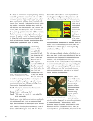
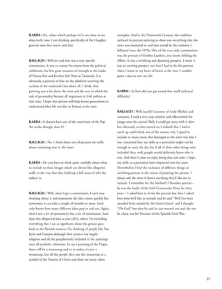
By the late 1970s, Ballagh had begun to question his
previously somewhat clearcut views which had starkly
polarised notions of urban modernism and rural insularity.
He found himself becoming more sympathetic to what (in
the 2002 catalogue for his exhibition, Land and Language)
he later called ‘another approach, in line with the Irish
bardic tradition, described by Declan Kiberd in Irish
Classics… “the effect of the Penal Laws against Catholics
after 1691 was that a conservative, even aristocratic longing
on the lips of the Poets acquired a radical, even populist
purchase, because of the extensive repression: and ever since
the Irish have produced a strongly traditionalist radicalism
which looked back in order to look forward.”’
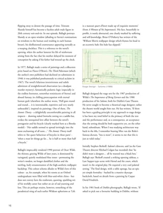
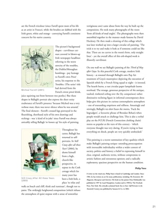
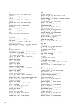
Hints of this new
approach - of ’a
strongly traditionalist
radicalism which
looked back in order
to look forward’ -
had emerged in a
1983/84 painting
entitled Highfield, in
which, he has
written, ‘the artist
[looks] out from the
studio to the
landscape, an
obvious source of
inspiration for many Irish artists, yet the interior canvas
remains curiously blank. In addition, the torn Picasso poster
on the floor warns of the dangers involved in slavishly
following international cultural fashions.’
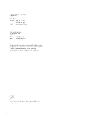
A 1997 painting, The Bogman, shows the artist in
Wellington boots doing something he has never done in his
life - digging for turf in a bog. There is more than a note of
18
Highfield (1983)](https://image.slidesharecdn.com/robertballagh-140314062020-phpapp01/85/Robert-ballagh-19-320.jpg)

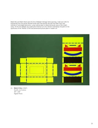
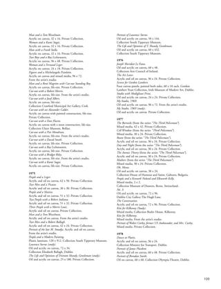
![52
37. Study for Tristram Shandy (1975)
Pencil
8” x 7”
Initialled & Dated Lower Right 1975
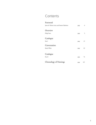
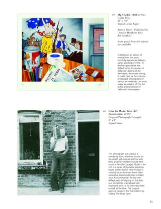
38. My Studio 1969 (1976)
Collage
8” x 10”
Signed Verso
A preparatory work for the
larger painting My Studio
1969 created in 1976 ‘as a
comment’, says Ballagh ‘on
earlier works [in which he
had made his own
simplified, hard-edged
versions of classical paintings
by Goya, Delacroix and
David] I had made in
1969/70 concerning events
in Northern Ireland. Few
people got the message at
the time so I created this
painting to make my
intentions clear.’
This pencil sketch was a study towards a large
canvas depicting key events in The Life and
Opinions of Tristram Shandy, Gentleman. Ballagh
had greatly enjoyed reading Laurence Sterne’s
novel (written in instalments between 1759 and
1767), relishing its sceptical wit, non-linear
narrative and deliberately absurd philosophical
digressions. This image - portraying Tristram in
modern dress and, surreally, with a fluid clockface
as his countenance - refers to the catastrophic
moment at the novel’s start when his mother
delays his conception by asking his father, ‘Pray, my
dear… have you not forgot to wind up the clock?’](https://image.slidesharecdn.com/robertballagh-140314062020-phpapp01/85/Robert-ballagh-53-320.jpg)
![101
97. Monetary Memories (2004)
Watercolour
6” x 12”
Signed & Dated Lower Right 2002
Conceived as a watercolour sketch for a commissioned painting, this work depicts Irish banknotes Ballagh
has designed, along with the new Euro notes, all of which flutter endlessly in a cloudy blue sky – an
ethereal symbol perhaps of monetary transience and life’s ultimate immateriality.
98. Sean MacReamon (2004)
Pencil on Paper
13” x 10”
Signed & Dated Lower Right 2004
The following two studies are in turn portraits of the Irish
journalist & writer Sean MacReamon and the theatrical
impresario & art collector Maurice Cassidy. Each
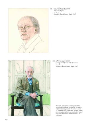
demonstrates Ballagh’s impressively subtle draughtsman’s
skills and his perceptiveness regarding human character.
He says he likes to evoke ‘something in [people’s] faces
that bespeaks experience and a life lived.’](https://image.slidesharecdn.com/robertballagh-140314062020-phpapp01/85/Robert-ballagh-102-320.jpg)


![[PDS] What Collectors Want... with Chris Ingram](https://cdn.slidesharecdn.com/ss_thumbnails/ingramuniartslondon-110214093441-phpapp01-thumbnail.jpg?width=640&height=640&fit=bounds)


