
Recommended
More Related Content
What's hot
What's hot (18)
Viewers also liked
Viewers also liked (17)
Similar to Rihanna album advert analysis
Similar to Rihanna album advert analysis (20)
Recently uploaded
Recently uploaded (11)
Rihanna album advert analysis
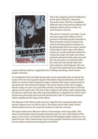
- 1. This is the magazine advert for Rihanna’s fourth album ‘Rated R’, released in November 2009. This has a completely different look to her previous albums and magazine album adverts, as they are more feminine and sexy. This advert’s context is very basic, it uses the same image of her album cover to promote it and make people remember it. They obviously wanted to promote the artist by focusing people’s attention on the photograph and on her name, instead of focusing it on the name of the album which is in a really small font and hard to read.In the image, her make-up is heavy and dark making her look quite scary and the way she poses, covering half of her face with one of her hands makes her look suspicious and intriguing. The way she gives that dominant look, making eye contact with the audience, suggeststhat she is hiding something, which attracts people’s attention. It is completely black and white giving quite an emo and gothic look, except for the names of the two most popular singles of the album (‘Russian Roulette’ and ‘Hard’) which are written in Red to grab the readers’ attention.This colour could connote in this particular advert blood and danger. The colour scheme of this advert suggest that her songs are quite crazy and dark and slow, meaning that the music is not that upbeat and are quite rocky. The font of the writing is quite gothic, again representing the album as quite dark and rocky and giving Rihanna a completely new look to what she has been previously perceived and represented as.The 'R' also looks deranged which compliments the songs of this album. The darkness of the album could connote a stage that she is going through as her previous album covers are full of colour. This album advert looks really serious, which could be because she wants the audience to take her seriously. The target audience for Rihanna’s album is for teenagers and young adults. This album is particularly aimed at people around the age of 13-30. At the bottom of the page we can see the record label’s logo (Def Jam Recordings) andits website in a very small font size. This is because they want to focus people’s attention on the artist and the new album instead of promoting the record label.