Download to read offline
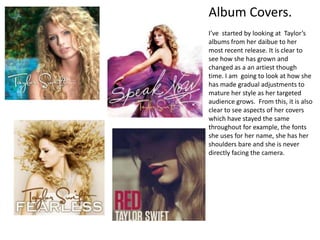
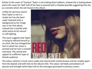

This document analyzes and compares the album covers of Taylor Swift from her debut album to her most recent release. It discusses how her style has matured over time while still maintaining some consistent elements. For example, her shoulders are often bare, she doesn't make direct eye contact with the camera, and she uses the same font for her name. The document examines themes, costumes, backgrounds, and other design elements to understand how Taylor's image and branding have evolved as her target audience has grown older.


![Albums[1]](https://cdn.slidesharecdn.com/ss_thumbnails/albums1-091023051503-phpapp02-thumbnail.jpg?width=640&height=640&fit=bounds)


