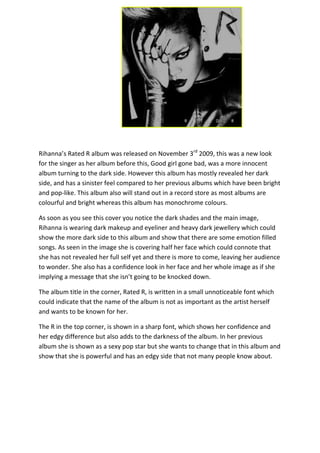
1. Rihanna’s Rated R album was released on November 3rd 2009, this was a new look
for the singer as her album before this, Good girl gone bad, was a more innocent
album turning to the dark side. However this album has mostly revealed her dark
side, and has a sinister feel compared to her previous albums which have been bright
and pop-like. This album also will stand out in a record store as most albums are
colourful and bright whereas this album has monochrome colours.
As soon as you see this cover you notice the dark shades and the main image,
Rihanna is wearing dark makeup and eyeliner and heavy dark jewellery which could
show the more dark side to this album and show that there are some emotion filled
songs. As seen in the image she is covering half her face which could connote that
she has not revealed her full self yet and there is more to come, leaving her audience
to wonder. She also has a confidence look in her face and her whole image as if she
implying a message that she isn’t going to be knocked down.
The album title in the corner, Rated R, is written in a small unnoticeable font which
could indicate that the name of the album is not as important as the artist herself
and wants to be known for her.
The R in the top corner, is shown in a sharp font, which shows her confidence and
her edgy difference but also adds to the darkness of the album. In her previous
album she is shown as a sexy pop star but she wants to change that in this album and
show that she is powerful and has an edgy side that not many people know about.