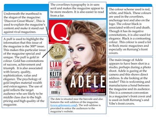
Download to read offline


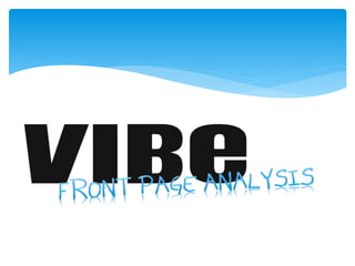


This document provides a detailed analysis of the front covers of three music magazines: Vibe, Q, and Kerrang. It summarizes the key design elements of each magazine cover, including mastheads, color schemes, images, coverlines, barcodes and more. The target demographics and genres of music covered by each publication are also examined. Overall, the document analyzes the cover designs and how they appeal to different audiences through the use of graphic design principles.


![Magazine research really official [recovered]](https://cdn.slidesharecdn.com/ss_thumbnails/magazineresearchreallyofficialrecovered-160222160255-thumbnail.jpg?width=640&height=640&fit=bounds)


