Download to read offline


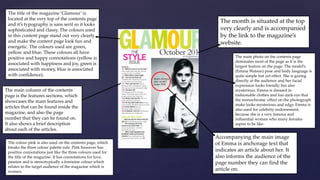

The document summarizes the design and layout of a magazine contents page. It uses bright colors like green, yellow, and blue for the title to look fun and energetic. The main photo features actress Emma Watson to endorse celebrity and looks mysterious in monochrome. The page also lists the main features and articles with descriptions and page numbers.