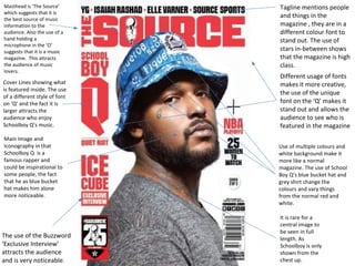
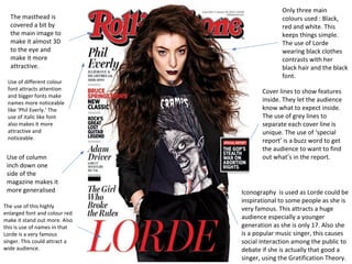
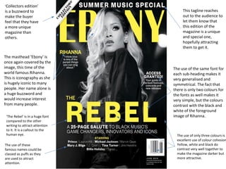
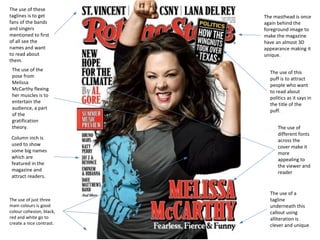
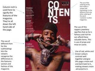
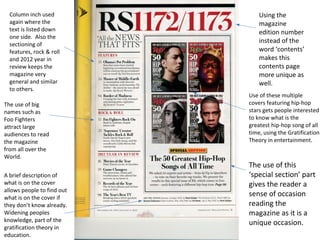
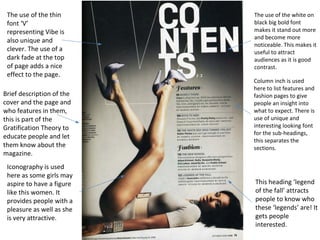
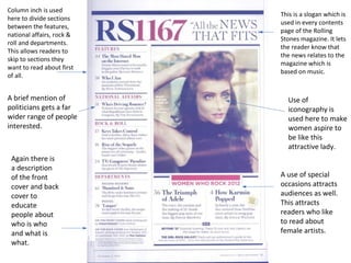
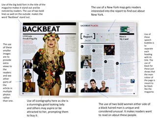
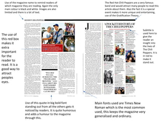
The document discusses design elements used on magazine covers. It analyzes covers of music magazines focusing on mastheads, images, fonts, colors and other stylistic choices. Specific magazines and artists featured include Schoolboy Q, Lorde, Rihanna, Rolling Stones and Red Hot Chili Peppers. Elements like iconic images, different font styles and sizes, and use of colors aim to attract audiences and signal the magazine's content. Buzzwords, taglines and listings also provide information and intrigue readers.
1. Masthead is ‘The Source’
which suggests that it is
the best source of music
information to the
audience. Also the use of a
hand holding a
microphone in the ‘O’
suggests that it is a music
magazine. This attracts
the audience of music
lovers.
Cover Lines showing what
is featured inside. The use
of a different style of font
on ‘Q’ and the fact it is
larger attracts the
audience who enjoy
Schoolboy Q’s music.
Main Image and
Iconography in that
Schoolboy Q is a
famous rapper and
could be inspirational to
some people, the fact
that he as blue bucket
hat makes him alone
more noticeable.
Tagline mentions people
and things in the
magazine , they are in a
different colour font to
stand out. The use of
stars in-between shows
that the magazine is high
class.
Different usage of fonts
makes it more creative,
the use of the unique
font on the ‘Q’ makes it
stand out and allows the
audience to see who is
featured in the magazine
Use of multiple colours and
white background make it
more like a normal
magazine. The use of School
Boy Q’s blue bucket hat and
grey shirt change the
colours and vary things
from the normal red and
white.
It is rare for a
central image to
be seen in full
length. As
Schoolboy is only
shown from the
chest up.
The use of the Buzzword
‘Exclusive Interview’
attracts the audience
and is very noticeable.
2. The masthead is
covered a bit by
the main image to
make it almost 3D
to the eye and
make it more
attractive.
Only three main
colours used : Black,
red and white. This
keeps things simple.
The use of Lorde
wearing black clothes
contrasts with her
black hair and the black
font.
Cover lines to show features
inside. They let the audience
know what to expect inside.
The use of grey lines to
separate each cover line is
unique. The use of ‘special
report’ is a buzz word to get
the audience to want to find
out what’s in the report.
Use of different colour
font attracts attention
and bigger fonts make
names more noticeable
like ‘Phil Everly.’ The
use of italic like font
also makes it more
attractive and
noticeable.
Iconography is used as Lorde could be
inspirational to some people as she is
very famous. This attracts a huge
audience especially a younger
generation as she is only 17. Also she
is a popular music singer, this causes
social interaction among the public to
debate if she is actually that good a
singer, using the Gratification Theory.
Use of column
inch down one
side of the
magazine makes it
more generalised
The use of this highly
enlarged font and colour red
make it stand out more. Also
this is use of names in that
Lorde is a very famous
singer. This could attract a
wide audience.
3. ‘Collectors edition’
is a buzzword to
make the buyer
feel that they have
a more unique
magazine than
others.
This tagline reaches
out to the audience to
let them know that
this edition of the
magazine is a unique
and special one,
hopefully attracting
them to get it.
The masthead ‘Ebony’ is
once again covered by the
image, this time of the
world famous Rihanna.
This is iconography as she
is hugely iconic to many
people. Her name alone is
a huge buzzword and
would increase interest
from many people.
‘The Rebel’ is in a huge font
compared to the other
writing to attract attention
to it. It is a callout to the
human eye.
The use of these
famous names could be
classed as puffs as they
are used to attract
attention.
The use of the same font for
each sub-heading makes it
very generalised and
symmetrical. The fact that
there is only two colours for
the fonts as well makes it
very simple, but the colours
contrast with the black and
white of the foreground
image of Rihanna.
The use of only three colours is
excellent use of colour cohesion.
Yellow, white and black do
contrast very well together to
make the magazine darker but
more attractive.
4. The use of these
taglines is to get
fans of the bands
and singers
mentioned to first
of all see the
names and want
to read about
them.
The masthead is once
again behind the
foreground image to
make the magazine
have an almost 3D
appearance making it
unique.
The use of this
puff is to attract
people who want
to read about
politics as it says in
the title of the
puff.
The use of the
pose from
Melissa
McCarthy flexing
her muscles is to
entertain the
audience, a part
of the
gratification
theory.
Column inch is
used to show
some big names
which are
featured in the
magazine and
attract readers.
The use of
different fonts
across the
cover make it
more
appealing to
the viewer and
reader
The use of a
tagline
underneath this
callout using
alliteration is
clever and unique.
The use of just three
main colours is good
colour cohesion, black,
red and white go to
create a nice contrast.
5. v
The use of the
ordering of this
font makes it
unique and
interesting. It is far
different from any
other ordering of
the word
‘contents’ in other
magazines.
Column inch is
used here to
signify the
features of the
magazine.
They’re all
down the left
hand side of
the page.
The use of this
rappers jewellery
signifies that as he is
famous and rich he
can afford these
valuable items. This
is use of props and
mise en scene.
The use of
different font
for the
subheadings
lets the
viewers
recognise the
differences in
the features
section and
fashion of the
magazine.
Use of red, white and
brown colours
contrast well
together and give
this page a more evil
and dark look to it.,
making viewers more
attracted to it.
6. Using the
magazine
edition number
instead of the
word ‘contents’
makes this
contents page
more unique as
well.
The use of this
‘special section’ part
gives the reader a
sense of occasion
reading the
magazine as it is a
unique occasion.
Column inch used
again where the
text is listed down
one side. Also the
sectioning of
features, rock & roll
and 2012 year in
review keeps the
magazine very
general and similar
to others.
The use of big
names such as
Foo Fighters
attract large
audiences to read
the magazine
from all over the
World.
A brief description of
what is on the cover
allows people to find out
what is on the cover if
they don’t know already.
Widening peoples
knowledge, part of the
gratification theory in
education.
Use of these multiple
covers featuring hip-hop
stars gets people interested
to know what is the
greatest hip-hop song of all
time, using the Gratification
Theory in entertainment.
7. Brief description of the
cover and the page and
who features in them,
this is part of the
Gratification Theory to
educate people and let
them know about the
magazine.
Iconography is used
here as some girls may
aspire to have a figure
like this women. It
provides people with a
pleasure as well as she
is very attractive.
The use of the white on
black big bold font
makes it stand out more
and become more
noticeable. This makes it
useful to attract
audiences as it is good
contrast.
Column inch is used
here to list features and
fashion pages to give
people an insight into
what to expect. There is
use of unique and
interesting looking font
for the sub-headings,
this separates the
sections.
This heading ‘legend
of the fall’ attracts
people to know who
these ‘legends’ are! It
gets people
interested.
The use of the thin
font ‘V’
representing Vibe is
also unique and
clever. The use of a
dark fade at the top
of page adds a nice
effect to the page.
8. This is a slogan which is
used in every contents
page of the Rolling
Stones magazine. It lets
the reader know that
the news relates to the
magazine which is
based on music.
Column inch is used
here to divide sections
between the features,
national affairs, rock &
roll and departments.
This allows readers to
skip to sections they
want to read about first
of all.
A use of special
occasions attracts
audiences as well.
This attracts
readers who like
to read about
female artists.
A brief mention of
politicians gets a far
wider range of people
interested.
Again there is
a description
of the front
cover and back
cover to
educate
people about
who is who
and what is
what.
Use of
iconography is
used here to make
women aspire to
be like this
attractive lady.
9. Use of the big bold font in the title of the
magazine makes it stand out and be
noticed by readers. The use of two bold
lines as well on the outside makes the
word ‘Backbeat’ stand out.
Use of iconography here as she is
a stunningly good looking lady
and others may aspire or be
attracted to her, prompting them
to buy it.
The use
of these
smaller
images
are to
provide
extra
views to
the
readers
and see
other
parts of
the
article in
multiple
photos
rather
than one.
The use of a New York map gets readers
interested into the report to find out about
New York.
Use of
these
speech
bubbles is
to
separate
each
heading
with its
title. The
use of
black for
these just
shows that
the main
colour of
the page is
meant to
be black
like the
magazine.
The use of two bold women either side of
a black haired man is unique and
considered unusual. It makes readers want
to read on about these people.
10. Use of the magazine name to remind readers of
which magazine they are reading. Again the only
main colour is black and white. Images are also
limited and there is a lot of text.
Use of this quote in big bold font
standing out from all the others gets it
noticed by readers. It is quite humorous
and adds a humour to the magazine
through this.
The Red Hot Chili Peppers are a very famous
band and would attract many people to read this
article about them. Also the fact it is a special
event makes it more unique and entertaining,
use of the Gratification Theory.
Main fonts used are Times New
Roman which is the most common
used, this keeps the magazine very
generalised and ordinary.
The use of
this red box
makes it
extra
important
for the
reader to
read. It is a
good way to
attract
peoples
eyes.
Subtitle is
used here to
give the
reader an
insight into
the lives of
The Chili
Peppers. It is
in red to
make it
stand out.