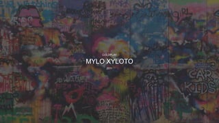
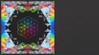
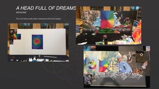
This document discusses the artwork and design for Coldplay's 2011 album Mylo Xyloto. It provides details on:
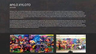
- The album's concept theme of two people living in an Orwellian society and their rebellion through art/graffiti.
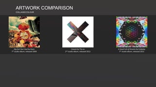
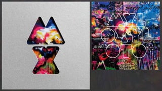
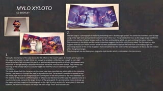
- How the album artwork was created, with a studio wall painted using spray paints to depict psychedelic colors, lyrics, and references to songs.
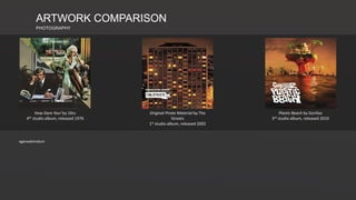
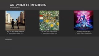
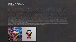
- The two variations of the album cover, which feature different sections of the painted wall and have different symbolic meanings related to the album's story/theme.
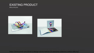
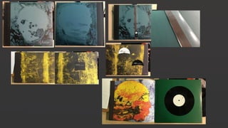
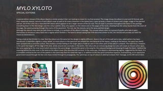
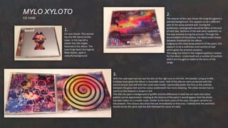
- A special edition release that includes vinyl/CD formats, stencils, a pop-up book, stickers, and a larger