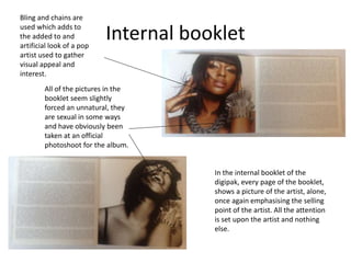
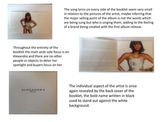
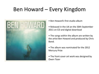
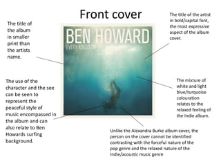
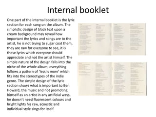
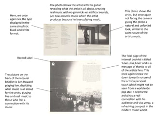
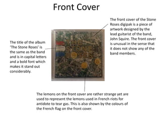
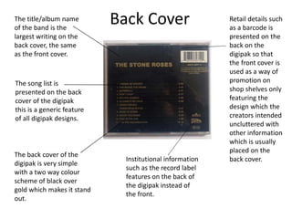
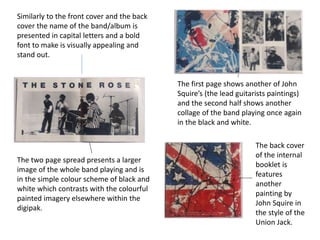
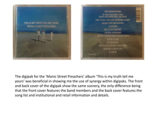
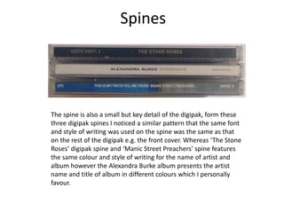
Digipak Analysis
What is a Digipak?
The popularity of digipaks came about in the early 2000s amongst recording
artists and record labels. A digipak is used by record labels to promote sales
similarly to a music video and will be a part of my promotional pack for ‘The
Crystal Whites’.
The idea of a digipak is to give the customer/fan something physical with a
multitude of features which they can keep as opposed to downloading the
song or album from the internet, a digipak gives fans more features than the
regular CD.
Digipaks are made up of either a 4 or 6 plate net with the physical CD in the
middle and some generic features are:
•CD
•Songs list
•Photos of the artist or other relevant images
•Lyric/song book
The overall idea of a digipak is to provide a fan with a creative package which
creates more appeal and demand than the standard CD.
Which and Why?
During my Digipak research I decided to select three
main products to use, these select three digipaks in my
opinion give me a good understanding and use of the
digipak, whilst influencing my personal design for ‘The
Crystal Whites’. My digipak research was divided
between ‘Alexandra Burke’ and her debut album
‘Overcome’ giving me a perspective from the female
pop genre. Secondly I selected ‘Ben Howard’ and his
album ‘Every Kingdom’ giving me the perspective of an
understated indie artist . Finally ‘The Stone Roses’
debut album gives me an insight into the use of a
digipak from a bands perspective, producing influences
for my personal digipak.
Alexandra Burke - Overcome
• Alexandra Burke’s debut album
• Released on the 19th October 2009
• Record label – Syco Music
• The album was released a year after the artist won The X
Factor
• The album debuted at number one on the UK Albums
Chart
• Sold 132,065 copies in the first week
• All singles on the album placed within the UK top 20
singles chart with 3 making number one.
• Received a nomination for Best Album at the Urban Music
Awards.
Front Cover
The bold black title
can be seen to
stand out against
the plain white
background,
emphasising the
name of the artist.
And the promotion
of the brand.
Alexandra is the only
person to feature on the
cover of the album
revealing the solo
aspect of the album,
being an ex-album
contestant Alexandra
would have been sold as
a brand and so pictures
of her would be key to
escalate interest and
business.
Dressed in a sexy an
seductive manner, and
an unnatural and
somewhat
uncomfortable looking
dress, reflects how the
pop genre uses clothing
and accessories to make
the artists more
appealing to audiences
to maximise sales.
Goodman's theory of
showing the artist is used
in this album cover to not
only promote the music of
Alexandra but her as an
individual furthermore.
The silver and shiny colour of the
dress can be seen as attractive,
visually appealing and reflective
of a stereotypical pop star.
Internal booklet
In the internal booklet of the
digipak, every page of the booklet,
shows a picture of the artist, alone,
once again emphasising the selling
point of the artist. All the attention
is set upon the artist and nothing
else.
Bling and chains are
used which adds to
the added to and
artificial look of a pop
artist used to gather
visual appeal and
interest.
All of the pictures in the
booklet seem slightly
forced an unnatural, they
are sexual in some ways
and have obviously been
taken at an official
photoshoot for the album.
The individual aspect of the artist is once
again revealed by the back cover of the
booklet, the bold name written in black
used to stand out against the white
background.
The song lyrics on every side of the booklet seem very small
in relation to the pictures of the artist, maybe inferring that
the major selling point of the album is not the words which
are being sung but who is singing them, adding to the feeling
of a brand being created with the first album release.
Throughout the entirety of the
booklet the main ands sole focus is on
Alexandra and there are no other
people or objects to deter her
spotlight and buyers focus on her.
Back cover
Barcode (Sales)
Song list
Record
companies/
labels
The back cover reveals an exact style
to the front cover, here we see a short
dress maybe to attract a male
gaze/viewpoint.
Artist main
feature of the
back cover as
well as the front
Ben Howard – Every Kingdom
• Ben Howard’s first studio album
• Released in the UK on the 30th September
2011 on CD and digital download
• The songs within the album are written by
the artist Ben Howard and produced by Chris
Bond.
• The album was nominated for the 2012
Mercury Prize
• The front cover art work was designed by
Owen Tozer
Front cover The title of the artist
in bold/capital font,
the most expressive
aspect of the album
cover.
The mixture of
white and light
blue/turquoise
colouration
relates to the
relaxed feeling of
the Indie album.
The use of the
character and the see
can be seen to
represent the
peaceful style of
music encompassed in
the album and can
also relate to Ben
Howards surfing
background.
The title of
the album
in smaller
print than
the artists
name.
Unlike the Alexandra Burke album cover, the
person on the cover cannot be identified
contrasting with the forceful nature of the
pop genre and the relaxed nature of the
Indie/acoustic music genre
Internal booklet
One part of the internal booklet is the lyric
section for each song on the album. The
simplistic design of black text upon a
cream background may reveal how
important the lyrics and songs are to the
artist, he is not trying to sugar coat them,
they are raw for everyone to see, it is
these lyrics which everyone should
appreciate and not the artist himself. The
simple nature of the design falls into the
niche of the whole album, everything
follows a pattern of ‘less is more’ which
fits into the stereotypes of the indie
genre. The simple design of the lyric
section shows what is important to Ben
Howard, the music and not promoting
himself as an artist in any artificial ways,
he doesn’t need fluorescent colours and
bright lights his raw, acoustic and
individual style sings for itself.
Internal Booklet - Artwork
The artwork and pictures within
the internal booklet follow with the
simplistic and minimalistic theme
of the Ben Howard digipak. Like the
lyrics, the pictures are in black and
white following of the motif
throughout the booklet. The
natural photos of the artist once
again depict the indie style of the
artist, there are shots of the artist
but they are natural looking and
the artist is never directly looking
at the camera juxtaposing pop style
photos as seen in the Alexandra
Burke digipak, where the artist is
the main focus.
Black & White
motif
Natural
photos of
the artist,
not forced
like
stereotypical
pop genre
photos.
Record label
Here, we once
again see the lyric
displayed in the
same simplistic
black and white
format.
This photo shows the
artist, but once again
not facing the camera
giving the photo a
natural and unforced
look, similar to the
calm nature of the
artists music.
The photo shows the artist with his guitar,
revealing what the artist is all about, creating
real music with no gimmicks or artificial sounds,
just raw acoustic music which the artist
produces because he loves playing music.
The final page of the
internal booklet is titled
‘Love,Love,Love’ and is a
message of thanks to all
of the artists fans. This
once again shows the
down to earth nature of
the artist a personal
touch which might not be
seen from a worldwide
pop star, it seems the
artist has a real
connection with his
audience and visa versa, a
refreshing prospect in the
modern music world.
The picture on the
back of the internal
booklet is Ben Howard
playing live, depicting
what music is all about
for the artist, playing
live and real music to
those who feel a
connection with his
music.
Back cover & CD
Both the CD and backcover are
extremely simple, complementing the
style of the overall digipak. The CD has
no visual aspects apart from the white
text upon a black background, infering
how the music is the most important
element to the artist. The CD is black
with white text, whereas the rest of
the digipak is made up of a cream
background with black text revealing
the CD being the most crucial part of
the digipak, the element which
everything else is based upon.
The overall simplistic and minimalistic nature of the backcover and CD follows the style of the overall digipak,
there are no pictures of the artist on the CD inferring the music is more important than the person who plays it
contrasting with stereotypes of the pop genre. Furthermore the understated design of the back cover parallels
with the rest of the digipak and the simplistic front cover. It is there to display he song list and that is what it
does, nothing more much like the artist Ben Howard who plays music because it is his passion, you either like or
you don’t and that is all the digipak is raw and real and not fake and forceful something the artist truly believes
in.
• Debut album of English rock band The Stone
Roses the album carries the same name as the
band.
• Released in 1989 by Silvertone records
• Critically considered one of the best albums of
all time
• Central to the Madchester movement and
influential on the rise of Britpop and bands such
as Oasis
Overview
Front Cover
The front cover of the Stone
Roses digipak is a piece of
artwork designed by the
lead guitarist of the band,
John Squire. The front cover
is unusual in the sense that
it does not show any of the
band members.
The lemons on the front cover are rather strange yet are
used to represent the lemons used in French riots for
antidote to tear gas. This is also shown by the colours of
the French flag on the front cover.
The title of the album
‘The Stone Roses’ is
the same as the band
and is in capital letters
and a bold font which
makes it stand out
considerably.
Back Cover
The back cover of the
digipak is very simple
with a two way colour
scheme of black over
gold which makes it stand
out.
The title/album name
of the band is the
largest writing on the
back cover, the same
as the front cover.
Institutional information
such as the record label
features on the back of
the digipak instead of
the front.
Retail details such
as a barcode is
presented on the
back on the
digipak so that
the front cover is
used as a way of
promotion on
shop shelves only
featuring the
design which the
creators intended
uncluttered with
other information
which is usually
placed on the
back cover.
The song list is
presented on the back
cover of the digipak
this is a generic feature
of all digipak designs.
Internal Booklet
The internal booklet firstly like
the back cover presents the
song list and the lyrics to
some of the songs within the
album.
Institutional information is
also featured through
recognition of the record
label ‘Silvertone’ records.
The producers, songwriters
and photographers are also
noted.
Various images of the
band playing live makes
the internal booklet
visually appealing and
aesthetically pleasing.
Similarly to the front cover and the back
cover the name of the band/album is
presented in capital letters and a bold
font to make is visually appealing and
stand out.
The two page spread presents a larger
image of the whole band playing and is
in the simple colour scheme of black and
white which contrasts with the colourful
painted imagery elsewhere within the
digipak.
The first page shows another of John
Squire’s (the lead guitarists paintings)
and the second half shows another
collage of the band playing once again
in the black and white.
The back cover
of the internal
booklet is
features
another
painting by
John Squire in
the style of the
Union Jack.
The digipak for the ‘Manic Street Preachers’ album ‘This is my truth tell me
yours’ was beneficial in showing me the use of synergy within digipaks. The front
and back cover of the digipak show the same scenery, the only difference being
that the front cover features the band members and the back cover features the
song list and institutional and retail information and details.
Spines
The spine is also a small but key detail of the digipak, form these
three digipak spines I noticed a similar pattern that the same font
and style of writing was used on the spine was the same as that
on the rest of the digipak e.g. the front cover. Whereas ‘The Stone
Roses’ digipak spine and ‘Manic Street Preachers’ spine features
the same colour and style of writing for the name of artist and
album however the Alexandra Burke album presents the artist
name and title of album in different colours which I personally
favour.

Digipak analysis

  • 1.
  • 2.
    What is aDigipak? The popularity of digipaks came about in the early 2000s amongst recording artists and record labels. A digipak is used by record labels to promote sales similarly to a music video and will be a part of my promotional pack for ‘The Crystal Whites’. The idea of a digipak is to give the customer/fan something physical with a multitude of features which they can keep as opposed to downloading the song or album from the internet, a digipak gives fans more features than the regular CD. Digipaks are made up of either a 4 or 6 plate net with the physical CD in the middle and some generic features are: •CD •Songs list •Photos of the artist or other relevant images •Lyric/song book The overall idea of a digipak is to provide a fan with a creative package which creates more appeal and demand than the standard CD.
  • 3.
    Which and Why? Duringmy Digipak research I decided to select three main products to use, these select three digipaks in my opinion give me a good understanding and use of the digipak, whilst influencing my personal design for ‘The Crystal Whites’. My digipak research was divided between ‘Alexandra Burke’ and her debut album ‘Overcome’ giving me a perspective from the female pop genre. Secondly I selected ‘Ben Howard’ and his album ‘Every Kingdom’ giving me the perspective of an understated indie artist . Finally ‘The Stone Roses’ debut album gives me an insight into the use of a digipak from a bands perspective, producing influences for my personal digipak.
  • 4.
    Alexandra Burke -Overcome • Alexandra Burke’s debut album • Released on the 19th October 2009 • Record label – Syco Music • The album was released a year after the artist won The X Factor • The album debuted at number one on the UK Albums Chart • Sold 132,065 copies in the first week • All singles on the album placed within the UK top 20 singles chart with 3 making number one. • Received a nomination for Best Album at the Urban Music Awards.
  • 5.
    Front Cover The boldblack title can be seen to stand out against the plain white background, emphasising the name of the artist. And the promotion of the brand. Alexandra is the only person to feature on the cover of the album revealing the solo aspect of the album, being an ex-album contestant Alexandra would have been sold as a brand and so pictures of her would be key to escalate interest and business. Dressed in a sexy an seductive manner, and an unnatural and somewhat uncomfortable looking dress, reflects how the pop genre uses clothing and accessories to make the artists more appealing to audiences to maximise sales. Goodman's theory of showing the artist is used in this album cover to not only promote the music of Alexandra but her as an individual furthermore. The silver and shiny colour of the dress can be seen as attractive, visually appealing and reflective of a stereotypical pop star.
  • 6.
    Internal booklet In theinternal booklet of the digipak, every page of the booklet, shows a picture of the artist, alone, once again emphasising the selling point of the artist. All the attention is set upon the artist and nothing else. Bling and chains are used which adds to the added to and artificial look of a pop artist used to gather visual appeal and interest. All of the pictures in the booklet seem slightly forced an unnatural, they are sexual in some ways and have obviously been taken at an official photoshoot for the album.
  • 7.
    The individual aspectof the artist is once again revealed by the back cover of the booklet, the bold name written in black used to stand out against the white background. The song lyrics on every side of the booklet seem very small in relation to the pictures of the artist, maybe inferring that the major selling point of the album is not the words which are being sung but who is singing them, adding to the feeling of a brand being created with the first album release. Throughout the entirety of the booklet the main ands sole focus is on Alexandra and there are no other people or objects to deter her spotlight and buyers focus on her.
  • 8.
    Back cover Barcode (Sales) Songlist Record companies/ labels The back cover reveals an exact style to the front cover, here we see a short dress maybe to attract a male gaze/viewpoint. Artist main feature of the back cover as well as the front
  • 9.
    Ben Howard –Every Kingdom • Ben Howard’s first studio album • Released in the UK on the 30th September 2011 on CD and digital download • The songs within the album are written by the artist Ben Howard and produced by Chris Bond. • The album was nominated for the 2012 Mercury Prize • The front cover art work was designed by Owen Tozer
  • 10.
    Front cover Thetitle of the artist in bold/capital font, the most expressive aspect of the album cover. The mixture of white and light blue/turquoise colouration relates to the relaxed feeling of the Indie album. The use of the character and the see can be seen to represent the peaceful style of music encompassed in the album and can also relate to Ben Howards surfing background. The title of the album in smaller print than the artists name. Unlike the Alexandra Burke album cover, the person on the cover cannot be identified contrasting with the forceful nature of the pop genre and the relaxed nature of the Indie/acoustic music genre
  • 11.
    Internal booklet One partof the internal booklet is the lyric section for each song on the album. The simplistic design of black text upon a cream background may reveal how important the lyrics and songs are to the artist, he is not trying to sugar coat them, they are raw for everyone to see, it is these lyrics which everyone should appreciate and not the artist himself. The simple nature of the design falls into the niche of the whole album, everything follows a pattern of ‘less is more’ which fits into the stereotypes of the indie genre. The simple design of the lyric section shows what is important to Ben Howard, the music and not promoting himself as an artist in any artificial ways, he doesn’t need fluorescent colours and bright lights his raw, acoustic and individual style sings for itself.
  • 12.
    Internal Booklet -Artwork The artwork and pictures within the internal booklet follow with the simplistic and minimalistic theme of the Ben Howard digipak. Like the lyrics, the pictures are in black and white following of the motif throughout the booklet. The natural photos of the artist once again depict the indie style of the artist, there are shots of the artist but they are natural looking and the artist is never directly looking at the camera juxtaposing pop style photos as seen in the Alexandra Burke digipak, where the artist is the main focus. Black & White motif Natural photos of the artist, not forced like stereotypical pop genre photos.
  • 13.
    Record label Here, weonce again see the lyric displayed in the same simplistic black and white format. This photo shows the artist, but once again not facing the camera giving the photo a natural and unforced look, similar to the calm nature of the artists music. The photo shows the artist with his guitar, revealing what the artist is all about, creating real music with no gimmicks or artificial sounds, just raw acoustic music which the artist produces because he loves playing music. The final page of the internal booklet is titled ‘Love,Love,Love’ and is a message of thanks to all of the artists fans. This once again shows the down to earth nature of the artist a personal touch which might not be seen from a worldwide pop star, it seems the artist has a real connection with his audience and visa versa, a refreshing prospect in the modern music world. The picture on the back of the internal booklet is Ben Howard playing live, depicting what music is all about for the artist, playing live and real music to those who feel a connection with his music.
  • 14.
    Back cover &CD Both the CD and backcover are extremely simple, complementing the style of the overall digipak. The CD has no visual aspects apart from the white text upon a black background, infering how the music is the most important element to the artist. The CD is black with white text, whereas the rest of the digipak is made up of a cream background with black text revealing the CD being the most crucial part of the digipak, the element which everything else is based upon. The overall simplistic and minimalistic nature of the backcover and CD follows the style of the overall digipak, there are no pictures of the artist on the CD inferring the music is more important than the person who plays it contrasting with stereotypes of the pop genre. Furthermore the understated design of the back cover parallels with the rest of the digipak and the simplistic front cover. It is there to display he song list and that is what it does, nothing more much like the artist Ben Howard who plays music because it is his passion, you either like or you don’t and that is all the digipak is raw and real and not fake and forceful something the artist truly believes in.
  • 15.
    • Debut albumof English rock band The Stone Roses the album carries the same name as the band. • Released in 1989 by Silvertone records • Critically considered one of the best albums of all time • Central to the Madchester movement and influential on the rise of Britpop and bands such as Oasis Overview
  • 16.
    Front Cover The frontcover of the Stone Roses digipak is a piece of artwork designed by the lead guitarist of the band, John Squire. The front cover is unusual in the sense that it does not show any of the band members. The lemons on the front cover are rather strange yet are used to represent the lemons used in French riots for antidote to tear gas. This is also shown by the colours of the French flag on the front cover. The title of the album ‘The Stone Roses’ is the same as the band and is in capital letters and a bold font which makes it stand out considerably.
  • 17.
    Back Cover The backcover of the digipak is very simple with a two way colour scheme of black over gold which makes it stand out. The title/album name of the band is the largest writing on the back cover, the same as the front cover. Institutional information such as the record label features on the back of the digipak instead of the front. Retail details such as a barcode is presented on the back on the digipak so that the front cover is used as a way of promotion on shop shelves only featuring the design which the creators intended uncluttered with other information which is usually placed on the back cover. The song list is presented on the back cover of the digipak this is a generic feature of all digipak designs.
  • 18.
    Internal Booklet The internalbooklet firstly like the back cover presents the song list and the lyrics to some of the songs within the album. Institutional information is also featured through recognition of the record label ‘Silvertone’ records. The producers, songwriters and photographers are also noted. Various images of the band playing live makes the internal booklet visually appealing and aesthetically pleasing.
  • 19.
    Similarly to thefront cover and the back cover the name of the band/album is presented in capital letters and a bold font to make is visually appealing and stand out. The two page spread presents a larger image of the whole band playing and is in the simple colour scheme of black and white which contrasts with the colourful painted imagery elsewhere within the digipak. The first page shows another of John Squire’s (the lead guitarists paintings) and the second half shows another collage of the band playing once again in the black and white. The back cover of the internal booklet is features another painting by John Squire in the style of the Union Jack.
  • 20.
    The digipak forthe ‘Manic Street Preachers’ album ‘This is my truth tell me yours’ was beneficial in showing me the use of synergy within digipaks. The front and back cover of the digipak show the same scenery, the only difference being that the front cover features the band members and the back cover features the song list and institutional and retail information and details.
  • 21.
    Spines The spine isalso a small but key detail of the digipak, form these three digipak spines I noticed a similar pattern that the same font and style of writing was used on the spine was the same as that on the rest of the digipak e.g. the front cover. Whereas ‘The Stone Roses’ digipak spine and ‘Manic Street Preachers’ spine features the same colour and style of writing for the name of artist and album however the Alexandra Burke album presents the artist name and title of album in different colours which I personally favour.