
Recommended
More Related Content
What's hot
What's hot (20)
Similar to Peer feedback
Similar to Peer feedback (20)
More from Cameron Whapples
More from Cameron Whapples (20)
Recently uploaded
Recently uploaded (20)
Peer feedback
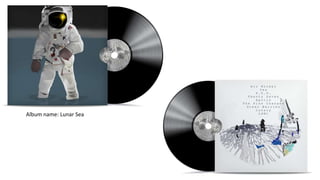
- 1. Album name: Lunar Sea
- 3. • Which genre do you think the albums fit into? • Personally I would say it fits into the indie rock genre however many album covers in my opinion don’t necessarily correlate with a specific genre. • Should the album name and artist appear on the front of the first album? • I would say no as it may take away from the main artwork. I feel the artwork itself is too good to have any text over it. If text was to be added I would definitely say not to have the text cover the image and make the text as small as you can with it still being readable. • Is the Archipelago font too generic, should a different font be used instead? • I don’t think its too generic however it is quite hard to read where it is on the image. I feel it may work better on the bottom left of the image where there is more of a block colour background. • Is there anything you would change to the artwork or titles? • Personally I wouldn’t change anything to the artworks or titles other than move the font on the archipelago to the bottom left instead so it doesn’t take away from the image in anyway.
- 4. • Which genre do you think the albums fit into? • I would say that it fits into an experimental electronic genre as some of the imagery is space themed, however it could also be for an indie rock band it isn't extremely clear. • Should the album name and artist appear on the front of the first album? • I think having the album name on the front is helpful especially for a sales point as it is far easier for a consumer to find the right product. However if this causes the overall aesthetic and design to get worse then it would not be worth it. • Is the Archipelago font too generic, should a different font be used instead? • I think that the font fits the style of the product well as it looks fairly historical like it is on an old map. However I believe that it is quite hard to actually read as it doesn't’t stand out on the product very clearly. • Is there anything you would change to the artwork or titles? • I personally wouldn't change the art style as it is very cool and unique which will work really well to draw potential customers to it.
- 5. • Which genre do you think the albums fit into? • I believe that the first album fits more into the genre of hip-hop music particularly more from around the time of the 80s, when everybody was in to a bit of everything. • Should the album name and artist appear on the front of the first album? Normally I would say that it is necessary to do this but based on the graphic design of your first front cover I believe that you will get away with having the name of the album on the back cover as in my opinion people will mostly be looking at your graphic front cover. • Is the Archipelago font too generic, should a different font be used instead? I think that you should stick to the font of which you have already used as I think it gives a representation of the old-style cut of a map you have used as the background. The text also looks to be more on the old school type as such I think it looks good with the map background ,keep it the same. • Is there anything you would change to the artwork or titles? The only change I would make to your work is to re-position the ‘archipelago’ title on your other cover as it looks like part of your map background is covering up the ending letter ‘o’.
- 6. Summary The feedback was very positive and gave me confidence in the design choices I had already made. Interestingly the first question I asked was answered correctly by the majority, with two out of three believing that my album covers are for an indie rock band. To my queries about the album name on the cover, I got three answers that all said that it would detract from the graphic design work. One person did say that from a marketing view it would not be a wise move. In response to my question about the choice of font on my second album I was left with three comments that stated the font choice was good but the layout was not. All three people stated that the album name should be moved to the bottom left area of the cover. I disagree with these comments as I like the way that the font is jammed between the islands, with the some characters even overlapped by them. This was the only thing stated when asked if anything should be changed.