Download as PDF, PPTX
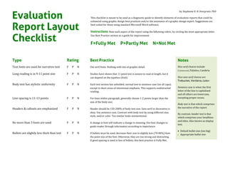


This document provides a checklist for evaluating the design elements of reports to ensure they follow best practices for readability and comprehension. The checklist covers typography, layout, graphics, and color use. Elements are rated as fully meeting, partly meeting, or not meeting best practices. Adhering to design best practices can help make report content more easily readable and memorable for audiences.