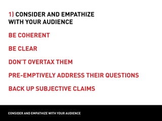
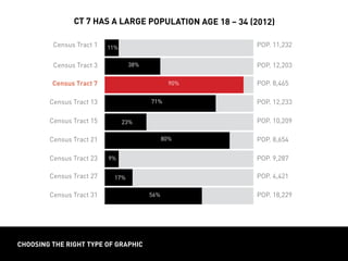
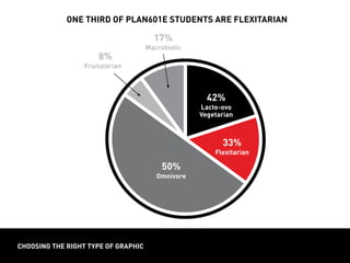
evaluative and synethetic graphics
// design direction
PLAN601E Verbal and visual: Information Graphics (session 4)
evaluative and synethetic graphics
evaluative and synethetic graphics examples
design direction
design direction
how do you choose
among design strategies?
1) Consider and empathize
with your audience
2) Understand the strengths and limits
of your tools and media
consider and empathize with your audience
1) Consider and empathize
with your audience
be coherent
design directionconsider and empathize with your audience
1) Consider and empathize
with your audience
be coherent
be clear
design directionconsider and empathize with your audience
MEDIAN INCOME
CENSUS TRACTS
INCOME
design directionconsider and empathize with your audience
median income
CENSUS TRACTS
902 906 910 912 922 924
INCOME
$46,023
$43,023
$31,023
$16,023
$18,423
$71,457
design directionconsider and empathize with your audience
income in CT 910
is half the neighborhood average
CENSUS TRACTS
902 906 910 912 922 924
average:
$32,023
INCOME
$46,023
$43,023
$31,023
$16,023
$18,423
$71,457
design directionconsider and empathize with your audience
1) Consider and empathize
with your audience
be coherent
be clear
design directionconsider and empathize with your audience
1) Consider and empathize
with your audience
be coherent
be clear
don’t overtax them
design directionconsider and empathize with your audience
1) Consider and empathize
with your audience
be coherent
be clear
don’t overtax them
pre-emptively address their questions
design directionconsider and empathize with your audience
1) Consider and empathize
with your audience
be coherent
be clear
don’t overtax them
pre-emptively address their questions
back up subjective claims
from Tufte, 1983, p. 69
responsible graphics
Avoid misrepresentation in your graphics: be careful about
relative scale and the presentation of relative proportion!
choosing the right type of graphic
100 %
Census
Tract55
80 %
60 %
40 %
20 %
0 %
N
ew
York
State
Census
Tract31
Brooklyn,N
Y
M
anhattan
CD
1
Hudson,N
Y
PrattPSPDPrattGAUDBard
College
population age 18 – 34 (2012)
choosing the right type of graphic
Census Tract 1 POP. 11,232
Census Tract 13 POP. 12,233
Census Tract 23 POP. 9,287
Census Tract 3 POP. 12,203
Census Tract 15 POP. 10,209
Census Tract 27 POP. 4,421
Census Tract 7 POP. 8,465
Census Tract 21 POP. 8,654
Census Tract 31 POP. 18,229
ct 7 has a large population age 18 – 34 (2012)
11%
38%
90%
71%
23%
80%
9% 9%
17%
56%
choosing the right type of graphic
100 %
M
eatEater
80 %
60 %
40 %
20 %
0 %
Lacto-Vegetarian
Lacto-ovo
Vegetarian
Vegan
Pescatarian
Fruitatarian
M
acrobiotic
Flexitarian
diets of plan601E students
choosing the right type of graphic
one third of plan601e students are flexitarian
42%
Lacto-ovo
Vegetarian
50%
Omnivore
8%
Fruitatarian8
17%
Macrobiotic
33%
Flexitarian
choosing the right type of graphic
12 %
10 %
8 %
6 %
4 %
0 %
scores of 470 fall short of average
800
770
740
710
680
650
620
590
560
530
500
470
440
410
380
350
320
290
260
230
PERCENTAGEOFTESTERSBYSCORE
SCORE
choosing the right type of graphic
1970
1980
1990
2000
2010
pescatarians
choosing the right type of graphic
non-smokers
smoking in art school cohort (100 students)
choosing the right type of graphic
Can be useful when your sample size is manageable enough
to display all units or percentages. Makes units more tangible,
easily indicates both quantity and share.
smokers
63%
non-smokers
37%
smoking in art school cohort (100 students)
Instances of related or
complementary categories
Parts of a whole
OR independent categories
Quantities AND shares
One or more
COUNT CHART
choosing the right type of graphic
Related categories at a
specific moment in time
Parts of a whole
Percentages or shares
Single and simple
DISPLAY
components
units
messages
PROPORTION CHART
Unrelated quantities
OR a trend across value range
Independent categories
Absolute quantities
One or more
BAR CHART
formatting for your medium
Aa10’ ­– 30’
Aa2’ ­– 10’
Aa
1’ ­– 2’
INFORMATION GRAPHICS = USING GRIDS
Leading the eye. Rule of thirds.
layout = using grids
Leading the eye. Rule of thirds.
TIME TO VOLUNTEER FOR CASE STUDIES!!!REPORT LAYOUT
Minimum font sizes: Title – 18 pt.; subhead – 10 pt.;
body / caption-text – 12 pt.
Can you read all fonts from 1 to 3 feet away?
report layout
report layout
Typography and columns provide a basic navigation system for
reports, which have a high level of detail.
Use typography (sizes, colors, styles) as a navigation system for the page;
organize text and images into columns; scale images so they balance with text
gutter
column column column column
margin
report layout
Typography and columns provide a basic navigation system for
reports, which have a high level of detail.
Use typography (sizes, colors, styles) as a navigation system for the page;
organize text and images into columns; scale images so they balance with text
HEADER
MAP
photo
SUBHEAD
/ TEXT TEXT TEXT
TEXT
TIME TO VOLUNTEER FOR CASE STUDIES!!!REPORT LAYOUT
Minimum font sizes: Title – 18 pt.; subhead – 10 pt.;
body / caption-text – 12 pt.
Can you read all fonts from 1 to 3 feet away?
report layout
Typography and columns provide a basic navigation system for
reports, which have a high level of detail.
Use typography (sizes, colors, styles) as a navigation system for the page;
organize text and images into columns; scale images so they balance with text
header
subhead
sub-
subhead
footer
summary
deck
body text
image scaled
proportional
to text
sidebar box
with unique
font styles
caption
TIME TO VOLUNTEER FOR CASE STUDIES!!!REPORT LAYOUT
Minimum font sizes: Title – 18 pt.; subhead – 10 pt.;
body / caption-text – 12 pt.
Can you read all fonts from 1 to 3 feet away?
report layout
Minimum font sizes: Title – 18 pt.; subhead – 10 pt.;
body / caption-text – 10 pt.
Can you read all fonts from 1 to 2 feet away?
TIME TO VOLUNTEER FOR CASE STUDIES!!!
Can you read all fonts from 10 to 12 feet away?
BOARD LAYOUT
Minimum font sizes: Title – 48 pt.; subhead – 36 pt.;
body / caption-text – 18 pt.
poster layout
poster layout
Rows and columns provide a basic navigation system for boards,
which organize information thematically.
Use the 3 x 3 grid to organize images and annotation into thematic areas.
TIME TO VOLUNTEER FOR CASE STUDIES!!!
Can you read all fonts from 10 to 12 feet away?
BOARD LAYOUT
Minimum font sizes: Title – 48 pt.; subhead – 36 pt.;
body / caption-text – 18 pt.
Use the 3 x 3 grid to organize images and annotation into thematic areas.
poster layout
Fonts and columns provide also basic navigation system for
boards, which organize information thematically.
rendering
strategies
collages
title
intro precedents
analysis
concept
site plan
phasing
title
TIME TO VOLUNTEER FOR CASE STUDIES!!!
Can you read all fonts from 10 to 12 feet away?
BOARD LAYOUT
Minimum font sizes: Title – 48 pt.; subhead – 36 pt.;
body / caption-text – 18 pt.
Can you read all fonts from 10 to 12 feet away?
poster layout
Minimum font sizes: Title – 48 pt.; subhead – 36 pt.;
body / caption-text – 18 pt.
slide layout
Maximize image size on the slide with legible headers and text.
header
header
header
subhead
subhead
subhead
image
image
images
text
text
Minimum font sizes: Title – 36 pt.; subhead – 24 pt.;
body / caption-text – 14 pt.
report
Linear
1 – 2 ft.
Proportional to text
Detailed narrative
Sequential ideas
Format
Reading Distance
Image Size
Text
Structure
poster
Linear/non-linear
2 – 10 ft.
As large as possible
Annotation
Related ideas
slides
Linear
10 – 30 ft.
As large as possible
Summary statements
One idea at a time
format comparison

Plan601 e session 4 lesson alt

  • 1.
    evaluative and synetheticgraphics // design direction PLAN601E Verbal and visual: Information Graphics (session 4)
  • 2.
  • 3.
    evaluative and synetheticgraphics examples
  • 4.
    evaluative and synetheticgraphics examples
  • 5.
    evaluative and synetheticgraphics examples
  • 6.
    evaluative and synetheticgraphics examples
  • 7.
    evaluative and synetheticgraphics examples
  • 8.
    evaluative and synetheticgraphics examples
  • 9.
    evaluative and synetheticgraphics examples
  • 10.
    evaluative and synetheticgraphics examples
  • 11.
    evaluative and synetheticgraphics examples
  • 12.
    evaluative and synetheticgraphics examples
  • 13.
  • 14.
    design direction how doyou choose among design strategies? 1) Consider and empathize with your audience 2) Understand the strengths and limits of your tools and media
  • 15.
    consider and empathizewith your audience 1) Consider and empathize with your audience be coherent
  • 16.
    design directionconsider andempathize with your audience 1) Consider and empathize with your audience be coherent be clear
  • 17.
    design directionconsider andempathize with your audience MEDIAN INCOME CENSUS TRACTS INCOME design directionconsider and empathize with your audience median income CENSUS TRACTS 902 906 910 912 922 924 INCOME $46,023 $43,023 $31,023 $16,023 $18,423 $71,457
  • 18.
    design directionconsider andempathize with your audience income in CT 910 is half the neighborhood average CENSUS TRACTS 902 906 910 912 922 924 average: $32,023 INCOME $46,023 $43,023 $31,023 $16,023 $18,423 $71,457
  • 19.
    design directionconsider andempathize with your audience 1) Consider and empathize with your audience be coherent be clear
  • 20.
    design directionconsider andempathize with your audience 1) Consider and empathize with your audience be coherent be clear don’t overtax them
  • 21.
    design directionconsider andempathize with your audience 1) Consider and empathize with your audience be coherent be clear don’t overtax them pre-emptively address their questions
  • 22.
    design directionconsider andempathize with your audience 1) Consider and empathize with your audience be coherent be clear don’t overtax them pre-emptively address their questions back up subjective claims
  • 23.
    from Tufte, 1983,p. 69 responsible graphics Avoid misrepresentation in your graphics: be careful about relative scale and the presentation of relative proportion!
  • 24.
    choosing the righttype of graphic 100 % Census Tract55 80 % 60 % 40 % 20 % 0 % N ew York State Census Tract31 Brooklyn,N Y M anhattan CD 1 Hudson,N Y PrattPSPDPrattGAUDBard College population age 18 – 34 (2012)
  • 25.
    choosing the righttype of graphic Census Tract 1 POP. 11,232 Census Tract 13 POP. 12,233 Census Tract 23 POP. 9,287 Census Tract 3 POP. 12,203 Census Tract 15 POP. 10,209 Census Tract 27 POP. 4,421 Census Tract 7 POP. 8,465 Census Tract 21 POP. 8,654 Census Tract 31 POP. 18,229 ct 7 has a large population age 18 – 34 (2012) 11% 38% 90% 71% 23% 80% 9% 9% 17% 56%
  • 26.
    choosing the righttype of graphic 100 % M eatEater 80 % 60 % 40 % 20 % 0 % Lacto-Vegetarian Lacto-ovo Vegetarian Vegan Pescatarian Fruitatarian M acrobiotic Flexitarian diets of plan601E students
  • 27.
    choosing the righttype of graphic one third of plan601e students are flexitarian 42% Lacto-ovo Vegetarian 50% Omnivore 8% Fruitatarian8 17% Macrobiotic 33% Flexitarian
  • 28.
    choosing the righttype of graphic 12 % 10 % 8 % 6 % 4 % 0 % scores of 470 fall short of average 800 770 740 710 680 650 620 590 560 530 500 470 440 410 380 350 320 290 260 230 PERCENTAGEOFTESTERSBYSCORE SCORE
  • 29.
    choosing the righttype of graphic 1970 1980 1990 2000 2010 pescatarians
  • 30.
    choosing the righttype of graphic non-smokers smoking in art school cohort (100 students)
  • 31.
    choosing the righttype of graphic Can be useful when your sample size is manageable enough to display all units or percentages. Makes units more tangible, easily indicates both quantity and share. smokers 63% non-smokers 37% smoking in art school cohort (100 students)
  • 32.
    Instances of relatedor complementary categories Parts of a whole OR independent categories Quantities AND shares One or more COUNT CHART choosing the right type of graphic Related categories at a specific moment in time Parts of a whole Percentages or shares Single and simple DISPLAY components units messages PROPORTION CHART Unrelated quantities OR a trend across value range Independent categories Absolute quantities One or more BAR CHART
  • 33.
    formatting for yourmedium Aa10’ ­– 30’ Aa2’ ­– 10’ Aa 1’ ­– 2’
  • 34.
    INFORMATION GRAPHICS =USING GRIDS Leading the eye. Rule of thirds. layout = using grids Leading the eye. Rule of thirds.
  • 35.
    TIME TO VOLUNTEERFOR CASE STUDIES!!!REPORT LAYOUT Minimum font sizes: Title – 18 pt.; subhead – 10 pt.; body / caption-text – 12 pt. Can you read all fonts from 1 to 3 feet away? report layout
  • 36.
    report layout Typography andcolumns provide a basic navigation system for reports, which have a high level of detail. Use typography (sizes, colors, styles) as a navigation system for the page; organize text and images into columns; scale images so they balance with text gutter column column column column margin
  • 37.
    report layout Typography andcolumns provide a basic navigation system for reports, which have a high level of detail. Use typography (sizes, colors, styles) as a navigation system for the page; organize text and images into columns; scale images so they balance with text HEADER MAP photo SUBHEAD / TEXT TEXT TEXT TEXT
  • 38.
    TIME TO VOLUNTEERFOR CASE STUDIES!!!REPORT LAYOUT Minimum font sizes: Title – 18 pt.; subhead – 10 pt.; body / caption-text – 12 pt. Can you read all fonts from 1 to 3 feet away? report layout Typography and columns provide a basic navigation system for reports, which have a high level of detail. Use typography (sizes, colors, styles) as a navigation system for the page; organize text and images into columns; scale images so they balance with text header subhead sub- subhead footer summary deck body text image scaled proportional to text sidebar box with unique font styles caption
  • 39.
    TIME TO VOLUNTEERFOR CASE STUDIES!!!REPORT LAYOUT Minimum font sizes: Title – 18 pt.; subhead – 10 pt.; body / caption-text – 12 pt. Can you read all fonts from 1 to 3 feet away? report layout Minimum font sizes: Title – 18 pt.; subhead – 10 pt.; body / caption-text – 10 pt. Can you read all fonts from 1 to 2 feet away?
  • 40.
    TIME TO VOLUNTEERFOR CASE STUDIES!!! Can you read all fonts from 10 to 12 feet away? BOARD LAYOUT Minimum font sizes: Title – 48 pt.; subhead – 36 pt.; body / caption-text – 18 pt. poster layout
  • 41.
    poster layout Rows andcolumns provide a basic navigation system for boards, which organize information thematically. Use the 3 x 3 grid to organize images and annotation into thematic areas.
  • 42.
    TIME TO VOLUNTEERFOR CASE STUDIES!!! Can you read all fonts from 10 to 12 feet away? BOARD LAYOUT Minimum font sizes: Title – 48 pt.; subhead – 36 pt.; body / caption-text – 18 pt. Use the 3 x 3 grid to organize images and annotation into thematic areas. poster layout Fonts and columns provide also basic navigation system for boards, which organize information thematically. rendering strategies collages title intro precedents analysis concept site plan phasing title
  • 43.
    TIME TO VOLUNTEERFOR CASE STUDIES!!! Can you read all fonts from 10 to 12 feet away? BOARD LAYOUT Minimum font sizes: Title – 48 pt.; subhead – 36 pt.; body / caption-text – 18 pt. Can you read all fonts from 10 to 12 feet away? poster layout Minimum font sizes: Title – 48 pt.; subhead – 36 pt.; body / caption-text – 18 pt.
  • 44.
    slide layout Maximize imagesize on the slide with legible headers and text. header header header subhead subhead subhead image image images text text Minimum font sizes: Title – 36 pt.; subhead – 24 pt.; body / caption-text – 14 pt.
  • 45.
    report Linear 1 – 2ft. Proportional to text Detailed narrative Sequential ideas Format Reading Distance Image Size Text Structure poster Linear/non-linear 2 – 10 ft. As large as possible Annotation Related ideas slides Linear 10 – 30 ft. As large as possible Summary statements One idea at a time format comparison