SlideShare a Scribd company logo
A Textual Analysis of a Regional Magazine Contents Page- Shropshire Life
Title- This informs (U+G) the target audience of
the name of the magazine and the area that it is
focusing on’ Shropshire. The typography of the
title is classic and formal, perhaps connoting the
lifestyle of the people who live in Shropshire.
Contrasting with the title of the magazine featured
on the front cover analysis of Shropshire Life, the
title here is much bolder and more recognisable to
the target audience. In addition, the location of
the title is positioned in the first third of the shot,
in reference to the rule of thirds.
Date- Informs (U+G) the target
audience of when the issue is
distributed. It is assumed that
because the date only states a
month and no specific dates within
that month, that Shropshire Life is a
regional magazine that is distributed
on a monthly basis.

Website- The use of their website
means they are using convergence as a
means to promote and market their
products, whether they are print or
online. Target audiences will be able to
socially interact (U+G) online and get in
contact with Shropshire Life very easily
through social networking sites e.g.
Facebook and Twitter. Being able to
access Shropshire Life’s website online
means the use of convergent
technology
is
developing
and
audiences can access information
through different media platforms.

Secondary
ImageAlthough
Shropshire Life is a regional
magazine
that
targets
the
countryside,
there
are
still
stereotypical ‘city’ features such as
competitions. This informs (U+G)
the target audience that there are
events/competitions that they can
be apart of, connoting that
Shropshire Life value their target
audiences. This beautiful landscape
shot of Shropshire could possibly be
a photograph that is in the
competition, or has been taken by
the professional photographer,
Harper Adams.
Institutional Information- This is
informing (U+G) the target audience
who photographed the front cover
of this issue. By doing this,
Shropshire Life are working in
synergy with Victoria Jones by
advertising
her
brand
and
institution. Both institutions are
working together to achieve
something they might otherwise not
have been possible
Page Numbers- These page numbers
inform (U+G) the target audience of
where they can refer to find the
specific topics that they want to
read. This allows them to consume
the regional magazine in an efficient
way and for each member of the
target audience to identify (U+G)
which topics they are interested in.

Secondary Image(s)- The images
that are featured on this
contents page are related to the
content
of
the
regional
magazine. For example, this mid
shot of the street entertainer is
identifying (U+G) to the target
audience that there could
possibly be an event where this
type of street act could be
performing. The bright and bold
colours of his outfit connote he is
for
entertainment
(U+G)
purposes. In addition, the page
number included on this
secondary image identifies (U+G)
where in this issue the target
audience can be informed (U+G)
of the dates, hence the text that
reads ‘2013 diary dates’. This
event looks at though it is
targeting
families,
which
connotes that Shropshire Life are
a ‘family friendly’ regional
magazine.
Secondary
ImageBridgnorth is a town in
Shropshire. This beautiful
wide shot of the train is
iconic
to
Bridgnorth
because of the Bridgnorth
Cliff
Railway.
Target
audiences will be able to
identify (U+G) through this
image that there will be an
article either based on the
town of Bridgnorth, or
new
research
and
development being made
on the train services.

Topics- This is one of the most
important features of a contents page.
These topic titles allow the target
audience to instantly identify (U+G)
which topic they wish to read about.
Shropshire Life clearly target people in
the countryside; this is evident from this
topic title. The topics included in
‘Countryside Life’ correlate with their
title e.g. the Harper Adams Photography
Competition
was
centred
on
photographing landscapes of the
countryside of Shropshire.

House Style- The colour
scheme of this contents
page
is
evidence
of
Shropshire Life’s house style.
The target audience can
identify (U+G) the different
information clearly. The
structure is clear and
concise, using bold titles to
inform the target audience.
Layout- This is clear and concise to the target
audience. They can clearly identify (U+G) the
different topics of reading by the difference
in typography, colour and size between the
subject topics and the individual articles.
There are a wide range of reading topics,
connoting that Shropshire Life attract mass
audiences.
This textual analysis will be based upon the Shropshire Life contents page I have annotated. Researching different
contents pages that belong to different types of regional magazines will develop my knowledge and understanding of
contents pages, and why they are probably the most informative page to target audiences.

Firstly, the title of the magazine can clearly be identified (uses and gratification) by the target audience. The
positioning of it is at the top of the contents page. This connotes that it is almost like a summary of what the contents
page includes. The positioning is in the first third of page, in reference to the rule of thirds. The typography is very
stereotypical of a classic and formal font. The lines and shapes created with this style of typography is indeed very
formal. It is a typography that could possibly correlate and represent the lifestyle of Shropshire; classic, formal and
correct. Although the title features on the front cover, it is important to note that including it on the contents page
simply reinforces that this is Shropshire Life regional magazine.
Including the institutional website on the contents page connotes that Shropshire Life are using convergence
technology as a means to promote and market their products, whether they are print or online. Target audiences will
be able to socially interact (uses and gratification) online and are able to get in contact with Shropshire Life very easily
through social networking sites like Twitter and Facebook as they have their own page e.g.@ShropshireLife. Being
able to access Shropshire Life’s website online means the use of convergent technology is developing and audiences
can access information through different media platforms and technologies e.g. smart phones, PC’s laptops, tablets,
etc. The typography of the website is in the colour black correlating with the house style of Shropshire Life regional
magazine. The background colour of this contents page is white, so stereotypically, black and other dark colours like
red would be the best colour to use for the typography of the text. This is so the target audience can clearly see and
identify (uses and gratification) the different topics, articles and reading subjects that Shropshire life have to offer.
The secondary images that are featured on this contents page all directly correlate and relate to at least one article.
For example, the mid shot of the ‘street entertainer’ is identifying (uses and gratification) to the target audience that
there could possibly be an event where this type of street entertainment could be taking place in Shropshire. The
excellent thing about this is that not only were the target audience initially capture by the bright and eccentric
colours of his costume and outfit (mise-en-scene), but the page number layered on top of the image informs (uses
and gratification)the target audience of which page they can refer to so they are able to refer to the correct page. In
addition, incorporating the page number into the secondary image allows the target audience to refer further down
the contents page to be informed (uses and gratification) of what the secondary image is representing; diary dates.
This article is under the topic title of ‘Events’, which further connotes that this street entertainer will be apart of an
event. The target audience are able to be informed (uses and gratification)of all of these aspects of one article simply
by the information that is provided on the contents page.
In addition, the beautiful landscape shot of Shropshire is another secondary image featured on the contents page.
Although Shropshire Life is a regional magazine that targets the countryside, there are still stereotypical ‘city’ features
such as competitions. This informs (uses and gratification) the target audience that there are events/competitions
that they can be involved in. This connotes that Shropshire Life value their target audience because they are offering
something to them in the form of a competition that they can take part in. Also, Harper Adams is a professional
photography company who are predominantly know for their beautiful landscapes shots and photographing events.
This connotes that possibly, Harper Adams could photograph the events that will be taking place throughout the year
that are informed (uses and gratification) on the contents page too. There is synergy between Harper Adams and
Shropshire Life because they have created this competition and are advertising it through Shropshire Life magazine.
This is an example of synergy between the two institutions because they are creating something that could not have
been done individually.
Thirdly, the secondary image that is of the wide shot of the train is of particular importance. Bridgnorth is a city town
in Shropshire, and the train is an iconic figure of Bridgnorth because of the Bridgnorth Cliff Railway. It is a touristic
part of Shropshire. Target audiences will be able to identify (uses and gratification)through this image that there will
be an article either based on the town of Bridgnorth, or new developments being made on the train services. This
creates a sense of an enigma because the target audience are intrigued as to what this article could possible be
about. They begin to ask questions such as ‘What is the article going to be about?’, ‘Will the train services affect me?’,
‘Are they going to close this historical train station?’. (Barthes’ enigma code).
The date informs (uses and gratification) the target audience of when the issue is distributed. It is assumed that
because the date only states a month and no specific dates within that month, that Shropshire Life is a regional
magazine that is distributed on a monthly basis. The typography of the date is simple and clear, connoting that this
piece of information is important. The colour of the typography is red, which is a colour that works well with a bright
white background colour. The use of red for representing the date also conforms to the layout and house style of
Shropshire Life because it is the colour that represents the individual article son the contents page.
This piece of institutional information informs (uses and gratification) the target audience who photographed the
front cover primary image of this issue. The fact that there is a smaller scale version of the front cover represented on
the contents page allows the target audience to remember and identify (uses and gratification) which issue of the
magazine they are reading, without having to refer to flick back to the front cover page. By informing (uses and
gratification) the target audience who photographed the primary image, it is evidence of synergy. Shropshire Life are
working in synergy with Victoria Jones by advertising the brand and institution within the regional magazine on the
front cover. Both Institutions are working together to achieve something that they could not have done individually.
The topic titles are extremely important for the target audience to be able to follow and be informed (uses and
gratification) of the different categories within the regional magazine. The topic titles range from education and
society, to food and drink to people and places. These are clearly defined by the typography of them. The typography
of all the topic titles are in black. This is because it is the most ‘standout’ colour against the white background . In
addition, it is in the same style of typography as the title is, reinforcing the house style of Shropshire Life.

More Related Content

What's hot

Media Evaluation- Questions 1-5
Media Evaluation- Questions 1-5Media Evaluation- Questions 1-5
Media Evaluation- Questions 1-5nicole2095
 
Grimed out mag - proposal
Grimed out mag - proposalGrimed out mag - proposal
Grimed out mag - proposaltahlialorenz
 
Grimed Out Magazine Proposal
Grimed Out Magazine ProposalGrimed Out Magazine Proposal
Grimed Out Magazine Proposaltahlialorenz
 
EVALUATION QUESTION 4
EVALUATION QUESTION 4EVALUATION QUESTION 4
EVALUATION QUESTION 4rmackrory10
 
Unit 13- LO2
Unit 13- LO2Unit 13- LO2
Unit 13- LO2ricobyrne
 
Analysis of professional magazine front covers
Analysis of professional magazine front coversAnalysis of professional magazine front covers
Analysis of professional magazine front coversdeemplemorar16
 
Media evaluation jack kay
Media evaluation jack kayMedia evaluation jack kay
Media evaluation jack kayjackkaymedia
 
Unit 13 – Planning and Pitching a Print based Media Product (LO2)
Unit 13 – Planning and Pitching a Print based Media Product (LO2)Unit 13 – Planning and Pitching a Print based Media Product (LO2)
Unit 13 – Planning and Pitching a Print based Media Product (LO2)mdelmar97
 
Riot treatment sheet
Riot   treatment sheetRiot   treatment sheet
Riot treatment sheetPaul_Franklin
 
Initial Ideas For My Magazine
Initial Ideas For My Magazine Initial Ideas For My Magazine
Initial Ideas For My Magazine EmilyMoorby
 

What's hot (20)

Unit 1 LO2 PowerPoint
Unit 1 LO2 PowerPointUnit 1 LO2 PowerPoint
Unit 1 LO2 PowerPoint
 
Unit 13 LO2 Powerpoint
Unit 13 LO2 PowerpointUnit 13 LO2 Powerpoint
Unit 13 LO2 Powerpoint
 
WIX Website Research
WIX Website ResearchWIX Website Research
WIX Website Research
 
Media Evaluation- Questions 1-5
Media Evaluation- Questions 1-5Media Evaluation- Questions 1-5
Media Evaluation- Questions 1-5
 
Unit 13 LO5 Powerpoint
Unit 13 LO5 PowerpointUnit 13 LO5 Powerpoint
Unit 13 LO5 Powerpoint
 
Unit 13 LO1 Powerpoint
Unit 13 LO1 PowerpointUnit 13 LO1 Powerpoint
Unit 13 LO1 Powerpoint
 
Grimed out mag - proposal
Grimed out mag - proposalGrimed out mag - proposal
Grimed out mag - proposal
 
Grimed Out Magazine Proposal
Grimed Out Magazine ProposalGrimed Out Magazine Proposal
Grimed Out Magazine Proposal
 
Unit 13 LO3 Powerpoint
Unit 13 LO3 PowerpointUnit 13 LO3 Powerpoint
Unit 13 LO3 Powerpoint
 
EVALUATION QUESTION 4
EVALUATION QUESTION 4EVALUATION QUESTION 4
EVALUATION QUESTION 4
 
Task 1 + 2
Task 1 + 2Task 1 + 2
Task 1 + 2
 
Proposal: TeensRule.doc
Proposal: TeensRule.docProposal: TeensRule.doc
Proposal: TeensRule.doc
 
Pitch
PitchPitch
Pitch
 
Unit 13- LO2
Unit 13- LO2Unit 13- LO2
Unit 13- LO2
 
Analysis of professional magazine front covers
Analysis of professional magazine front coversAnalysis of professional magazine front covers
Analysis of professional magazine front covers
 
Media evaluation jack kay
Media evaluation jack kayMedia evaluation jack kay
Media evaluation jack kay
 
Unit 13 – Planning and Pitching a Print based Media Product (LO2)
Unit 13 – Planning and Pitching a Print based Media Product (LO2)Unit 13 – Planning and Pitching a Print based Media Product (LO2)
Unit 13 – Planning and Pitching a Print based Media Product (LO2)
 
As evaluation 2
As evaluation 2As evaluation 2
As evaluation 2
 
Riot treatment sheet
Riot   treatment sheetRiot   treatment sheet
Riot treatment sheet
 
Initial Ideas For My Magazine
Initial Ideas For My Magazine Initial Ideas For My Magazine
Initial Ideas For My Magazine
 

Similar to Rabbit

Appendix one
Appendix oneAppendix one
Appendix one000015895
 
Appendix one
Appendix oneAppendix one
Appendix one000015895
 
Preliminary task and planning & research
Preliminary task and planning & research Preliminary task and planning & research
Preliminary task and planning & research MaximilianStainer3138
 
Newspaper front cover analysis
Newspaper front cover analysisNewspaper front cover analysis
Newspaper front cover analysisbdr628
 
Research plan magazine analysis.pptx
Research plan magazine analysis.pptxResearch plan magazine analysis.pptx
Research plan magazine analysis.pptxsaifbmun
 
Research plan magazine analysis.pptx
Research plan magazine analysis.pptxResearch plan magazine analysis.pptx
Research plan magazine analysis.pptxsaifbmun
 
A2 Textual Analysis
A2 Textual AnalysisA2 Textual Analysis
A2 Textual AnalysisAnne Horne
 
Who would be the audience for your media
Who would be the audience for your mediaWho would be the audience for your media
Who would be the audience for your mediatps_caprice
 
Cohesive Marketing Campaigns
Cohesive Marketing CampaignsCohesive Marketing Campaigns
Cohesive Marketing Campaignscjflowers2014
 
Ancillary product, Magazine - analysis Task
Ancillary product, Magazine - analysis TaskAncillary product, Magazine - analysis Task
Ancillary product, Magazine - analysis TaskTomOwen3103
 
Market Research and Textual Analysis of UK Music Magazines (Media Studies Cou...
Market Research and Textual Analysis of UK Music Magazines (Media Studies Cou...Market Research and Textual Analysis of UK Music Magazines (Media Studies Cou...
Market Research and Textual Analysis of UK Music Magazines (Media Studies Cou...elaboscabbo
 

Similar to Rabbit (20)

Rabbit
RabbitRabbit
Rabbit
 
Print rotation.
Print rotation.Print rotation.
Print rotation.
 
Rabbit
RabbitRabbit
Rabbit
 
Appendix one
Appendix oneAppendix one
Appendix one
 
Appendix one
Appendix oneAppendix one
Appendix one
 
Unit 15
Unit 15Unit 15
Unit 15
 
Preliminary task and planning & research
Preliminary task and planning & research Preliminary task and planning & research
Preliminary task and planning & research
 
Newspaper front cover analysis
Newspaper front cover analysisNewspaper front cover analysis
Newspaper front cover analysis
 
Unit 13 L01
Unit 13  L01Unit 13  L01
Unit 13 L01
 
Unit 13 - LO1
Unit 13 - LO1Unit 13 - LO1
Unit 13 - LO1
 
Unit 13 - LO1
Unit 13 - LO1Unit 13 - LO1
Unit 13 - LO1
 
Research plan magazine analysis.pptx
Research plan magazine analysis.pptxResearch plan magazine analysis.pptx
Research plan magazine analysis.pptx
 
Research plan magazine analysis.pptx
Research plan magazine analysis.pptxResearch plan magazine analysis.pptx
Research plan magazine analysis.pptx
 
A2 Textual Analysis
A2 Textual AnalysisA2 Textual Analysis
A2 Textual Analysis
 
Who would be the audience for your media
Who would be the audience for your mediaWho would be the audience for your media
Who would be the audience for your media
 
Cohesive Marketing Campaigns
Cohesive Marketing CampaignsCohesive Marketing Campaigns
Cohesive Marketing Campaigns
 
Ancillary product, Magazine - analysis Task
Ancillary product, Magazine - analysis TaskAncillary product, Magazine - analysis Task
Ancillary product, Magazine - analysis Task
 
Analysis of
Analysis ofAnalysis of
Analysis of
 
Market Research and Textual Analysis of UK Music Magazines (Media Studies Cou...
Market Research and Textual Analysis of UK Music Magazines (Media Studies Cou...Market Research and Textual Analysis of UK Music Magazines (Media Studies Cou...
Market Research and Textual Analysis of UK Music Magazines (Media Studies Cou...
 
Evaluation 1
Evaluation 1Evaluation 1
Evaluation 1
 

More from melishussein (10)

Rabbit
RabbitRabbit
Rabbit
 
Rabbit
RabbitRabbit
Rabbit
 
Shrewsbury school education advert
Shrewsbury school education advertShrewsbury school education advert
Shrewsbury school education advert
 
Rabbit
RabbitRabbit
Rabbit
 
Rabbit
RabbitRabbit
Rabbit
 
Rabbit
RabbitRabbit
Rabbit
 
Rabbit
RabbitRabbit
Rabbit
 
Rabbit
RabbitRabbit
Rabbit
 
Rabbit
RabbitRabbit
Rabbit
 
Rabbit
RabbitRabbit
Rabbit
 

Recently uploaded

一比一原版BC毕业证波士顿学院毕业证成绩单如何办理
一比一原版BC毕业证波士顿学院毕业证成绩单如何办理一比一原版BC毕业证波士顿学院毕业证成绩单如何办理
一比一原版BC毕业证波士顿学院毕业证成绩单如何办理amvovau
 
What Does the PARKTRONIC Inoperative, See Owner's Manual Message Mean for You...
What Does the PARKTRONIC Inoperative, See Owner's Manual Message Mean for You...What Does the PARKTRONIC Inoperative, See Owner's Manual Message Mean for You...
What Does the PARKTRONIC Inoperative, See Owner's Manual Message Mean for You...Autohaus Service and Sales
 
Tyre Industrymarket overview with examples of CEAT
Tyre Industrymarket overview with examples of CEATTyre Industrymarket overview with examples of CEAT
Tyre Industrymarket overview with examples of CEATkshamashah95
 
The Future of Autonomous Vehicles | civilthings.com | Detailed information
The Future of Autonomous Vehicles | civilthings.com |  Detailed informationThe Future of Autonomous Vehicles | civilthings.com |  Detailed information
The Future of Autonomous Vehicles | civilthings.com | Detailed informationgettygaming1
 
gtyccccccccccccccccccccccccccccccccccccccccccccccccccccccc
gtycccccccccccccccccccccccccccccccccccccccccccccccccccccccgtyccccccccccccccccccccccccccccccccccccccccccccccccccccccc
gtyccccccccccccccccccccccccccccccccccccccccccccccccccccccc4thzenzstar
 
Wondering if Your Mercedes EIS is at Fault Here’s How to Tell
Wondering if Your Mercedes EIS is at Fault Here’s How to TellWondering if Your Mercedes EIS is at Fault Here’s How to Tell
Wondering if Your Mercedes EIS is at Fault Here’s How to TellVic Auto Collision & Repair
 
一比一原版SDSU毕业证圣地亚哥州立大学毕业证成绩单如何办理
一比一原版SDSU毕业证圣地亚哥州立大学毕业证成绩单如何办理一比一原版SDSU毕业证圣地亚哥州立大学毕业证成绩单如何办理
一比一原版SDSU毕业证圣地亚哥州立大学毕业证成绩单如何办理psavhef
 
Core technology of Hyundai Motor Group's EV platform 'E-GMP'
Core technology of Hyundai Motor Group's EV platform 'E-GMP'Core technology of Hyundai Motor Group's EV platform 'E-GMP'
Core technology of Hyundai Motor Group's EV platform 'E-GMP'Hyundai Motor Group
 
Why Isn't Your BMW X5's Comfort Access Functioning Properly Find Out Here
Why Isn't Your BMW X5's Comfort Access Functioning Properly Find Out HereWhy Isn't Your BMW X5's Comfort Access Functioning Properly Find Out Here
Why Isn't Your BMW X5's Comfort Access Functioning Properly Find Out HereMasters European & Gapanese Auto Repair
 

Recently uploaded (10)

一比一原版BC毕业证波士顿学院毕业证成绩单如何办理
一比一原版BC毕业证波士顿学院毕业证成绩单如何办理一比一原版BC毕业证波士顿学院毕业证成绩单如何办理
一比一原版BC毕业证波士顿学院毕业证成绩单如何办理
 
What Does the PARKTRONIC Inoperative, See Owner's Manual Message Mean for You...
What Does the PARKTRONIC Inoperative, See Owner's Manual Message Mean for You...What Does the PARKTRONIC Inoperative, See Owner's Manual Message Mean for You...
What Does the PARKTRONIC Inoperative, See Owner's Manual Message Mean for You...
 
Tyre Industrymarket overview with examples of CEAT
Tyre Industrymarket overview with examples of CEATTyre Industrymarket overview with examples of CEAT
Tyre Industrymarket overview with examples of CEAT
 
The Future of Autonomous Vehicles | civilthings.com | Detailed information
The Future of Autonomous Vehicles | civilthings.com |  Detailed informationThe Future of Autonomous Vehicles | civilthings.com |  Detailed information
The Future of Autonomous Vehicles | civilthings.com | Detailed information
 
gtyccccccccccccccccccccccccccccccccccccccccccccccccccccccc
gtycccccccccccccccccccccccccccccccccccccccccccccccccccccccgtyccccccccccccccccccccccccccccccccccccccccccccccccccccccc
gtyccccccccccccccccccccccccccccccccccccccccccccccccccccccc
 
Wondering if Your Mercedes EIS is at Fault Here’s How to Tell
Wondering if Your Mercedes EIS is at Fault Here’s How to TellWondering if Your Mercedes EIS is at Fault Here’s How to Tell
Wondering if Your Mercedes EIS is at Fault Here’s How to Tell
 
Antique Plastic Traders Company Profile
Antique Plastic Traders Company ProfileAntique Plastic Traders Company Profile
Antique Plastic Traders Company Profile
 
一比一原版SDSU毕业证圣地亚哥州立大学毕业证成绩单如何办理
一比一原版SDSU毕业证圣地亚哥州立大学毕业证成绩单如何办理一比一原版SDSU毕业证圣地亚哥州立大学毕业证成绩单如何办理
一比一原版SDSU毕业证圣地亚哥州立大学毕业证成绩单如何办理
 
Core technology of Hyundai Motor Group's EV platform 'E-GMP'
Core technology of Hyundai Motor Group's EV platform 'E-GMP'Core technology of Hyundai Motor Group's EV platform 'E-GMP'
Core technology of Hyundai Motor Group's EV platform 'E-GMP'
 
Why Isn't Your BMW X5's Comfort Access Functioning Properly Find Out Here
Why Isn't Your BMW X5's Comfort Access Functioning Properly Find Out HereWhy Isn't Your BMW X5's Comfort Access Functioning Properly Find Out Here
Why Isn't Your BMW X5's Comfort Access Functioning Properly Find Out Here
 

Rabbit

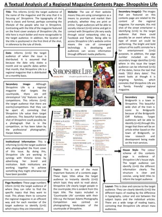
  • 1. A Textual Analysis of a Regional Magazine Contents Page- Shropshire Life Title- This informs (U+G) the target audience of the name of the magazine and the area that it is focusing on’ Shropshire. The typography of the title is classic and formal, perhaps connoting the lifestyle of the people who live in Shropshire. Contrasting with the title of the magazine featured on the front cover analysis of Shropshire Life, the title here is much bolder and more recognisable to the target audience. In addition, the location of the title is positioned in the first third of the shot, in reference to the rule of thirds. Date- Informs (U+G) the target audience of when the issue is distributed. It is assumed that because the date only states a month and no specific dates within that month, that Shropshire Life is a regional magazine that is distributed on a monthly basis. Website- The use of their website means they are using convergence as a means to promote and market their products, whether they are print or online. Target audiences will be able to socially interact (U+G) online and get in contact with Shropshire Life very easily through social networking sites e.g. Facebook and Twitter. Being able to access Shropshire Life’s website online means the use of convergent technology is developing and audiences can access information through different media platforms. Secondary ImageAlthough Shropshire Life is a regional magazine that targets the countryside, there are still stereotypical ‘city’ features such as competitions. This informs (U+G) the target audience that there are events/competitions that they can be apart of, connoting that Shropshire Life value their target audiences. This beautiful landscape shot of Shropshire could possibly be a photograph that is in the competition, or has been taken by the professional photographer, Harper Adams. Institutional Information- This is informing (U+G) the target audience who photographed the front cover of this issue. By doing this, Shropshire Life are working in synergy with Victoria Jones by advertising her brand and institution. Both institutions are working together to achieve something they might otherwise not have been possible Page Numbers- These page numbers inform (U+G) the target audience of where they can refer to find the specific topics that they want to read. This allows them to consume the regional magazine in an efficient way and for each member of the target audience to identify (U+G) which topics they are interested in. Secondary Image(s)- The images that are featured on this contents page are related to the content of the regional magazine. For example, this mid shot of the street entertainer is identifying (U+G) to the target audience that there could possibly be an event where this type of street act could be performing. The bright and bold colours of his outfit connote he is for entertainment (U+G) purposes. In addition, the page number included on this secondary image identifies (U+G) where in this issue the target audience can be informed (U+G) of the dates, hence the text that reads ‘2013 diary dates’. This event looks at though it is targeting families, which connotes that Shropshire Life are a ‘family friendly’ regional magazine. Secondary ImageBridgnorth is a town in Shropshire. This beautiful wide shot of the train is iconic to Bridgnorth because of the Bridgnorth Cliff Railway. Target audiences will be able to identify (U+G) through this image that there will be an article either based on the town of Bridgnorth, or new research and development being made on the train services. Topics- This is one of the most important features of a contents page. These topic titles allow the target audience to instantly identify (U+G) which topic they wish to read about. Shropshire Life clearly target people in the countryside; this is evident from this topic title. The topics included in ‘Countryside Life’ correlate with their title e.g. the Harper Adams Photography Competition was centred on photographing landscapes of the countryside of Shropshire. House Style- The colour scheme of this contents page is evidence of Shropshire Life’s house style. The target audience can identify (U+G) the different information clearly. The structure is clear and concise, using bold titles to inform the target audience. Layout- This is clear and concise to the target audience. They can clearly identify (U+G) the different topics of reading by the difference in typography, colour and size between the subject topics and the individual articles. There are a wide range of reading topics, connoting that Shropshire Life attract mass audiences.
  • 2. This textual analysis will be based upon the Shropshire Life contents page I have annotated. Researching different contents pages that belong to different types of regional magazines will develop my knowledge and understanding of contents pages, and why they are probably the most informative page to target audiences. Firstly, the title of the magazine can clearly be identified (uses and gratification) by the target audience. The positioning of it is at the top of the contents page. This connotes that it is almost like a summary of what the contents page includes. The positioning is in the first third of page, in reference to the rule of thirds. The typography is very stereotypical of a classic and formal font. The lines and shapes created with this style of typography is indeed very formal. It is a typography that could possibly correlate and represent the lifestyle of Shropshire; classic, formal and correct. Although the title features on the front cover, it is important to note that including it on the contents page simply reinforces that this is Shropshire Life regional magazine. Including the institutional website on the contents page connotes that Shropshire Life are using convergence technology as a means to promote and market their products, whether they are print or online. Target audiences will be able to socially interact (uses and gratification) online and are able to get in contact with Shropshire Life very easily through social networking sites like Twitter and Facebook as they have their own page e.g.@ShropshireLife. Being able to access Shropshire Life’s website online means the use of convergent technology is developing and audiences can access information through different media platforms and technologies e.g. smart phones, PC’s laptops, tablets, etc. The typography of the website is in the colour black correlating with the house style of Shropshire Life regional magazine. The background colour of this contents page is white, so stereotypically, black and other dark colours like red would be the best colour to use for the typography of the text. This is so the target audience can clearly see and identify (uses and gratification) the different topics, articles and reading subjects that Shropshire life have to offer. The secondary images that are featured on this contents page all directly correlate and relate to at least one article. For example, the mid shot of the ‘street entertainer’ is identifying (uses and gratification) to the target audience that there could possibly be an event where this type of street entertainment could be taking place in Shropshire. The excellent thing about this is that not only were the target audience initially capture by the bright and eccentric colours of his costume and outfit (mise-en-scene), but the page number layered on top of the image informs (uses and gratification)the target audience of which page they can refer to so they are able to refer to the correct page. In addition, incorporating the page number into the secondary image allows the target audience to refer further down the contents page to be informed (uses and gratification) of what the secondary image is representing; diary dates. This article is under the topic title of ‘Events’, which further connotes that this street entertainer will be apart of an event. The target audience are able to be informed (uses and gratification)of all of these aspects of one article simply by the information that is provided on the contents page. In addition, the beautiful landscape shot of Shropshire is another secondary image featured on the contents page. Although Shropshire Life is a regional magazine that targets the countryside, there are still stereotypical ‘city’ features such as competitions. This informs (uses and gratification) the target audience that there are events/competitions that they can be involved in. This connotes that Shropshire Life value their target audience because they are offering something to them in the form of a competition that they can take part in. Also, Harper Adams is a professional photography company who are predominantly know for their beautiful landscapes shots and photographing events. This connotes that possibly, Harper Adams could photograph the events that will be taking place throughout the year that are informed (uses and gratification) on the contents page too. There is synergy between Harper Adams and Shropshire Life because they have created this competition and are advertising it through Shropshire Life magazine. This is an example of synergy between the two institutions because they are creating something that could not have been done individually. Thirdly, the secondary image that is of the wide shot of the train is of particular importance. Bridgnorth is a city town in Shropshire, and the train is an iconic figure of Bridgnorth because of the Bridgnorth Cliff Railway. It is a touristic part of Shropshire. Target audiences will be able to identify (uses and gratification)through this image that there will be an article either based on the town of Bridgnorth, or new developments being made on the train services. This creates a sense of an enigma because the target audience are intrigued as to what this article could possible be about. They begin to ask questions such as ‘What is the article going to be about?’, ‘Will the train services affect me?’, ‘Are they going to close this historical train station?’. (Barthes’ enigma code).
  • 3. The date informs (uses and gratification) the target audience of when the issue is distributed. It is assumed that because the date only states a month and no specific dates within that month, that Shropshire Life is a regional magazine that is distributed on a monthly basis. The typography of the date is simple and clear, connoting that this piece of information is important. The colour of the typography is red, which is a colour that works well with a bright white background colour. The use of red for representing the date also conforms to the layout and house style of Shropshire Life because it is the colour that represents the individual article son the contents page. This piece of institutional information informs (uses and gratification) the target audience who photographed the front cover primary image of this issue. The fact that there is a smaller scale version of the front cover represented on the contents page allows the target audience to remember and identify (uses and gratification) which issue of the magazine they are reading, without having to refer to flick back to the front cover page. By informing (uses and gratification) the target audience who photographed the primary image, it is evidence of synergy. Shropshire Life are working in synergy with Victoria Jones by advertising the brand and institution within the regional magazine on the front cover. Both Institutions are working together to achieve something that they could not have done individually. The topic titles are extremely important for the target audience to be able to follow and be informed (uses and gratification) of the different categories within the regional magazine. The topic titles range from education and society, to food and drink to people and places. These are clearly defined by the typography of them. The typography of all the topic titles are in black. This is because it is the most ‘standout’ colour against the white background . In addition, it is in the same style of typography as the title is, reinforcing the house style of Shropshire Life.