
More Related Content
What's hot
What's hot (20)
Viewers also liked
Similar to Rabbit
Similar to Rabbit (20)
More from melishussein
Recently uploaded
Recently uploaded (17)
Rabbit
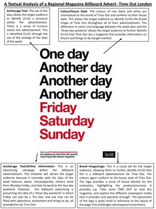
- 1. A Textual Analysis of a Regional Magazine Billboard Advert- Time Out London Anchorage Text- The use of the days allows the target audience to identify (U+G) a structure within the advertisement. There is a sense of humour within this advertisement. This is identified (U+G) through the use of the analogy of the days of the week. Colour/House Style- The colours of red, black and white are intertextual to the brand of Time Out and conform to their house style. This allows the target audience to identify (U+G) the brand image of Time Out throughout all of their advertisements. The difference in colour and language between the week days and the ‘three day weekend‘ allows the target audience to further identify (U+G) that Time Out are a magazine that provides information on leisure and things to do (target market). Anchorage Text/Online Information- This is an advertising campaign within the billboard advertisement. This initiative will attract the target audience because it coincides with the days of the week features above. Stereotypically, citizens work from Monday-Friday, and look forward to the two day weekend. However, this billboard advertising is presenting the idea of a ‘three day weekend’ in which Friday can also be a ‘fun day’ and one that can be filled with adventure, excitement and things to do; all provided for by Time Out. Brand Image/Logo- This is a visual aid for the target audience, allowing them to further identify (U+G) that this is a billboard advertisement for Time Out. The colours again conform to the house style of Time Out. The logo provides a sense of brand identity for the institution, highlighting the products/services it provides e.g. ‘Take some TIME OUT to read this magazine, and explore the different convergent media that it provides and operates through’. The placement of the logo is quite small in reference to the layout of the page; this challenges stereotypical conventions.
- 2. This is a textual analysis that will be based on the Time Out London billboard advertisement that I have annotated. Whilst I have already annotated a Time Out Singapore billboard advertisement, I wanted to explore Time Out London, and to investigate into whether Time Out use different advertising and marketing strategies to target their audience in different regions on a global scale. Throughout my textual analyses of Time Out media products, their house style is distinctively evident throughout each individual product. The colours used are complementary to one another; black, red and white. Whilst red connotes love and passion and white connotes purity and class, black challenges this by connoting mystery and the unknown. It creates a sense of enigma as the audience are automatically thinking, ‘What is this billboard advertisement about?’, ‘Why are there days of the week listed?’ (Barthes’ enigma code). It is important for the house style to be evident so the target audience are able to identify (uses and gratification) who this billboard advertisement belongs to and what it is clearly advertising. The ‘days’ that are represented in the black typography (font) are the days that are stereotypically ‘working days’ within society. They are the days that audiences and society find dull and boring, days that are filled with work. The phrase of ‘another day’ is often used within society to describe these days, as they seem repetitive and continuous. What Time Out have cleverly done is distinguish between the stereotypical ‘work days’ and the ‘fun days’. Although Friday might still be a work day, in the evening, the target audience can still plan things to do via their family and friends. This has been made possible by Time Out as they are advertising a ‘three day weekend’. On the other hand, whilst the dull days are represented in black, the exciting and more adventurous days are represented in a bright red, connoting excitement, passion, love and possibly an element of danger in terms of being thrilled on the weekend. The analogy of the days of the week is an excellent marketing strategy because it is something that mass audiences can identify (uses and gratification) with. It relates to their lifestyle in terms of working and this advertisement provides them with a sense of escapism (uses and gratification). For example, the target audience will be waiting for the weekend to arrive, in which they will escape from their usual working lives, whether in a working environment or school environment. They will use Time Out magazine as a means to be informed (uses and gratification) of the latest things to do, whether it relates to restaurants and food, music, film, television or competitions, etc. The ‘initiative’ placed in the bottom left hand corner of this billboard advertisement provides the target audience with even more information (uses and gratification) regarding the ‘three day weekend’. Accessing the online website stated in the advertisement will allow there to be technological convergence because the target audience will be able to access it via their smartphone, laptop, tablet, etc. The fact that this ‘initiative’ is represented as an advertising campaign further draws the attention of the audience to the advertisement. Audiences want to consume a media product that has their best interests at heart. Time Out are supporting the ‘three day weekend’ because it is an issue that many people within society feel is not being addressed correctly. The target audience will visit the online website and have access to high volumes of information (uses and gratification) regarding this campaign. They will then inform (uses and gratification) their family and friends of this which will hopefully ‘create a buzz’ for Time Out within society (two step flow). The text that follows the online website clearly states and informs (uses and gratification) the target audience of what Time Out are, what they stand for, and what products and services they provide. The fact that they have stated the phrase ‘ The world’s most important leisure magazine’, this connotes and further informs (uses and gratification) the target audience that Time Out do not only operate in London, but they are a global media institution that operate in an international market. Time Out’s logo is placed in the bottom right hand corner of the billboard advertisement. Stereotypically, the logo is often bigger in terms of size and the placement is often in a more visible place. Time Out have challenged this convention by not focusing on the logo so much, but more so on the anchorage text and visual colour and typography. Time Out’s logo is intertexual to their brand and creates brand awareness within both the magazine industry and to their mass audiences. Stereotypically, the logo is often the magazine’s title; Time Out have conformed to this convention and it is evident throughout all their media products and advertisements. What I particularly found very effective about this advertisement was the use of language and colour. This billboard advertisement is very simplistic in terms of its features, however it has still attracted its mass audiences. The schedule of most people’s lives is done day by day, so instantly, the target audience would be able to identify (uses and gratification) with this analogy because they would be able to relate to it in terms of their lifestyle and work ethic. It is almost as though Time Out are targeting each individual member of their target audience; they are using the days of the week to anchor their attention into consuming the billboard advert, which will lead to them consuming Time Out magazine.