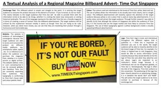
1. A Textual Analysis of a Regional Magazine Billboard Advert- Time Out Singapore
Anchorage Text- This billboard advert is simple and straight to the point. It is enticing the target
audience to consume the product because of the element of humour. ‘If you’re bored, its not our fault’.
This clearly indicates to the target audience that Time Out will be able to provide them with the
information (U+G) to be able to do things, whether it is visiting the latest new restaurants or visiting
historical landmarks. The use of this language represents the idea that Time Out are a friendly magazine
in terms of creating a sense of humour from the billboard advertisement. The target audience will be
enticed by this euphemism because initially it seems as though Time Out are trying to be rude.
However, when you delve more closely, you can see that they are marketing their product through a
humourous and memorable way.
Website- The website is
evidence of technological
convergence because the
target audience are able
to access and consume the
product via different
media platforms
e.g.
smartphone, tablet, laptop
, etc. It is a reference as to
where the audience can
purchase the magazine
from, whether it is a print
version or digital archive.
This website address ends
in ‘.com’, connoting that it
can be accessed globally
and therefore Time Out
are constantly expanding
their
audiences.
The
typography is conforming
to Time Out’s house style
and colour palette; black.
Colour- The colours used are intertextual to the brand of Time Out; white, black and red.
The use of yellow allows the information to be visually seen more clearly, and is a bright
colour. This billboard advertisement will instantly capture the attention of the target
audience because yellow is not a colour that is used on every day advertisements. It is a
quirky colour and will attract the target audience. Through further research I was able to
identify (U+G) that although the citizens of Singapore are within the audience of Time
Out, it is the tourists that are the target market and most likely to consume Time Out
Singapore. The use of black typography against a yellow background creates a visually
appealing billboard advertisement.
Logo- Time Out’s logo is iconic and intertextual
throughout the different regions that it
publishes in. I think this is important so
wherever you are in the world, the target
audience will be able to instantly identify (U+G)
the brand image of Time Out. For example, if a
citizen is England was to visit Singapore, they
would be able to access information (U+G)
instantly because they would identify (U+G) the
logo of Time Out and what they advertise and
are about. Logo’s are important to an
institution’s brand image because it is
intertextual and can be recognised globally, as
Time Out is. Stereotypically, the logo is often
the title of the magazine. Time Out conform to
this convention. The positioning of the logo has
been cleverly placed as an advertising strategy.
It is in between the words ‘BUY’ and ‘NOW’.
This will entice the target audience to be more
inclined to purchase it because of the
anchorage text.
2. This textual analysis will be based upon the Time Out Singapore billboard advert that I have annotated. I decide to chose this billboard advert because I wanted to explore my understanding of
different regions around the world, and whether Time Out target their global audiences the same way that they target audiences in London. This billboard advertisement is simplest, yet very
effective. The positioning of the anchorage text and the style of typography contribute to the overall effectiveness of the billboard advert, and how it has been able to target a mass audience of
primarily tourists.
What I first noticed about this billboard advertisement was the anchorage text. Not only is the placement directly in the middle of the shot to connote its dominance, the size of the typography
takes up most of the shot in terms of the positioning and placement. The use of the word ‘you’re’ personalises the billboard advertisement, almost as though each individual member of the
audience is being personally targeted. This would make the member of the target audience feel unique and special, as though Time Out Singapore have created this advertisement especially for
them. The use of this anchorage text almost ‘shouts out’ to the target audience, making it seem as if Time Out are directly speaking to them. I think that the use of ‘you’re’ and ‘our’ is probably
the most prominent features of this billboard advertisement. Through further research, I was informed (uses and gratification) that Time Out Singapore’s primary target audience are tourists. This
is particularly important because Time Out provide a lot of information (uses and gratification) for tourists, both in London and Singapore. The anchorage text that reads ‘If you’re bored, its not
our fault. Buy Time Out now’ is simplistic yet very effective. This is because there is only a small amount of text on the page, but due to the size of the typography, it becomes the most prominent
feature of the billboard advertisement. To an extent, the target audience are likely to be instantly injected with the information that is provided from the billboard advertisement (hypodermic
needle). This is because tourists will be walking and exploring the sites of Singapore and will come across this billboard advertisement. They will be able to identify (uses and gratification) Time
Out’s logo and read the anchorage text and begin to think about what Time Out can provide from them as a member of their target audience. Moreover, ‘BUY NOW’ has been represented as a
command. To an extent, audiences often are attracted to the fact that advertisements are straight to the point and inform (uses and gratification) them directly. This billboard advertisement is an
example of this. The euphemism of this anchorage text further contributes to the effectiveness of it. Additionally, the typography (font) is big, bold and black. Black is a colour that works well
with yellow because one is very vivid and the other is dark (visual codes).
The logo is a piece of institutional information that is intertextual to the brand of Time Out. Stereotypically, media institutions, particularly within the magazine industry tend to use their
name/title as their logo to reinforce their brand image. Time Out have conformed to this convention, allowing their target audience to identify (uses and gratification) their brand. In addition, not
only will this reinforce their brand image in Singapore, but tourists could identify (uses and gratification) their brand globally because of the intertextuality of the logo, minus the name of the
region. The positioning of the logo in reference to the placement of the billboard advertisement is between the words ‘BUY’ and ‘NOW’, further enticing the target audience to
consume/purchase the product because they are command words that psychologically attract audience members. The logo is also a visual aid for the target audience to continuously identify
(uses and gratification) the brand image of Time Out. The logo also conforms to Time Out’s overall house style and in particular the iconic colours of black, white and red.
The website is a generic convention that is stereotypically found on billboard advertisements; Time Out have conformed to this generic convention. The use of an online website address allows
the target audience to be informed (uses and gratification) that they can access information and content via a website; this is evidence of technological development and convergent media
because they will able to access it via a number of different media platforms e.g. their smartphone, tablet, laptop, etc. The website’s typography is again in black to conform to Time Out’s house
style, further emphasising their brand image throughout the entire billboard advert. The website address ends in ‘.com’, connoting that Time Out are not limiting themselves to Singapore.
Although the website address states Singapore, accessing this website will lead to the other regions that Time Out operate in throughout the world e.g. New York, Paris, Melbourne, Rome, etc.
Moreover, ‘www.TIMEOUTsingapore.com’ also has a hyperlink to ‘Time Out Worldwide’, in which the target audience can access information (uses and gratification) about all the different regions
that Time out operate in. The website does not only provide the target audience with information regarding things to do, food and drink, competitions, etc., (some conventions of a regional
magazine), but it also provides them with social interactivity options (uses and gratification) to access live feeds direct from Time Out. Social networking sites such as Facebook and Twitter are
also available which will provide the target audience with even more information regarding the top things to do. This billboard advert has allows target audiences to not only consume the
billboard advert itself, but it has provided them with online information and live feeds, being able to socially interact (uses and gratification) with Time Out and possibly access different regions
that Time Out operate in.