The document provides details about a proposed grime music magazine called "Grimed Out Magazine" that will focus on the North London grime scene. It outlines the magazine's purpose of educating fans on grime music origins and promoting local talents. It discusses the target 16-20 year old audience in North London and plans to market the magazine through social media, artists, and local music venues/shops. The low monthly print and digital subscription prices aim to appeal to the demographic's limited budgets.
Grimed Out Magazine will be a print and online magazine focused on the grime music scene in North London. It aims to educate fans on grime music's origins in North London and promote local upcoming talents. The magazine will target ages 16-20 and include articles on new artists, music reviews, interviews, and cultural topics of interest to grime fans like clothing. It will have a dark color scheme and fonts that appeal to younger readers.
The document provides details for a proposed grime music magazine called "Grimed Out Magazine" that will focus on the North London grime scene. It will include articles on upcoming artists, music reviews, interviews, and event guides. The target audience is ages 16-20. It will be distributed both online and in print monthly. Marketing strategies include social media, promotions with artists, and advertising in locations frequented by the target demographic.
Unit 13 – Planning and Pitching a Print based Media Product (LO2)mdelmar97
This document contains the slide contents for a presentation on the development of a music magazine concept. It includes slides on mood boards, font styles, magazine layout plans, photography plans, cover and spread designs, and proposals for two magazine title ideas - "Tune iN" and "Beat". Key elements that are explored include house styles, color schemes, graphic layouts, and annotated codes and conventions for the magazine designs. The presentation shows the process behind conceptualizing and designing the different elements of an original music magazine.
Unit 13 (LO1) – Understanding existing print-based media products and how the...mdelmar97
Mojo is a monthly music magazine published in the UK since 1993. It focuses on classic rock music and targets upper middle class readers aged 35 and older. The magazine promotes itself through social media platforms and aims to build connections between readers and artists. It uses in-depth articles and reviews to provide surveillance of the music industry and help readers find community and identity through their shared love of classic rock.
The document discusses a music magazine evaluation comparing the student's magazine to Vibe magazine. Some key similarities and differences are noted, including central image placement, masthead design, use of a main story or "kicker," double page article layouts, contents page design, and targeting of the 14-25 age demographic. Technical choices like the use of Photoshop and InDesign software are also mentioned.
The document compares the author's music magazine to Vibe magazine, highlighting similarities and differences in their design conventions. Both magazines feature a central image on the cover, kickers (main stories), and double-page articles. However, they differ in elements like mastheads, backgrounds, and layouts of articles. The author's magazine targets 14-25 year olds interested in grime music, and uses British artists and relatable stories to attract this audience.
The document discusses the ways in which the author's music magazine uses conventions of real music magazines as influences. Key similarities and differences are highlighted between the author's magazine and Vibe magazine, a popular hip hop magazine. The author also discusses the layout, design choices, target audience, and use of technology and editing in creating their magazine.
The document summarizes the student's media product, which is a magazine aimed at teenagers interested in rock music. Some key points:
1) The student aimed to use conventions of real magazines like logos/mastheads and layouts while also challenging conventions with aspects like diverse models.
2) The magazine represents groups like ethnic minorities and women by featuring them prominently.
3) The target audience is 13-18 year olds interested in various rock genres.
4) The student learned skills in Photoshop and other technologies to construct the magazine pages and enhance/edit images.
Sophie Lyne is proposing a new rock/indie and alternative music magazine called "Record". The 32-page monthly magazine would have a black and white design with some elements in red. It would feature articles on bands and artists, album and concert reviews, and photos. The target audience is 15-35 year olds, mainly male, from socio-economic classes C1, C2, and E, with a diverse ethnicity. The magazine would retail for £3.99 and compete with publications like Q, NME, and XXL magazine.
Here are the key details from the conversation:
- Dimzy recently collaborated with New Gen on the song "Jackets" which was a success in the grime scene.
- New Gen is working on an album to be released at the end of January 2017 and Dimzy will feature on it. Dimzy is also working on a new EP with New Gen which may be released in July 2017.
- Dimzy's recent album "Lets Lurk" with features from artists like A.S.A.P and Giggs, cemented his mark in the grime scene over the past 2 years. The album illustrated Dimzy and his group's experiences growing up in North London.
- Dimzy plans
This document outlines ideas for two music magazine pitches - MIC and LIMIT. For MIC, the target audience would be 16-34 year olds and it would feature a variety of new and classic artists. It would be released weekly for £2.50. LIMIT's target is 18-40 year olds and would focus on alternative, indie and rock music similar to Q Magazine. It would be released monthly for £4.50 to connote a premium brand. Both magazines would use quality paper and glossy covers. Financial projections show MIC could make a £5 million profit in the first year while LIMIT could make £849,108. Marketing would involve Facebook ads and subscription services may be utilized in the future. Hand
The document summarizes magazine layout techniques used to attract readers. Bold mastheads and prominent images are used to draw the eye. Contrasting colors stand out and quotes pique interest. Artwork is framed to emphasize featured artists. Descriptive text previews contents to inform readers. Overall the layouts employ attention-grabbing designs, imagery, and formatting to engage audiences.
The document discusses ideas for two music magazine concepts - Music in Common (MIC) and LIMIT.
For MIC, it proposes a weekly release schedule, targeting 16-34 year olds with a red and white color scheme. Images would be close-ups of artists. LIMIT would be monthly, targeting 18-40 year olds with a black and gold color scheme focusing on classic artists. It would have a higher price point of £4.50 to position it as a premium brand like Q Magazine. Both magazines aim to provide coverage of a wide range of trending artists through a variety of article types and images.
The document provides an evaluation of the student's final magazine project titled "MASWAGGER". It summarizes the key elements and design choices for the front cover, contents page, and a featured double page article spread. Feedback from surveys indicated that visual elements like main images and layouts were particularly appealing to the target audience of younger urban music fans. The represented artist and style helped brand the magazine as focused on hip hop, R&B, and rap music genres.
- Q Magazine is a UK-based monthly music magazine published by Bauer Media that includes interviews, reviews, and articles on new and popular music.
- It aims to keep readers of all ages informed on music trends and appeals to a wide audience by covering various genres.
- The magazine uses consistent branding elements like its red and white logo and color scheme to create familiarity for readers across issues.
Sophie Lyne proposes a new rock/alternative music magazine called EP. It will be an A4 sized, monthly publication sold for £2.99. EP will feature interviews, album reviews, and concert listings covering well-known bands in the rock genre. The target audience is 15-30 year olds, mainly male, from socioeconomic classes ABC1 to C2E. Sophie plans to design the front cover and double page spread in Adobe Photoshop CS5 to showcase her magazine concept when pitching it.
This document discusses magazines in the music and fashion genres for both print and digital formats. It examines pros and cons of print versus digital magazines. For print magazines, pros include having a physical copy that some value more, while cons are higher production costs and inability to include multimedia. Digital magazines' pros are ubiquitous access and monetization potential, while cons are lack of sentimental value and technological barriers. Technical considerations for producing magazines include planning, page size, budget, file formats and sustainability. Sample front covers and spreads are presented for print magazines GQ and Rolling Stone, and a digital version of Rolling Stone.
Jake McMann is creating a double page spread for a BTEC Media assignment. The spread will be for a magazine focused on pop music, aimed at informing readers aged 13-18 about the artists and music they listen to. The spread will feature artist Dua Lipa and use neutral colors and a simple font to appeal to a wide audience rather than a specific demographic. Potential issues could include lacking the proper photo editing software or unable to access the perfect photo shoot location.
The document discusses two proposals for a new music magazine. The first proposal is for a magazine called "Smash Music Magazine" that would take inspiration from Clash Music Magazine in its style and formatting. The second proposal renames the magazine to "The News of Music Magazine" but otherwise has similar details about drawing inspiration from Clash and other magazines. Both proposals discuss the target demographics, genres covered, and pricing for the new magazine.
This document provides details on the planning and production process for a print-based music magazine. It includes slide presentations on rough sketches, final layouts, style guides, article drafts, photography plans, and resource needs. Key elements that will be featured include a masthead, strap line, cover image, inside articles, and photos related to the content. Conventions like the masthead location and additional branding elements are considered to maintain consistency across issues. Suitable photography is planned without needing extra props, as outfit changes will provide variety.
My media magazine targets audiences who listen to classic hard rock and heavy metal. It represents a traditional heavy metal band in a contemporary way, adhering to representations of aggression and larger-than-life personalities seen in magazines like Metal Hammer. This follows genre conventions. The magazine also appeals to older audiences through a more sophisticated layout while still representing the rock subculture through imagery of chaos and secretive gestures. Future Publishing would be suited to distribute the magazine due to their wide reach and experience with music magazines. The target audience is rock fans aged 14 and up due to the focus on different rock genres.
The student has learned several technologies through constructing their media product. They learned to use Macromedia Fireworks more extensively for image editing. They also learned about using blogs to upload and share work, reducing paperwork. Slideshare allowed them to upload presentations for viewing. Looking back, they felt their preliminary task lacked professional conventions compared to their final product, which was more sophisticated in its visual editing, photography techniques, and use of design principles like the 'Z' pattern.
The student has learned a lot about designing media products through this project. Their preliminary task magazine lacked professionalism compared to their final product. For the final product, they applied techniques like the "Z" pattern more effectively and edited photos to a higher standard using Fireworks. They also learned about technologies like blogging, slideshare, and how uploading work online can improve the feedback and editing process. Overall, the final product showed significant improvements from applying lessons learned in designing the preliminary task magazine.
Jessica Monk plans to launch a new indie music magazine called Bass. It will compete with popular magazines Kerrang and NME by focusing on the indie genre. Bass will be a 70-page, weekly magazine sold for £1.95. The target audience is males ages 14-19 in the UK who enjoy indie music. The magazine will feature interviews, festival guides, album reviews, and free CDs to subscribers.
The document outlines ideas for two music magazine brands - MIC (Music in Common) and LIMIT.
For MIC, the target audience will be 16-34 year olds. It will have an eclectic genre including various trending artists. The colour scheme will be red, white and black to stand out. It will be released weekly and cost £2.50.
For LIMIT, the target audience will be 18-40 year olds as it will feature both new and classic artists. It will have a premium look using gold and black colours. The genre will be alternative, indie and rock similar to Q Magazine. It will be released monthly and cost £4.50 to portray a premium brand.
The magazine aims to engage with mod culture through its design elements that reference symbols of mod subculture like the Union Jack. These include the masthead, cover lines in red, white and blue, and a feature photo of a band member addressing the camera intensely. The double page spread continues these design elements and features a large photo of a band in black clothes against a background with graffiti, appealing to the aesthetic tastes of the target audience. The magazine targets males aged 18-45 interested in mod music, fashion, and lifestyle, especially those interested in reliving the mod revival era or passing the culture to younger generations.
This document contains notes and ideas from a student for planning and pitching a print-based music magazine. It includes summaries of ideas, proposed masthead names, font choices, target audience analysis using Hartley's 7 subjectivities, Katz' theory of uses and gratification, and Maslow's hierarchy of needs. Mood boards and mind maps are presented showing visual inspirations focusing on club and festival atmospheres. Color schemes, magazine release dates, and sample cover designs are proposed.
The document outlines plans for a new music magazine targeting 16-25 year olds. It will feature modern genres like EDM, rap, house and grime as well as spotlight emerging artists. The magazine will promote concerts and albums through interviews, listings and ads on social media. It will sell for £2.50 per issue or £25 for an annual subscription to be affordable to its young audience.
This document provides a proposal for a new indie music magazine. The magazine will be published both online and in print, with a focus on indie artists and music scenes in North London. It will include interviews, reviews, charts, and information on concerts. The target audience is teenagers aged 13-19. The magazine will be distributed in North London and cost £4 online or £4.99 in print. It will differentiate itself from competitors by offering a 10% student discount. The proposal includes details on branding, design, personnel needs and a marketing plan.
Megan del Mar proposes producing a new music magazine called "Beat" that will cover classic rock, folk, soul, country, reggae, electronic, and experimental genres. The monthly magazine will include concert and festival backstage coverage, tour schedules, album and movie reviews, studio sessions, celebrity gossip, new album announcements, and artist interviews. It will be promoted on social media and have a simple color-based design with 131 pages in A4 size at a starting price of £2.50, aiming to compete with the existing magazine "Mojo" while focusing on smaller artists.
Rock On! will be a rock music magazine targeted towards people aged 16-30 in North London. It will be released both online and in print monthly, covering upcoming rock artists and music. The magazine aims to become one of the most successful rock magazines in North London by marketing to its target audience and conducting research to understand what appeals to readers. It will be distributed in Camden market and local shops, and online via a QR code that provides access to the digital magazine and social media pages.
The document describes a proposed rock music magazine called "Rock On!" that will be distributed both online and in print monthly in North London. It will target readers ages 16-30 and feature content about up-and-coming rock artists and music. The magazine will have a rock-inspired design with red, white, black, and gray colors and rough fonts. It will cost £3.50 and include features like interviews, reviews, and giveaways to attract audiences.
This document provides details for a proposed magazine about the music venue KOKO in Camden Town, London. The magazine would advertise upcoming rock and indie music events at KOKO. It would have a glossy format and be available both online through subscription and in print at the venue and local shops. The target audience is people aged 23-29 who attend live music events. Each issue would provide information on the artists, events, and include photos. The magazine aims to promote KOKO events and offer discounts to readers.
This document provides information and ideas for developing two music magazines targeted at 16-30 year olds. It discusses color schemes, mastheads, images, frequencies, and target audiences for the magazines. Font styles, graphic layouts, and mockups are proposed for the magazine covers and sample double page spreads. Key details include using red, white, black and blue colors; releasing issues monthly; and focusing on genres like indie, alternative and rock. Fonts and cover designs are selected to be bold and visually appealing to the intended audience.
The document outlines a proposal for a weekly grime music magazine targeting lower class males aged 18-22 with interests in grime music. The magazine will be called "Catchy Upbeat Name" and use a graffiti-inspired font to represent grime culture. It will include articles, reviews, stories and QR codes linking to free music. The magazine will be distributed both physically and online via a website subscription. Marketing will utilize social media and promotions. The creator will fulfill various roles in launching the first edition independently before potentially expanding distribution and hiring personnel.
Zack Simpson is proposing a new R&B/hip hop print magazine called Riddim Magazine. The 40-page monthly magazine would have a bright, bold design featuring photos of R&B artists. It would include news, information and content about R&B musicians to inform readers ages 15-30 of genres developments. The magazine aims to compete with Vibe Magazine and be distributed for £2.99.
The document provides details about two magazine proposals - CM (Critical Music) and FS (Funky Session). For CM, the summary includes using bold colors like red and white to attract audiences, and the Garamond font for the main text. Key aspects of the FS proposal include developing an app to provide exclusive content and faster updates to attract more readers, although app development can be expensive. Production plans and timelines are also provided for the magazine creation process.
Ronan Beirne created a magazine aimed at teens and young adults interested in punk and heavy rock music. The magazine would feature band interviews, reviews of gigs and fashion related to the target audience's interests. Beirne refined their design skills using Photoshop and Publisher to create a magazine mock-up with a professional layout, including a cover featuring a rock musician, contents page and double page spread. Through repeated drafting, they improved the color scheme, images and structure to better address the niche audience.
The document outlines a pitch for a new rap magazine. The purpose of the magazine is to provide details about rap artists and the genre of rap music to a global audience. The target audience is males and females ages 14-25 in North London. The magazine will contain interviews, articles, photos, and advertisements about up-and-coming rap artists. It will be distributed in shops throughout North London and marketed through social media platforms. The magazine aims to fill a gap in the rap magazine market with a reasonable price point and bold design to stand out from competitors.
Zack Simpson is proposing a new R&B/hip hop magazine called Bass Magazine. The magazine would have a bright, bold font for the title on the front cover and focus on content about R&B artists, including photos, news, and information about their lives and careers. It would be presented with bright colors and clear fonts to attract readers' attention. The target audience is 15-30 year olds of both genders from a range of socioeconomic backgrounds. Each monthly 40-page issue would be produced on A4 paper and cost £2.99.
Q Magazine is a monthly music magazine aimed at young adults interested in a variety of music genres. It aims to inform and educate readers about different types of music and new artists. The magazine uses an informal tone and red color scheme to appeal to younger audiences. It follows consistent styles and formats across issues with features like artist interviews, reviews, and content about individual musicians. The goal is to keep readers updated on the latest music industry news and discoveries.
The document discusses the history and operations of DMC and Mixmag, two UK-based media publishers in the electronic music industry. DMC started in 1983 releasing cassette tapes and vinyl records, and later began hosting annual DJ competitions. Mixmag launched over 15 years ago as a monthly print magazine with over 150,000 copies sold. It became known as the "Bible" for electronic music fans. While print sales have declined, Mixmag has adapted by publishing content online and on smartphones to maintain revenue and readership. Both publishers have kept a consistent simplistic style across their branding to appeal to electronic music fans.
The document describes the design and content elements of an urban music magazine focused on the grime genre. Key elements include a bold masthead in grey and blue colors, central images of grime artists, features on the left page in large font, and articles following the house style colors of black, blue and white. The target audience is teenagers and young adults interested in grime music. Technology like Photoshop and Indesign were used to edit images and layout the magazine pages.
The document describes the design and content elements of an urban music magazine focused on the grime genre. Key elements include a bold masthead in grey and blue colors to attract readers, central images of grime artists to represent the genre, and features on the left side in large font to draw readers in. The target audience is teenagers and young adults interested in grime music. Technical skills with Photoshop and InDesign were developed to manipulate images and layout the magazine professionally.
This document provides information about NME magazine, including its target audience, publisher, and circulation numbers. NME targets mainly men aged 17-30 with an interest in new music. It has experienced declining circulation, with an average weekly sale of 18,184 in 2013 dropping to 14,312 in 2014. NME is published weekly and its publisher is Timeinc.UK. The magazine aims to cover the past, present, and future of music through features, interviews, and reviews that appeal to its target psychographic groups of survivors and explorers interested in music and social change.
The document outlines a proposal for a new magazine targeting a niche audience interested in grime music. The magazine would have an upbeat title using graffiti font to appeal to its target demographic. It would aim to positively promote grime music and create a sense of community. The primary audience would be lower-class young black males interested in grime. Content would include articles, reviews, and giveaways. The magazine would be physically printed weekly and available online with a subscription. It would have colorful, graphic design and include QR codes linking to free music clips. The creator would fulfill all roles initially and distribute through shops and online, advertising through social media.
The document outlines a proposal for a new magazine targeting a niche audience interested in grime music. The magazine would have an upbeat title using graffiti font to appeal to its target demographic. It would aim to positively promote grime music and create a sense of community. The primary audience would be lower-class, English-African males aged 19-22 living in the UK, but the secondary audience could include all ages, races and classes. Content would include articles, reviews, stories and QR codes linking to free music clips. Initially a weekly print magazine would be created, with plans for a subscription-based online version and potential app in the future. One person would fulfill all roles for the first issue, using various equipment and software
❼❷⓿❺❻❷❽❷❼❽ Dpboss Kalyan Satta Matka Guessing Matka Result Main Bazar chart Final Matka Satta Matta Matka 143 Kalyan Chart Satta fix Jodi Kalyan Final ank Matka Boss Satta 143 Matka 420 Golden Matka Final Satta Kalyan Penal Chart Dpboss 143 Guessing Kalyan Night Chart
KALYAN MATKA | MATKA RESULT | KALYAN MATKA TIPS | SATTA MATKA | MATKA.COM | MATKA PANA JODI TODAY | BATTA SATKA | MATKA PATTI JODI NUMBER | MATKA RESULTS | MATKA CHART | MATKA JODI | SATTA COM | FULL RATE GAME | MATKA GAME | MATKA WAPKA | ALL MATKA RESULT LIVE ONLINE | MATKA RESULT | KALYAN MATKA RESULT | DPBOSS MATKA 143 | MAIN MATKA
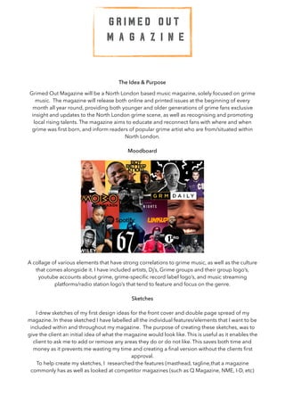
1. The Idea & Purpose
Grimed Out Magazine will be a North London based music magazine, solely focused on grime
music. The magazine will release both online and printed issues at the beginning of every
month all year round, providing both younger and older generations of grime fans exclusive
insight and updates to the North London grime scene, as well as recognising and promoting
local rising talents. The magazine aims to educate and reconnect fans with where and when
grime was first born, and inform readers of popular grime artist who are from/situated within
North London.
Moodboard
A collage of various elements that have strong correlations to grime music, as well as the culture
that comes alongside it. I have included artists, Dj’s, Grime groups and their group logo’s,
youtube accounts about grime, grime-specific record label logo’s, and music streaming
platforms/radio station logo’s that tend to feature and focus on the genre.
Sketches
I drew sketches of my first design ideas for the front cover and double page spread of my
magazine. In these sketched I have labelled all the individual features/elements that I want to be
included within and throughout my magazine. The purpose of creating these sketches, was to
give the client an initial idea of what the magazine would look like. This is useful as it enables the
client to ask me to add or remove any areas they do or do not like. This saves both time and
money as it prevents me wasting my time and creating a final version without the clients first
approval.
To help create my sketches, I researched the features (masthead, tagline,that a magazine
commonly has as well as looked at competitor magazines (such as Q Magazine, NME, I-D, etc)
G R I M E D O U T
M A G A Z I N E
2. The Name
The reason for selecting the name ‘Grimed Out’ for the magazine is because I want each issue to
give as much relevant information on grime culture and the industry as possible. I want
audiences to be ‘grimed out’, in other words, bombarded with a great amount of exclusive
information, news and other various content revolving the genre.
The Aim
The aim of Grimed Out Magazine is to become the most prominent and successful music
magazine within North London, and hopefully expand throughout the rest of London.
Our aim is to inform readers about upcoming grime music and artists, and showcase potential
stars and the new generations of artists.
In order to help achieve these aims, Grimed Out Magazine will have to be successfully marketed
at the target audience. One way in which this can be done is by conducting both primary and
secondary research on the age demographic. This will help us to better understand our target
audience and understand what appeals to them. This information can also help create a
successful marketing campaign and advertisement that is guaranteed to appeal and catch the
attention of the target audience.
Target Audience
Grimed Out Magazine will be aimed at ages 16-20 as grime music is most listened to by these
ages. The magazine will not favour a particular gender, religion or ethnicity/race — It will aim to
appeal to anyone living within North London and part of the age demographic.
The target audience will be taken into account when designing the magazines layout, fonts and
content, so that it most interests and attracts the demographic.
When creating Grimed Out Magazine, I will have to consider the interests of the target audience,
other than grime music. For example, cultural aspects (such as clothing) that the target audience
may commonly like will be useful to gain knowledge about as they can be featured in Grimed
Out Magazine. To add, although the magazine focuses on grime music, those who listen to the
genre may also have common interests in other genres. For example, from my research I found
3. that individuals who listen to grime also like to listen to hip-hop and urban UK afro-beats (e.g
artists such as Yxng Bane and Not3s).
The Price
As Grimed Out Magazine is going to be targeted at teenagers/young adults, it will have to be
reasonably priced and not too expensive. This is because it will be common for members of the
target population to be in school/college/university, meaning they wont have full time jobs and
afford a high priced magazine. We want Grimed Out Magazine to be available to everyone
hence the reason we do not wish to price it high.
As Grimed Out magazine will be targeted at an age range who don't typically have full time
jobs, the general NRS social grade will be from C2 (manual workers with a level of skills) to E
(unemployed).
Although we don't want to sell a high priced magazine, we do want Grimed Out Magazine to
have a high quality glossy finish. In other words, we want the magazine to be sold for
exceptional value for money. The magazine will be sold at £3.99 per copy (both printed and
online) or an annual subscription of £24.99 (which is much cheaper than other magazines, such
as Q Magazine which costs £35 a year).
Content & Form
The magazine’s content will include feature articles about new and upcoming artists to the grime
scene, reviews of new music (albums, singles, etc) as well as live shows (e.g how well the artists
performed), exclusive interviews with grime artists and, special features. The magazine will be
available as an online article and a print based version.
The layout of the magazine will consist of a front cover page and contents pages. The front
cover will typically contain a large image of an artist, a concert, etc. Most issues will contain
feature articles that will be presented across double page spreads.
The theme of colours in Grimed Out Magazine will consist of grey, black and white, followed by
pops of colour to create an eye catching, dramatic effect. Reasons for the dark colours
contrasting on the bright, is to connote the raw and edgy aspect of grime, as well as the up-beat
and energetic side.
Examples of online magazines:
4. Examples of printed magazines, including double page spreads:
The Font
The magazines font throughout will have to cater for both younger and older readers within the
target population. As the overall target population is relatively young and between the ages of
16-20, the font will be simplistic and modern, in order to appeal to the age demographic.
Here are some fonts we have considered using throughout the magazine:
Andale Mono
Noteworthy
Superclarendon
Andale Mono - Due to this fonts simplistic design and spaced letters, it is easy to read/
understand and creates a clean, fresh appearance. These factors make this font fitting to Grimed
Out Magazine as it will be easy for the target audience to follow.
As Andale Mono has the most clean, simplistic design out of the fonts I have considered, I will
be using it for the body text throughout the magazine. Colourful and bolder variations of this
font will also be used as subheadings throughout the magazine. For example, I may decide to
use the font as a subheading by making it bold or medium and changing the colour of it. This
font will also be used on the cover lines of the magazine.
Noteworthy - This font’s script-like appearance looks as though it has been hand written. This
creates a casual and creative impression which accurately fits the magazines theme and content,
as it is an informal magazine. The hand written look of this font also creates a raw and
wholesome impression, which again, fits to Grimed Out Magazine’s urban and unique
appearance.
Superclarendon - Despite the magazine being modern, it will also keep to an authentic and
original appearance so that it connotes the authenticity of grime music. This font has a classic
and vintage-like appearance which can help to portray the magazines genuineness and
authenticity to grime music.
5. The masthead on Grimed Out Magazine will either be the logo itself or the font used within the
logo on its own. The font used is entitled “Spray.Me” and has the same appearance as graffiti.
We have chosen this to be the masthead as it stands out and creates an urban and edgy affect.
As the font is bold and strong, it will be used for various headlines/titles within the magazine, in
order to emphasise the content.
The font is shown below:
G R I M E D O U T M A G A Z I N E
Colour Scheme
As I want to keep Grimed Out Magazine as authentic as possible, a grey scale colour scheme will
be used throughout the magazine. This creates an edgy, raw and grungy feel to the magazine
which is typically the kind of connotations that the genre itself gives off. In comparison to the
grey scale theme, there will also be consistency with hints of bright colours. This will connote the
upbeat, energetic and creative aspect to grime music.
Shown below are some colour schemes created as ideas for the concept of Grimed Out
Magazine:
Resources & Personnel
The following equipment are the resources that will be needed for Grimed Out Magazine:
Software:
• Adobe photoshop — editing images for the magazine
• Microsoft Word — when writing up articles
• Photos on Apple — used when uploading images to edit
Hardware:
• DSLR digital camera & various camera lenses to create different pictures
• Tripod for the camera to stand upon — ensures images will not be blurry and will be levelled
correctly
• Computers for editing
• SD Card
6. Before purchasing/hiring equipment, it would be useful to see what we can borrow & already
have in order to save money and prevent going over budget.
The following listed below are the personnel factors that will have to be considered for the
magazine:
• Artists to interview & photograph — Can be cheaper to interview artists we already know
personally. The first article will include an interview with a Grime artist followed by pictures of
them.
• Photographer — Hiring a friend or family member to take photographs for the magazine will be
cheaper than hiring a professional. For the front cover and double page spread of the first
issue, images of the talent being interviewed will be used.
• Graphic designer & digital artist — Will be needed when creating the layout of the magazine
(both online and printed), as well as editing and refining images. Hiring graphic designers and
digital artists is expensive so to save money, it would be cheaper to hire friends/family or earn
how to use software such as photoshop myself.
• Editor — Will be required when touching up the magazine before printing, and making sure
there is not too much or too little content, or any errors throughout the magazine.
Distribution & Marketing
The magazine will be distributed both online and in store, and will be released monthly. We
want Grimed Out Magazine to be sold in newsagents as this is were people most commonly
tend to go to purchase a magazine. The magazine will also be sold within nightclubs and music
venues in the hope that it catches the eye of those walking in/out. The magazine will also be
available to order both printed and online versions from our website (printed versions will be
delivered).
By hiring famous advertising companies such as ‘Total Media’ to advertise Grimed Out
Magazine, awareness can be raised and help create a large following. Another way in which
Grimed Out Magazine can be marketed is by paying grime artists with a large following to pose
with a copy of our magazine on social media in order to promote it. In order to target our target
audience and ensure they know about the magazine, we could also have it advertised in corner
shops/newsagents as well as in universities, colleges and bars/nightclubs.
A free way in which we could promote Grimed Out Magazine could be by free distribution of
the first issue. This can help get readers interested and hopefully willing to purchase the next
issue of the magazine, as they get a taste of what Grimed Out Magazine is like.
Using social media as a marketing tool can also be incredibly effective as it is used frequently by
our target audience. Creating a social media site on platforms such as Instagram and Facebook
is both free and effective.
7. Marketing Plan
Summary:
The main goal for Grimed Out Magazine is to reach out to a wide range and variety of 16-20
year olds and become the most prominent and favoured magazine for grime insights within
North London
Target Customers:
The primary target audience is between ages 16-20 as this is the demographic that most
commonly listen to the genre, making Grimed Out Magazine most relevant to these ages.
Unique Selling Point:
A magazine that is specifically focused on grime music.
Pricing Strategy:
Low priced so that the demographic can afford it as the majority of the demographic are in
school/part-time education and are either not working or only have part time jobs resulting in
little to no income.
Unique Selling Point & Competition
Research has shown that there are currently no grime specific magazines within North London.
This means competition is both weak and low which increases Grimed Out Magazine’s chances
of being a successful music magazine.
As there are no grime music magazines in North London, this shows a gap in the market. This
means that the music magazine market in North London is lacking a grime based magazine,
making Grimed Out Magazine a great business opportunity.
Despite there not being any grime specific magazines, there are magazines that
frequently feature grime artists and attract Grimed Out Magazines age demographic. For
example I-D, Billboard, Q and NME magazine, have featured famous grime artists such as
Wiley, Dizzee Rascal and Stormzy.
8. S.W.O.T Analysis
Legal & Ethical Issues
Legal:
One legal issue that may arise when publishing Grimed Out Magazine, is the permission to use
content including an individual. For example, using information and quotes obtained from an
interview, using images of an individual, etc. If the reason and purpose for using ones content is
not clearly communicated, then the individual who is included in the content may decide to sue
Grimed Out for being mis-leading/not asking for the authority to use such content.
The best way in which this can be avoided is by creating permission & release forms. These will
enable the participant to see what, how and why their content is being used. This can prevent
confusion, and also create evidence that an individual has consented to allowing the magazine
to use the necessary content.
Another legal issue that may arise are copyright challenges. For example, if I was to use an
image that includes a logo belonging to another company, then I would have to blur or
photoshop it out, or get permission from the establishment in order to use it. If I do not get
permission to use a company’s content or logo, then I would be breaking the ‘UK Copyright,
Designs & Patents Act (1988)’. This could result in the company suing Grimed Out Magazine , or
the government fining Grimed Out.
Ethical:
Ethical issues that may arise from Grimed Out Magazine are stigmas that certain individuals may
hold over the genre of grime and its connotations. For example, despite a vast majority of grime
music containing explicit language, it would not be ethically correct to include this language
within Grime Out, as my target population is relatively young (teenagers/young adults).
Another ethical issue is ensuring that the magazine is not bias, and is aimed at all types of
people within the age demographic. In other words, the magazine cannot discriminate against
Strengths:
• Unique — No other magazine in North
London that only focuses on the genre of
grime music.
Weaknesses:
• Niche market — May not be popular enough
to sell and make a sustainable profit
Opportunities:
• Gap in the market — Fans of grime music are
yet to be catered for
Threats:
• Competitors — Prominent music magazines
base in London, such as Q Magazine
9. any genders, religions, ethnicities, etc. This can be avoided by creating marketing campaigns
designed to appeal to everyone within the age demographic.
Grimed Out Magazine will also have to ensure that it does not promote any negative
stereotypes or connotations related to grime music. For example, some people may believe that
grime music general is in relation to violence and crime, however, Grimed Out Magazine will
prevent the promotion of this by creating non bias reports on grime music, for example,
identifying new music of the month. Another way in which promotion of such topics can be
prevented is by including artists and songs that are not in relation to the stereotypes. For
example, grime artists such as Santan Dave and Stormzy create music with political views and
meaningful stories.
Finally, another ethical, and somewhat legal issue, is ‘libel’. This involves creating and publishing
false statements/information about a person or establishment that can harm their reputation.
This is not ethically correct as it is untruthful and misleading, and can result in an individuals
reputation being damaged for something that they have been falsely accused of. This can result
in the consequence of being sued by the individual who was a victim to the libel act.