The document provides a textual analysis of the contents page of the Cornwall Life regional magazine. It analyzes various elements of the page including the primary image, title, topic titles, page numbers, QR code, and images. The primary goals are to identify how these elements inform the target audience about the stories and content in the issue and to see how the page reinforces the theme of the issue through visuals and topics relating to the Cornish seaside and wildlife. The analysis also notes how the page utilizes conventions of contents pages while customizing elements to the Cornwall region and lifestyle.
How effective is the combination of your main media product and the correspon...tfyeomans13
The combination of the documentary and ancillary texts was effective in creating a consistent brand. Quotes, pictures, and information from the documentary were used in the double page spread and radio trailer to immediately connect them and create consistency. The title "Necessity or Luxury" was also carried over to reinforce the connection between products. While some of the individual channel/publication choices were inconsistent and disconnected the products, overall the texts promoted the documentary and maintained consistency in branding to some extent.
This document provides examples of commercial, tactical, and topical advertising opportunities:
[1] Orange Wednesdays, a partnership between Orange and cinemas, allowed customers to get two cinema tickets for the price of one on Wednesdays, filling otherwise empty screens and boosting both brands.
[2] Starbucks launched free weekly iTunes downloads for coffee purchasers, reminding customers of the brand during daily commutes and potentially converting occasional buyers to regulars.
[3] A 2006 Nike ad depicted soccer star Wayne Rooney as a "warrior" on the day of an England match, connecting strongly with national pride and positioning Nike as the brand of empowerment around a major
This document analyzes and summarizes several magazine spreads. It discusses how each spread uses conventions of the magazine format, appeals to its target audience, and creates synergy. Specifically, it examines spreads on food trends, cooking techniques, a television show, and a video game product. For each spread, it identifies the visual elements, subject matter, and cross-promotional opportunities that would attract readers and synergize with related companies or products.
The advertisement summarizes as follows:
1. The primary image shows students dressed formally, suggesting high standards, but also potential lack of identity. It targets both parents and students.
2. The name "Shrewsbury School" is prominently displayed to identify the institution. The logo and colors suggest tradition.
3. Contact information and an institutional website allow two-way communication between the school and prospective students/parents. The website provides information across devices.
4. Dates for open days are provided, with Saturdays chosen to accommodate typical parent schedules. Details aim to help visitors plan and attend.
The contents page of Time Out London magazine uses various techniques to target a young audience. The title "The Hot List" uses colloquial language to entice readers, while images of tattoos, celebrities, and events imply topics of interest. A large primary image of tattoo art and secondary images of Kate Moss and political venues visually represent the magazine's content. The date, editor's note, and features/regulars sections inform readers about the issue's distribution and content. Throughout, colors and layout conform to Time Out's house style for brand recognition. Various interactive options allow social engagement with the magazine's content online and offline.
In this presentation, I share about the importance of planning a design process for a robotic competition. The content covers Design Requirement and Objective (DR&O) and Iterative Design Process to guide us through the process of designing robots for competition.
This front cover of Cornwall Life magazine aims to inform readers about life in Cornwall and entice them to purchase the magazine. The title establishes that the magazine focuses on Cornwall. The primary image of a beach depicts the seaside lifestyle stereotypical of rural Cornwall. Additional elements like the date, headline about Newquay, and price further characterize Cornwall Life and provide readers with information about topics, locations, and cost to engage and attract their interest. The inclusion of a website and barcode also signal the magazine's embrace of digital technologies while maintaining traditional modes of reading. Overall, the front cover uses visual and textual elements to profile Cornwall Life for its target audience and promote the insights into rural Cornwall living that
This front cover of Cornwall Life magazine aims to inform readers about life in Cornwall and entice them to purchase the magazine. The title establishes that the magazine focuses on Cornwall. The primary image of a beach depicts the seaside lifestyle stereotypical of rural Cornwall. Additional elements like the date, headline about Newquay, and price of £3.10 provide key details about the magazine in a visually appealing layout. The inclusion of the website and digital editions indicates convergent media, allowing various ways to access magazine content. Overall, the front cover creates an idealized view of coastal Cornwall to attract local and tourist readers.
This textual analysis summarizes the front cover of Shropshire Life, a regional magazine published in Shropshire, England. Shropshire Life is published by Archant, a large regional media company. The front cover indicates that the magazine focuses on life in Shropshire and is distributed monthly. It provides information on local schools, events, people, food and drink through features, photos and articles. The layout and stylistic elements on the cover are consistent with the magazine's focus on Shropshire and its residents.
Hypertension is defined as a systolic blood pressure over 120 mmHg or a diastolic blood pressure over 80 mmHg. It is one of the most common diseases and its prevalence increases with age and genetic factors and varies between racial groups based on dietary and lifestyle habits. Hypertension can be primary or essential, or secondary to conditions like renal vascular disease or endocrine disorders. It is classified based on blood pressure readings and can range from mild to malignant. While some patients experience headaches or blurred vision, hypertension often presents no symptoms. Managing hypertension involves lifestyle changes, medication prescribed by a doctor, and monitoring to prevent complications like heart disease and stroke.
Trying to introduce the concept of innovation in the public sector with some examples and make the point of the need to change the way we do development and we work in International Organizations
The document analyzes the contents page of Shropshire Life magazine. It finds that the page effectively informs its target audience through clear organization and visual elements. Key information like the title, date, and website are prominently displayed. Secondary images directly relate to articles and provide additional context through captions. The variety of topics signal broad appeal while reinforcing the magazine's focus on countryside life. Overall, the contents page allows readers to easily identify topics of interest through its well-structured presentation of information.
The document discusses innovation in the public sector. It notes that the world is changing rapidly, creating new challenges for governments. Innovation in the public sector involves experimentation, flexibility, and risk-taking to change "business as usual." Examples provided include service design approaches used in OECD countries. For developing countries, innovation may involve changing processes like public financial management and placing more attention on soft issues like change management, problem-solving, and human-centered approaches. Specific innovative practices highlighted from Africa include identifying bottlenecks in Mozambique's justice sector, citizen participation in service design in Tunisia, and a knowledge management platform in Madagascar.
This advertisement targets young students looking at universities by featuring an attractive young female model. It uses her excitement at finding a university that offers more than just education to entice audiences. The capitalized text "I WANT" draws immediate attention, appealing to people's desire for more. Interactive elements like social media and the university's website allow potential students to easily learn more and plan a visit to the upcoming open days in September and October. The familiar university logo and consistency in visual elements like the white color help identify this as a Northumbria University advertisement.
- Presentation of two cases of acute liver failure of pregnancy
- Causes of acute liver failure of pregnancy
- Characteristics of each cause of acute liver failure of pregnancy
- Management of acute liver failure of pregnancy
- Summary of the general management of acute liver failure of pregnancy
Explain the non safe or harm aspects of CT scan on the patient,, particularly after multiple CT scans done for one patient. mentioned essentially the risk of cancer in later life, which reach 1/2000.
Also, mentioned the organs, age group, and gender which affected more by CT radiation
Finally , stressing on eliminating CT scan as possible
This document provides guidelines for screening, diagnosing, and managing diabetes and prediabetes. It recommends screening all adults over age 45 or those overweight/obese with risk factors, repeating screening every 3 years if normal. It also provides guidelines for gestational diabetes screening and management. The document recommends lifestyle interventions and metformin to prevent diabetes in those with a history of gestational diabetes or current prediabetes. It outlines recommendations for diabetes self-management education, medical nutrition therapy, smoking cessation, foot care, and treatment individualization.
This textual analysis summarizes an education advertisement for Bexley College. The logo uses the initials "BC" in a stylized dark blue font to clearly identify the institution. Throughout the ad, dark blue and pink are used to represent both male and female audiences. Images of both a smiling female and trendy male student are meant to attract each gender. The slogan "Inspiration for the Future" promotes the idea that Bexley College can inspire students to succeed through its educational opportunities. Key details like the open day dates and contact information inform the target audience of young adults about visiting the campus.
Review article including the definition, types, and methods of nursing innovation, with some examples of nursing innovations throughout the world.
Aiming to stimulate and promote the innovation ideas and processes of nursing staff for contribution of nursing practice development and upgrading
This document discusses design-to-value (DtV) for telecommunications companies. Some key points:
- DtV is an approach to optimize costs and customer value early in the design phase when most costs are embedded. It allows optimizing investments and costs while preserving revenue.
- DtV requires a cross-functional team, aggressive target setting, systematic use of optimization tools, clear governance, and rigorous execution and controlling.
- A successful DtV program combines factors like the right skills/mindset, target setting to create stress, tool usage, governance integration, and savings measurement against targets.
- DtV implementation should start with pilots to refine the approach before a broader rollout
The document describes a Teaching and Learning Cycle (TLC) framework for systematically scaffolding students' language and literacy development. The TLC is based on Vygotsky's zone of proximal development and Bruner's concept of scaffolding. It involves a 4-step process: 1) Setting the context, 2) Modelling, 3) Joint construction, and 4) Independent construction. Teachers use this cycle to plan units where they build students' topic knowledge, explicitly teach text structures and language features, and provide support and feedback to help students independently construct texts in the target genre. The TLC provides a rationale and framework for sequencing teaching and learning activities to focus on language learning and scaffold students towards independence.
Codes and conventions of digital imagesieshacowley
The document provides information on the codes and conventions used in digital and print magazines. For digital magazines, it discusses elements like the masthead, tagline, date, cover lines, and anchor text. Pros of digital magazines include lower costs, ability to add videos, and easier sharing. Cons are reliance on technology and inability to read copies offline. For print magazines, it analyzes elements such as barcodes, fonts, images, and skylines. Pros are reliability, ability to take copies anywhere, and supporting more jobs. Cons include higher costs and slower results from print advertising. It also summarizes a double-page spread from a print magazine, noting techniques like subheadings describing days, contact information, and images showing activities.
This document analyzes conventions used on the covers of soap opera magazines. It discusses elements like the masthead, main image, web address, headlines, cover lines, and strapline. Specific magazines analyzed include "What's on TV" and "Inside Soap". Elements the author intends to replicate for their own magazine cover include prominent images, eye-catching headlines in central positions, and bold mastheads and strap lines to brand the magazine and stand out to readers.
The document analyzes the October 2011 edition of the Kent Life magazine. It discusses the magazine's use of design elements like fonts, colors, images and layout to clearly identify the publication, appeal to readers, and effectively promote topics of interest related to the Kent region. The white title, orange background colors, mixture of fonts and additional cover images help attract attention and convey the magazine's focus on nature, gardening and local community.
Charlie Barker created a regional magazine and evaluated how it used and developed conventions of real magazines. Audience feedback helped shape the design and content. Technologies like Facebook, YouTube, Photoshop and Weebly were used at different stages of production to research, plan, construct and evaluate the work. The magazine employed conventions of layout, color scheme, imagery and content while also challenging conventions in some ways based on audience feedback.
The document discusses how to create a cohesive marketing campaign across multiple media platforms. It analyzes the magazine campaigns of "Derbyshire Life" and "Yorkshire Life" as examples. Both magazines maintain consistency across their print and digital versions through similar fonts, layouts, color schemes, and a focus on landscapes in their imagery. Their websites and mobile apps also follow the same stylistic conventions. The document suggests ideas for the marketing campaign such as partnering with regional radio stations and adding games to the mobile app to appeal to older audiences. It concludes that the campaign should emphasize consistency of branding elements like the masthead and a focus on natural colors and rural imagery tailored to their target demographic.
The document analyzes codes and conventions used in tourist magazines. It summarizes that magazines commonly use images of popular tourist locations to gain readers' attention and persuade them to visit appealing destinations featured. Magazines also typically use blue and white colors which symbolize tourism through associations with water and travel. The layout keeps young adult readers engaged through short snippets of information separated by many images. Headlines, mastheads, folios and ratings are all used on the front pages and spreads to quickly attract readers' eyes and influence their perceptions of the best places to visit.
Comparison of regional magazine with a national magazinevincentsophie75
This document compares a regional magazine called Dorset Life with a national magazine called BBC Wildlife.
Dorset Life targets an older audience through large typography, large images instead of text, and advertisements for furniture. BBC Wildlife has a more colorful and busy layout, suggesting it does not target a specific age. It uses complex layouts of overlapping articles and equal images/text, emphasizing the need for a younger reader. The dragonfly diagram with annotations and mind map-style layout also indicates targeting a younger, more childish audience.
The document discusses several popular music magazines in the UK industry, including Kerrang!, Q, Mojo, and NME. It provides details on the target audiences, content, and ownership of these magazines. Specifically, it notes that Kerrang! targets younger teenage readers, Q aims to be the "ultimate guide to modern music" reaching over 1 million fans per month, Mojo focuses on classic rock music appealing to an older audience, and all of these magazines along with others are owned and published by Bauer Media Group, one of the largest media companies in Europe.
This document summarizes and analyzes several magazine covers and websites.
The first section summarizes an outdoor magazine from Arizona, noting that the main image depicts rocky mountains as the landscape is mountainous. The cover focuses on the Grand Canyon as the main attraction.
The second section summarizes a regional British magazine based in Cornwall. The cover image depicts the county's coastline and seaside to represent its identity and uniqueness within England.
The third section summarizes a nature magazine from the UK. It notes the magazine follows conventions of using high-contrast colors on the cover to draw the eye, with subtle photo effects to guide attention to key points. Details from inside magazines are also previewed on the cover
This document discusses strategies for designing a soap opera magazine. It recommends using bright colors, formal fonts, and casual language to appeal to the target working class audience. Headlines should feature names from multiple popular soap operas to attract different fan bases. Images should be professionally lit and include stars from other shows. Social media links will create synergy and advertising. The magazine will be affordably priced at £1.99.
The document summarizes research conducted on potential customers for a travel company focused on trips to locations in northern England. A questionnaire was administered to gather information on customers' preferences. Most respondents were ages 18-24, with a relatively even split between males and females. Blue and green were strongly preferred colors. Images were highly preferred to text in advertisements. Most customers booked travel online and were interested in destinations that offered relaxation and historical sites. The research provided insight into how to design advertisements and trips to appeal to this target audience.
The document summarizes research conducted on potential customers for a travel company focused on trips to locations in northern England. A questionnaire was administered to gather information on demographics, preferences, and perceptions. Most respondents were ages 18-24, liked blue and green colors, preferred images over just words in advertisements, and booked holidays online. Relaxing locations, historic sites, and places for drinking and dining were popular desired activities. Respondents associated York specifically with its history, tourists, shops, and restaurants. The analysis indicates appealing to this audience through competitively priced trips featuring these types of locations and activities, with colorful, image-heavy advertisements.
Here are the key points from the research evaluation:
- Product research provided examples of existing travel advertisements to understand effective design elements. However, it lacked customer insights.
- The online questionnaire received around 16 responses from a diverse sample, allowing generalizable insights. However, online distribution risks a low response rate.
- Structured interviews allowed an in-depth understanding of customer preferences and experiences. But the small sample size limits generalizability.
Overall, triangulating multiple research methods provided a well-rounded perspective on the target audience for the travel advertisements. Both qualitative and quantitative data informed the audience profile and design approach.
The document analyzes the contents page of a magazine. It notes that the layout uses a simple, neat and tidy design with clear navigation to make it easy for the older target demographic to find articles. The font and color scheme create a sophisticated, classy look to appeal to the audience's tastes. Images are included to help break up the page and intrigue readers into learning more about certain articles. Overall, the document examines how conventions like layout, images, font and colors work together to create a contents page that will appeal to the magazine's specific target audience.
The document discusses how different elements of a marketing campaign for a magazine called "Leicestershire Living" work together to create cohesion. The billboard poster, magazine, and radio advert all reference each other and share visual elements like fonts, images, and taglines. They promote a sense of local pride and community in Leicestershire through images of landmarks. While some elements don't explicitly target all audiences, like gardening topics, overall the campaign ties together through consistent messaging about rural life in the region.
The document provides an analysis of common codes and conventions used in regional magazine front covers, contents pages, feature articles, and advertisements. Some key points include:
- Front covers typically feature images representing the region, competitions, and mentions of the region in sell lines. Mastheads are bold and colors stand out.
- Contents pages use images to attract readers, list editors/writers, and include large page numbers for navigation.
- Feature articles employ techniques like drop caps, pull quotes, and writer bios. Colors schemes and fonts vary depending on the intended audience.
- Advertisements clearly display logos and slogans, use bright colors matching the brand, and feature images that appeal to gender stereotypes
The document discusses how a billboard poster, magazine, and radio advertisement work together in a cohesive marketing campaign. Key points of cohesion include using the same images, fonts, and references to social media across the materials. The goal is to create a sense of local pride and community among residents of Leicestershire by highlighting landmarks and events. Consistency of messaging across different media helps reinforce the brand and campaign messaging to the target audience.
This Kerrang magazine document discusses various pages within the magazine. The front cover uses red, white and blue to target a British audience and features 5 artists. The contents page continues the quirky style and changes colors. A double page spread features Billie Joe Armstrong and uses green and white. The promotions page advertises new albums and a Deftones concert. Feedback pages allow readers to engage with the magazine. A main article uses boxes to break up the text. Throughout, the magazine maintains cohesion while displaying an unconventional style.
Ever been troubled by the blinking sign and didn’t know what to do?
Here’s a handy guide to dashboard symbols so that you’ll never be confused again!
Save them for later and save the trouble!
Understanding Catalytic Converter Theft:
What is a Catalytic Converter?: Learn about the function of catalytic converters in vehicles and why they are targeted by thieves.
Why are They Stolen?: Discover the valuable metals inside catalytic converters (such as platinum, palladium, and rhodium) that make them attractive to criminals.
Steps to Prevent Catalytic Converter Theft:
Parking Strategies: Tips on where and how to park your vehicle to reduce the risk of theft, such as parking in well-lit areas or secure garages.
Protective Devices: Overview of various anti-theft devices available, including catalytic converter locks, shields, and alarms.
Etching and Marking: The benefits of etching your vehicle’s VIN on the catalytic converter or using a catalytic converter marking kit to make it traceable and less appealing to thieves.
Surveillance and Monitoring: Recommendations for using security cameras and motion-sensor lights to deter thieves.
Statistics and Insights:
Theft Rates by Borough: Analysis of data to determine which borough in NYC experiences the highest rate of catalytic converter thefts.
Recent Trends: Current trends and patterns in catalytic converter thefts to help you stay aware of emerging hotspots and tactics used by thieves.
Benefits of This Presentation:
Awareness: Increase your awareness about catalytic converter theft and its impact on vehicle owners.
Practical Tips: Gain actionable insights and tips to effectively prevent catalytic converter theft.
Local Insights: Understand the specific risks in different NYC boroughs, helping you take targeted preventive measures.
This presentation aims to equip you with the knowledge and tools needed to protect your vehicle from catalytic converter theft, ensuring you are prepared and proactive in safeguarding your property.
Implementing ELDs or Electronic Logging Devices is slowly but surely becoming the norm in fleet management. Why? Well, integrating ELDs and associated connected vehicle solutions like fleet tracking devices lets businesses and their in-house fleet managers reap several benefits. Check out the post below to learn more.
Expanding Access to Affordable At-Home EV Charging by Vanessa WarheitForth
Vanessa Warheit, Co-Founder of EV Charging for All, gave this presentation at the Forth Addressing The Challenges of Charging at Multi-Family Housing webinar on June 11, 2024.
What Could Be Behind Your Mercedes Sprinter's Power Loss on Uphill RoadsSprinter Gurus
Unlock the secrets behind your Mercedes Sprinter's uphill power loss with our comprehensive presentation. From fuel filter blockages to turbocharger troubles, we uncover the culprits and empower you to reclaim your vehicle's peak performance. Conquer every ascent with confidence and ensure a thrilling journey every time.
Welcome to ASP Cranes, your trusted partner for crane solutions in Raipur, Chhattisgarh! With years of experience and a commitment to excellence, we offer a comprehensive range of crane services tailored to meet your lifting and material handling needs.
At ASP Cranes, we understand the importance of reliable and efficient crane operations in various industries, from construction and manufacturing to logistics and infrastructure development. That's why we strive to deliver top-notch solutions that enhance productivity, safety, and cost-effectiveness for our clients.
Our services include:
Crane Rental: Whether you need a crawler crane for heavy lifting or a hydraulic crane for versatile operations, we have a diverse fleet of well-maintained cranes available for rent. Our rental options are flexible and can be customized to suit your project requirements.
Crane Sales: Looking to invest in a crane for your business? We offer a wide selection of new and used cranes from leading manufacturers, ensuring you find the perfect equipment to match your needs and budget.
Crane Maintenance and Repair: To ensure optimal performance and safety, regular maintenance and timely repairs are essential for cranes. Our team of skilled technicians provides comprehensive maintenance and repair services to keep your equipment running smoothly and minimize downtime.
Crane Operator Training: Proper training is crucial for safe and efficient crane operation. We offer specialized training programs conducted by certified instructors to equip operators with the skills and knowledge they need to handle cranes effectively.
Custom Solutions: We understand that every project is unique, which is why we offer custom crane solutions tailored to your specific requirements. Whether you need modifications, attachments, or specialized equipment, we can design and implement solutions that meet your needs.
At ASP Cranes, customer satisfaction is our top priority. We are dedicated to delivering reliable, cost-effective, and innovative crane solutions that exceed expectations. Contact us today to learn more about our services and how we can support your project in Raipur, Chhattisgarh, and beyond. Let ASP Cranes be your trusted partner for all your crane needs!
EV Charging at MFH Properties by Whitaker JamiesonForth
Whitaker Jamieson, Senior Specialist at Forth, gave this presentation at the Forth Addressing The Challenges of Charging at Multi-Family Housing webinar on June 11, 2024.
Globalfleet - global fleet survey 2021 full results
Rabbit
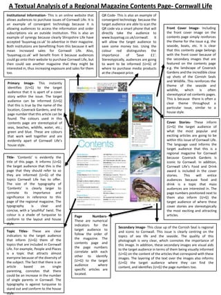
1. A Textual Analysis of a Regional Magazine Contents Page- Cornwall Life
Institutional Information- This is an online website that
allows audiences to purchase issues of Cornwall Life. It is
an example of convergent technology because it is
allowing audiences to access the information and order
subscriptions via an outside institution. This is also an
example of synergy because clearly Shropshire Life have
accepted ‘buyamag.co.uk’ to advertise in their magazine.
Both institutions are benefitting from this because it will
mean increased sales for Cornwall Life. Also,
‘buyamag.co.uk’ will benefit from it because audiences
could go onto their website to purchase Cornwall Life, but
then could see another magazine that they might be
interested in, thus increasing exposure and sales for them
too.
QR Code- This is also an example of
convergent technology because the
target audience are able to scan the
QR code via a smart phone that will
directly take the audience to
www.buyamag.co.uk/cornwall.
It
will allow the target audience to
save some money too. Using the
colour red distinguishes the
importance
of
‘Save
£1’.
Stereotypically, audiences are going
to want to be informed (U+G) of
where to purchase media products
at the cheapest price.
Primary Image- This instantly
identifies (U+G) to the target
audience that it is apart of a cover
story within the issue. The target
audience can be informed (U+G)
that this is true by the name of the
location, Coverack Gardens, and the
page number that this article can be
found. The colours used in this
contents page are stereotypical of
seas, beaches, wildlife, water, etc.;
green and blue. These are colours
that work well together and are
evidently apart of Cornwall Life’s
house style.
Title- ‘Contents’ is evidently the
title of this page. It informs (U+G)
the target audience that this is the
page that they should refer to so
they are informed (U+G) of the
topics Cornwall Life has to offer.
The size of the typography of
‘Contents’ is clearly larger to
connote its importance and
significance in reference to this
page of the regional magazine. The
typography
is
clear
and
concise, with a ‘youthful’ twist. The
colour is a shade of turquoise to
conform to the layout and house
style.
Topic Titles- These are clear
indicators to the target audience
that inform (U+G) them of the
topics that are included in Cornwall
Life. For example, People and Places
is a topic that attracts almost
everyone because of the diversity of
the subject. The fact that there is an
article
based
on
single
parenting, connotes that there
could be an increase in the number
of single parents in Cornwall. The
typography is against turquoise to
stand out and conform to the house
style.
Page
NumbersThese are numerical
indicators for the
target audience to
follow the order of
the magazine. The
contents page and
the page numbers
correlate with each
other to identify
(U+G) to the target
audience
where
specific articles are
located.
Front Cover Image- Including
the front cover image on the
contents page simply reinforces
the theme for the issue e.g. the
seaside, boats, etc. It is clear
that this contents page belongs
with the front cover because of
the secondary images that are
featured on the contents page
e.g. the landscape of Coverack
Gardens and the incredible close
up shots of the Cornish Seals
and Wildlife. This reinforces the
theme of the seaside and
wildlife,
which
is
often
stereotypical od contents pages.
This is because there is often a
clear theme throughout a
particular issue, similar to a
house style.
Cover Stories- These inform
(U+G) the target audience of
what the most popular and
exciting articles are going to be
within this issue of Cornwall Life.
The language used informs the
target audience that this is a
regional magazine for Cornwall
because Coverack Gardens is
iconic to Cornwall. In addition,
Cornwall Life’s Food and Drink
award is included in the cover
stories.
This
will
entice
audiences because food and
drink is a topic that mass
audiences are interested in. The
page numbers positioned next to
them also inform (U+G) the
target audience of where these
cover stories are stereotypically
the most exciting and attracting
articles.
Secondary Image- This close up of the Cornish Seal is regional
and iconic to Cornwall. This issue is clearly centring on the
topics of sea life and the seaside. The quality of this
photograph is very clear, which connotes the importance of
this image. In addition, these secondary images are visual aids
to the target audience in terms of them being visually informed
(U+G) on the content of the articles that correspond with these
images. The layering of the text over the images also informs
(U+G) the target audience where they can find the
content, and identifies (U+G) the page numbers too.
2. This is a textual analysis that will be focusing on the contents page of Cornwall Life regional magazine that I have
annotated. I have decided to conduct a textual analysis based on this because I wanted my research to be diversified
in the sense that I would be researching different regional magazines that focus and are located in different regions
o f England.
Firstly, the primary image that is used on this contents page instantly identifies (uses and gratification) to the target
audience that this correlates with a cover article/story in this issue of Cornwall Life. The focus of the primary image is
always going to correlate with a cover feature/article within the magazine. It is clearly evident that this primary
image connotes the theme of this issue of Cornwall Life, which is to with the sea side, water, beaches and also sea life
and wildlife. The target audience can be informed (uses and gratification) that this true because of the name of the
location; Coverack Gardens. The layering of this text on the primary image connotes that this is the focus of the
article that this primary image is conveying through visual imagery. In addition the page number (86) clearly informs
(uses and gratification) where the target audience can find the article that relates to this primary image further down
the contents page. The beautiful landscape shot of Coverack Gardens conforms to the house style of Cornwall Life in
the sense that it included colours that are used throughout the contents page e.g. blue and green.
Furthermore, the title of the contents page is clearly evident to the target audience; ‘Contents’ it informs (uses and
gratification) them that this is the page within the regional magazine that they should refer to so they are informed
(uses and gratification) of the topics Cornwall Life has to offer. The contents page is very important because it is a
clear, informative indicator for the target audience to use to find the topics that they want to read about. The size of
‘Contents’ is considerably bigger in reference to the other pieces of text. This reinforces that the title allows the
target audience to be informed (uses and gratification) that this is the contents page. The typography is clear and
concise, with a ‘youthful’ twist due to the brightest of the turquoise which is a colour stereotypically associated with
younger audiences. Moreover, the colour of the text conforms to the layout and house style of this issue of Cornwall
Life.
The topic titles that are used on the contents page are stereotypical of the features expected on a contents page. This
is evidence that although Cornwall Life is conforming to the conventions of a contents page, they are making it iconic
to them by titling topics such as ‘Countryside, Heritage and Natural World’ to target the audience of people who live
in Cornwall, and people who want to experience something new by visiting Cornwall. Another example is ‘People and
Places’. This is a topic that will attract almost everyone because of the diversity of the subject. The fact that there is
an article based on single parenting, this could possibly connote that there could be an increase in the amount of
single parents in Cornwall. The topic titles are a very stereotypical convention of contents pages because they inform
(uses and gratification)the target audience about what particular articles will be based on.
Page numbers are very important within a regional magazine, specifically on the contents page. These are numerical
indicators for the target audience to be able to follow the order of the magazine. The contents page and the page
numbers correlate with each other to identify (uses and gratification) to the target audience where specific articles
are locate with the magazine. Page numbers are a reference point that are included in the feature of a contents page
to ease the target audiences minds. When consuming a regional magazine, the target audience wants to be able to
find the information and the articles stress free. The page numbers allow this to happen as the target audience can
quickly refer to the contents page and then be able to skim the magazine until they find the page that they are
looking for. This could not have been done without using page numbers.
The OR code is an example of technological convergence because the target audience are able to scan the QR via a
smart phone that will instantly direct them to the website www.buyamag.co.uk/cornwall. Here ,the target audience
can purchase single issues of Cornwall Life online, something that would not of been possible anywhere else. This
website allows the target audience to save money too. Using the colour red distinguishes the importance of ‘Save £1’.
Although it is only one pound, if the target audience like the way that this website distributes the magazine, then over
time, this will have a positive effect on the target audience because they are able to save money when consuming
this media product. Stereotypically, audiences are going to want to be informed (U+G) of where to purchase media
products at the cheapest price. If this website offers this, this will mean that both institutions, buyamag.co.uk and
Cornwall Life are working in synergy to create something that might otherwise not have been possible.
3. The secondary images allow the target audience to identify (uses and gratification) what some of the articles will be
centred on e.g. wildlife and sea life. The positioning of them in reference to the layout is important. They are
positioned together on the right of the page to create a clear and concise sense of layout, The text on the contents
page needs to be together and create an understandable layout for the target audience to comprehend. The close up
of the Cornish Seal is regional and iconic to Cornwall. The style and focus of the image is incredible because the
photographer was able to capture this shot at just the right second. This issue of Cornwall life is clearly centring on
the topics of sea life, wildlife and the sea side, this is evident through the visual codes represented through the
imagery throughout this contents page. The accompanying text that is layered over the image informs (uses and
gratification) the target audience of the name of the animal. This is very important because the target audience might
not have known what this animal was. They could of initially had a sole purpose to consume this product which might
have had something to do with Arts and Literature for example, but now they can read about the Cornish Seals. They
would instantly be able to be informed (uses and gratification) of where to locate this information in the contents
page and by the page numbers.
Including the front cover image on the contents page simply reinforces the theme for the issue, for example the
seaside, wildlife, boats, etc. It is clear that this contents page belongs with the front cover because of the secondary
images that are featured on the contents page, for example the landscape shot of Coverack Gardens and the
incredible close up shots of the Cornish Seas and Wildlife. This reinforces what the theme of this issue is. This is a
stereotypical convention of contents pages a s the theme of the front cover stereotypically would continue through
to the contents page.
The cover stories are stories that are of most importance and are the stories that would stereotypically entice mass
audiences into consuming the media product. Some of the cover stories listed are in direct correlation and relate with
the images used on the contents page. This connotes that all the features of the contents page, ranging from the
topics to the cover stories to the images are all in correlation with each other, to convey an organised atmosphere
and mood for the target audience to be able to read the contents page in a well structured way. The layout of the
contents page is clear and the target audience can identify (uses and gratification) how the different features
correlate with each other to entice the target audience to consume the regional magazine.