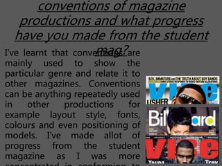
Q7. Looking back your preliminary task, what do you feel
that you have learnt in the progression from it to the full
product?
By Chapter-Jane Yeboah
conventions of magazine
productions and what progress
have you made from the student
mag?I’ve learnt that conventions are
mainly used to show the
particular genre and relate it to
other magazines. Conventions
can be anything repeatedly used
in other productions for
example layout style, fonts,
colours and even positioning of
models. I’ve made allot of
progress from the student
magazine as I was more
Think about every aspect of both productions
and scrutinise every decision you made?
In my school magazine production my front cover was very simple with
the colours matching the background but not the specific genre. I
focused more on the visual aspects and not adding much content. The
contents page could have been done to a much better extent ad I’ve
used the same image as the front cover and cropped it. The colours used
did not stand out as much from the background making it hard for the
reader to read.
In my R&B magazine production, my front cover mostly conformed to
the conventions seen in other music magazines making it unoriginal.. I
made sure to use fonts that are easy to read and use the image and text
in ways to relate to the target audience who are young people. My
contents page used similar colours to the front cover helping to show the
specific genre, the layout of the images could have been nearer and
much bigger allowing them to be more visible to the reader. Also the text
used was not as much eye catching which the reader could easily get
bored of. The big image used on the first page was very suitable and
fitted well as it appeared that the artist was looking up at the heading
‘contents’ . My Dps was very unique looking compared to other
magazines in my genre, with the colourful background image and
Think about the production as a journey from
the initial sketching to the final product?
My Initial sketching was a simple layout for my
front cover, contents page and Dps. As I then began
to take my pictures using various amount of angles
I then realised that my positioning would not be
appealing with my images and text due to the type
of pictures I wanted to use. Then later changing the
entire layout from the initial designs. I positioned
the pictures first so I could have an idea how I’ll
include my text. I then was able to look at it and
include conventions seen in other magazines. So
my magazine changed allot from my initial
sketching.

Q7 evaluation

  • 1.
    Q7. Looking backyour preliminary task, what do you feel that you have learnt in the progression from it to the full product? By Chapter-Jane Yeboah
  • 2.
    conventions of magazine productionsand what progress have you made from the student mag?I’ve learnt that conventions are mainly used to show the particular genre and relate it to other magazines. Conventions can be anything repeatedly used in other productions for example layout style, fonts, colours and even positioning of models. I’ve made allot of progress from the student magazine as I was more
  • 3.
    Think about everyaspect of both productions and scrutinise every decision you made? In my school magazine production my front cover was very simple with the colours matching the background but not the specific genre. I focused more on the visual aspects and not adding much content. The contents page could have been done to a much better extent ad I’ve used the same image as the front cover and cropped it. The colours used did not stand out as much from the background making it hard for the reader to read. In my R&B magazine production, my front cover mostly conformed to the conventions seen in other music magazines making it unoriginal.. I made sure to use fonts that are easy to read and use the image and text in ways to relate to the target audience who are young people. My contents page used similar colours to the front cover helping to show the specific genre, the layout of the images could have been nearer and much bigger allowing them to be more visible to the reader. Also the text used was not as much eye catching which the reader could easily get bored of. The big image used on the first page was very suitable and fitted well as it appeared that the artist was looking up at the heading ‘contents’ . My Dps was very unique looking compared to other magazines in my genre, with the colourful background image and
  • 4.
    Think about theproduction as a journey from the initial sketching to the final product? My Initial sketching was a simple layout for my front cover, contents page and Dps. As I then began to take my pictures using various amount of angles I then realised that my positioning would not be appealing with my images and text due to the type of pictures I wanted to use. Then later changing the entire layout from the initial designs. I positioned the pictures first so I could have an idea how I’ll include my text. I then was able to look at it and include conventions seen in other magazines. So my magazine changed allot from my initial sketching.