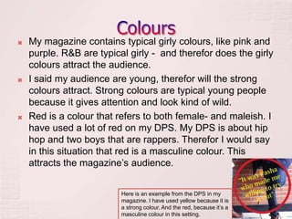
By Elisabeth E. Larsen
   The masthead on my magazine is big, black and written
    in a groovy way.
    It’s very simple
    but at the same time interesting. The masthead is like
    written to a rhythm.
   In this issue, is the masthead written in black, which
    attract boys more than girls. It’s black in this issue,
    because it’s a hip hop issue, and black makes the
    magazine more masculine.
   The font that are used are funky and interesting, we can
    believe the font is a girl font, because girls are more
    known for writing pretty. If my magazine had been a plain
    hip hop magazine, then the font would have been more
    simple and plain. But since this is a R&B magazine as
    well as hip hop, is the font written in a more girly style.
    This type of loop writing attracts girls.
   To make my pictures attract to teenagers, have I used
    masculine boys with a cool hip hop style as models.
    Especially boys get attracted by the clothes the boys are
    wearing, because the clothes are the audience’s style as
    well. The models are posing in their own way, and it
    looks like their having a good time and that they got self
    confident. This attracts the audience because they look
    safe and make the magazine look pro.



                                       Here you see
                    Here you see the   the masculine
                    confident facial   clothes on the
                    expression.        boys
   My photos attracts teenager girls because “the
    Elements” got a seducing expression – this makes
    girls/boys interesting in the magazine.
   The picture of Katy B attracts the
    audience because the shot is taken
    in a low angle shot. This means that
    she gets the power and that she looks
    confident.
    The picture of her is taken from a live show, and we can
    see that it’s taken from a wild show. Wild concerts are
    usually something young adults attend. The audience
    get the feeling of being in the concert when they see live
    pictures. This attracts young adults and teenagers who
    likes to listen to good music, dance and go to concerts –
    aka my audience.
   My magazine contains typical girly colours, like pink and
    purple. R&B are typical girly - and therefor does the girly
    colours attract the audience.
   I said my audience are young, therefor will the strong
    colours attract. Strong colours are typical young people
    because it gives attention and look kind of wild.
   Red is a colour that refers to both female- and maleish. I
    have used a lot of red on my DPS. My DPS is about hip
    hop and two boys that are rappers. Therefor I would say
    in this situation that red is a masculine colour. This
    attracts the magazine’s audience.


                          Here is an example from the DPS in my
                          magazine. I have used yellow because it is
                          a strong colour. And the red, because it’s a
                          masculine colour in this setting.

Question 5

  • 1.
  • 3.
    The masthead on my magazine is big, black and written in a groovy way. It’s very simple but at the same time interesting. The masthead is like written to a rhythm.  In this issue, is the masthead written in black, which attract boys more than girls. It’s black in this issue, because it’s a hip hop issue, and black makes the magazine more masculine.  The font that are used are funky and interesting, we can believe the font is a girl font, because girls are more known for writing pretty. If my magazine had been a plain hip hop magazine, then the font would have been more simple and plain. But since this is a R&B magazine as well as hip hop, is the font written in a more girly style. This type of loop writing attracts girls.
  • 4.
    To make my pictures attract to teenagers, have I used masculine boys with a cool hip hop style as models. Especially boys get attracted by the clothes the boys are wearing, because the clothes are the audience’s style as well. The models are posing in their own way, and it looks like their having a good time and that they got self confident. This attracts the audience because they look safe and make the magazine look pro.  Here you see Here you see the the masculine confident facial clothes on the expression. boys
  • 5.
    My photos attracts teenager girls because “the Elements” got a seducing expression – this makes girls/boys interesting in the magazine.  The picture of Katy B attracts the audience because the shot is taken in a low angle shot. This means that she gets the power and that she looks confident. The picture of her is taken from a live show, and we can see that it’s taken from a wild show. Wild concerts are usually something young adults attend. The audience get the feeling of being in the concert when they see live pictures. This attracts young adults and teenagers who likes to listen to good music, dance and go to concerts – aka my audience.
  • 6.
    My magazine contains typical girly colours, like pink and purple. R&B are typical girly - and therefor does the girly colours attract the audience.  I said my audience are young, therefor will the strong colours attract. Strong colours are typical young people because it gives attention and look kind of wild.  Red is a colour that refers to both female- and maleish. I have used a lot of red on my DPS. My DPS is about hip hop and two boys that are rappers. Therefor I would say in this situation that red is a masculine colour. This attracts the magazine’s audience. Here is an example from the DPS in my magazine. I have used yellow because it is a strong colour. And the red, because it’s a masculine colour in this setting.